Winds of Life

As a sculptor, I always seek ways to use my work to create positive (and sometimes intellectually challenging) experiences for those who have the opportunity to see what I’ve done.
In my case, most of the time I’m not trying to make direct, narrative or literal statements. Instead, I seek to conjure feelings of fascination that lead to appreciation and enjoyment: You don’t necessarily have to understand the forms I create to walk away from them with good feelings.
When I have the opportunity to work in public settings (as was the case in the project featured on these pages), I’m stimulated by the idea that large numbers of people will be exposed to my sculpture and that, in many cases, those people will be exposed to what I’ve done over and over again because they’ll be passing by at least twice each day as they go to and from their jobs in adjacent buildings.
In this case, I was working next to an office tower in Century City – a famous business and entertainment district near downtown Los Angeles – which meant that thousands would repeatedly be walking right past my work and would come to accept it as part of their daily lives. In that light, I see art set amid architecture as a permanent commitment, as a cultural reference that has the potential to resound for generations.
This recognition fills me with a heightened sense of
responsibility and makes me approach such projects with a great deal of sensitivity, care and caution: To be successful, I know that such a sculpture needs to offer a changing set of aesthetic experiences that will enable it to be interesting for the long haul. That’s a big challenge – and great fun to see when everything clicks.
INVITING FORMS
I was one of five artists asked to submit designs for a piece to be located near the main entrance of a skyscraper owned by Held Properties, a leading developer of commercial real estate in southern California. The competition was handled through Xiliary Twil, director of Jonathan Novak Contemporary Art.
The plaza piece was intended to celebrate the renovation of the building, which is about 40 years old and was in need of a fresh look. I was one of an original group of 12 artists selected by Ms. Twil for the design competition. From that dozen, the property owners selected five and commissioned us to create models of our proposed designs.
That was in February 2007 – the beginning of a process that culminated in June 2008 with the dedication of the remodeled building and the “unveiling” of my sculpture. It was an honor simply to be one of those selected from among such a respected group of artists. I know all of them and am familiar with their work, and I was impressed by the range of styles and approaches we represented.
The models were prepared and presented to the owners and their representatives, and I was delighted to be the one they selected.
My design concept was based on five aesthetic elements:
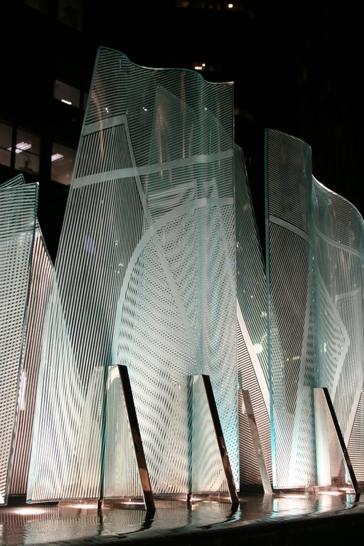
[ ] Movement: The linear patterns within the glass panels that comprise the piece generate moiré patterns to create an internal geometry that moves and shimmers as people pass by. This means the work constantly changes as viewers’ positions change.
[ ] Sound: The subtle sound of moving water creates a peaceful and continuous feeling of tranquility that contrasts with urban noise and the nearby sounds of traffic.
[ ] Water: The constant movement and rippled reflections of water in transit interact with the composition’s static elements as it flows over a weir and back into itself.
[ ] Glass: The internal and external visual qualities of glass offers transparency, reflection and refraction.
[ ] Light: The visual interaction between glass and sunlight constantly changes with the position of the sun in the sky, with the seasons and with clouds. At night, the piece takes on an entirely different quality as it rises above sources of artificial light.
In the presentation, I explained that my work is about line, form, space and light, about the tension of expressing movement in static forms and about using that tension to produce rhythms and energy. These elements conspire to create optical depths that result in interplay and interaction, depth within depth, space within space, visual space along with physical space and the illusion of far grander spaces. And it all works because light invades the glass – entering, passing through, reflecting multiply and altering the appearance of the glass as viewers pass by and perceive change.
If my work is successful, it’s because a piece is interesting, fun to examine and enjoyable to be around. That’s really all anybody needs to know: If it works, none of the conspiracy of interactions really matters.
WORKING IN PLACE
During the design phase, I had access to every bit of architectural information I needed and supplemented those documents with multiple site visits and scores of photographs I took from all sorts of angles at various times of day.
The space I was given was a 15-by-55-foot spot in the middle of the plaza between two tall office buildings, and I spent a considerable amount of time discussing everything with structural engineers to make absolutely certain my work would pass muster with the building department and conform to all applicable codes.
| Models are everything in this sort of design competition, but for a composition of the sort we were submitting, words and descriptions mattered a great deal because the small scale definitely left a lot of detailing to the selection committee’s imaginations. |
Beyond that, I had tremendous freedom to do what I wanted to do, but there was one stipulation: Right in the middle of the space where the piece was to go was an exhaust vent for the building’s underground parking garage: It couldn’t be moved and somehow had to be incorporated into the piece’s design. Other than that, I was given free rein – a wonderful situation from an artist’s perspective.
As I examined the existing space and studied plans for the remodeling of the building’s entrance, I thought about the experiences I wanted people to have as they came and went and applied everything I observed and learned as the process moved along. I was pleased by the fact that, by nature, my work changes with different light and with movement of the observer and would therefore never become a monotonous mass that people would take for granted.
I was also pleased because the client wanted water to be incorporated into the work. This was perfect because its flow would provide an aural and visual feeling of tranquility to contrast with the noisy activity that occurs in busy spaces such as this one. At the same time, I didn’t want the water itself to become monotonous and add to the daily grind with vertical plumes or other effects that suggested activity rather than tranquility.
| Many steps are involved in the process of preparing glass panels for these sculptures. We start by placing cut-glass panels in the oven over a set of rollers selected to allow the glass to “slump” in the desired way. Once the glass cools, the surface is taped with intricate patterns in advance of sandblasting, then the tape is peeled away to reveal the final etched surface of the glass. |
The time I spent on site also demonstrated that gusting winds would be a factor. Channeled through the canyon created by the two tall buildings that encompassed the plaza, these breezes not only made sense of the sculpture’s title – Ventus Vitae, Latin for “Winds of Life” – but also let me know that I needed to consider splash-out in my design. (Also, as a purely practical consideration, I’ve learned through the
years that water interacts with glass surfaces in such a way that scale can become a significant maintenance issue.)
As all of these ideas coalesced for me, I saw water as an indispensible means of creating a composition that would draw people right up close and make them feel comfortable. The result is a sculpture that obviously can be enjoyed from a distance, but by using water as an attractive medium, I also established a link that draws passersby closer to appreciate the sound and reflections – and deeper into the complexities of the overlapping glass panels, their graceful contours and the interactive dance of their etched surfaces.
PURPOSEFUL BLENDS
The interaction between light, glass and water never ceases to fascinate me and has become a recurring theme in almost all of my work.
In this case, I started with 12 slumped-glass panels held upright by stainless steel braces. These panels vary in height, with the central one rising to a peak of 11-1/2 feet.
| Once all of the panels were ready, we set them up in the studio to finalize the arrangement and spacing. Once everything was aligned as desired, we started playing with positions for lighting, looking for spots and angles that amplified visual effects and the optical interactions between panels. |
(My original proposal was taller across the work’s full span, but there were concerns that it might interfere with the view of the remodeled entrance, so I was asked to scale things down. I did so willingly, because an installation of this sort must work on a variety of levels within its setting and I wanted the piece to integrate with the ideas of the architects and the developers. Besides, I saw right away that the revised scale still worked well from all primary vantage points.)
The concept behind the peaked form had to do with the staging of perceptions for someone walking toward the building’s entrance: First they would see the water and the edges of the lowest glass panels – a sort of introductory glimpse. As that same person moves up into the plaza, the panels rise and guide the eyes upward, leading to views of the sky and the looming architecture of the buildings before tapering back down on the far side as the building’s entrance swings into view.
With this arrangement, I was thinking in metaphorical terms of lifting that person’s spirits to the sky just before focusing his or her thoughts on the destination and tasks at hand.
| As we were completing our work in the studio, a crew was finishing its preliminary work on site. The coordination between shop and plaza was on the very highest level as we made certain all of the pipes and conduits and anchors matched perfectly so we could move our sculpture bases into place with relative ease. Next came the tense work of moving each of the heavy panels into place and securing them to the base system. |
The glass structure rises above a black-granite pedestal over which a very fine sheet of water flows, rippling and spilling into a lower basin. The movement of the water adds a measure of visual complexity to the overall composition as the panels and braces are captured in shimmering reflections and light bounces off the water’s surface to dance among the panels.
The panels themselves were shaped in a furnace at my studio, where I take what starts as a very flat, very rigid material and give it a variety of sensuous, undulating shapes. This process enables me to create harmonies and contrasts between the solidity of the material and the fluidity of its new forms – and play endlessly with the ephemeral nature of light.
At night, the piece is lit by 15 adjustable fixtures set beneath the water’s surface. My goal here is to make the panels glow like strange, luminescent jewels that become a strong visual focus after dark. It’s all part of my program of contrasts and changes, by day with ambient light infusing the piece from without, by night with a light from within emerging to do battle with darkness.
BASED ON INSTINCT
I’ve been an artist for most of my life and take great pride and pleasure in teaching students about the possibilities of lives in the arts at Harvard Westlake School in North Hollywood, Calif. They often ask me how they should think about and approach the creative process, and although I can talk for hours about what I do, ultimately I have a hard time describing how my design ideas take shape.
Certainly, that process is different for every artist. I’m now 64 and I’ve been working with slumped glass for almost 40 of those years, and all I can say after giving it a lot of thought is that it’s basically an intuitive phenomenon. I see and fully understand the materials I use, their capabilities and their limitations; I also know a lot about the forms I use and how far toward the limit I can press things and still get desired results. Beyond that, however, I follow my feelings.
This piece is perfect example: Yes, it responds to the setting and the architecture and the needs of my clients, but when all is said and done, what you see is the product of my willingness to follow my creative instincts.
As I watched people respond to Ventus Vitae at the dedication ceremonies this past June, I found that some were capable of going to great lengths to impose some sort of narrative meaning on the piece. For people who simply must look at art in that way, I’m happy to oblige by providing the sort of complexity that rewards differing levels of appreciation and understanding.
| Once installed, the composition immediately made itself at home in the plaza, working its magic internally with rich moiré patterns and interactive reflections but also taking on and mirroring the character of the surrounding sky, structures, lines, lights and colors. And the show after dark is simply wonderful, with the well-placed lights giving Ventus Vitae a nocturnal life all its own. |
My belief, however, is that relatively few of the people who will walk by this sculpture daily will ever think of it in such probing, intellectual terms. Instead, they’ll be thinking about what’s going on at work as they arrive in the morning and about what’s going on at home at the end of the day and will experience the aesthetics tangentially. That doesn’t bother me at all, and I enjoy the additional stray thought that people in the building will start saying, “Meet me by the sculpture” in making lunch plans.
To me, that’s enough, and I’ll be content if they simply register the composition as something nice to look as they pass by for a few brief seconds. If any of them happen to stare at it for a moment in sorting out a problem or planning a course of action, all’s the better. On that level, it doesn’t matter to me if they don’t even recognize its presence in any sort of direct, immediate way.
The point is, whether you’re an art critic or someone who moves through the day somewhat oblivious to the immediate details of his or her surroundings, a work such as this will invariably become a defining component of its environment. Just as it speaks to people on multiple aesthetic levels, so, too, does it resonate in different ways that harmonize with and complement human behavior.
It’s this context that was behind naming this work Ventus Vitae: It honors a great Los Angeles businessman, Harold Held, as being akin to the Winds of Life – always engaging and, depending on where one happens to be, the time of day and the season of the year, ever changing.
John Gilbert Luebtow is a glass sculptor based in Chatsworth, Calif., and has designed and constructed large-scale pieces in architectural settings for nearly 30 years. He holds advanced degrees in ceramics, glass and fine arts from the University of California at Los Angeles and California Lutheran University. His portfolio includes elaborate commissions for commercial clients including Atlantic Richfield, MCI, the Supreme Court of Nevada and the Yokohama Royal Park Hotel in Nikko, Japan, among many others. Among his most striking works are those that include the use of water as a design component.


