Whimsical by Nature
Many of the projects I tackle are largely about beauty and elegance and striking just the right balances between my watershaping and the setting, the architecture of the home and the character of my clients.
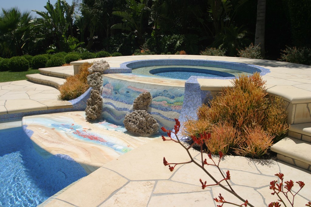
In the case of the project depicted here, however, a couple of other considerations jumped into the mix – including impulses for fun and excitement as well as an overriding need to raise the visual energy level to align with the clients’ personalities and a glorious setting. The result is an exquisitely adorned watershape that stands as one of the purest expressions of whimsy and unbridled joy I’ve ever produced.
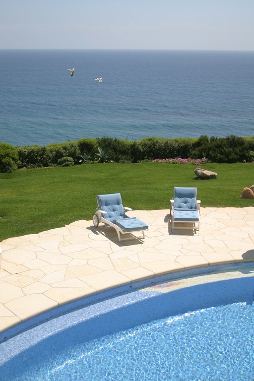
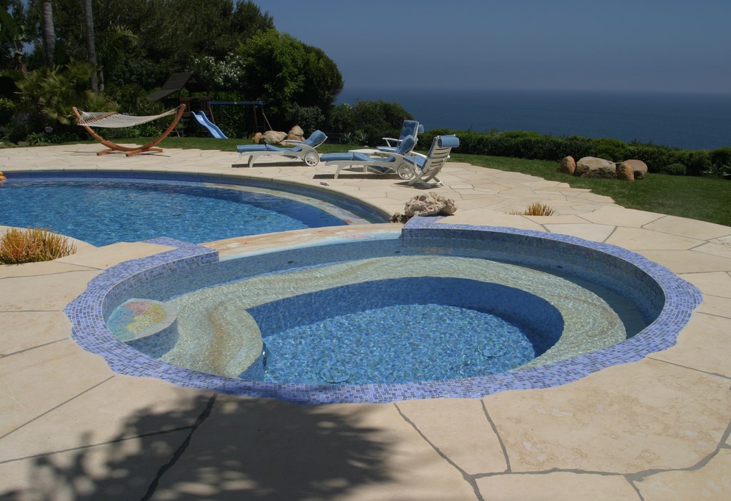
Truly, it all flowed from the clients and the setting. The clients are quite educated, well-traveled and sophisticated and had both the resources and the desire to do something special. Moreover, they’re about as nice a couple as you could ever hope to meet and had refined tastes to match. As for the setting, we’re talking beauty in the extreme: The home is a modern masterpiece perched atop a bluff in Malibu, Calif., with 180-degree ocean views and spectacular distant vistas.
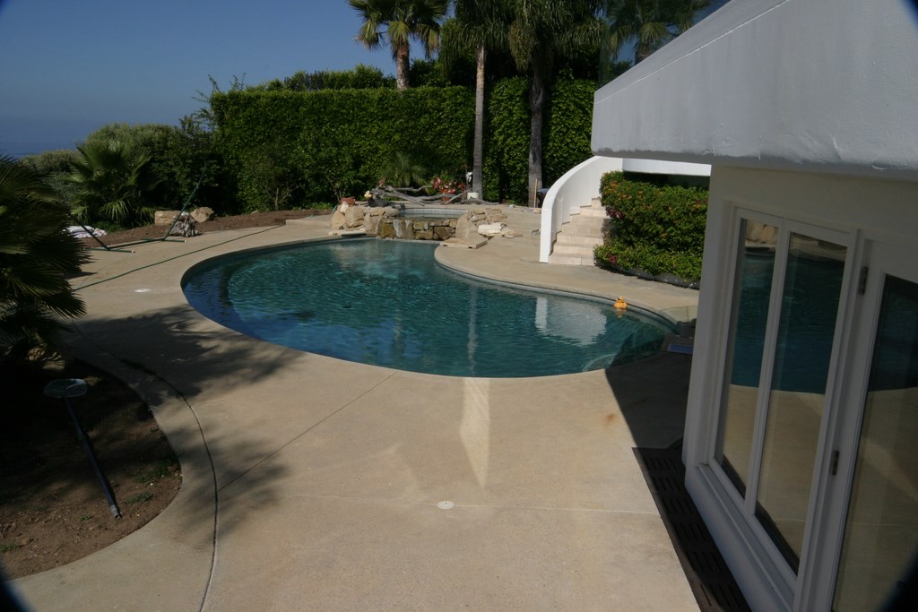
The only clinker on the property was the existing pool and the surrounding decks – an aggressively plain, kidney-shaped drag surrounded by equally boring decks. It was time for a change.
BUT NOT SO FAST
These homeowners, of course, knew what was wrong and had an idea of what they wanted to do. Their problem, through eight long years of trying, was finding a watershaper who shared their sense of what the backyard could be. This is why, by the time I came in contact with them, they had interviewed and rejected no fewer than 50 pool designers and contractors.
I was finally brought to their attention by a landscape designer who was working just across the street from a Bel Air property on which I was building a pool I’d designed. He stopped by on numerous occasions and, after conversations with several of my subcontractors, saw the possibility of a fit and passed my name to his Malibu clients. (Talking with subcontractors is, by the way, a much better way to gauge a builder’s capabilities than is reviewing a résumé or portfolio.)
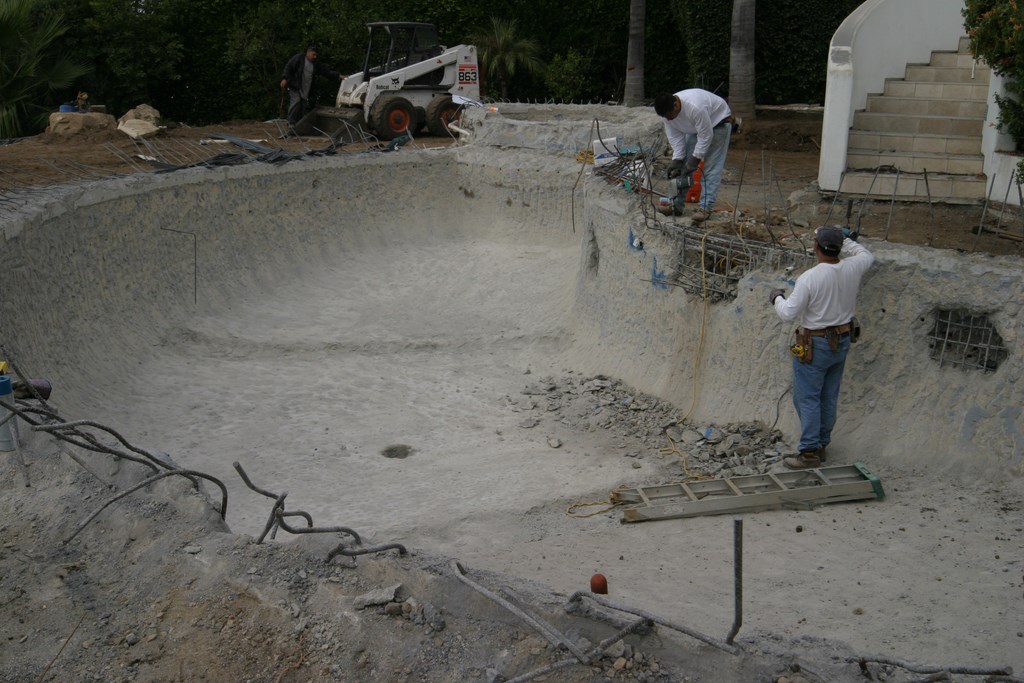
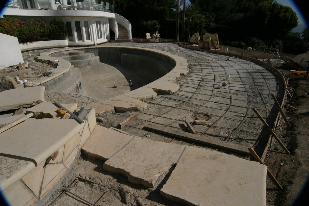
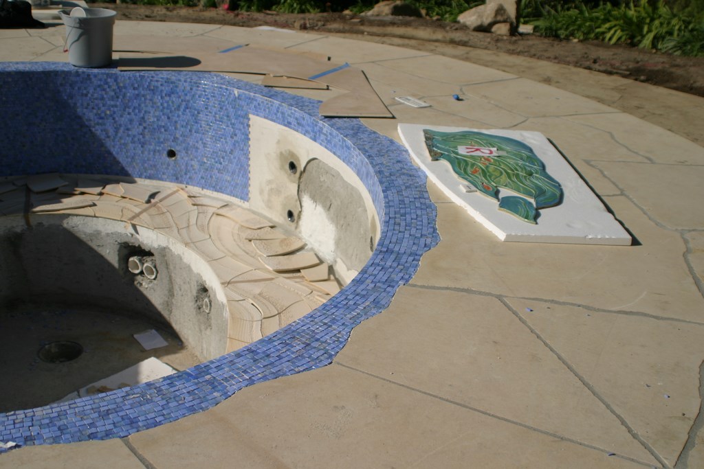
| The original pool was plain vanilla, a clunky waste of materials in a fabulous setting (left). We stripped the finish, broke out the decks, cleared access for a new skimmer, plumbing lines and electrical conduit and began a detailed process of reconstruction on the original footprint (middle). Inside the pool, we raised the floor and added new benches and a thermal ledge. Around the pool, we set a heavy-duty sub-base. What you see in (right) is the second of three pours that support and compensate for the different thicknesses of the large slabs of Hillsboro stone we used as coping (three inches thick) and as the deck material (gauged at three quarters). |
Our initial meeting lasted about 45 minutes and focused almost entirely on my background and some preliminary thoughts about what might be done in their backyard – nothing specific, just general ideas.
Before my next visit to the site some time later, I focused entirely on the color palette and materials I thought would work. I set up some glass-tile samples and things started to gel quickly because they liked what they saw and immediately opened up. From that point on, we talked mainly about how they wanted to use the backyard as a source of fun and frolic for their grandchildren, family and friends.
That input, coupled with impressions derived from their home décor and their buoyant personalities, made it clear that, in addition to being appropriately gorgeous and done up with the finest possible materials, this design had to be all about play and excitement.
They didn’t balk at all when talked about various material options and their relative costs – ceramic or glass tile, plaster or pebble finish, stone or concrete decking. In fact, they liked just about everything they heard and wanted to keep all options open pending a design proposal. So I went back to my studio and began mixing up tile samples and researching various material options.
UNDER THE SEA
Seeing real potential in both the project and the clients, I contacted my friend Nick Powell of Craig Bragdy Design Ltd., an art tile supplier based in Denbigh, Wales. His firm specializes in entirely customized, highly decorative, extremely colorful and fully textured ceramic works of art – bold statements in every square inch.
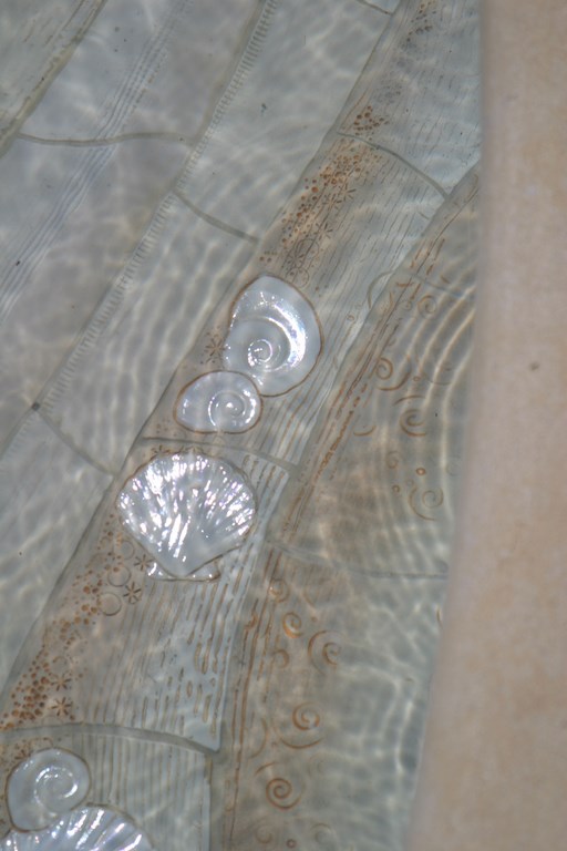
We discussed several ideas and came up with a scheme that would involve finishing the pool in a combination of glass tile and ceramic imagery that would depict underwater scenes highlighted by fish, crabs, lobsters and seashells in a textured beach motif.
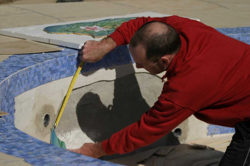
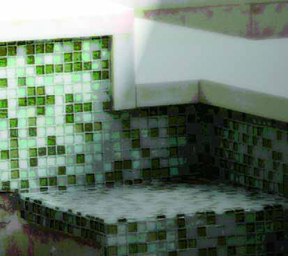
| The decorative ceramic tile we used in both the pool and the spa is an artful combination of color and texture. Master installer Paul Kelly (seen here) flew in from the supplier’s headquarters in Wales to get the job done. The images in the highly detailed tile were made with the contours and dimensions of this specific pool in mind, so perspectives are always correct and ‘natural.’ Note the detail at the top of the spa: The materials intersect in a way that creates no protrusions that might poke anyone in the neck or shoulders as they sit and relax in the spa. |
Personally, I’ve seen scores of “underwater scenes” in tile and dismiss them for the most part as garish and way over the top – stuff that makes me cringe. With this supplier, however, I knew that if the client decided to go this route that Powell’s artists would come up with something unique, beautiful and fun.
Given the setting, the clients had run into lots of designers and contractors who told them that a vanishing edge was the best possible approach – with all sorts of waterfalls, leaping jets and every conceivable bell and whistle to boot. I knew, even given my brief acquaintance with them, that these clients wanted their fun to come via different means.
I created a sense of whimsy using elegant materials that, in a sense, tell a story. In that light, there was no need for much-overused water-in-transit details or fire effects or deck jets; instead, we used traditional elements that were much more appropriate to the site, the architecture and the clients, adding personalizing touches at every opportunity.
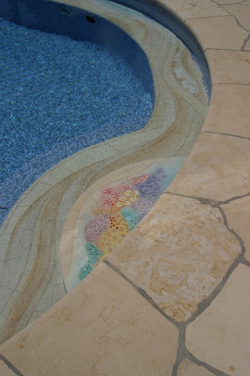
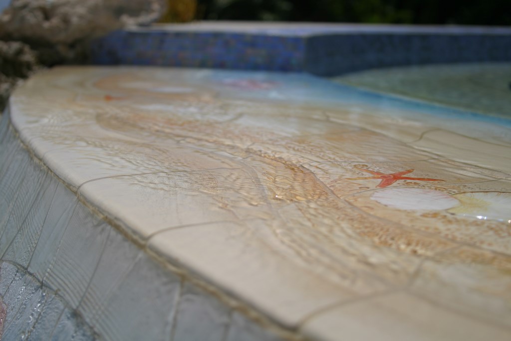
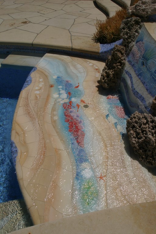
| The ceramic-tile images, all produced by Craig Bragdy Designs of Denbigh, Wales, are truly ethereal and go a long way toward telling the pool’s story. The top of the dam wall (left) displays the dimensionality of the tile, and you can see the way the texturing produces tiny ripples reminiscent of waves washing across a sandy beach. The sandy colors applied to the steps, benches (middle) and thermal ledge (right) – almost all of the pool’s and spa’s horizontal surfaces – make the interior surface seem like a submerged, shimmering extension of the sand-colored coping and decking. |
Before long, I’d generated a design based on the use of a glass-tile field accented by patches of an ocean-going underwater scene in ceramic, and from then on there was no looking back – although there was a fly in the ointment in that Powell’s local distributor simply didn’t “get it” and was spoiling everyone else’s good time.
Happily, Powell recognized the problem and took ownership of the project, soon providing us with exactly the help we needed to turn things around in the form of the company’s tile-installation wizard, Paul Kelly, who flew in from Wales to get the job done. After a few dicey weeks, we were right where we needed to be – a real tribute to Powell’s professionalism and Kelly’s attention to detail.
THE HAND DEALT
As for our work on site, we knew going in that it would be best to leave well enough alone so far as the old pool was concerned.
As mentioned above, the property sits on a bluff overlooking the Pacific Ocean, which places it firmly under the jurisdiction of the California Coastal Commission and subjects it to a whole raft of restrictions and regulations. To remove and replace the gunite shell – which certainly would have been my preference – almost certainly would have involved years of bureaucratic wrangling, incredible expense and extreme, mind-numbing frustration.
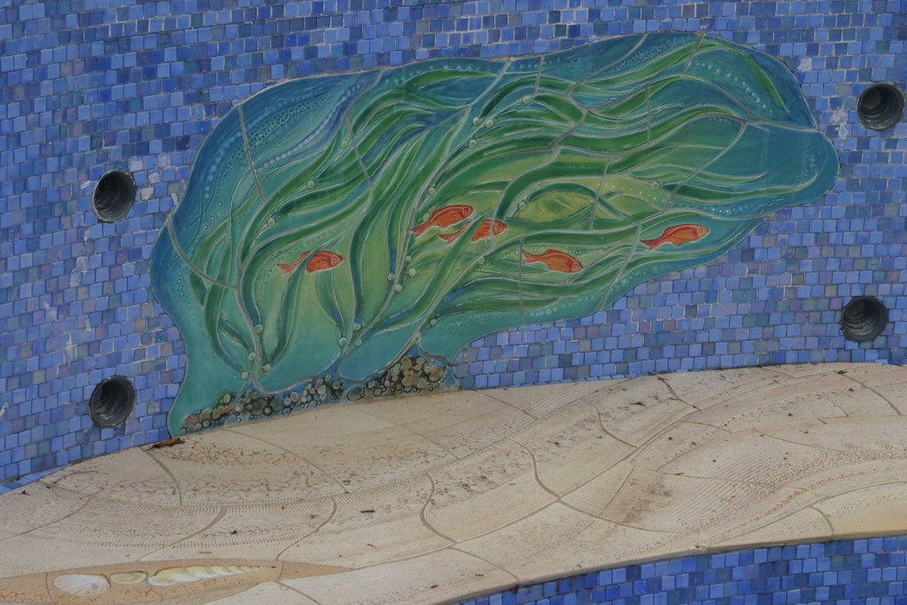
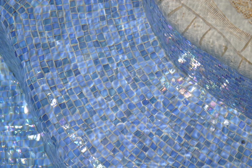
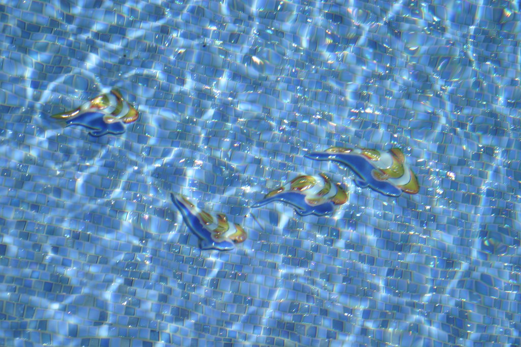
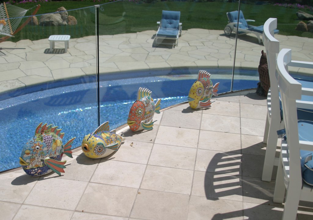
| The pool’s blue field is a custom blend of iridescent glass tile from Sicis of Ravenna, Italy. No trim pieces are available with this material, so we rounded over the edges of the steps and folded the tile over the contours (left). This glass material was chosen for the way it catches and reflects sunlight and helps create a vivid underwater world in which ceramic fish swim freely. The fish, shown before the pool was filled (middle), stand proud of the pool’s bottom and have ceramic shadows that give them an even greater sense of dimensionality. Under the water, they come alive and play in a shimmering field of blue (right). |
Early on, we decided to dodge that problem entirely by leaving the kidney-shaped structure in place and working with the hand we’d been dealt. This meant that all of our aesthetic “moves” had to happen within the existing shell and would reach no farther than removing and replacing the decks and equipment – no increase in deck area, no tinkering with the pool’s shape, no addition of complex waterfeatures.
The new deck is a stone called Hillsboro that, with the help of my friends at Malibu Stone of Malibu, Calif., we brought in from the Midwest, and every drain head, skimmer lid and corner was painstakingly detailed for uninterrupted visual flow. To ensure long-term stability, a new 30-inch-deep footing was tied to elements of the pool’s original structural deck. To handle the multiple thicknesses of the unusually large pieces of stone, the concrete sub-base we prepared is more than 14 inches thick in places and includes several mats of steel and wire.
| From the deck above pool level, we see some of the touches of whimsicality that characterize the entire project as well as the personalities of the homeowners (left). There’s no denying the beauty of the setting middle), and comparison of the ‘before’ image to the revised appearance of the spa with its new dam wall and thermal shelf shows the way in which the remodeled watershape settles more gracefully into its surroundings (right). |
As luck would have it, the shell itself was sound. We didn’t break into it anywhere, didn’t alter the bond beam, didn’t in any way tinker with the structure. Inside the shell, however, we changed things considerably, adding a bench that encircles almost the entire perimeter of the pool and raising the pool’s floor. (These additions made it possible for us to add new plumbing and lighting as well as an underwater sound system.)
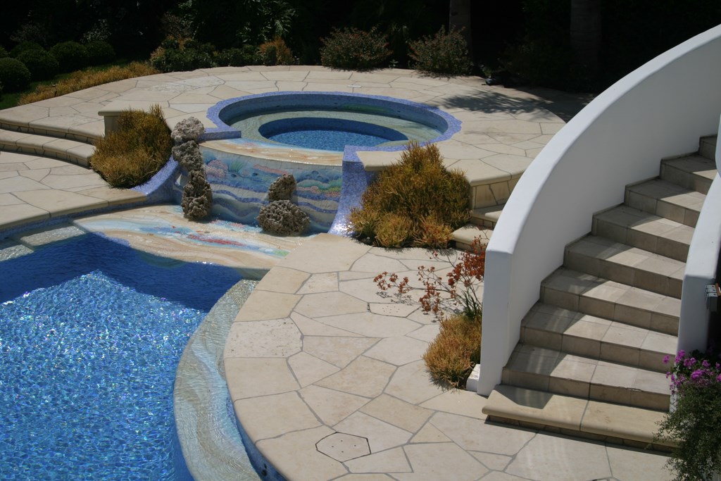
We also left the large raised spa alone structurally, although we completely redefined the transition between spa and pool by shaping a softly sloping dam wall (to minimize the noise of the flowing water) and placing a wide thermal ledge between the spa and the pool. This area was the focus of much of the ceramic tile work and also displays two large rocks that look like coral.
The equipment set was completely replaced with components from Jandy Pool Products (Petaluma, Calif.). We also switched out skimmers as well as the electrical systems and control equipment.
MAKING MAGIC
Once these modifications were made, the fun of executing the aesthetic details began.
The basic idea was to drape the sandy colors and textures of the Hillsboro stone onto all of the horizontal surfaces of the watershape, starting at the top of the dam wall, stepping down onto the thermal ledge and then reaching into the pool and onto the steps and benches and, in places, sliding down the walls into the field of glass tile.
The interior surface beyond the ceramic scenery is covered in a custom blend of glass tiles from Sicis (Ravenna, Italy). The mix I developed includes subtle blues and silvers with all sorts of iridescence – the idea being to reinforce the impression of shimmering, jewel-like water as a foil for the beach-like scenes.
Unlike many suppliers of illustrative ceramic tiles (and largely because they do made-to-order work on watershapes of known configurations), the artists at Craig Bragdy Design work with perspective and appreciate the angles at which their undersea creatures will be viewed. Throughout the pool, we scattered dozens of fish, shellfish and shells as well as aquatic plants – all seen at realistic angles, meaning top-down views of fish on the pool’s bottom.
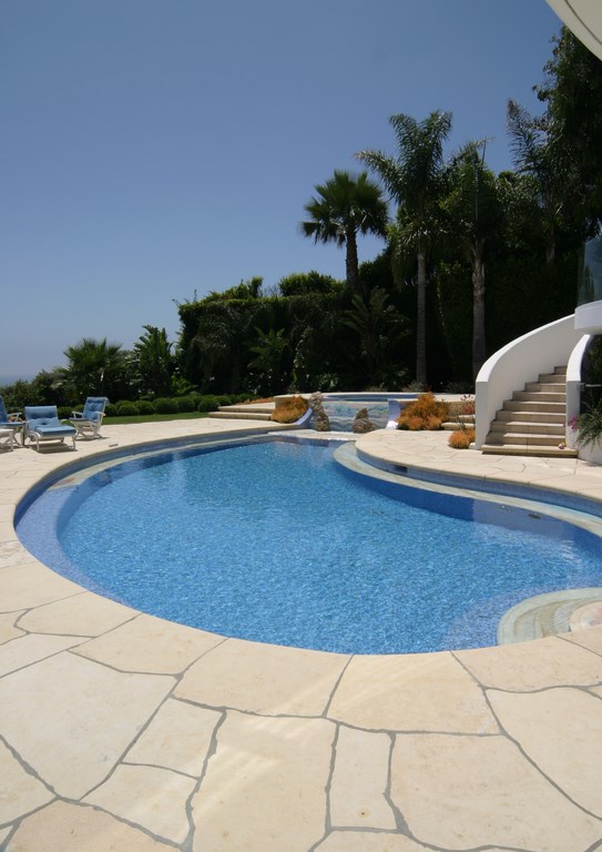
| Overall views of the pool, spa and deck complete the tale of whimsy and indicate the degree to which the project befits the homeowners and their ambition of creating a substantial slice of a safe, fun-filled undersea world, from the aquatic appearance of the plants to the coral-like rocks of the dam wall to the minute details of the ceramic-tile vignettes. |
This is the area in which I’ve so frequently been disappointed by off-the-shelf tile mosaics. It’s always struck me, for instance, that when you show a full profile of a fish on a horizontal surface, it looks as if the poor creature must be dead. Not so in this pool, where everything is visually consistent and, to my eye, does a great job of “selling” the narrative that this is a sandy underwater paradise.
One of the things I love about the ceramic surfaces is that they have fantastic texture and relief details in addition to being beautifully composed, rendered and colored. The beach area atop the spa’s dam wall, for instance, has small ridges in the tiles that make the water ripple as it flows. Not only does this detailing make for safe footing, but it also has a magical visual effect – especially in the context of the aquatic appearance of the Euphorbia plants that flank the spillway on both sides.
And then there are the details just for the children, including raised fish with drop shadows on the bottom of the pool that they can swim down to and touch and will almost certainly end up giving names – great fun. From the adult perspective, the composition may be showy, but it happens in ways that are also casual, extraordinarily expressive and perfectly suited to the setting.
To be sure, the “attitude” expressed by this project stands out from much of the work I do, and I’m proud to think I was the one who finally spotted what was needed by these fabulous clients and was able to deliver once the ideas began to coalesce. Fun and frolic may not be watchwords for every client, but in this case, they were perfect – and the result has been joy all around without any apparent limits.
David Tisherman is the principal in two design/construction firms: David Tisherman’s Visuals of Manhattan Beach, Calif., and Liquid Design of Cherry Hill, N.J. He can be reached at tisherman@verizon.net. He is also an instructor for Artistic Resources & Training (ART); for information on ART’s classes, visit www.theartofwater.com.


