Luxury with a Twist

Root Design has always focused on developing environments that delight, inspire and occasionally surprise clients, but the project seen in this, the first of two articles, may well be the company’s most elaborate to date. Here, Ben Dozier and Michael Percy describe what went into designing and building across the entire site, including the multiple watershapes that helped transform this estate into an oasis filled with plants, light, sounds and water.
Although it doesn’t always work out this way, the best-case scenario for us at Root Design (Austin, Texas) is to accept full responsibility for all exterior spaces of a given property, from the footprint of the house out to the property lines. In these situations, our team is able to establish designs with wall-to-wall continuity in response to the environment, the architecture and our client’s wishes.
We commit ourselves in these circumstances to taking homeowners and their guests on a journey, starting the moment they enter the property and moving all the way through to the yard’s farthest reaches and all the spaces in between. Along the way, they’ll enter a variety of small or large vignettes, conceal-and-reveal discoveries, dramatic focal points and multiple rewarding destinations – each conceptually linked as a coherent “whole.”
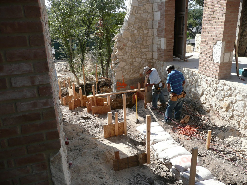
In this case, we were called upon to develop all of the exteriors for a home on a two-acre lot in an affluent Austin suburb. Better still, our work coincided with the construction of the home, so we were able to coordinate with the architect, interior designer and builder early on in order to value-engineer the construction process and control costs effectively. As you’ll see here (and in a future article), our work offers an interesting perspective on what it takes to orchestrate connections between landscape architecture and pool construction.
At this writing, the project is about three-quarters complete. In this article, we’ll cover the design process and construction of major exterior elements including several watershapes that serve as unifying elements throughout the design. Once the plants and trees have settled in, we’ll revisit the site for a detailed pictorial tour.
RUSTIC GRACE
Our practice is largely guided by the idea that good architecture is edited architecture. Our client, for example, had many ideas about what he wanted, starting with a central courtyard; a private spa off the master bathroom; and a large swimming pool he envisioned as a key feature in the project. That was all good, but beyond that outline our client allowed us to develop the overall program with complete creative freedom, allowing us to link each element through a series of exterior spaces while harmonizing everything.
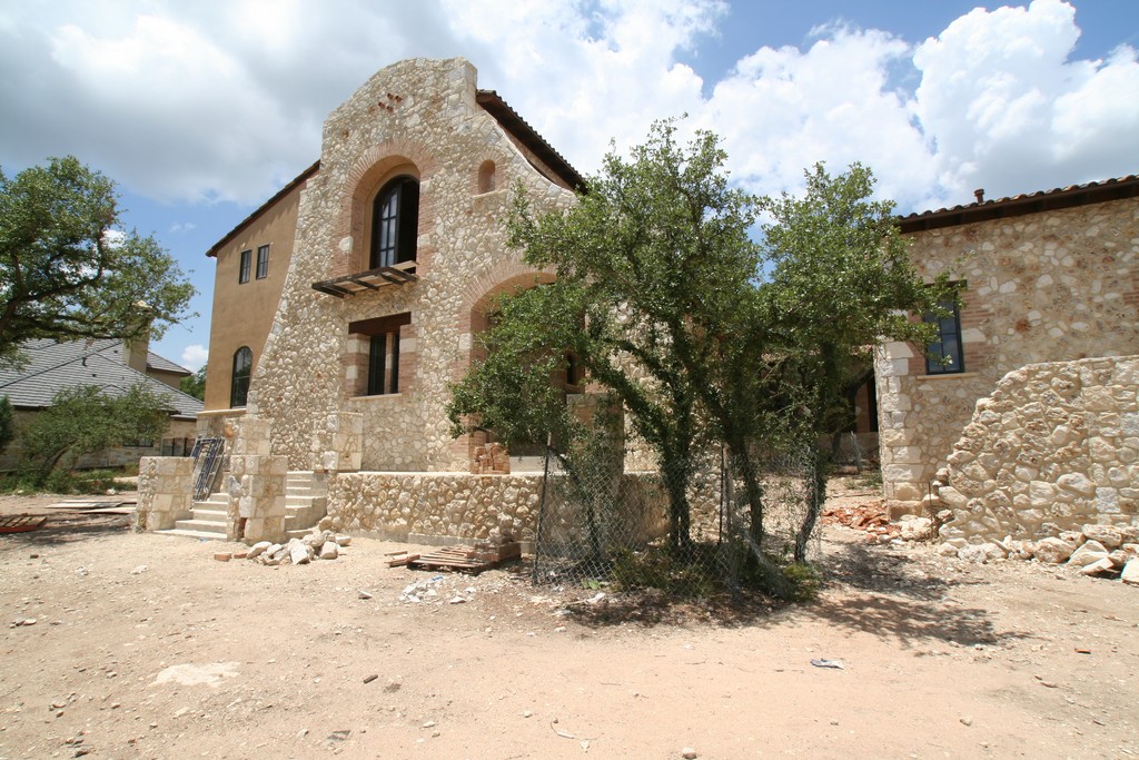
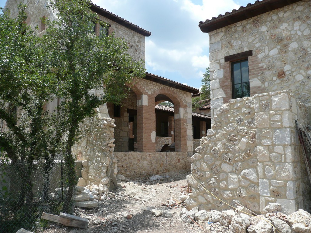
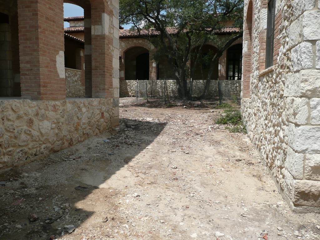
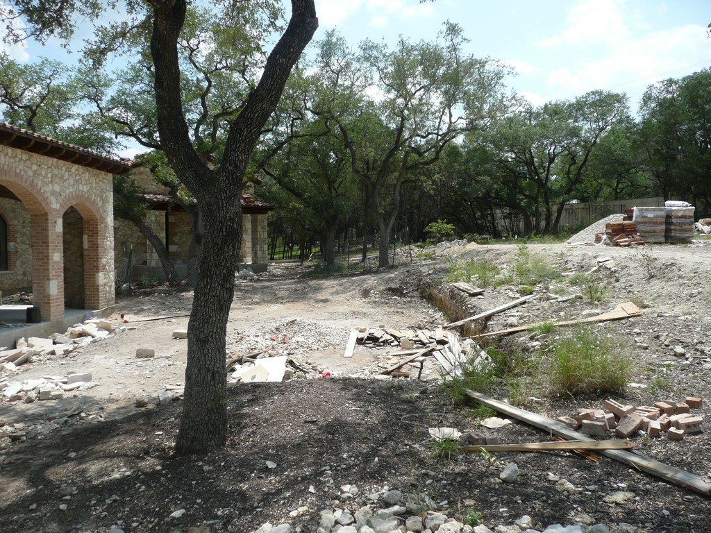
His prerequisites, in other words, gave us a promising start – and so did the work of the other designers on the project: The Hacienda-style building had been perfectly sited on the lot, woven through stands of mature live oaks spread across a gently sloping topography. The architecture was to include plentiful use of stone, large structures made of reclaimed beams, grand archways, a barrel-tile roof and, best of all, open views to various outdoor spaces being programmed around the site.
The house is true reflection of site conditions, giving it the appearance of having always been there, and we knew that every design decision we’d make would be focused on preserving and enhancing the home’s connection to the land. This was, in effect, the foundation of our design and, ultimately, our driving force throughout the construction process.
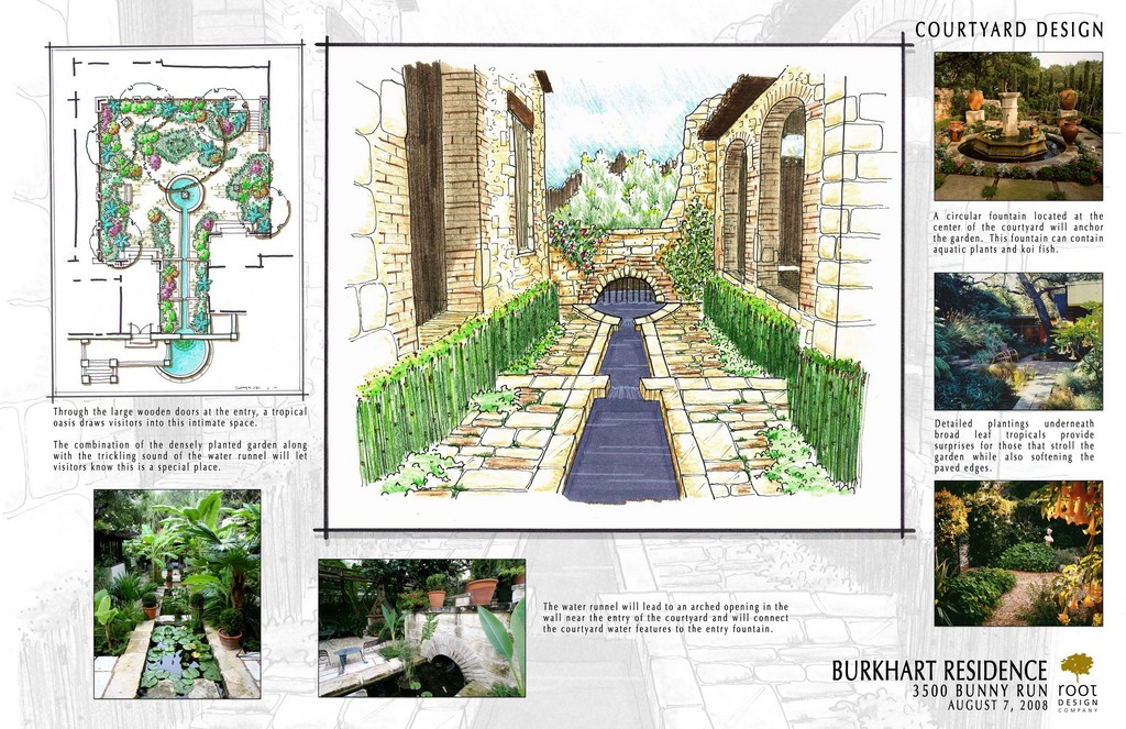
| The architecture of the home gave us tremendous inspiration: The Hacienda-style composition was sited perfectly and used materials and details we knew we could carry well beyond its walls in developing exterior spaces. In presenting out ideas to the client, in fact, we spun off the house in creating ‘story boards’ that laid out our ideas in the form of drawings supplemented by photographs from other projects showing our capabilities. |
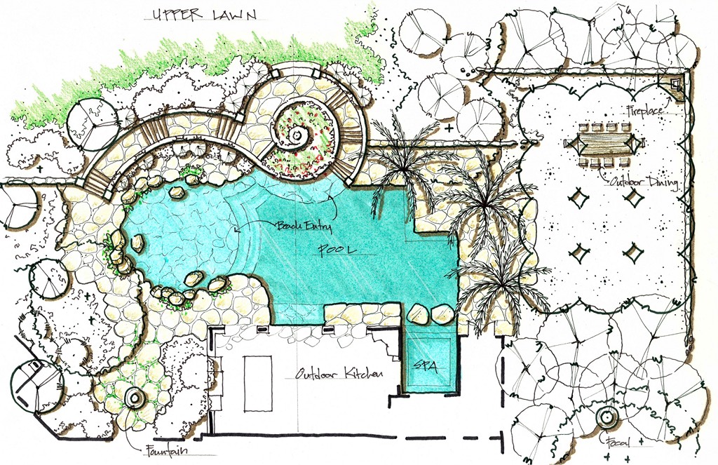
As part of the conceptual design process, we generated a comprehensive set of drawings that illustrated primary exterior areas. All done by hand, these sketches were used in conjunction with photographs selected from our own portfolio as well as fully credited images illustrating the work of others. In this particular case, all of this material was organized on “story boards” we shared with the client. We also assembled sets of images demonstrating our ability to blend architecture and landscape, blurring lines in such a way that you can’t tell where one begins and the other ends.
Throughout the presentation, there was lots of spirited collaboration with the client, particularly when it came to our strategies for connecting the formal and functional with the historic and aged. When he’d taken in all of the sketches and began to perceive the overall program we were advocating, the flood of questions about details fell away and the leap of faith was taken: In fact, he became so distinctly excited that all he had to say, finally, was “When can you get started?”
A REWARDING JOURNEY
The site’s layout and the design of the home lent themselves perfectly to creating a sweep of visual action that would fully engage anyone visiting the property. Accordingly, we deliberately defined a sequence in which the visitor would constantly be discovering new areas by moving and being drawn through the space, always with water serving as a unifying element.
Let’s set the scene: As you drive through the large wooden gates at the edge of the property, you are led to a circular entry court. A formal stone pathway finished with native limestone then guides you to massive, reclaimed-wood doors that seem to be the entrance to the house. The only hint that this might not be the case is a semicircular, eight-foot-diameter pond placed to the right of the doors’ landing: Water seems to flow to it from under a low arch that penetrates the wall. From this point, you also hear water flowing on the other side of the wall – a definite spur to curiosity.
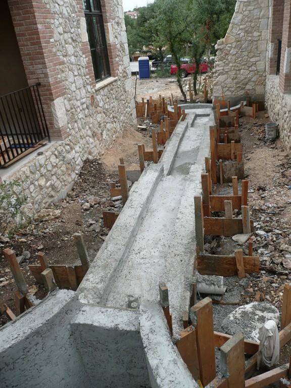
Opening the door, you find yourself a good 80 feet from the home’s main entrance, which stands at the far end of a large courtyard. The first few steps are under an arched loggia, and to the right is a long runnel, the source of the sound first heard from outside the doorway.
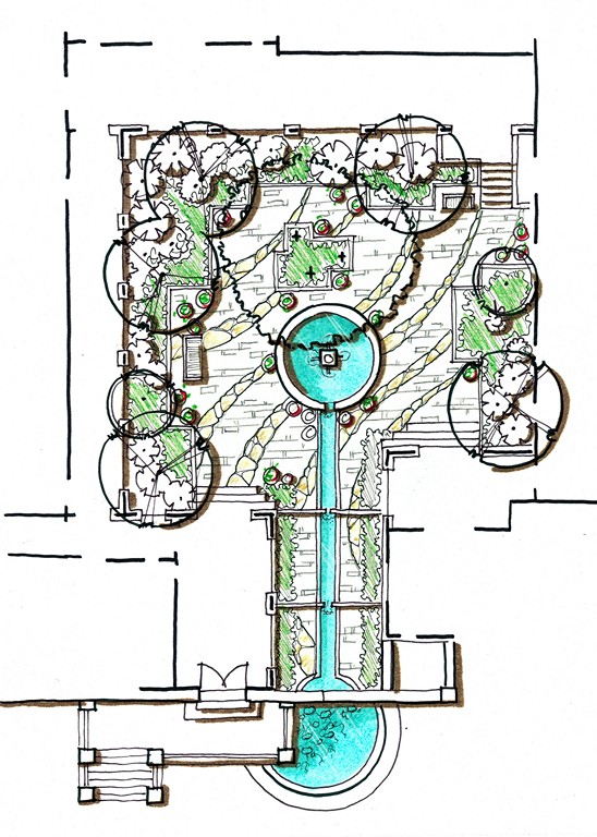
The courtyard is really the heart and soul of the project: Designed around mature live oaks and completely enclosed on three sides by the house, the space is recessed 18 inches below the building’s floor level and is surrounded by outdoor porches and living areas that overlook the courtyard on all sides. It truly is the social core of the design.
| The courtyard sets the tone for the entire project, serving as a social core of the home for the family and their guests and guiding visitors on an extraordinarily peaceful journey from the front gate to the entry door. As is the case with all of the main spaces of this project, water is the key: A long runnel greets those who enter, and an appropriately scaled fountain draws them through to approach the front door. |
Absorbing all of this, you follow a line parallel to the runnel, up the courtyard toward the front door. Along the way, you discover that the runnel is fed by three separate spillways that echo a fourth spillway seen in the pond off the driveway.
At that point, the courtyard broadens into an area in which we centrally placed a tiered quatrefoil fountain. When completed, the five-foot-diameter fountain’s lower basin will host aquatic plants that will add interest and color to the setting, and the whole assembly will be topped by a sculpture that’s being hand-carved by sculptors in Mexico. (Although the surrounding area is spacious, we definitely didn’t want the fountain to take over, so we scaled it down to make it both intimate and more inviting.)
Beyond the water, the courtyard is planted with a host of mostly broad-leafed plants, including a range of palms intended to give the space a Mediterranean or even a tropical ambiance – all very different from what is typically seen in central Texas. We felt comfortable moving in this direction because the courtyard is so well sheltered by a light-filtering canopy of live oaks: As we saw it, injecting this exotic flavor would be a key part of the overall impression we wanted to make.
To get to the main entrance, you walk around the back of the fountain, finally reaching a set of steps that leads to a porch. By now, you have already experienced an encompassing sanctuary that simultaneously feels luxurious and very private.
VIEWING THROUGH
In walking through the door, you immediately look right through the great room’s floor-to-ceiling windows and through arches out over a broad deck and the swimming pool, in effect leaving behind one area defined by water and immediately getting an invitation to explore another.
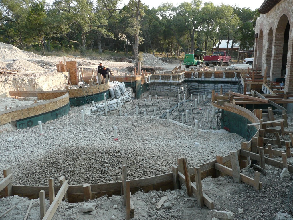
The pool features a deck-level perimeter-overflow detail: The rationale for this thoroughly modern touch in an otherwise Old World design is the fact that we wanted to bring the water right up to the deck’s grade, which is in turn dead level with the floor of the home’s interior spaces. As we saw it, doing so would increase both the viewability and the reflectivity of the water’s surface and make the scene more immediate and dramatic.
Given all this, it’s no surprise that the pool was the subject of most of our discussions with the homeowner. We had originally submitted a design that was far simpler and more traditional, but we believed so strongly in the more aggressive perimeter-overflow approach that we submitted it as well – then good-naturedly (but quite directly) challenged the owner to show some nerve and take the riskier path.
Whatever was said, we have no regrets because it prompted him to step up and commit himself to making a stronger impression.
| When visitors enter the house, the first thing they see is more water in the space just opposite the door in the form of a large swimming pool that includes a sheltered spa as well as a beach entry. The visual keys to this space are the sweeping curves on the far wall – and the spiraling structure that rises above it. |
Much of the pool’s perimeter involves a series of right angles flowing into slots, but to the left (from inside the home) is a beach entry with irregular, undulating contours. The decking (along with the beach entry’s submerged surface) incorporates a native limestone that received a “brush” finish, giving it a worn and aged appearance. (We also used this material on most of the horizontal surfaces around the property.)
The pool is 55 feet long (up to the waterline of the beach entry) and about 22 feet across at its widest point. The main deck area is off to the right – alongside the pool’s deep end and adjacent to its square spa.
The pool’s interior is finished in a dark plaster that increases the water’s reflective qualities. The water spills over into a half-inch slot, entering the gutter system and ultimately flowing to the surge tank. The circulation system – including the pumps, filters and controllers – all came from Jandy (Vista, Calif.). The water is treated using an ORP-governed, in-line chlorine feeder (supplier, city, state) supplemented by an ozone-generating system from DEL Ozone (San Luis Obispo, Calif.). The pool also has an in-floor cleaning system (supplier, city, state).
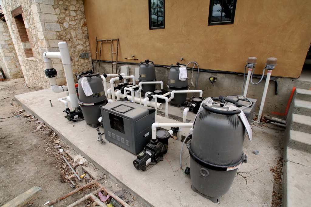
With eight pumps, three filters and a host of other components, the equipment pad became large enough to justify the design and construction of a structure to conceal it and knock down any noise it might generate. This became a casita-style outbuilding that’s consistent with the architecture of the home.
As a side note: When we finished the pool, the owner was so pleased with the view that he had the builder knock out a portion of one of the home’s exterior walls to create an additional vantage point from inside the home. At that point, we were fully confident that we had completely nailed the pool design.
UPWARD SPIRAL
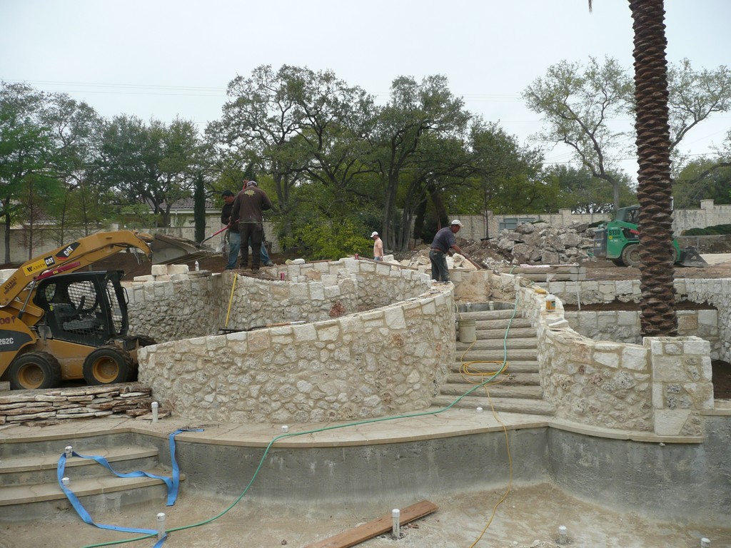
The most unusual and by far the most difficult element of the entire project is the spiral retaining-wall system that rises above and serves to define the landscape configuration on the pool’s far side.
As noted above with the perimeter-overflow detail, we’d already met with success by challenging the homeowner to think of being unique. In this case, we went after both unique and breathtaking in pressing him to make this twisting hardscape feature the core of the backyard space. Although it turned out beautifully, it also reminded us to be careful in what we ask for, as this structure turned out to be among the trickiest we’ve ever built. The shape was so difficult to achieve, in fact, that we actually built it three times, tearing out the first two attempts.
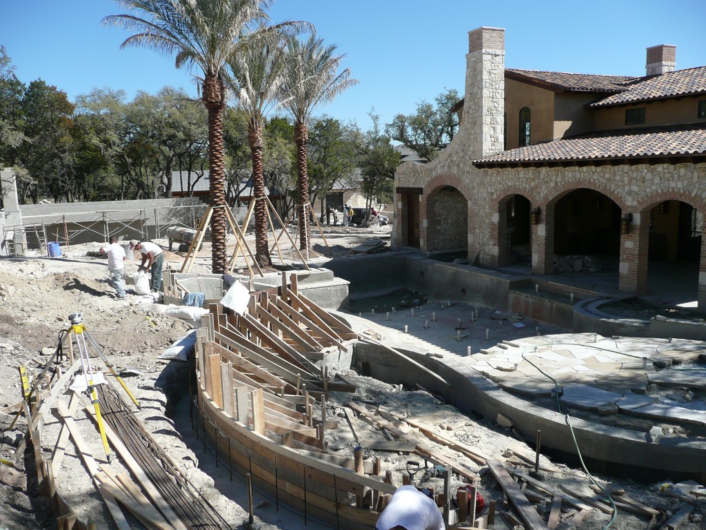
As finally completed, the spiraling walls rise above a small deck area just beyond the pool. To the right side, a set of solid stone steps rise some eight feet above the pool to a point behind the spiral’s center. Water flows directly down these steps, originating with a narrow weir behind the top step. On the left side of the twisting structure (reaching out past the pool’s beach entry) is a dry stone pathway a visitor can use to reach the top of the spiral.
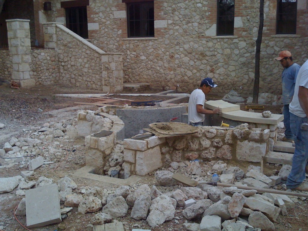
In structural terms, this feature serves as a retaining wall holding the slope above the pool in place. We made it using concrete masonry units (CMUs) up to grade. Above that, the wall is made of flat limestone pieces and is basically hollow. The difficulty came in executing the tight curves: It took extreme patience and involved several days of frustration and headaches – but eventually it all worked out.
Keeping with the ziggurat theme, the spaces in the structure that aren’t devoted to the wetted stairs or the pathway will be filled with multiple layers of plants that will cascade over the walls in a hanging-garden effect. All of these details are important, as the spiral stands dead center in the arch that defines the main view from inside the house.
Climbing to the top of the spiral, the visitor gains a 360-degree view of the entire backyard landscape, including the formal lawn stretching above the pool. At the highest point, we’ll eventually be placing an 18-inch fire bowl – a feature that will be seen from the house and most surrounding areas.
Just as the courtyard is the defining element in approaching to the home, the spiral serves as the hub of the entire backyard. Filled with visual energy and building a sweeping sense of motion, it engages the eye in a way that coaxes the visitor to look around and absorb the presence of water, plants, landscape elements, decks and various surrounding structures. The visitor atop the spiral also sees the trees and plants that serve as a backdrop for the rest of the property. In that sense, the spiral form serves perfectly as both a means to encourage movement and organize views.
As mentioned above, the area above the pool has been fashioned into a large, rectangular lawn area bound by low stone walls. (The owner has a nine-year-old son and wanted a broad space for play with family and friends.) The lawn is to be manicured to a fairway-like quality. At one end, the low walls reach out as a semicircle that eventually will host a large sculpture– another destination as the visitor ventures into spaces past the pool.
BEYOND THE CORE
The lawn area is just one of several backyard “rooms” we established around the core formed by the pool and the spiral structure.
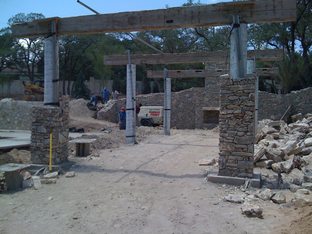
Close by the water (to the right side as you enter the space) is a stand of palm trees that create a visual break between the pool and the areas just beyond. One of those areas is an outdoor dining space surrounded by a nine-foot-tall stone wall and a large arbor constructed of reclaimed stone and beams salvaged from various buildings. In overall affect, this outdoor room gives the impression of being the ruins of an older settlement, built long ago. The massive structure is softened with grape vines that weave around the arbor’s rusted steel trellis. There’s also a table that seats 12, and the whole area is illuminated at night by a set of custom-made chandeliers.
Next in line moving away from the house is a massive outdoor fireplace. Flanked by a mature, transplanted olive tree and separated from other spaces by a stone wall, this room is intended as an after-dinner lounge – perfect for enjoying a snifter of cognac under the stars in a fire-lit space. The wall, by the way, blocks the view of areas stretching to the back corner of the property.
That blockage is deliberate, of course: What’s hidden back there is a recreation area that includes a putting green and a half-court for basketball. The client specifically wanted these features, but he also saw them as visually unappealing, aurally disruptive and a departure from the rest of the design program. As a result, he asked us to do whatever it took to make them unobtrusive.
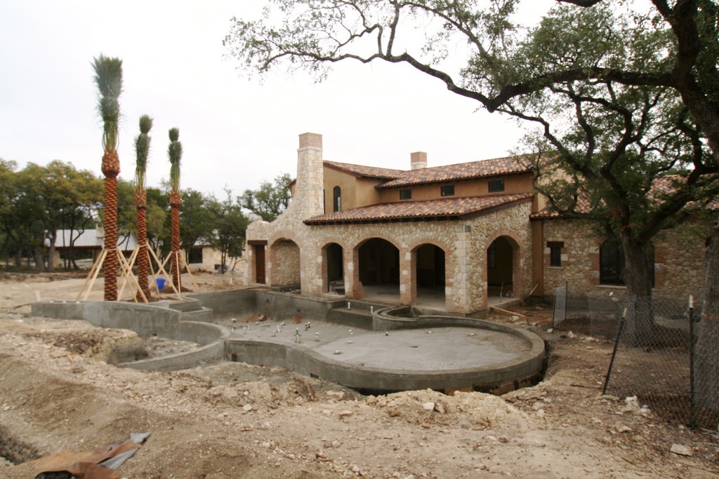
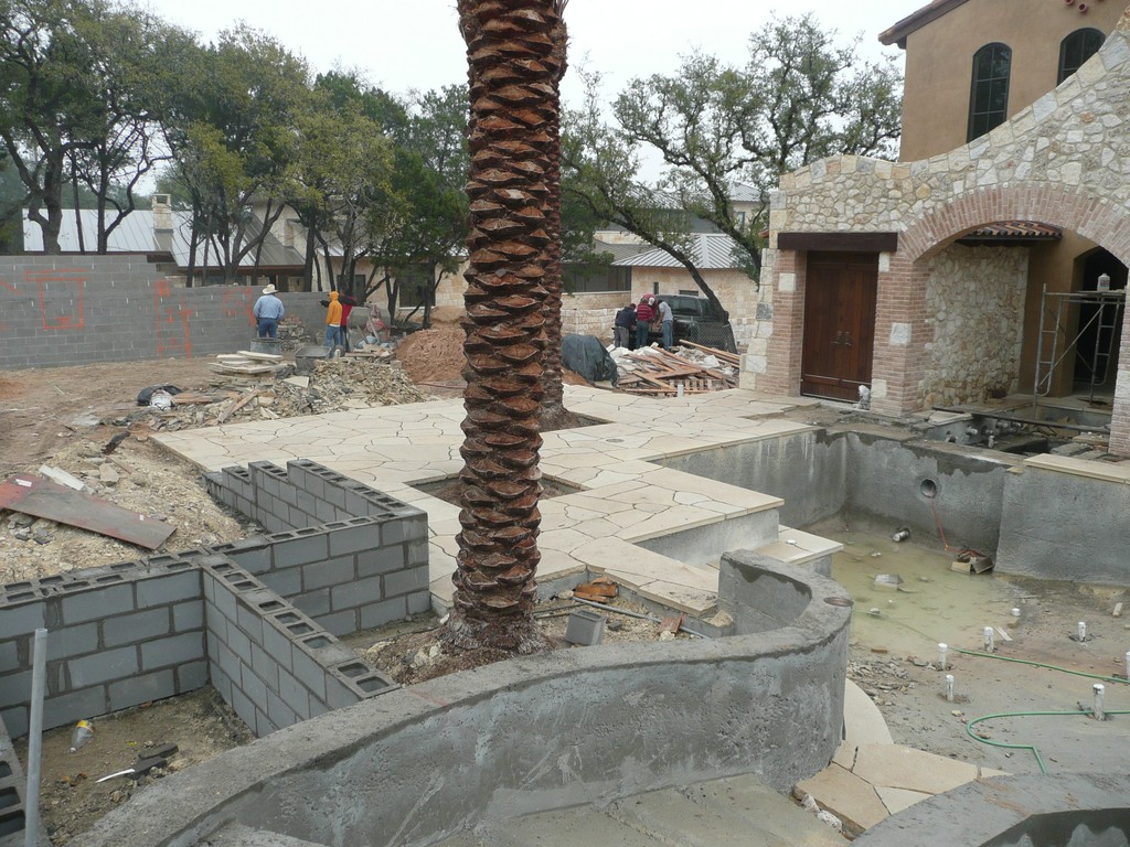
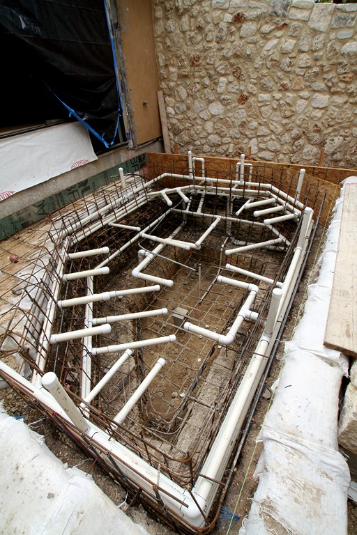
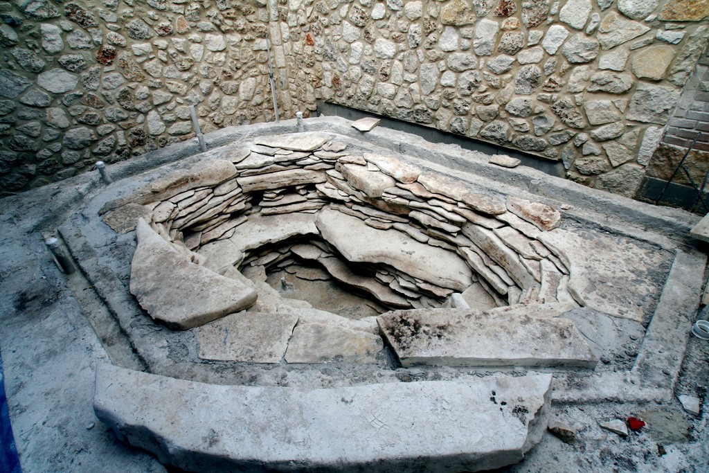
| We developed the property from the footprint of the house out to its perimeter boundaries, so we were involved in much more than the two main watershapes depicted previously on these pages. The equipment pad (top row, left), for example, will ultimately be housed in a casita-style outbuilding; the spiral structure rising above the pool (top, middle left and right) will retain the soil above the pool while providing the core image for the backyard; the dining area and fireplace (top, right) will suggest ruins of a much older structure that had been on the property forever; and, finally, a private spa off the master bedroom (second row, both images) will to give the impression of being fed by an ancient natural spring – wall-to-wall details that define this amazingly intricate project. |
The fireplace area and its wall go a long way toward making them disappear from view on the right side of the property. But we also carefully studied the sight lines and set things up in such a way that you can’t see the concrete of the basketball court from the house or the pool area – the keys here being a sweeping row of rocks we dug out of the ground on site and moved to a key location; a stand of olive trees that mask the putting green and sand trap; and the natural flow of the slope, which tends to hide that corner of the lot anyway.
It all works so well that you discover these recreational areas only by moving along a stone path that runs along that side of the property.
The farthest-removed part of the parcel – out directly beyond the lawn – is the project’s least structured component. To reinforce that sense, we’ll be bringing in native grasses and other local species and making the spaces we’ve organized give way to untamed nature at the margins. A number of live oaks provide a beautiful backdrop for this effect, and we’ll cut winding trails through the area to encourage traffic – rewarding visitors who wander so far by creating small destinations, perhaps with artwork and seating areas.
We are aware, of course, that from a design standpoint it makes sense to let the outer reaches of large properties exist as “natural” spaces. To be frank, however, treating these outer areas in an unstructured way enabled us to gain some ground on a budget consumed by the detailing of the courtyard, pool, spiral structure, orchards and fireplace.
MOVING TOWARD COMPLETION
The informal, perimeter “veldt” will ultimately wrap around the entire back of the property and along its left side – up until it runs into a wing of the house in which the master suite is located.
Just outside this bedroom, we’re establishing a private retreat that includes a spa intended to appear as though it’s the outflow of a natural spring. Along the way, we’ve often joked that it’s the largest gunite spa ever built for two or four people: The shell is quite large at fully 14 feet across: We needed this bulk to support the large boulders we’ll be using to create the spring illusion. In fact, the actual seating area inside the spa will be no more than six to seven feet across.
To enhance the natural-spring effect, we’re including a highly unusual detail in which water will flow gently into the spa through gaps in the bases of the stones encircling the spa’s interior space. We’re working on this arrangement at this writing, and it’s proving to be quite a challenge to create a naturalistic appearance and make the spa comfortably functional. By the time we’re done and everyone is satisfied, we’re confident this will be one of the most unusual inground spas anywhere.
To ensure privacy, the spa area will be enclosed by an eight-foot wall fitted with a wooden gate that will allow access from the yard. We will be taking advantage of the humidity generated by the spa to fill the space with delicate tropical plants, including several species of orchids.
In this particular area and in the grander space, there was a collaborative effort between ourselves and the client in working in detail with a range of additional tradespeople, including the landscape lighting artist, the crew that installed the mosquito-repelling system, the ornamental-vessel craftspeople, the wonderful ironworkers and furniture fabricators, the irrigation specialists and an outdoor-sound-system installer. All of them joined us in fulfilling the overarching design philosophy.
By the time we’re through, we figure there will be hundreds of fixtures of all kinds in place to mark paths and stairs, create moonlight effects and cast beautiful music throughout social spaces. And we’re still in the process of commissioning artworks to add final touches to some of the corners we’ve designated throughout the gardens.
Designing and constructing of all this has been a huge undertaking, and we’re not finished yet – but we’re moving forward confident in all of the major design elements we’ll be following through to conclusion.
At this point, we’re satisfied that not only have we pushed our own creative boundaries, but that we also have done so while honoring the space, the architecture and our client’s desires. In doing so, we have given him the confidence he’s occasionally needed to step outside the box. His enthusiasm has been unbounded and fills us with a fire that drives us to do everything in our power to make him even happier.
As is often is the case in projects of this sort, we are all looking forward to an evening gathering during which we will enjoy the setting as it’s been meant to be experienced. It might just be an appropriate time to enjoy a drink – with, of course, a twist!
Ben Dozier is partner and principal of design at Root Design Co., a landscape architecture, pool construction and estate management firm located in Austin, Texas. The firm focuses primarily on private commissions related to residential estates, with an emphasis on unique gardens and watershapes. A graduate of Western State College in Gunnison,Colo.,with a degree in recreation business, Dozier has extended his studies in the industry through the Mike Lin Graphic Workshop and continuing education courses sanctioned by the American Society of Landscape Architects (ASLA), the Association of Pool & Spa Professionals and Genesis 3. He currently serves as chair of ASLA’s Design/Build Professional Practice Network. Michael Percy, ASLA, is senior landscape architect at Root Design Co. A graduate of Louisiana State University, he has been certified by the Council of Landscape Architectural Registration Boards (CLARB) and the Texas Recreation & Park Society. Before assuming his current position, he held positions at Jeffrey Carbo Studio, Mesa Design Group and HNTB Corp., refining skills in design and management of high-profile public projects that he is now applying in residential contexts.


