Coordinated Perspective

In a word, the project pictured in these pages is about the power and value of collaboration.
I was originally called in to consult on the planting design for a backyard in need of remodeling. A couple of months into the process, the clients informed me that they hated their existing pool and asked me if I knew of a pool contractor named Randy Beard, who had worked with them previously on another of their residences. I offered to contact Beard and discuss the project with him: We had known about each other for years, mostly through WaterShapes columns and articles, but to that point we’d never had the opportunity to work together.
The clients had said they wanted to remove the spa from the pool and perhaps raise it to create a spillway into the pool. Beard and I quickly came to the same conclusion: Revamping the pool would neither be cost-effective nor would it achieve the outcome the clients desired. Pointed discussions and budget reviews led to the determination that the existing pool/spa combination should be abandoned in favor of something that worked better to generate a sense of space, greater functionality and enhanced aesthetic appeal.
Although we didn’t set out to tackle the project as a team, Beard and I wound up working hand in glove with a synergy that was valuable to both of us – especially in approaching a complex project for most particular clients.
AN EXTERIOR GALLERY
Coordination was the key, but experience played its part, too, as Beard had worked with the couple before on a similarly complex project at another of their homes. We knew going in that these clients demanded quality in all aspects of the project and that they understood what that meant with respect to budget.
From the design standpoint, the fact that they were interested in obtaining exactly what they wanted opened up the process to a huge range of possibilities and a number of detailed discussions. They were quick to dismiss ideas they didn’t like and weren’t particularly hasty in committing to those they did. Given Beard’s experience with them, we were ready for this sort of give and take.
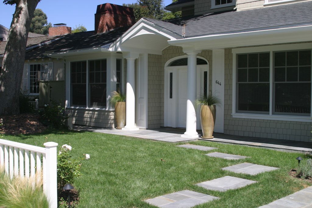
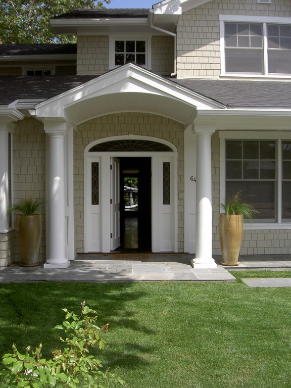
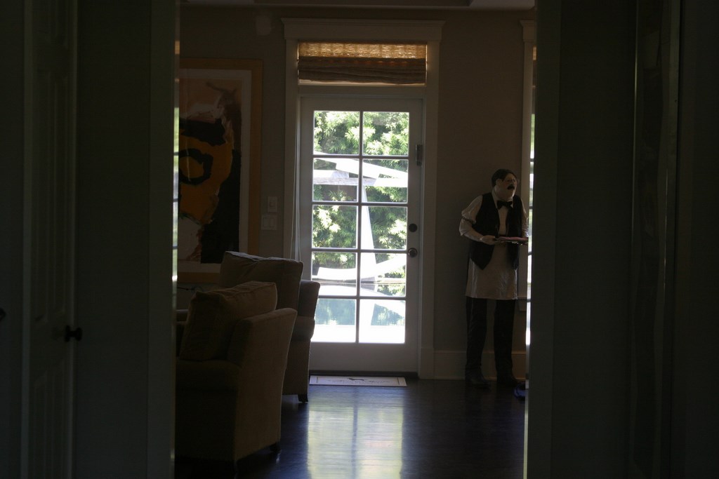
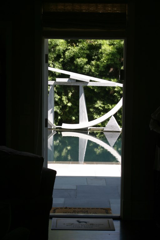
| We reworked the approach to the home, guiding visitors on an indirect path to the front door. The structure itself is a traditional Cape Cod, so we used the sleek verticality of the vases to begin a transition to a more contemporary space. Through the open door, you immediately catch a glimpse of a large sculpture out back, which continues to loom large as you pass through a long hall filled with contemporary art. By the time you reach the door leading into the backyard, the transition from past to modern styles is complete. |
It was immediately apparent that they liked having options for everything from big ideas about the basic layout to the specifics of material selections and small hardscape and landscape details.
In other words, the design process evolved and, indeed, continued right through various construction phases. I knew from the outset that the clients were focused on art and the paintings and sculptures that filled their homes, for example, but as I became more familiar with them, I saw that their lives really did revolve around art and that what they wanted most was to put it on display.
|
Flowing Over The swimming pool and spa described in the accompanying text are fitted with a slot-overflow detail that encompasses the watershape’s entire perimeter. We knew, given the fact that Stephanie Rose’s design was meant to provide a seamless, reflecting-pool effect, that the appearance and function of the overflow system was critical.
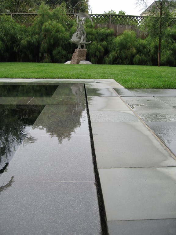
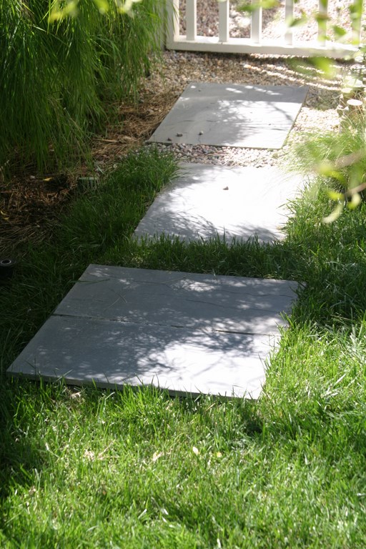
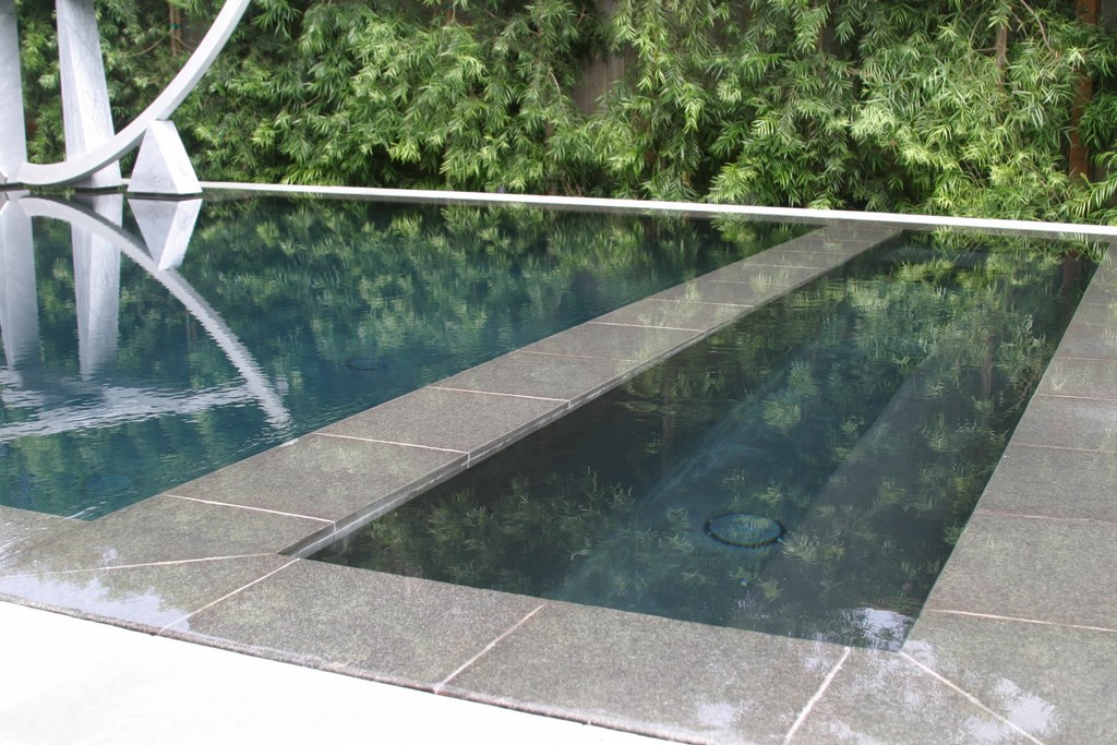
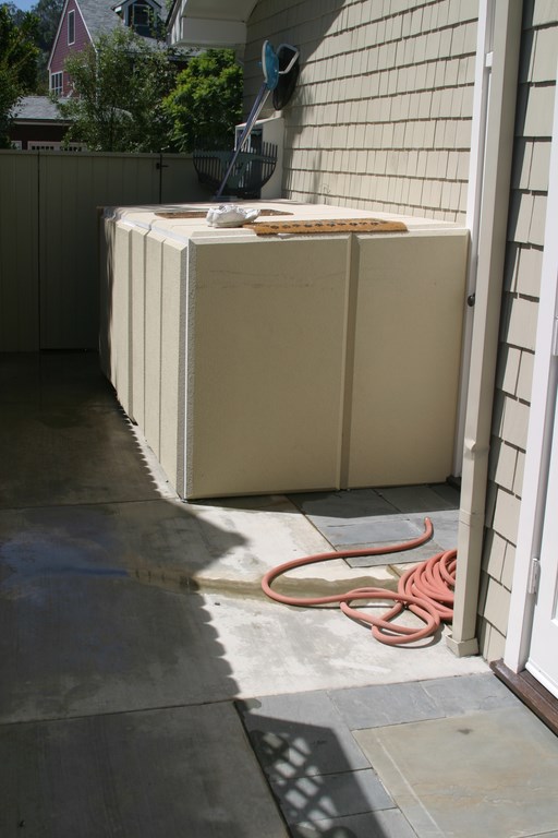
The water flows over a flamed granite coping and into a half-inch slot. It then flows by gravity along a formed gutter to feed a six-inch plumbing loop that drops into an eight-foot-cube surge tank buried beneath stepping pads that lead to the side yard and the equipment pad. We didn’t want the access to the tank to be visually disruptive in the relatively small space, so we placed it so one of the stepping pads is lifted to reveal the tank’s hatch. As with all perimeter slot-overflow systems, precision leveling was a key to success. Using water levels, our masons hit the mark dead on. This was especially tricky with the spa: To maintain a sense that the entire pool was a monolithic reflecting surface, the spa’s overflow is a mere 1/64th of inch above the surface of the pool and all but vanishes when you look across the water. — Randy Beard |
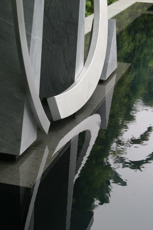
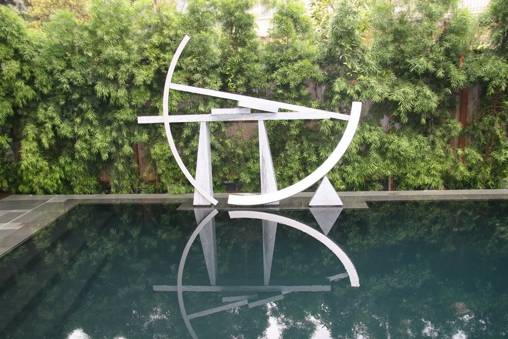
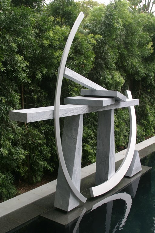
One of the first things we talked about was incorporating a sculpture by the modern abstract artist, Guy Dill, who had created a concrete and steel piece they’d placed in another of their homes. During the construction process, Dill suggested that the piece would work better in this setting if redone in marble and stainless steel.
I suggested placing this sculpture over a functional swimming pool that would effectively double as a reflecting pool, an idea that immediately appealed to the clients. They also showed me a photograph of a kinetic sculpture by artist Bruce Stillman – another piece they wanted to put on display outdoors.
Through this stretch of the process, I became acquainted with the remarkable art collection they had on display inside the home, including pieces by Andy Warhol and other prominent modern artists. With this piece of the puzzle falling into place, the basic design began to come together.
SETTING A COURSE
It had taken us months of ongoing discussions to get to the point at which I finally presented a program for their exterior spaces. I had settled on the thought that the exteriors should act as a functional extension of the art-centered interior spaces and would serve as a setting for artwork – a sort of outdoor gallery.
From that point on, all decisions were driven by a perceived need to support the artwork and increase the functionality of the yard.
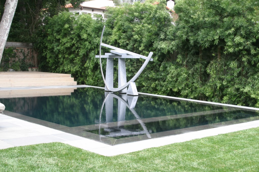
| The large marble-and-steel sculpture seems to dominate while you’re inside the house, but it becomes a component in a larger composition once you move out to the backyard. The views of Guy Dill’s piece are fantastic from any angle, day or night, with great reflections reaching all the way out to the sharp visual edge of the perimeter-overflow pool in virtually any light. |
But there was a challenge here: While the artwork to be displayed all had a distinctly modern look and feel, the home itself was basically a traditional Cape Cod in style. Going with a sleek, minimal exterior design would harmonize with the artwork but conflict with the house. By the same token, had we headed toward a classic design for the pool, the artwork would have seemed out of place.
This concern over direction evaporated as I became more familiar with the scope and nature of their art collection. It was so dominant inside, and the art slated for use outdoors was so striking that a scheme featuring an ultra-contemporary watershape and landscape design coordinated with views from inside the home emerged as the best visual solution.
|
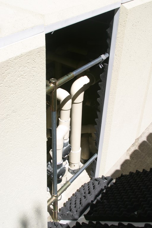
Silent Running Locating the equipment for this project was complicated by the fact that local codes in crowded (but highly affluent) Santa Monica Canyon impose rigid noise restrictions. We had to get permission from the next-door neighbors to place the equipment in the side yard, for example, and even then we needed to use some form of noise control. We turned to a sound-deadening panel system made by Quiet Enclosures (Garden Grove, Calif.). Where normally a pool/spa system such as this generates sound in the 60-to-65-decibel range, these enclosures, which also look reasonably attractive, let us knock that down to 30 to 40 decibels.
Proper sizing and selection of pumps was critical as well, not only to minimize noise but also to increase hydraulic efficiency. In this case, the primary circulation system runs on a half-horsepower WhisperFlo pump (Pentair Water Pool & Spa, Sanford, N.C.) with a pair of two-horsepower pumps for the slot overflow system and the spa. We also use diatomaceous earth filters by Jandy (Petaluma, Calif.), one for the spa the other for the pool, along with Jandy’s valves and its control system. The set is rounded out by a small heater from Sta-Rite (Delavan, Wis.) chosen for its small, modular design. Proper plumbing size is also crucial in generating a whispering, smooth-running perimeter-overflow system. In this case, we upsized the plumbing with four-inch lines from the surge tank to the equipment pad, using two-inch return lines to feed a balanced loop of returns. — R.B. |
The program now included a watershape that would function as a reflecting pool while being fully function for use by the clients’ grandchildren and their dogs. It was to work with Dill’s striking sculpture, and the plantings were to provide medium-green, nearly uniform backdrops for the artwork – like an art gallery’s walls.
When we arrived, the existing yard was about 180 degrees from that direction: The space was dominated by a humdrum swimming pool, and there were raised planters for two big trees – one a sycamore and the other a Japanese maple. Both were mature and quite lovely, but the planters sliced off a third of the backyard space and established a grade that flooded toward the back and was killing a ficus hedge that lined the back of the property.
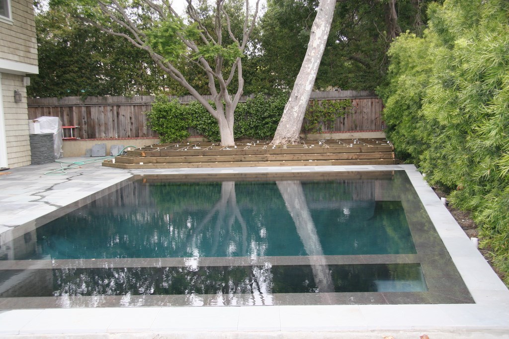
The pool had to be demolished and the space entirely re-graded while keeping the existing grade around the trees. To accommodate the trees, we built a raised wooden deck that masked the fact that the trees had been planted on different grades from each other and the rest of the yard. The deck would also serve to extend the usable space in the yard and provide a comfortable spot shaded by the trees and overlooking the pool.
UNUSUAL DETAILS
The yard wasn’t quite square across the back line of the property, so while the pool appears to be rectangular, it is actually a rhomboid offset at one end by about 18 inches. The pool is 33 feet long by roughly 17 feet wide and between 3-1/2 and 7-1/2 feet deep. A set of broad steps extends the full width of the pool on the side adjacent to the deck (which helps them visually disappear under the water), while a pedestal supporting the Dill sculpture is located inside the pool along the far wall.
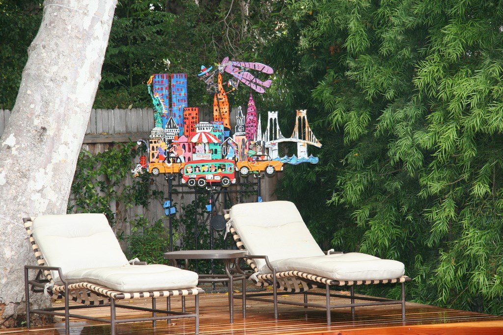
| The yard is large enough to hold several art pieces, but in keeping with the minimalist spirit of the space, there are just two others in addition to the Guy Dill piece floating in the pool: a colorful urban landscape by Fred Prescott on a corner of the wooden deck and, on the opposite end of the yard, an amazing kinetic sculpture by Bruce Stillman. |
The spa is on the opposite side of the pool from the steps and is unusual in shape: It extends the full width of the pool but is only six feet wide. The atypical configuration prevents any visual disruption in the appearance of the overall structure. (To get the spa seating just right, we placed a chair in the “spa” when we excavated the area and had the clients sit in it so we could adjust the height and width of the benches to accommodate them.)
The pool decking consists of irregularly set bluestone provided by Malibu Stone of Malibu, Calif. The colors harmonize with those of the house in ways that soften the sense of stylistic differences. The same material was used to create a stacked ledger detail on the outdoor cooking area located at the entrance to the side yard by the wooden deck.
|
Dark Beauty Working to create a dramatic reflecting pool, designer Stephanie Rose asked us to develop a jet-black plaster finish – and it turned out to be the darkest I’ve ever installed. The plaster is a custom blend of black ColorQuartz aggregate from 3M (St. Paul, Minn.) in a black-dyed plaster matrix that we blended with a special anti-cracking material to prevent calcium bleed and nodule development through the life of the surface. As anyone who’s worked with dark plaster knows, it’s one thing to mix and install the finish and quite another to start it up so that the color holds. In this case, any trace of calcium-carbonate plaster dust from the start-up process adhered to the surface would ruin the appearance. To prevent problems, we used a start-up method recommended by chemistry expert and consultant Randy Dukes. We started with a traditional approach and let things run for 60 days, during which time a small amount of calcium deposition occurred on the surface. Next, we dropped the total alkalinity and pH to immeasurably low levels to dissolve the plaster dust. We then drained the pool, removing the calcium-saturated water, and quickly refilled it, balancing the chemistry as the vessel filled. When we were done, we were thrilled to see the plaster was a remarkably uniform black. In a dark pool such as this, it’s also critical to be sure than none of the interior fittings disrupt the look. This was a simple matter of selecting black anti-vortex main drain covers. (We always install split main drains to avoid the risk of entrapment.) We also painted the inside of the return lines black so that no white PVC would be visible. — R.B. |
The pool also features a flamed black-granite coping or interior ledge that blends beautifully with the pool’s black plaster, works well with the bluestone and provides a necessary non-slip surface around the perimeter of the pool.
Given the fact that the design was to focus on the Dill sculpture, we spent a considerable amount of time working through possible placements. In fact, no fewer than six meetings were devoted mainly to this subject, and we all knew the decision had to be both well-considered and final because the pedestal was to be part of the pool’s structure.
We wanted visitors to get a glimpse of the sculpture as they entered the house as a means of drawing them to the backyard. To ease the placement process, I developed a full-scale template for the basic pieces of the sculpture and moved it along the far side of the pool so the clients could pick a precise location.
Again, it was all about visually linking interior and exterior spaces: This placement worked to everyone’s satisfaction and construction began in earnest.
FINISHING TOUCHES
The surface of the pedestal falls an inch below the water’s surface and is also finished with a black granite top. The sculpture is mounted on three small granite disks concealed beneath the piece’s footprint and is secured with threaded stainless steel pins sealed with epoxy. The effect is that the disks disappear, leaving the sculpture to float on the surface of the dark water.
The kinetic Stillman sculpture is located on the south end of the yard, opposite the raised wooden deck in a small lawn area. Although it isn’t close enough to the pool to be reflected on the water’s surface, its movements draw the eye across the pool and the lawn during relaxing moments on the deck.
| One of the challenges in our on-site efforts was the need to work with and around two large, mature trees. As can be seen in the image with the deck under construction, the trees had been planted on different levels – neither of which matched the grade set for the rest of the reworked yard. To even things out, we installed a wooden deck that lends a consistent elevation to its end of the yard, leaves plenty of room for tree growth and serves as a great platform for entertaining and taking in views of the backyard gallery. |
The planting plan in this outdoor-gallery treatment is very simple – mostly medium to dark evergreen plants with little variation in texture. While it blends with the minimalist goals of the setting, it also has a subtle East Coast style that harmonizes with the home’s architecture.
Across the back, we removed the Ficus hedge and its invasive roots, replacing it with a line of Podocarpus. On the side of the yard just behind the Stillman piece, we set up a wall of Mexican Weeping Bamboo, which has a soft texture and makes beautiful rustling sounds as it moves in the wind behind the kinetic sculpture. We also placed a pair of Mayten trees on each side of the Stillman piece as a soft, subtle frame.
|
Project Reinforcement As Stephanie Rose describes in the accompanying article, executing this project required tight coordination between her design work and on-site managing of the landscape installation and our work in developing construction details and building the pool and spa. In our experience, these collaborations work best with a hands-on designer – and specifically one who is familiar with the construction process. Rose was right on target here: She was on board every step of the way and did a great job of “running point” with the clients. There are countless details we can point to that resulted from step-by-step coordination. In fact, we worked so closely together that, from the clients’ perspective, we offered a unified front. In other words, we looked out for one another, which made our lives easier and gave the clients confidence that the design and construction processes were fully synchronized. In projects with absentee designers, the process is always more difficult and unpredictable. If this particular project had been run that way, I would have been left to make many aesthetic decisions on my own – and I know from experience that making those sorts of decisions in a vacuum is risky at best. In a case like this, however, where the designer, contractor and clients are in constant and coordinated contact, those decisions proceed with confidence – and everyone in the loop stands to be satisfied with the outcome. — R.B. |
To soften the appearance of the house’s foundation, I planted a line of Roses, Pittosporum, Heliotrope and Stipa grass. Keeping this area simple and only using whites, greens and purples was critical to maintaining the gallery feeling while subtly blending the yard into the structure. These particular plants also appear in the front yard, tying the two areas together.
On the opposite side, we lightened the redwood decking with a straw-colored stain that picks up some of the architectural woodwork on the exterior of the home. We wanted the deck to look as though it had been there a while, so we applied just one coat of stain to allow the wood’s grain and imperfections to show through.
Finally, in the front yard, we picked up some stone details as well as the same basic planting scheme, so now the aesthetic treatments flow through the entire space, both front and back.
The upshot of the months of meetings, countless side discussions, research and construction is a space that satisfies a complex set of needs. Most important, it has left our clients pleased with the outcome.
SEEING THROUGH
It bears mentioning that these clients are not the type of people who dispense praise or easily give pats on the back. Actually, we’ve yet to hear much in the way of comments or praise. They both focused on what we were doing and at no time eased the pressure.
The clients were so attentive to detail and so utterly involved in every decision that we knew, once we nailed down a detail in concept, we could move forward with confidence.
Satisfying their needs was made possible through dynamic teamwork and diligence that enabled Randy Beard and me to withstand the scrutiny, questions and criticisms while completing a project that works not only functionally, but also aesthetically.
Stephanie Rose wrote her Natural Companions column for WaterShapes for eight years and also served as editor of LandShapes magazine. She may be reached at [email protected].Randy Beard owns Pure Water Pools, a construction/service firm in Costa Mesa, Calif., that specializes in working with architects and landscape architects to create a range of custom watershapes for upscale commercial and residential clients.


