


The Rhythm of Design
Designing beautiful outdoor spaces that feel welcoming and harmonious is oftentimes a matter of self-editing, says Kirk Bianchi. Here he delves into the design process with the idea of creating rhythm and visual balance, when making decisions about what to include and leave out.
By Kirk Bianchi
Designing an outdoor space is much like composing a great piece of music. Each element, like a note or a chord, must exist in harmony with the others, creating a rhythm that guides the eye and shapes the experience. When done well, the design flows naturally, effortlessly leading visitors through a space that feels both intentional and organic.
Achieving that sense of movement and cohesion requires tenacity and patience, and an understanding of key guiding principles of proportion. As my colleague Jeff Hennig often says, “A design isn’t done until I’ve removed every last element I can—until there’s nothing left to take away.”
I believe he’s right about that because it’s easy to overload a space, especially when there’s room to do so. That’s why, I believe, restraint is where true design mastery emerges. This is particularly critical in smaller yards, where every inch matters and every decision carries visual weight.
PUROSEFUL COMPOSITION
One of the most common design pitfalls is the tendency to clutter. Too many features, too many materials, too many visual elements competing for attention—it’s like listening to a speech without pauses or a song without rests.
Fact is, the power of a great design lies as much in the spaces between objects as in the objects themselves.
Think of a small courtyard. Instead of filling it with multiple competing focal points, a single, well-placed feature—a fireplace, a sculptural planter, a striking water feature—can anchor the design. The open area around it then amplifies its presence, giving it room to breathe and be appreciated.
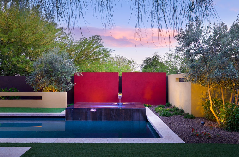
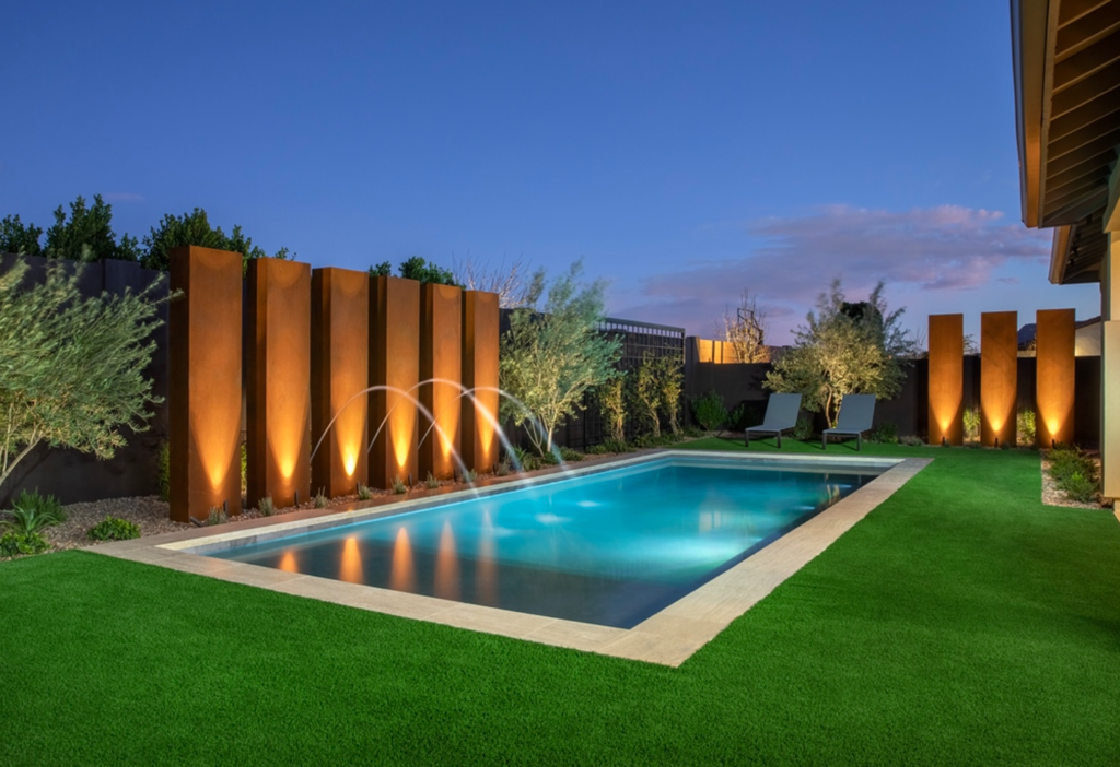
The alternating rhythm of the arbors and pot pedestals lead your eye across the property, matching the scale of the 14-foot tall retaining wall into a positive feature. It became a unifying background asset rather than an imposing negative presence.
A well-designed scene isn’t just about what’s included, it’s about what’s left out. This is where editing becomes a critical skill. Every element should have a purpose, whether it’s defining a boundary, framing a view, or creating a sense of movement.
DEFINING VISUAL BOUNDARIES
When I first approach a design, my focus isn’t on the ground plane—it’s on the vertical boundaries. These structures, be they hardscape or plantings, define the spatial experience and provide the framework upon which everything else depends. When you step into a backyard, you’re typically looking at a 180-degree sweep of space. The elements within that view—the walls, hedges, fences, or trees—set the tone for the entire design, while defining the visual boundaries.
One of the biggest mistakes I see is ignoring these vertical elements or treating them as an afterthought. Designers will spend endless hours refining a pool’s edge details but leave a chaotic, uninspired background that ultimately undermines the entire scene. A beautiful pool in front of an uninspired wall is like a framed masterpiece with a distracting, cluttered border.
By defining key vertical elements and creating focal points that naturally draw people in, you can generate a feeling that is both expansive and intimate at the same time.
That’s why I teach my students to think of containment first. Whether it’s refined plaster, decorative steel panels, or sculpted green walls, the backdrop is just as important as the focal point itself. It provides context, balance, and a sense of enclosure that transforms a simple yard into a cohesive, immersive environment.
A SENSE OF SPACE
A well-designed outdoor space should feel like an extension of the home, while at the same time exist as its own separate environment with its own identity and rhythm. One project I worked on involved a large front open area framed by three sides of the house but exposed to the street.
By adding a fireplace and planters, we subtly defined the space as a courtyard, creating a sense of enclosure without cutting it off completely. The result? A transition area that felt like a destination of its own, not just a pass-through on the way to the front door.
This concept—dividing a vast area into “rooms” to make it feel larger—may seem counterintuitive, but it’s a fundamental principle of great design. By defining distinct zones, each with its own purpose and character, you create a dynamic experience rather than an amorphous, undefined sprawl.

The colorful walls create an artful interplay and lead your eye to the diagonal back corner of the yard, where the overflowing spa and stainless spillway emerge. The client was from Mexico City and loved the work of Luis Barragán that was our inspiration.
I recently worked with a client in Palm Springs who wanted to add a Las Vegas-style pool spectacle onto the back of her Spanish Colonial property’s entertaining space, used for weddings. Her vision of luxury for the 30-something crowd included fire features, arching water jets, a raised spa with a towering water wall, and every gadget imaginable. The existing yard, however, was already striking in its simplicity; an elegant rectangular pool flanked by palm trees, directing the eye toward the mountains beyond.
The rear landscape around the pool was endless grass, which offered flexibility, allowing wedding guests to arrange tables as they pleased. But something was missing.
While the openness provided versatility, it also left everything feeling adrift, lacking containment or structure. The scene was like a shipwreck with fragments floating without direction. I proposed that the solution wasn’t to overwhelm the pool with bling to try to satiate the dopamine deprived 20-30 year olds, but to define the edges of the scene, creating intentional zones where guests would naturally gravitate.
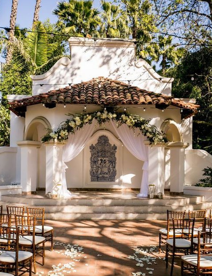
To illustrate my point, I pulled up images of Spanish Colonial wedding venues. What stood out in every photo was how the backdrops in each setting framed the wedding party. Whether it was an arched stairway, a colonnade, or a grand doorway, there was always an vertically situated background, whether planted or architectural, that gave context to the moment. These elements weren’t merely decorative; they provided a sense of place, guiding people toward natural gathering spots and creating ideal photo opportunities.
I explained to my client that instead of pouring money into an over-the-top pool remodel, she should focus on defining the yard’s perimeter in a theme consistent with the home. She needed alcoves, intimate niches where guests could gather, where a wedding couple could take a beautifully framed photo, or where a small seating area could feel both private and connected to the larger space. It’s the difference between a stage with a thoughtfully designed set and an empty expanse where the actors seem lost.
THE ORDER OF ELEMENTS
Again, and it’s a point worth repeating, every successful outdoor design begins with its vertical boundaries. This doesn’t mean enclosing the space but rather using carefully selected elements to shape the experience.
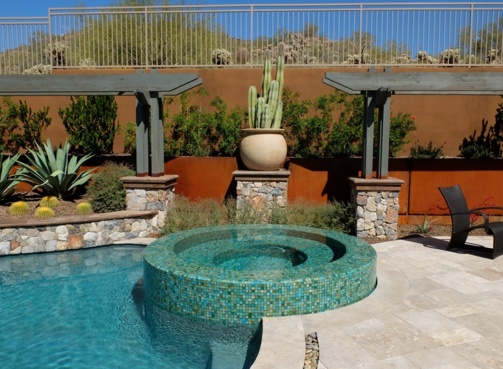
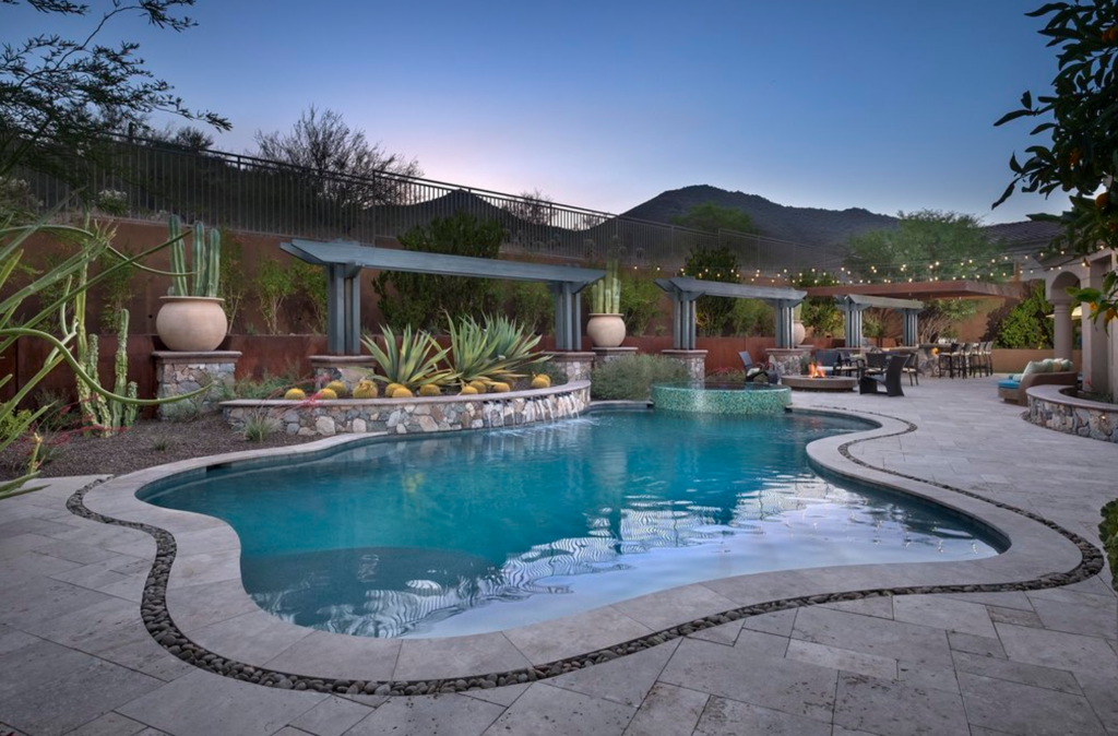
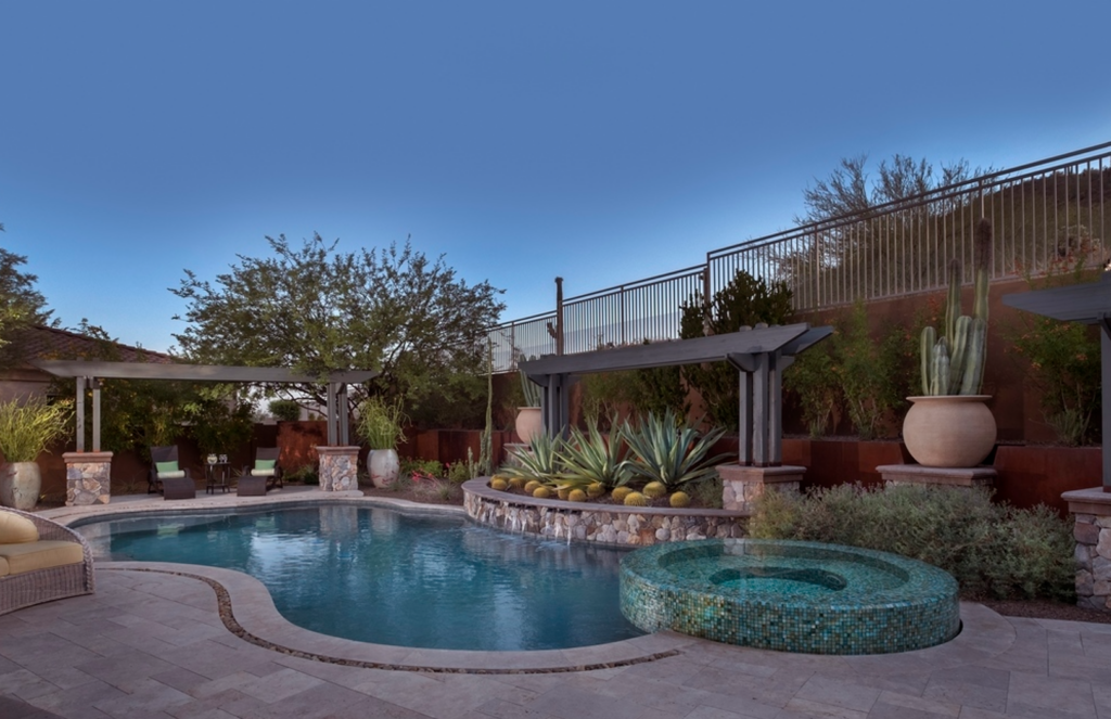
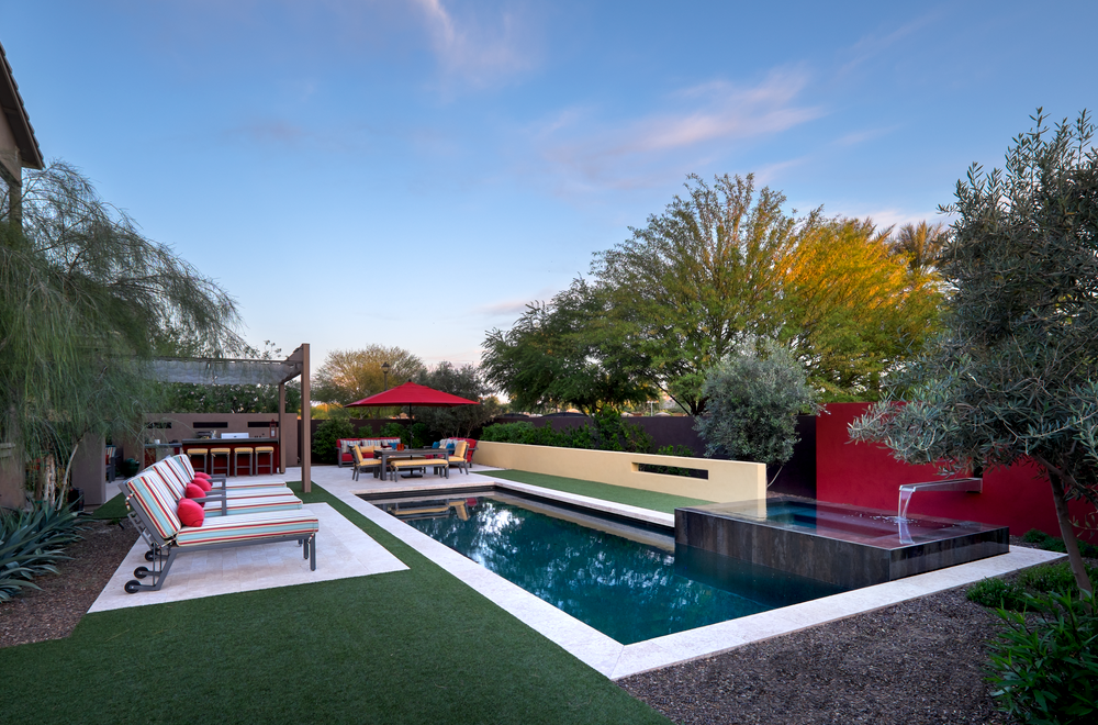
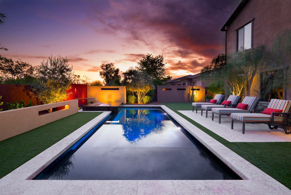
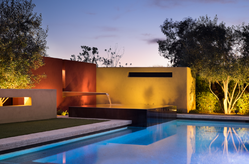
In a recent project, I faced a unique challenge: a utility easement cutting across the back of the yard, preventing me from placing traditional structures. Instead of seeing this as a limitation, I used it as an opportunity to experiment with layered design.
At the back edge of the pool, I had to give reason to a preexisting vanishing-edge spa. It was trying to serve as a focal point, but it needed something more to anchor the view. I placed three statement pots in a light color behind the spa, each holding vertical branches of sandblasted manzanita trunks.
These pots existed only in key focal areas of the yard, making them a unique and deliberate design choice. Behind them, I installed a decorative metal screen wall with intricate leaf cutouts in a medium coppery blue-green finish, illuminated with uplighting to emphasize texture. Beyond that, a tall hedge as the darkest element formed the final backdrop, softening the view and providing a natural enclosure.
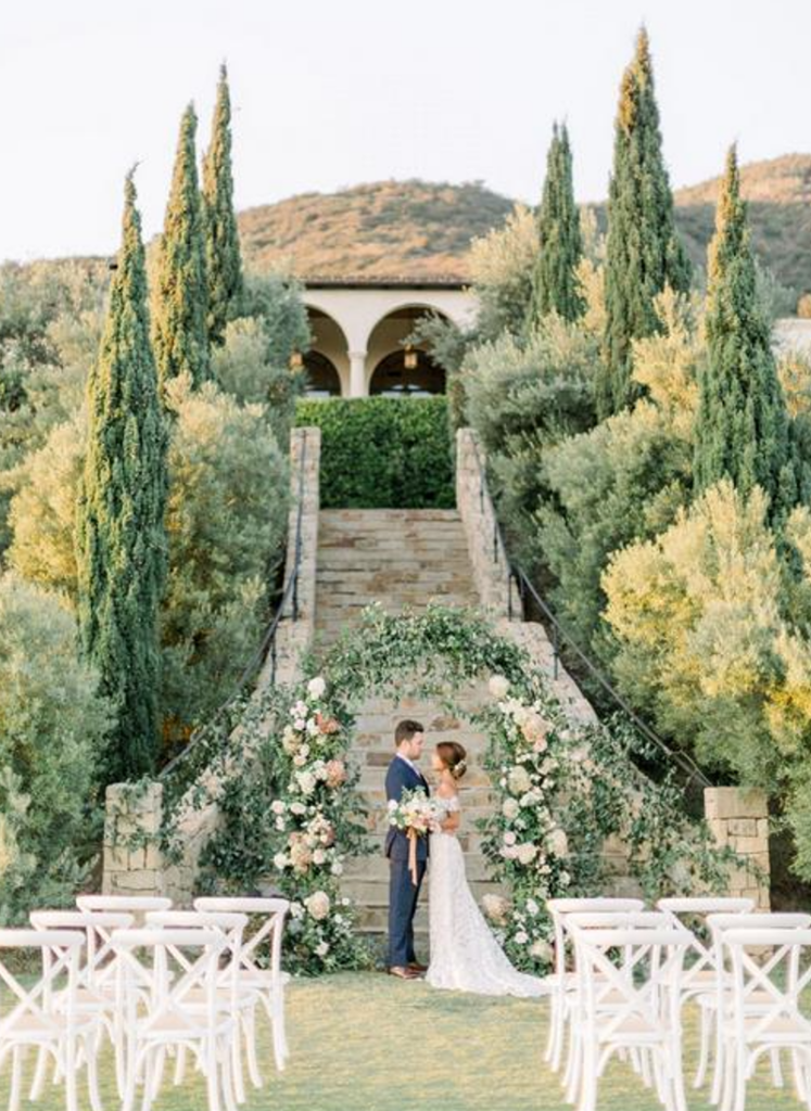
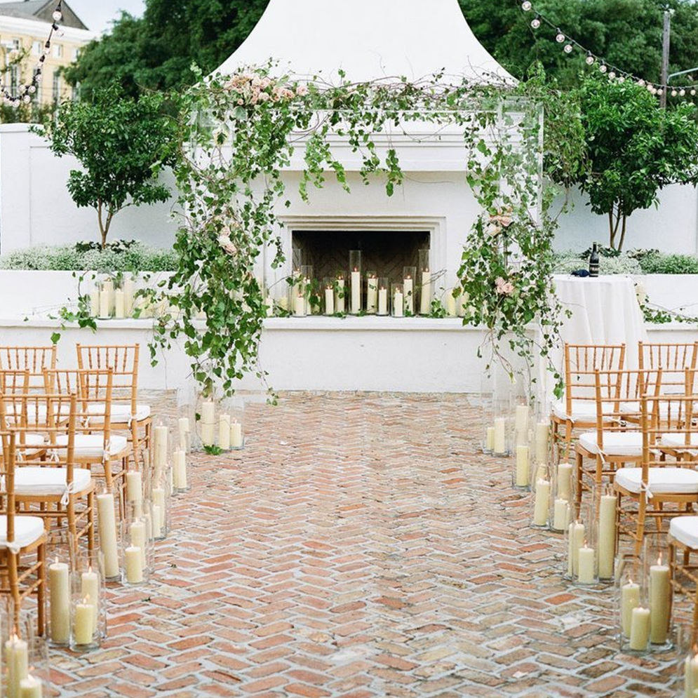
These photos depict architectural backdrops. People gravitate to these spaces as significant enough to take wedding photos in front of. Maybe we should spend time designing the background behind the pool, and the outdoor living spaces, just as much if not more than the pool itself?
In every project, the goal is not to fill scene but to shape it. Whether designing for a grand wedding venue or a small backyard retreat, the approach remains the same: thoughtful placement, purposeful restraint, and an understanding that great design is as much about what you leave out as what you put in.
When done right, a space doesn’t just look beautiful, it simply feels right. It invites people to move through it effortlessly, to settle into its alcoves, to find moments of pause and connection. It’s a rhythm, a melody, a carefully composed piece of art.
In my design process, the pool isn’t the first thing I consider but instead it’s often the ninth or tenth. Before the water even enters the conversation, I define the structure of the overall space: the perimeter, the trees, the walkways, the furniture areas, and the circulation paths. Once those elements are in place, whatever remains dictates the size and placement of the pool.
Think of it like a golf course. The fairway is the connective tissue between tee and the putting green, which makes the experience cohesive. In an outdoor design, that connective tissue is formed by three elements: water, turf, and hardscape. These are the broad strokes that guide movement, linking the different “nodes” where people gather, much like a golfer navigating each hole.
While horizontal surfaces define movement, vertical elements shape the visual experience. In the same recent project, I used stone walls to create depth and repetition. A tall, eight-foot stone wall was placed as a backdrop for cactus, silhouetted dramatically with backlighting. To balance it, I mirrored the concept on the opposite side of the pool, creating symmetry and cohesion.
This repetition, used sparingly, is key in small spaces. You don’t have the luxury of endless variation. Instead, you need a clear visual language. Perhaps it’s a hedge, a wall and a panel.
PLANTING HIERARCHY
The same principle applies to planting. I like to work with a hierarchy: large, medium, and small. The largest trees are positioned in the farthest corners, acting as visual anchors. The mid-sized trees, sculptural fruitless olives, for example, flank the pool, providing structure without overwhelming the space. Closer to the house, smaller ornamental trees, like Texas mountain laurels, create a soft transition.
I inherited a pool design under way with a utility easement behind the spa. My task was to finish the composition, again using the walls concealing the easement as an asset defining the space.
Accent plants, like agaves and cacti, punctuate the landscape.
Keep in mind, a hundred of the same species can create a quiet, uniform ground plane, like a broad stroke of watercolor. This avoids the checkerboard effect that comes from excessive variation. In nature, plants tend to exist in stands, not as a mishmash of different species. The goal is to replicate that sense of order and continuity.
Traffic flow is also critical, especially in small spaces. You can’t afford to place obstacles in key pathways. That’s why I always keep tall elements at the perimeter. Nothing should obstruct movement in the foreground.
Too often, I see patios where the dining table is jammed right up against the sliding door, making it impossible to navigate. Or seating arrangements that turn their back on entry points, creating an unwelcoming feel. Everything in a space should be oriented to invite interaction. A couch, for example, should align with the natural sightlines of the yard, not block them.
THE COLOR OF WATER
One of the most common design battles I face is the color of the pool. Clients often say, “I want the water to be blue.” But when you look at nature, the most breathtaking water isn’t pure blue but a blend of blue-green. Think of the turquoise waterfalls in Havasupai, the soft greens of agave, or the aged patina of copper.
Yet, pool finishes are trending in the opposite direction, everything is gray or blue, with some manufacturers even discontinuing unique colors like seafoam green. It’s a shame because dark water can be more reflective, pulling in the colors of the surrounding landscape and creating depth. That being said, context matters. A white pool might look perfect against the stark architecture of Greece, where everything is monolithic and bright. But in a desert landscape, deeper, richer tones tend to feel more natural and inviting.
When it comes to color, less is often more. A restrained palette, subtle tonal shifts within a neutral or earth-toned scheme, creates a cohesive, immersive environment. Whether it’s the clay reds of Sedona or the soft grays of a coastal retreat, the goal is to establish a monolithic base. From there, carefully placed focal accents—a vibrant bougainvillea, a striking feature wall, or a bold water element—draw the eye intentionally.
Just as a single brushstroke of intense color can transform a painting, a well-placed splash of vibrancy in a water feature or an architectural detail can elevate an entire space. This principle applies not only to color but to all forms of contrast in design.
This pool is finished in a Turtle Bay pebble finish. It has a “slate / copper patina” but dark grey green that blends beautifully into the desert foliage. This color works well next to lawns too.
In the work of landscape and watershape design, fire and water are potent brushstrokes that are way over done, because they hold an innate power to captivate. Whether it’s a flickering fire bowl or a cascading fountain, these dynamic elements should be placed where people naturally gather.
Overuse of fire features, like tiki torches scattered aimlessly in rampant bowls on pedestals, dilutes their impact. Instead, fire should be a beacon, drawing people in like moths to a flame. Similarly, a thoughtfully positioned water element, with its movement and reflectivity, becomes an intentional focal point rather than just another detail lost in visual clutter.
THE POWER OF NEGATIVE SPACE
One of the most overlooked yet essential aspects of great design is negative space, and again, restraint is the key to sophistication.
A well-balanced composition follows the principle of approximately one-third positive elements (such as structures, plantings, and focal features) and two-thirds empty or background space. This allows key design elements to breathe, preventing visual chaos.
Take the example of modular stepping stones, a popular but often misused design feature. Their repetitive geometry creates a high-contrast, staccato effect that can visually dominate a space, making them more of a visual distraction than a functional pathway. Instead, allowing uninterrupted expanses of lawn or subtly integrated stone elements fosters a more natural, calming transition.
DIRECTING THE EYE
The eye is instinctively drawn to the greatest area of contrast. Whether it’s light against dark, a textural juxtaposition, or the sharp edge of a sculptural element, these high-contrast zones dictate the hierarchy of visual attention. Strategic use of contrast ensures that the most important design elements stand out without competition.
The graphic repetition and rhythm of the steel folded monoliths create a light against dark that draws the eye magnetically.
For instance, in a minimalist design, an Ansel Adams black-and-white print against a white wall commands focus. Likewise, a well-lit plant set against a dark feature wall creates a dramatic theatrical effect. When complexity is concentrated in a single area—such as an intricate mosaic or an ornate water feature—it must be given room to stand alone, free from competing details.
Across all design traditions—from the ornate excesses of Baroque to the understated elegance of wabi-sabi—one principle remains constant: intention. In a setting designed for tranquility, every element must have a reason for being. Overloading the scene with competing details, as seen in Hearst Castle, for example, creates visual fatigue. In contrast, the meditative simplicity of a Japanese tea ceremony demonstrates how attention to minute details can cultivate mindfulness and appreciation.
In that way, a great composition allows for moments of rest, where the mind can process and appreciate the interplay of elements. By embracing negative space, guiding the eye with contrast, and using color with precision, designers can craft environments that not only look stunning but feel effortlessly harmonious.
MORE WITH LESS
In the end, great design is about editing. It’s about knowing when to stop, when to simplify, and when to let the design breathe. The most successful projects aren’t the ones packed with every possible feature; they’re the ones where every element has a purpose within the context of visual melody.
Kirk Bianchi is the founder and designer of Bianchi Design, a custom luxury watershape and landscape design firm based in Scottsdale, AZ. Educated at the school of architecture at Arizona State University, Kirk founded Bianchi Design in 1999. A design mentor, he teaches for PHTA/Genesis, is widely published in consumer and trade publications including AQUA and WaterShapes. He also offers independent online mentoring for aspiring design professionals, find out more at www.kirkbianchi.com.