The Crest of the World

Montecito is home some of the grandest estates on the West Coast, but relatively few people know about it or where it is.
A sleepy little town, it lies several miles east of Santa Barbara and some 80 miles or so northwest of Los Angeles. From the beautiful hilltop estates that dot the landscape, you can see Santa Barbara’s wharf and downtown in the foreground, with sweeping vistas of the Pacific Ocean dominating the horizon.
The big ranches of Montecito are dotted with hundreds of watershapes inspired by the Spanish-Colonial and Moorish architecture that surround them. Most were installed as part of the Spanish Revival movement that took hold among architects and landscape designers all over California through the first half of the 20th Century.
The revivalists’ octagonal and quatrefoil fountains and courtyards provide a visual link to the state’s Spanish heritage. Fueled by the explosion of Hollywood’s movie industry during this time, the combination of money, lots of open land and a popular architectural style resulted in creation of some of the most beautiful estates anywhere in the world – none more so than a property named Cima del Mundo, Spanish for “Crest of the World.”
This series of articles will deal with the work my company, Earth Patterns of Fullerton, Calif., has done at this spectacular location, with a focus on the design and installation of its watershapes. This first part offers an overview along with details on an inner courtyard that stands at the heart of the estate and all of our work there.
A PLACE TO REMEMBER
The estate and gardens of Cima del Mundo originated when architect Myron Hunt – well known as a student of Frank Lloyd Wright’s and for designing the Rose Bowl in Pasadena, Calif. – first conceptualized an 18,000-square-foot home for Harry and Lora Knight, aristocrats who’d made their millions in the shoe and dry-goods industries. Hunt began pursuing the Knights’ dream in the Montecito hills in 1924, completing the project in 1926.
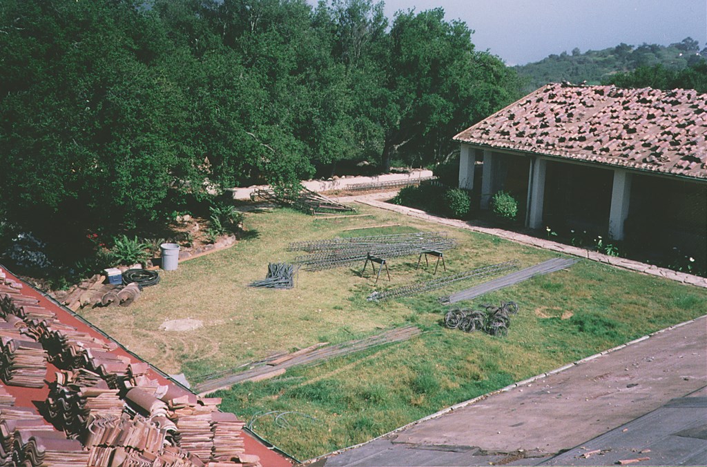
| Surrounded by the residence on three sides, the courtyard we found had never been developed as more than a grassy yard. Our immediate goal was to make it the visual and aural focal point of every space that opened onto it. |
“Sprawling” is the best word to describe the result: a 47-room home with spectacular views of the ocean from just about every vantage point and amenities including its own bowling alley. The property originally stretched over 350 acres and was one of the most celebrated in the area. Charles Lindberg once landed on the property, taxied up to the main house and gave the Knights and their neighbors rides, circling the area and eventually making an aerial loop on his departure. (A home movie of Lindberg’s visit to Cima del Mundo is now in the Smithsonian Institution.)
The home changed hands over the years, and portions of the property were sold off, reducing the estate to its current 150 acres. For many years, the property served as a monastery for Jesuit priests; it was eventually abandoned and stood alone, vacant and unlocked, for more than a decade. It survived squatters, vagrants and parties – all without sustaining too much damage.
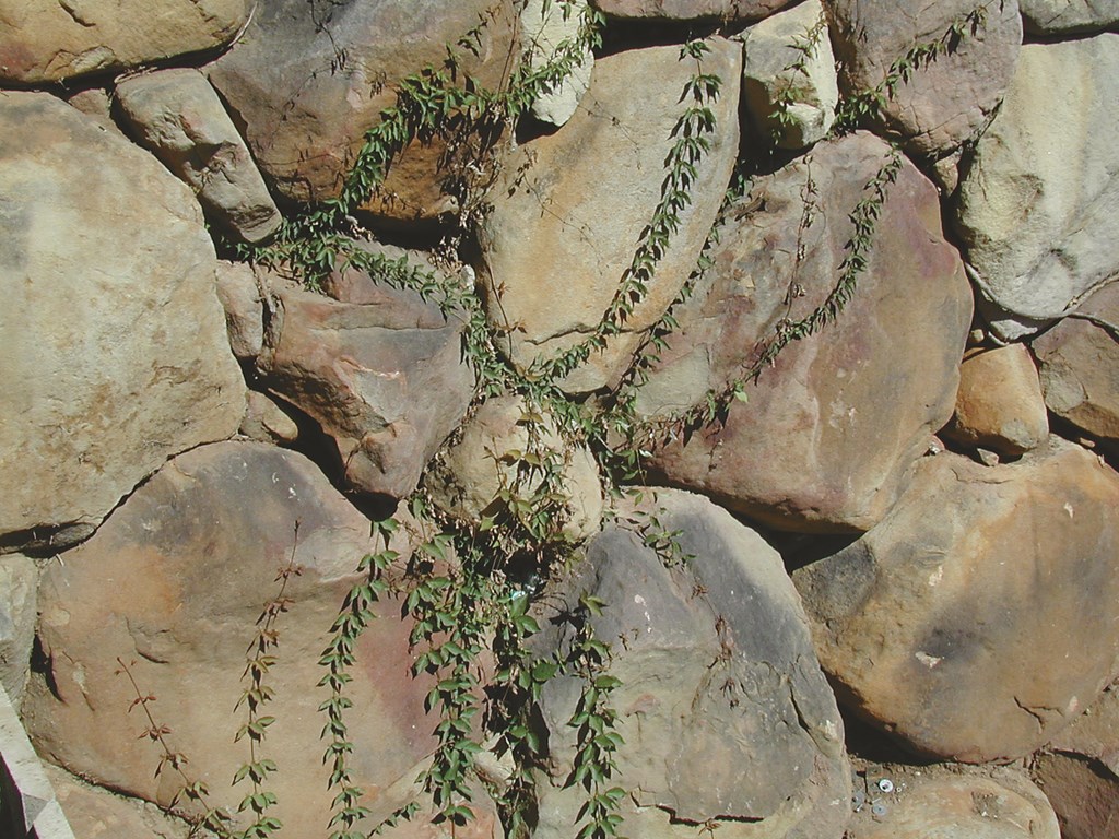
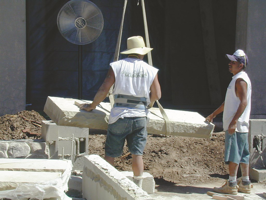
| In keeping with the client’s desire to make everything we did seem like it had been crafted from local materials in the 1920s, we’ve worked extensively with the indigenous Santa Barbara sandstone boulders that dotted the estate. |
Three years ago, the property was purchased by my client, who bought with it with complete restoration and renovation in mind. Both were necessary: For all of its grandeur, for example, Cima del Mundo never boasted much of a formal landscape. The grounds contain mostly California Live Oaks, and the ever-present Santa Barbara sandstone boulders dot the entire site.
The projects currently under way include construction of two new garage structures, enlargements of the kitchen, a complete rehabilitation of the interior (including the spectacular architectural woodwork), and the creation of five acres of densely built ornamental landscape all around the home.
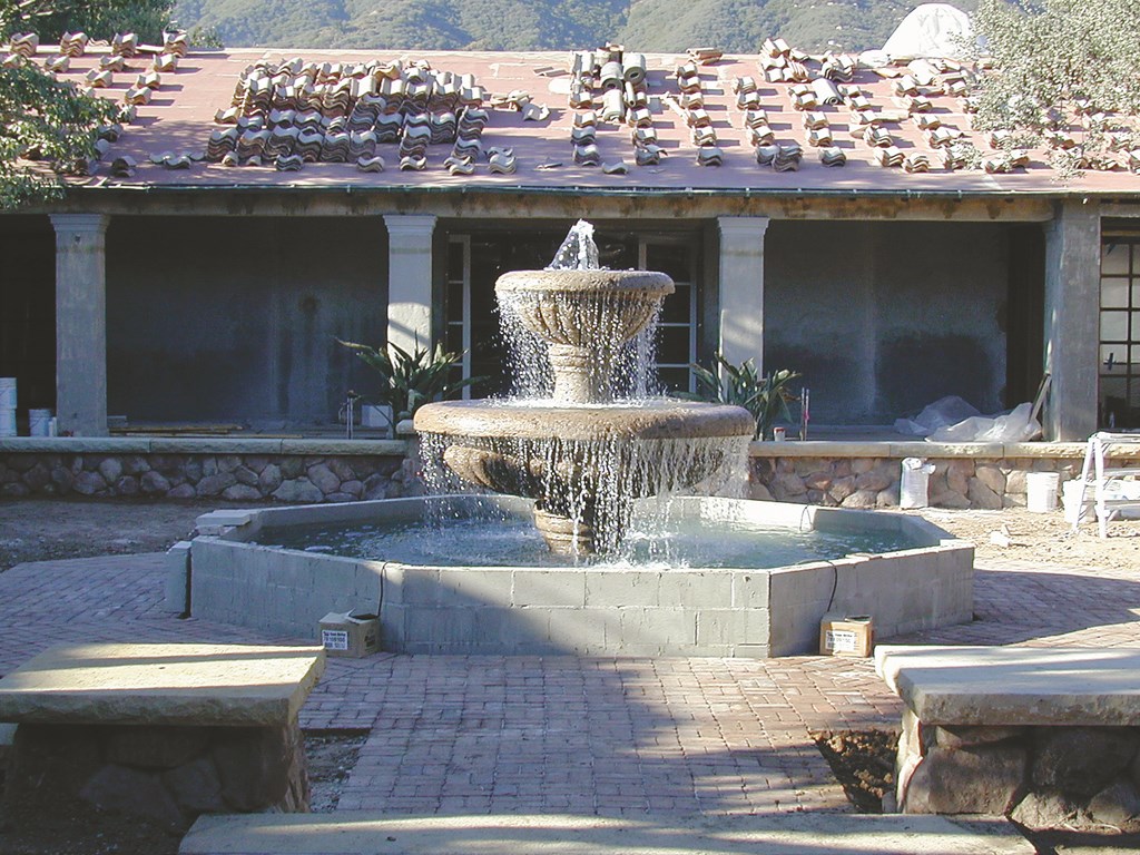
| The fountain is indeed the focal point for its courtyard. As planned, the noise of the splashing water can be heard throughout the top level of the huge home and offers a meditative heart that the estate needed – but had previously lacked. |
The exterior design includes numerous courtyards and gardens – including a main, central courtyard with a spectacular quatrefoil fountain; a 9,000-square-foot main lawn with an 1,800-square-foot pool and spa; and a meandering stream with a koi pond and a retention pond.
Before this series of articles is complete, we’ll cover all of these installations. As indicated above, we’ll begin with a discussion of the central courtyard, partly because it is the portion of the project we tackled first, but also because it establishes themes that are expressed in everything else we’ve done and will be doing in this huge project.
CENTER PEACE
The courtyard is indeed central: Almost every room in the house has visual and/or auditory access to this space, so we focused on it both as a visual centerpiece and as a mood setter for all of those interior rooms.
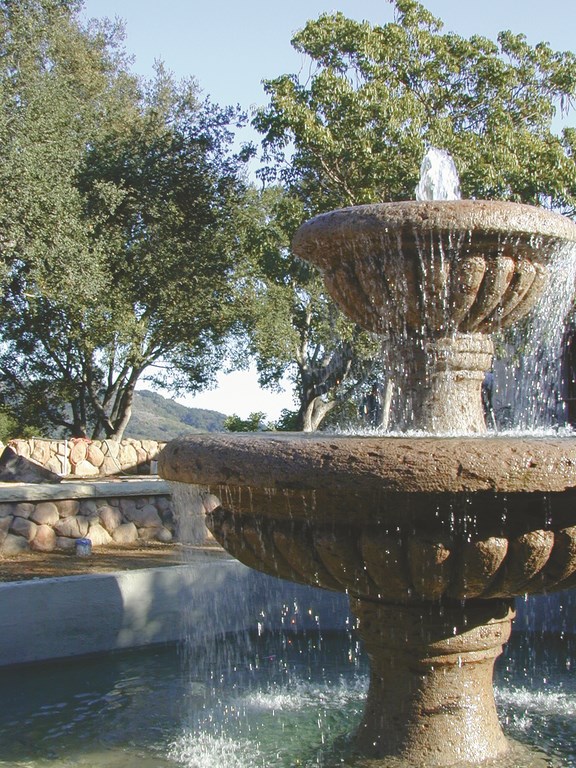
As you approach and pass through the front door of the home, your eyes move to the center of the courtyard and its nine-foot-tall fountain. Made of Mexican igneous cantera stone, this structure sets the stage for the visitor’s entire experience, with the fountain providing a landmark amid the confusion of the home’s intricate floor plan.
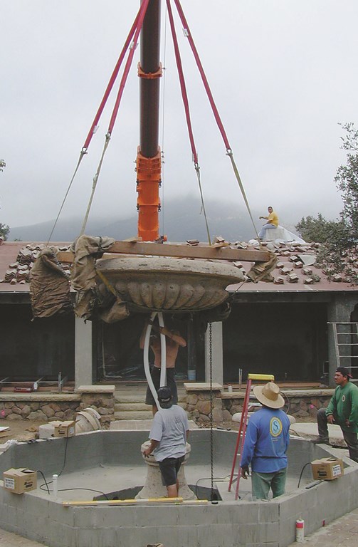
| We used a huge crane for multiple purposes while we had it on site. The big slabs of sawn and groomed Santa Barbara sandstone would have been hard to handle otherwise, and the rig made short work of lifting the cantera stone fountain bowls into place. |
And whether you’re seated or strolling in the courtyard, dramatic mountain vistas rise above the roofline of the home, while mature trees and manicured landscaping lend a sense of peace and isolation.
As mentioned at the outset (and discussed in greater detail in the sidebar below), a guiding principle for this project was the owner’s desire to create the feeling that visitors are stepping back in time to the 1920s.
|
Art Direction With project like Cima del Mundo, the jobs of design and construction resemble nothing so much as the skills employed by an art director on a movie set. Our primary goal has been to make the visitor truly believe he or she is walking on grounds that were created in 1925. To do this, we have trained ourselves to think along the same lines builders must have in those days. In our case, this has meant using indigenous materials and forms, as in the use of the sandstone collected on site and milled to create the courtyard’s hardscape. Even details like the lawn’s irrigation system come into sharp focus when you work this way. We couldn’t go to the local supply store and pick up modern sprinkler heads, for example. Instead, we used the old, flat, round brass types of the past. Such a detailed pursuit of details may seem frivolous, but if a PVC sprinkler head were to pop up in front of a visitor, then the entire illusion would be ruined. To be sure, this process can get tiresome – and frustrating at those times when we can’t find what we need. This has led us to create more things from scratch than I care to remember, but it is all worth it when we dream of how this whole story will conclude. We stick and will keep on sticking to our guiding principles, knowing that authenticity is the highest goal. — M.H. |
Executing this concept has meant thinking like a movie-set designer in making certain every detail supports the illusion. In that context, any misstep would result in a visual anachronism – not unlike watching a movie about ancient Egypt and spotting an actor wearing a wristwatch.
Had this courtyard been installed as part of the original design, everything would’ve been vintage 1925: The materials used would have been those readily available to the craftsman working the property – in this case, lots of Santa Barbara sandstone. That in mind, we gathered stone material on site and sent it out for custom milling at a shop that boasts one of only two six-foot blade cutters left in California. We then used this stone to create the court’s walls, steps and copings.
Once the stone was “cubed” into the rough shapes needed for the eight-foot steps, caps and other hardscape structures, the pieces were hand chiseled and bush-hammered by local artisans familiar with the stone’s character. These pieces were then hoisted over the home and into position using a 200-ton crane before being set in place by our masons.
The result is a hardscape that visually fits the home, the surrounding environment and the time frame. True, we could’ve used a more spectacular stone and created a more ornate treatment for the courtyard’s hardscape, but this was the best way to remain true to the historic themes we were pursuing.
DRAMA IN THE WATER
The subtlety of the stone surrounding it leaves the center fountain to provide the lion’s share of the drama in the courtyard. The idea was to create a traditional fountain that would captivate the observer with its elegant visual components.
The bowls for the fountain were designed and then hand-chiseled out of Mexican cantera stone in a quarry outside Guadalajara. The stone was chosen not for its dry appearance, but for how well it blends with the Santa Barbara sandstone when wet.
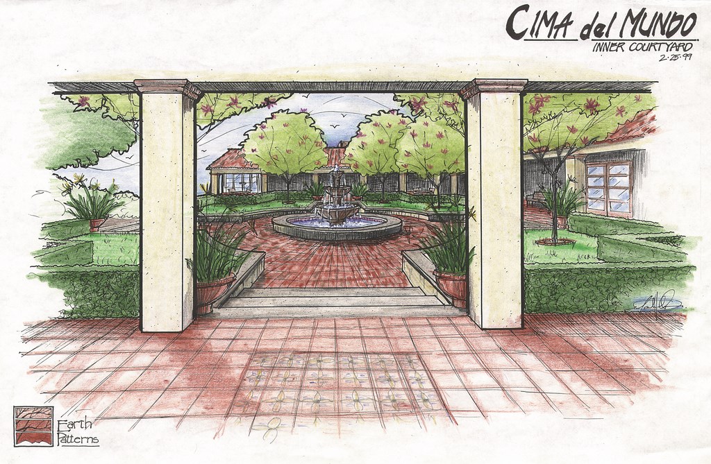
| This is the color rendering we’ve used as our touchstone in assembling the various elements of this magnificent space. In future articles in this series, we’ll see how well we managed to stick to this image and feel in applying our finishes and landscaping. |
The exterior of the basin, which will be dry most of the time, is also the same Mexican cantera, but to blend with the wet bowls a surface masonry sealer was applied. The basin’s interior is lined with classic, hand-painted Malibu tile designed specifically for this project. (We knew, of course, that Malibu tile had its heyday in the ’20s.)
The hydraulic network for the fountain was designed with the help of Jeff Freeman of Fluid Logics, a hydraulic design and installation firm based in Oak Hills, Calif. Our idea was to create a system that enabled the owner to set flows at three distinct levels of intensity.
| One of the burdens of making our current work look as though it had been around for 75-odd years was bringing in mature trees. The 200-ton crane came in handy here as we moved the 96-inch boxes into position in the courtyard. |
For daily operation, for instance, we wanted a quieter courtyard environment with a mild flow of water and restful sounds. For hot mid-day weather or for special occasions, we wanted to be able to intensify the flow of water spilling from the bowls – more water and much more water, respectively. Freeman achieved this using three distinct pumping systems 170 feet away from the fountain, all run through 3-inch PVC (to keep the pump noise down) and connected to remote controls inside the home.
We also wanted to have algae growing in the fountain – but with crystal-clear water. That in mind, we went with ozone and a UV-sterilization unit that kills the bacteria in the water but leaves some of the algae alive and flourishing on surfaces of the fountain. Chemstain and hand-rubbed cement synthesized the effects of algae and calcium buildup.
|
Soft and Elegant The mood of Cima del Mundo is one of subtle elegance. Each space is designed not to overwhelm visitors, but rather to capture their attention and entice them to move further into the setting to discover more and more variety and detail. These seductive spaces are not filled with ostentatious “statements” of color or texture, but are designed instead to create sensations of peacefulness and comfort. For example, there are many cool, wooded “vignettes” with just a small architectural form included along with two or maybe three splashes of color. Our objective here is to create attractive destinations within the landscape that beckon to visitors and then incline them to stay and explore the grounds in quiet comfort. — M.H. |
The result is a fountain that appears worn and covered with calcium and algae to look its 1920s age – but one that has thoroughly modern water clarity.
As was true with all other phases of the project, even the courtyard plantings had to stick to the ’20s theme. We spent more than a year researching Santa Barbara’s indigenous plant species and historic planting trends in creating our palette. We found that plant selections from the turn of the century tended to be simple – lots of green with just a few dramatic points of interest.
We expressed this on site by using palms as focal points amid fields of green. In many cases, we set up the greenery with various texture changes and positioned the palms in front of key architectural features, often adding a single splash of color for interest. We’d found this basic arrangement throughout Santa Barbara and Montecito – an approach that accents the views without disrupting or competing with them.
OPENING A SPACE
The courtyard, however, lacks the long-range ocean views, so we worked to turn viewers’ attention inward, always toward the fountain.
The perimeter plantings are simple and serve to reinforce the rectilinear shape of the courtyard and the home. Mature, 96-inch-box Coral and Tabebuia trees were installed with the same 200-ton crane we used to place stonework for the fountain and hardscape. These trees frame the courtyard, creating a sense of enclosure and giving the courtyard an intimacy it previously lacked.
| The plumbing, which sits to one side of the courtyard in a submerged vault, features three-inch pipes for super-quiet operation. The system runs at three distinct flow rates for different fountain effects. |
The splashes of color are found in plantings at the corners of the courtyard and in the collection of antiqued terra cotta pottery that adorns the pilasters and surrounding veranda. These were originally simple clay pots, but we “distressed” them through a process of grinding, filing, hammering and sanding. We added an antique patina by rubbing gray and white thin-set into the surface of each pot. A green chemical stain was then applied to simulate the growth of algae and mold on their surfaces.
|
Concept and Documentation Our ambition may be to recreate the 1920s, but some of the technology we’re using to communicate project details is strictly 21st Century. Indeed, Cima del Mundo’s gardens and watershapes have been developed using two methods of graphic communication: traditional hand-drawn renderings and digitally crafted construction documents. The conceptual designs and client presentations have all been conducted with renderings done to levels that communicate the feeling of each idea. (Occasionally, however, we’ve resorted to digital photography, which lets us superimpose new elements among the current scene to communicate ideas with complete, literal clarity.) Once the concept is approved, we jump forward about 75 years into the world of computer models in order to pinpoint exact data on every item to be installed at the estate. Matt Randolph, a landscape architect and Earth Pattern’s CAD manager, has created a virtual model of Cima del Mundo that he uses to communicate design intent and construction guidelines to on-site crews. Within the 200-sheet design package, hierarchy of information has become an important issue. The plans include computer-generated surveys, soils reports, structural specifications, design concepts and all sorts of technical information that needs to be overlaid and viewed in a variety of ways. Layering of these various elements and a custom file system (organized just for this job) enable us to communicate as best we can with the customer and the field crews alike. Without our computer based design services we would be severely hindered by the conventional pencil and blueprint process. Computers enable us to simplify the painstaking process of what we do and focus more valuable time on the really important thing: creating! — M.H. |
With landscape lighting, we were able to tell yet another story in the courtyard space. By using a mixture of high- and low-voltage fixtures, we’re able to change the viewer’s perception of the space at night by creating a play between light and dark spaces within the courtyard.
The fountain itself has four standard spa lights in the basin and three 12-volt fixtures in each of the bowls, providing a luminescent centerpiece for the nighttime space. The landscape surrounding the basin is lit with much subtler, softer lights. An existing Oak tree in the courtyard, for example, contains more than a dozen low-voltage lights that create mock moonlight through the tree’s foliage. The result is a dancing, mosaic-like pattern cast on the stone paths below.
To intensify the presence of the courtyard’s four major trees, high-voltage up lights were used to bathe the trunks in an intense light. Combine all of this with a series of custom path lights, and the overall effect is quite dramatic. The arresting presence of the fountains and the main trees juxtaposed with the softness of the faux moonlight through the live oak, along with the recessive lighting elements, create a textured space gently transitioning between light and dark.
To top it all off, fixtures throughout the entire estate’s gardens and courtyards use amber lenses to convey the feeling of old-world comfort and richness. The overall mood is bright as a first impression, but it soon gives way to intimacy and elegance.
Next: A focus on the swimming pool at Cima del Mundo – a massive 60-by-30-foot rectangle with a maximum depth of 10 feet – with a look at its Moorish roots as well as its modern enhancements.
Mark Holden is a landscape architect, pool contractor and teacher who owns and operates Holdenwater, a design/build/consulting firm based in Fullerton, Calif., and is founder of Artistic Resources & Training, a school for watershape designers and builders. He may be reached via e-mail at mark@waterarchitecture.com.


