That’s Just Wrong

I’m not a big believer in conformity, strict rules and absolutes, but sometimes in my travels I’ll come across something that, well, is just wrong. These aren’t matters of taste, style, or visual appeal: What I see is just plain wrong!
Whether we classify ourselves as watershapers or landscape professionals, we collaborate with our clients to create spaces that appeal to them both visually and emotionally – environments that fit sets of needs and wants they have conveyed to us. Generally, we will find that there are certain colors that appeal to them, design styles they prefer, budgets they can afford, physical limitations to the site and codes by which they must abide.
For all that, it’s our professional responsibility to guide them within those parameters to a design that makes sense to us while following principles of proper installation. Aside from basic issues of visual incongruity that might be carried in clients’ preferences, we need to be keenly aware of other ways projects can go off track, whether it’s about liability issues, installation practices or (not to be too insulting here) professional common sense.
CASE IN POINT
This thought came to mind recently as I was driving in my neighborhood. (It’s amazing, by the way, that I haven’t gotten into any accidents as I conduct drive-by evaluations of local handiwork.)
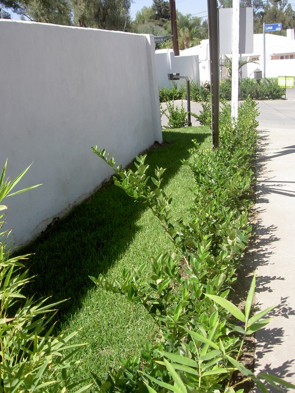
Not far from my house, I spotted a corner-lot landscape that was being reworked, and what was complete at that point was a six-foot-tall, concrete-block wall that screened the house from the street. It was massive, but not necessarily a bad idea with respect to blocking out traffic noise and giving the homeowners a greater sense of privacy and security. The wall was smooth-troweled and had been painted white.
My first thought is that I would probably have used an off-white to minimize glare and the prominence of the wall, but I moderated that assessment by imagining a beautiful selection of foreground plants with colored foliage and/or flowers that might be arranged in a variety of ways. But that’s not what I saw in driving by a couple days later (Figure 1).
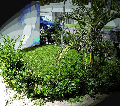
| Figure 1: A lawn surrounded completely by a hedge is hardly the way to go. Who will see the lawn once the hedge fills in, and how will anyone get a lawnmower in there to keep it neat and tidy? The fault in such cases rests with designers and/or installers rather than with the homeowners who entrusted the tasks to them. |
Instead, whoever was running the project planted a lawn right up to the wall and completely surrounded it on the street-side edge with a hedge. (In my quick drive-by, I didn’t determine whether it was a Privet or a Ficus hedge, but the latter would have been a terrible choice so close to a freestanding wall.)
I’m sorry, but try as I might, I couldn’t come up with a redeeming rationale for these choices. The main reasons this design is flat-out wrong flow from both aesthetics and maintenance: On the one hand, that nice lawn will become invisible once the hedge grows. On the other, the only way to trim the lawn even now is to pass a mower over the hedge! Just plain wrong.
So now the bright, white wall serves only to separate the private from the public area of the property: It’s not a backdrop that enhances a tasteful planting; rather, it is a barrier that stands out like a sore thumb, pure and simple.
Forgive me for sounding so passionate about just how wrong this is: These are the types of errors in judgment that give landshapers a bad name – and the same holds true in the realm of watershapers as well. In the case of this wall and the ridiculous planting, even if it were a case of the client being interested in saving money, all the landshaper had to do was reverse the arrangement, placing the hedge against the wall and the lawn in front.
SEARCHING FOR REASONS
So why would anyone do this? In this case, I fix blame completely on the landshaper, and I’m certain most of you can think of analogous follies you’ve seen perpetrated by watershapers who just can’t get proportions right or who overreach their abilities and make gross errors when installing water effects.
Revisiting our list of responsibilities – one shared by landshapers and watershapers alike – it’s our job to take all of a client’s wants and needs and roll them into a design that works. Cutting corners to fit a budget or doing things you don’t understand or haven’t learned to do are unacceptable and hurt not only clients and your business but also the industry as a whole.
It’s not the client’s job to figure out why this wall/lawn/hedge arrangement doesn’t work. It’s the professional’s job, and what seems to be missing in too many cases is application of a spark of common sense. (In this particular case, I’m hoping a bulldozer is what’s applied to this project sometime soon.)
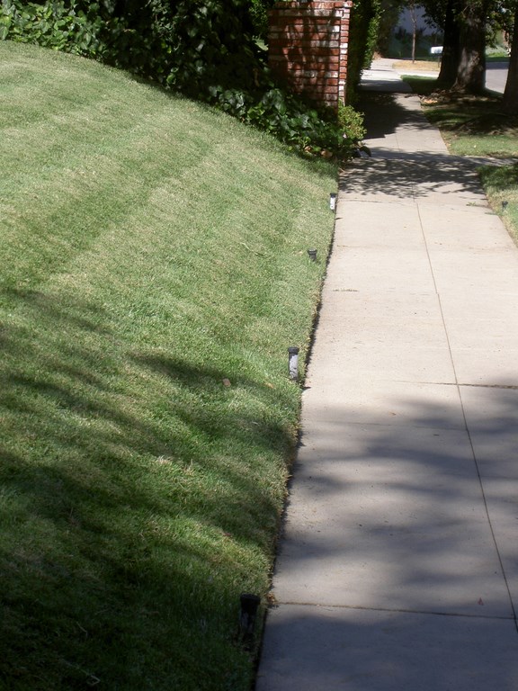
| Figure 2: Protruding sprinkler heads are an obvious trip hazard and an open invitation to vandalism or simple accidental damage. I wonder what the installer was thinking in arranging things this way. |
Trouble is, the eyesore I’ve been discussing here is hardly an isolated incident. While walking my dog the other day, for example, I passed a lawn in which the pop-up sprinkler heads are elevated about six to eight inches above the soil level (Figure 2). Most homeowners wouldn’t think twice about this – until, of course, a pedestrian trips, falls and calls an attorney.
The landshaper should have known better, but this sort of obvious tripping hazard is one of the most common mistakes I see in installations. Whether it stems from laziness on the part of an installer who doesn’t want to dig an adequate trench or simple ignorance of proper installation practices, anyone can see that raising sprinkler heads this close to a heavily trafficked sidewalk is a recipe for disaster.
Again, I don’t know how this came to be, but whatever the “reason,” it shouldn’t have been done this way.
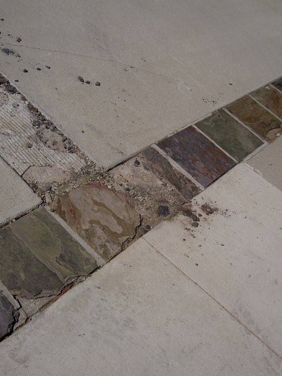
Or take the sad driveway I spotted another short walk from my house (Figure 3, below): In this instance, I would surmise that the client wanted to save money and did so by finding a slate that looked right but was completely incapable of handling the weight of cars. As a result, the slate started breaking up immediately after installation – no doubt the first time the homeowners rolled over it in one of their cars.
I’m sure they look at this mess every day and blame the installer. Yes, the installer has some culpability, but had it been my project, I would have informed the clients that the chosen stone was wholly inadequate and would break the first time someone drove over it. Why this conversation didn’t happen is anyone’s guess.
GETTING IT RIGHT
I know I’m not alone in seeing these situations, and I know for a fact that cases like these aren’t limited to landscapes. My point is, any good watershaper or landshaper looks around and evaluates his or her environment, constantly on the lookout for better ways to do things – but let’s face it, we’re also vicariously fascinated by failures.
The fact that we see so many errors tells me that there are plenty of so-called “professionals” out there who are either unscrupulous or incompetent. But it also tells me that there’s a poorly educated client base shopping for price and the almighty “bargain” rather than quality. In no case is poor performance acceptable, but it is perpetuated by the fact that clients don’t know what to expect – which leaves them open to being victimized by the unscrupulous and the incompetent.
| Figure 3: The stone selected to accent this driveway may have looked good for a couple days, but it was just wrong: The thin ‘pavers’ were too fragile to hold up under the weight of any vehicular traffic – something a competent designer or contractor would have known. |
Client education is the key. Those who buy our services need to understand what quality watershape and landscape design and installation mean, including issues of liability and the long-term performance of their investments. The surest way to convey this information is to build it into our initial client meetings – a chance for the good players in the marketplace to arm clients with questions they need to ask to ensure that everyone they speak with thereafter is playing on a level field.
If budget is an issue, it’s our job to create a design that works within that constraint. And if all else fails, you need to be able to tell clients that you cannot deliver on the design they want for the amount they’re willing to spend. I’ve found that using this direct, honest approach has a way of nudging the budget to a higher, more workable level. I’ve also found that clients have little or no idea what landscapes or watershapes cost – a point that makes education about what “quality” means all the more important.
On the flip side, landshapers and watershapers need to take more responsibility for their designs and installations. There are lots of qualified designers and contractors out there who already deliver on their promises, but it’s important that all of us aspire to operate with higher standards and are willing to walk away from situations that will show us and our industries in a bad light. When we lower our standards to meet a client’s wishes, we all lose.
Still, I firmly believe we need to spend more time educating people that a quality landscape or watershape installation does not have to be expensive to be beautiful and that within almost every budget is a way to do things properly while simultaneously meeting a client’s expectations. In that light, there’s absolutely no excuse for poor workmanship, sloppy designs, upset clients – or unmowable lawns.
Stephanie Rose wrote her Natural Companions column for WaterShapes for eight years and also served as editor of LandShapes magazine. She may be reached at sroseld@gmail.com.


