Team Building
This was a fun one – a project that was fully within our comfort zone but pushed us into new territory and gave us an opportunity to shine in a unique design context.
We had worked with the property-management firm before, and they called us in to have a look at a large space behind a multi-story office building in Overland Park, Kans., where we were also to meet with the building’s owner and some of the project’s stakeholders.
We had done well in our previous work with the property manager, so the design-development contract was ours if we wanted it – which we did. In the course of our initial conversations, we learned that the stakeholders wanted an outdoor gathering space for employees that would include an event space, a shade structure, various seating options, a bar-and-grill area and a waterfeature – mostly rough notions, but a great starting place.
It was a large area, and the stakeholders were in full support of its revision. Soon after our first meeting, we came back with multiple design concepts; after they’d settled on one they liked, we worked with the project team to fill in the details and bring the space fully to life in their imaginations. All in all, it was a great experience: They were participating in all the right ways, and their active involvement made the process run more smoothly from start to finish.
SHAPING THE SPACE
Once the direction was set, we moved forward in refining the design.
As mentioned above, we hadn’t worked in exactly this sort of commercial setting before, but we didn’t come to the process cold: We’ve worked in the office/commercial market for more than 25 years, and although we specialize in work for residential clients, we’ve also designed community spaces for multifamily developments and for senior-housing facilities. The fact that this was a unique project and client in a corporate environment made it a bit different, but we saw it as just another form of outdoor environment – albeit one on a larger-than-typical scale and with the basic recreational component removed.
I also note that we spent more time working directly with the clients in the design stage than is the case with a typical homeowner. We ran everything by the project team throughout the development process to make certain we all stayed on the same page with respect to expectations and the quality of the outcome. But while we had to accommodate a greater-than-usual number of stakeholders, it wasn’t unlike working on an ultra-high-end residential client.
One of the pivotal elements here is the waterfeature. I was relieved to learn that the project team wanted one, because it’s my firm belief that water is an essential element in good exterior design. But in this case, there were lots of demands on the available space and a crucial grade transition to consider.
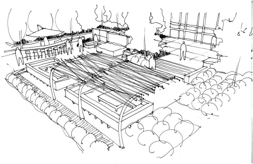
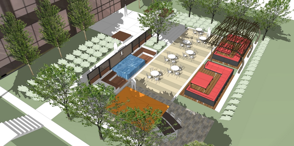
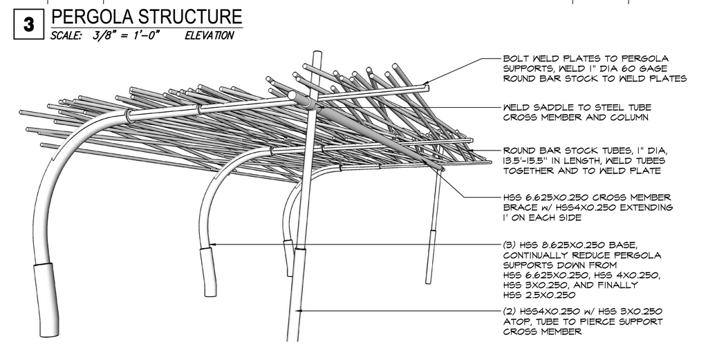
| The basic layout came together quickly, essentially by transplanting the stakeholders’ stated desires to a drawing of the available space (left). That was followed by more detailed drawings (middle left), then by three-dimensional renderings (middle right) and, finally, by construction details (right). |
We wanted to place the waterfeature near the center of the plaza so it’s sound could be heard through most of the space, but we also knew that it would have to be winterized, so making it compact and positioning it in the heart of the grade transition emerged as the best of our options. It’s always tough to predict how sound will work in an open setting – nothing less than a full-scale model placed on site would fill that information vacuum – but we’ve designed so many waterfeatures for so many settings that we felt secure in placing and sizing this one to maximize its impact.
This was something of an unusual project for us in another significant way: Once the design was ready, we handed it off to a general contractor who hired all of the subcontractors, set the schedules and managed the site. We did offer some recommendations, however, and were particularly pleased that our preferred metal fabricator, Kansas City Metalworks (Kansas City, Mo.), was hired to prepare the elaborate screen fence and the project’s signature shade structure.
Beyond the pronounced slope, the site was quite cooperative: There were some underground utilities that needed to be sidestepped, but there were no soils issues to speak of, and we’d included a precautionary surface-drain system as part of our grading plan. Access was easy, too, although all contractors had to be considerate about how they moved through and used the building’s adjacent parking lot.
Throughout construction, we made ourselves available to the general contractor as a sounding board and general resource. The project team also stayed involved through the entire process, as did the building’s owner, who ultimately became the glue that held everything together with a singular vision.
CREATING A VIBE
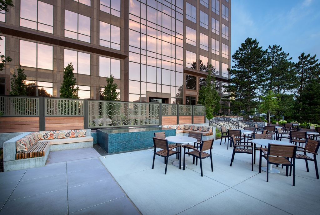
Of all the design elements on display here, there are two that command the initial attention of people accessing the space, namely, the waterfeature and the elaborate screen fence that runs almost the full width of the space.
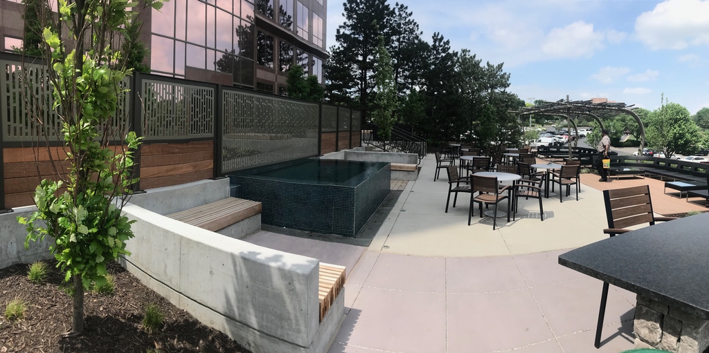
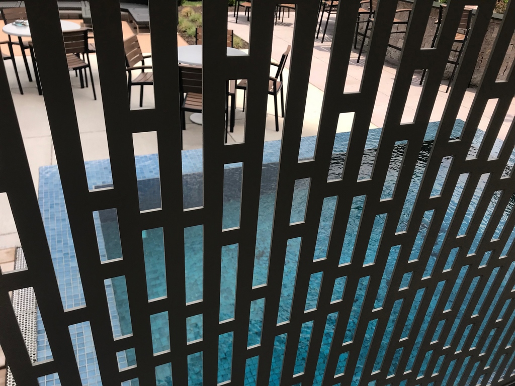
In technical terms, the waterfeature is extremely basic – just a small, rectangular, perimeter-overflow tank set inches above grade level on one side and lifted above the deck on the other. To simplify winterization, it runs with a submersible pump and has no sanitizing system, although we’d proposed one. When it’s on, it fills the space with soft sounds, and its iridescent glass-tile finish brings intriguing flashes of color and visual depth to the setting.
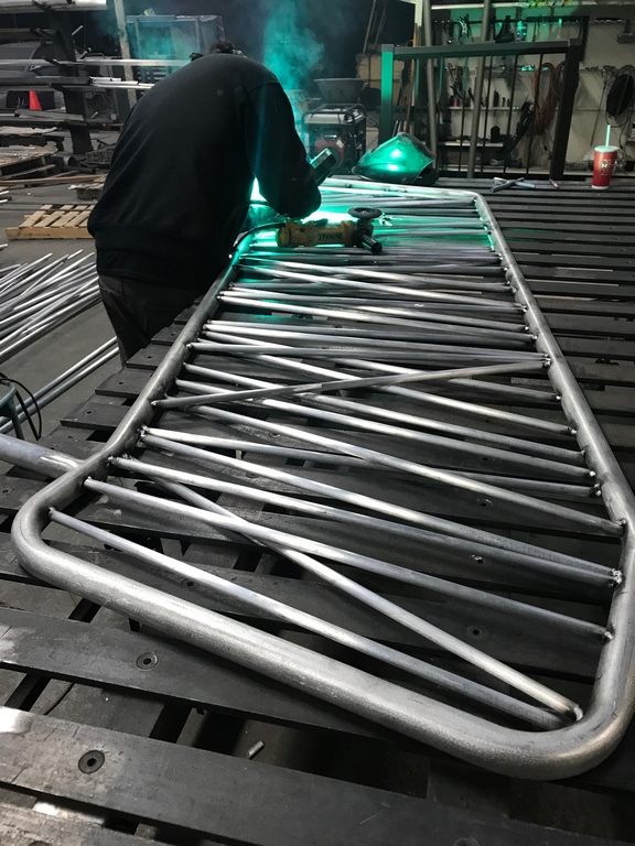
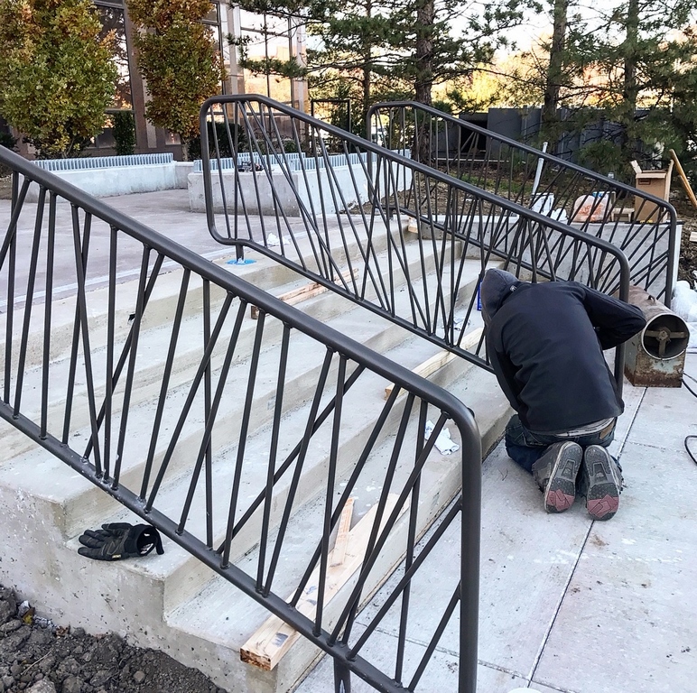
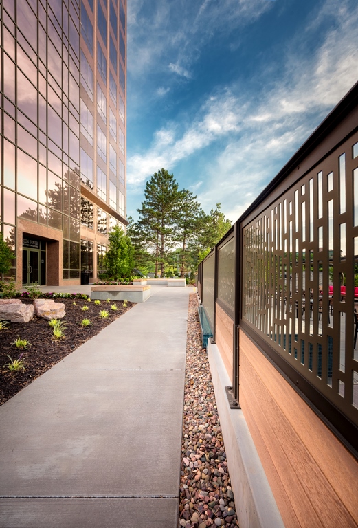
We also designed the pattern for the screen fence, which includes frames built with a hybrid composite/hardwood material made by Geolam (Toronto, Ontario, Canada) that hold the custom-fabricated steel panels made by my friends at Kansas City Metalworks. The fence spans much of the length of the transition from the top deck down to the seating and social areas, offering a decorative solution to a distinct safety requirement. (Our approach also afforded us an interesting way to tease the presence of the waterfeature to those on the upper level.)
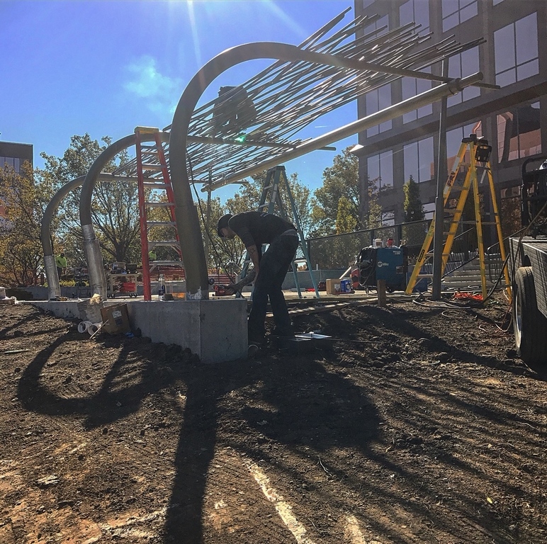
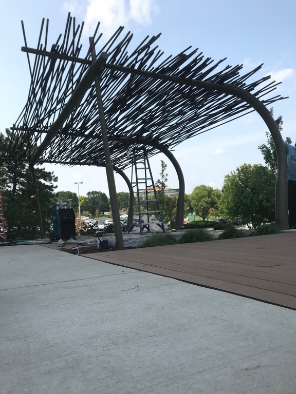
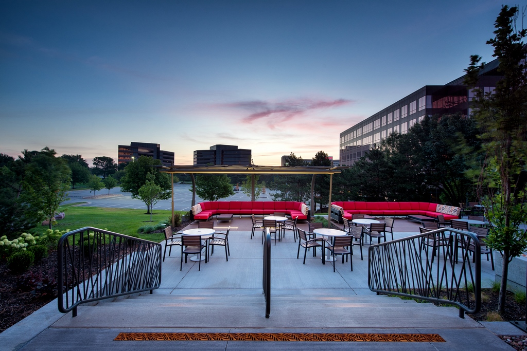
Kansas City Metalworks was instrumental once again in executing the dramatic pergola that runs along the far side of the lower deck. We wanted it to resemble bamboo reeds in use as a primitive sort of thatching atop a sweeping, organic frame. It’s actually steel rod stock of various lengths, all carefully woven over the top of a trio of curving, steel-tube supports that gradually taper as they rise, lean over and cross the space.
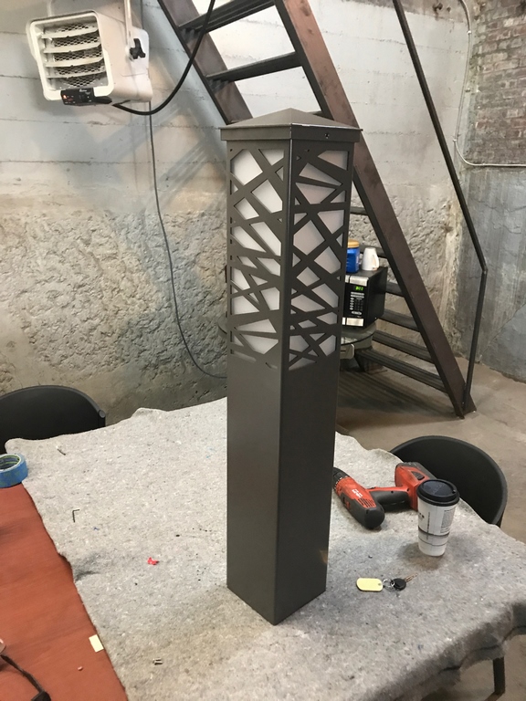
| We kept our favorite fabrication shop busy with this project, involving them in preparation of the shade structure (top row) and in creation of site amenities that reflected the project’s most visually prominent detail (lower row). This shop also generated the screen fence that divides the upper terrace from the larger lower terrace (as seen in the next set of images, below). |
We initially proposed running this structure all the way along the width of the deck, but cost was an issue – and reducing it in length was one of the major edits that helped us keep the project within budget.
As for the rest of the space, it’s all about comfortable seating in sun or shade and about hosting events – all dedicated to creating a comfortable vibe while encouraging a sense of community among the building’s occupants. In that respect, this wasn’t so very different from other projects we’ve done for residential backyards, where we have a similar focus on traffic patterns, destinations, gathering spaces and level transitions before we start filling the space with water, decks, structures and furnishings.
In all, the project took about four months to complete – done just in time for the arrival of warmer spring weather, as it turned out. It certainly helped that we at Lorax Design Group (Overland Park) pride ourselves on the thoroughness of our documentation and the way we accommodate design and construction issues before they have a chance to interfere with progress. We set our projects up to run on time and within budget, in other words – goals easily met in this instance.
BEAUTY AND UTILITY
I haven’t witnessed activity in the plaza for myself, but I understand from the clients and others that businesses with offices in the building took a shine to the space in no time at all. Particularly when the weather is fair, the big space is often used for outdoor meetings and casual gatherings, and it’s always in use at lunch and break times.
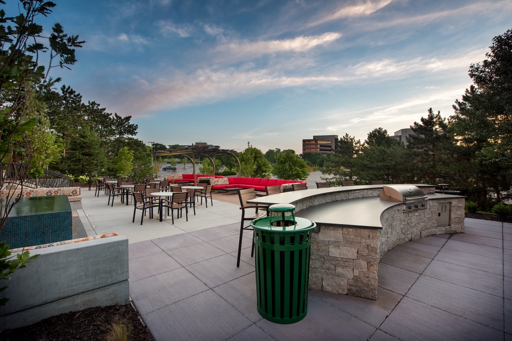
The inclusion of an outdoor cooking facility might seem a bit off the beaten path, but we’ve heard that it frequently comes into play during after-hours events. In fact, it even sees use on weekends, when catered food is often part of the fun.
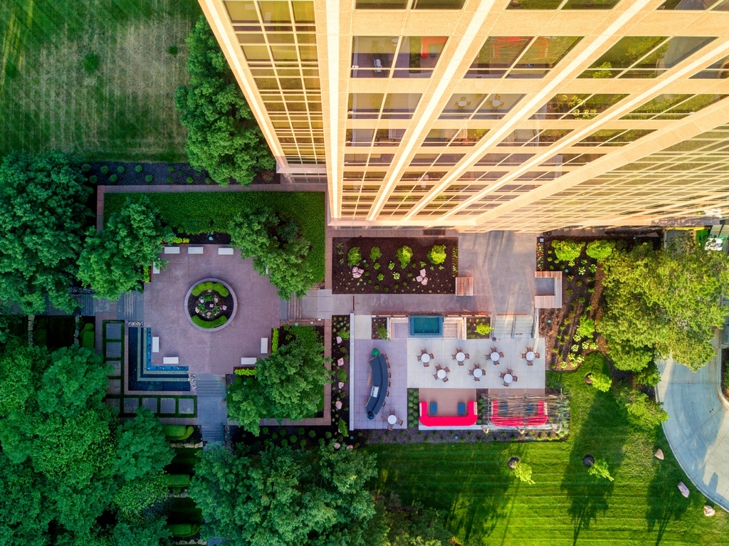
| From above (top right), you can see how the new plaza relates to another, existing plaza to which it connects. The old one has linear benches in a big, open space and lacks the broader purpose we built into the new plaza, which offers lots of opportunities to relax, eat, meet and socialize. The waterfeature bridges the two deck areas, with a little tease on the upper level that invites folks down to the main seating areas, the outdoor kitchen/service area and the already-iconic shade structure. |
When you look at the plaza from a distance, it all looks pretty simple – which is the beauty of projects like this one. Truth is, there was a lot of hard work involved in conjuring this easygoing atmosphere, particularly with the pergola, which has details we’d never specified before. We also faced challenges in sizing and placing the waterfeature and figuring out how it would relate to the retaining wall and the screen fence.
Ultimately, our strategy of getting the stakeholders involved in the design process and keeping them engaged throughout the construction process worked like a charm: Once they’d bought into the program, we worked throughout the rest of our time on site to keep them interested and excited about the eventual outcome – and nobody, it seems had any cause for disappointment.
The new plaza is beautiful, but even more important, it’s now the foundation for an enhanced sense of community – just what the stakeholders wanted!
Kurt Kraisinger is a landscape architect with more than 25 years’ experience in design and consulting. In 2009, he founded Lorax Design Group (Overland Park, Kans.) with a goal of creating memorable spaces that allow people to engage in their surroundings. He received his degree in landscape architecture and urban planning from Kansas State University and participates in Genesis programs. He may be reached at kkraisinger@loraxdesigngroup.com.


