Sunset Dynamics
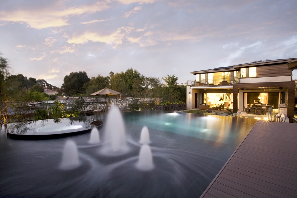

Although this project was developed and installed back in 2014, it remains one of Kevin Cobabe’s personal favorites for a handful of unusual and special reasons he explains here. Featured in Sunset Magazine’s “Idea House” program, the property gained widespread attention with a design that was most certainly ready for its close up.
By Kevin Cobabe
The project was driven by a need to create something very special in a relatively small space. I worked with a custom-home spec builder who had purchased a property in beautiful and wildly affluent Manhattan Beach, Calif., where space is always at a premium.
He subdivided the property, scrapped the original house — which was in the center of the original property — and built two new houses. One of the houses was more average and cookie cutter. In stark contrast, the property featured here was far more unusual.
It’s an area where every square foot might as well be paved in gold, real estate there is so expensive. The lot with the existing home went through a remodel that included installing a relatively ordinary pool. It’s a simple rectangle with spa located inside the pool and an automatic pool cover. I call it the kidney-bean pool of the 21st century. I’ve probably built more than 50 such pools over the years.
The other pool turned into something very different.
AN IDEA HOUSE
I had worked for this homebuilder, Mike Davis Custom Homes, for about 10 years at the time. We had done a dozen pools together and were a month into the process on this property when the whole situation took an unusual turn.
As fate would have it, Sunset Magazine somehow heard about the project and got in touch with the builder saying the publication wanted to feature the project in that year’s “Idea House,” a special program the magazine stages every year where they get involved with the development of a property with all sorts of creative design elements. They organize tours of the homes and give the work major coverage in print and online.
It was the first time the magazine had featured a Los Angeles-area home in the program.It’s such a prestigious deal that the magazine inserts some of their favorite designers into the process, in this case an interior designer and a landscape designer.

Over the next few weeks after hearing from the magazine, the landscape designer got to work and created a number of basic layout and concept drawings, none of which impressed the builder, or the new owner who had snatched up the property while it was still in development.
He asked me to get involved in the design phase, so I stepped in and we started moving through a variety of concepts, and important details, that would harmonize the outdoors with his vision for the house. The original landscape designer was let go, so I brought in a very good friend, Chris Canaday, founder of Masterpiece Gardens Design and Build in Redondo Beach, who did all of the landscape/hardscape design.
The house, designed by local architect Louie Tomaro, is a beautiful example of contemporary architecture in what could loosely be described an eclectic, soft-modern or organic modern style. It has five bedrooms, with 4.5 bathes, lots of glass and a host of playful contemporary features.
The exterior spaces, and especially the pool, were designed to look and function as extensions of the home’s creative and welcoming interiors. Everything feels connected in form, function and luxury befitting the exclusive setting.
It was, indeed, a home brimming with ideas.
ABOVE GRADE
The idea of the pool being mostly above ground was twofold. One was so that it created an elevated backdrop when coming from the rear doors of the house. The other was the house was already well under construction and to minimize costs we left all soils on site as machine access was cutoff and export would have to have been done by wheelbarrow at a big expense.
We did some shallow excavating and used the spoils to raise the ground in various places to create small vertical transitions here and there. Even though the pool is two miles inland from the beach, the soil was entirely sandy. Building pools in sand is generally the best conditions with minimal engineering and excellent drainage, so we avoided the expense and difficulty of any major foundational work.
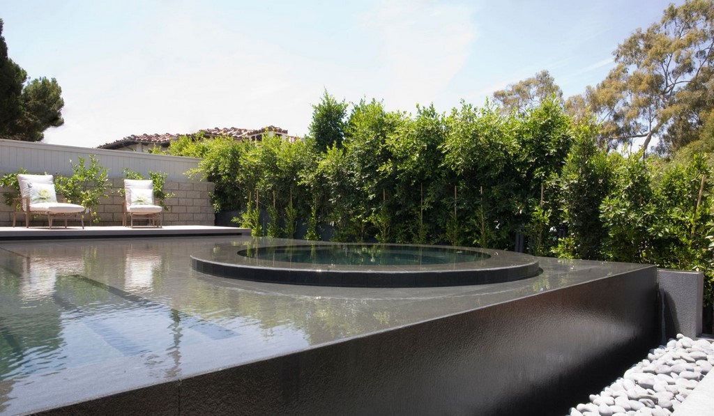
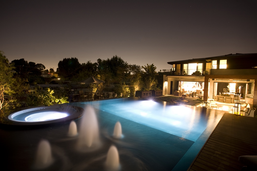
Some of the big ideas the project team liked included a large, very shallow Baja Shelf, three-inches deep, which were not nearly as common then as they are now, and a spa that “floats” out in the shelf, another design move that has caught on in recent years. We had done a couple pools with a similar design where you have to step through shallow water, -or across stepping stones — to get to the spa, but it was still relatively unconventional at the time
The pool also features a perimeter overflow on all sides and color changing lights.
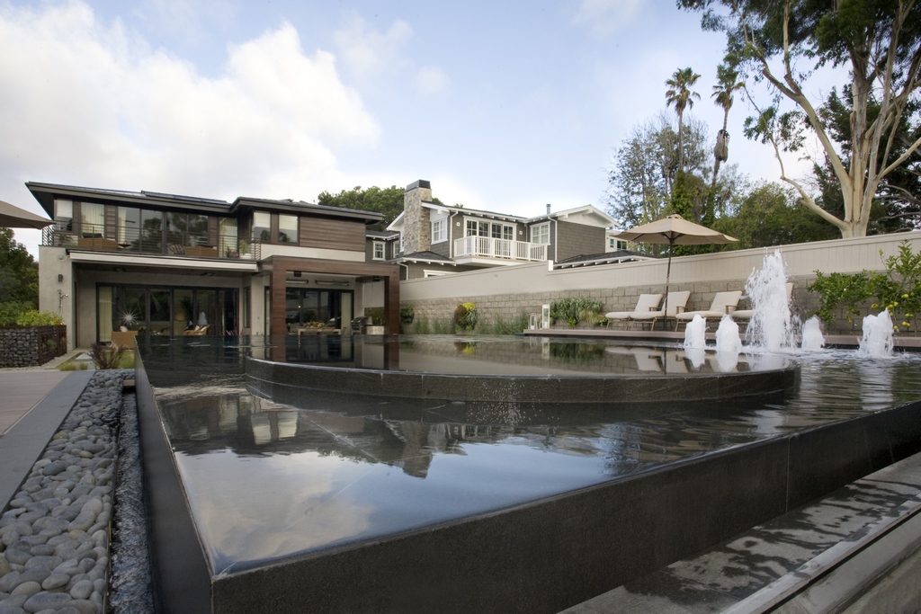
The pool is relatively large for the space, it’s 29 feet wide and 39 feet long, counting the three-foot trough for the overflow. The Baja shelf is 13-by-25 feet, with a nine-foot spa in the middle. The spa is raised six inches above the water level. The bond beam is 30 inches above grade.
The “swimming” pool area is relatively small, only about 15 feet, because of the size of the Baja shelf and a set of steps that extends off the shelf and spans the width of the pool. From the steps, the pool starts at three-feet in depth down to five-feet at the end opposite the shelf and spa.

The spa is set off to one side of the Baja shelf, closest to the house, leaving a wide lounging area, where we installed a set of five vertical Crystal Fountains flush-mounted foam jets, providing a nice fountain effect when the pool isn’t in use. (I will admit this is not a detail I push in projects with perimeter overflow designs because of the way that fountain features disrupt the reflective surface.)
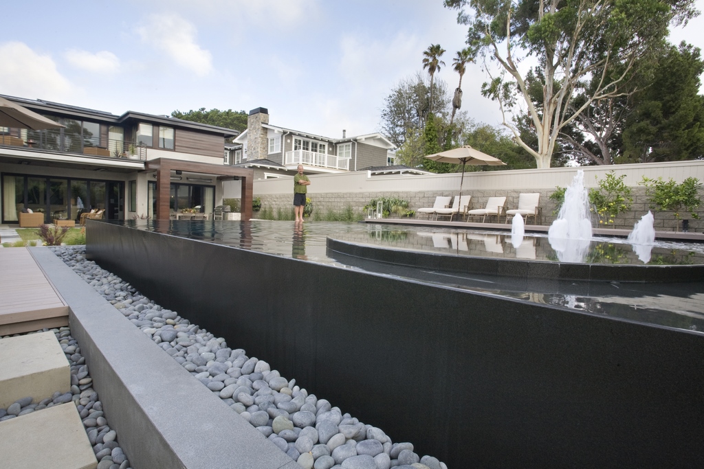
The perimeter-overflow trough contains all the surge capacity for water-in-transit over the edge. It includes a tricky detail where we installed a stainless-steel shelf that supports a grated cover over the trough, on top of which we placed river rocks. In all, there’s 110-feet of perimeter overflow.
The stainless steel shelf enabled us to hold the river rocks off the pool all by a foot so that we could install up lighting on the side of the pool, creating a dramatic visual effect highlighting the pool structure.
DOWN TO DETAILS
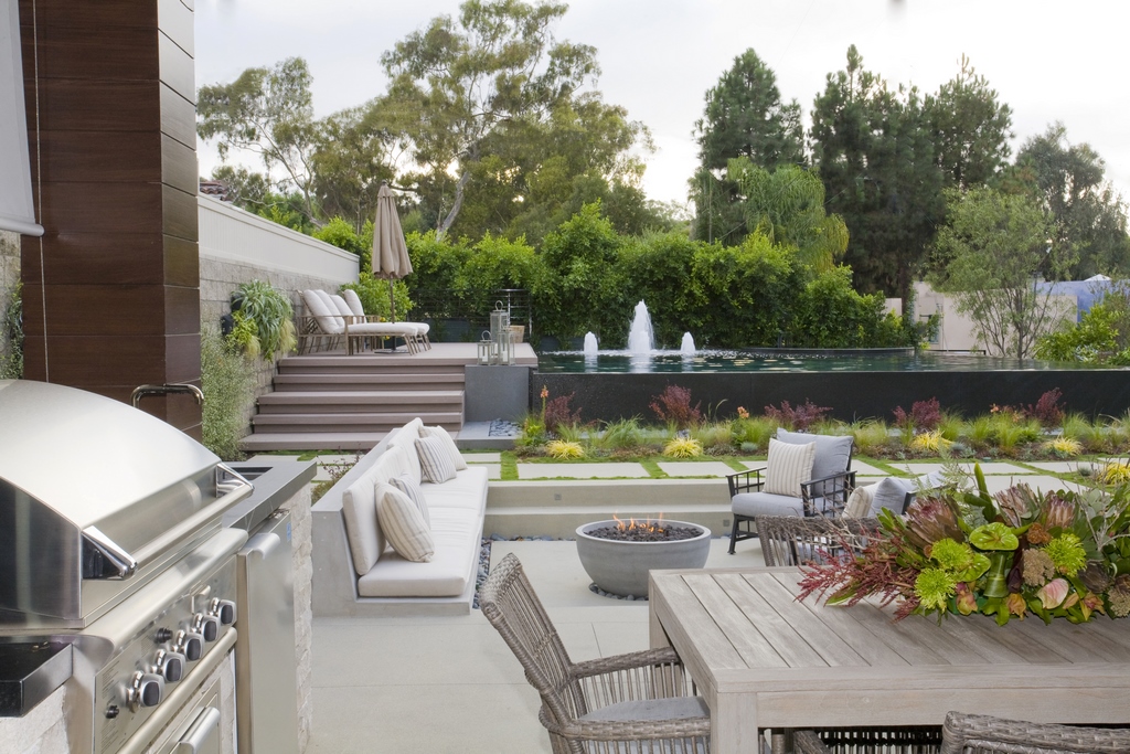
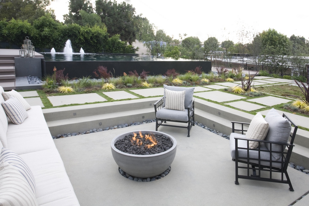
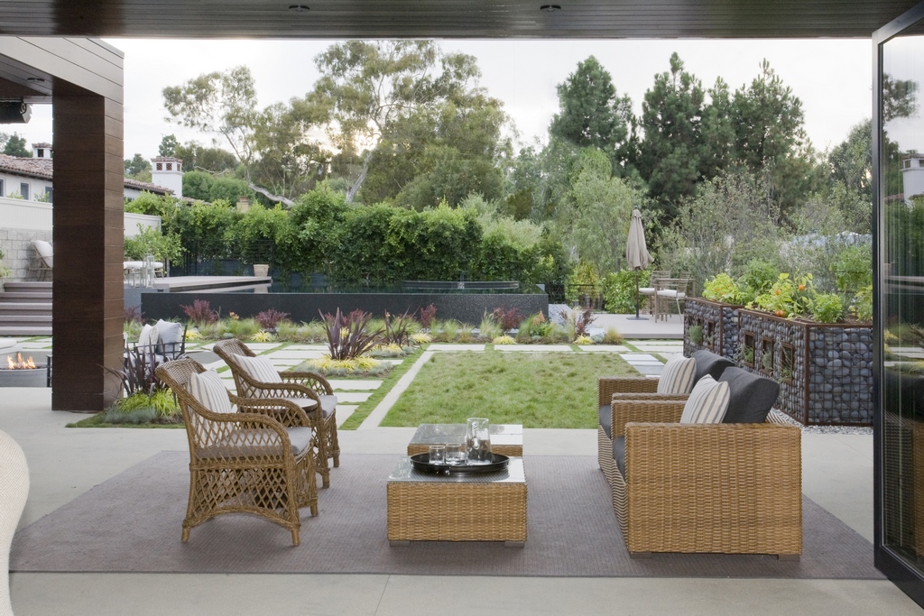
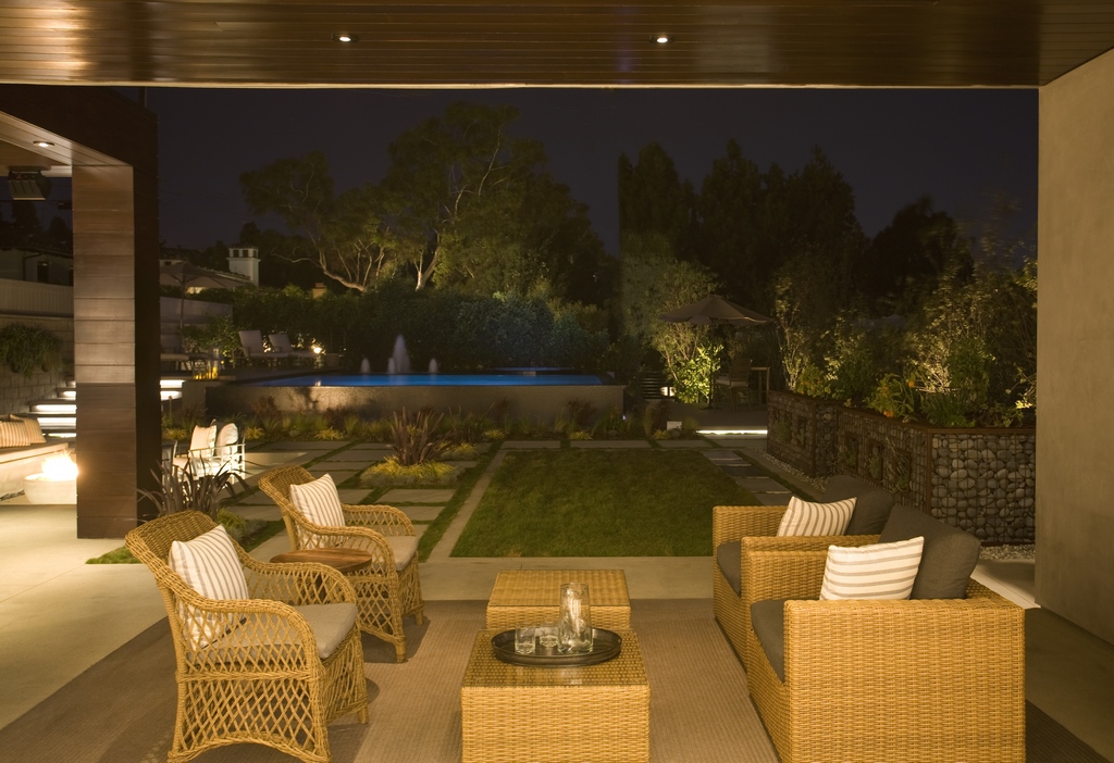
The interior design of the pool, and the entire backyard outside the pool, were designed to function as a social setting. The yard features a covered patio and fully equipped outdoor kitchen area next to the house. There’s a sunken firepit/seating area adjacent to the pool, next to which there’s a large set of wooden steps that leads up to a deck next to the Baja shelf and spa.
The landscape design features modular decking, steps and pathways, keeping with the contemporary house architecture. It also meant that we could embroider the space with turf and other decorative plantings between the hardscape, giving the yard a welcoming garden-like feeling.
The equipment pad is located in a subgrade vault beneath the deck, making maximum use of the limited and expensive space. Like other beach cities with tight confines, Manhattan Beach has tough set-back requirements for equipment locations, so I usually push for underground vaults that are basically built into the side of the pool, as was the case here where the vault shares a wall with the pool adjacent to the Baja shelf.
I take pride in setting up highly organized and clean equipment pads, which requires ample room. In this case, the vault takes up most of the area beneath the deck.
During much of the design phase, we left the finish material selection for later in the process. We knew those choices would need to harmonize with the exterior materials on the house and the interior material palette, which include gray metal, wood, stone and concrete.
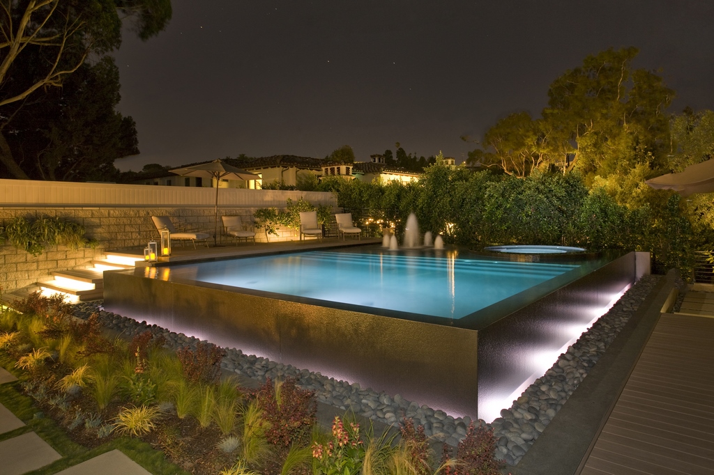
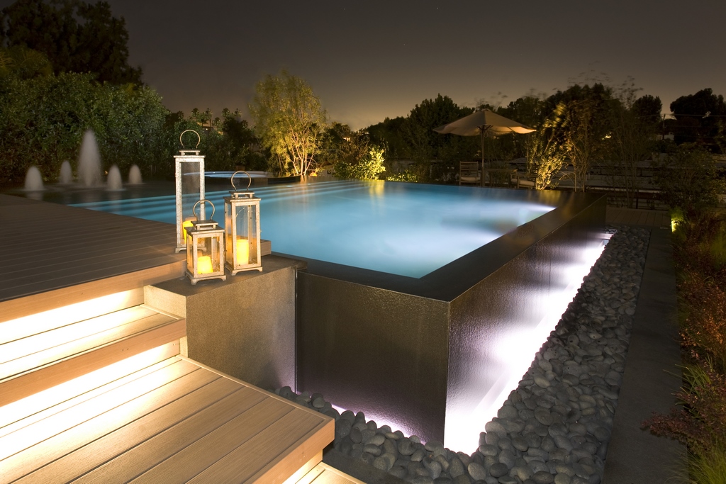
The big decision for the pool was largely driven by the interior designer. We settled on a dramatic black, flamed granite, which was all cut out of massive slabs. The face of the raised edge only has joints every eight feet. The pieces were mounted on thinset, just like massive pieces of tile, but it took six guys to install each piece because of the size and weight.
The top and side pieces are mitered together at the edge where there’s an eighth-inch grout joint. We used water-leveling to achieve basically zero tolerance, so when the slabs were installed, we had almost no adjustments needed, just some very minor grinding at the top of the edge. We worked with Mike Wilson Tile, who did a fantastic job start to finish.
It was quite an undertaking and a bit of a learning process, but the result was a monolithic contemporary look that was a perfect complement to the overall setting.
We were encouraged to be somewhat experimental on this project. One of the areas where we were creative involved the interior surface. After a bunch of trial and error we went with a polyurethane composite material that creates a very smooth gelcoat, in this case a dark gray hue that supported the surface reflections.
Part of that decision came down compatibility with the waterproofing treatment we used over the entire shell, which didn’t allow for good adhesion with traditional plaster or exposed aggregate material. Since then, we’ve discovered newer, more advanced products that don’t present that issue.
HIGH EXPOSURE
As we approached the final stages of construction, there was fair amount of deadline pressure, mostly to meet the magazine’s schedule for publication and the tours they planned over the summer. While the situation did get somewhat tense, everyone managed to do their part and cross the finish line in time.
When it was all done, the pool and backyard did receive a lot of fanfare from people who visited the property during the Idea House tours. Unfortunately, the magazine itself barely included any discussion of the pool in its coverage, which was disappointing.
Still, everyone involved was duly impressed by our work. We learned a lot on this job and as mentioned above, after all these years it’s remained one of my favorites and an eye-catching part of our company’s portfolio.
It is a visually dynamic watershape setting that looks fantastic at sunset!
Kevin Cobabe is president of Dynamic Pool & Spa Construction, a high-end watershaping firm based in Redondo Beach, Calif.


