Style Council

I’m steadily reminded of one key point: No matter how talented any one of us might be, the work ultimately is not about us.
For intensely creative people equipped with the necessary measures of self-confidence and ego, that point can be tough to accept and absorb, but it’s true: For all our skills, we nonetheless work with our clients’ visions, and the reality is that creating sympathetic designs for them takes time, patience and lots of effort.
As a result, I’m passionate about uncovering what my clients are truly after in their garden and watershape designs. It’s an investment of time and energy at the onset of the relationship that always pays dividends by directing the creative decisions I make as a project unfolds. It’s also, I believe, liberating to me as a designer.
Indeed, this is the most exciting aspect of landscape and watershape design for me, this freedom I have to move across a spectrum of ideas and influences to come up with something fresh and unique for each and every project-something to which I can apply my own signature while keeping faith with client’s objectives and the requirements of the setting.
Sometimes these turns of style are subtle; other times they’re quite distinctive. In all cases, I follow the clues and signposts I find, using my own preferences and background as a compass. To demonstrate what this philosophy means in the real world, let’s review four recent projects, each with its own character.
I: Organic Undulations
The clients on this first project – in Alpine, CA – had a long wish list and lots of general ideas about what they wanted. This gave me a starting point while leaving plenty of room for interpretation when it came to specific design decisions.
When we first met, they said they wanted something natural, even mountainous, to give what was otherwise a drab, flat-as-a-board space a rustic feeling. Their lot was a big square, quite typical of those in the subdivisions of East San Diego County these days.
As I do with all my clients, I closed in specifically on what they meant. Through the entire conversation, we kept returning to the same set of ideas: They wanted lots of plants, plenty of mounding and an overall sense of undulation in the landscape – a “voluptuous” setting, so to speak – to go with a pool, spa, waterfeature and built-in barbecue.
STAYING FLEXIBLE
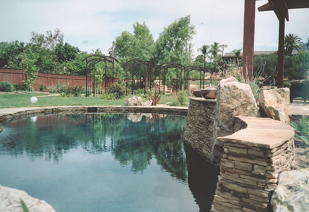
As we kept exploring and reviewing books and magazines, the clients were also (surprisingly) attracted to some highly formal elements (including an arbor allée) that can be tricky to fit within a natural style. Fortunately, we were working with a large project area that made it possible to create distinct spaces that could be blended and held together by picking up plant and stone material, for example, and working with them from zone to zone.
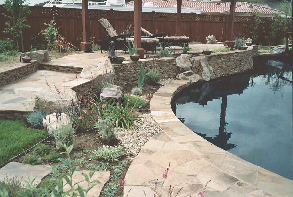
In this case, low walls surfaced in Cameron ledger stone were key integrating elements. It all starts with the pool and a raised portion of the bond beam that extends well beyond the pool and gradually disappears in the rolling contours of the garden. All of the extended walls were laid out with sweeping curves to reinforce the impression of undulation.
I’ve used this extended-wall detail on other projects to lead the eye into a garden while integrating a watershape into the scenery: There’s a wonderful unity that rises where a pool isn’t separated from it’s setting – and in this case I think it works quite well.
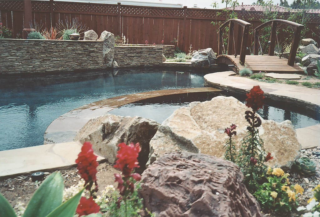
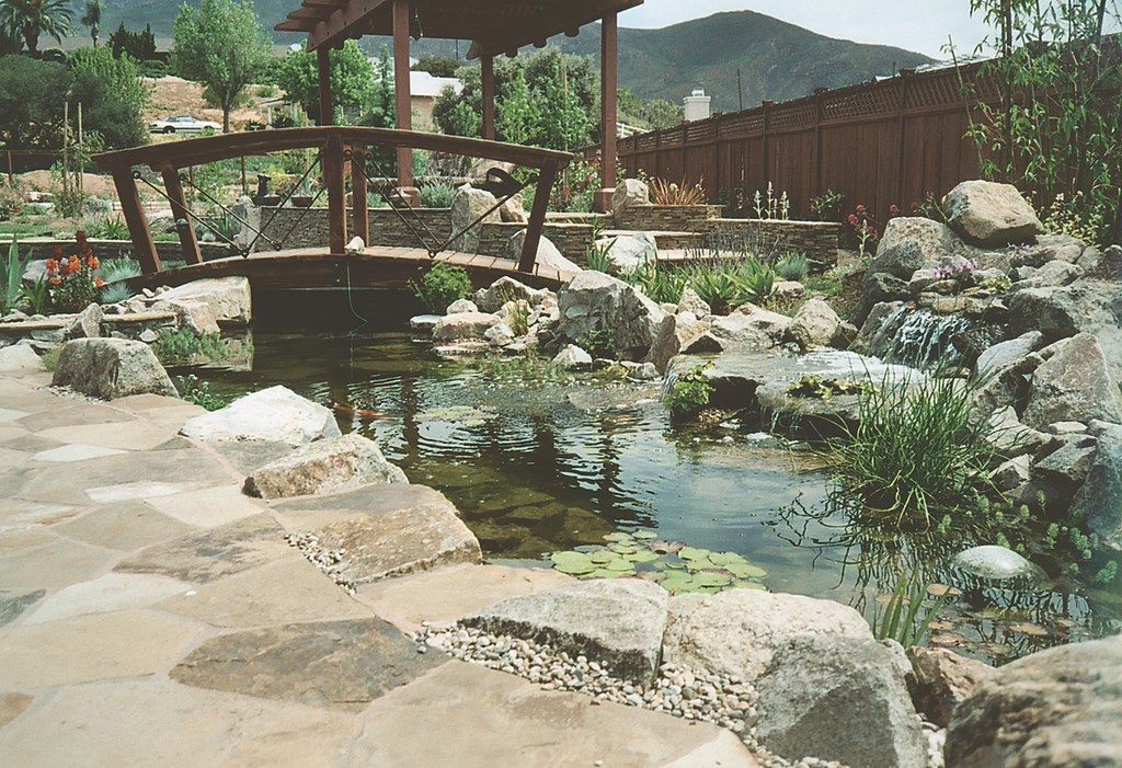
| The homeowners wanted a natural, ‘voluptuous’ backyard setting that we delivered by adding soft elevation changes to their flat lot marked and by establishing sweeping lines and undulating curves throughout (left). Not even a formal element such as the arbor allée disrupts the impression made by these rolling contours (middle left). There’s also a bridge marking the functional division between the ledger-framed swimming pool and the rustic-looking pond (middle right), but the overall free-form shape carries over onto both sides of the span (right). |
In shaping the undulations, we took the spoils from the swimming pool dig and piled them up in several places in low, gentle contours. Nothing was too drastic by way of elevation changes, as we didn’t want it to look like we’d “buried dead horses” all over the property and topped them with symbolic tombstones of rocks or plants: The whole area is very softly graded.
The pool itself has a freeform shape. The foreground spa is set down in the pool itself instead of serving as a large, separate statement. Nearby is a waterfeature – a small Koi pond designed not to compete with the spa, but rather to function visually as part of the pool itself while being operationally separate from it. (The effect works because of the small bridge that separates the vessels while leading onward to a large raised deck and shade structure that overlook the pool.) There’s small waterfall with the Koi pond that provides aeration for the biological system as well as soothing set of sounds.
The pool and spa interiors are finished in fine, dark-grey and black pebbles that pick up the dark veins in the Cameron stone. Here as in many of my other projects, I relied on the skill and color sense of my hardscape/swimming pool installer, Goran Kirovski of Triton Pools & Spas (Escondido, CA). He’s a genius with hardscape color, giving me the freedom to design a spectrum of subtle, custom looks right on site.
PLANTING IDEAS
Given the clients’ desire for lots of greenery, developing the planting plan for this project was a great deal of fun. The space was large, so they wanted a scheme that would be easy to maintain. They also wanted a great deal of screening on both sides of the property, with breaks to maintain and frame portions of views in certain areas.
For primary trees, we selected Liquidambars and Deodar cedars – trees well suited to the large lot and a beautiful combination, especially in the fall. The Liquidambars develop deep-burgundy leaves, while the cedars look blue; when these trees mature, they should be truly spectacular.
|
Blight Avoidance I often try to talk clients out of built-in barbeques, and when I can’t, I at least look for ways to de-emphasize their visual role in the garden. The constant challenge with these popular amenities is finding ways to blend them successfully into an overall aesthetic scheme. The best solution seems to be using materials borrowed from other places in the barbeque area, but I generally also try to place them in blind spots a bit off to the side where they are still both functional and convenient. — M.J. |
The arbor allée was planted with climbing white roses. We used lamb’s ears for their grey foliage alongside Mexican feather grass and a variety of other grasses. For the screening, we used clumping bamboos – a plant I love for a number of reasons, a key one mentioned below.
Fragrance was another item on the clients’ wish list, so we used honeysuckle and its wonderfully sweet smell to go along with the roses as well as patches of rosemary, creeping thyme and sage.
The clients also specifically requested a park-like concrete path that would move through they yard as defined conduit for moving kids through the space. The path moves in and out of garden spaces, through a “bamboo grove” and the trees, past the arbor allée and around a grove of fruit trees at the back of the property.
They were also very concerned about sound, which is one of the reasons we included the waterfall with Koi pond and why we used the clumping bamboo, which make a fantastic rustling sound when the wind blows and makes the canes tap into one another.
The clients installed a sound system, choosing rock speakers that sound terrific but don’t harmonize with the aesthetics, so I’ve selected plants I’ll use to hide them. For setting nighttime moods, we went with moonlighting in the trees to light the pathways and create interesting shadow patterns.
II: Artfully Crafted
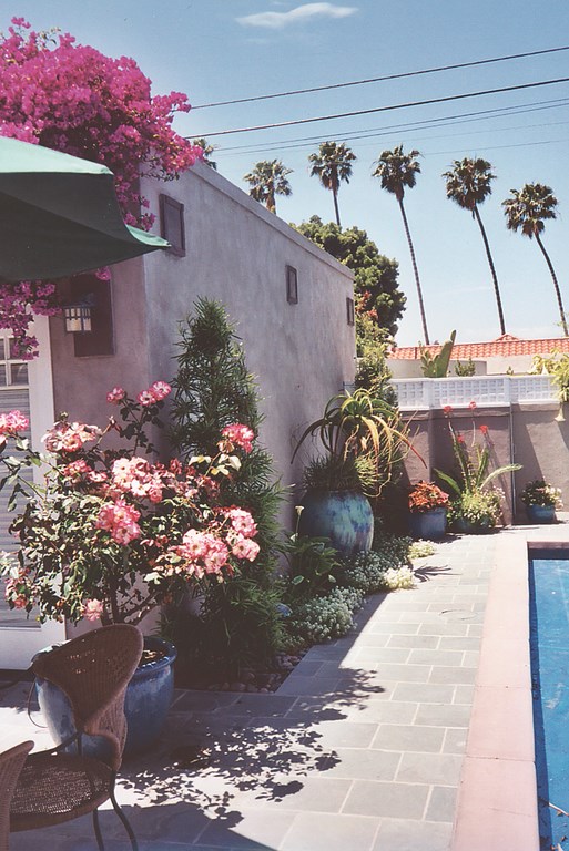
This project – one of my personal favorites – is an example of using a distinctive architectural style as the basis for an exterior design. The home, built in the early 1900s and renovated in the 1980s, is a beautiful, two-story cross between the signature Mission influences of the famous San Diego architect Irving Gill and the early Craftsman style that was just becoming popular at that time. The residence is located in the gorgeous (and very urban) setting of San Diego’s Mission Hills district.
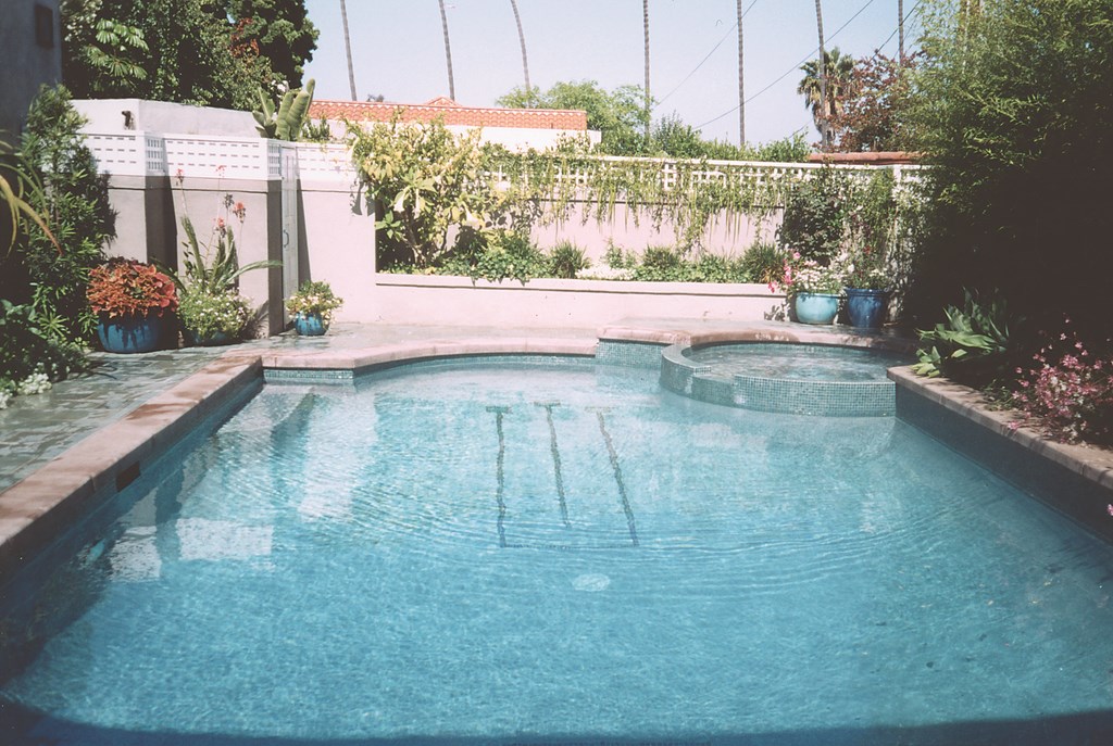
| We used soft greens and greys throughout the space in slate, concrete, stucco and glass tile, picking up elements of the Mackintosh Rose when and where we could to tie the exterior design to the home’s Arts & Crafts-inspired interior. |
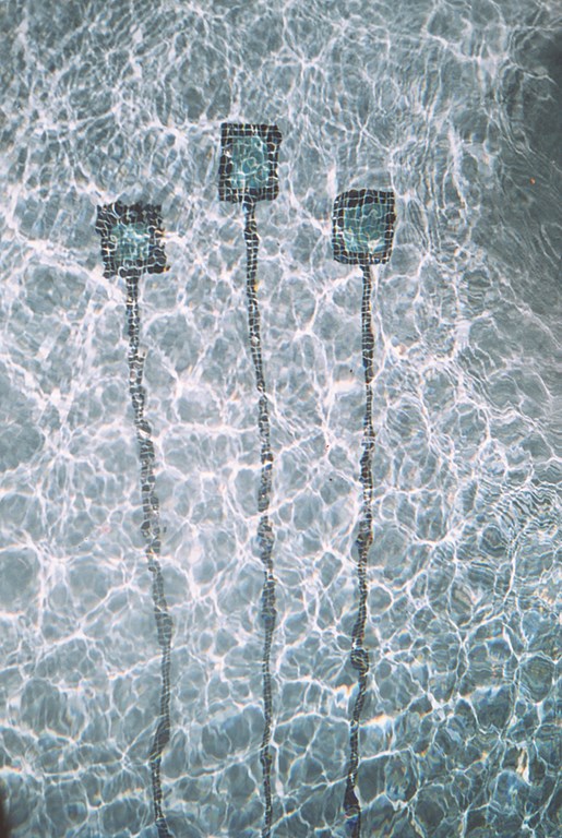
In visiting with the client’s, I saw their fantastic collection of Arts & Crafts furniture and eclectic artwork, all with a distinctly warm, feminine flair. Right away, I noticed a chair made by Charles Rennie Mackintosh, the famous Arts & Crafts designer who used a graphic pattern known as the Mackintosh Rose on many of his pieces.
When I recognized this detail, the clients were pleased and excited – and I had a strong feeling the job would be mine. As we continued our conversation, I noticed that much of the rest of their furnishings picked up the Mackintosh Rose or similar patterns, and I knew right away that I had a visual motif that I could repeat in the garden.
MARCHING ORDERS
The scope of work here was to replace all of the hardscape, give the existing pool a major facelift and rework all the plantings.
For the hardscape renovation, we used (mostly) a teal-green slate set on concrete along with sand-blasted, natural-grey concrete with saw-cut joints, grey stucco and lots of teal-green and gold glass tile. I picked up the Mackintosh Rose in the scoring patterns of the decking and pathways and in the layout of the stepping pads.
| The pool itself was in reasonable shape, so our work with it was mainly cosmetic. A key addition was the mosaic rendition on the floor of the pool of the Mackintosh Rose in black, green and purple tiles. |
The swimming pool was basically in good shape, so our main work was cosmetic: We replaced all the waterline and raised-bond-beam tile with the teal-green and gold glass tile and added, in the bottom of the pool, a large, mosaic version of the Mackintosh Rose using glass tile in black, greens and purples.
A big portion of the project involved reworking the side yard seen primarily from the dining room. The space had little by way of landscaping, which was bad enough, but worse was the fact that beyond the fence in plain view was an unsightly, utility-laden portion of the neighbor’s house.
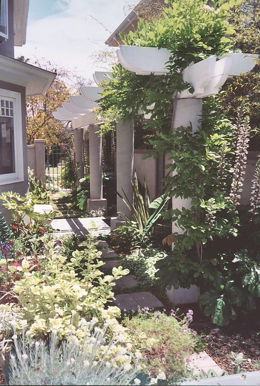
For this area, I designed a large pergola (classic Irving Gill) with a tall screen of Black Bamboo as a backdrop and to obscure the view of the neighbor’s wall beyond. The columns for the pergola are made of sand-blasted, poured-in-place concrete – basically round columns on raised pedestals that rise about ten feet to support a series of wood beams across the top. We included a six-foot-tall, grey-block-and-stucco screen wall with detailing down the face suggested by a photograph of a Charles Rennie Mackintosh headboard he’d designed for his own home.
Right outside the dining room window, we placed a small, square waterfeature, just a simple tiled basin with a small spray jet that sends a delicate stream of water just a couple of feet into the air. Above the fountain on the wall, I designed a tile detail that suggests a wall fountain, even though it’s completely dry.
GREEN SCENE
The plantings throughout this project are lush and too numerous to list. We used mostly moisture-loving plants with dense foliage and leaves of differing sizes, textures and colors to add interest.
In the side yard are lots of grey highlights and white flowering plants to create a “moonlight garden” in which white blossoms and light foliage create highlights that are visible at night, the time of greatest use of the adjacent dining room.
| The small space outside the dining room was designed to mask the view of the neighbor’s utility connections and is enhanced by the sound of moving water generated by a small fountain. The glass-tile backdrop looks like a water wall, but it is actually dry. |
In the front, there’s a particularly beautiful plum tree graced with spectacular purple leaves. Against the basic green of the plant palette and the grey of the house, its colorful foliage provides a fantastic and intriguing contrast. Other colorful plants include angel’s trumpet, scaevola, a ground cover with blue flowers, iceberg roses and lots of lamb’s ear – among much more.
III: Snaky Sleek
These clients had spent a lot of time and money remodeling the inside of their home, mostly removing walls to create a large, continuous living space with clean, crisp, simple lines. There was wonderful modern art on the remaining walls along with a lot of cool colors and a clear preference for stone and natural materials.
The fact that their stylistic aims were so clear was a big help in this case, because the couple was from Israel and, at first there was a little trouble in communicating through a language barrier. This was somewhat complicated by the fact that they had differing priorities. The husband was a bottom-line kind of guy for who the outdoor space was all about function, while the wife was primarily concerned with art.
This was no real problem from my perspective: It was so obvious what they wanted in terms of style that my “homework” on this project was really quite simple.
BALANCING VIEWS
To carve a path between their differing agendas, I kept everything straightforward when it came to the main elements. The resulting garden is all open space with no pathways or niches, and the rectangular swimming pool serves as the main visual focus for the space.
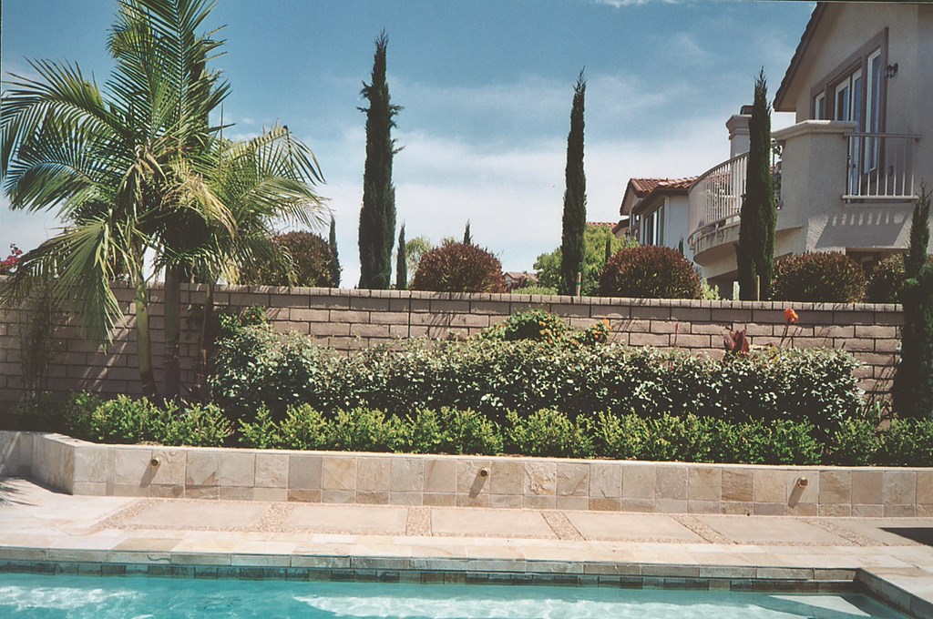
| This backyard is distinctly about clean, crisp, uncluttered lines – all open space with the rectangular pool serving as the centerpiece in a deck of beautiful blond stone. |
Around the pool, we used a dazzling Chinese blond quartzite called d Golden Ray for the decks. We also used a seeded exposed-aggregate concrete with Salmon Bay pebbles to add accents to the hardscape.
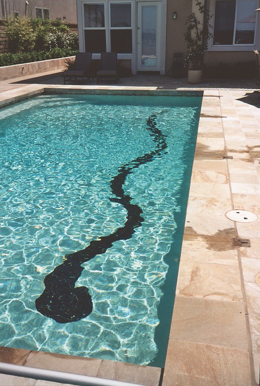
The most elaborate design feature is the tile snake mosaic in the bottom of the pool, which also functions as a lap line. The snake is located off to the side on the pool’s floor, running almost its entire length. It’s done in black tile with small gold glass tiles that make it sparkle.
Along the length of the pool, we installed deck-mounted steam sprays that arc over the snake. Our thought here was to use a rippling water surface to give the snake a sense of motion; it serves the purpose, but truth be told, any time the water surface moves, even in the slightest breeze, the snake really “wiggles.”
| The snake mosaic at the bottom of the pool is the yard’s most elaborate feature. It seems to wriggle across the pool’s floor whenever the surface water is disturbed. But that still leaves the hard lines of the decks, walls and pool, which are softened by plantings at the yard’s edges: They offer understated colors and textures but don’t compete for control of the space’s overall character. |
The snake, by the way, was inspired by a picture I found of a Balinese garden that featured a snaking waterfeature at the center of a rectangular garden. It was so compelling that I picked it up here to add interest to the otherwise clean minimalist space.
We went with something of a mixed planting palette, focusing on grasses and succulents to soften the hardscape while sticking to a minimalist spirit. We also used black bamboo, silver berry, Japanese boxwood, Canna Tropicana, society garlic, agapanthus, day lilies, angel’s trumpets and blue fescue to accent the lawn that takes up a good bit of space. The grass runs to an edge of the property that falls away down a slope toward a golf course – a neat way to connect the backyard with the hues of the distant view.
IV: Classy Modernity
For this project, my clients wanted something classic and warm but with simple shapes and lines and plenty of open space. They also wanted a spectacular swimming pool as the absolute centerpiece of the project.
Ultimately, photographs of pools on the Spanish island of Majorca inspired the pool/deck design, with the influence seen in the rectilinear geometry and patterns and the ease of pilasters to frame the view. We stopped short of full Moorish influence, however, by not picking up the classic tile embellishments that would have been appropriate in a more ornate design.
UNDER CONTROL
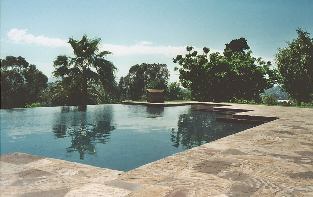
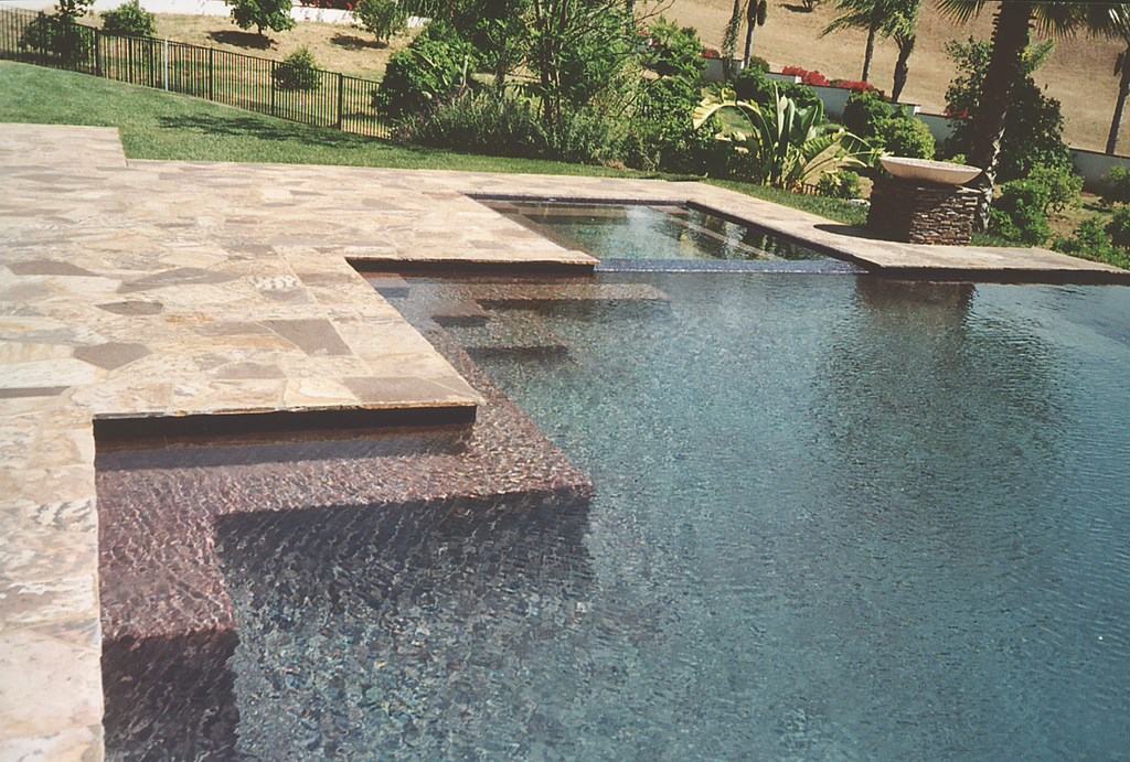
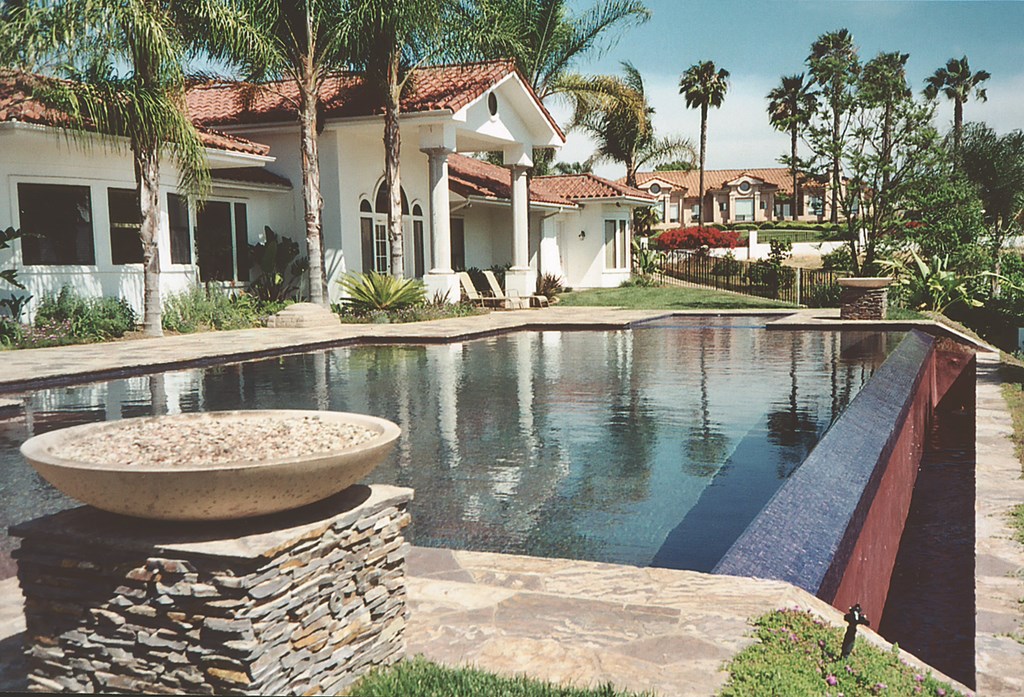
The pool is some 60 feet in length with a vanishing edge and an attached spa. Its lines are clean and simple, but there are striking details including the intersecting rectilinear elements in the shallow alcove and extensive step details.
The surrounding hardscape is done in a beautiful limestone material known as Three Rivers stone and actually looks like a carpet around the pool with its colorfully complex patterning, swirls, striations and points of variation and visual interest. This decking, in fact, is the key to the whole design and keeps the pool from overwhelming its setting.
| This broad pool was inspired by photos of Spanish watershapes, but we shied away from the ornamentation that would characterize a more overt Moorish design influence. The materials make all the difference in the impression made by the watershape, with the exceptionally textured stone decking, the deep-plum-colored tile and rich interior finish making the water take on the appearance of a fine Spanish wine. |
The pool’s tile – on the dam wall and edge detail and at the waterline – is all a deep-plum glass tile that shimmers like jewels in the sunlight. The interior is finished with a custom-colored, polished exposed aggregate, again created on site by Goran Kirovski.
The deep wine color that is unlike anything I’ve ever seen. Without water in it, the surface looks almost pink or magenta, and there were some tense moments at the start of the application process when we wondered if we’d gone too far. When filled, however, the pool takes on a rose color that deepens in hue as the depth increases. At the steps in particular, you can see a gradation in color that’s quite dramatic in the right light. (We’ve since named to color Majorca Rose.)
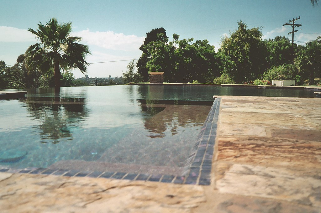
| The pre-cast bowls light the evening with fire effects and frame the long vanishing edge 24 hours a day. Everything works together to lead the eye to the vistas beyond the clients’ backyard. |
The rectangular shape of the pool gives the design its classic feel, abetted by the pilasters that frame the vanishing edge with their pre-cast concrete bowls and fire effects. Finished in stacked stone, the pilasters are large – three by three foot cubes – and highlights the edge detail while engaging the eye in distant views of rolling hillsides.
There’s not much landscaping here beyond the lawns. The desire was to extend the simple line of the pool and emphasize the expansiveness of the deck with out interrupting the sense of open space. And the project might have seemed overly cool and austere if it wasn’t for the vivid colors and fine textures of the decking the pool finish – colors and textures that might have been too bold in a more complex setting.
Melanie Jauregui is principal designer and founder of Biomirage Landscape & Garden Design in San Diego, Calif. She entered the landscape design business in 1980 while pursuing a career in the fine arts in Sedona, Ariz. She soon discovered great creative possibilities resulting from blending her background in the arts with the technical aspects of construction and horticulture. Returning to school to study landscape architecture, Jauregui accepted an internship at Wiley Group Landscape Architecture in San Diego, where she worked and studied for eight years. She started Biomirage in 1992, focusing her efforts on high-end, custom residential landscape and garden design.


