A Study in Contrasts, Part 1
Most watershape designers and builders I know largely rely on referrals to generate new business. That’s certainly been true in my case and I’ve learned that word of mouth is extremely important, and arguably the best form of marketing.
It is unusual, however, to have one referral from a satisfied client turn into two massive projects at the same time. That’s exactly what happened, when one of my past clients put me in touch with a pair of highly successful business partners he knew, who were in the process of building their dream homes right next door to each other.
Interestingly the projects couldn’t have been more different: one features an extremely contemporary design, while the other is all about rustic ambiance. Working on them concurrently became a fascinating study in contrasts. In this first of this two-part project profile, we’ll look at the rustic project and return with the ultra-contemporary take on luxury in the next WS edition.
SHARING THE VIEW
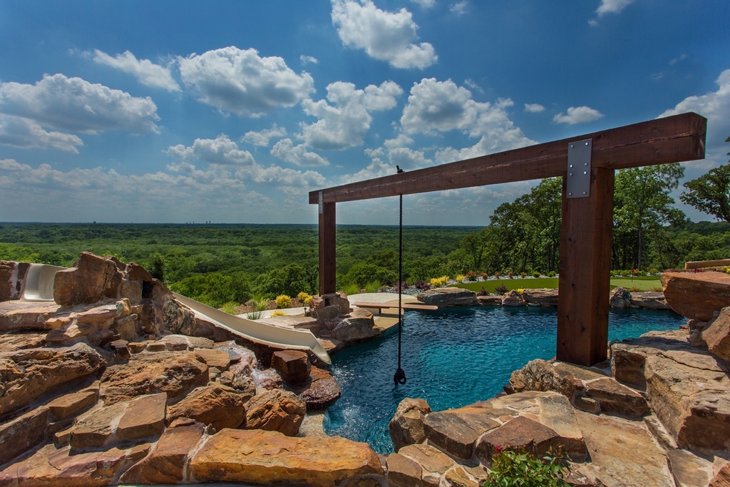
The homes share a 20-acre property that the partners purchased together and then subdivided down the middle. It’s in a gorgeous location overlooking protected watershed land on Lake Lewisville, Tex. They loved the fact that the views would never be developed and they had been trying to buy the property for 10 years. At one point when they were at last finalizing the sale, they actually flipped a coin to see who would get to choose which half of the property belonged to whom.
They both wanted pools and surrounding recreational areas that would take advantage of their sweeping vistas. Even though the parcel is spacious, it narrows to a relatively short property line on the view side. That meant both houses were built relatively close together and they can see into each other’s pool areas.
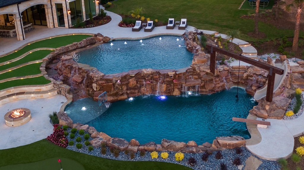
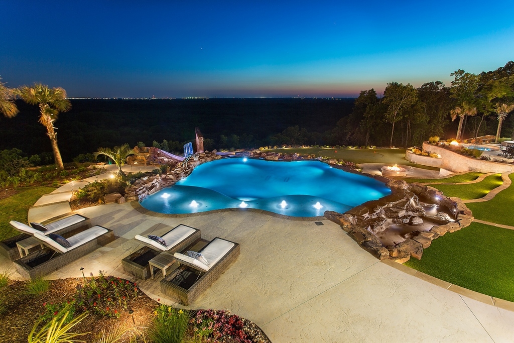
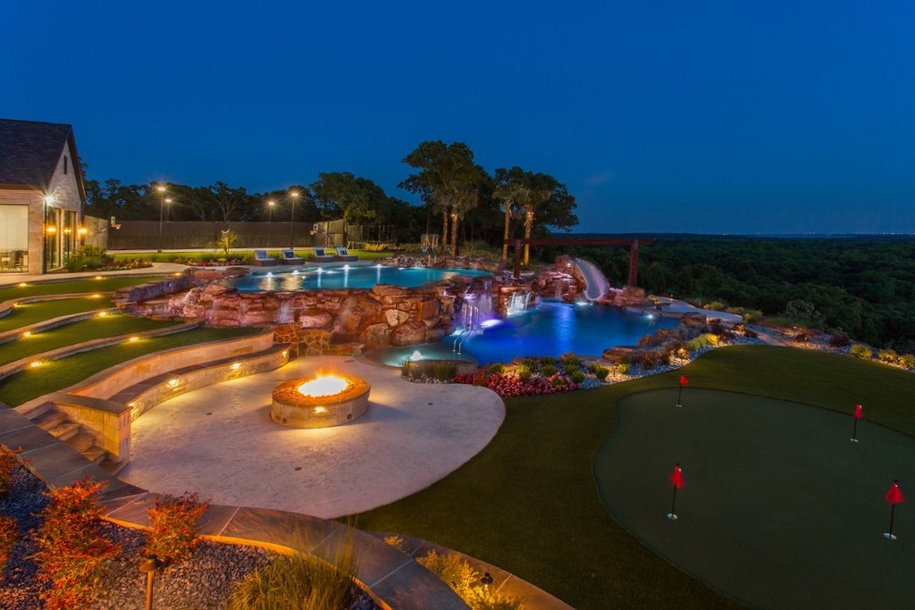
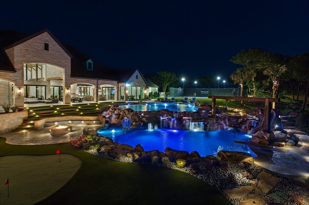
| The design started with the concept of fun and entertainment. The upper and lower pools effectively create activity zones where kids of all ages and adults can enjoy themselves at their own speeds — either lounging in the shallows of the upper pool, or going nuts playing on the rope swing, diving board and water slide of the lower pool.(All photos in this article, including the opening image above, by Vernon Wentz, Ad Imagery, Dallas, Texas) |
I was working for Claffey Pools in Southlake, Tex. at that time, and while I did the vast majority of the design work, Claffey’s crews expertly handled both installations. Key players included Jose Serrato and Charlie Claffey for their work on drafting and specifications, project manager, Bobby Brzozowski, engineer Jerald Kunkel, and general contractor Links Construction. These are two projects for which everyone involved can be proud.
It was a challenging situation from a construction standpoint because despite the fact that the two projects are literally within a stone’s throw of each other, they required completely different structural approaches. The contemporary project is raised almost 30 feet above grade on a system of piles and grade beams, while the rustic project is carved deep into the slope and is supported entirely on the sturdy bedrock.
In addition to their shared desire to celebrate the view, both clients wanted to create places for socializing and enjoying the good life. For the rustic project, that translated into a multi-faceted design with an emphasis on places for kids to play and adults to socialize.
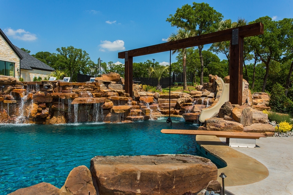
They’re an active family with three kids who are constantly entertaining groups for their various activities, such as cheerleading and little league. That’s why the design really started with the play area where we have a rope swing, waterslide and a wooden diving board, comprising a perfect place for older kids to indulge in highly energetic activities.
The upper pool, is all shallow and meant for smaller children, as well as adults who want to wade around in the shallow water and, again, enjoy the view.
ALL FOR FUN
We have a lot of clients who want both a play pool and a diving area, which basically leaves you with one of two choices: you can either make a huge pool with a shallow area on one end and a deep end on the other, a more traditional way of creating the two areas, or you can separate them – as we did here — into two distinct bodies of water, creating separate play areas.
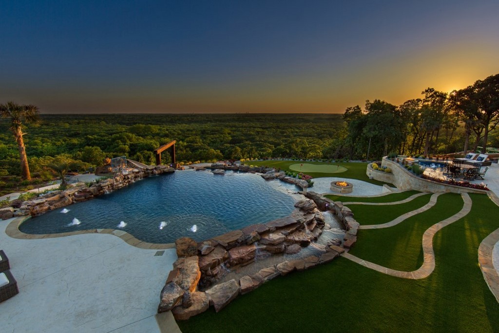
The upper and lower pools are linked hydraulically and structurally, but appear separate. We took advantage of the slope and created a large six-foot structural wall and slab that both separates and links, the two vessels. That’s where we placed several tons of natural stone to create a series of waterfalls that appear to flow from upper pool into the lower pool.
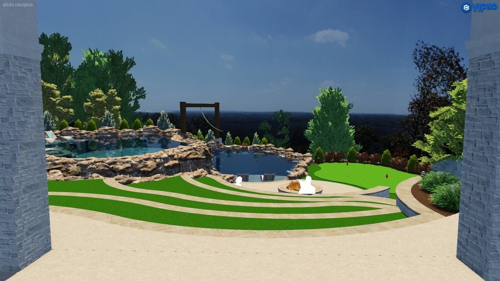
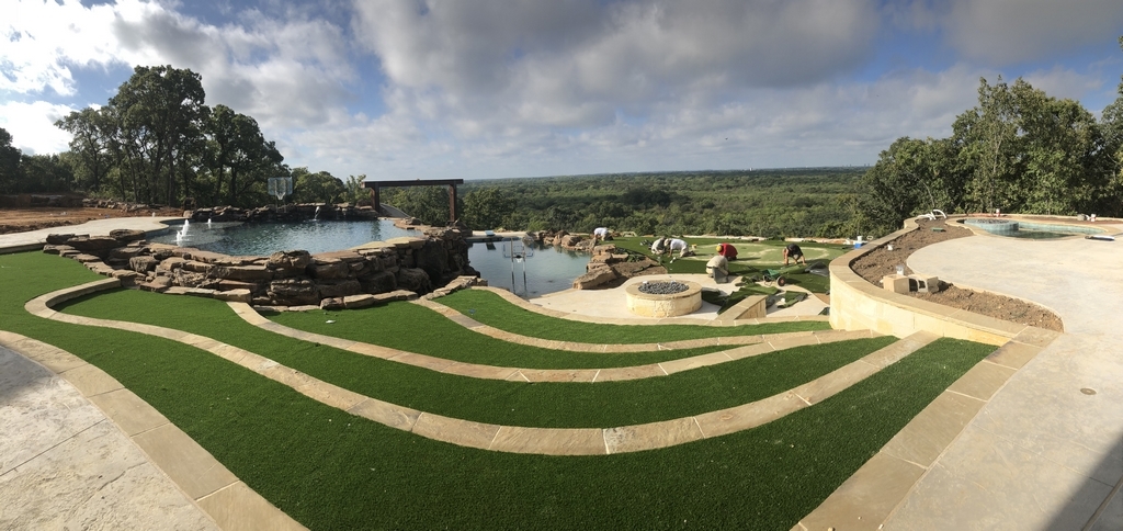
| The design included multiple terraces — including an outdoor amphitheater for nighttime movie viewing — that provide multiple areas to take in the views and experience the water. In this project, the clients like what they saw in the initial design iterations and requested very few changes along the way. |
The upper pool measures 40-by-30 feet, transitioning from three-and-a-half feet deep at the sides to four and a half in the middle. The lower pool diving pool is 51-by-29 with a nine-foot deep end.
Interestingly, going this way came down to cost. The clients originally wanted a vanishing edge, but the difference between building a lower catch basin and an entire lower pool wasn’t all that much, relatively speaking. In effect, the diving pool acts as the catch basin for the play pool and it wasn’t a huge expensive to turn the catch basin into its own functional swimming pool, something we’re doing more and more these days.
The play pool features a large shallow lounging area with plume jets that give it a fountain effect when not in use and it features a large stream that wraps around from the side and flows down into the rock formation and diving pool and all its play features.
(As an aside, going to back to the client who referred us to these clients, he showed them the pool we built for him and it was a rope swing that hooked these clients, and was the initial reason we received their call.)
Another big feature was what amounts to an outdoor amphitheater in the form of terraced artificial grass seating areas that descend the hillside between the pool and spa areas. It’s designed for watching outdoor movies on a massive 20-by-30-foot inflatable screen, which they set up on a putting green located at the bottom of the terraces.
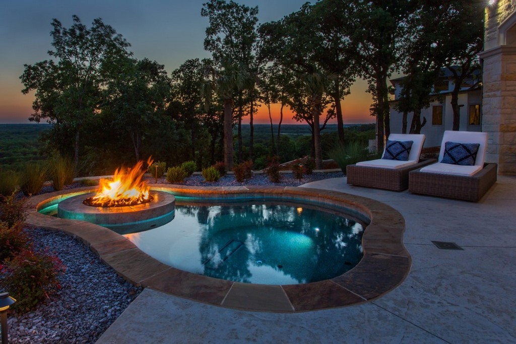
There’s also a master-suite area that’s removed off to the side of the pool and out of the main flow of traffic. It features a large in-ground free-form spa that wraps around a fire pit, suitable for about 10 people.
The clients loved the idea of having a place to enjoy hot water and hydrotherapy but they specifically didn’t want it attached to the pool. We located the spa so that they can sit in the water and look over both pools.
NATURAL TENDENCIES
The entire space is organized into a set of cascading terraces nestled around the water with shifting focal points that reward spending time in the various destinations within the landscape.
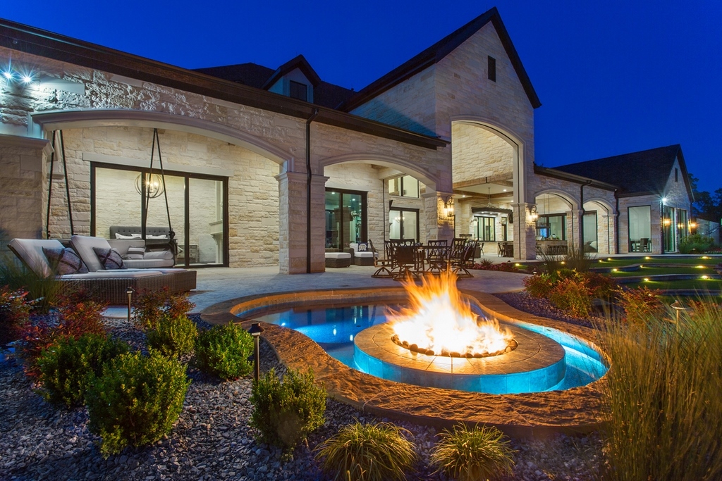
While we were leaning toward naturalistic shapes and materials, we weren’t trying to make it look as though anything was literally natural. Everything is free form in an almost undulating design where one area flows into the next. We took cues from the house, which also uses lots of stone cladding and wood, but at the same time it’s very clean cut and architectural.
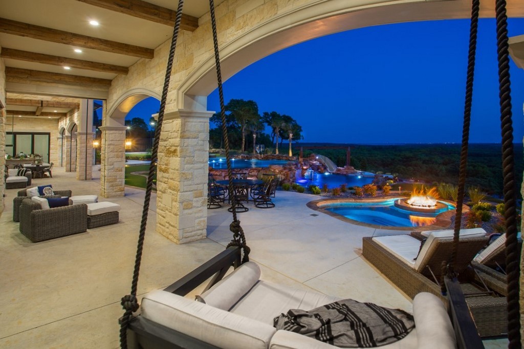
| Ultimately, the project celebrates the views during the day and then comes alive with ambiance at night supplied by LED landscape lighting and fire features at night. The complex, multi-leveled design gave us a wide range of opportunities to highlight various features, shapes and textures after the sun goes down. |
In general, I’m a little cautious when it comes to going too “pondy” in my designs. While I enjoy using natural stone, I still like to define shapes and assert a sense of architectural structure and organization. I think there are homes where it works to go for the purely natural pond look, but I’ve always thought that it can look out of place against a structure with crisp architectural lines.
That motif is reflected in a variety of details including free-form planting areas and rock formations throughout space. The decking is all stamped concrete, which is colored to match the natural Oklahoma flag stone we used on all the coping. We have multiple fire features and LED landscape lighting throughout that gives the space a beautiful warm glow at night.
As mentioned above, in complete contrast to the neighbors above grade contemporary structure, this one was painstakingly carved back into the slope. There are not piles or grade beams, but the cost of fighting through the rock made for an extremely expensive and difficult excavation. We did not use dynamite, but maybe we should have.
The projects had one more significant contrast. For this project, the original design didn’t change much at all. The other one was a constant process of revision, which was somewhat ironic since it was the far simpler design aesthetically.
We’ll pick up that discussion next time with a look at the other project and the stark contrasts it offers.
Reid Schindler is president and founder of SchindlerDesignCo., a design and construction management firm located in Edmond, Ok.


