Softly Modern
When used to classify a design style, the term “modern” can carry many meanings. From the soaring, audacious forms of Frank Gehry and the sweeping organic spaces of John Lautner to the hard rectilinear shapes of Le Corbusier and the gem-like transparency of Mies van der Rohe, modernism is truly a broad conceptual umbrella.
That sprawling diversity leaves designers and their clients with lots of wiggle room to get things done, but even so there can be challenges – as in the case depicted here, where the clients’ desire for modernity in exterior design came into mild conflict with the more traditional architecture of the home to which they wanted to attach it.
From the start, the clients were adamant: Although their home had been designed to fit in with the stately, retrospective styles that surrounded it in the rolling terrain of their portion of Bucks County in Pennsylvania, they had established clean, modernist lines and furnishings inside that architectural shell and wanted their backyard to flow seamlessly from the refined interior spaces.
This left me and my partner in Liquid Design of Cherry Hill, N.J., David Tisherman, with the prickly challenge of creating a backyard and watershape that adhered to contemporary themes, but in a subtle way that didn’t seem out of place in less-than-modernist surroundings. The result is a distinctly modern design that diverges from the usual pattern in a number of interesting and significant ways.
TO GOOD USE
As is the case with many high-level watershape/landscape projects, we worked as part of a project team that included the homebuilder, an interior designer and the homeowners themselves, who were deeply involved in every detail. From start to finish, there was a high level of cooperation and give and take; there were also some challenges and frustrations, but the outcome is a set of indoor and outdoor spaces that came together in outstanding ways.
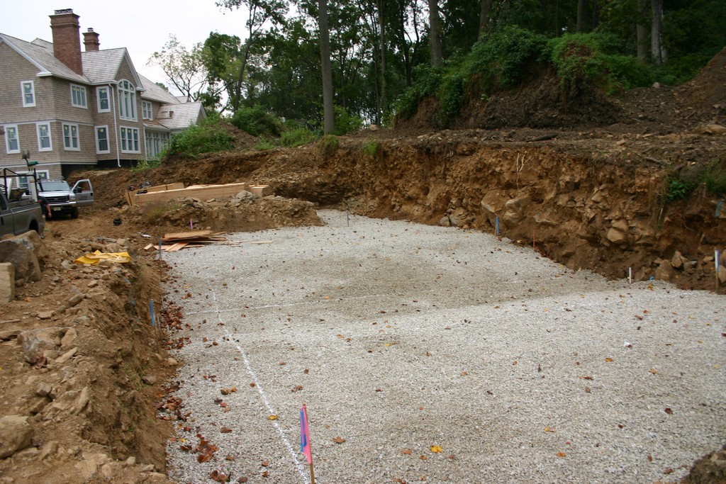
There was also a specific challenge posed by the topography, but even that turned out to be a significant design asset. The entire property slopes upward from the street to the back of the lot. The house and backyard area had been established by flattening a pad in the center, leaving a steep slope that rises as a wonderful backdrop from the back of the pad to the top of the property.
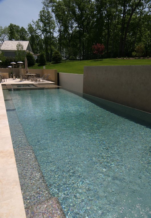
| The steep slope led us to use the back wall of the pool both for soil retention and as an unusual backdrop for a vanishing-edge effect. The complexity of the framing for that wall meant we had to shoot the dam wall for the vanishing edge in a second pass after the trough was complete. The trough itself extends past the edge wall in both directions, giving us the opportunity to light the entire span of the wall from below the water’s surface. |
The clients wanted a vanishing-edge pool, despite the fact that the slope eliminated the possibility of incorporating a distant view. But they would not be swayed from that idea, so we had to find a way to make it work.
We started by raising the pool out of the ground by 18 inches on the side closest to the house. This is how we would have handled the design in a more typical situation in which the far edge would fall away into a view, but in this case we elected to cut off the view by inserting a series of retaining walls on the far side, positioning them directly atop the outside wall of the vanishing-edge trough. These walls were to hold back the slope and would also enable us to increase the area of flat space we had available for use.
In visual terms, the idea was that the edge would appear to flow over against the walls – which, of course, would attract a great deal of attention and thus put a premium on making the walls worthy of scrutiny. To do so, we planned a system of staggered, offset, sectional walls that were to seem to float on air.
The design is loosely based on the expressive masterworks of legendary Mexican architects Luis Barragan and Ricardo Legorreta – both famous for designs featuring spectacular treatments of vertical planes. They’ve always been major influences for us at Liquid Design, but in this particular case, we shied away from their tendency to use daringly bright colors, instead deciding to work with earth tones as a first step toward softening the project’s modernist edges.
As envisioned, this system of modular retaining walls would become a sculptural statement and would, in effect, become the view we needed to make the vanishing-edge effect work visually. Moreover, an extension of the walls to one side of the pool would serve a completely practical purpose, serving as a privacy wall to conceal views into the yard from next door.
CAREFUL WEAVING
As a key part of the program, our clients also wanted a large outdoor entertainment/cooking/dining area to accommodate frequent gatherings of family, friends and business associates.
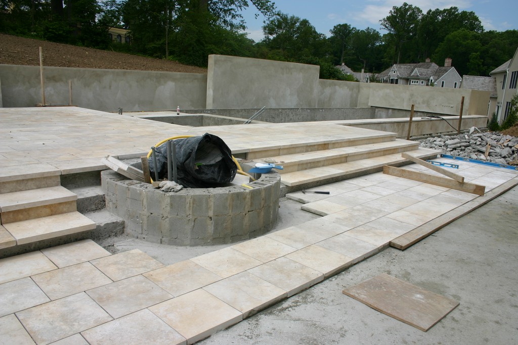
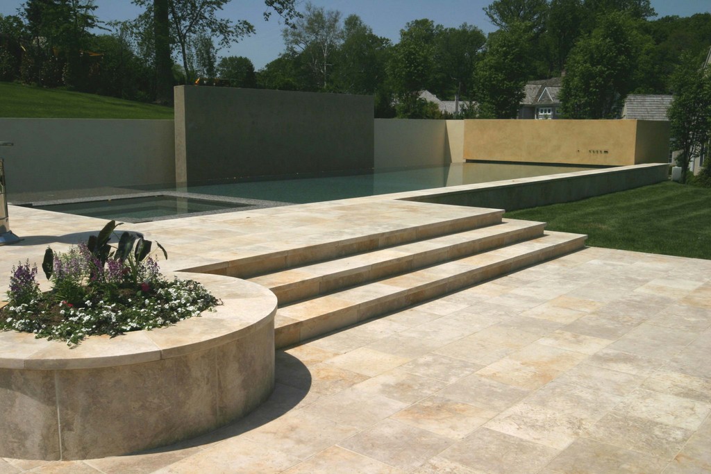
We set this area up on the opposite side of the pool from the privacy wall, establishing a large split-level deck with one level on grade with the house and the other flush with the top of the pool. These areas are connected by a set of broad steps, a circular planter and a barbecue area that serve as transitional points between levels.
The retaining-wall system extends nearly the full width of the property, so it reaches approximately 40 feet beyond the extent of the 60-foot-long, 20-foot-wide pool. To integrate the look, we extended the trough beyond the end of the pool along the far side of the upper-deck area – yet another variation on the typical approach to vanishing-edge designs.
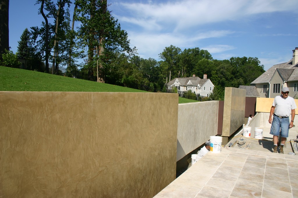
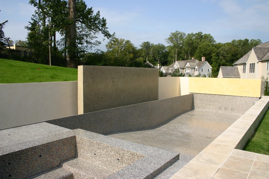
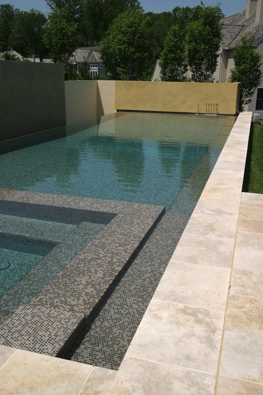
| Although they actually form a continuous barrier, the staggering of the walls and the small offsets we used where different panels meet give the impression that the walls are entirely separate from one another. In addition, the slight cantilever of the finished walls over the trough wall make it appear as though the wall sections are floating on the water. |
This extension enabled us to uplight the entire wall from fixtures placed in the trough below the waterline, thus creating a consistent impression along the full visible length of the wall. In shining up through the water, the light moves and appears to caress the wall’s surfaces – another measure we used to soften the modern appearance of the design with an eye-catching effect.
We placed a large spa inside the pool at the end next to the entertainment area, flanking it with a thermal ledge. At this same spot on the outside of the raised pool wall, a set of steps between the upper and lower decks extend some 20 feet along a portion of the side of the pool near the house.
All of this works to create both visual and “social” transitions between water and deck: Someone sitting in the spa or lounging on the thermal ledge can easily converse with those outside the water. Extending this social area, we ran a combination of steps and benches the full length of the pool so that those sitting in the water can engage in comfortable conversation with those who choose to stay dry.
As mentioned above, a circular planter and a barbecue area serve as additional visual transitions from level to level, weaving structures and spaces into a single composition. The interior designer took care of the barbecue structure and did a fine job (with the rest of the design team’s support) of integrating what can be highly intrusive elements into the overall design.
TRICKY FORMING
By far the most challenging aspect of construction had to do with the retaining walls.
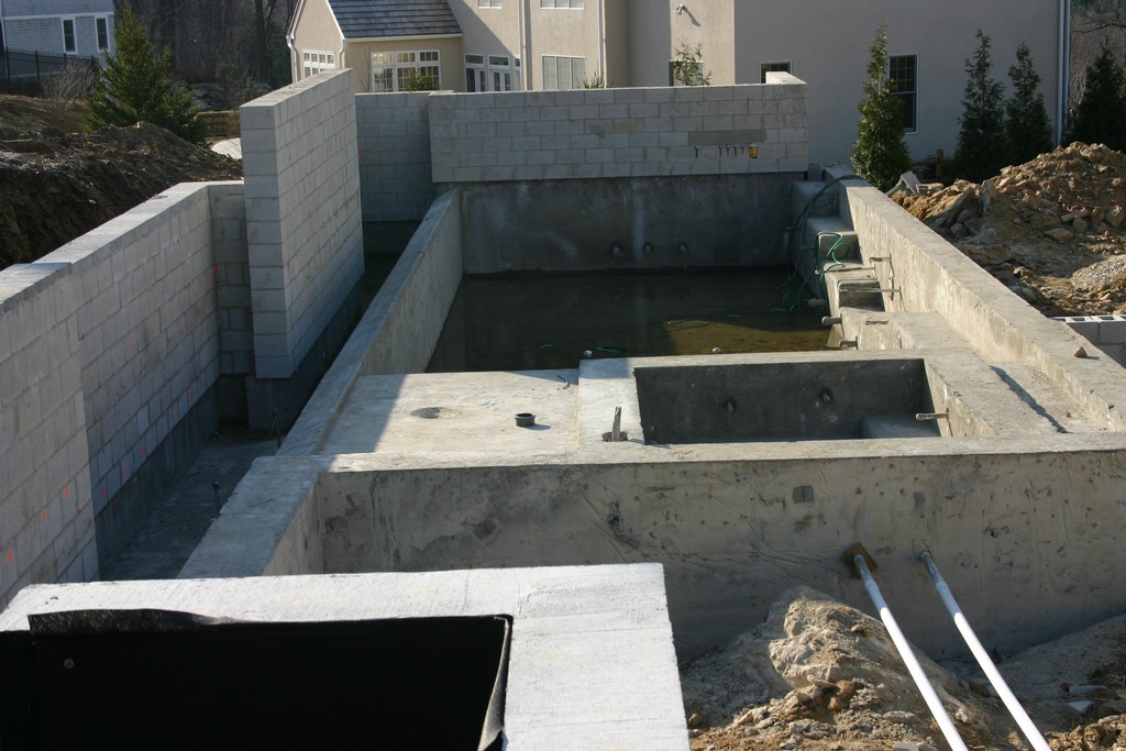
To support them, we shot the outside wall of the trough to a level two feet above the shallow section of the pool floor, then eventually tied the walls (which were to be made with concrete blocks) directly into the pool structure.
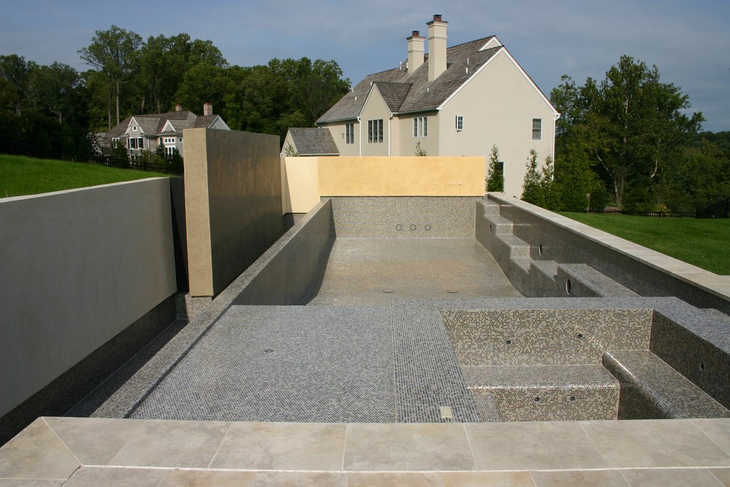
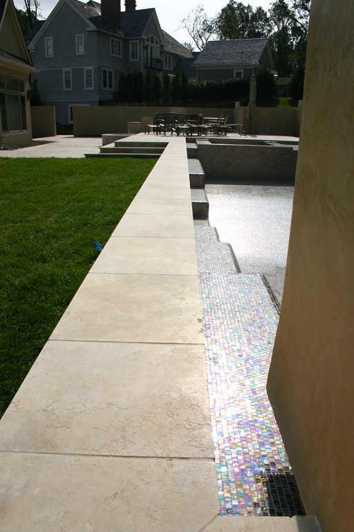
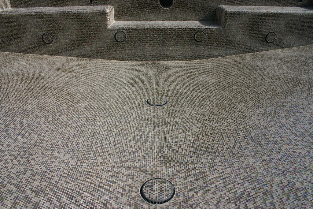
| The glass-tile blend chosen as the interior finish for the watershapes offers an excellent complement to the soft earth tones of the walls, coping and deck, but when the glass catches the light, the tile field reveals an inner iridescence that draws the eye right to the water. To minimize and visual compromises with that glistening finish, we not only finished drain covers and other penetrations with tile, but also aligned all of the grout lines for an obstruction-free look. |
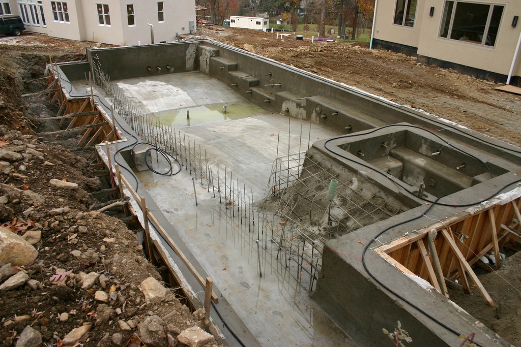
Because the trough is part of the pool’s monolithic structure, from an engineering standpoint, the entire pool now acts as a structural footing for the retaining walls. That may sound straightforward, but the walls were to be staggered in this case, which meant we had to prepare extremely complex forms to create the multiple right angles needed to make the system work visually.
This staggered design is one of three tricks we used to give the walls their floating-panel appearance. Also contributing to the effect is the fact that the small sections of wall that run perpendicular to the pool’s edge (while connecting the wall sections) are recessed several inches behind the end of each panel. We painted those hidden walls black, thereby creating an all-day shadow effect in the spaces between wall sections.
|
Modern All the Way Although the visual design of the project described in the accompanying text is a step back from true modernism, the equipment used to drive the watershapes (supplied through Hachik Distributors of Aston, Pa.) is strictly state of the art – all in keeping with the clients’ desire to have the very best components available to maximize energy efficiency, functionality and control. We placed the equipment area behind a set of walls beyond the large deck area. Even though the area is open to the air, the system is so unobtrusive that our clients and their guests are hardly aware of its presence: They can’t see it, of course, but it’s also so quiet it can barely be heard, even when everything is running. There are six pumps in all to run separate equipment sets and filtration systems for the spa and pool as well as the vanishing edge and the spouts that emerge from the privacy wall. All of the pumps are variable-speed-drive units from Pentair Water Pool & Spa (Sanford, N.C.) that have been programmed to maximize energy efficiency and reduce noise. Pentair also provided the latest incarnation of its IntelliTouch control system, which features touch screens inside the house as well as PDA remotes that can be used from just about anywhere around the property. The thoroughly modern equipment pad also includes multimedia filters produced by Sta-Rite (Delavan, Wis.) to create beautifully polished water heated by high-efficiency heaters from Jandy (Petaluma, Calif.). There’s also a saltwater chlorine system from AutoPilot (Fort Lauderdale, Fla.). — K.F. |
The clincher in forming the floating impression is the fact that the blocks comprising the walls are slightly cantilevered over the inside edge of the trough wall: Not only does this mask the transition between the pool’s glass-tile finish and the plaster of the wall, but it also creates a shadow line that seems to mark a physical separation between the wall and the structure below.
We established these offsets in accordance with the basic design principle that says whenever you have two flat surfaces coming together, they shouldn’t meet on exactly the same plane. Doing so hides the lines created by material transitions and adds a great deal of visual interest.
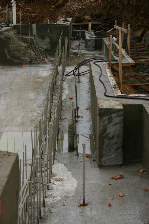
Our forming was complicated because we were working in solid bedrock: This meant we had to over-excavate and install a completely freestanding system of forms. Given of the complexity of those forms – and especially those on the trough wall – we decided to shoot the entire structure without the vanishing-edge dam wall. We stubbed out steel at that wall’s location, formed it once the gunite had set up, then came back, set the forms and steel for the dam wall and shot it in a second pass.
TAKING SHAPE
The pool itself is relatively shallow from end to end – three-and-a-half-feet deep by the spa and thermal ledge, gently sloping to five-and-a-half-feet deep at the center then rising to four-and-a-half-feet deep by the privacy wall.
All-shallow pools such as this one are unusual in the northeast, where the vast majority of clients still want a deep end. It’s our feeling (and a particular crusade of my partner’s, as he’s discussed many times in his columns and features in WaterShapes) that a deep end is more a convention than a necessity and really serves only those who want to dive – something that was not on these clients’ must-have list.
This lack of diving depth isn’t the only thing about this project that deviates from convention: Where the style we were using and the impressions we were making would typically call out for brightly colored, attention-grabbing walls in the spirit of Barragan and Legorreta, we chose instead to soften the overall look through careful selection of materials, finishes and, as mentioned above, colors.
| The finished project is distinctly modern and linear, but the hard edges have been considerably softened through careful selection of colors, materials, textures and finishes – precisely what the clients were after in their thoroughly transformed backyard. |
Starting inside the watershapes, we went with an all-glass-tile finish supplied by Sicis, an Italian manufacturer. My partner worked up several blends using three different types of tile and presented them to our clients on sample boards to help them visualize a range of possibilities. The blend they selected included mostly beiges and browns, with a few grape-purple pieces mixed into the blend.
The purple was crucial in this case, because we know from experience that when it interacts visually with those other colors and the blue sky, it ultimately gives the water’s surface a greenish tint. Moreover, these particular tiles have a beautiful iridescent quality that adds to the shimmering quality of the water’s surface.
Not wanting to disrupt this gorgeous tile finish with drain covers and fittings, we ordered custom-made anti-vortex drain covers finished with tile – all set up so their grout joints aligned precisely with the lines around them in the pool and spa. We also used colored, flush-mounted fittings for the return and suction lines and for the spa jets. The idea is that everything disappears into the tile surface, giving the inside of the pool an uninterrupted, uniform appearance.
FINE DETAILS
As various project elements came together, we found ourselves dealing simultaneously with a mountain of additional details that needed our attention.
The pool’s coping, decking and steps, for example, are a beautiful Greek Travertine that picks up the lighter side of our color palette with pale beige and cream colors. The coping and steps are heavy, two-inch-thick slabs for durability and visual weight, while the decking is thinner and was set in a simple offset pattern. The step treads are a generous 16 inches wide, lending an air of comfort and ease to the transition between deck levels.
|
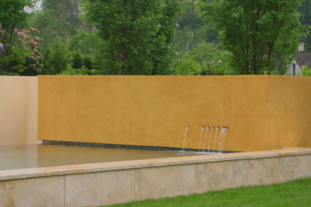
Special Effect One of the most distinctive details on this entire project takes the form of the subtle set of spillways located in the lower right corner of the privacy wall. These spouts were designed by my partner, David Tisherman, and take a form appropriately known as “Tishways.” In the project, he used a single, three-by-one-inch spillway flanked by five one-inch-square units to create the sort of asymmetrical balance found in many modernist designs. Each spout has it’s own fiberoptic lighting element to give the effect a softly colored glow at night. — K.F. |
The circular planter is also finished in Travertine. To avoid the jarring appearance of using straight pieces to create curves, we special-ordered radius-cut pieces for the vertical walls and the coping, achieving a refined look that would have been impossible to attain without a great deal of precision in installation.
Finally, the all-important retaining walls were finished in a special Venetian stucco that has a subtly mottled appearance as well as a rough texture that gives the walls something of an Old World feeling atypical of modernist designs. We also chose this texture because we knew how brilliantly the light would dance on the wall surfaces once the sun went down.
In the end, everyone on the design team (including the clients) were satisfied that the pool and entertainment areas hit all the right notes when it came to harmonizing the modernist looks of the interior and exterior spaces – all without clashing too profoundly with the home’s more traditional architecture.
In making everything work together, materials and colors were critical: They enabled us to soften the geometry of the pool and hardscape and find what the clients see as just the right balance between their design sensibilities and the prevailing tastes of their neighborhood.
Kevin Fleming is a partner with David Tisherman in Liquid Design of Cherry Hill, N.J. A 1991 graduate in landscape architecture from West Virginia University, he worked in residential landscape design, sales and project management for a New Jersey landscaping firm from 1991 until 1998, when he started the company’s swimming pool division and, in 2001, a new division aimed at providing design/build services for custom, high-end residential watershapes.


