Site-Specific Solutions
At our firm, we treat every project and every customer as if they’re one of a kind – which in truth they are.
And we’ve been lucky in developing a high-end clientele that, on the whole, is looking for something special: They enable us to treat each project as an individual work of art; at the same time, they challenge us to stretch our own abilities and increase the variety of design solutions we bring to the drafting table.
In many cases, this requires something of balancing act between what clients think they’re after and the practicalities of the site itself, the architecture of adjoining structures and the views of surrounding areas. For that reason, each of our projects at Leisure Living Pools of Frisco, Texas (a suburb of Dallas), is managed from start to finish by a designer who takes ownership and responsibility for the outcome.
In this article, we’ll look at three very different examples of projects designed by landscape architect Mike Farely where bringing all of these factors together in a single design required creativity – and an occasional willingness to bend the rules a bit to meet the specific challenges posed by each setting.
REVERSE EGO
Before we get into the projects, there’s an important point to cover – one that influences both the procedural realities and our overall design philosophy. It’s a concept we call “reverse ego.” What this means is that we go into a situation looking to assist in forming and executing the creative vision of the homeowners and/or their architect while applying the company’s 20 years of design and construction experience to the process.
On a practical level, this means that most of the design decisions are made by a committee that consists of our designer/project manager, the clients and possibly their architect, landscape architect or designer. We have meetings and discussions with the key players at the outset of the design process – and at every step of the way when a decision is made that significantly influences the end product. This requires a hands-on approach from our designer from start to finish. We build close personal relationships and work hard to keep the lines of communication as open as possible.
At the design desk, reverse ego means that we focus on the circumstances of the site and the desires of the clients and make it all work together. In this way, no two of our watershapes are ever the same, and there’s no way anyone can peg our company as having a certain, distinct “style.” This quality of what we do is so pronounced that when some people look at our portfolio, they’re often impressed to see that the same company has built pools that reflect so much stylistic diversity. For many clients, in fact, this range of possibilities comes as a pleasant (and appealing) surprise.
The fact that we work as part of a design team is not, however, to say that we don’t offer our own ideas. In most cases, in fact, the final designs are based either in part or wholly on our creative suggestions. The key here – and the reason for our desire to make sure our own egos don’t get in the way – is to develop ideas with our clients firmly in mind. In that sense, we get so deeply involved that we say that ours are the ideas our clients would have suggested if they had our experience.
And sometimes, it turns out that our clients are surprised at how smart they really are!
An Artful Split
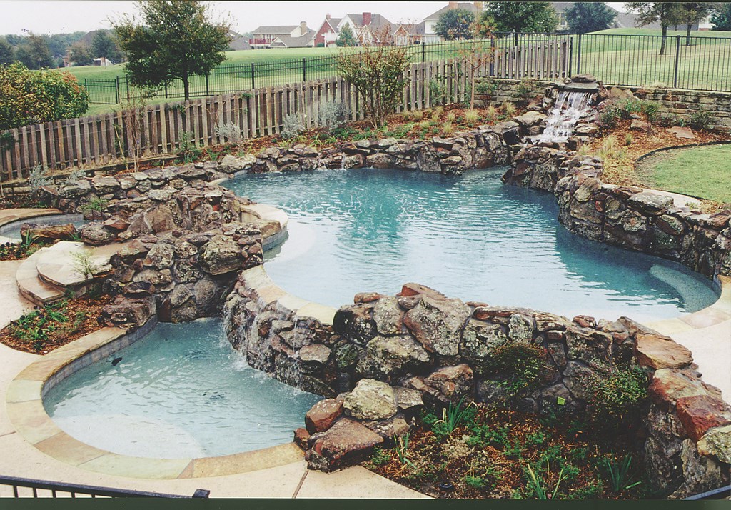
The Challenge: The first project we’ll discuss was installed with a beautiful custom home built adjacent to a private golf course. The back of the house is about six feet below the level of the course, and the yard stretches a modest 63 feet from the back of the house to the property line. The six feet in height transitions (we consider this a mountainside here in the flatlands of Texas) were initially handled with one three-foot retaining wall at the fence line and another three-foot wall 30 feet in from the fence that basically split the yard in half.
The homeowners wanted something different – something that would really impress visitors as they explored the property. They also said they wanted to be able to see portions of the pool from two specific points within the home, one on each side. Their wish list also included a large waterfeature and large patio areas for entertaining.
Stylistically, they were after a natural feel with rocks and plantings – but not necessarily with a full-blown duplication of nature that they thought would seem unrealistic. Finally, they wanted to take advantage of the views of the neighboring golf course, which was basically invisible from inside the home because of the elevation change.
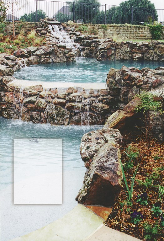
The Solution: In this case, we decided to use the six-foot change in elevation to full advantage. At the fence line, a rock waterfall now tumbles into a large, free-form pool that in turn spills into two lower pools over the existing retaining wall via a split vanishing-edge design that flows toward the house (rather than away from it, as is the case with most vanishing edges).
This terraced design enabled us raise the patios and walkways associated with the pool so that people standing or lounging next to the water would be able to see the golf course, thus expanding their views and giving the area a greater sense of openness. By splitting the vanishing edge and creating the two lower pools, we also were able to provide views from the two primary observation points within the home.
Turning the vanishing edge around in this way meant changing the usual approach to these edges, because we didn’t want to confront our clients daily with a monotonously smooth, uniform sheet-flow. Instead, we broke the continuity of the edge with irregular rockwork to provide a more interesting waterfall effect coming towards the home. (In fact, you really only see the vanishing edge effect from the golf course.) The ragged flow into the two lower pools also reinforces the effect of the rock waterfall at the back of the upper pool.
|
Making Adjustments We made a significant design change late in the project to one patio – the circular deck between the two lower pools. In the original design, this deck was on the same level as the main pool, the thought being that it would provide a sort of central, raised viewpoint. As we spent more time on site, however, it became obvious that this deck would be far too prominent as originally designed – too abrupt a change in elevation between the house and the pool. So we lowered it 18 inches to a point about halfway between the levels of the main upper pool and the lower catch basins. — T.M. |
Now from the two main interior observation points – one in the formal dining room, the other in the kitchen on the other end of the home – the upper pool appears to wrap around the house and move out of sight; in fact, you take in about half the space from each point, which invites the observer to move out into the space to walk the pathways and find out what’s going on in the rest of the yard.
And there’s much to take in: There are four separate patio areas around the pool on different levels, offering private areas for relaxing or conversation and offering a variety of viewpoints of the pools and their natural rockwork and landscaping.
A Secret Garden
The Challenge: Sometimes what your clients want and what makes sense for the site are entirely different things. This project offers an extreme example of this situation.
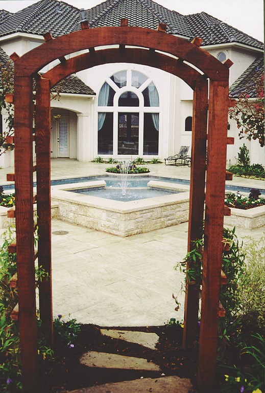
Here, the clients wanted two things in their small backyard: First, they were after a formal, architectural swimming pool to go with the geometric look and dramatic arched back window of their home – as well as decking and rockwork that would to pick up the elegant whites and cream colors. Second, they wanted their backyard to include a woodsy, natural fishpond that would serve as sort of a meditation garden. And all of this, of course, had to fit in a 60-by-60-foot space.
To be honest, we weren’t sure at first how we were going to pull this one off. But we proceeded to reverse our egos, accepted the fact that the clients had ideas we needed to accommodate and gave it our best shot.
The Solution: As we were considering how to put an architectural pool next to a naturalistic pond and make it all work together, it became obvious that we did have one thing in our favor: The line of sight from the focal-point arched window stretched at a perfect diagonal across the yard to the back corner. So we knew we could use the maximum distance to create two distinct exterior “rooms.”
Immediately, we knew that the pool would be in the foreground and that we’d somehow conceal the pond area and push it as far to the back as we could.
Our first design had a rectangular pool set diagonally in the yard. The space beyond the pool would be (somehow) disconnected from the pool and was to include the small pond in a garden setting. The clients didn’t like what they saw: They wanted a bigger pond and weren’t crazy about basic rectangular shape of the pool. So we went back to the drawing board.
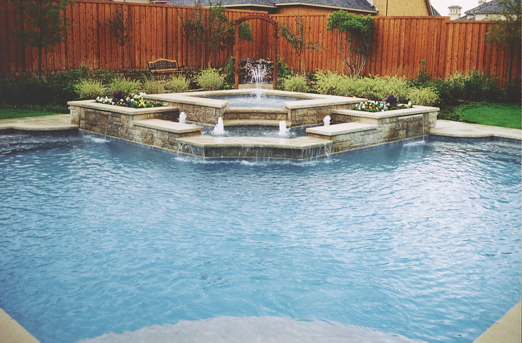
Before long, we’d come up with the current L-shaped pool design along with the raised spa/waterfeature structure on the far side. This new spa structure echoes the geometry of the pool and draws the eye toward the back of the pool by spilling into a small basin containing four vertical waterfeature jets. Sheet waterfalls in front of the waterfeature basin fall into the pool itself.
Once we hit on the basic pool/spa configuration, the rest began to fall into place. The circular planter in the foreground of the pool lines up with the raised spa structure. Directly behind that is a garden arch that separates the pool area from the pond beyond.
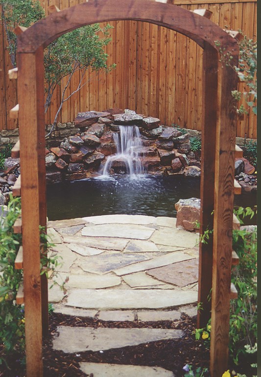
We used an arched pergola to echo the arched window on the home and also to provide a visual barrier directly behind the pool. (We’ve found that arches, pergolas and other, similar architectural transitions work well in situations where you want to separate areas, because they provide a distinct visual threshold that invites you to discover what’s on the other side.) Low hedges planted on both sides of the arch further separate the pond from the pool, while the raised spa, arch and plantings conspire to hide the low-lying pond in the back.
At first, our clients were cool to this design because they wanted to see the pond from inside the home. We convinced them, however, that the pond area offered anyone wandering in the yard a wonderful surprise. This made sense to them, so we moved forward.
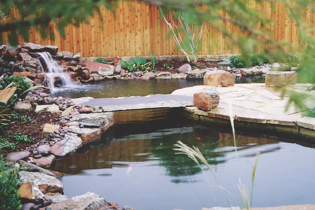
The transition to the pond is eased by the arch and, as important, by the flagstone decking, which we extended into the pond area to intersect with a crown of natural rock that surrounds the far side of the pond. The modest two-foot waterfall is located in the very back corner of the space, filling it with gentle sounds. A stone bridge (reinforced by a steel plate below) lets observers cross the pond at its narrowest point.
There’s not a lot of room around the pond, but we were able to provide space for plantings, narrow pathways and a bench.
Given the challenges of the site and the clients’ desires, this project came together remarkably well: These two distinctly different areas comfortably coexist despite the tight quarters.
A Daring Display
The Challenge: This project was built as part of the annual “Parade of Homes” event in Dallas. Each year, the local chapter of the National Association of Home Builders hires six to ten high-end architects and builders to create model homes in a selected neighborhood. When the work is finished, the public buys tickets for tours of the fully furnished and landscaped homes; all proceeds go to the Make-a-Wish Foundation.
The project seen here was part of the 2000 Parade of Homes. In September and October, more than 40,000 people came by.
All of these projects are true examples of partnering: Everything is decided by committee in order to create environments that are aesthetically consistent with the vision of the architect. In this case, the home has a Moroccan design motif with arches, tile roofs and lots of beautiful gold and cream colors throughout. This style, while common in other parts of the country, makes a bold statement in North Texas where it’s seldom seen. We felt that this gave us an opportunity to do something truly different and exciting.
The challenge we faced was to echo this architectural style in the backyard, a steeply sloped slice of ground measuring a cramped 68-by-30 feet. The homebuilder wanted something spectacular in this small space, with strong views from several interior points.
The problem was that no one location in the house overlooked the entire yard. Another challenge came by way of the fact that the property was located just above an extremely busy street that needed to be concealed from view – and its noise masked as well.
The Solution: The design we came up with involved a series of arches installed in front of a wall that effectively blocked out the view of the street. We started by building a retaining wall and raising the grade to level. Now the wall stands nine feet above the original grade – and a full twelve feet above the street on the other side. This creates an enclosed space inside which we created our Moroccan courtyard.
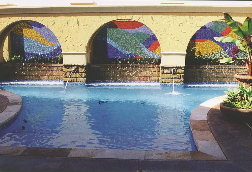
We used the sequence of three arches as a visual motif that could be seen from various points inside the home. During the design process, we became aware of the Florida Falls rainmaker fixtures (supplied by Polaris of San Marcos, Calif.) and decided to install them in our arches to add visual interest and blot out all but the loudest traffic noise.
In the recesses of the arches, we placed love seats where bathers could relax beneath or behind the sheeting droplets. Our original concept was to install tile backgrounds on the wall behind the two outer arches and to set up some sort of fire effect in the center arch.
The committee decided this was impractical, so we went with tile mosaics and landscaping that worked across all three spaces. The landscaping was included to soften the transition between the property wall and the arches. It also contributed to the effect of looking through the arches to a landscape beyond that was to be represented by the vivid tile mosaics.
At that time, a pair of local artists was making a small tiled table for the kitchen’s dining nook. We liked the look, so we asked them to create a similar pattern using the same shapes and colors behind our arches. Although the three resulting panels are separate, they now seem to flow into one another.
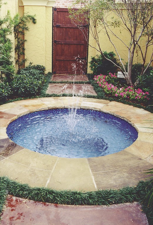
On one side of the fan-shaped pool we installed a barbecue; on the other, we set an all-tile circular spa. Lush plantings were distributed throughout the space, and we installed an oversized wooden door next to the spa; this door leads to the carport but suggests that something far more interesting lies beyond.
This setting is so intimate that it’s virtually impossible to capture the area in a single photograph. But as you move through the area, the effect of the gold stucco and landscaping – and especially of those three rainmaker arches with their beautiful tile backdrops – is really something to behold.
Tom Moneta is president of Leisure Living Pools, a high-end custom swimming pool design and construction firm based in Frisco, Texas. He founded the company with his wife Joyce in 1980, with the goal of emphasizing overall backyard designs that include decks, arbors and fences in addition to watershapes. The company has been recognized both nationally and locally with a variety of design awards: In 1998, the National Spa & Pool Institute gave the company its Technical/Engineering Achievement award. Moneta is currently a member of the national board for NSPI and is past chairman of its Builders Council. When this article was written, Mike Farley was one of Leisure Living Pools’ design/project managers. A landscape designer with more than 20 years of experience, he is currently a designer/project manager for Claffey Pools in Southlake, Texas. A graduate of Genesis 3’s Level I Design School, he holds a degree in landscape architecture from Texas Tech University and has worked as a watershaper in both California and Texas.


