Revisiting the Spillway

As much I enjoy seeing my own projects come to fruition, there’s something wonderful in seeing watershapers I know achieve great results in their work. I admire and encourage the effort, especially when the outstanding outcomes are the result of a professional’s concentrated efforts to improve his or her own skills.
This is one of the reasons I teach: I take great satisfaction in sharing my techniques, sensibilities and the conviction that what I do is special, a true form of art.
Sometimes I speak with former students – watershapers in their own rights – who have, as a consequence of what they’ve learned, completely reconsidered the nature of their businesses and redirected their approaches. Other times, I see smaller-scale improvements that result from modest gains in capability, such as zeroing in on a product I’ve discussed with them or a material they’ve added to their bags of tricks.
Recently, however, I had something of an epiphany about one of my favorite details – a realization that has led me to participate in the creation of a brand-new product that stands to add a truly tasteful dimension to what might be an otherwise ordinary project. Although working on product development for various manufacturers is something I’ve enjoyed doing in the past (including work on Jandy’s One Touch controller and RJE Technologies’ Sonar Guard safety system), this particular new gadget has me unusually excited because it can take so many watershapers to a new level of performance.
Ego aside, isn’t that what being a teacher all about?
BIG IDEAS, SMALL SPACES
I was recently referred to a project on New Jersey’s Long Beach Island, a beautiful beachfront setting to which a fairly sophisticated set of affluent people repairs to escape the heat and humidity of New Jersey summers.
The prospective client was an architect in the process of building a home for his family. He contacted my Liquid Design partner, Kevin Fleming, and brought us to a site where the plans included a small, L-shaped pool to be surrounded by a series of tall, broad walls.
It’s a traditional home with a nice variety of beautiful architectural touches, and the plans told me that the architect knew what he was doing. My confidence was reinforced when he admitted up front that he knew about building houses, but that swimming pools remained a mystery to him. He’d seen pools I’d designed and built, he said, and was willing to insist that Kevin and I were the watershapers he wanted for the job.
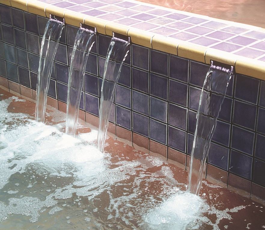
| These channeled spillways offer an elegant alternative to the standard surface weir featured on so many spas, entirely changing the visual impression while serving the same basic function. |
We had a lengthy design meeting with the family during which we focused mainly on what they wanted from the pool. It wasn’t to be deep or the focus of vigorous waterplay, just a place to cool off and perhaps swim some easy laps. In rough terms, what they seemed to want was a concrete hole flanked by walls and filled with water. Our mission was to take that basic idea, strike a lively visual chord and create something that was worthy of the home.
The first thing we talked about was materials. The color palette in which the architect was already working – lots of greens with off-white trim – opened a wide range of possibilities running from stone veneers or exposed aggregate to stucco or tile. When the architect’s mother said she wanted something “sparkly,” she helped us narrow our focus to the reflectivity of ultra-smooth plaster or glass tile. The door was opened to the ultimate choice: blends of rich and subtle green glass of the sort offered by Oceanside Glasstile of Carlsbad, Calif.
These discussions were complex, but eventually we were on track in our quest for a design that suited the setting. I also knew there were challenges ahead. For starters, the pool was positioned in a small space with walls rising on two sides of the shallow end with a vanishing edge at the end of the walls. The edge was to be surmounted by two of the columns that held up the home’s second story, and a third column was to be encapsulated within one of the walls. In other words, the job required an unusually critical degree of precision.
The more I considered the possibilities, however, the more I could see how this pool could be spectacular if we could light upon the right set of visual details.
EUREKA!
The walls had some dramatic potential, growing as they did above the sides of the pool, but the look had to be softened and integrated in some way. The standard approach would have been a wet wall, while a better approach might have been to mount a straight-edged weir in one of the walls – but both of those ideas lacked imagination. Instead, I decided to repurpose one of my favorite spa details and use the walls to lend movement, sound and visual impact to the composition while breaking down the starkly perpendicular relationship between the walls and the water.
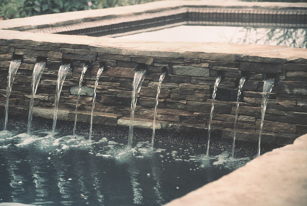
| A range of materials can be used to set off the spillway spouts. In this case, stone does the job; I’ve also used ceramic and glass tile to wonderful effect in framing this detail. |
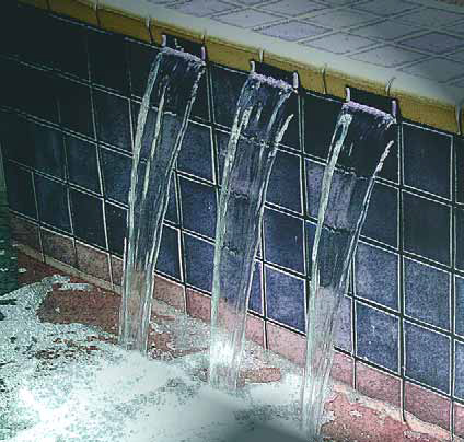
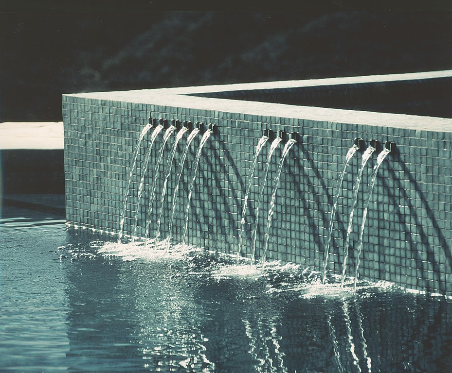
Some time ago, my friend and fellow watershaper Paul Benedetti started calling this spillway detail “Tishways.” I’ve focused on this approach many times in these pages going back to the very first project I ever published in WaterShapes: It’s about shaping a visually simple set of channels in a spa’s dam wall to create delicate flows of water that pour out into the pool rather than dribbling over a spillway and down the wall.
It’s among my all-time favorite details, but appearances are deceiving and the effect is actually harder to achieve than one might think because of its advanced hydraulic design, difficult and expensive construction techniques and rigorous finish standards.
In this case, I thought, why not put a series of Tishways in one of the walls to spill into the pool? This seemed a good solution for a couple of key reasons. First of all, in a pool so small a more vigorous flow of water across a long weir would very likely visually overpower the whole composition. In addition, a larger effect would cause turbulence that would disrupt the vanishing-edge effect, and the sound would also reverberate way too much in the small, enclosed space.
| The spillway openings don’t always need to be one-inch squares. In this case, they’re all wider than that, and in others, I’ve used sets of wide and narrow outlets to achieve visual balance. |
The idea of having a series of small, carefully spaced and visually balanced spillways send small streams from the wall into the pool soon took shape as a means of adding the visual and aural delights of moving water to the project in an intriguing way that was properly scaled to the setting. My thought was to position the spouts no more than 12 inches above the waterline to create a soft, subtle effect.
That was all great, but never before had I installed Tishways in a wall. It wasn’t exactly a matter of reinventing the wheel, however, and I soon came to see it as an opportunity to improve on what I immodestly think is a darned good idea.
The more I thought about how to do it, I kept coming back to the idea that these simple spillways really should be available as an off-the-shelf fixture that could be adapted to almost any two-level water effect, existing or new. After all, there are lots of waterfall and fountain fixtures available to create a range of effects, but nowhere to date has there been a fixture that gives you these small spillways in various widths and configurations.
IN THE PIPELINE
I weighed the idea for a while and soon called David White of OreQ (Temecula, Calif.), the company that manufactures and sells the Custom Cascades line of water effects. He had worked with me before, most notably on the beautiful scalloped weirs I used on the acclaimed (or notorious?) “Red Pool.”
I told David that I wanted to talk to him about a product that might be good for the industry and shortly thereafter met with OreQ’s Jeff Hetzner and David about making Tishways available to watershapers everywhere.
They quickly let me know that they already had a product that, with some refinement, could do the job. We soon began talking turkey about a fixture with enough flexibility to insert any number of runnels in dam walls at least five inches thick. The front side of the system breaks slightly past the plane of the vertical wall to send streams of water out into the pool; the back side has a tray that receives whatever finish material is being used on the inside face of the spa – pebbles, plaster or tile – so there’s no visual disruption inside the spa itself.
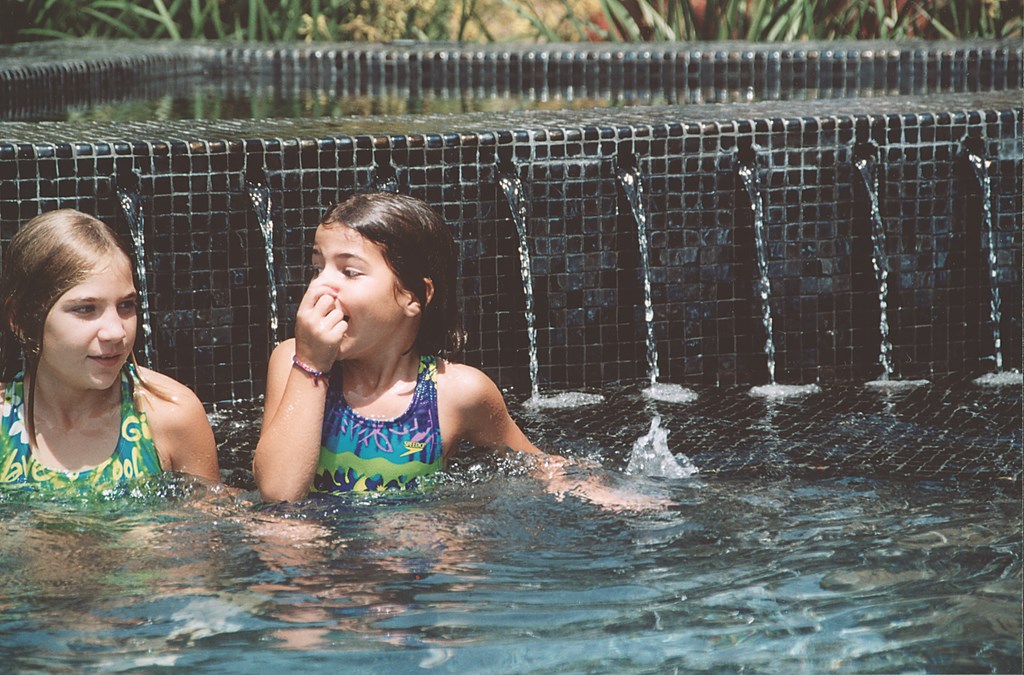
| Whether they’re in or out of the water, both clients and kids (Casey at left and Madison on the right in this case) love this spillway detail for its aesthetics, its sounds and its visual energy. |
The idea was to create something that would be very simple to install: All that would be required is setting and leveling the fixture and establishing proper hydraulics in the spa to avoid turbulence that would disturb smooth flows to the runnels. We discussed standard models as well as the potential for custom configurations. We also discussed a different sort of application: a custom and more complicated system for architectural walls, as in my current project, rigged with a multiple-port box that would accept water lines and fiberoptics.
As is the case with anyone who has participated in the development of a new product, I’d love to see Tishways take off and gain acceptance in the marketplace. But swing back with me to the sentiment with which I opened this column: It’s more important to me as a teacher to make ideas accessible to those who are ready and willing to apply them.
More than anything else, I’d like to give designers and builders an alternative to the ordinary, flat-weir spillways found in countless backyards across the country and a simple way to bring beauty and visual balance to their designs and projects. That’s a major point for me: Our clients spend a lot more time looking at our work from outside the water than they’ll ever spend in it, so taking advantage of opportunities to enhance visual and aural aesthetics is always the right thing to do.
Even in a purely practical sense, these fixtures prevent formation of the familiar patches of calcium that build up on dam walls within a short time of completion: These spillways effectively push the water away from the wall, so scale isn’t an issue.
I’m a firm believer that, as designers, it’s not our role to reinvent the wheel. What we’re after is ways to refine what’s already there, and even if I had no part at all in coming up with this concept or turning it into a product, I think of it as a neat arrow for any designer’s quiver.
David Tisherman is the principal in two design/construction firms: David Tisherman’s Visuals of Manhattan Beach, Calif., and Liquid Design of Cherry Hill, N.J. He can be reached at tisherman@verizon.net. He is also an instructor for Artistic Resources & Training (ART); for information on ART’s classes, visit www.theartofwater.com.


