Revealing Elegance

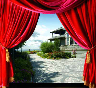
It often happens that the way people enter a space has everything to do with the way they experience it and come to regard its overall design.
This was much on my mind as we concluded our work on the Long Beach Island project I’ve discussed in my last few “Details.” By orchestrating access and movement toward the backyard/pool area, we developed a string of transitions that lend a sense of surprise and delight to those entering a beautifully designed and constructed space that literally seems like a world apart.
As discussed in previous columns, the backyard features a swimming pool set up as a reflecting pond that augments rather than distracts from the architecture of the house and its environs. Indeed, we intentionally designed the exterior spaces to mirror and extend the feelings conjured by home’s interior, with its handmade tile, beautiful wood veneers, lovely windows, eclectic furnishings, elegant artworks and a range of other personal touches too numerous to list.
Every move we made outside was inspired by the impression gained inside that a new discovery awaits around every corner. In that context, and despite the fact my recent columns have focused entirely on the pool, the watershape is a complementary feature – a supporting character rather than the star of the show.
DECKED IN
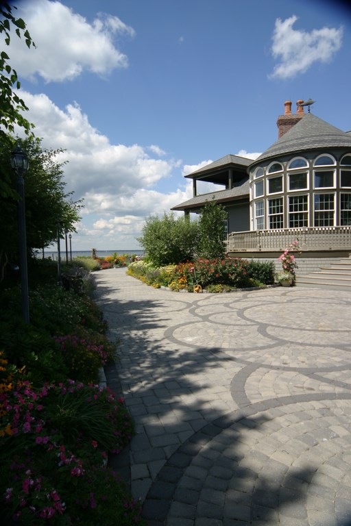
As mentioned previously, the backyard decks are finished in Lompoc stone, a material that offers subtle hues of oatmeal, gray, beige and buff with subtle blue veining. These decks are meant to be formal, but they are elegant, soft and subtle as well – almost feminine in tone.
There are also terraced planters that enclose various spots around the deck, all of them finished in a ledger pattern of the same Lompoc stone. The totality of this stonework forges soft transitions across the planted/softscape areas and up to the wooden deck that encircles the home. Throughout are inviting seating areas, places for umbrellas and a variety of step treatments, all acting as subtle appointments for superbly elegant surroundings.
The challenge we faced in organizing these areas had to do with managing the way visitors would transition from the driveway area and the home’s front door in moving toward the backyard. We knew from the start that we wanted to have those who happened to bypass the transforming experience of the home’s interior undergo a similar process in approaching from the side.
That side approach is accessed from a 150-foot-long driveway surfaced in the cheap, interlocking pavers you find just about everywhere in the northeast these days. They may be easy to install, but I don’t care for them at all, especially not in the multicolored-fish-scale patterns that seems so popular. But despite their hideousness, we have to live with them because the driveway is huge and shared with a neighbor.
| The pavers that wrap around the side of the house are of the same sort we removed without hesitation in the backyard around the pool, but that wasn’t an option here. To minimize their negative visual effect, we’ve developed a program that will turn the approach to the pool into a voyage of unfolding discoveries that will set the stage for a unique experience beyond. |
This was, by the way, the same material and pattern that originally surrounded the pool (see page 26 in the May 2006 issue): Where we had control, we had no hesitation in removing the pavers – and I have to say that even the bare dirt we found underneath was more appealing.
Given the fact that the driveway was there to stay, we faced a real challenge in figuring out how to take someone entering the property beyond that sort of sterile hardscape treatment and quickly transport them into an entirely different realm of beauty and elegance. And we’re talking clinical here: Visitors pass an electric gate and move along to a garage on the right and the front entry to the left, and we needed to pull them past this visual wasteland to get them to the backyard.
GATE SOLUTION
The solution will involve setting up visual barriers and creating a new corridor that leads visitors down the side of the house and invites them to move into an area that will be separate from everything around it.
The entry to the corridor is to be marked by a pair of planters that will gracefully sweep up to pilasters that will bracket an iron gate. (We’ll go with planters here in preference to any other structure in order to comply with permeable-surface requirements set down by local building codes.)
The gates, which will look like the entrance to an enchanted castle, will be fabricated by a wrought-iron specialist from California (another sort of craftsperson we couldn’t find locally). The two panels will span seven and a half feet but will rise to a height of just six and a half feet – a manipulation of proportions that will make them seem less imposing. They’ll have a curving, filigree pattern with an arch that splits down the middle, and the plan is to have them stand open all the time – a thoroughly whimsical and welcoming artistic statement.
Our plan also includes letting them rust and oxidize in the ocean air and develop a weathered patina that eventually will make them look like they’d been there since the home was first built years and years earlier.
The key here is that the openwork gates will constitute a transparent visual barrier that invites visitors to approach and pass. The walls on either side will be low and engaging rather than repellent, exploiting the natural tendency we all have to approach and look beyond an open barrier before moving on. In other words, it may be a barrier, but it will be an invitation as well.
Three feet or so in front of the gate, the deck material will change from the driveway’s pavers to the Lompoc stone, sharply indicating a transition. (It’s worth pointing out here that the corridor beyond the gate could be accessed by simply walking around the planters instead of passing through the gate. The fact that it will not be a functional barrier adds to the sense of fun in the space.)
Beyond the gate, the pathway slopes up gently, leading first to a the steps on the right that rise to the front door, then moving beyond a formal landing to a set of large Lompoc-stone stepping pads.
A SECRET PLACE
In direct line with these pads is a small “secret garden” that leads the eye to a point well to the left of the main portion of the backyard and the swimming pool.
This garden is still under construction, but eventually it will include some sort of fountain or sculpture that will control the view as visitors move up the pathway. There will also be distressed-concrete benches, a series of planters and a meandering dry streambed that will wrap around an area to be paved with a tumbled green Colorado stone – or perhaps some other material that suits the final color scheme.
So now, instead of confronting an ugly driveway and a choice between the garage and the front door, visitors who make it onto the property are invited through a whimsical wrought-iron gate along a special path that draws them up into a secret garden. Only when they reach the top of the trail will they turn to the right and see the full backyard, the swimming pool to the left and the ocean beyond – a beautiful and surprising chain of revelations.
That sense of an unfolding is what our approach to this space was all about. Visitors have the sense that good things await them at every fresh step as they move further into the space. Only when the journey is over does the pool come into view – and by that point, it’s only part of a glorious overall composition.
Coming soon: A pictorial feature that wraps up this entire project, now complete.
David Tisherman is the principal in two design/construction firms: David Tisherman’s Visuals of Manhattan Beach, Calif., and Liquid Design of Cherry Hill, N.J. He can be reached at [email protected]. He is also an instructor for Artistic Resources & Training (ART); for information on ART’s classes, visit www.theartofwater.com.


