Rendering a Visual Assist

Long before the Bobcats show up, most watershape designers will have used some sort of two-dimensional artwork to excavate their customers’ imaginations. Perhaps it starts with old photographs in a portfolio, but it almost always ends up with new drawings that encourage precise, detailed communication between designer and client in a way that can never be fully achieved with verbal descriptions or written proposals.
If done with appropriate detail and skill, a drawing gives designer and client the opportunity to explore the size and shape of the vessel, its location on the property, the materials to be used on the job and the natural elements of the landscape surrounding it. If that vision is fully articulated and realized in drawn form, then the clients are better disposed to invest in the concept, both emotionally and financially: They can zero in on details, offer suggestions for changes, weigh the relative value of options and truly get involved in the process of developing what is, after all, their watershape.
These drawings come in all shapes, scales and sizes, from basic line art to full-color illustrations – that is, from simple plot plans to elaborate, fully realized renderings.
Lots of pool designs begin and end with flat plot plans of varying degrees of quality and detail. But where the budget warrants it, a growing number of watershapers are encouraging their clients to invest (or are investing themselves) in full-color renderings. Some are done by the designer, others by graphic artists hired to create the desired image. Whatever the source, the value of renderings is in inspiring clients and helping them visualize.
AN EXTRA DIMENSION
Right up front, I want to establish an important distinction between basic site plans and rendering.
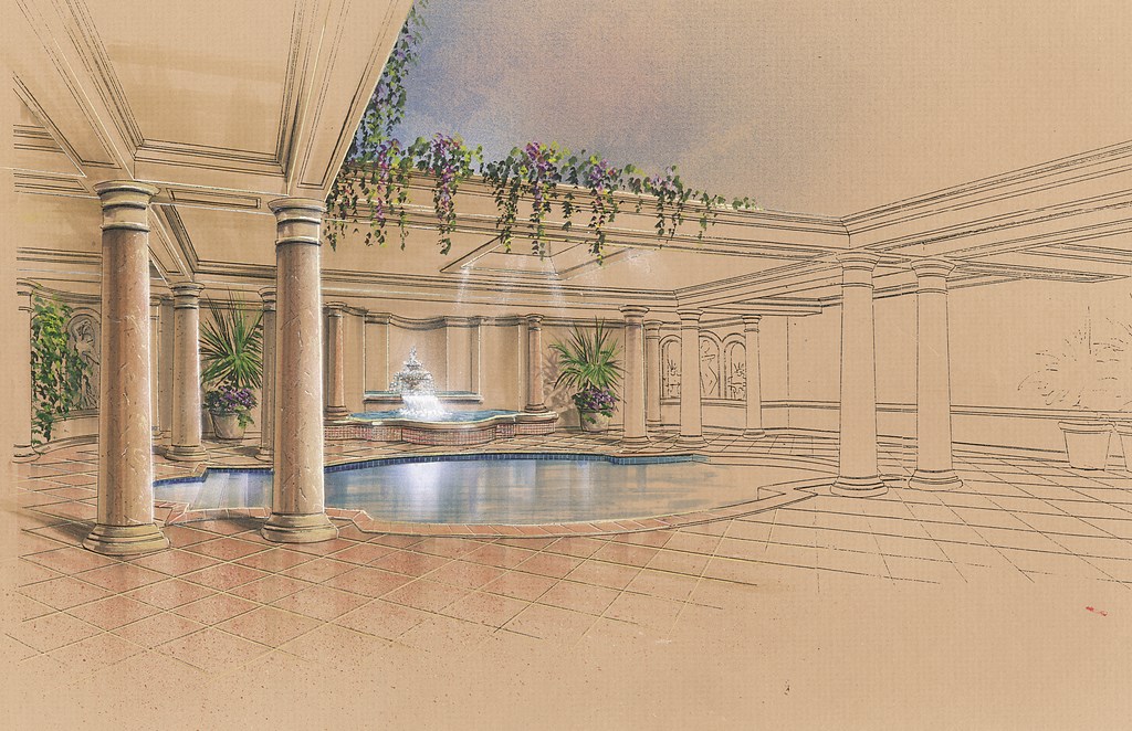
A rendering is a representation in full color of a convincing three-dimensional space – an image on a flat, two-dimensional piece of paper that offers the viewer a well-realized 3-D impression. As such, renderings of the sort seen with this article offer site-line perspective, depth and, often, a subtle interplay of light and shadow.
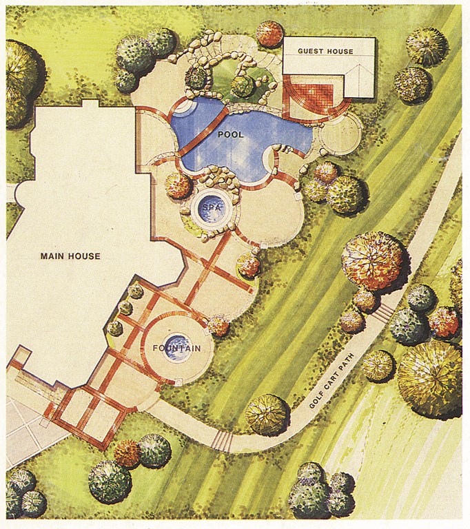
By contrast, site plans or color boards offer a two-dimensional, bird’s-eye view of the property and its features (Figure 1). Such a drawing can be of high quality, but it carries no sense of perspective, no sense of what it really will be like to stand in the yard next to the pool, spa or waterfeature. And rarely do these images yield any significant information about materials or how the project hangs together.
| Figure 1: Not all plot plans are created equal. This full-color, detailed version, for example, gives the prospective buyer a good sense of the lay of the land. But even so, its bird’s-eye perspective limits its utility in getting clients to visualize the space as they will usually see it. |
That’s not to say that all 3-D renderings are works of art packed with incredible amounts of detail. Many are done using simple line-drawing techniques, but some carry huge amounts of detail, color and texture. Ultimately, the most significant difference between a rendering and a site plan is that the former puts you in the location, often at eye level, seeing the work as you would when it’s finished – something basic, bird’s-eye-view site plans cannot do.
In my ten years as a graphic artist, I’ve rendered many pools and other watershapes, and I’ve come to believe that the magic is not only in the communicating power of perspective, but also in the watershapes and the materials and textures that go into them. They let us see concrete, granite, limestone and ceramic tiles of all colors, patterns and reflective sheens. They bring us grass, trees, flowering plants, shrubs and hedges of all kinds. And, of course, we see the water.
|
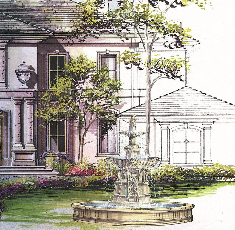
Artistic Degrees As demonstrated by the composite image shown on the opening pages of this article and by the one shown here, renderings are developed and offered to customers in three general categories: as “loose line drawings,” as “tight sketches” or as “full renderings.” These modes can be employed to suit the customer’s budget and expectations. In each case, however, the value of handmade work is evident in the warmth, subtlety and dimensionality of all three stages. That dimensionality is their common bond: The effect is eye-catching and captures clients’ imaginations. To get these sorts of illustrations, you need either to be a competent artist or know where to find one to do the work for you. A true professional artist will be able to accommodate a range of budgets and project sizes, both commercial and residential, and will respond to the needs of the client in terms of size and sophistication of the drawing. Size is indeed a factor: You’ll find, for instance, that residential customers simply don’t require large renderings of the sort a commercial developer might need for a boardroom presentation. With that smaller size comes quicker work – and more affordable artists’ fees. — C.W. |
In representing these elements, the designer or graphic artist can influence the observer’s perceptions by choosing to highlight one or more areas and make them brighter in relation to the other materials, thus emphasizing either their importance or beauty. Or these materials can be only suggested with a touch of texture or color, leaving the overall contours and setting of the watershape as the dominating element.
However the artist manipulates the image, a rendering enables the client to see how the materials and the design work together. As mentioned above, this may lead to changes, additions or other products of inspiration. Obviously, it’s far easier to change a 2-D plot plan, and making changes to renderings takes time and money. But on a project with a good budget, it’s far easier to negotiate changes on a quality rendering than it is on site.
That may be an obvious point, but it’s also an important one in that it speaks to the power of a rendering to define and shape and refine a client’s vision and expectations.
SLEIGHT OF HAND
In all of this, of course, I reveal my bias as a graphic artist and as a hired gun. But despite the fact that I do better financially when detailed renderings are called for, I can’t help thinking that a three-dimensional rendering’s capacity to communicate so far exceeds that of any two-dimensional sketch or drawing that it makes sense to go that way – particularly if the project warrants it.
I also tend to think that hand renderings are superior to anything you can get out of a computer. Neither nature nor handwork is perfect – and the world is full of imperfections that are inevitably excised from computer-generated images. Water is not uniformly blue, nor is the sky an even gradation of color, but those simple facts are beyond recognition of most of today’s CAD programs and the computers that run them.
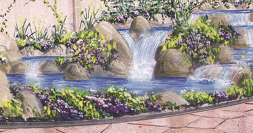
Let’s consider water for a moment: Think of the fact that it is constantly moving, that it is translucent in some areas and reflective in others, that the sunlight makes it sparkle in some places and fade to indigo in others. Think about the foam at the base of a waterfall or in a spa – or about water rolling over a rock, as in Figure 2. With careful application of just a few rendering skills, the water becomes far more engaging, more textured, more interesting. Without these qualities, it appears stiff and unnatural – strictly two-dimensional and flat.
| Figure 2: The artist’s ability to capture a sense of motion and play of light in water is crucial to the success of watershape renderings, especially when it comes to applying drawing skills to such details as water running over rocks. |
When you study drawing, you learn that creating these effects in everything from water to plantings and surfaces requires relatively little time – especially when weighed against the value that customers are likely to place on a quality rendering. In the hands of qualified artist, a few small touches of texture and light can go along way. And when applied in a detailed, full-color rendering, the effect can be dazzling.
Another advantage that comes with a living, breathing artist is his or her ability to appropriately embellish drawings, particularly the landscape elements. No freshly planted landscape is as full and lush when it’s first planted as it will be eventually: The artist can look a season or two into the future (or further even) and size the plantings accordingly.
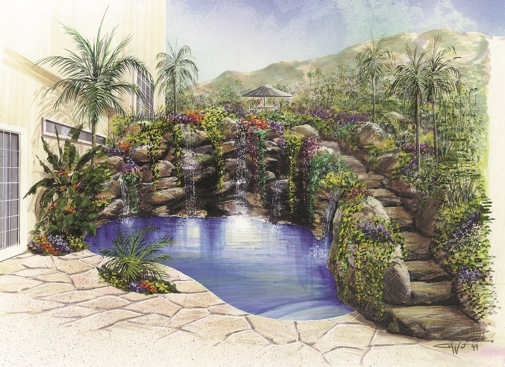
An example of how these elements come together can be seen in Figure 3, a rendering I did for Don Goldstone, a pool designer/builder based in Beverly Hills, Calif.
| Figure 3: A full-tilt rendering is more than a photograph: It’s an artist’s interpretation of the scene and is filled with highlights, hot spots and gradations of shadings and values that lead the clients’ eyes where the designer wants them to focus – in this case, on the watershape and its rockwork. |
Here, I incorporated the existing home and its architecture as well as elements of the surrounding property to give the owner a sense of the scale of the pool and its relationship to the house. Let me use this image to explain how the rendering process works.
ANATOMY OF A RENDERING
In this case, I wanted to attract most of the attention to the pool itself, so I kept the center of the drawing light by adding a white spray of an airbrush to create a focal point, or a “hot spot” as artists call it. Beyond that focal point, I applied the standard drawing formula: For every change of plane, there should be a change of value in terms of brightness, color, texture or tone. I also settled on a single light source and used it to set shadows on all of the rocks and structural elements.
|
On Your Own It is possible to do your own drawings and renderings. Indeed, some builders use their ability to draw as a way to make more money with their design work and take a good fee away from a project even if another builder gets the nod to do the installation work. As you work with your skills, you’ll find more and more ways that these images take on value for you and your clients. With so much money involved in the purchase of a high-end, custom watershape – and so much riding on the customer’s perception of the end result – it only makes sense to develop and adjust the project up front on the affordable and disposable media of ink, paper, vellum and/or blueprint paper. Ultimately, it behooves both customer and contractor to view the rendering process a critical trial run for the concept. That way, when the bulldozers and backhoes arrive, all parties are reasonably certain the groundbreaking will be the beginning of a dream that will inevitably come true. – C.W. |
Notice that the birds of paradise in the foreground are painted using lighter colors in areas facing the light source and darker in areas away from the light source. This sort of highlighting is also used to define the edges of the steps, individual stones, the waterlines and other details. Small trees, faint in color, are painted in a softened background to create a sense of depth.
In terms of overall composition, the linear elements of the home and the stairs serve to pull the viewer’s eye toward the pool – an urge compounded by the hot spot. This centering effect is enhanced by the curving limbs of the plants I’ve used to frame the area.
My starting point for this drawing was a plot plan given to me by the designer. Doing the 3-D rendering would have been impossible without two key steps: First, I visited the site to get the lay of the land, a sense of its light patterns and color saturation and a sense of context. Second, I drew on my knowledge of other projects by this designer to get a sense of elevations, plantings and his capabilities and strengths as a builder.
|
Hired Hands When you employ the services of a graphic artist, it’s crucial to work with someone who understands the nature of your work. Accurately rendering the qualities most important to you and your clients requires first of all that the artist understand that every architect, designer or builder has a different style. For example, the builder who asked me to do the rendering seen as Figure 3 on page 70 in the accompanying text is well known for waterfalls, rock formations and tropical looks. Not only does this mean that as the artist I have to be good at rendering rocks, it also means that I’ll choose an eye-level perspective that establishes and highlights the rockwork and plantings in context of the entire space. For designers who include a variety of specialized design features in their work, I’ll often be asked to isolate specific elements of the work in a separate “detail” drawing. Vanishing edges, fountains, spillway treatments, edge treatments, decking details, steps and elevation transitions are just a few of the elements that can be pulled out for an isolated “mini-rendering.” So how do you find and hire a graphic artist with the skills you need? It can be trickier than it seems, but a good place to start is with local architects who generate or commission lots of this kind of work. Once you have a candidate, look at experience and education – and spend lots of time with his or her portfolio. Take your time and take away as honest an impression as you can of the caliber of the work. Look for skillful and appropriate use of perspective and focal points, defined shading and highlighting and overall composition. Look for competent communication of texture and detail. Look at the way changes of flat planes are expressed as changes of value and emphasis. Ultimately, it’s a subjective decision and a matter of how the work strikes you. It’s generally safe to say, however, that if you like an artist’s work, chances are pretty good that your clients will like it, too. — C.W. |
Make no mistake: This is an imaginary setting, no more than a collection of shapes on a flat piece of paper that have been pulled up to three dimensions. The important point to make here is that the collected shapes are based on the designer’s style and accurately reflect his construction techniques and preferences when it comes to plantings.
My visit to the site and familiarity with his work gave me the information I needed to “translate” a flat plot plan into a rendering in which all of this visual information works together in a detailed, colorful composition that has a distinct focal point, depth and accurate perspective. By intent, the continuity of these elements serves to generate an impression that speaks volumes to clients.
VISION TO REALITY
Is this exercise necessary for every backyard project? Certainly not, but in cases where the designer needs to completely master the variables, a rendering of this sort has value in advancing discussions and in helping clients visualize the potential locked up in their property. It’s a tool – and can be a critical one in cases where budgets ride high and expectations ride even higher.
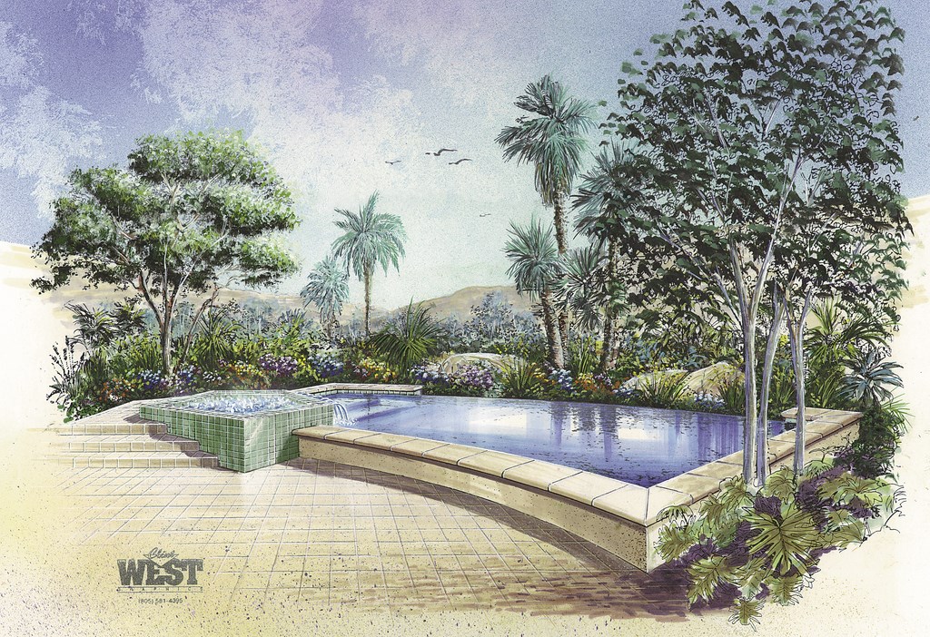
The project seen in Figure 3 (above) has yet to be built. The image seen in Figure 4 has been, however, and should be familiar to readers of WaterShapes as the pool David Tisherman designed, built and described in detail in the magazine’s October 1999 issue (see “A Gem from Every Angle,” page 52).
| Figure 4: This project is now complete, and the thing that impresses me most isn’t so much the literal truth of the rendering, but rather the way it captured the spirit and flavor of the beautiful finished product months before it became a reality. |
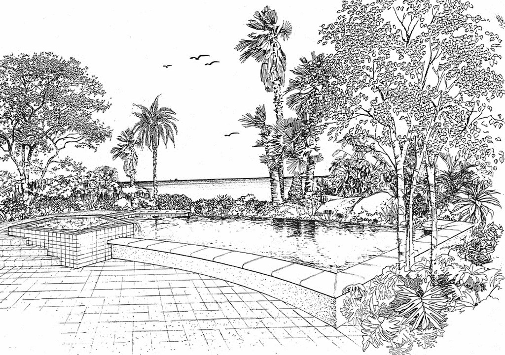
This, too, started out as a flat plan, then became the pen-and-ink drawing seen as Figure 5 before I took out my paints, markers and airbrush and spent a little extra time making it a rendering fit to show the client in a formal (and ultimately successful) presentation.
| Figure 5: It takes quite a bit of effort to translate a plot plan into a three-dimensional rendering – and even more time and skill to take a pen-and-ink drawing and transform it into the full-color image seen in Figure 4. Both are evocative, but for the right client, why not take it all the way? |
It was time well spent, I think – and doubly satisfying to me because the finished pool and spa so closely resemble the rendering. That’s when the work gets satisfying.
Clint West owns and operates Clint West Graphics in Simi Valley, Calif. He has worked as a graphic artist and illustrator for more than 12 years, after studying design and rendering at the University of California at Los Angeles and architectural rendering and design at the Art Center College of Design in Pasadena. An instructor for the Genesis 3 Design School, West specializes in interior and exterior architectural renderings and has worked with numerous watershape designers. Leah Canon is a free-lance writer based in Encino, Calif.


