Rendered Vision

In this day and age, designers have a variety of ways to communicate their ideas to clients – hand drawings, models and computer imagery among them. We also know every client is unique and that each has his or her own way of absorbing information and processing concepts. Although there are some who never fully understand a designer’s vision until a project’s been built, most clients will accept one style of design presentation or another and in some way visualize what’s happening.
In the project we’re currently engaged in with an historic Spanish Colonial Revival home in Orange County, Calif., however, we at Holdenwater, a design firm based in Fullerton, Calif., have had to use four different methods to convey our ideas.
We’ve always dedicated ourselves to staying at the cutting edge when it comes to presentation strategies, but never before have we been compelled to use so many different media to make our case to a client. And since then we’ve had to keep on refining and reconveying those ideas over and over again as the process has moved forward.
In this case, we used not only old-school techniques including hand-rendered drawings and models made of clay and wood but also went high-tech, using computer-assisted drafting as well as three-dimensional, computer-generated renderings to present ideas and show these clients what we think they want. All four methods have their benefits and limitations – and in this instance, we found that we needed every single one of them to help our clients understand how their property would eventually appear.
REWORKING A CLASSIC
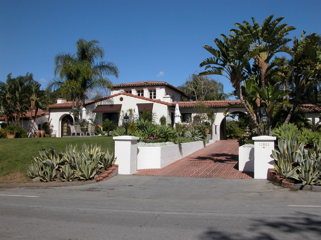
This project encompasses the complete revising of the spaces surrounding an old house on a two-acre hilltop property in Tustin, Calif. The home, which was built in 1927 by William Irvine, a developer whose work still dominates much of Orange County, is undergoing major renovations intended to restore the faded glory of its Spanish Colonial styling.
Before contacting us, the current owners had plowed through a series of landscape architecture firms, none of which had displayed an understanding of exactly what they were after. They had considerable design expertise coming in – he’s a general contractor for large resort properties and she’s an accomplished interior designer – and both spoke the language of design in bringing sophisticated ideas to the table.
They had seen our work in magazines and had been impressed by what we’d done on estates of similar vintage and style and particularly by our evident understanding of the sensibilities of California’s early-20th-Century approach to Spanish Colonial environments.
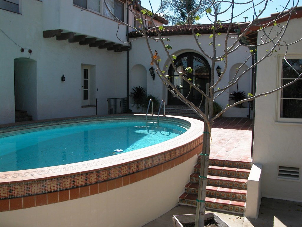
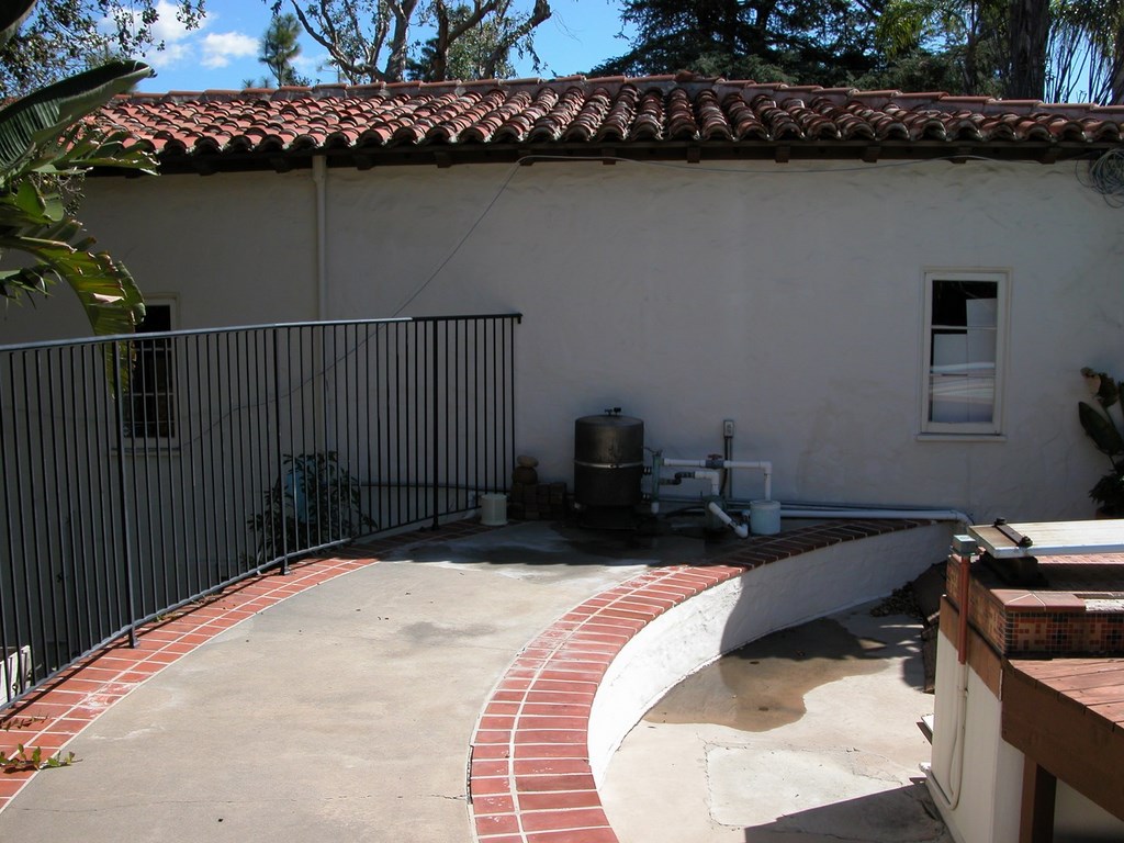
| The grounds we were asked to revise surrounded a vintage Spanish Colonial-style house with all the right structural and interior attributes but suffering with some serious problems outdoors. The pool and its exposed equipment pad, for example, intruded on what should have been a cool, peaceful courtyard, and the rest of the yard was dotted with awkward little spaces that needed significant attention. |
We weren’t immediately interested, however, as much of our focus lately has been on design work for large-scale commercial projects. But what they offered seemed a perfect fit with our background and experience, so we agreed to add our name to the list of candidates.
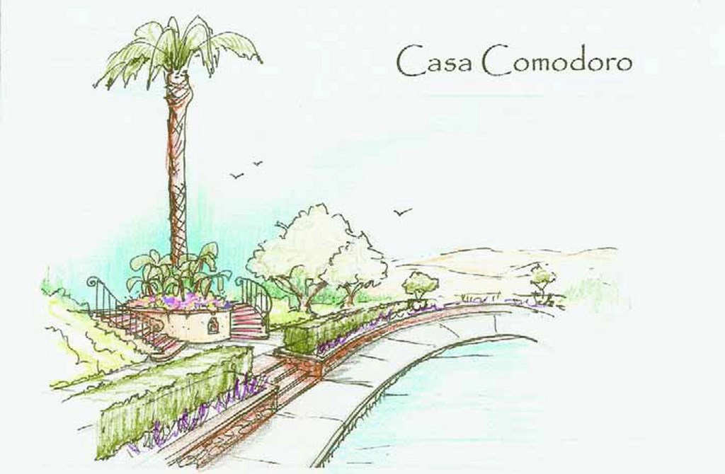
We made our decisive mark with a single hand-drawn rendering – the best-available approach in the context of our key meeting with these clients. Even though we use computers for all of our design work these days, we needed to show them quickly what we were thinking about the way a particular area might look.
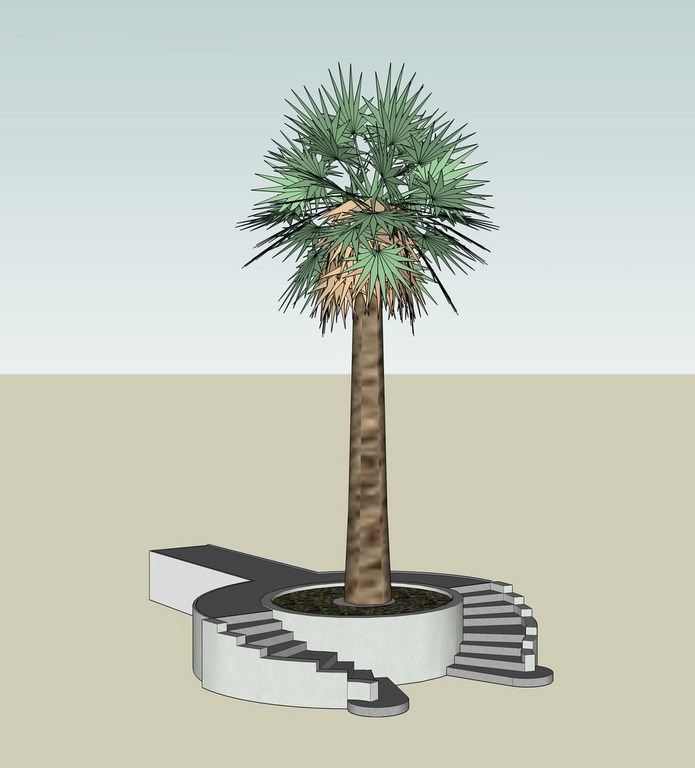
It was just a simple, roughly drawn sketch of a planter/step detail, but for whatever reason it captured the spirit and essence of the type of ideas we thought would work for the project – and from that moment on, they believed they’d reached the end of their quest and that we were the ones they wanted.
This pen-and-colored-pencil sketch was the very first design idea we developed, and as it has turned out, it’s one of the few that, so far, has held as a firm concept throughout the process. Along the way, we’ve assumed responsibility for everything beyond the walls of the rambling, ranch-style house.
One of the first tasks we tackled in a formal, large-scale way was a tight space adjacent to a design studio: The clients wanted something private and unusual that fit within the overall design scheme.
DEVELOPING A VISION
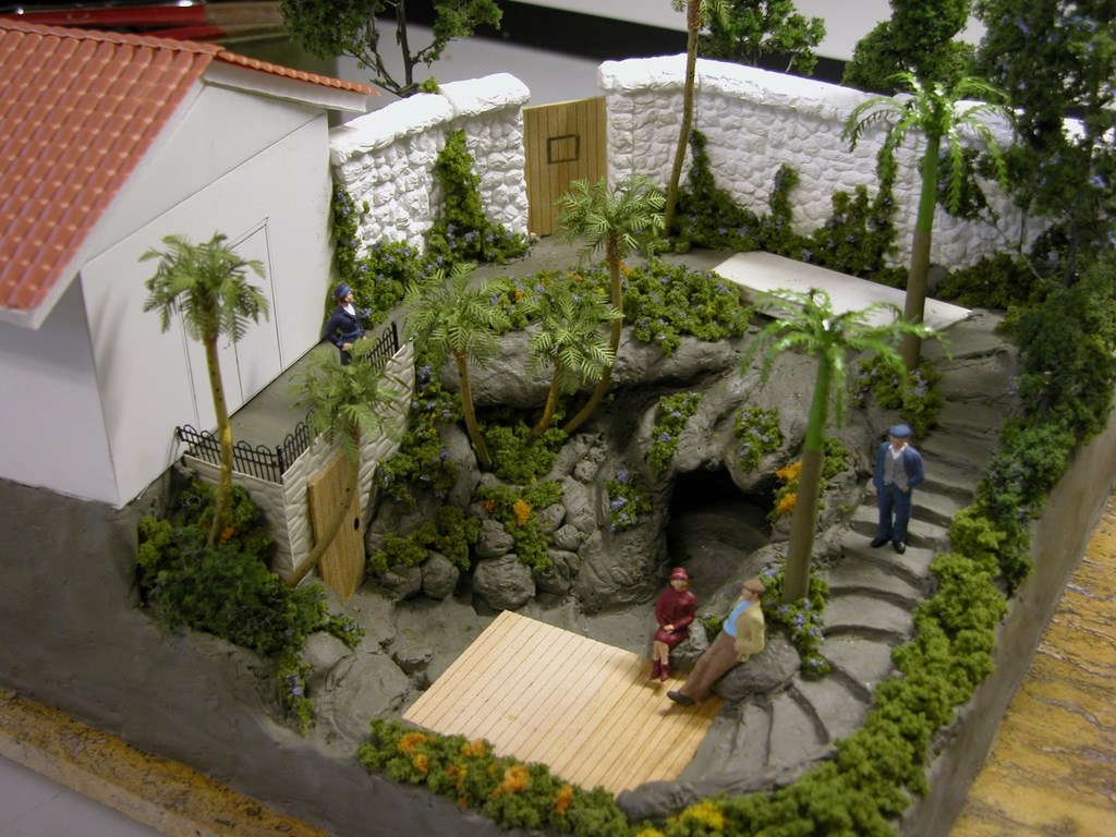
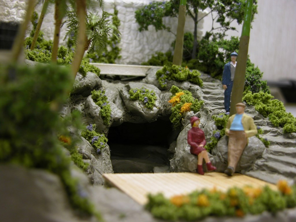
The small space is in a sloped area next to a two-level section of the house. We suggested developing a private spa area there that would include rockwork, plantings, a spa and a grotto that would reach into the hillside like a natural cave.
As we began developing this space, we quickly realized that no sketch or computer rendering would give the clients the information they needed to form a worthwhile mental picture of how the space would look. In fact, working on flat media put us in a place where we didn’t think we could ever truly communicate the essence of the space.
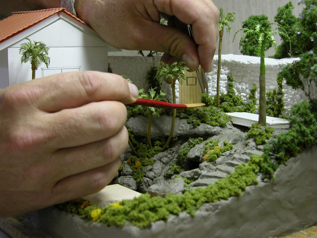
As a result, we decided to venture into the world of plasticine clay to sculpt the delicate details of the space. My background includes extensive work in television and movies related to model-making and special effects, but my first experience applying those skills to landscape and watershape design came a few years ago at a time when our firm was collaborating with artificial rock pioneer Philip diGiacomo.
He’s a master of presentation and often used extremely detailed models to demonstrate concepts to clients. We thought this sort of elaborate presentation technique would illustrate our ideas in ways that simply couldn’t be achieved otherwise.
| A simple hand-drawn and -colored rendering of a step/planter detail convinced the clients that, on some level, we knew exactly what they were after and indeed proved to be the key to our winning the job. Oftentimes, such details and flat, drawn schematics are enough to drive a project along, but in this particular situation with these specific clients, we soon recognized that we needed to go further in helping them visualize key project features. |
Frankly, there’s something special about being able to look at model: You can step back and look at it from a distance, move around and view it from all angles – and get close enough to imagine yourself in the space. There’s also a “wow” factor with models, a sort of visceral joy in conceptualization that can’t be conveyed in any other way.
In this instance, it worked like a charm: Our clients fell in love with the idea and to this day remain thoroughly enamored of the concept – and what it took was a $2,500 model to make them fall in love with a project feature that ultimately will be realized at about a hundred times that cost.
And the model will have staying power in that we plan to use it during the construction phase to make certain its every detail is represented in the field. As such, it’s a case of a presentation method becoming an on-site guide for key suppliers and contractors that gives them a clear understanding of the look we want to achieve.
It also bears mentioning that, with both initial small sketch and model, it was obvious to us that the clients were beginning to see us not only as designers of landscapes and watershapes, but also as artists. There’s something about media in which a designer uses his or her hands in the act of creation that seems to impress certain clients – even those who have design backgrounds.
GOING DIGITAL
For all that, we certainly live in a digital age, so design competence these days also means being well versed in computers.
CAD renderings have been around for a long time now, and the technology has already become one of the greatest design tools of the modern age. The days of drawing plans and details over and over are gone, and I don’t perceive any mourning at the passage of the era of repeated blueprinting and burning of mylar prints.
| In discussing a grotto/private spa area to be set next to the home’s design studio, we recognized that sketches and renderings weren’t doing well at conveying our intentions, so I broke out the clay and some reasonably-close-to-scale figurines and developed a model that let all of us see things in three dimensions from every working angle. The clients loved what they saw, and this area is now firmly on the project agenda. |
With a project such as this – which features clients who constantly revise their thinking – the flexibility provided by digital methods creates a fluid design process that can be ongoing for weeks or months or even years. That’s really no problem, because when you are competent in computer-assisted design, the prospect of changing details is neither time-consuming nor difficult.
And when that basic ability is backed up by artistic vision and combines with clients who really enjoy the process, what you have is a tool that supports artistry while at the same time it allows for refinement of ideas almost at a moment’s notice. In a word, it’s liberating.
Since we started the process in spring of 2007, we’ve used this technology to slide and move elements literally hundreds of times around the rambling perimeter of the house. Without CAD, we would have been stuck erasing and redrawing these elements every time the wind changed directions.
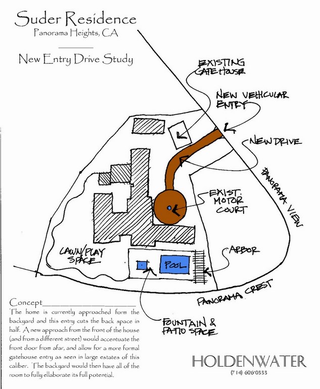
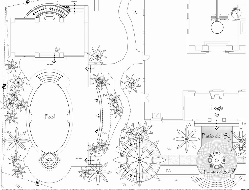
| For a project such as this one where the design process is lengthy and filled with give-and-take discussions of each detail, our familiarity with and capable use of computer-assisted-design technology is proving invaluable. It’s helping us deal with a near-constant flow of changes and adjustments – and again serves as a ready, easy way to help the clients visualize everything as we move forward. |
Indeed, the realm of electronically represented vectors is all about adaptation. As clay can be subtly pushed with a thumb, a digital pool or fountain can be nudged, rotated or scaled in a matter of seconds. Better still, these computer images are all layered and carry with them essential documentation that will become critically important in the construction phase. Mechanical plans for pools, hardscape sections, irrigation plans, utilities – they’re all there in the computer until we need to output them from any viewpoint and in any scale.
Presenting these CAD drawings is also a breeze. Once a design is ready, we decide how we want to crop and scale our views, encase them in our company’s title-block frame and send them to a plotter to create documents our clients can see, review and discuss.
So here we were, with sketches, models and CAD drawings in hand – and we started to feel as though something was missing, as though we needed another means of bridging the gaps and help these media to converge. This is when we turned to three-dimensional computer modeling and began taking our flat, two-dimensional renderings and bringing them to life with accurate shadows and realistic textures.
Happily, the two computer-based system are linked, so changes made in two dimensions automatically translate to our three-dimensional files.
COMPLETING THE PICTURE
As we see it, our capability with three-dimensional rendering gives us a digital version of the old-school model concept – but at a tiny fraction of the cost.
Although these clients were impressed with the model I built, they were reasonably reluctant to shell out that kind of money to have us work up clay models for the entire site. That classic process was perfectly suited to one area of the project, but we all agreed that different communication tools would suffice elsewhere – with computer models largely filling the bill when it came to conveying information about other project features.
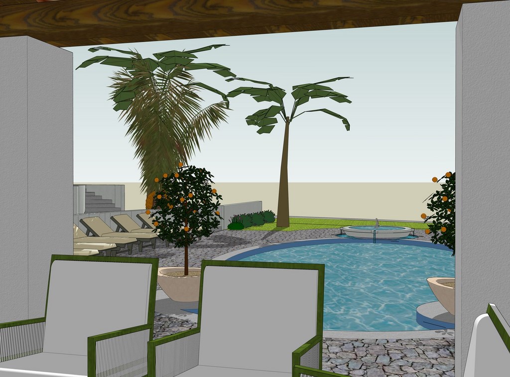
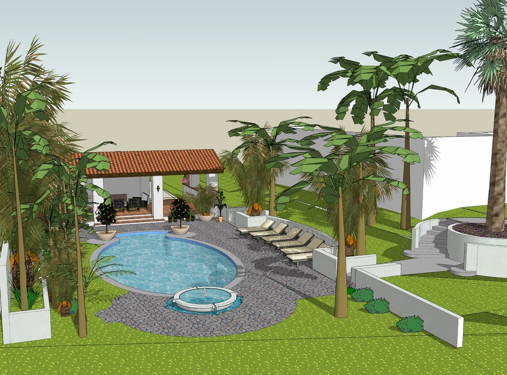
And there’s that wonderful flexibility factor: We ran through several water-display ideas, for example, and sliding new fountain configurations into our virtual models was always a snap. What’s more, we were able to set things up to give our clients “virtual walk throughs” of these spaces by rotating and moving through the field of vision. This bonus is an utter revelation to just about anyone who’s having trouble understanding a space.
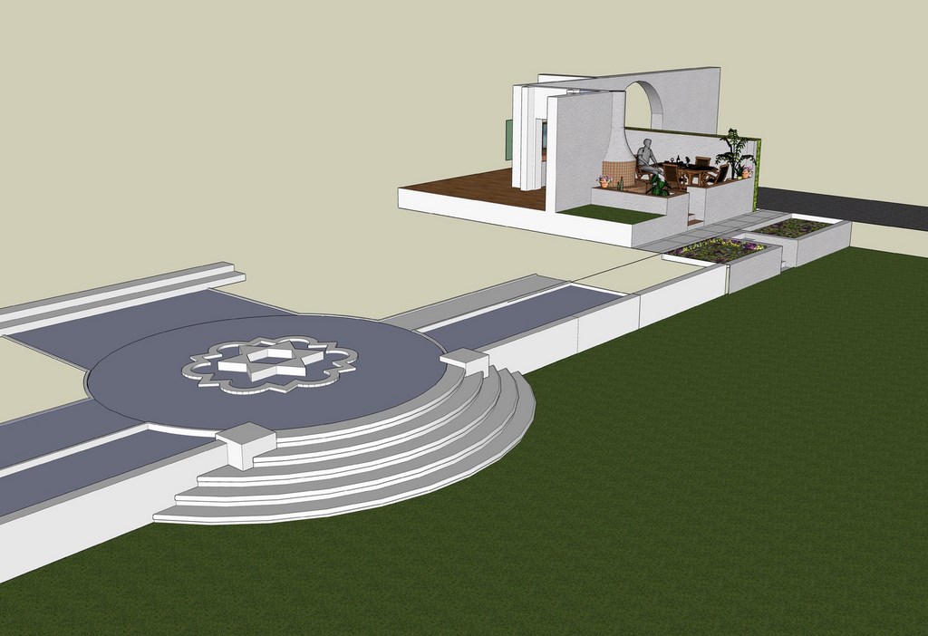
| A computer’s current ability to take basic CAD drawings and translate them into three-dimensional renderings is another method of communicating spatial information to clients that is working wonders with this project. We can literally walk them through these settings step by step, showing them, for example, the spatial relationship between a quatrefoil fountain and an outdoor kitchen, how the pool looks from various angles and elevations – and what it will be like to walk around that step/planter detail that was so important to our winning the project in the first place. |
At this point, we are currently working with literally scores of three-dimensional models that are being changed almost daily as we swap out materials and plants. Sometimes, we change out entire structures, whether it’s just to see how things work or part of our effort to line what we’re doing up with our clients’ ideas.
In this particular project, the clients’ design sophistication has made the process extremely fluid and dynamic, a steady procession of collaborative revision that is possible only because of the ease and convenience of three-dimensional modeling.
In essence, this project so far has been an object lesson in the nature of communication and has had its greatest value in letting us know that there is no single, perfect tool that enables clients to understand design ideas. As watershapers, we must evaluate our clients, their budgets and specific site issues and judge which methods are needed. Sometimes, one will be all it takes; other times, all four of those I’ve described here come into play. On occasion a fifth – that is, the spoken word and the pictures we can create with them – comes into play. As designers, we have to make the call and deal with the implications.
For this project – still very much in the early stages and subject to almost daily changes – we have learned at the very least that with sophisticated clients with complex ideas and extensive sites, it pays to have multiple presentation methods available for use. They have enabled us to apply our talents to the fullest as we extract information and ideas from the clients and the site that, someday soon, will lead to memorable results.
Donovan Brown is a designer for Holdenwater, a watershape design and engineering firm based in Fullerton, Calif. He has been with the company for more than three years, focusing on detailed engineering plans, specifications and presentation material. Before joining Holdenwater, he pursued a broad range of career interests – everything from stints as a professional bullfighter and a role on the ground crew of a blimp company to work in creating special effects models and costumes for movies and television and gigs as a professional ukulele player.


