Refinements in Stone
It’s the little things that often make the biggest difference in creating beautiful spaces within gardens or near watershapes. A well-articulated retaining wall here, a clever treatment of a stone footpath there or the perfect placement of a stone stairway can, at various points, lend variety, balance and even a sense of antiquity to the work.
In the first installment of this series of articles on classic uses of stone in gardens and watershapes, we began with an overview of stones set among plantings and used as simple structures in some of the world’s most beautiful spaces. This time, we’ll continue the journey with a more focused look at the way masters of the craft used stone in their walls, pathways and steps – ideas that can easily be translated to modern watershape settings.
By exploring these classic and often subtle stone treatments, today’s watershapers stand to gain inspiration along with very specific design ideas – a powerful brew that will help you liven and enrich your clients’ garden spaces now and in the future.
INTERIOR SPACES
Last time, we looked at walls used mainly to define the external boundaries of landscape spaces. But walls also find use within those larger confines, either to define or divide smaller spaces within gardens or to manage transitions in elevation.
|
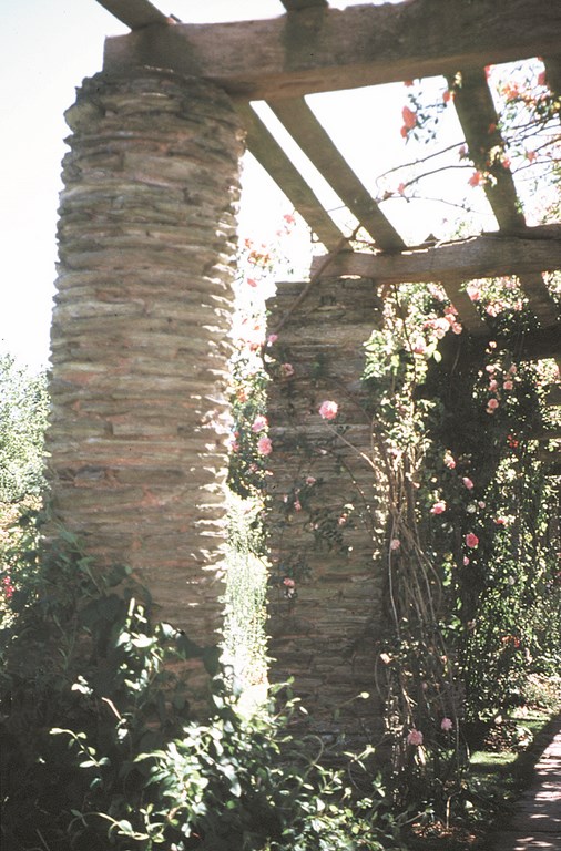
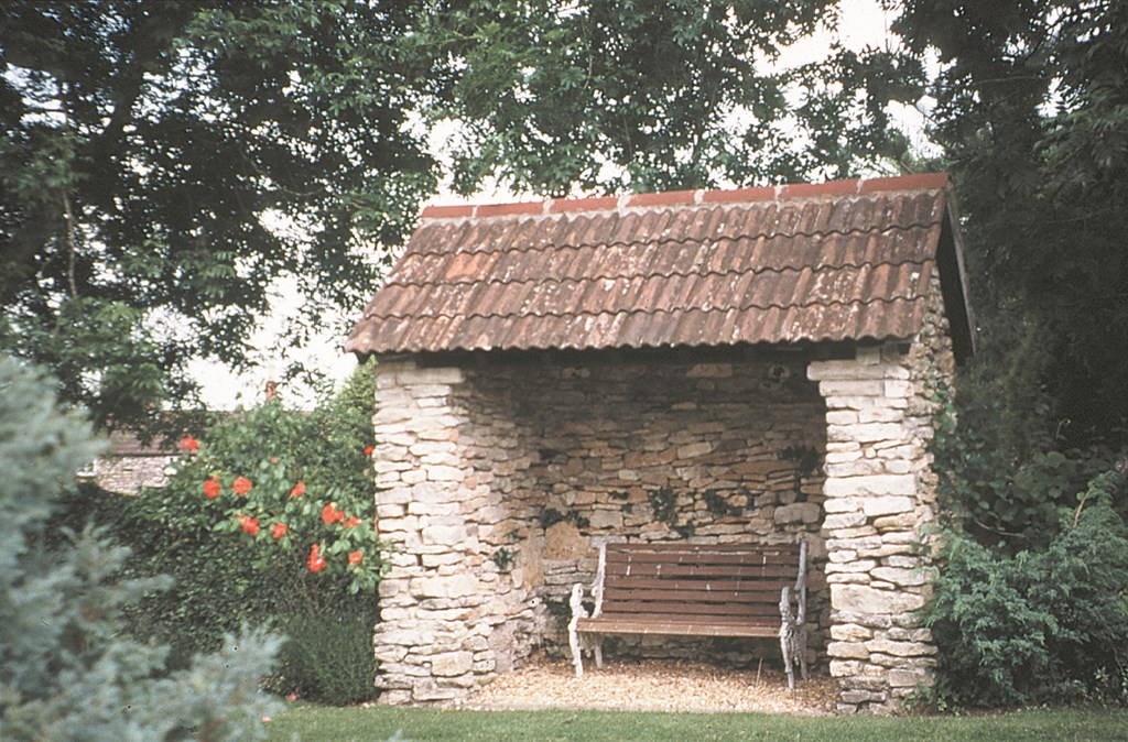
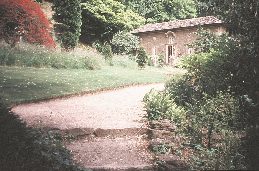
The Stone Option Who says that the supports for garden structures have to be made of wood? Landscape architect Sir Edwin Luytens had a wonderfully fertile mind, and he constructed many of his pillars out of stacked stone in both round and square designs or in combinations of the two. Some were set up as freestanding focal points while others served as supports for pergolas (left). I’ve also seen (in the work of other designers) stone structures that would serve perfectly well as pool houses (right). As with walls and pathways, structural elements such as pillars and even shelters can be made beautiful with the use of stone in creative shapes and patterns. — B. S. |
When I look at much contemporary work, I can’t help noticing many missed opportunities. Particularly bothersome are the glaringly “new” retaining walls that make it seem as though the designer had resigned himself or herself to installing a purely functional structure without much (if any) thought about turning the necessary presence of the wall to his or her clients’ visual advantage.
In classic gardens, you don’t find this pale, flat attitude. Indeed, the master gardeners were adept at taking advantage of every opportunity offered by walls, and you’ll find a variety of approaches aimed at making both retaining and freestanding walls enhance, complement or reflect their surroundings.
At Vann, for instance, the designer of this private English garden set large slabs of stone against a straight cut as a retaining wall, then put smaller slabs in the wall slabs as seating (Figure 1). Set against a cut-stone patio, the wall extends and harmonizes with a serene, sheltered refuge.
| Figure 1 |
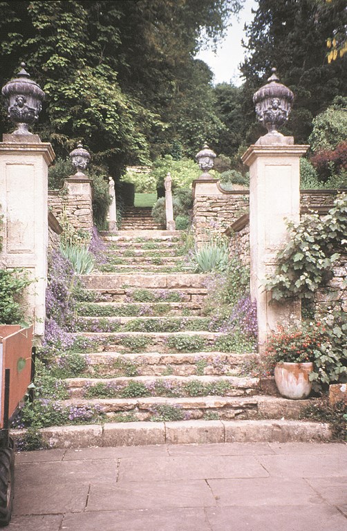
Or consider the use of stacked-stone walls with beautiful ornamental caps, as we find at Iford House in England. The terrain here is very steep and is governed by a series of stone walls, terraces and staircases (Figure 2) designed by landscape architect Harold Peto, who owned the house from 1899 until 1933. It’s a beautiful combination of sound engineering with a real visual treat – and not a missed opportunity in sight.
| Figure 2 |
Peto firmly believed that the most beautiful gardens had to combine plants and architecture – a sentiment he picked up from predecessors who designed the gardens of the Italian Renaissance and that he has passed along to us in an unbroken chain stretching back more than 500 years.
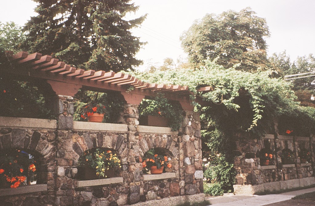
Observation of the past also shows us that walls need not be solid, monolithic masses to get the job done, as can be seen in the unusual stone wall used as a “room” divider at Spadina House in Toronto (Figure 3). Its arches serve as display niches for flowers in containers, and the wall itself is also the base for a pergola covered with vines.
| Figure 3 |
In these three examples, we see what could have been mundane, practical structures made into distinctly ornamental visual elements within the overall garden composition. Applying these same creative approaches around watershapes is certainly possible – and can transform the merely utilitarian into something that supports and extends the impression made by the overall design.
FOOTFALLS
Beyond wall construction, the most common use of stone in gardens is as a paving material for walks or as edging for walks or driveways made of another material.
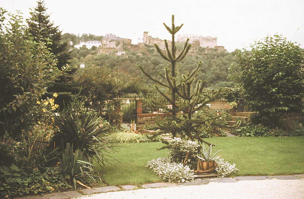
Gravel is frequently used for walkways or driveways in Europe but is used less often in the United States, where it is frowned upon as being “messy.” It’s possible, of course, to use an aggregate that looks like gravel but has the solidity and permanence of concrete – as seen at St. Goarshausen, a small town along the Rhine in Germany, where the aggregate is set off by small edging stones (Figure 4).
| Figure 4 |
As for paving with stone itself, there are many old patterns that we can use for inspiration – one of which is the use of wide stone slabs laid horizontally to create a sidewalk. This approach appears at Iford House, where Peto edged the surface with squares of stone of a corresponding color (Figure 5). This same approach has been applied elsewhere, sometimes with the edging elevated to create a channel, other times with the edging at the same grade as the walkway.
| Figure 5 |
For a moment, let’s look back to the first article in the series – June 2001, page 50 – and bring up a point that was raised about the usefulness of deliberately aging or distressing stone so that it appears old. To my mind, mimicking age is a wonderful way to add warmth and a sense of timelessness to modern work. Peto’s accomplishment at Iford house is about a century old – but it looks as though it has been around for centuries uncounted.)
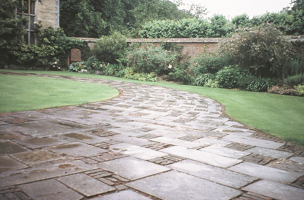
As for broader expanses of stone decking, you’ll often find the use of different sizes of rectangular stone set horizontally and perpendicularly to create a pattern that seems consistent, yet somewhat irregular. A beautiful but unusual pattern was designed for the entrance to Cranborne Manor in England in the mid 1800s – a pattern consisting of squares and rectangles of cut stone intermingled with stacked squares and rectangles of brick (Figure 6).
| Figure 6 |
Of course, the range of opportunities available with stone paving is virtually limitless. The few images seen here are just a sampling of what’s been done by our predecessors to bring the durability of stone together with an aesthetic approach that makes structures as common as walkways a source of visual interest in their gardens – and the perfect potential complement to well-designed watershapes.
STEPWISE TRANSITIONS
We’ve already addressed garden walls as one way of managing elevations, and now we come to a second: stairways, and the potential they have in guiding visitors to our designs from place to place within a garden.
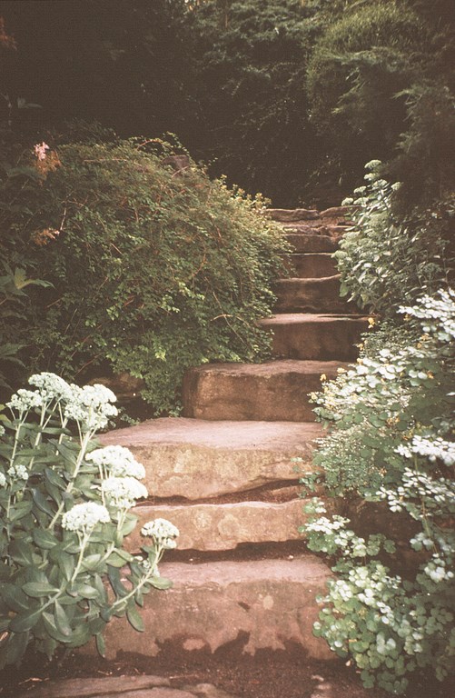
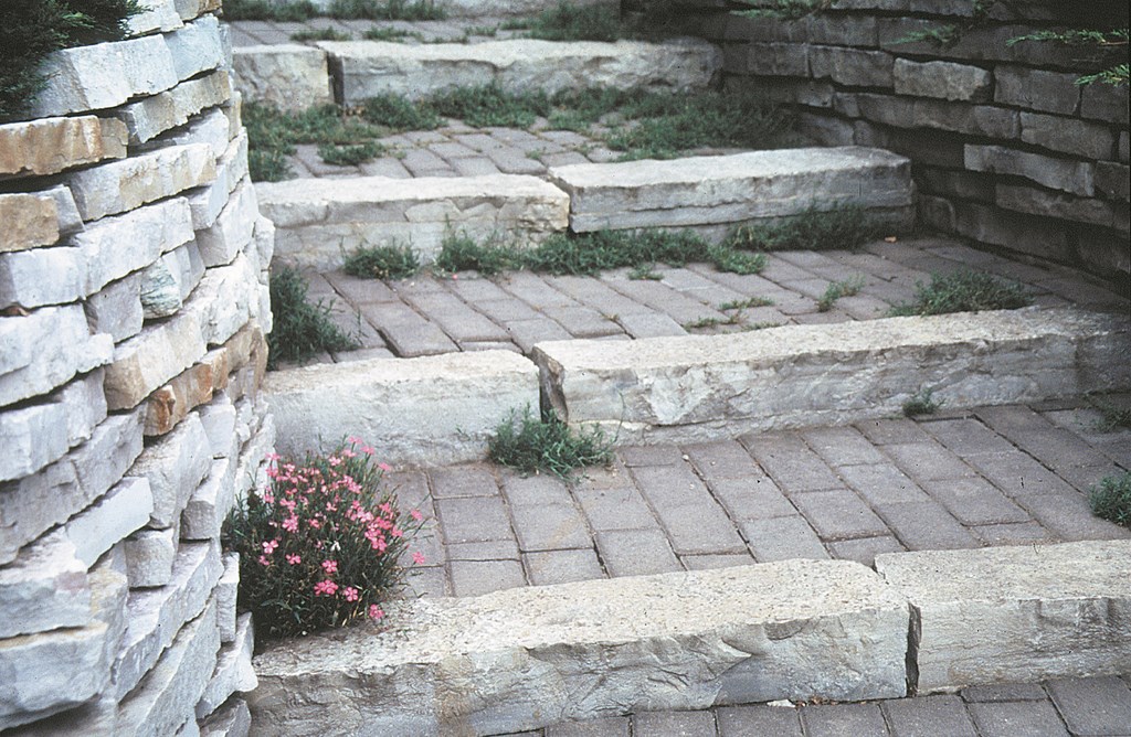
Steps can take on any number of “looks,” from the rustic to the formal. Of the former sort is the rough-hewn stairway in the Royal Botanical Garden in Hamilton, Ontario, which looks as though it erupted as slabs from an ancient quarry (Figure 7). In fact, the stone was brought in and placed in the 1930s – a reminder that one of characteristics of stones is that the larger their size, the older and more permanent they seem.
| Figure 7 |
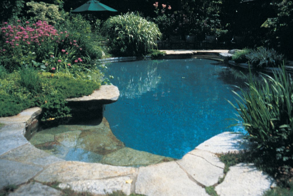
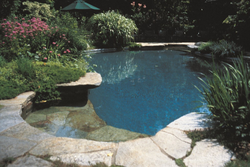
Watershapers, of course, have the opportunity to use stone stairways (whether rustic or formal) as a source of access and egress from their pools, as is the case in this project in suburban Boston. Here, a set of irregular (but basically triangular) steps leads to an irregularly shaped swimming pool with a stone deck, and the stone steps carry right into the pool itself (Figure 8).
| Figure 8 |
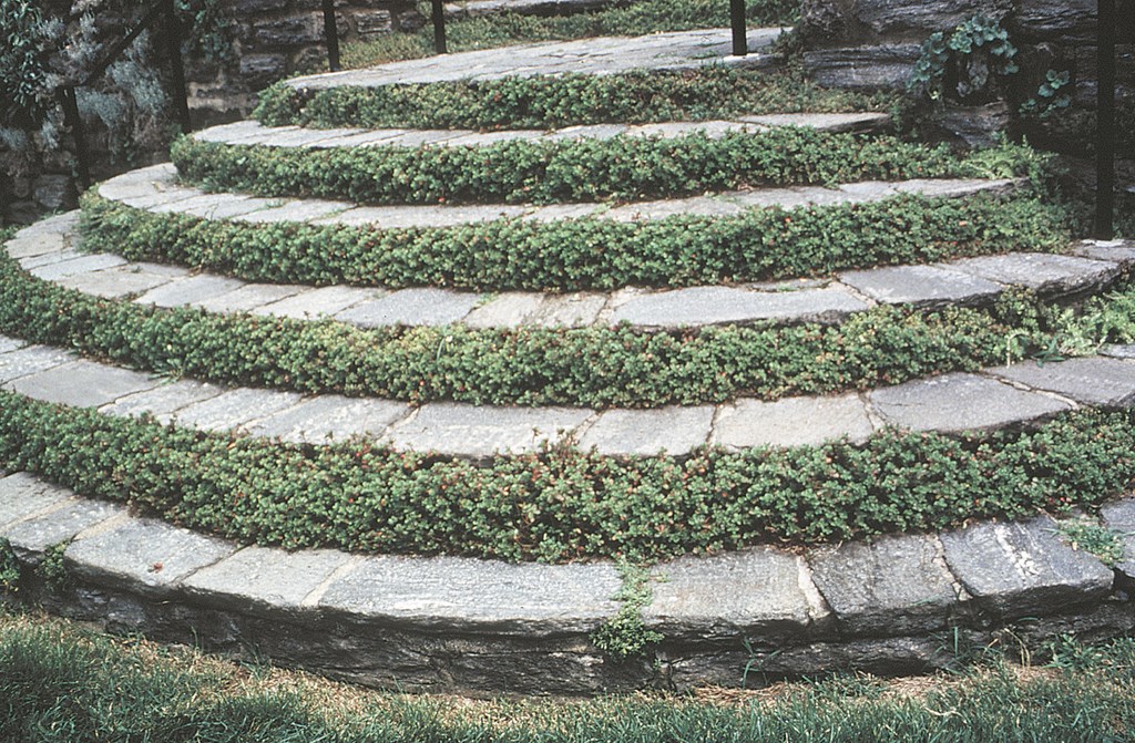
There are also more formal approaches to stairways, such as one found at the Morris Arboretum in Philadelphia. This sweeping stairway follows models found in classic English gardens designed by Sir Edwin Luytens, including Great Dixter. Particularly impressive is the way in which vegetation has been used to instill a sense of age and permanence (Figure 9).
| Figure 9 |
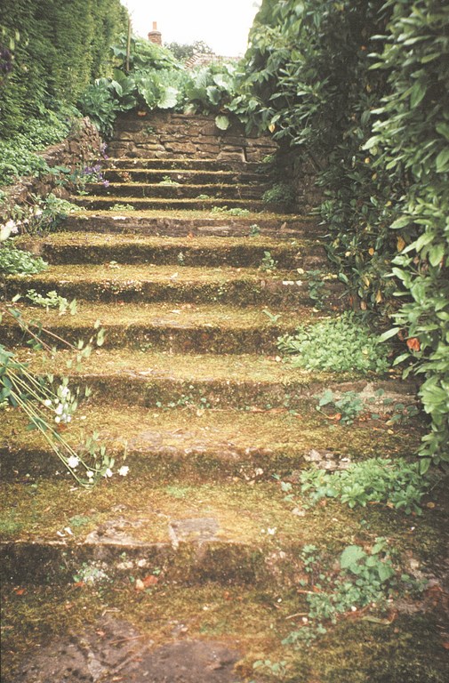
In many cases, as at Upton Grey in England, designers will let the plantings and/or mosses run wild to soften the harder edges of the stone (Figure 10); at the Morris Arboretum, however, the plantings and their close-cropped perfection actually add to a sense of formality and structure and lend grace to what is too often seen as a utilitarian means of transition.
| Figure 10 |
For designers who aim to please rather than simply convey their clients from place to place, steps should be more than a means of achieving an end. Rather, they should beckon us to discover a new world and give us visual pleasure as we traverse them..
SEEKING PATTERNS
One of the key concepts underlying all of the positive examples discussed so far is the designers’ use of patterns: Repetition of a certain shape or line is a wonderful way to create continuity within any physical space, and patterns of stone, in particular, serve as wonderful visual foundations for the ever-changing whimsy of plant life or moving water.
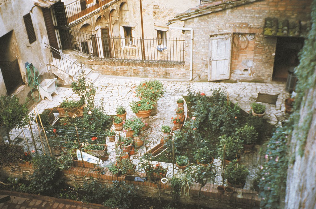
Many of the patterns we’ve seen here are fairly regular, but that doesn’t imply any sort of limit on the possibilities. A “cracked glass” pattern, for example, can be particularly effective and evocative. At Siena in Italy, I saw a very simple rooftop garden set into a terrace of irregular stone (Figure 11). With larger stones, this same sort of random patterning works on decks.
| Figure 11 |
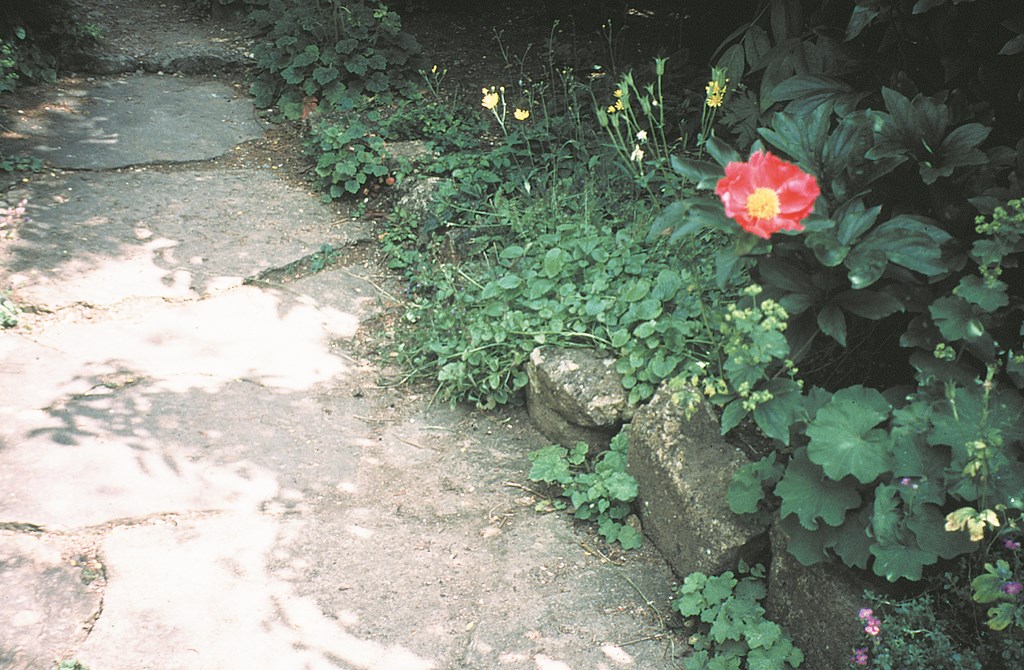
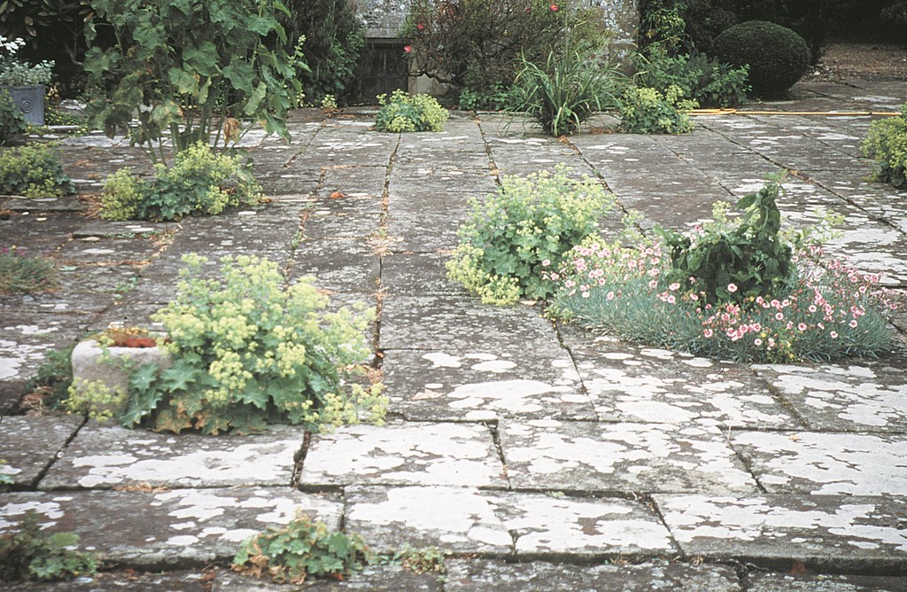
Another key point: No matter whether the patterns are regular or random, it’s always wise to remember the value of making new work look old – and think about encouraging the growth of crevice creepers or planting perennials to seed between the stones (Figure 12). You might use any of a number of plant varieties here, the choice being mainly determined by the “zone hardiness” of the site.
| Figure 12 |
Of course, cost is a factor in choosing to use stone in watershaping projects. On the one hand, it’s probably easier than it’s ever been to get your hands on good-quality stone in a huge variety of types, textures and colors; on the other hand, it’s true that stonework can run through a heavy portion of any given budget.
But sometimes, all it takes is a creative approach rather than a monster budget. At Iford House, for example, you’ll find stone used as risers with dirt or gravel as the steps (Figure 13) – a simple solution that really works. (There are, of course, other compromises that don’t work so well, such as mixing good-quality stone risers with precast-concrete pavers as treads, as seen in Figure 14. This is a mixing of media that would have worked better with treads made of well-packed gravel fines, grass or even dirt.)
| Figure 13 and Figure 14 |
The point is, whether you’re working to mimic the masters or striving to create something innovative and new, the past can be used as a template or source for ideas that fit into a variety of visual contexts. Whether it’s a decorative pattern on a stone wall or clever arrangement of stones on a deck or a pathway, these elements lend beauty, depth and interest to the work. And no matter the style or perceived age of the work, the more refined and informed your approach, the more successful you’ll be.
|
Structural Magic As you can see in the accompanying feature, there’s no limit to the patterns and aesthetic touches that can be picked up in the study of classic designs. The best thing about such study is that it leaves plenty of room for creative interpretation – and for transmuting a general construction idea into an almost magical creation. At Hadspen House in England, for example, you’ll find a spectacular garden that contains an unusual watershape: There’s a tall (approximately 12-foot) brick wall on the inside of a rectangular lily pond that was once a water tank. Above the wall you’ll see more gardens and a path between them, and the whole composition is set up to manage views and make the pond a pleasant surprise when you approach it from above. If I were building this sort of space now, I’d think about using stone instead of brick and then adding to the potential delights of the space by accenting the wall with small water spouts – something along the lines of the Hundred Fountains wall and walkway at the Italian Renaissance’s Villa d’Este, although a hundred spouts would be somewhat overwhelming in this space! The fact is, in drawing inspiration from the classics, designers are never beholden to them, never required to imitate them slavishly. Inspiration is literally filling one’s mind with the spirit of a thing rather than a direct borrowing of form or function. Speaking for myself, I use the classics as touchstones and try to create new, innovative, site-specific projects that evoke the same feelings and emotional responses I find in the originals. When it works, it’s magical. — B.S. |
Next time: A look into the art and science of creating rock gardens and using stone as an accent to plantings.
Bobbie Schwartz is a landscape designer, consultant, lecturer and writer – professions that have made her well traveled in pursuit of excellence in garden and watershape design. She founded her full-service design business, Bobbie’s Green Thumb, in 1977, and her residential, institutional and commercial designs have been recognized by awards from the Perennial Plant Association, the Ohio Nursery & Landscape Association, the Ohio Landscapers Association and the Cleveland Botanical Garden/ASLA. Schwartz participates in several trade associations on the national, state and local levels and currently chairs the Certification Committee for the Association of Professional Landscape Designers.


