Refined Expressions
No matter how it’s used – as a focal point in a design or as just another feature balanced among many – the thoughtful use of water offers landscape architects and other watershape designers a huge range of aesthetic opportunities. Indeed, the water’s texture, reflectivity, sounds and sculptural qualities can all be used to enhance the observer’s experience as he or she moves through an environment, and in a near-infinite number of ways.
Regardless of how familiar one becomes with these attributes and using them in built spaces, the presence of water in a design often yields something new, interesting and even unexpected. Whether you use it as a visual transition, a physical destination, an expression of nature or an architectural statement, water is the designer’s great ally – especially if it is used in a way that is inspired by, and harmonizes with, its surroundings.
Because we accept the fact that the application of water is so dependent on the setting and circumstances, it’s difficult for us to categorize our work or cast broad generalizations about the way we use water in our designs. Therefore, the best way for us to discuss our approach to watershaping is to look at what we’ve done in the context of specific projects.
CAREFUL VARIATIONS
Many of our projects are installed in and around the Toronto area, where there’s a need to control water in ways that might not be necessary in warmer climates. As you’ll see in the group of projects discussed in this article, we often use smaller bodies of water so they can be immobilized quickly and easily for the winter season, or well plan our waterfeatures so that they can freeze and create interesting ice formations when the weather turns cold. In addition, a lot of what we do is inspired by the history of a given location or by its dominant function.
However the water is used, we work with the understanding that all of us love to be by the water’s edge – a simple fact that invariably makes the effort and expense of quality watershaping worthwhile.
And make no mistake: Both the effort and expense are real factors in our area, where many people are reluctant to use water because of concerns over maintenance and both short- and long-term costs. Despite such concerns, however, we strive to use some form of water whenever we can and have, perhaps as a result of our advocacy, seen through the past several years a tremendous surge in the demand for watershapes across the full range of our projects.
Let’s take a look at some recent cases in which water has served as a key or central element as a way of understanding this demand – and as a means of exploring the ways we use overall settings to set the context for our designs.
A Vintner’s Trough
Jackson-Triggs Estate Winery
This project encompasses an 11-hectare (27-acre) site immediately outside the historic town of Niagara-on-the-Lake near Niagara Falls. KPMB Architects of Toronto designed the building. Our firm was retained by the client to assemble the design team and create a master plan for the site.
The site program called for a main entry road, pedestrian and bicycle routes, parking, auto and bus drop-off routes, an entry plaza, terraces, gardens, a demonstration vineyard and an amphitheater – as well as naturalization and restoration of a flood plain and reconstruction of the existing vineyard.
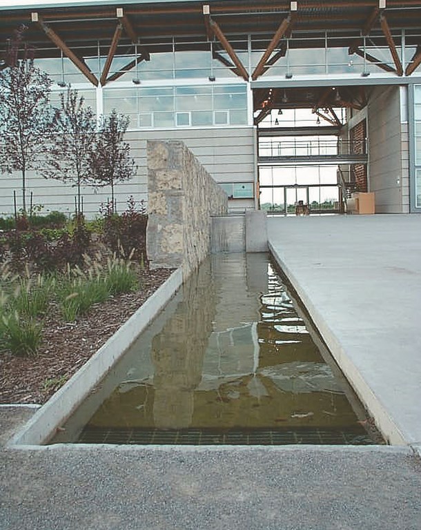
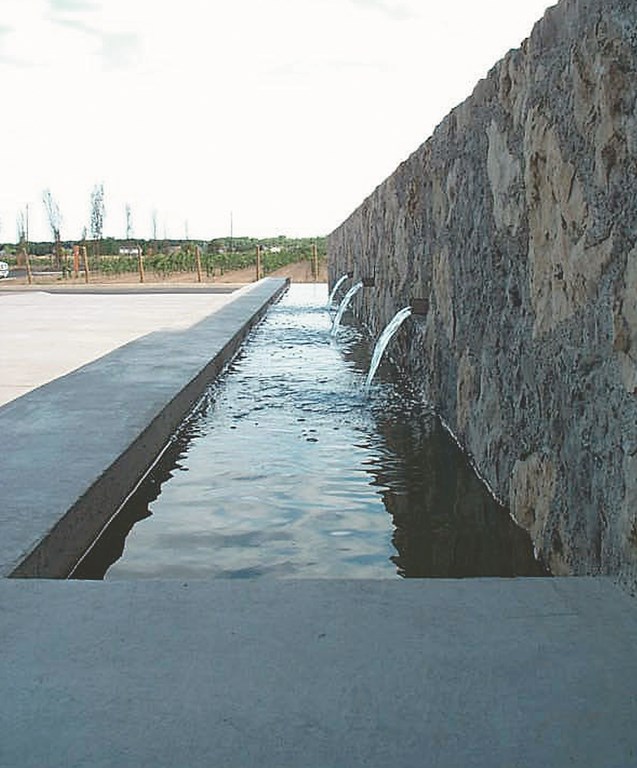
The watershape we designed for this project is simple and modest – but of crucial aesthetic importance. Visitors approach the main building along a gracious, curved entry road that passes through the vineyard. They arrive at a grand entry plaza edged by a linear watershape – a trough approximately 65 feet long and three feet wide that provides a soothing transition from the wide-open viticultural space into the winery’s Great Hall.
Although its rectilinear design is purely architectural, the trough’s raw, unfinished concrete surface and the rough-hewn rock wall are inspired by structures used to contain irrigation water for the property’s defining purpose. At the midway point along the trough, water sheets over a weir of stainless steel from the upper basin, whose backdrop is a raised, rough-hewn wall. Water cascading from three stainless steel spigots embedded within the wall add sound and motion to the otherwise simple but elegant system.
An Oval Heart
The Common at York University
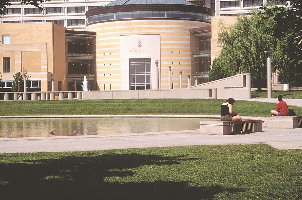
The Common is a ten-acre space nestled in a U-shaped complex of buildings that serves as the functional core of the sprawling campus of York University in North York, Ontario.
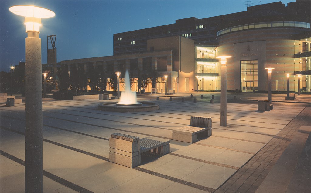
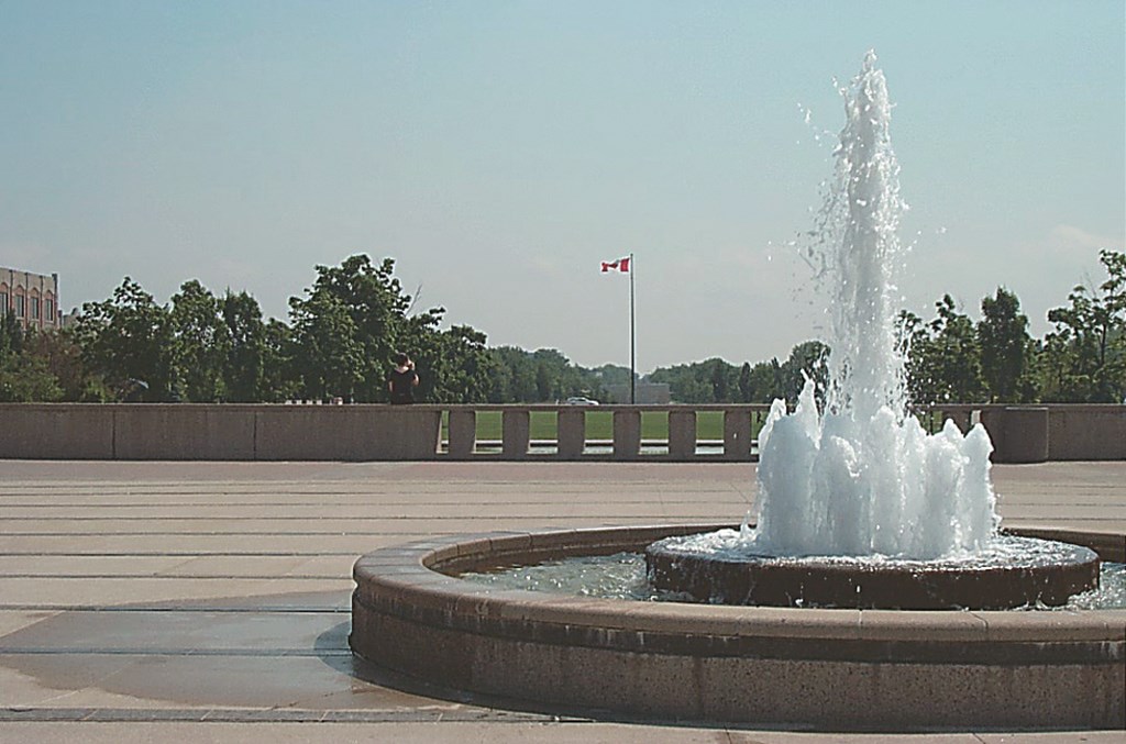
The main design feature is the grand ceremonial lawn. At the center of this space, we placed a large oval reflecting pond. The pond was originally intended to double as an ice rink in winter, but the cost of the system needed to maintain the ice proved to be prohibitive. In addition, we set a small circular fountain with simple vertical plumes in a large paved area that serves as a transition between the lawn and the adjacent building’s main entrance.
The overall design of the plaza reflects the formal architecture of the surrounding structures. The surface of the simple, elegant pond reflects the sky, the surrounding trees and the architecture itself, lending a special sense of tranquility, beauty and interest to what is usually a busy plaza.
The rest of what we did on site fits into this program: The major pedestrian and vehicular routes as well as the lawn and pond are surrounded by colorful perennial gardens with graceful steel arbors. We also worked in chaise lounge-like benches, low walls, subtle grade changes and broad paved areas to create a variety of spaces in which students and staff may escape the confines and stresses of the university’s buildings.
Monolithic Precision
Courthouse Square Park
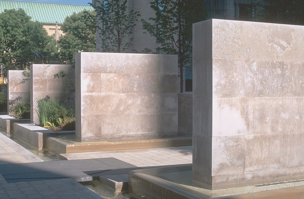
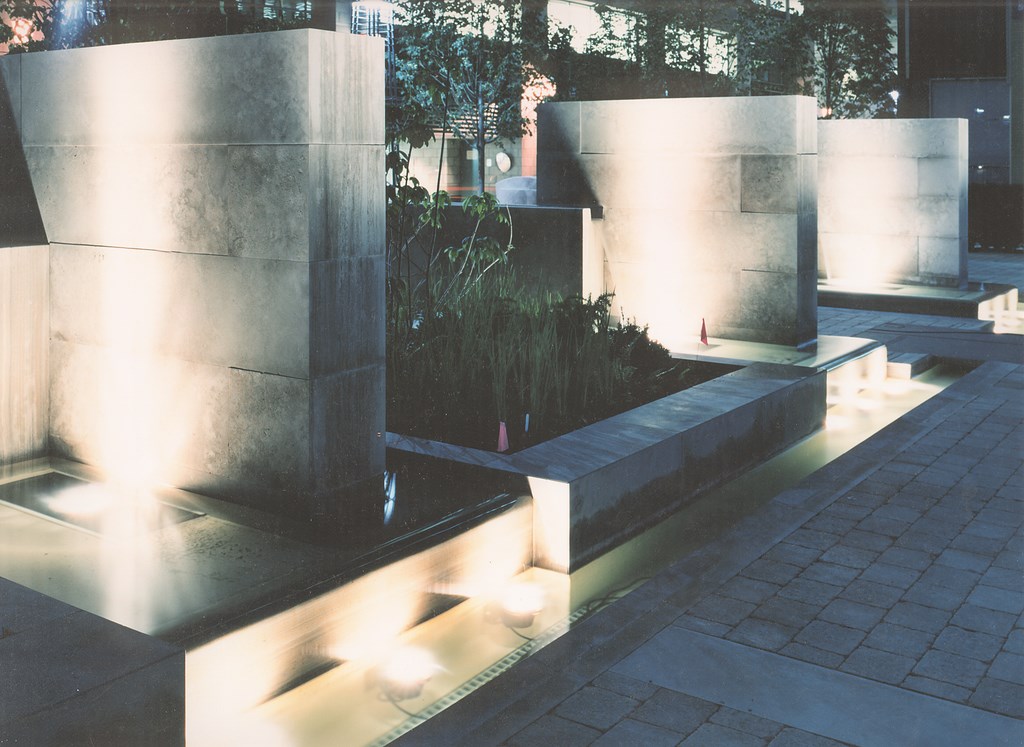
The watershape in this design is among the largest and most complex we have created to date. The goal here was to revitalize a long-neglected space behind a courthouse in Toronto by transforming it into a vibrant urban square. Along the way, we designed streetscapes, public amenities and the waterfeature – and integrated them all with a variety of historic elements into the overall plan.
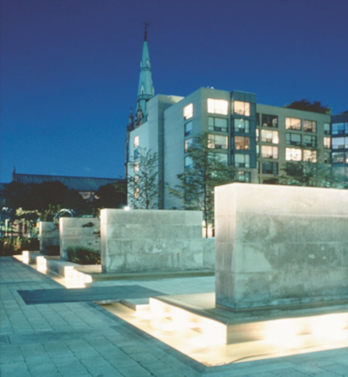
The watershape defines one of the boundaries of the square and serves as a transition to the adjacent streetscape. Large monoliths rise above a two-tiered system of troughs and runnels – an approach inspired by Luis Barragan’s design for the Plaza del Bebedero de los Cabellos in Las Arboledas, Mexico.
|
A Valued Colleague Our firm has become known for its use of water, and it is a distinction we’re proud to wear. A significant part of our success can be attributed to our ongoing collaboration with R.J. Van Seters, a Toronto-based watershape consultant and engineer. His extensive experience with all manner of fountains, ponds and swimming pools has been invaluable to our ability to transform aesthetic concepts into three-dimensional reality. Projects such as Courthouse Square (seen here) and many others have required careful and precise hydraulic designs that must function reliably under a range of conditions. Without the hard discipline of engineering, our watershapes would be little more than nice ideas on paper. — J.R. & G.H. |
Four large Algonquin-stone monoliths rise above the pools and serve as visual metaphors for the four historical buildings that once occupied the space surrounding the square. Water emerges from troughs in the tops of low walls that abut the monoliths and then flows down the sides of the precisely shaped stones into a system of troughs and pools below.
A specially designed auto-fill system adds water when needed to prevent any break-up of the uniform sheets of water, while an adjustable wall-mounted overflow system removes excess water in the event of rain. A special system used in winter creates “ice candles” that form as water trickles from the tops of the monoliths.
This evocative watershape contrasts with the subtle beauty of extensive plantings within the square itself, including an herb garden, a double row of espalier crab-apple trees and an unusual set of latticed steel columns that serve as planters and visual barriers that reinforce the geometry of the space.
Garden Showcase
Canada Blooms
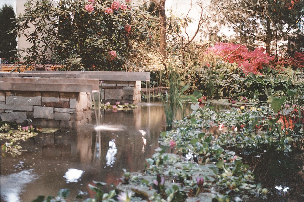
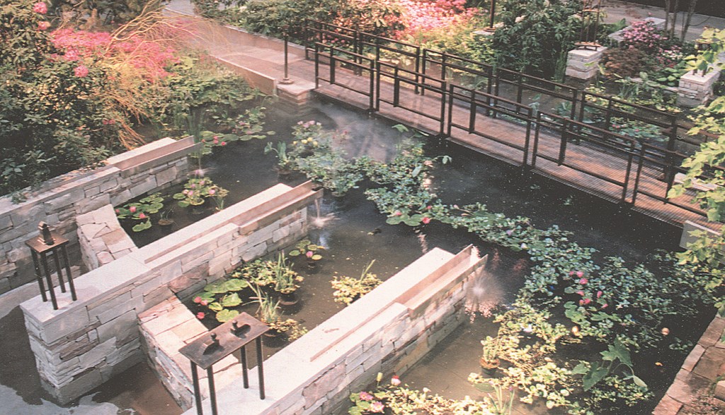
We created this “dream garden” for the 2001 Canada Blooms garden show in March 2001. Held at the Metro Toronto Convention Centre, this annual event is Canada’s premier flower and garden show and is intended to promote the landscaping industry to the general public.
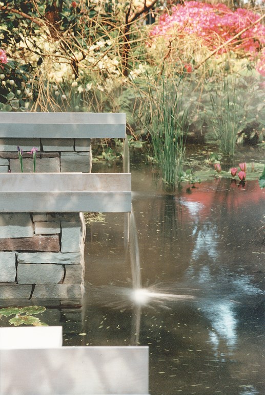
We were asked to create a focal point for the four-day event. Our design keyed on the use of water in a natural setting featuring sculpture along with decorative stone, steel and wooden elements. The display transformed a 4,000-square-foot section of concrete floor into a tranquil environment that included a 1,000 square foot pond, lush plantings, a wooden bridge and unique stone and metal trough waterfeatures.
We started by raising the level of our working area two-and-a-half feet above the floor. This enabled us to install a wooden structure to contain a liner for the pond. We then moved in sod and stone to create berms that would effectively conceal transitions in elevation.
The garden was presented to visitors as a sort of secret haven protected by lush green hedging and a deciduous forest canopy. The plantings along the edges of the pond were critical in that they allowed glimpses of the garden. In strategic places, stone walls with detailed Chinese characters framed the view of the garden and enticed visitors to explore further.
Once inside, visitors were treated to a rich combination of elements including large, specimen rhododendron plantings and a pine canopy looming over a garden where whimsical statuary emerged from sweeping shrubs and combinations of perennials, annuals and bulbs.
Elevated Elegance
Queen’s Quay Terrace
Perched eleven stories up, this windswept terrace overlooks Toronto’s Lake Ontario harbor. In this case, our goal was to transform a small, angular space into a unique, art-inspired contemporary garden.
Our work was inspired in part by a unique “music garden” located in the park below. Designed by renowned artist Julie Messervy, the garden makes use of spiral geometry and whimsical combinations of plants and materials in making its impressions.
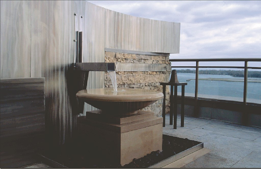
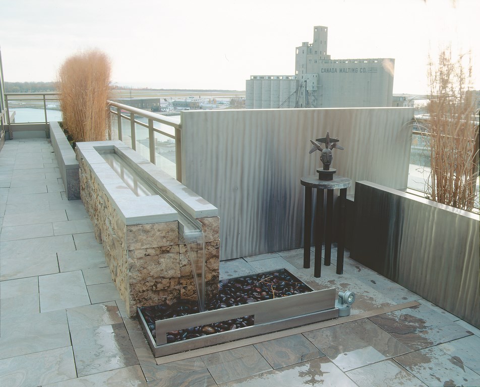
High above the park on this private terrace, we used every last corner of space to hold a combination of raised stone planters, sculptures and contemporary watershapes – one a raised stone trough and spillway, another a hand-carved Indiana stone bowl and fountain. Throughout the design, textured stainless steel walls (including a serpentine steel wall on the south portion of the terrace) play off against the rough stone elements of the fountains and planters with combinations of linear forms and wave patterns.
We used the simple watershapes to create visual links to the grand harbor and lake vistas beyond – and to resonate against, and harmonize with, the serpentine wall. At the same time, the gentle sounds of falling water conveniently help by masking the traffic noise from the city streets below.
We rounded out the visual experience with a variety of sculptures and six-foot-tall stands of specimen grasses that create a beautiful rustling sound as the wind blows across this lofty perch.
***
This terrace project always worked in aesthetic terms, but it was a challenge to build.
For starters, the building is not equipped with a service elevator, so we had to carry materials up to the terrace by hand. In addition, there were limits on how much weight the underlying structure would support, which required careful coordination with a structural engineer in both the design and construction phases. And finally, due to a lack of storage space on the narrow terrace, materials had to be used immediately upon delivery so as not to invade the clients’ private lives of interfere with their daily routines.
Ultimately, however, we all considered the extra effort to be worthwhile, considering the connections we established to the surrounding architecture and scenery.
Janet Rosenberg is founder and principal of Janet Rosenberg & Associates Landscape Architects Inc. in Toronto, Ontario, Canada. With extensive experience in the development of detailed design features, the integration of artistic elements into landscapes and considerable horticultural expertise, she is actively involved in every one of her firm’s projects and uses her design and management skills to find creative and functional solutions for each client. Before establishing her own firm in 1983, Rosenberg was Senior Landscape Architect for five years at Cumming Cockburn Ltd. Consulting Engineers & Planners. Glenn Herman has been a landscape architect with Janet Rosenberg & Associates since 1988. As the firm’s Senior Designer, he works closely with Rosenberg and oversees all of the firm’s projects from schematic design to contract administration. In those roles, he ensures the highest quality design output for both private and public-sector projects.


