Public Statements

When it comes to the old buildings that people most want to preserve, the good-looking ones always top the list. These structures are cherished because they make strong aesthetic statements and are often associated with a given period of history, a particular architect or a specific design movement.
As an architect working to create public and institutional aquatic complexes, I try to think of my designs in those enduring terms. In other words, I want to develop watershapes that make strong aesthetic statements and therefore have a chance to be cherished and therefore stand a better chance of being preserved, well used and enjoyed for generations to come.
I do so because a facility that is both functional and beautiful will, I think, inevitably be of greater value to its community than one that is simply functional.
Ugly buildings do the exact same job as beautiful ones in sheltering human activities, but which are more likely to generate excitement, enjoyment and value for the long haul? The answer, I think, is obvious. As a result, I see aquatic facilities as places that should be beautiful.
FUNCTION BEFORE FORM
For all of that, it must be said that the most attractive aquatic facility isn’t worth a thing if it doesn’t have the required functionality. In fact, whenever I’m given the opportunity to design one of these spaces, my thought processes always start with key questions about client priorities – the who, what, when, where and why of the pre-planning process.
At this level, I’ve found that clients are often sophisticated and that a good number of them have had experiences at different levels with other facilities. So I start by asking for their observations and ideas and for their vision of the new facility, right down to desired activities, anticipated usage, the ages of projected users and more.
Their answers yield a list of elements and priorities that guide my work in the concept phase. Every project is unique, of course, but I’ve noticed the emergence of certain patterns in recent years – especially a near-universal desire for facilities that are not only multi-functional, but also multi-generational.
This trend extends from the belief that facilities providing activities and amenities and safe, comfortable environments for entire families will draw greater attendance and visits of longer duration than will those with more limited ambitions. And there are indeed direct correlations to be made between the presence of multi-generational elements/design schemes and facilities’ financial success.
Hand in hand with this movement toward generational diversity is the thought that accommodating a broad spectrum of age groups turns these places into venues for shared family and community experiences, all centered on healthful and enjoyable activities.
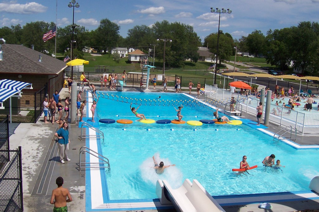
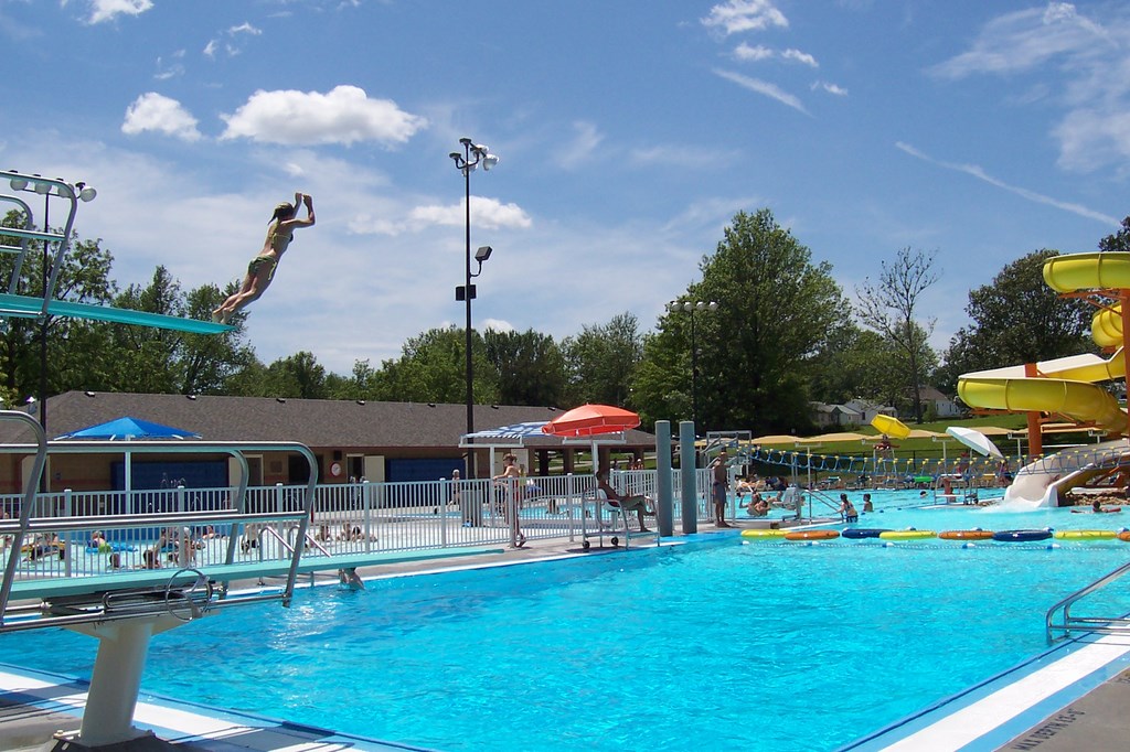
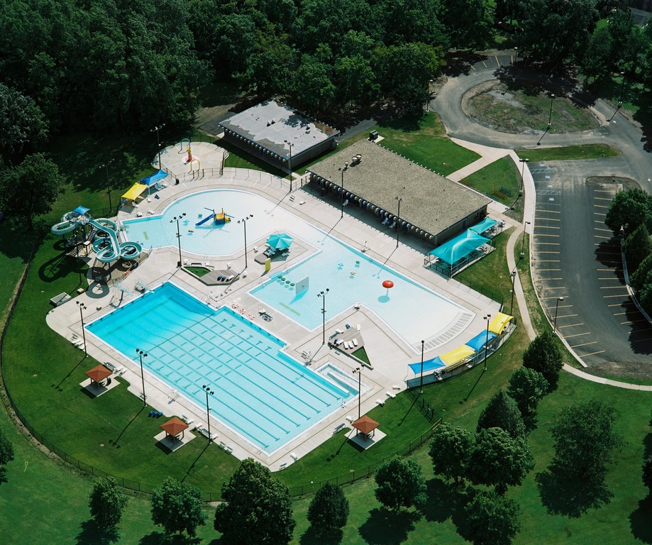
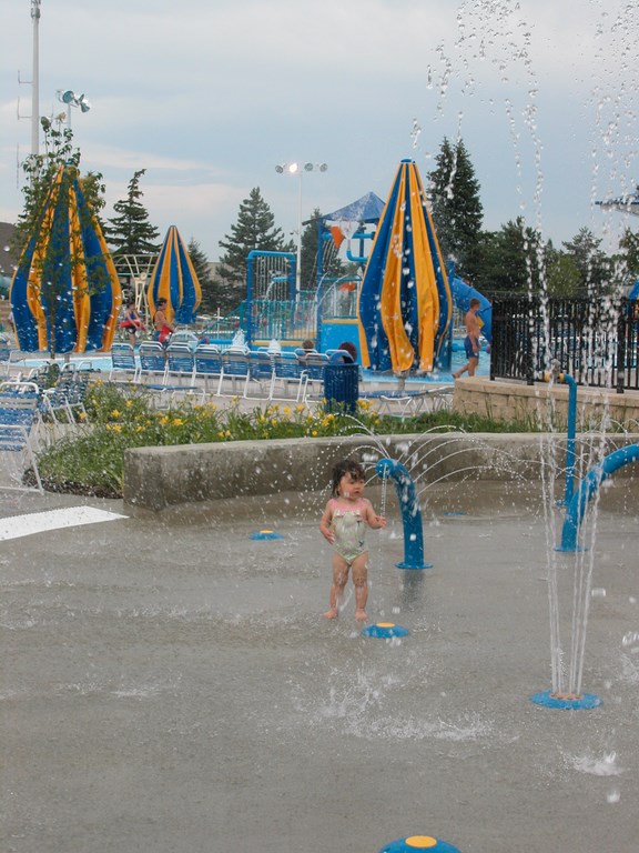
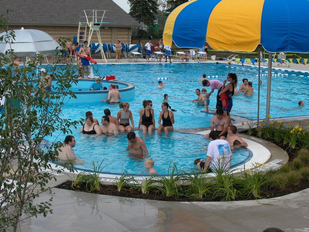
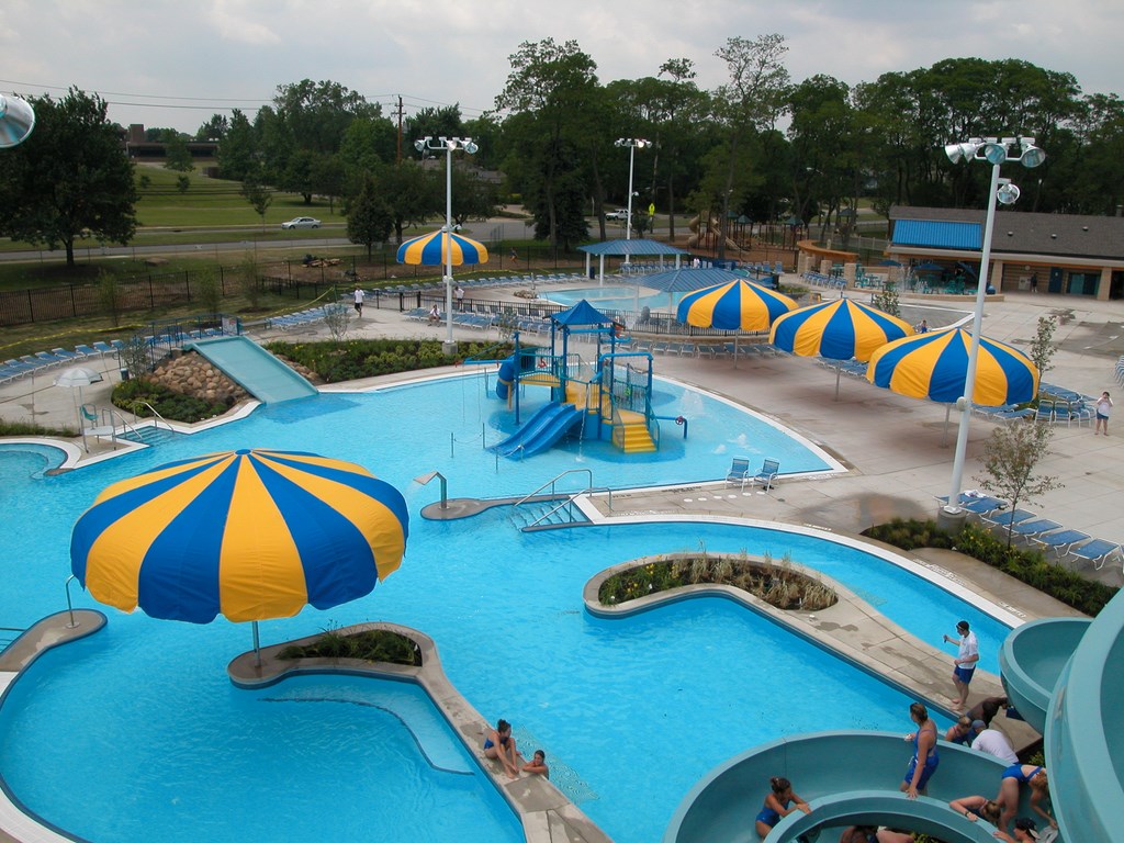
| In these two Larkin Aquatics projects, the multi-generational purposing of the complex is clear in the basic layout of in-pool activities and nearby observation and/or lounging areas. With this approach, a huge amount of activity can take place with few conflicts, even in relatively compact spaces. (Photos courtesy Larkin Aquatics, Kansas City, Mo.) |
Yet even though the enjoyment of water is manifestly common to all generations, the plain fact is that a small child’s involvement with it is much different from a teenager’s or a thirty-something’s or a senior citizen’s. Not only does this complicate facility design in many respects, but, more important, it also forces us to consider the significance of some very basic design elements.
Beach entries, for example, become amazingly significant. These sloped access ways – which originated partly in residential pools, partly in the wave pools of waterparks – give parents and small children a chance to experience the water together, safely and comfortably, instead of forcing them to move off to a separate wading pool.
CAREFUL WEAVING
In the traditional paradigm, aquatic facilities had these separate rectangular or round wading pools for smaller children. Such configurations, however, do not account for the transitional groups of children who are in the early stages of learning to swim and for whom a beach entry provides a useful bridge to the larger aquatic environment.
The kids feel safe, parents are reassured. The kids can play, parents can relax. And all of this increased utility, participation and fun comes from the simple deployment of a beach entry. Better yet, beyond this functionality, beach entries also happen to make much more interesting visual statements than do the aforementioned wading pools.
Shade structures are another example of simple elements that provide critical functionality while offering the potential for dramatic architectural statements as well. When visitors of all ages can escape direct sunlight on hot summer days, they’re more apt to stay longer. In addition, as Baby Boomers slide into middle age, we’re steadily bombarded by news of the sun’s skin-damaging potential.
Accordingly, the presence of shaded areas spells the difference between parents dropping kids off at a facility on the one hand and coming along with them to spend time visiting with other parents (and their own kids) on the other. By any definition, these simple shade structures are extremely important amenities in modern times.
The implications of including such new-fangled amenities go on: Parents, for instance, want to relax while being able to maintain visual contact with their smaller children, which indicates a need to place shade structures adjacent to areas (such as beach entries) where young children are most likely to spend their time. Beach entries are also often the perfect places to locate interactive elements such as spray nozzles and slides. By combining these three elements into one area, we create self-contained “family zones.”
But say, for example, you place a pair of waterslides that appeal to teenagers next to lap lanes where you’re likely to find older adults and more serious swimmers: This is a conflict of activities that can be avoided by thinking in terms of a whole series of zones – tot-and-family zones, zones for young children who are new (and less-confident) swimmers, zones for teenagers who want to hang out by the pool and have fun, zones for seniors who take their time in the water more seriously.
DIVISION OF FUNCTIONS
Exactly how each of these zones is arranged and configured relative to the others has everything to do with budgets, space and client priorities. There are, however, commonsense ways of thinking about certain areas. Large waterslides, for example, generally appeal to those in the seven-to-15-year-old range, while beach entries appeal to small children and parents. Diving areas appeal to teens, lap lanes to seniors.
Areas away from the pool that allow viewing of these areas should be designed with the needs of each user group in mind. We know, for example, that teenagers will almost certainly take over the deck area around the diving pool, while the deck near the lap lanes will host mostly middle-aged adults and seniors. When possible, it’s a good idea to keep those areas separate to avoid conflicts related to teenage boisterousness and volume, but there are also subtle design distinctions we can apply to those areas that have to do with types of seating, immediacy of access to the water, areas of privacy, access to locker rooms, placement of concessions and more.
Things get interesting with elements such as lazy rivers, which are so appealing that they draw people of all ages. Kids and adults alike love to float around in the gently moving channels of these waterfeatures, and seniors enjoy walking against the current as a form of low-impact exercise. This leads to many designs in which these rivers flow from zone to zone as unifying elements.
|
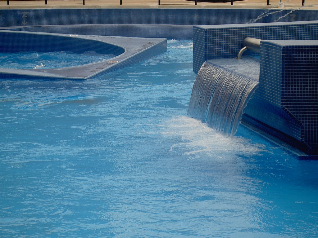
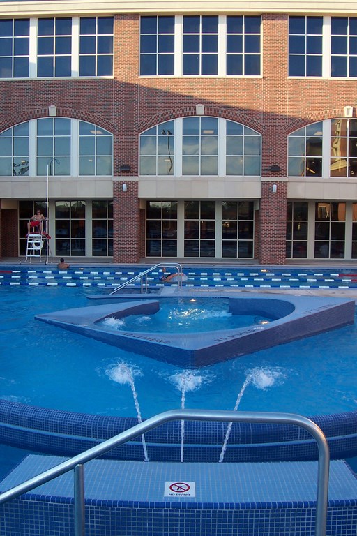
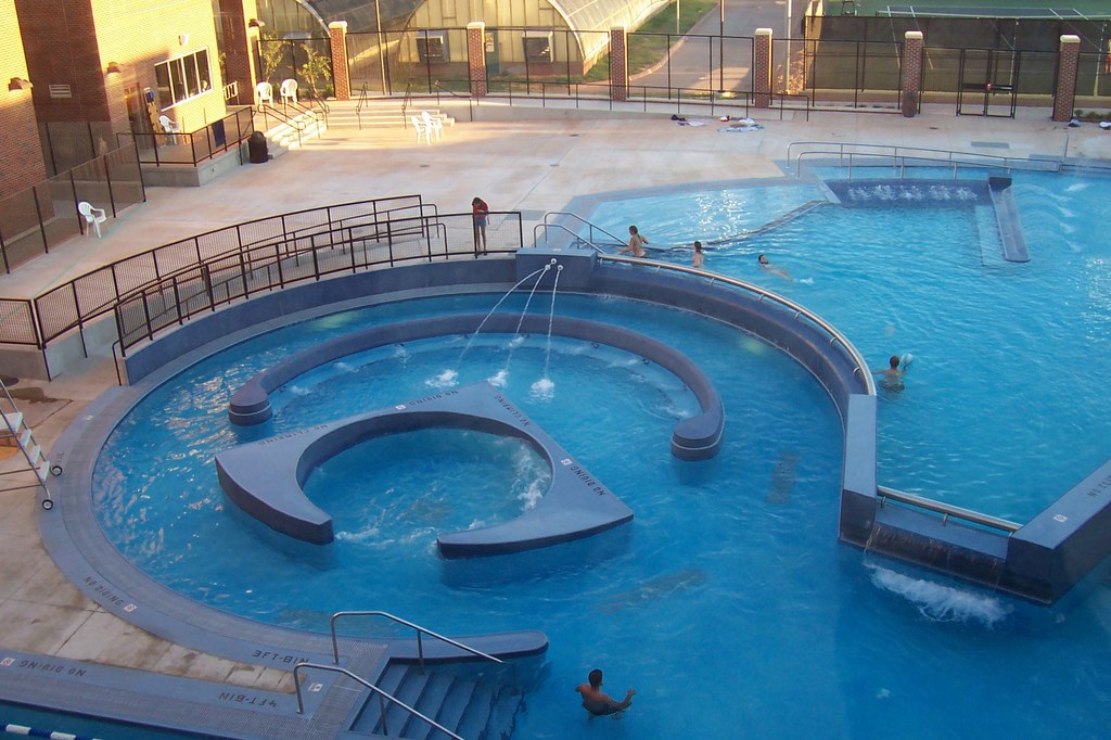
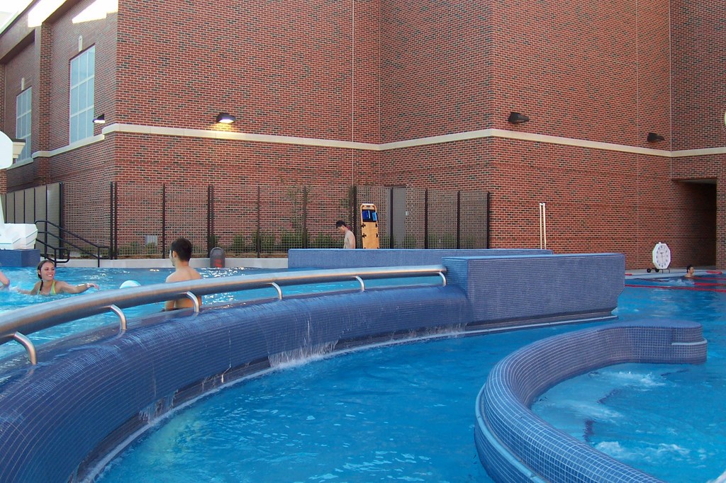
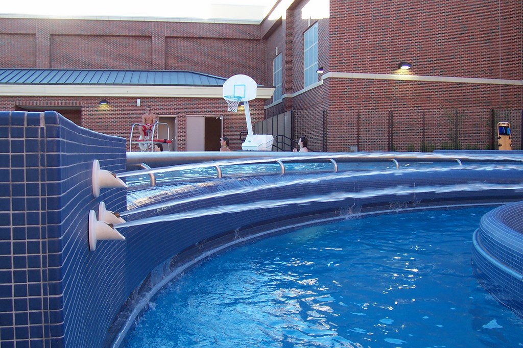
Case Study #2: Visual Core Colvin Center, Oklahoma State University The project architects and university representative did not want a campus waterpark; instead, they were after an architectural statement that would be visible from the windows of the university’s fitness center. There are a number of classical visual references in this design. We played on axial elements, with sleek curvilinear shapes juxtaposed against angled shapes. Knowing this was a space that would be used primarily by students, we allowed for lots of social spaces with abundant underwater seating and places to hang out in or by the water. The circular area features current-stream channels for exercise on the outside of the “cheese wedge” design at the center of the pool. Inside the wedge is a free-flowing vortex effect. There’s also an upper pool that spills into the circular pool with the wedge at its center. The upper zone is strictly for lounging in various depths of water, with measures of variety provided by an array of simple moving-water effects. (Photos by Treadwell Jones; courtesy Counsilman/Hunsaker, St. Louis, Mo.) |
The possible permutations of design elements and amenities are truly limitless, which is why it’s so important to approach discussions with clients and the subsequent layout and design processes with functionality and user needs high in mind.
If that’s all there was to it, the specific engineering, budgeting and construction challenges with each project would still be quite complicated. But when you add aesthetic considerations to project fundamentals (as we invariably do), the process of conceptualizing an aquatic facility steps up to an even higher level of complexity.
Let me be blunt for a moment: In days not long gone by, engineers and pool contractors designed most aquatic facilities, and one of their prime directives was to satisfy health department regulations in the strictest and most direct possible terms.
Many facilities built in the 1980s bear witness to the aesthetics-crushing nature of that directive: Designing stopped once lap swimming, diving and aquatic sports were accommodated; everything else around the pool existed solely to facilitate those activities and satisfy code requirements for deck space and handicapped access.
That narrow mode of design thinking is probably fine for facilities dedicated to competition and capably satisfies the needs of swimming instruction, aquatic exercise and safety training. But aesthetics were rarely considered, if at all.
BEHIND THE LOOKS
Don’t get me wrong: Lap swimming, aquatic exercise and safety training are wonderful and valued activities, but the erstwhile exclusive focus on these elements needs to be swept completely away in favor of a more recent trend to add aesthetics to the mix along with the multi-generational considerations discussed above.
Oddly, credit for much of the progress in the direction of aesthetic considerations comes from an unexpected source: waterparks.
These waterparks are fanciful places. They tend to be colorful and visually striking (when they’re not being willfully garish, that is). And because they exist to generate profits by way of attendance and the sale of concessions, the designers of these facilities and the manufacturers of their interactive waterfeatures have pushed the envelope in terms of developing ever more exciting details. In fact, wave pools, large water slides, lazy rivers and shallow-water play structures all owe their origins and proliferation to waterparks.
|
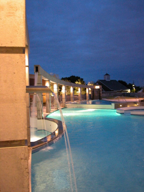
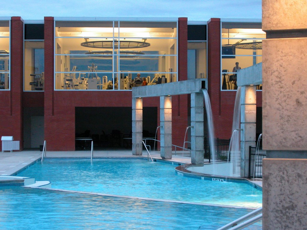
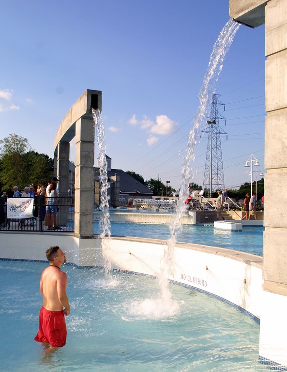
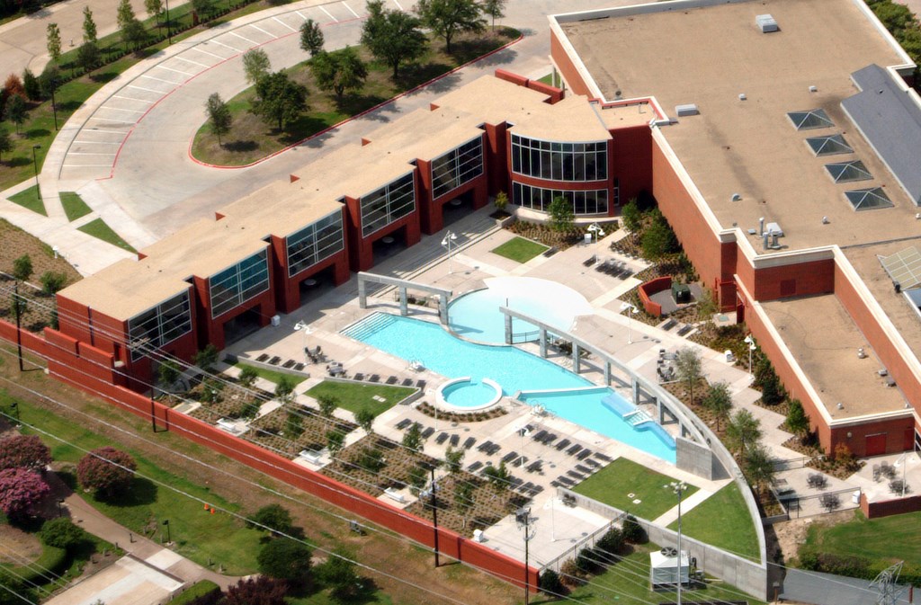
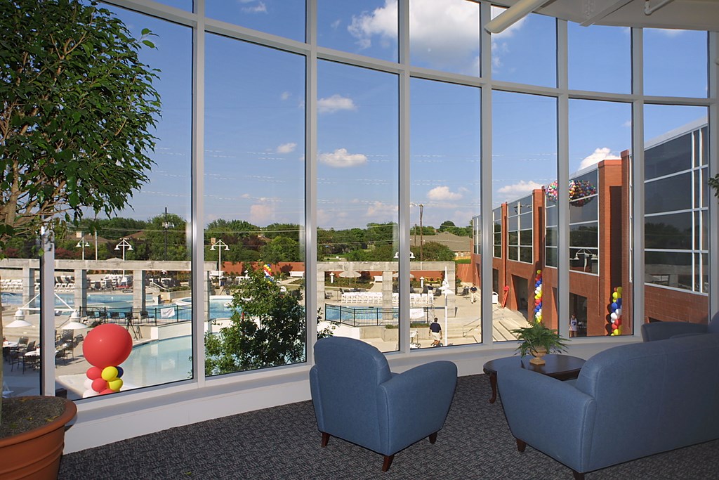
Case Study #3: Cool Curves Addison Athletic Club This project was driven by project architect Ron Hobbs, who had a vision for the entire facility and wanted the watershape elements to reflect his overall site design. From above, you can see that the overall site plan includes angles and curves that reverberate from the parking lot through the building and straight into the watershapes in a collision of crisp, modernist contours. When seen through the windows of an indoor fitness center, the aquatic facility is perceived as a collection of elevation changes and sheeting water effects that emanate from an arcade of sculptural columns. Those vertical structures are clearly an homage to Mexican architect Ricardo Legorreta, but some of the details of the water’s flow reveal the additional influence of Japanese architect Tadao Ando. The three levels of the facility define its zones: The upper level is the adult leisure area, while the lower area is a splash-and-play zone for kids from seven to 15 years of age. Between the two is a circular pool for tots. The owners were very clear that they didn’t want the usual play features and sprays, so the water flowing from the columns and the elevation transitions provides for interactivity. Overall, it’s a sculptured setting that provides a welcoming view from the fitness center and plenty of opportunities for multi-generational use. (Photo at upper left by Treadwell Jones; courtesy Counsilman/Hunsaker, St. Louis, Mo. Others by Roger Hein) |
A great many of these elements have proved wonderfully transferable to aquatic facilities operated by cities and other public institutions, including universities. Because it is human nature to want what we’ve seen, the presence of exciting waterpark elements has clearly raised the bar for the experiences people expect or want to have in other aquatic settings.
This, I think, is what has placed a premium on both fun and aesthetics in today’s public aquatic facilities. Once the play elements started transferring over from waterparks, we began to see the antiseptic environments dictated by health-department-driven aesthetics being replaced with more visually stimulating environments. Run with a modern sense of multi-generational functionality, the new facilities have proved extremely successful since they first began appearing during the 1990s.
Although the aesthetics of these facilities have been improving, progress on this artistic end has been much slower than it has been on the programming end. I have the feeling that this is because the public, numbed by the aesthetic excesses of waterparks, have yet to develop a sense of just how beautiful their communities’ aquatic facilities can be.
The best, I think, is yet to come.
MEASURED APPROACHES
For my part, I do not attempt to replicate the waterpark experience by importing specific visual cues from them. Instead, I provide visually stimulating spaces that make distinct architectural statements by working with elements commonly found in resort pools or high-end residential designs.
My approach begins with the idea of a park in the sense that the watershapes become part of either a natural or architectural setting. In other words, the aquatic facility is seen as an integral part of a larger environment rather than as something separate and isolated from it.
There are a number of specific ways this fusion occurs. We will repeat architectural elements from the surrounding structures or landscapes in the shapes of the watershapes and adjoining structures, for example, or we will:
* make use of vertical elements in shade structures or waterfeatures
* use changes in elevation to create overflows and distinguish user zones
* manage views and focal points from surrounding areas and from within the water
* use plant materials to soften edges
* incorporate tile, textured metal, colored concrete and stone
* use points of entry and egress to make explicit architectural statements
* deploy curvilinear forms and organic shapes instead of purely rectilinear designs
* stretch our consideration of aesthetics to include adjacent structures such as fences, locker rooms and office spaces.
None of these considerations are alien to those who design high-end residential pools, but they’re still somewhat revolutionary in the realm of large-scale aquatic facilities.
Of course, every facility is different and just how these sorts of considerations play out will vary from project to project. Budgets are all over the map, as are the site conditions we encounter. Through it all, we have now identified aesthetics as a key design goal – so much so that in my discussions with clients I often discuss the concept of using aesthetics as a way to protect the investment a community or organization is making in the facility.
Under the old paradigm, an aquatic facility might last only as long as the pipes and concrete with which it is built. With no abiding aesthetic value, there’s no motivation to maintain and preserve the watershapes and carry them into the community’s future. As with cherished buildings, however, communities will preserve an aquatic facility that is perceived as special.
CREATING A LEGACY
That in mind, every watershape facility should be special, especially those we build in the public arena. They are highly specialized gathering places and in that sense are not unlike churches, schools or city halls. When any of those facilities is perceived to have value, the experiences taking place within it are often considered to be of greater significance and more memorable.
It’s my view that watershapers working in the public realm have a responsibility to create works of architectural value. Yes, it complicates the work, especially considering the continuing expansion of functionality. When we hit the mark, however, appealing facilities elevate the value of the aquatic experience in the communities in which we work – and pass it along to future generations of families that will spend time together in the spaces we create.
Treadwell Jones is aquatics manager for Larkin Aquatics, a design and engineering firm based in Kansas City that focuses on competitive-swimming facilities, public and institutional aquatic centers and decorative waterfeatures. Jones earned his degree in architecture from the University of Kansas in 1991 and started his career by designing large aquatic and waterpark projects throughout Europe for Thalessa B.V. of the Netherlands. Returning to the United States, he designed multi-use aquatic centers for Counsilman/Hunsaker of St. Louis before moving over in February 2004 to join Larkin Aquatics as a designer and project manager for aquatic facilities commissioned by municipalities and educational institutions across the country.


