Public Participations

People don’t usually have trouble with boundaries and will honor requests to “Keep Out,” for example, or leave certain doors to “Employees Only.”
But there are also cases where we generally take issue with limitations on behavior whether stated or implied, and I can think of no better instance in which this takes place than with water in public spaces.
Despite designers’ best efforts over the years to make it clear where bathers are welcome and where they are not, the public has steadily defied boundaries by trespassing into waters that were never directly designed for human interaction. In fact, you might say that formal, decorative fountains are a forbidden fruit from which many of us have taken the occasional bite.
During the past two decades, watershape designers have looked very specifically at the irresistible urge we have to touch water in an effort to shape all-new boundaries between public nuisance and design nuance. Along the way, we’ve learned which elements offer a deliberate, positive signal – a real “permission to play” – and are now wielding this power of interactivity to create and define a broad range of public spaces.
A SENSE OF PARTICIPATION
CMS Collaborative works primarily with architects and landscape architects, participating in the conceptual design process as well as in producing the fountain mechanical and electrical contract documents.
For more than 20 years, CMS has been the fountain consultant of record for architectural projects ranging from the monumental (such as the Getty Center’s Gardens in Los Angeles and The FDR Memorial and The National World War II Memorial in Washington) to more intimate, “participatory” displays in civic and commercial settings.
While most of the latter have been designed with direct and sometimes obvious invitations to interact, the way the public has actually chosen to participate has provided many surprises (and design lessons) through the years.
That learning curve has kept us on our toes for years now, and I’ve selected several CMS projects here to represent different points in the process. Before we get there, however, there are three generalizations we need to keep in mind:
* The most obvious indicator of a permission to play is a zero-depth or deck-level surface. (It’s not unhelpful that this is also a significant first step toward compliance with the American with Disabilities Act). Where water appears to emerge from and flow over the “same surface” as the surrounding pedestrian area, there are no perceptible physical or visual barriers.
We see these designs in many public spaces these days, and wherever they are, we see kids and even adults spontaneously interacting with the water. These fountains provide a natural gathering place for people, and the ability for parents to enjoy watching their kids play while they stand back and stay dry creates an environment where most everyone can enjoy the scene.
* The next clearest permission to interact comes with installation of a pathway or stepping pads over, across or along a pool area. Such pathways invite the public much closer to architectural or more formal waterfeatures that might otherwise be observed only from a distance. In the same vein, you can accomplish this by simply creating a seat wall around the waterfeature that allows people to dangle feet or dip hands into the basin.
Neither of these approaches offers as explicit a permission to play and interact as does a deck-level fountain, but nonetheless they signal to one and all that the ability either to get wet or to move into intimate proximity of the water is part of the design intent of the watershaper.
* Scale and the immediate venue are also fundamental when announcing the amount of participation you are encouraging. Formal designs, for instance, are usually less inviting from a tactile standpoint, and the larger and more “powerful” they get, the more imposing and forbidding they become (although one might find older kids or adults in these displays). Smaller fountains are by nature easier to approach, friendly in ways that grand fountains never will be.
To be sure, you can mitigate formality on any scale by setting up access points that encourage onlookers to come nearer, or you can set up a range of moving water elements that are visually engaging. This display sequencing and programming may not create a fully tactile environment with the largest fountains, but it can generate interest that pulls and sustains the viewer’s interest.
Lessons Learned
Designer: Robert Perron, Perron Collaborative, Portland, Ore.
Project: Salmon Springs Fountain, Portland, Ore.
In the 1960s, the city of Portland, Ore., initiated a process of downtown urban renewal. As part of the project, renowned architect Lawrence Halprin designed several large displays – fountains that were not specifically intended for public interaction, at least not in the way that we now interpret it.
But that never stopped people from getting wet in them – and the city has been surprisingly permissive about it, considering that the fountains weren’t designed for public participation and the risk of injury was perceived as being fairly high.
In 1985, Perron Collaborative was approached by the Portland Development Commission to design a new fountain for the main entrance to the Tom McCall Waterfront Park. Based on the city’s experience with its existing fountains, Bob Perron knew the public wouldn’t keep away – so he decided to encourage their participation.
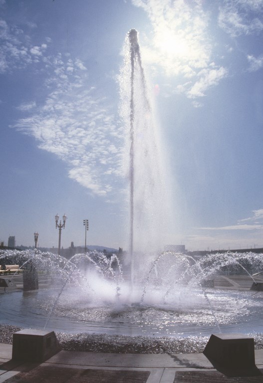
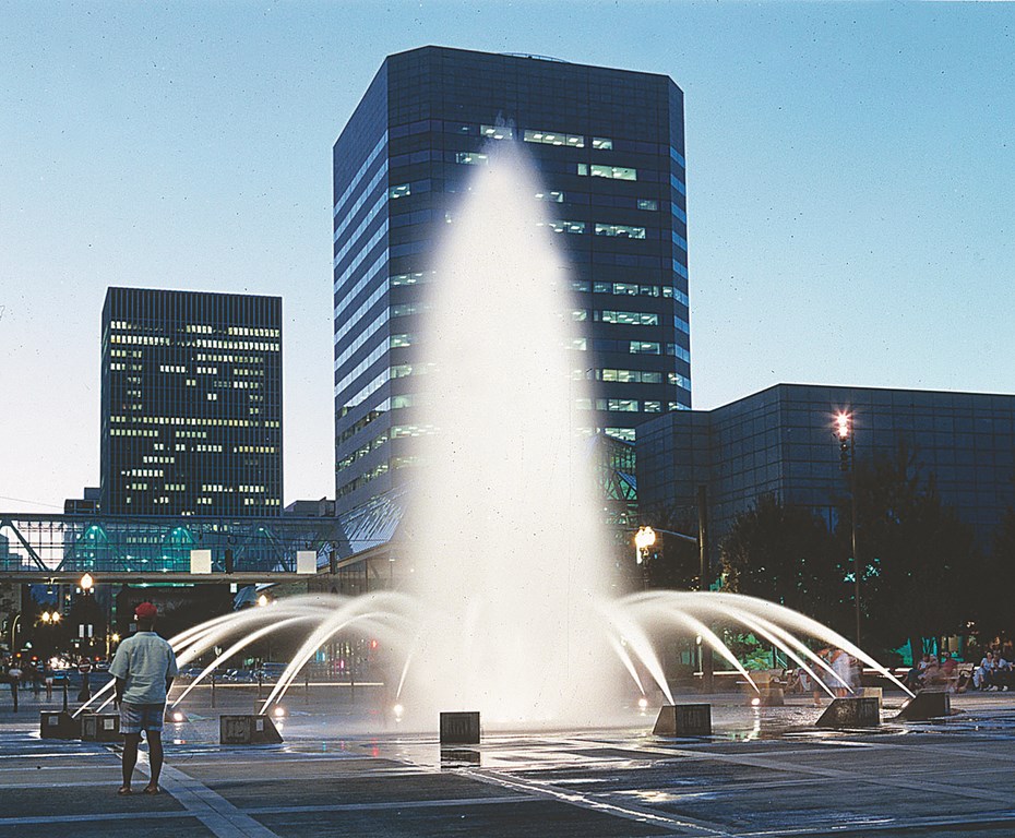
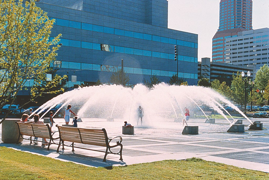
| From the start, the design for Portland’s Salmon Springs Fountain was about inviting the public to get involved with the water. Beautiful and imposing enough to be thoroughly enjoyed from a distance, it’s also a delight for anyone who doesn’t mind getting soaked. (Photos at left and right by Perron Collaborative; middle photo by Randy Shelton) |
As Perron says, “If people are going to get into the fountain anyway, let’s give them the fullest possible experience within the budget and make it totally accessible to all abilities and desirable to all age groups. Let’s make it part of the celebration of life, so people can feel permission to do what they want to do, as opposed to having to follow restrictive rules.”
What the city got were tens of thousands of people enjoying the waterfront park and embracing Perron’s fountain as part of their daily routines. Kids and their toys, bicycles, wheelchairs and dogs get in on the interactivity – and even the occasional bride and groom tie the fountain into their festivities.
Perron’s approach includes an additional design layer that makes the urban interactivity even more interesting: The waterfeature is programmed to reflect the rhythm, mood and pace of the surrounding downtown area. At 6 a.m., the fountain starts its day in a quiet mode, shrouded in a low cloud of mist. At 7:30 a.m., as the work day ramps up the energy level downtown, the fountain comes to life with more active sequencing – and by 9:30 a.m. is in full swing.
The fountain is programmed to provide a distinct “event” every half hour that reflects what’s going on around it – the lunch hour’s bustle, for example, or mid-afternoon calm, the return of rush hour, or after-dinner playfulness. At 12:56 a.m., one last vertical geyser from the center jet signals bedtime, at which point the fountain shuts down – as though gathering energy for a new day’s exertions.
A Point of Civic Pride
Designer: Manuela King, Royston Hanamoto Alley & Abey, Mill Valley, Calif.
Project: Weber Point Fountain, Stockton, Calif.
The city of Stockton, Calif., had spent years trying to revitalize its downtown area, but nothing had seemed to work. Ideas would fall through, key businesses moved on or failed, leadership would change hands – and the opportunities that emerged all seemed to lose momentum and get shifted to one back burner or another.
Finally, city officials took a big step and hired the firm of Royston Hanamoto Alley & Abey to develop a strategy for Stockton’s entire waterfront – which most agreed was the key to a broader downtown revival.
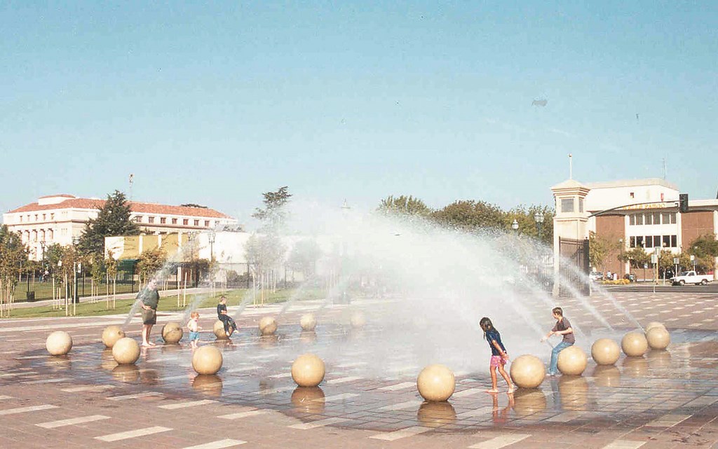
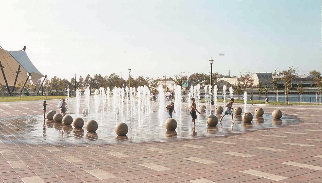
| Even its designers have been surprised by how powerful a magnet the Weber Point Fountain has been for the revitalized Stockton waterfront. Day and night, the fountain puts on a show that attracts visitors from all over the region. (Photo at left by Mark Schwartz; phottos in middle and at right by Harold Holland) |
All of the options the firm presented had one point in common: The intent was to lure the public to the site to see some sort of special feature at a central gathering place. Eventually, planners decided on a participatory watershape – a form of cool, free entertainment that would give people relief from Stockton’s long, hot summers.
After design approval, however, the city hit a budget crunch and dropped the waterfeature from the project. Royston Hanamoto Alley & Abey strongly encouraged the city to find a way to include the fountain, arguing that it was the crucial ingredient needed to draw people downtown. After much wrangling, the mayor found the funding to proceed with the fountain – and a huge local success story is the result.
|
Mixing It Up We at CMS Collaborative have learned through the years that the setting has a lot to do with the ways in which interactive watershapes are used by the public. The accompanying case studies show what happens when kids have access to the water, but the truth of the matter is that children aren’t always a factor. Some years ago, for example, we assisted architects at Skidmore Owings & Merrill in the design of a large, sequenced display for a formal setting at London’s Canary Wharf development. The display runs through a number of interesting sequenced events, the pool is raised to seat-wall level above the plaza, and the site functions as a gathering place – but just about the only onlookers here are well-dressed business people who wouldn’t dream of running through an interactive deck-level fountain! Those who visit the fountain are there to escape the confines of the surrounding office buildings, but few children ever come near – an absence that makes it difficult for adults to invent an excuse to jump in. Nonetheless, the mist, the sounds and the simple opportunity to touch the water’s surface provide an alluring connection to the natural world even for people too dignified to indulge the impulse to get wet. This is a continuum of possibilities we’ve found fascinating in our design work. And it’s made all the more interesting by the observation that, even though it is the demand for tactile contact that has driven the latest generation of fountain design, people don’t really even need to touch the water to interact with it on a profound level. — P.J.P. |
According to project designer Manuela King, “We knew how large we wanted it to be and that we wanted fog, vertical jets and arching side jets. We knew that we wanted the jets to range from low mist to a ten-foot vertical jet. Then we laid out a preliminary sequencing with about a 15-minute pattern that CMS programmed.”
What King, the design team and city officials didn’t know, however, was just how compelling an attraction this sprawling fountain would be. It is indeed a magnet for downtown, and the entire merchant community benefits because visitors need something to eat and want to buy from surrounding businesses.
Harold Holland, the city’s project manager and a strong advocate for developing the fountain, is especially pleased by the way the community has taken new pride in its waterfront. He says that the fountain “has been so popular that the city had to hire staff to watch over things and to keep people from being overly enthusiastic – such as too much running or jumping off the bollards, for example. We punish these and other ‘inappropriate behaviors’ with a ‘time out.’ “
“In three years,” he adds, “there have been no major injuries, and vandalism has never been a problem. It’s a peaceful sanctuary: Everyone’s out to have a good time and nobody wants anyone else to ruin it.”
A Spectrum of Possibilities
Designer: Bill Burton, Burton Landscape Architecture Studio & Gallery, Solana Beach, Calif.
Project: Irvine Spectrum Entertainment Center, Irvine, Calif.
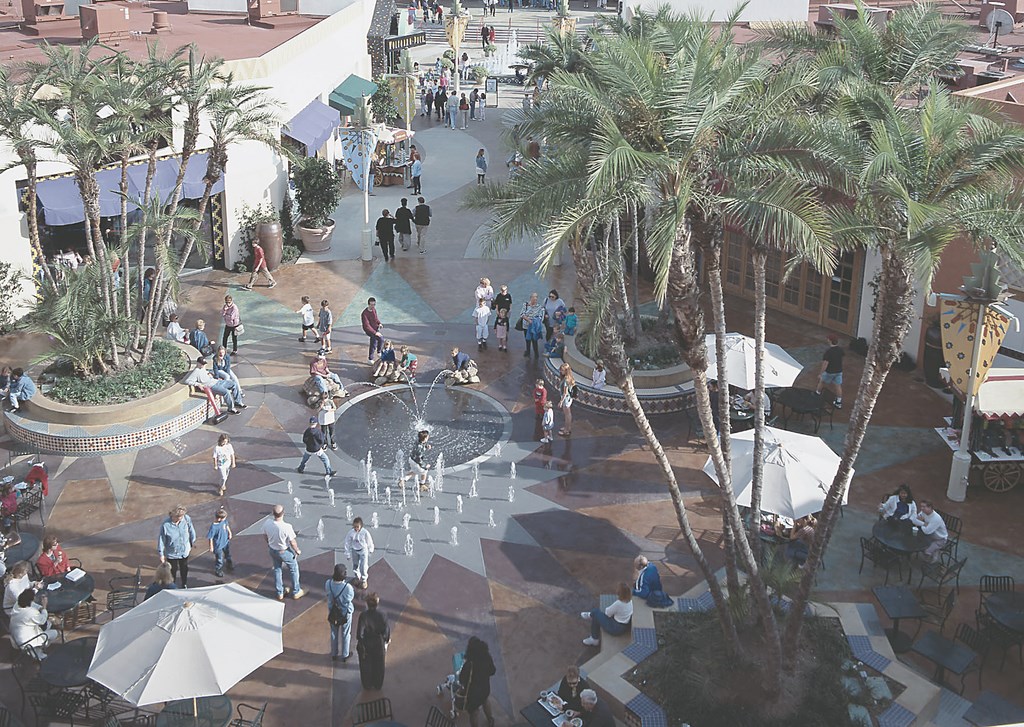
The premise behind the development of the Irvine Spectrum Entertainment Center was to give the city a “town center” – something that had always been lacking in the city’s vast collection of planned neighborhood developments.
As befits that ambition, Irvine Spectrum is not at all a traditional shopping mall: Businesses face inward toward a central plaza, and the focus has always been on entertainment, including a 20-screen movie house as well as restaurants, game arcades and outdoor kiosks. (Now in the third of four construction phases, Irvine Spectrum is beginning to add more retail space – but is also adding a carousel and Ferris wheel.)
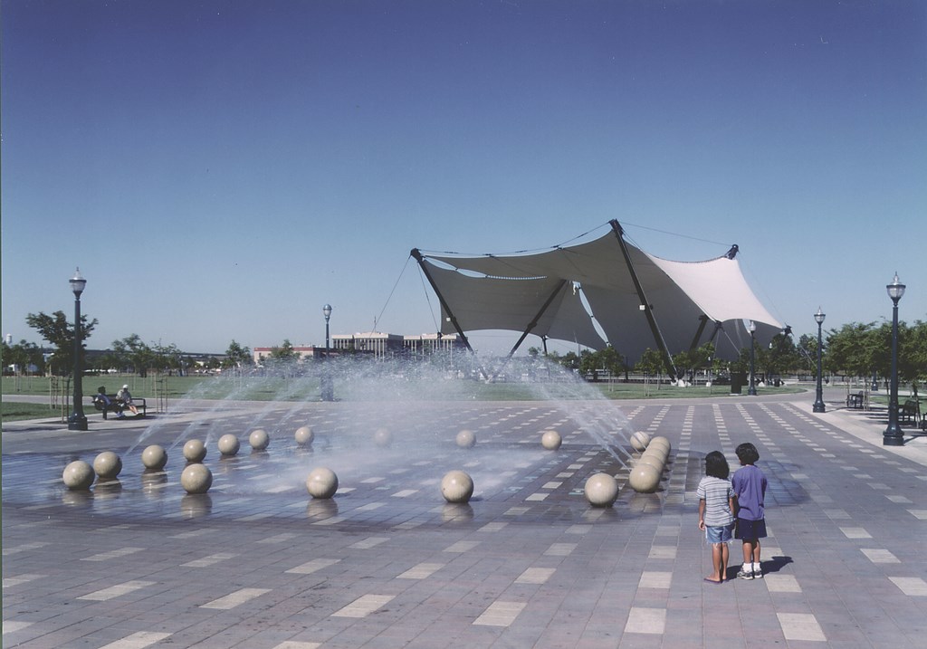
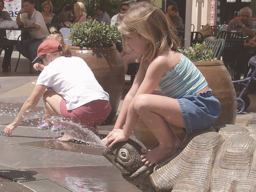
| Entertainment has always been the order of the day for visitors to Irvine’s unofficial town center, and young kids have taken a particular shine to an interactive fountain that’s just the right scale for their lively brand of fun. (Photos at left and in middle by CMS Collaborative; photo at right by Tom Lamb |
When the complex opened in 1998, the concept of a participatory fountain was relatively new, at least outside the context of a waterpark. And although designer Bill Burton could clearly imagine how such a fountain would fit into in a retail/shopping center or public park, he recognized quickly that the demographics for entertainment centers skew to a younger and much more energetic set of patrons.
|
Safety First Safety and common sense are watchwords when it comes to designing participatory fountains. Here’s a safety punch list we at CMS Collaborative follow on all projects: [ ] Stream height: Solid stream jets are great for moderate heights and velocities, but for greater heights, the use of aerated jet streams creates a robust visual effect while delivering less of a physical punch. [ ] Slow build: Sequenced jets that reach up to eye level should ramp up slowly rather than burst on with a surprise. [ ] Surface features: Keeping jets flush with the surface and minimizing hole diameter to under 1-1/2 inches will limit catch-points. And even in pools with standing water, suction fittings or sumps or transfer fittings need to be carefully considered: Anti-vortex or other fittings protruding from pool floors can injure feet, so flush sidewall fittings are preferable if you expect people to jump in the pool. In addition, any suction fitting cover must be absolutely secure and vandal-proof. (In many cases, we set up redundant and permanent barriers behind a surface cover or grating to be on the safe side.) [ ] Electrical safety: Underwater lighting must strictly follow the National Electrical Code and all relevant local codes. In addition, fountain fixtures in zero-depth pools should be mounted below a surface lens or grating to prevent direct contact with the fixture. (There are now several approved submersible/dry fixtures approved for fountain use that work well in this sort of situation.) And even though they are legal in most fountain installations, we never specify freestanding fixtures with exposed underwater cords. [ ] Public safety: As with any standing water, you must be concerned with toddlers who might drown and must be certain not to impede lines of sight of those who are supervising their children. As is true with any public water, you also have a potential health problem with biowaste. As a result, we often set up fountains with recirculated, treated water – along the lines of public swimming pools. — P.J.P. |
As Burton puts it, “We wanted the fountain to be an invitation,” he says, “but we didn’t realize it would be such a big one!” Early on, in fact, not-unreasonable concerns were voiced about rambunctious behavior that centered on the fountain. The arrival of parents with children dressed in bathing suits was another surprise, and the sheer intensity level of play on the part of older children was a legitimate safety issue.
The kids were having lots of fun, for example, climbing on top of the squirting turtles and diverting the arching water onto the sidewalk and café patrons. The original design offered spout trajectories that were more aesthetically pleasing, but reducing the flow of water from the turtles helped keep the peace.
Similarly, it was noted that although the fountain’s surface met minimum friction co-efficiency standards, the designers weren’t anticipating that anyone would be taking flying leaps in the area. There were a few minor injuries before it was thought to place a few large planters strategically around the perimeter of the fountain to block the running starts.
There was one last (and critical) change to the designers’ original intent: The fountain was designed with a zero-depth entry because the management wanted to be able to turn off the fountain and use the plaza to host special events – meaning that cars had to be driven over the area. It was soon apparent that the fountain plaza would never be used in this way, as it had already become far too valuable as an interactive playground – and the social heart of its community.
Pamela Jay Pasotti is marketing director in Santa Cruz, Calif., for CMS Collaborative Inc., a company that has been prominent as architectural-fountain consultants for more than 21 years and has participated in projects ranging from The Franklin Delano Roosevelt Memorial and The National World War II Memorial to the Getty Center Gardens and San Francisco’s Yerba Buena Gardens Esplanade. Pasotti joined the firm as a marketing and research specialist in 2001 after several years in the water-play industry. Through these experiences, she has developed a keen interest in peoples’ interactions with water in both formal and playful venues.


