


Simple Green

Understanding the client is frequently the most important factor in creating a successful design.
In the case of the project highlighted here, for example, it was a given that the clients were highly educated and knowledgeable with respect to design, style and materials: He’s a top-flight graphic designer with an amazing grasp of color, line, architectural details, presentation materials and techniques; she’s a degreed interior designer with a wonderful artistic flair.
They’re also two of my best friends: He and I taught together at UCLA and have known each other for more years than I care to admit.
They’ve known about the focus of my business for years and said they hadn’t wanted to call me because the project was relatively small compared to those I normally tackle. Instead, they’d called in a couple of other builders to develop plans and offer estimates. One night after dinner, I took a look at the proposals and offered my honest opinion that the designs were, in a word, terrible.
They had already reached the same conclusion. After a few more minutes of looking through the plans, he asked me point blank, “What would you do?” So I went to work.
SOFT AND RICH
The project involved renovation of a (basically) rectangular backyard pool, its decking and its landscaping along with the addition of a spa – nothing very tricky in technical terms but very important with respect to the space and its visual impact.
The home was typical of its surroundings in an upscale neighborhood of Thousand Oaks, Calif., and featured (as might be expected) tasteful interior décor. The backyard was fairly small, however, and clearly needed help: The original pool, with its rounded corners, modest pre-cast coping, drab gray plaster and boring waterline tile, needed complete reworking along with the drainage system and the hardscape.
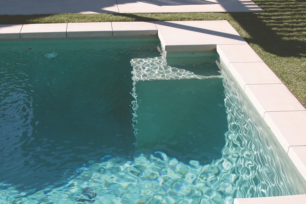
| The soft-green color of the one-inch glass tile at the waterline is carefully matched by the soft-green plaster, effectively blending them together and making the waterline tile ‘disappear.’ Note the newly squared corner and step detail. |
I drew up a set of plans that leaned toward contemporary styling with a narrow color palette. Basically, the plan called for squaring the pool’s corners and changing its color scheme while adding strong architectural touches and hints of Asian style to the overall space. The new hardscape was to be in concrete with clean lines, stepping pads and rich (yet subtle) organic colors – all greens, grays and blacks to maximize the visual impression made by the space and tie everything together.
When my friends saw the plans, they knew we were on the right track and we began the process of transforming the backyard environment from bland to gorgeous, beginning with the pool itself.
Once the structural work of updating the pool and adding the spa was done, we set about matching the new green plaster to the waterline tile so the tile would, in effect, disappear. Experience has taught me to appreciate those times when you want to draw attention to the tile line as well as those when it’s best to make it disappear for simplicity’s sake. In this case, the green one-by-one ceramic tile was nothing special, so I worked with my friends at Marquez Pool Plastering (Sylmar, Calif.) to create a custom plaster color to match the tile exactly and make it go away.
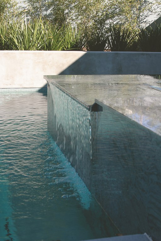
| The new spa features an unusually wide seating area all around the perimeter, with water flowing across a about a third of the green-and-black granite surface before sheeting into the pool. |
I’ve said it for more than 20 years now: The idea is not have someone walk into a backyard and be dazzled by the waterline tile. Rather, it’s about striving to create overall environments that make fuller, well-rounded impressions. In this case, we were looking for a beautiful, Zen-like look in which all the visuals worked together.
To complement the pool’s interior, we widened the bond beam to accommodate the simple, two-foot-wide, natural-concrete coping. We also raised a section of the beam by 18 inches to handle some grading problems in the sloping yard and finished it with a beautiful, steel-troweled gray stucco. (We wanted it to mottle to go along with the rest of the natural-concrete hardscape, which we’d sponge-finished to expose the sand particles for a roughened texture.)
This decision to go with a two-foot coping detail was crucial with respect to scale. While not needed from a structural standpoint, in visual terms it was essential in making everything work together.
The clients picked the materials for the square spa themselves. It’s all done in green and black granite and is perched above one end of the pool. We also changed the step configuration in the pool, put rectilinear benches in the corners and set up a seating area in the corner of the yard.
ARBOR TIME
One of the unique details on the project is a metal arbor off to one side of the pool.
In our conversations, the clients indicated that they wanted a structure that made an artistic statement but that wouldn’t obstruct views from inside the house. The problem with a conventional wood structure was the 20-foot space that needed coverage: If we’d gone in the usual direction, we would’ve been forced to use multiple posts. Ultimately, we moved in another direction and made the overhang out of steel.
The resulting nine-foot-tall structure is built with structural steel, primed and painted black and done up with wonderful details that brace the structure effectively without turning it into a solid cover. The key is that using steel enabled us to support the entire structure with only four posts, and the shadow patterns on the decking pads and in the pool are now truly fantastic.
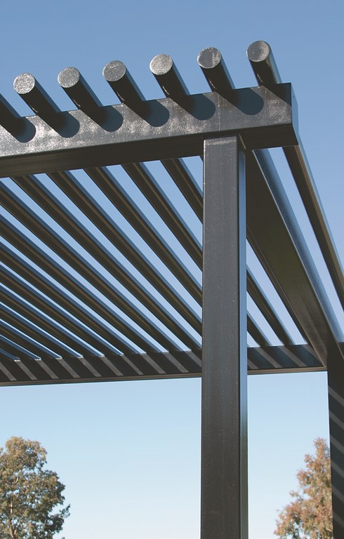
| With its tubular steel elements, the metal arbor is a wonderfully simple structure that offers a good bit of shade along with a distinctive appearance. |
As with the hardscape, we stuck to a simple planting palette. The entire yard is landscaped with grasses, bamboo and kangaroo palms selected by my frequent collaborator, Pat Kirk of Prestige Landscape (Northridge, Calif.). Again, nothing jumps out at you when you enter the space. Instead, there’s an impression of harmony and tranquility – exactly what the clients wanted.
As designers, both of them knew the role color would play in conjuring that fundamental response and knew the greens I was using took us in the right direction. Yes, there are times when I’ve used colors to make extremely strong statements and tell stories about particular sets of clients. For a project such as this one, however, the space was modest, the materials we were using were basic and I was working with savvy clients who wanted elegant simplicity.
To make it work, we used colors that worked with the colors within colors to minimize visual stress. That’s not to say the palette isn’t rich: We applied our greens and grays in ways that make even a simple project take on a great deal of elegance, depth and richness. By the same token, this setting isn’t extravagant by any stretch of the word: It’s all a tasteful reflection of the clients and their design sensibilities.
Working with a defined color palette led us to some very specific technical decisions. In designing the plaster mix, for instance, we knew that if we used white concrete with green oxide dyes, we would get a pastel green that wouldn’t match either the flat gray-green of the tiles or the natural greenery of the plantings. Instead, we used a mix that started with gray Portland cement to knock some of the yellow tint out of the green dye.
Not only did this make the tile disappear, it also blended it in with the grays of the surrounding concrete and the black of the steel arbor and the spa’s granite.
VERDANT VERACITY
Truth be told, I’m encouraged that some progress has been made through the years when it comes to use of colors in pool and spa design.
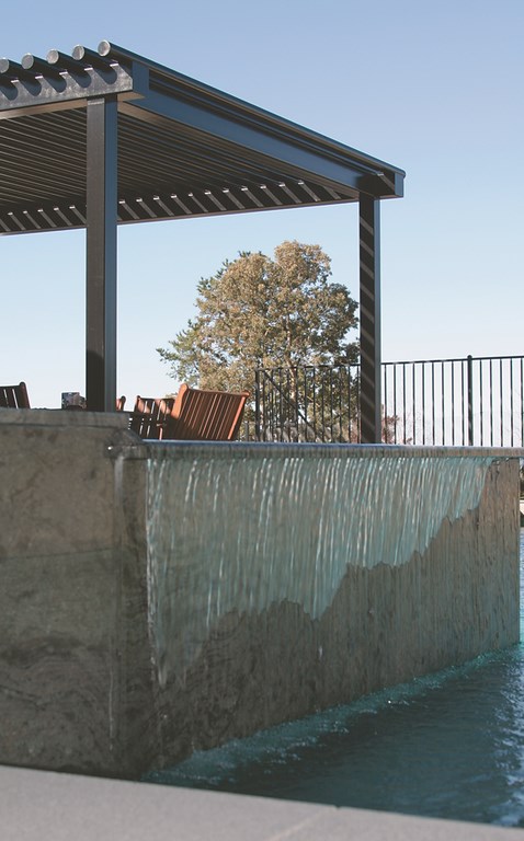
| The best thing about the metal arbor is that fact that it spans a full 20 feet with just four posts, meaning views across the yard are only slightly obstructed for those sitting either in the spa or inside the house. |
It wasn’t too long ago when I was greeted by jeers and near-uniform revulsion when I told participants in an NSPI Builders Council meeting that my favorite colors for pool interiors were greens – gray-green, blue-green, yellow-green and more in dozens of possible variations. Their thinking apparently ran to the thought that green in a pool would remind consumers of algae and that there was no way anyone would swim in a green-colored pool.
I’ve thought since then that what they lacked most at the time was any sort of grounding in color theory and that they simply didn’t know that blending soft greens with the reflective qualities of water makes for pools that are visually inviting with an irresistibly refreshing appearance. But times are changing: Not only is green accepted nowadays, it’s among the most popular of all colors for pool interiors.
In the case of my friends’ pool and entire backyard, any approach that didn’t take colors and color theory into full account would have left them dissatisfied, which is why they ultimately brought me in on the process. There’s simply no way that turquoise tile on white plaster with red-brick coping would’ve made the grade for them.
The thing that amazes me is that color theory isn’t inaccessible or unattainable and that it’s quite possible for most anyone to learn how to use it in basic and effective ways. When you take the time and make an investment in developing your own abilities with color, you’ll find that understanding and delivering on your clients’ desires is much more easily within reach.
David Tisherman is the principal in two design/construction firms: David Tisherman’s Visuals of Manhattan Beach, Calif., and Liquid Design of Cherry Hill, N.J. He can be reached at [email protected]. He is also an instructor for Artistic Resources & Training (ART); for information on ART’s classes, visit www.theartofwater.com.