Critical Distance
I love it when a project teaches me a lesson about my design process. In this case, it was just a smallish insight – but it had a profound effect on the outcome just the same.
I’d seen this property for the first time while the home was under construction. It was a large building, about three-quarters complete, that occupied most of a fairly large parcel. The clients were happy to show me around, let me figure things out and come back to them with a design – with, of course, a couple of ideas they wanted me to accommodate in the odd, angular space I had available for use.
For starters, there needed to be a lap lane so he could swim and train for Ironman events. There also needed to be a shallow, basking area where she could hang out and converse with friends while keeping an eye on her four children and any other kids who might be visiting. And they all wanted a large entertainment space with an outdoor kitchen and plenty of seating/dining/bar space for the large parties they were planning to host.
It wasn’t a huge or particularly demanding wish list, but the site offered some challenges that resulted in my first five or six passes at a design ending up in the round file by my drafting table. At that point, I decided to step back and tackle some other pending projects.
It was a good decision and apparently a much-needed break: When I came back to it a few days later, everything clicked into place in rapid order, and within four or five hours my presentation was ready, complete with a nice video. The clients loved everything about what they saw and immediately signed on the dotted line.
BIG SKIES
The property is in Gilbert, Ariz., on land that was once a ranch/farm of several hundred acres. The development consisted of just three homes, including one the farmer kept for himself after selling off most of the land. But what he held in reserve was truly special: The three parcels were surrounded by well-established woods and broad, open fields – not the sort of arrangement you encounter very often in a Phoenix suburb unless you happen to live by a golf course.
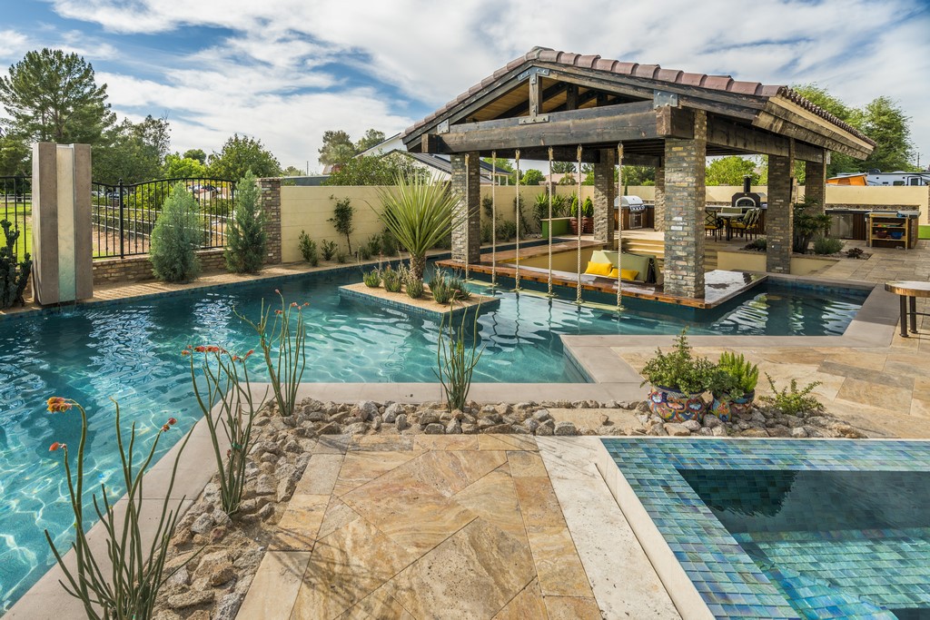
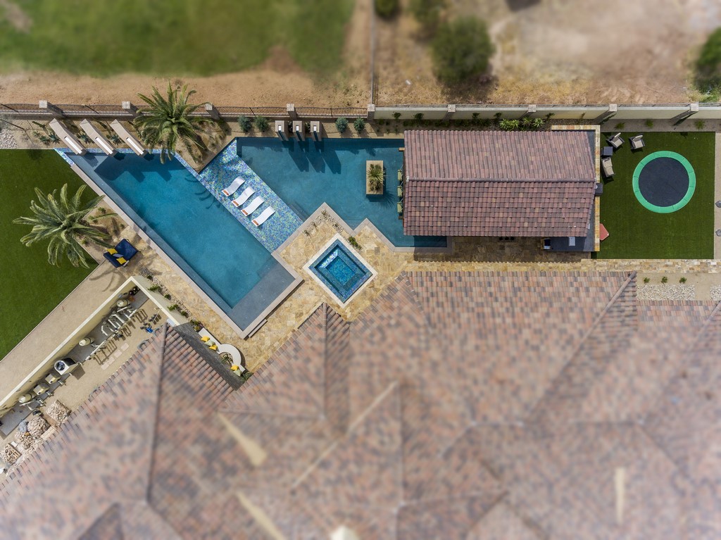
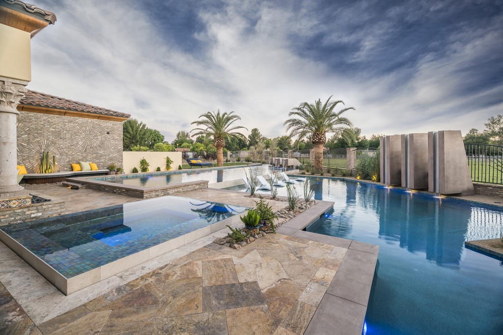
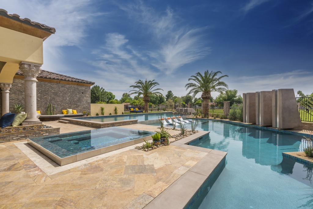
The house was pretty far along when I first saw it and was unusually large and opulent. Most homes in the Phoenix area are designed with specified “pool areas” on postage-stamp lots, and that was certainly not the case here. We had a large-enough space available that we were able to include a large Ramada (as a covered outdoor entertainment space), two pools separated by a vanishing edge and a big sun shelf, a separate spa and two sets of large waterfeatures that flowed into the pools.
The clients are gregarious and love entertaining large groups, but they’re also about family time and quieter backyard pursuits. Keying on those facts, I spent a lot of design time thinking through the visuals and how everything in the backyard would register with only the family present – then balanced those considerations by thinking through traffic patterns and gathering places where dozens of guests might sit or stretch out to have a good time.
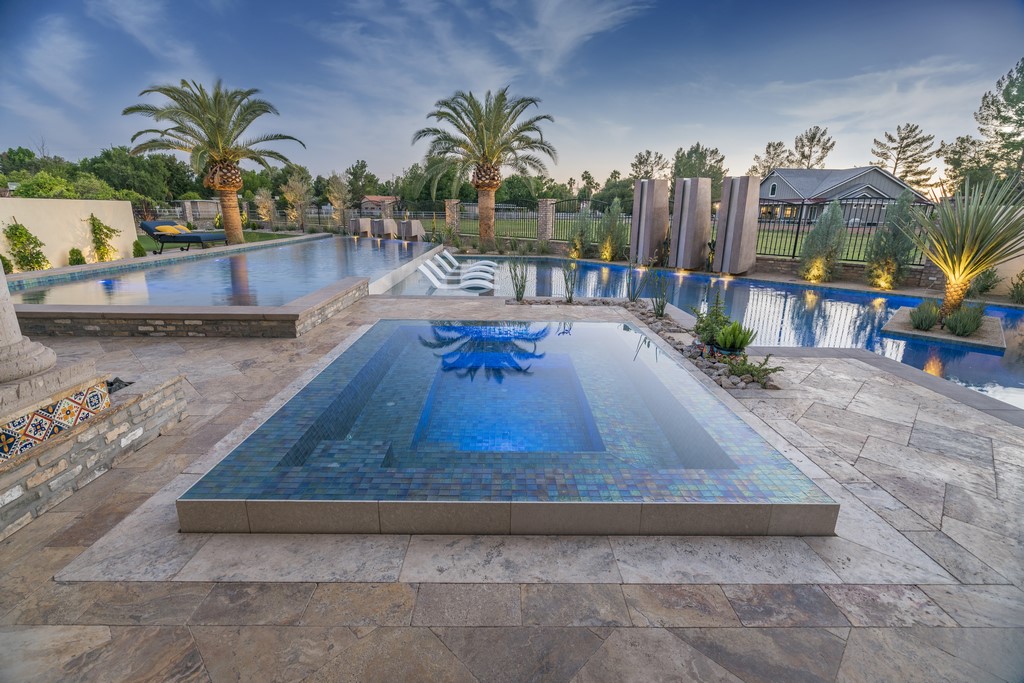
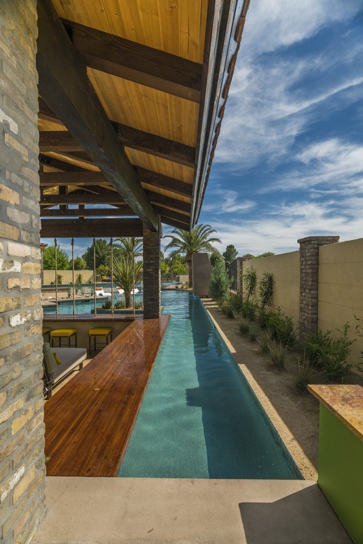
| The design is anchored by two features: The big ramada, which serves as a core entertainment space with 40 linear feet of in-pool bar surface and ample kitchen amenities; and the raised, perimeter-overflow spa, which commands the key line of sight through the indoor kitchen’s windows. Once these elements were in place, the rest of the design flowed through and around them. |
To get it done in the style they wanted, the clients established a big budget and left us at Premier Paradise (based in Gilbert) to determine every detail, from all choices related to plants and trees to the selection of materials and furnishings.
The design itself flowed from two key features: The Ramada, which I knew from the get-go had to be placed where it ended up being placed, and the spa, which was strategically positioned outside the kitchen window to set the tone and invite the homeowners, their children and guests out into the backyard.
Next came the upper pool just beyond the home’s family room. This vessel includes a lap lane he wanted while doubling as a grand reflecting pool when not in use. The upper vessel overflows across a long vanishing edge onto a shallow sun shelf area that in turn opens onto the larger, deeper lower pool, which includes a second lap lane as well as a swim-up bar that’s been buffered from the main body of the pool by a small, rectangular island.
ADDITIVE EFFECTS
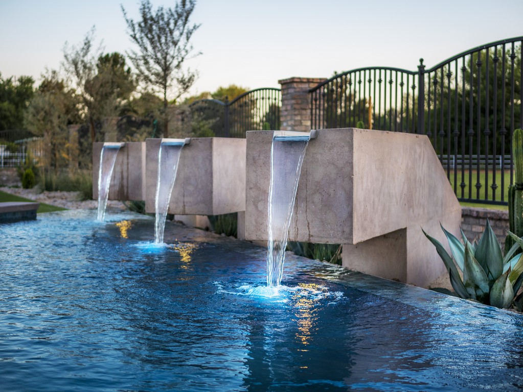
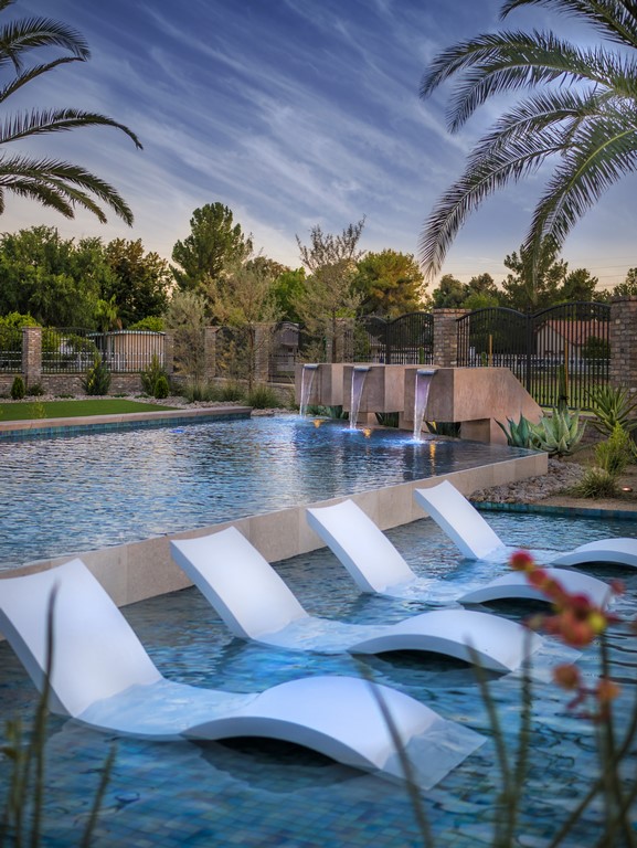
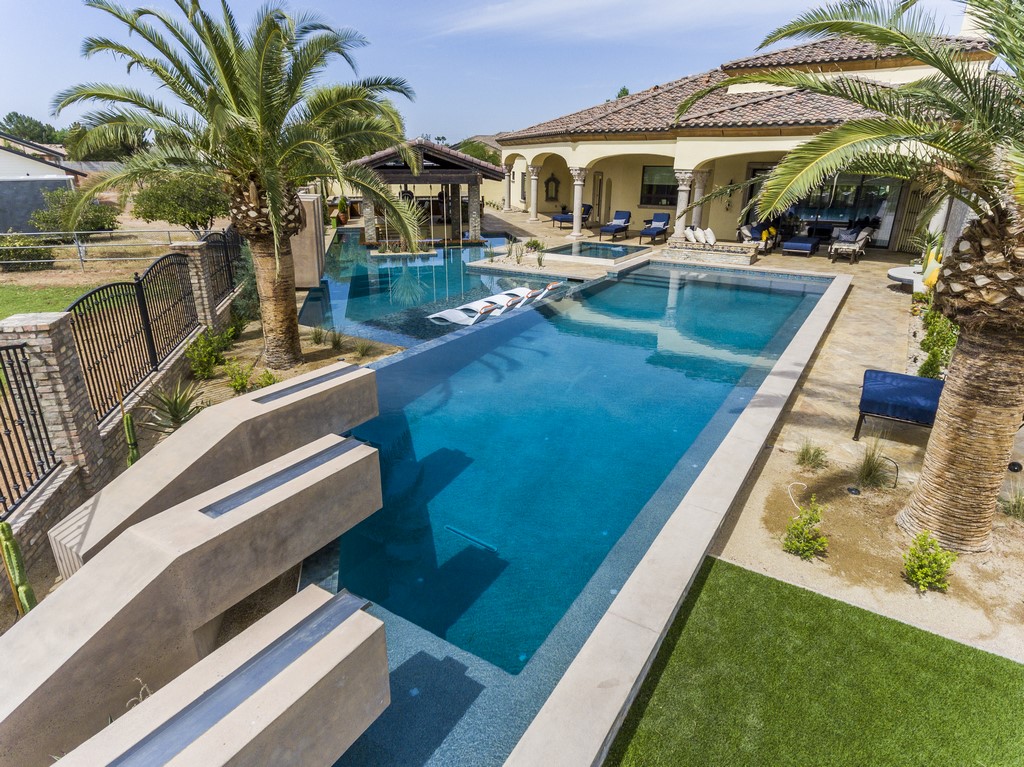
Both pools come with waterfeatures – the upper pool with low-slung monolithic slabs cantilevered past the bond beam and over the water, the lower pool with the similar slabs standing on end. In both cases, the runnels include stainless steel inlays (made by Watershape Scuppers in Gilbert) to ensure crisp, clear flows.
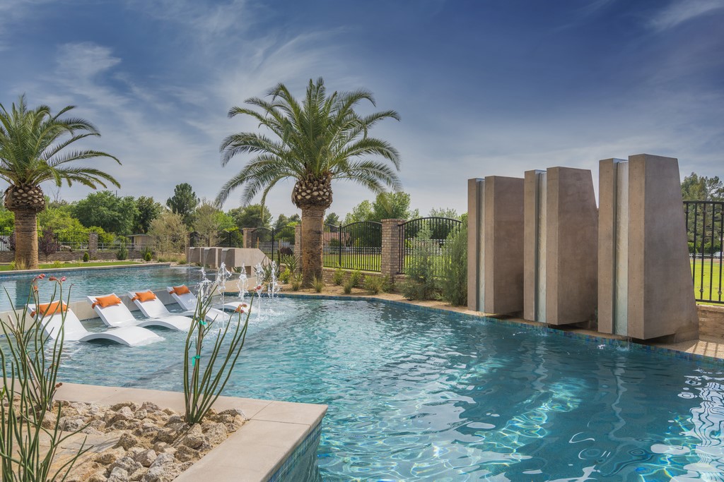
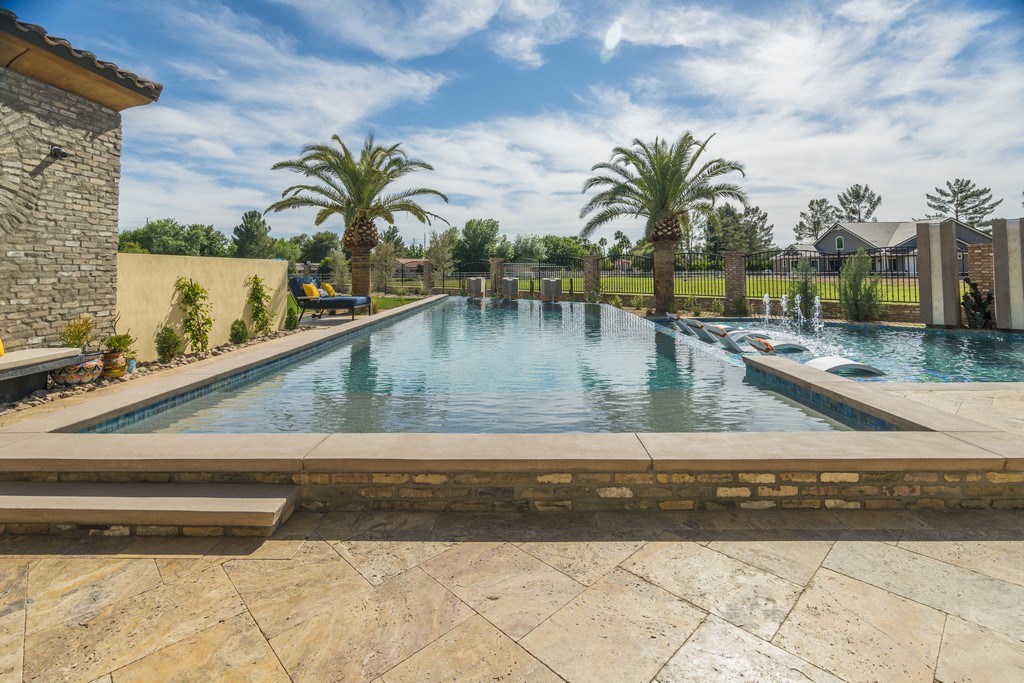
The vertical waterfeatures on the lower pool stand eight feet tall and were placed on end for a simple reason – that is, to block out the view of a home that was being built across the way. The presence of that new home came as an unexpected surprise: My clients had assumed their view would always consist of an open area backed by trees, and to say they were disappointed by the visual intrusion is an understatement.
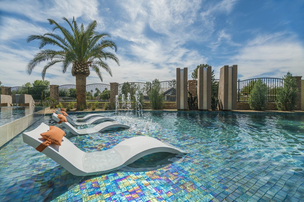
| The big, tripled waterfeatures serve a major purpose in controlling and directing views, with the low-profile blocks on the upper pool opening the view beyond, and the tall towers on the lower pool effectively blocking out a house that suddenly appeared across the way. (When the trees grow in, the more-complete barrier the homeowners want will be in place.) Arrayed between the waterfeatures – and immediately adjacent to a long vanishing edge wall – is a large sun shelf, again with the view blocked in one direction but open in the others. |
By standing the lower pool’s waterfeatures on end, we immediately blocked out the new house from the all-important perspective of the kitchen window. We also planted several trees to frame the big pylons, so eventually views will be blocked from the family room and Ramada as well. By contrast, the trio of low-profile waterfeatures on the upper pool are set up horizontally to keep that view invitingly wide open.
The rest of the pools’ features also revolve around a desire to control views and perceptions from both inside and out of the water. The sun shelf is a perfect example: Draped in shimmering Lightstreams Glass Tile (Santa Clara, Calif.), it is isolated from both pools by the gentle sounds of the flow across the vanishing edge.
| The bird’s-eye rendering shows the physical relationships between the two pools and their various amenities. Despite appearances, both pools are made for strenuous lap swimming, with clear, 50-foot lanes in each. In the lower pool, it runs alongside the swim-up bar, next to the island and over beyond the waterfeature towers; in the upper one, passage is simpler with a run along the outer wall. |
It’s an unusual, inset vanishing-edge treatment, but in this context it’s an ideal way to define a key, self-contained space within the composition – one that commands views of the lower pool, swim-up bar and Ramada but from which views of the home across the field are masked by the vertical waterfeatures. The shelf also faces north across the lower pool, keeping the sun out of the eyes of those lounging in the space.
The far end of the upper pool is a bit like a spear pointing out into the space beyond. It directs the eye to a great view, but in more practical terms, it defines the end of the upper pool’s 50-foot-long swim lane. But that’s not all: The spear’s tip also serves as the center line for the other 50-foot-long swim lane that moves alongside the Ramada at the far edge of the lower pool.
DELUXE DETAILS
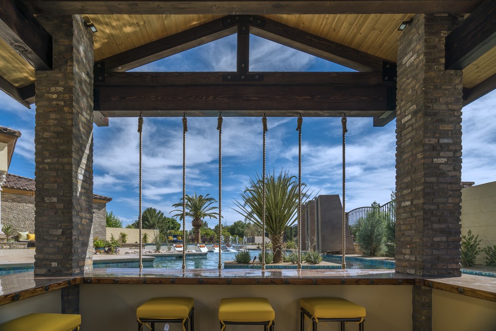
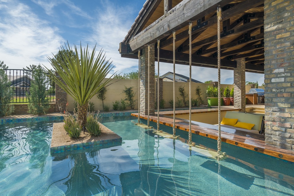
The swim-up bar is equipped with three rope swings, each of them wide and strong enough to support either one or two people. The swings’ seats are made using heavy coping stones, each of them wrapped in the sort of plastic material found in truck beds to protect all of the hardware. Their weight was carefully considered: We wanted the swings to move, but we wanted them to be hefty enough (at about 80 pounds apiece) that there was little chance they’d move freely enough to smack into the wooden bartop.
My wife and I had seen similar bar swings on our honeymoon on Bora Bora several years ago. I’d filed the idea away in my head, and this was the perfect opportunity to pull it up and put a variation of the original idea to good use. In addition, there’s standing room at the bar along the swim lane, so in all, there’s 40 feet of service area – a bar to meet the needs of even a very large pool party!
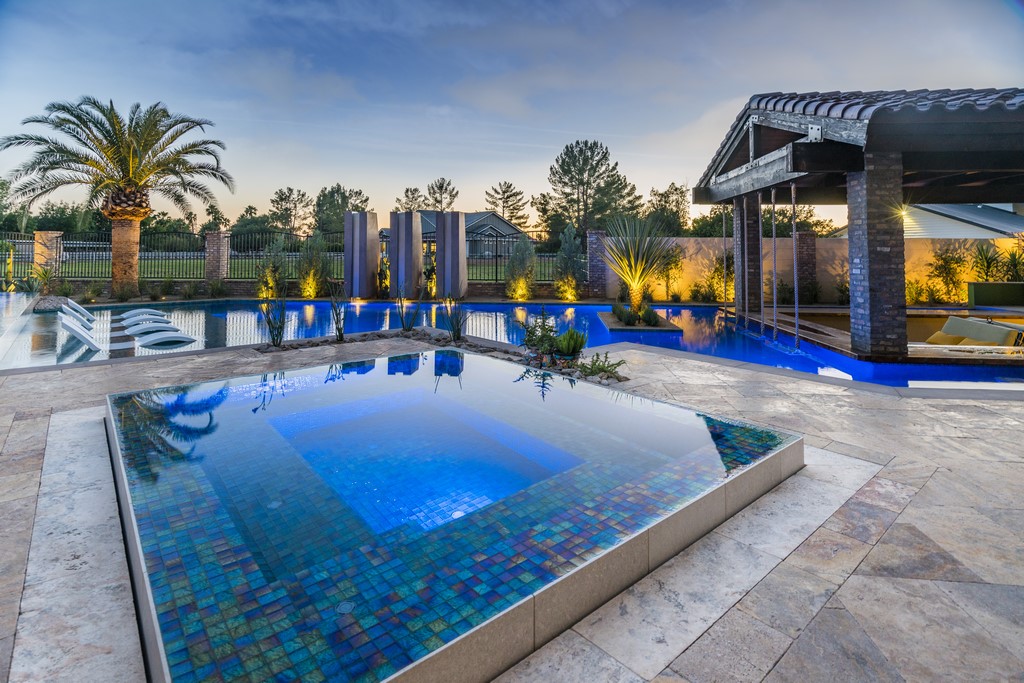
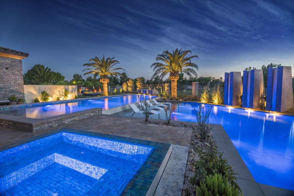
| As day fades to night, the setting hits a new level of interest courtesy of a detailed lighting scheme that includes an array of in-pool lights; fixtures in the waterfeatures; and thoughtful landscape lighting that serves to create new “distant” views within the confines of the backyard when the sun goes down. |
As mentioned above, we selected and placed every plant throughout the space. I spent days at Desert Horizon Nursery (Queen Creek, Ariz.), tagging, untagging and retagging plants and trees. The staff caught on to the significance of the project and granted me access to their private stock – one of the rewards of developing good, long-term relationships with key vendors.
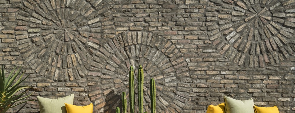
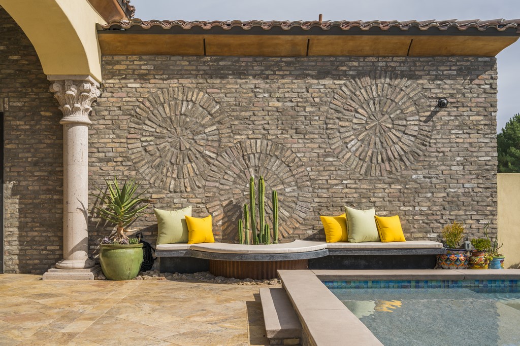
We can claim credit for most of the backyard’s great features, but there’s one detail – that is, the starburst brickwork on the wall adjacent to the spa – that was the product of the home-design team. It was in place when we did our initial walk-through, and I have to say it was always on my mind as the design took shape. We devised the low bench and the planting lunette with the cactus, but the brick design was so substantial on its own that much of what we did referenced it as the yard’s key focal point.
The backyard includes so many deluxe elements, so many fine details, that it rivals resort projects I’ve encountered in my travels around the world and have seen and worked on locally. The rope swings and waterfeatures mentioned above are among the cool elements we were able to bring to bear, while the brickwork starbursts are simply outstanding – elegant, beautifully textured and visually compelling.
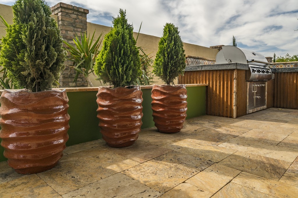
| The fine details truly enhance the setting, including the swings in the swim-up bar, the island that isolates them from much of the activity in the lower pool and the wonderfully textured plants and pots that look like carrots next to the outdoor kitchen. But the finest of the details was actually set in place before we started working on site: The starburst brickwork was so cool that it inspired us as we worked on the rest of the property. |
And then there are the curvaceous orange-tone vases (also supplied by Desert Horizon Nursery) planted with small cypresses: They look like fantastical carrots sprouting out of the ground alongside the kitchen area.
It’s a level of casual sophistication that can be achieved with the right clients in the right setting – and serves as a distinctive point of pride for all of us at Premier Paradise. As mentioned at the outset, my experience here also taught me a valuable lesson about critical distance and the value of stepping back to let a swirl of ideas coalesce into productive patterns.
All in all, it was a great and satisfying project – one of our most ambitious to date and one that has already helped us set the bar higher in projects we’ve pursued since we handed this one off to the happy homeowners.
Jeromey Naugle is the owner and chief “paradise expert” at Premier Paradise, a design/build firm he started in Phoenix, Ariz., in 2009. With more than 15 years’ experience in designing, building and maintaining watershapes and more than 10 years as a digital designer, Naugle participates in the Genesis 3 schools as well as Pool Studio educational programs. He may be reached at [email protected].


