Please Fence Me In

Almost every landscape I’ve ever worked on has had some type of fence.
I use them because they establish boundaries, but I also see them as having much more than a simple utilitarian function. To me, they set a stage for everything they enclose and, depending upon where you happen to be standing, encompass you within a space or invite you to appreciate the view from a distance.
In this discussion, I want to focus on the use of fences you can easily see over – a fence that defines a boundary while allowing viewers on one side to see what it encircles and on the other to enjoy the space’s visual imagery. By low, I mean 42 inches tall or lower – low enough not to require permits where I work, making them easy additions to any design, even those with limited budgets.
In my opinion, low fences set a distinct tone for the rest of the garden. I’ve used them in almost every style of design, from contemporary with cable-rail systems to traditional looks with the proverbial white pickets. I’ve enclosed whole properties with post-and-rail fences and in other cases have bisected yards using low fences to support vines and delineate secret gardens.
No single design element, however, can be considered in a vacuum. In every case, the decision about what type of fence to use and where to place it needs to be made in context with the plants and how they will be placed relative to the fence. You also need to think about how the fence works with other design elements in the space.
DOWN TO CASES
I’m currently working on a one-acre property in Santa Monica, Calif., that features what can best be described as a derivation of a Craftsman-style home – not pure Greene & Greene, but clearly a member of the same stylistic family. The home is centered on the property from east to west and has a large expanse of lawn in the front yard.
The current debate is over whether or not to enclose the property with a picket fence, a choice that would fit well with other prominent wood details evident on the home itself.
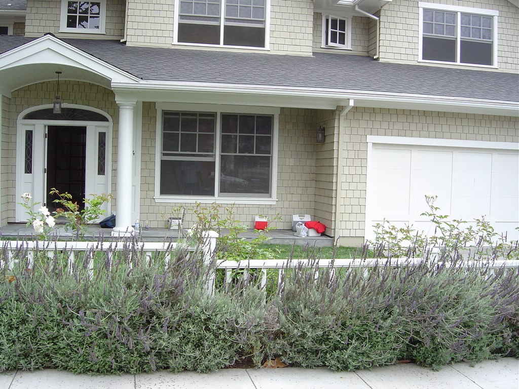
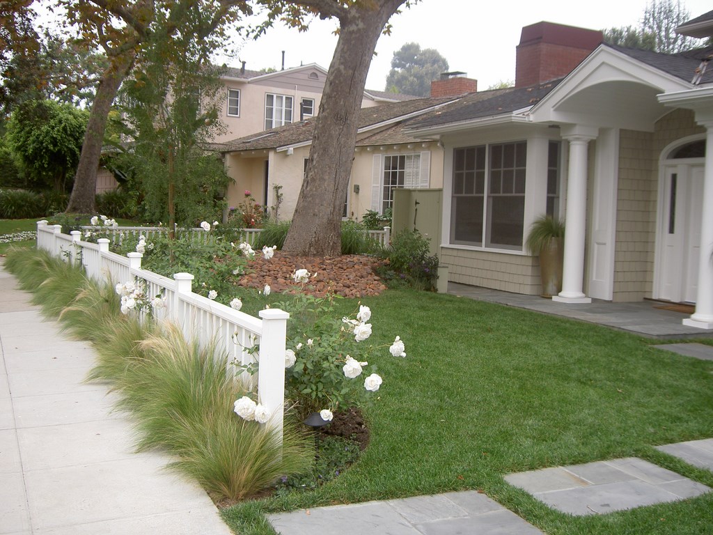
| The original lavender hedge grew to dominate the low, open fence and also grew out into the sidewalk – a poor choice that eventually looked unruly and unattractive. After we eliminated the central gate and redirected visitors around the barrier, the new fence’s continuous line gives the property the illusion of being wider – and the new plant choices complements the fence without the possibility of overwhelming it. |
I’d originally opposed a fence, thinking the big sweep of lawn and the existing plantings gave the property a sense of elegance and sophistication that I feared a barrier would truncate. But as our discussions moved forward, I had to leave the possibility open.
For one thing, the homeowners had a strong sense that the house was too exposed to the street – an observation backed up by the fact that a homeless person had once taken up residence on their spacious front porch. Part of what they wanted was a deterrent to this sort of occurrence.
For another, their children like to play soccer and the front lawn is the largest play area on the property. They believe a fence will keep the ball in the yard and the kids out of the street. (I reminded them that low fences aren’t ideal backstops and that the outcome likely will be that the kids will play out front less than they would otherwise because of the hassle of getting past the fence every time the ball goes over it.)
The final decision is still under consideration, so I’ve made a few suggestions in case they ultimately decide to build the fence. First, I recommended placing it back 18 inches from the sidewalk to allow enough room for plants on the street side that will soften the transition from sidewalk to fence. Second, I suggested an undulating border on the inside of the fence, varying from 18 to 36 inches wide and allowing plenty of room for another planting bed.
As the proposed fence would not be a solid one, borders on both sides will give viewers a sense of depth that draws their attention away from the fence itself, blending all the elements into views that will be attractive from both the street and from inside the house.
OTHER DIRECTIONS
In my experience, the only fences that work without planting are parts of contemporary or modern designs. The overall minimalist look gives a stronger architectural role to these fences, and they’re often used to establish or extend lines that move the eye in certain directions, elongate spaces or make simple artistic statements.
With other styles, there are myriad choices to be made about fences, including construction materials, gates and entries, planting schemes and more, with everything tied as always to the style of the home and the desires of the clients.
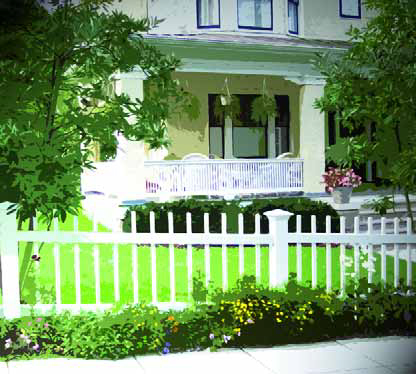
I once worked, for example, on a property with a classic Cape Cod-style home. There was an existing white picket fence with a low gate in the center, but through the years the planting had completely overwhelmed the wooden structure, growing higher than its top and blocking it from view.
| This post-and-rail fence was softened using a colorful mix of perennials and small, columnar trees that help establish a clear demarcation between private and public spaces. |
To simplify the design, I removed the central gate and redirected visitors around the fence and next to the driveway, running slate pads across the lawn to form a new link between the sidewalk and the slate entry porch.
The fence now elongates the front of the property, making it appear wider. I used Stipa tenuissima (Mexican Feather Grass) to create a lower, softer transition between sidewalk and fence. This plant will never grow higher than the pickets, and we purposely keep it thinned out so it won’t overwhelm the sidewalk, either.
Inside the fence, I planted a perennial border using only purple and white flowers, varying the width of the border between one and two feet. The narrower border is in scale with the rest of the design where a wider one would have dominated the view and been out of proportion.
I only used plants whose maximum height was three feet, as the idea was to introduce the house with a pleasant, calming scene that didn’t dominate visually and left the house itself as the showpiece. Where trees were added, they were small (Maytenus boaria) and placed off to the sides to frame the landscape and house.
INDIVIDUAL NEEDS
Not all Cape Cods are the same, of course, and another one I worked on required a different approach.
In this case, the house sat on a corner lot and was totally exposed to the street. The homeowners had two small children and were tired of neighborhood dogs using their lawn as a community depository. While they wanted a sense of enclosure and to establish some privacy, they didn’t want to feel claustrophobic or cut off from the street.
The solution in this case was to install a low post-and-rail fence three feet in from the curb line on the two street sides of the property. This meant that the children couldn’t easily gain access to the street and that uninvited four-legged (and two-legged) guests would be discouraged from trespassing.
Of course, a bare fence would have been boring, so I established an undulating lawn line that alternated from wide to narrow from post to post. This let me plant vines at the foot of every other post that will grow to soften the look of the fence. The intermediate areas were filled with low-growing perennials.
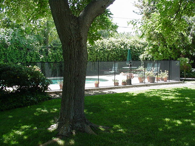
| This pool fence was never planted on one side, making it stand out like a sore thumb, and what planting there is blocks the view of a good portion of the water. My recommendation was to remove the hedge and set a low planting in front, moving the fence into the planter bed so we could put plants on either side. |
The homeowners in this case wanted a space where they could work with and teach their kids how to plant and care for a garden. To that end, I planted a mix of roses, strappy flowering plants (including Agapanthus and Hemerocallis) and a variety of low, flowering perennials that offer lots of color choices for cutting and flower arrangements.
To enhance the sense of privacy, I planted one small, columnar tree between each post – something that won’t take up much yard space while offering a lacy barrier that defines their private space.
I’ve also been called on through the years to develop barriers around watershapes. Most often, watershape fences appease local building inspectors but leave much to be desired visually and aesthetically. But even these utilitarian barriers can be dressed up using the principles described above by planting them front and back and turning what might otherwise be an eyesore into a beautiful transitional visual. I always suggest keeping these plantings low – generally below three feet, as you don’t want to block the view to a watershape.
“Removable” fencing is a special case: Most homeowners don’t take these fences down even when people are in the pool because it’s just too much work. If they intend to do so, any planting on either side of the barrier should blend well visually across the gap when the fence is removed.
In the best low-fence designs, the fence itself is the foundation for the planting. A barrier can be achieved with plants alone, but there’s no clearer or easier way to establish the demarcation than with a fence – unless, of course, you use a low wall instead.
The key as always is an understanding of the site, the style of the home and the clients’ needs. When you have all that information, you can establish transitions between any fence and the rest of the design so that everything works together in an attractive, appealing way.
Stephanie Rose wrote her Natural Companions column for WaterShapes for eight years and also served as editor of LandShapes magazine. She may be reached at [email protected].


