Picture Perfect
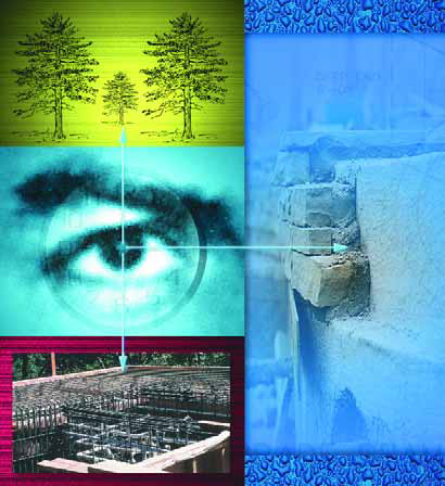
In February 1999, the cover photo on the premiere issue of WaterShapes showed a steel cage for a subgrade piling being lowered into the ground. That image was taken from a feature article by designer/builder David Tisherman, the first of many that he has contributed to the magazine. In that article and in another that followed in April 1999, he detailed the design and construction of an elaborate residential swimming pool project that he believed reflected his finest work.
The final article on the project, originally scheduled for the summer of 1999, was to cover the project in its finished state. A series of unexpected factors, including the storms of El Nino and extensive travel on the part of the homeowner, stalled completion of the project until December 2000. What no one knew, not even Tisherman, was just how truly stunning the finished work would be. In the pictorial that follows, Tisherman describes in words and images why this project stands among his finest.
To me, this project is an example of what elegance is all about.
There’s balance and harmony of line, shape and scale. There’s balance and harmony in the use of color and texture – even in the use of the sound of moving water. There’s beautiful tile and natural rock. There’s fascinating art and lush landscaping. There’s a delicate interplay of light and shadow and a lovely combination of distant views and intimate reflections of the surrounding greenery.
This all works in keeping with my belief that all good design happens on site. It’s this balance of visual elements, aural elements, colors, textures and views. It’s this creation of an experience and a sense of discovery (and even mystery). These things don’t happen by accident, yet there’s always something unexpected and even a little miraculous when you see how it all comes together.
That was certainly the case here.
SHAPING SPACE
This design exists solely to maximize the setting. Because the homeowners love contemporary art, the idea was to create a sculpture garden. They wanted to be able to meander through an environment where you would encounter individual works of art within a space that is itself a work of art.
|
Elements of Surprise On 90% of my jobs, I’ll tuck the pool off on one side of the available space. I do this because in most cases this is the best way to use and maximize the space and create some sense of discovery and surprise. I see no reason whatsoever to throw everything at the observer at once. I prefer to set up views and textures that are waiting there to be discovered, over and over again. Forgive a bit of gender bias, but to me it’s like a beautiful woman: It’s always so much more intriguing when there’s something left to the imagination. To leave something to be discovered, something’s that’s mysterious, is much more exciting on all levels. That’s why lingerie is so wonderful. It’s why we wrap birthday gifts. This sense of discovery is at the heart of the artistic experience: There’s great joy in discovering something beautiful. And most of the time, it’s not something you really think about so much as it’s something you feel. — D.T. |
And so there is sculpture, a select palette of colors, interesting shapes and a sense of spaciousness and connectedness between everything. There are distinct shapes, sweeping architectural lines, soft textures. The materials are warm, the colors are warm, the textures are warm, and there’s warmth and softness in the way the light plays over surfaces. The shadows are mesmerizing, and the reflections off the surface of the watershapes pull in and transform the silhouettes of the trees.
The balance between these elements creates an overall sense of tranquility in the space. What’s special is how everything in the space and beyond is now connected: What had seemed a large, unintegrated space is now intimate, possessed of a sensuality that’s easy to feel but almost impossible to capture in words or even images.
In any work of art, it’s the relationships between parts of the composition that generates the aesthetic achievement. These parts are equal in value; together they create the art. This project is an example of what can happen when the right combination of location, concept and client come together to create something truly beautiful.
Ultimately, this job was not about how much money there was to be made or how quickly it could be done: As this walking tour of the yard and some of its details shows, it really was about doing something beautiful.
Harmony In Hues
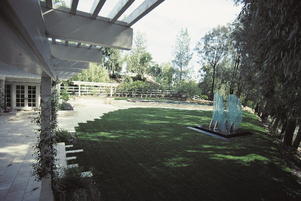
In this design, the first thing that strikes the observer upon first entering the yard is how colors are used to soften the modern lines and shapes of the pool, spa and John Luebtow’s amazing sculpture. (For more on his work, see WaterShapes, January 2001, page 58.)
Color has an incredible power to create a mood. If you took a white room and filled it with a blue chair, a green couch and a yellow table, the room will be cold and unbalanced because these primary and secondary colors will pull against each other, fighting and bouncing. It’s just not soothing.
In this design, by contrast, the greens, creams and grays that fill the yard create a sense of balance: They harmonize, and the overall effect is remarkably soothing.
One of the keys to achieving a sense of design balance is sizing the components of the composition so they’re appropriate in scale with respect to the environment.
Too many pools are far too big for the spaces they occupy. But proper scale is important, because it enables you to establish a comfortable relationship and connection between all of the elements you’ve designed into the work. Those relationships just won’t work if the elements aren’t properly scaled.
It all works in this backyard: The components are visually balanced, the spaces between them allow them to co-exist comfortably within their surroundings. There is no tension, no sense that one element is more important than the rest or that any one element overpowers another.
Guiding Lines
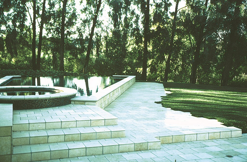
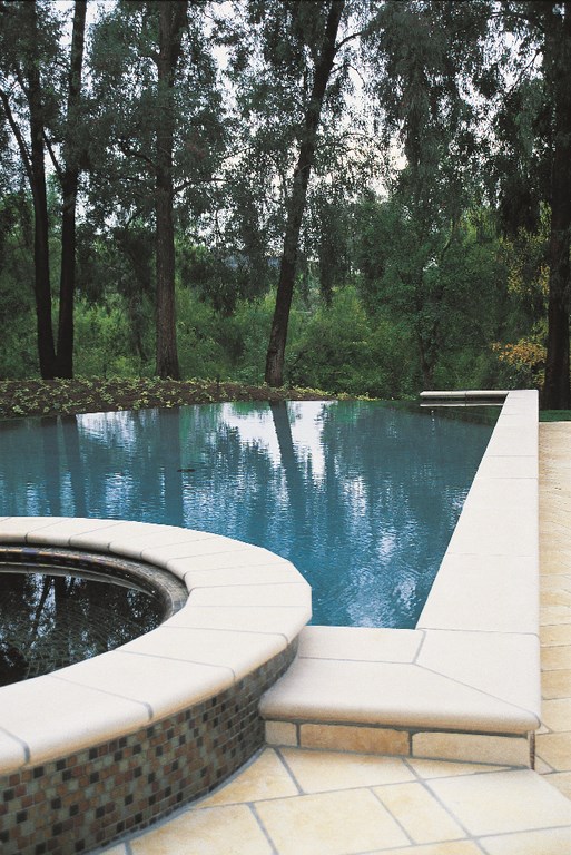
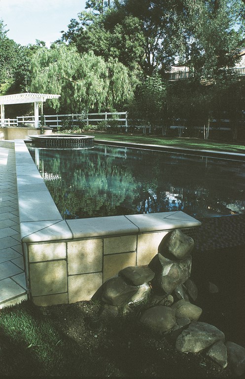
The lines of the pool are directional, leading your eye into the landscaping, the surrounding trees and the distant views. I guess I’d call it a modified arrowhead: It’s almost rectilinear, but it features obtuse angles that create an elegant shape and form.
The pool is beautiful, but it’s off to the side and you don’t really “see” it right away, even though it’s in plain view. As you approach it, the reflections of the trees in the water and the blend of materials and colors draw your interest even further into the environment. And even though the pool is beautiful and interesting, it’s not the focal point of the yard. Instead, it’s another design element, one among many of equal importance.
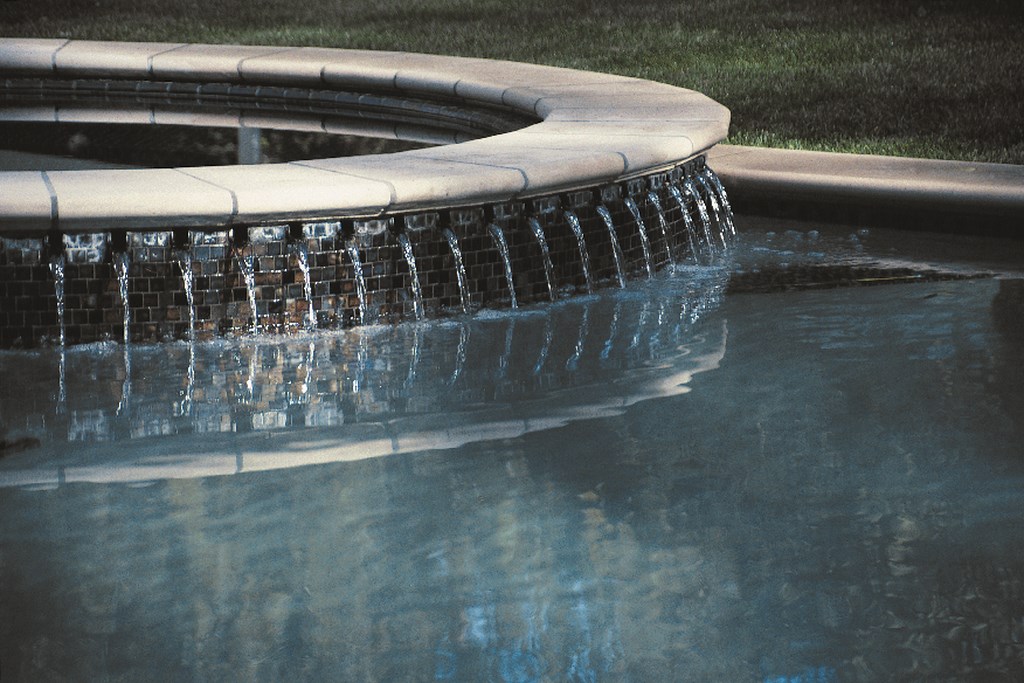
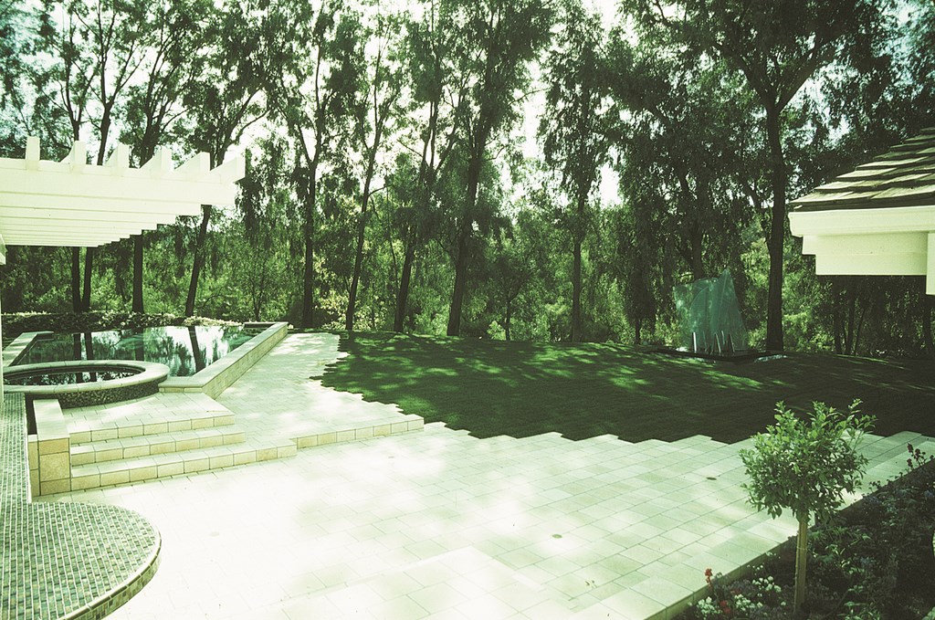
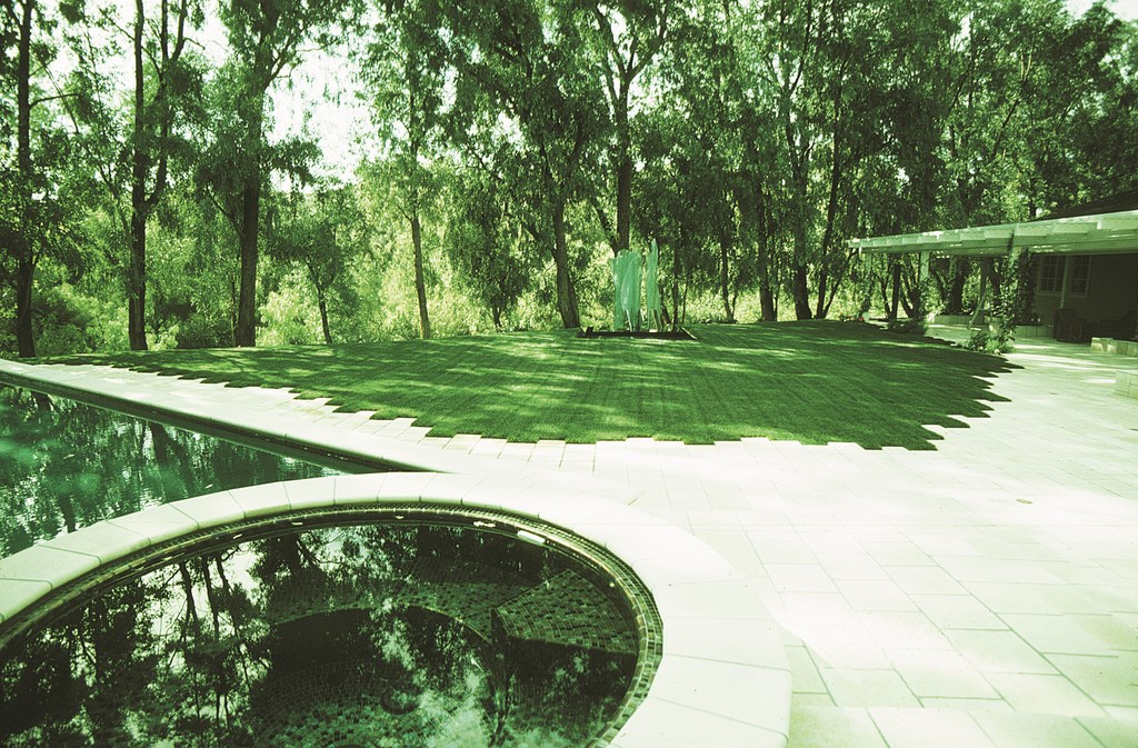
The slightly raised spa plays an important role. Its circular shape softens and counterbalances the angular arrowhead and offers an invitation to enjoy the pool. As you move down the deck past the spa, you see 21 spillways flowing from the spa into the pool, extending its circular geometry and connecting the shapes while softening the transition from space to space.
A Hidden Brook
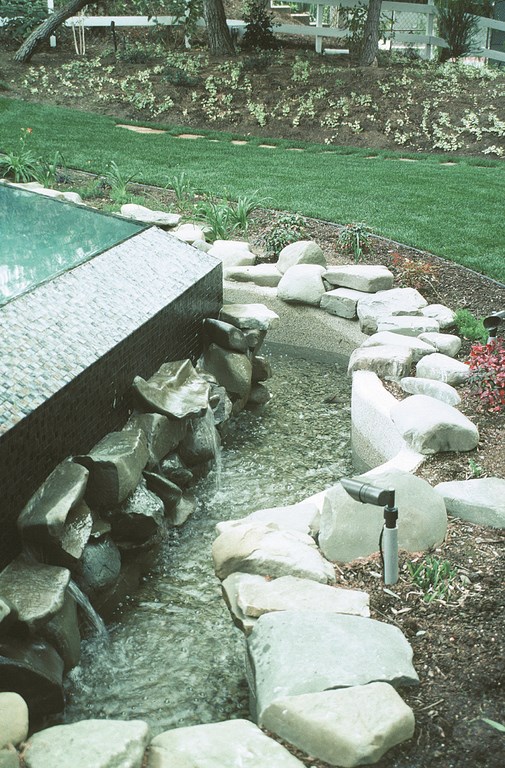
As you move past the pool and its long vanishing edge, you’ll find beautiful landscaping and sculptures – and this little running brook. It’s part of the pool’s detailing and works on the simple premise that the back of the pool is just as important as the front.
We changed the grade of the yard back here to create pathways and destinations related specifically to enjoying what would usually be seen (and dismissed) as the trough of the vanishing edge. We built up the grade to create gentle slopes that focus the experience of the splashing cascade and small stream.
This transition from the tile work on the edge to the rockwork in the stream is unusual – and might even seem ridiculous without a careful balancing of the visual and aural elements. It’s a particular kind of look, and the important thing here was finding materials that complimented each other enough to ease the transition.
|
The Power of Sound In addition to manipulating colors, textures, shapes and lines, we also played with sound on this project to compliment the sense of discovery. In the area around the barbecue, up near the house, it’s very quiet. As you move through the entertainment area and toward the pool, you first here the delicate sound of water provided by 21, one-inch radial spokes of water falling as the spa’s overflow. This detail is visually very gentle, symmetrical and controlled – and basically pretty quiet. As you move further away from the house, you move toward a more rustic environment and begin to hear a more prominent sound of moving water – although its source isn’t visible – and the entire feeling changes. Now, as you turn the corner at the vanishing edge, you see more greenery and trees and a running brook. The entire feeling changes again. In each case, you pick up the sounds and are drawn to the source, first as you approach the spa, then as you reach the vanishing edge. Each step effectively draws you more deeply into an increasingly serene experience – an experience set up by intricate construction detail, a knowledge of materials and how everything works together in the overall context of the design. — D.T. |
A Sweeping Deck
The decking is very much a part of the overall composition, particularly in the way the edge of deck interfaces with the grass: Their union distorts the sweeping line of the deck, softening its look and keeping it from dominating the space. By keying one into the other, it almost seems as though the stone and the grass are embracing each other.
In effect, this arced pathway from the house to the pool and beyond leads the observer without providing a direct line. There’s freedom in the space, and as you move your eyes or your feet the entire yard becomes part of an experience.
Framing Art
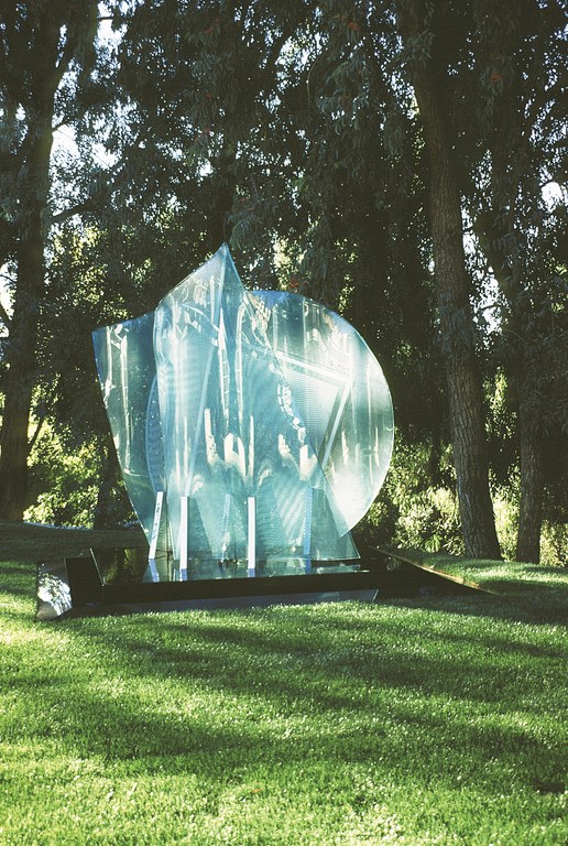
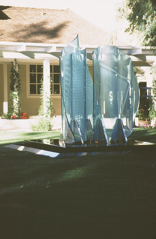
John Luebtow’s sculpture is infinitely fascinating. The glass reflects light and distorts views in a way that interprets the space around it. It has a bold language of its own, yet the statements it makes are balanced against the other elements in the yard.
The sculpture can easily be seen from the home’s entrance. As you move through the art collection inside, you’re drawn outside to see more. When you finally do reach the backyard, it’s verticality makes it the first thing you see.
The placement is ideal, but the sculpture itself is quite as powerful as its location in making an impression. The elegantly contoured glass panels and their intricate geometric etchings change as you move around the sculpture. And as light changes during the day and is variously filtered by the long row of eucalyptus trees, this piece becomes even more intriguing.
The black absolute granite pedestal with its beveled edge provides a smooth transition to the lawn. With water flowing over the entire perimeter, the pedestal offers its own stirring reflections – a beautiful work of art made all the more beautiful by it’s placement in this beautiful setting.
Stealing Beauty
The obtuse angle of the pool draws your eye to the vanishing edge and to the view beyond. By guiding the eye in this way, we’ve essentially borrowed the view and made it part of this environment, part of the experience of moving through this yard. It’s a matter of using reflection and shadow and color.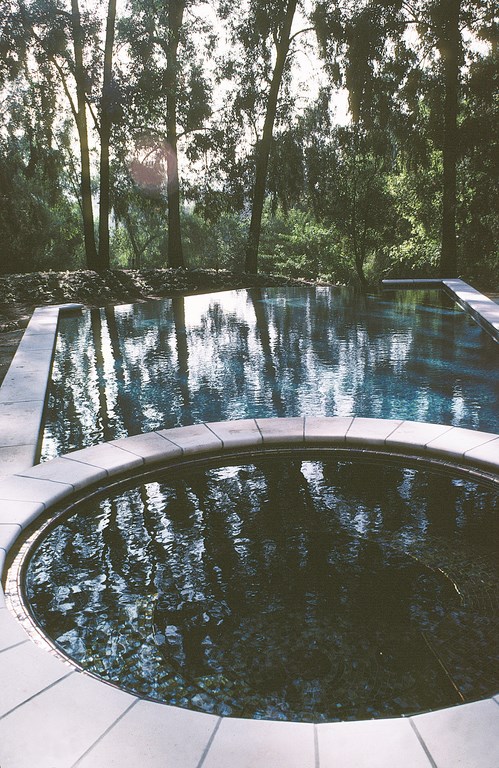
To be sure, you try to think of everything when it comes to designing a project such as this one, but even when you visualize things from every conceivable angle, it’s tough to anticipate everything – every possible position of the sun throughout the year, for example, and the effect it will have on each detail. When you have a good design and it’s well thought out, however, you’re not leaving much to chance – and what does happen by chance will often be as wonderful as it is surprising.
Special thanks to my friends Steve Gutai and Ron Soto of Waterpik Technologies/Laars and Jandy Pool Products for their assistance and care in designing the equipment set and the hydraulic and control systems for this project.
David Tisherman is the principal in two design/construction firms: David Tisherman’s Visuals of Manhattan Beach, Calif., and Liquid Design of Cherry Hill, N.J. He can be reached at tisherman@verizon.net. He is also an instructor for Artistic Resources & Training (ART); for information on ART’s classes, visit www.theartofwater.com.


