Serious Whimsy

This project was all about fun and finding ways to infuse watershapes and the overall landscape with childlike senses of playfulness and wonder.
At a glance, of course, it’s obvious that this particular approach wouldn’t work for too many clients, but in this case, we were working with a woman who wanted her yard to express her love of color, her sense of humor and her unparalleled inclination toward the unusual.
From our first meeting, I knew that this was someone who wouldn’t settle for anything that even approached the ordinary. Maybe it was the 12-foot-tall fiberglass chicken she’d placed in her front yard or the life-size hippopotamus in the backyard or her wildly eclectic taste in art and interior furnishings or her fittingly off-beat personality.
Whatever it was, from the outset I had the feeling that this job would go in a direction all its own and would almost certainly be among the most unusual projects I’ll ever tackle no matter how much longer I stay in the business. She was just like a kid in a candy store, mostly interested in anything that would make her laugh or surprise her steady flow of guests. From Day One, it was obvious she wanted something that no one else would ever have.
For more than three years, I worked side by side with this terrific client, making suggestions, expanding ideas and listening carefully to the way she talked about her world – all the while looking for ways to incorporate the wildest possible colors and materials into a design that would, in its own way, make perfect sense – or perhaps perfect nonsense?
GOOD LAUGHS
To my mind, the most important thing watershape and landscape designers do is communicate. Every client has a different personality and set of priorities and ideas, and it’s up to us to draw out their desires and apply our talent to the process of refining, expressing and creating a result that reflects their desires. That’s why I see every project as different, because every client is different.
These communication processes can be difficult to navigate, and in this situation, riding with the give and take was utterly crucial. There were things the client wanted that I tried to alter, nudge and transform, for example, and we engaged in many lengthy discussions before coming to agreement on each and every detail. The result, I think, is an expression of the client’s ideas paired with my ability to make it work in the given setting.
It bears mentioning that all of the explosive color and whimsical innovation she wanted required a huge amount of hard work and research on my part. The pool alone, for instance, features more than 100 types of carefully selected glass tile, each carefully matched to its intended use. (It might go without saying at this point that we went through several conceptual designs as I successively accommodated her desire for whimsy.)
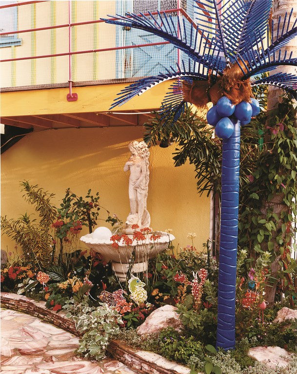
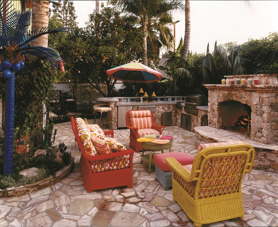
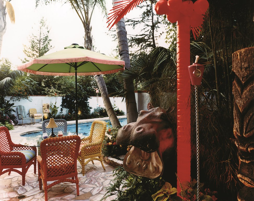
| The backyard is filled with unusual details, all aligned with the client’s unique spirit. From the artificial palm nestled up against the classic fountain to the vividly colorful patio furniture, from the sensational decking material and equally fantastic wall fountain to the glowing fireplace and welcoming hippopotamus, everything bespeaks an individual with an unabridged sense of exactly what she wants in her surroundings (All photos in this feature by Kathleen Persoff, Studio City, Calif.) |
The setting for this effort was a large rectilinear backyard in the verdant flats of North Hollywood, Calif. The accompanying house is shaped like a barn and has been festooned with antiques, artworks and architectural touches. The kitchen, for example, has a tile creation mosaic that took a local artist nearly five years to complete. When I arrived, the only part of the composition that didn’t fit was the backyard – decidedly drab and lacking in personality.
All I had to start with was the existing swimming pool (a functional but unadorned rectangle) along with the aforementioned hippo. Beyond that, we were to strip the backyard back to bare canvas and re-establish the space with a renovated pool, stone decking, eclectic plantings, an outdoor kitchen/dining area, lighting treatments, sculptures and a range of small waterfeatures.
That’s a lot to accommodate, especially with a client who wanted to see several versions of the overall concept. In the ensuing months, in fact, I offered at least five completely different versions of the design for review, each one of which went through multiple revisions that reflected the fact that things changed virtually every time we spoke.
Eventually, however, she settled on a concept that excited her and enabled us to proceed to get bids. But frankly, the design was so unusual and sublimely silly that it was basically impossible to get precise estimates even from our select team of subcontractors.
START TO FINISH
Ours is a design/build firm that works primarily on upscale residential projects. We prefer to provide installation services so that we can offer designs and then follow through with our own quality control for the duration of the project. The client recognized that this particular project was going to be in a continuous state of flux, and the fact that she trusted us to deliver helped us to bring everything to fruition.
Soon after we secured the construction contract, however, she decided she wanted to rework the design yet again, adding an outdoor fireplace and a couple of new waterfeatures. It was a never-ending process, but it was one that held few surprises for us after our experience in the design phase.
One of the first things we did after contracts were signed was go shopping for stone – not locally, but at a stoneyard located 200 miles to the south, near California’s border with Mexico. At first, she was drawn to a very expensive (but surprisingly conservative) limestone decking, the sort of stone we see all the time on high-end projects.
In this case, all I had to do was look at her and say, “Are you kidding? This isn’t you!” to get her to turn her attention to a beautifully expressive combination of rose quartz and what I call “candy stripe,” a type of limestone richly striated with reds, pinks and creams.
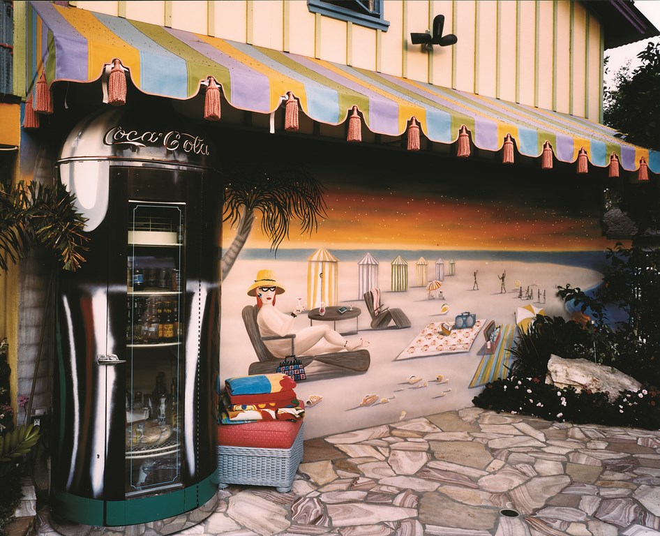
| Among many amazing qualities of the backyard is the way entirely different moods are encompassed within a single space. On the one hand is a wonderful beach-scene mural set under a colorful awning right next to an enormous Coca-Cola display case, while on the other is a weeping wall dedicated to the memory of the client’s son. As a designer, I was emboldened at every turn by her willingness to explore all of these forms and possibilities. |
She quickly fell in love with this base color palette, which we later augmented with materials in just about every color in the rainbow. Before we were through, we’d rounded out the palette with a blizzard of brightly colored glass tile and stone fragments, an Art Deco-style mural, fiberoptic lighting, specimen stone, flag and ledger treatments, colorful fabrics (courtesy of the umbrellas, awnings and patio furniture) and amazing hothouse plantings.
One of the reasons we ended up with five waterfeatures in all was the fact that she’d keep running into new materials that she absolutely loved, leaving me with the need to incorporate them somehow. (Three out of the five were developed well into the construction process.) That same “gotta have it” principle applied to detailing for the outdoor kitchen, the plantings and placement of such disparate items as a giant Coca-Cola machine, artificial palm trees lit internally with fiberoptics and an array of dangling “firefly” lights.
Late in the process, we even found a new home for the hippo courtesy of a bed of colorful riparian plantings. The portly fellow had already been moved several times by now, and at one point his concrete “riverbed” had already been poured and its river-blue glass tiles already purchased. Ultimately, however, it was decided to move him to a new space and let him serve as an unofficial greeter for guests emerging from the house to enter the garden for the first time.
CENTER STAGE
As we learned early on, this was not the first time the client had tackled the backyard.
Previous work had focused on a large tiki hut and a pool that had been finished in a pebble surface punctuated by disconnected glass-tile mosaics of fish and pathetic-looking seaweed. Both outcomes were dreadful: The hut was massive and extremely dark inside, and the mosaics just didn’t assert themselves to her liking. It was certain she’d be satisfied to discard those elements and start over.
Our first thought with the pool was to re-plaster the surface, keeping the fish (maybe adding a few more) and redoing the tile line. As we got into the demolition, however, a number of the fish mosaics were damaged – a possibility to which she’d been alerted before we started. It wasn’t long before we agreed to strip the pool completely, leaving only the shell intact as the foundation for an all-new finish.
|
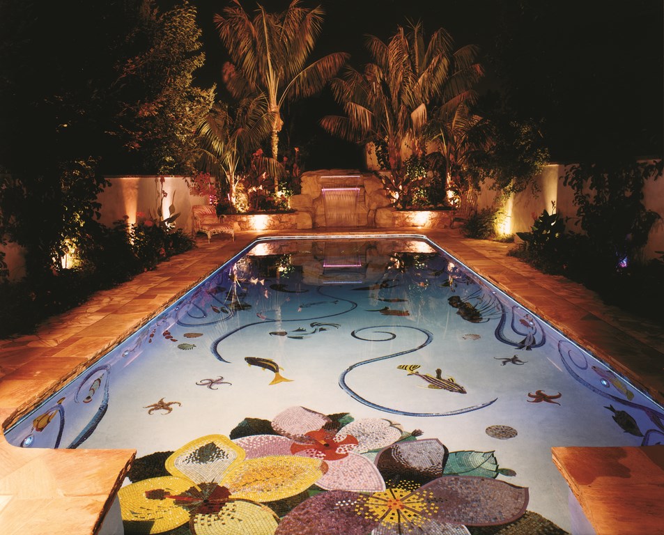
In the Pool With all of the contours of the mosaics that had to interface with the Hydrazzo, the finish work inside the pool shell became quite tricky in some places, especially in areas feathered into the deep end’s complicated mosaics. I must give credit where it’s due to the tile installer as well as to the plastering team, which did an absolutely amazing job of installing the polished exposed-aggregate finish in and around all that glass tile. Above the tile line is a thin ledger-stone detail that cantilevers slightly over the edge. This detail arose because we couldn’t obtain stone to match the deck that was thick enough to work as coping – an unusual consequence of the quarry’s having been closed because of some sort of environmental concern. It looked as though we had a real problem until I suggested using a much thinner flagstone flagstone to create an unusual stacked effect at the water’s edge. In this case, necessity led to a solution in perfect keeping with the unique spirit of the entire project. — C.H. |
At first we focused on the tile line, for which a random geometric pattern had been designed using a range of colorful one-by-one glass tiles. Then we started thinking about fish again and agreed that we needed several additional underwater elements to make the whole thing hang together. For a while, we talked about an all-glass-mosaic finish.
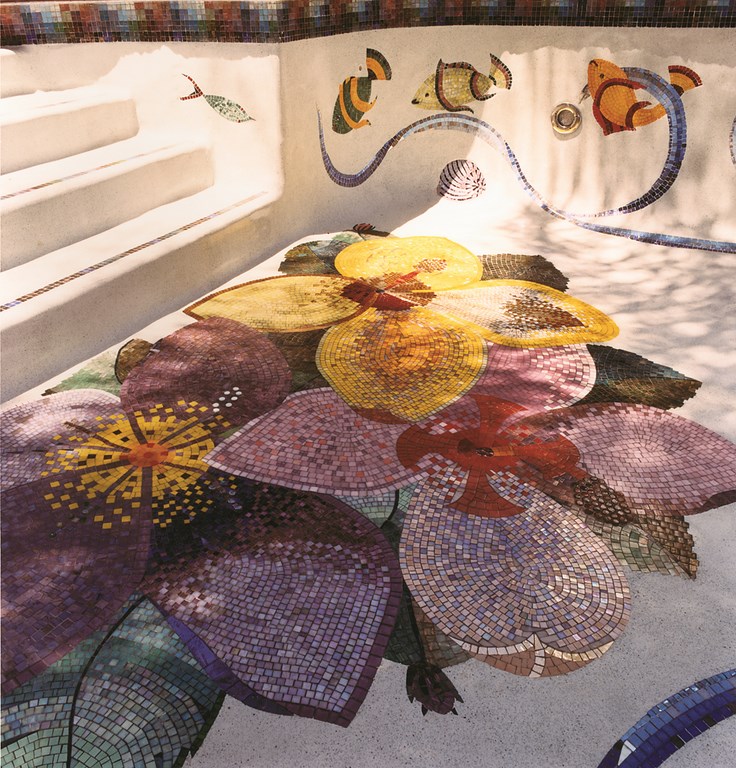
Even though she was seldom concerned about costs, I found that the all-tile option pushed her out of her comfort zone. As an alternative, I suggested a softly colored Hydrazzo finish to set off mosaic elements that would be woven throughout the pool. Before long, we’d settled on doing the deep-end wall of the pool in an all-tile rendition of an underwater kelp-bed scene and adorning a shallow, semi-circular ledge on the opposite end with a vivid mosaic depiction of hibiscus blossoms.
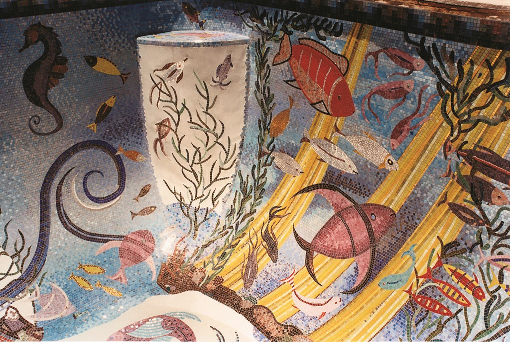
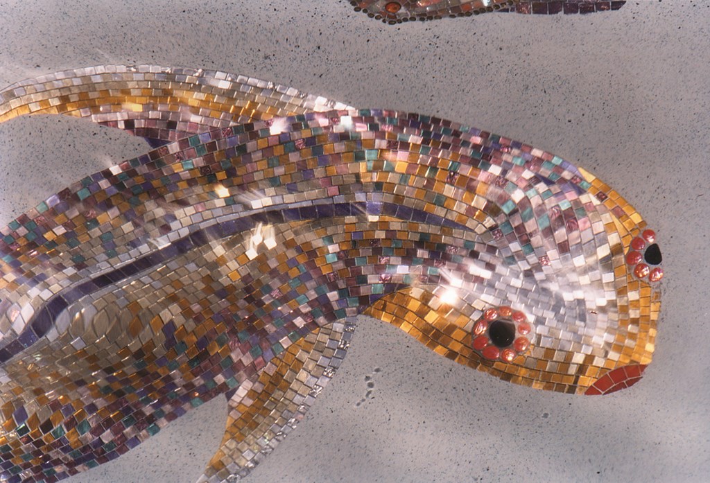
Developed in collaboration with scores of suppliers, the deep-end mosaics include dozens of fish and sea creatures, underwater rocks and a series of swirling contours suggesting the subsurface flow of a powerful current. It also includes beams of yellow sunlight penetrating the surface, a detail inspired by my own experiences while scuba diving in the clear waters off nearby Catalina Island.
This extreme variety was once again the result of the clients’ impulsive nature: Every time she’d see a new type of tile, she’d fall in love and we’d end up figuring out how to make it work. Often, she’d just order things on the Internet, have them shipped to our fabricator and then we’d go take a look at what she’d bought. Frequently, we ended up having to augment her purchases with other tiles of complimentary colors so that we could make everything hang together visually.
I wouldn’t suggest developing a mosaic program in this way, and there’s no doubt that such an approach would fail in most circumstances. But in this case, placed against all of the other vivid colors and materials in the rest of the project, the more we embellished the mosaics, the better it all seemed to work.
FIRES, FOUNTAINS AND FRESCOS
As mentioned above, the impetus for the multiple waterfeatures and many of the other elements came directly from the client’s desire to continually expand the range of materials we were applying.
The fireplace, for example, makes use of a captivating rose quartz paired with purple/lavender quartz and translucent Utah Ice stone, now illuminated from within by the dancing fire and the rays of light at sunset. When coupled with the surrealistic nighttime surroundings, the whole structure becomes luminous – and I’ve never seen anything quite like it.
Adjacent to the deep end of the pool is a large grotto/waterfall structure. Although it’s made of a faux stone, we gave no thought to making it mimic a natural waterfall, instead giving it a deliberately architectural/sculptural look. The key twist with this feature involved the use of dual-level weirs with hot-pink and lavender fiberoptics: The upper weir cantilevers over the lower one, creating nested layers of sheeting water – another unusual effect befitting a whimsical setting.
Opposite the grotto/waterfall on the far end of the yard, we built a weeping “ice fountain” so named because it’s made with a white, crystalline material known as Utah Ice. (As the project moved forward, tragedy beyond belief struck and the client’s grown son passed away in an accident; so she wanted the fountain to be built and dedicated to him.)
| Tile from dozens of suppliers has been arrayed in the pool’s elaborate depths. From the kelp beds on one end to the hibiscus blooms on the other, the level of detail, the depth of the colors and the sheer joy of the composition all shine through. Again, it’s a one-of-a-kind installation for a distinctly one-of-a-kind client, and the outcome is simply dazzling in a disarmingly playful sort of way. |
Appropriately, water emerges from spaces between the dramatic crystals and gives a literal appearance of crying. We finished its basin with an elegant, translucent, multi-colored glass tile and embedded small, pink-granite hearts in the stonework. Amazingly, despite its solemn dedication and appearance, a wonderful sense of whimsy, love and beauty comes shining through even here.
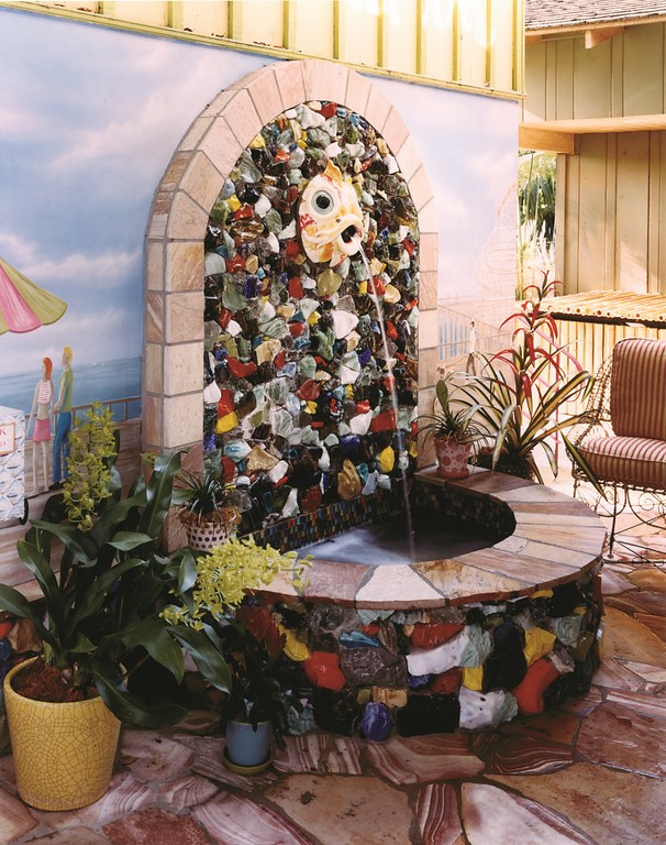
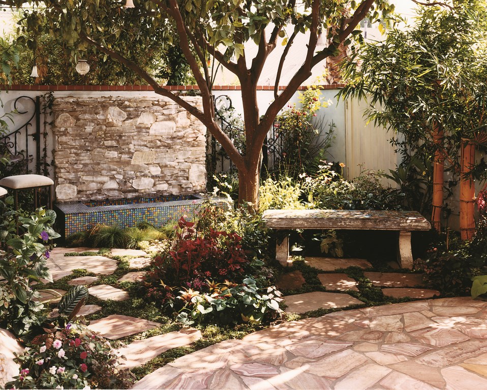
The registry of dramatic touches goes on and on: There’s the courtyard fountain made of pieces of wildly colored foundry-slag glass, a wishing-well fountain, the antique benches and the pieces of wrought-iron fence salvaged from the home of legendary entertainer Liberace. There’s also a tile-and-granite-finished outdoor kitchen area; a planting plan so diverse that the lists of bamboos and bromeliads alone beggar description; and a stunning mural painted in plaster on one of the walls of the house to set off part of the patio area.
That mural depicts a partially clad woman enjoying life with a pink martini in a hand with pink fingernails, her toes adorned with jewels. The woman lounges at the beach with a number of colorful cabanas and an array of beachgoers in the background. The sky at the top is emblazoned with constellations of stars articulated by hundreds of twinkling fiberoptic lights.
NOT TOO MUCH
The plain truth is that telling the full story of this job almost certainly would require many more pages than what you see here. In some sense, it would be best if you all could come over and see the setting for yourselves: It’s the only real way I know to understand and experience the space.
Way back when we started, I had this overarching notion that the entire composition would reflect the mood and feeling one has at that magic hour of twilight, when the world begins to glow with rich, warm pinks, reds and oranges turning to soft blues and eventually fading to indigo. Although our color palette ultimately expanded to encompass most points on the color wheel, we managed to hold onto that original vision and have, I think, captured the remarkable transitions that take place in the soft light of early evening.
What we’ve ended up with is hard to define in stylistic terms, but the overall effect encompasses the level of playfulness augmented by the client’s unique sense of romance. To a degree, the whole setting flows from a very adult sensibility – albeit one vested with almost an excess of personality.
Through the years, my client and I have become close friends, a bond that kept us on the same page through some trials and tribulations and enabled us at times to stand back and laugh together in the delight that comes from accomplishing something genuine and unique. The project tested my limits, but I must say that it now seems very strange to move along with projects of a more conventional type, if only because I miss the fun and camaraderie I experienced in this unforgettable backyard.
Every time I come back to this project even in thought, I find myself filling up with a special sense of creative freedom, love and silliness. All of it amounts to an experience I know I’ll never forget.
Colleen Holmes is president of New Leaf Landscape, a full-service landscape design/construction firm based in Agoura Hills, Calif. A landscape designer with more than 30 years’ experience, she began her career as a child at the side of her father, Charles Prowse, who instilled in her a love of the art of landscape design. She studied landscape architecture at the College of the Desert in Palm Desert, Calif., where she was profoundly influenced by sculptor/landscape artist Michael Watling, and later attended UCLA’s school of landscape architecture. Her early work focused on designs for country clubs and gated communities in the Coachella Valley. Since then, Holmes has run her own pool and landscape maintenance firms and founded her first landscape design/construction company in 1980. She established her current firm in 1987 and now focuses exclusively on high-end residential projects including a number of celebrities’ homes.


