Necks, Heads and Shoulders

I’m amazed at how few watershapers keep the size and shape of the average body in mind or consider the science of ergonomics when they design projects for their clients. Just think about how much more we can do to increase their comfort and enjoyment by doing so, particularly when it comes to custom concrete spas.
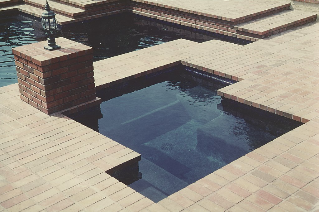
Take a look at the average spa attached to the typical pool: On a great many of them, you’ll see a cantilevered deck around the edges.
From the perspective of someone who isn’t conscious of what he or she is doing, this arrangement makes perfect sense. After all, a cantilever here look just like the cantilever that works so well as a grab rail around the swimming pool – and besides, this little “detail” can conceal a variety of imperfections at the critical interface between the watershape’s deck and shell.
Last time I looked, however, human beings aren’t built with a notch in their backs to match the intrusion of the cantilevered material. Rare indeed is the person who could lean back and be comfortable in such a spa! Not only is this lousy design and quite often a mask for sub-par construction: In the context of a spa intended purely for comfort or hydrotherapy, it’s also painfully ironic.
CONSIDER THE TUB
When you look at the way a bathtub is built, you can’t help noticing the rolled edge. This feature gives the shell of the tub a measure of structural strength at the edge – and, more important by far from the bather’s point of view, it’s a comfortable contour for leaning against.
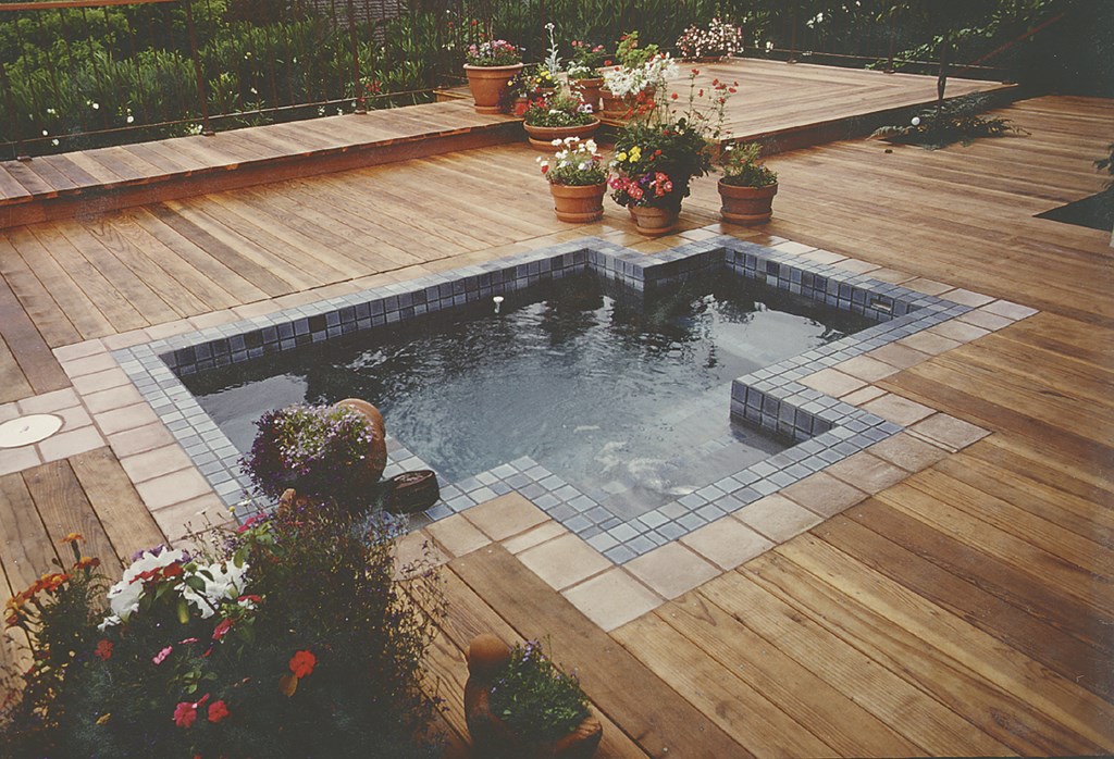
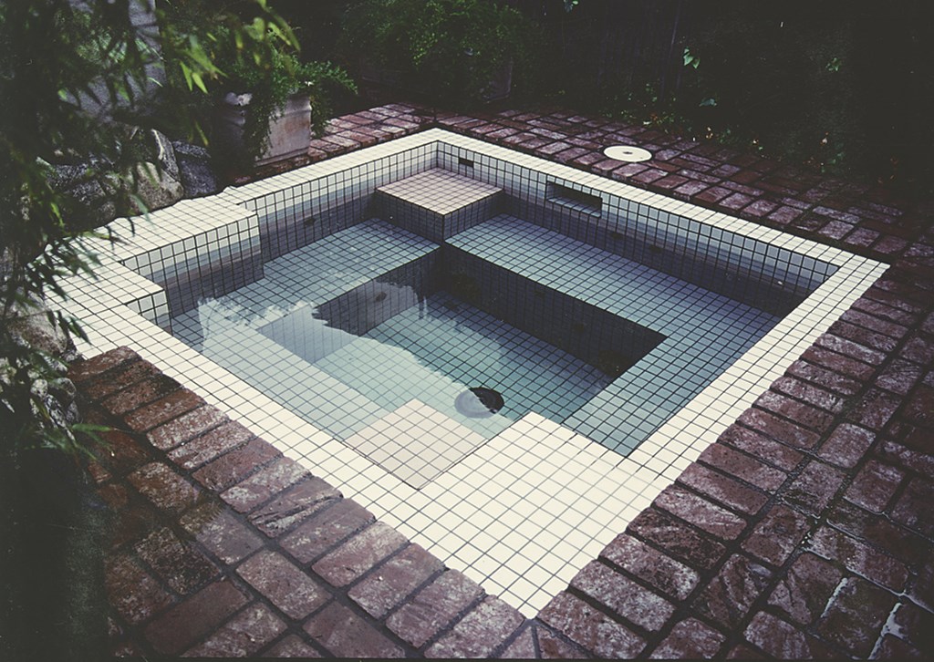
| The spa on the left looks great, but the cantilevered edge will make for reduced comfort and relaxation for anyone trying to lean back and enjoy the spa experience. Why not roll the edge of the spa like the rim of a bathtub, as was done in the spa below? Not only does it look great, but it dramatically increases bather comfort. |
I suggest that watershapers should do something similar in designing and building spas. It’s not a new idea: Manufacturers of self-contained plastic spas have embraced this tub-like detail for years. And so should those of us who build spas out of concrete and masonry materials.
It’s a simple idea, but it’s actually a complex detail when done correctly. To get it right, you have to work to precise physical dimensions and plan for the detail from the start of the project. You must know the thickness and size of the tile, the width and number of grout joints, the dimensions of the trim pieces, the precise width of the beam: All these measurements come into play as you specify the size of the vessel.
You also have to pay attention to coping size and thickness, and everything gets trickier when you use imported tile: It will be made using the metric system, so you have to make the conversion to inches and feet as you go. In other words, this approach takes precision and planning. If you don’t get all of the dimensions dead on, you’ll almost certainly end up having to use odd trim pieces that will give the detail an uneven look.
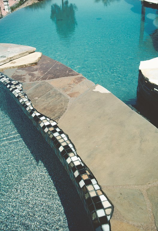
| As a design detail, you can carry the rolled spa look a long way. Here, for example, I’ve set up a ragged stone edge with a tile transition that carries down into the water – an eye-popping look that meets my clients’ need for both style and comfort. |
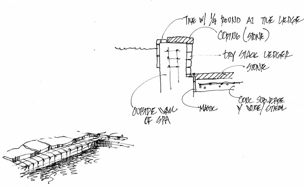
In preparation, I’ll push the coping back anywhere from an inch to a foot to create a beautiful and comfortable tile shelf.
|
Body Works To learn more about the science of ergonomics, I suggest reading The Measure of Man by Henry Dreyfus. It’s a brilliant book that defines the science of sizing common objects for the needs of the human body. — D.T. |
Not only is it a dream for backs and necks, but it’s also a great visual transition that accentuates the presence of the tile and visually connects the interior of the spa to the surrounding space.
Try it – you’ll like it. It’s not a terribly complex detail, and it adds only a little cost because all you need to do is add some concrete to the bond beam and set up your steel stirrups to accommodate the added mass of concrete.
There’s also lots of design flexibility when it comes to materials. I’ve done this using marble, granite or glass, ceramic or glazed tile. I’ve used quarter-rounds to make the vertical-to-horizontal transition, while other times I’ve use a surface bullnose. I’ve also used the 45-degree intersection from vertical to horizontal that’s popular in Europe: If trim pieces are not available, this offers a beautiful and comfortable transition and adds a subtle visual detail to the overall composition.
As with so many other fine details, of course, you need to pay attention to what you’re doing and know and understand the materials and joinery you’re using: There’s no way to cheat with imprecise dimensions or levels the way you can when you’re using a cantilevered deck.
There’s also no denying that this is a feature your clients will appreciate each and every time they set themselves down in the water for a welcomed bit of relaxation.
David Tisherman is the principal in two design/construction firms: David Tisherman’s Visuals of Manhattan Beach, Calif., and Liquid Design of Cherry Hill, N.J. He can be reached at [email protected]. He is also an instructor for Artistic Resources & Training (ART); for information on ART’s classes, visit www.theartofwater.com.


