


On the Verge

For the past year and more, we’ve worked our way step by step through the many processes involved in designing and installing quality residential watershapes, starting from the first contact with a prospective client and working our way through, in the last two months, to the application of well-selected interior finishes.
A concern I’ve always had with this step-wise approach is that it makes too many of these operations seem as though they happen in isolation and that decisions about design and materials and finishing touches are made as the process unfolds. Nothing could be further from the truth.
Take the subjects of this month’s column – coping and decking – as prime examples: Although we’ve finally reached the practicalities of these topics more than a year after we started this sequence of columns, I must point out that decisions about how they will be treated are properly made in the initial design stage, not at the tag end of things.
With that fundamental point in mind, let’s dig in and take a look at some of my favorite options when these finishing touches are applied as long-planned construction activities whose time has finally come.
COMBINED FORCES
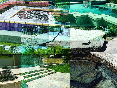
In discussing coping and decking, I invariably combine them because, in my view, they are truly inseparable: For a design to succeed, both must work together because they play such important roles in defining the ultimate “look” of a watershape.
Moreover, success is defined by the watershaper’s appreciation of what goes into working with both with respect to a huge variety of available options. In simple practical terms, different approaches and treatments require very different types of engineering and construction, and the choices you make have a substantial influence not only on the expertise you’ll need to bring to bear, but also on the project budget.
Finally, I combine the two because it is so often a tendency in the pool industry to separate them, with a pool builder often working up to the coping and then turning the project over to a decking contractor to take care of the rest. This is, I think, a huge mistake when and where things are still done that way: It almost inevitably leads us to ill-designed abominations that are still with us because they’ve become “traditional” – a word I’ve mistrusted throughout my career.
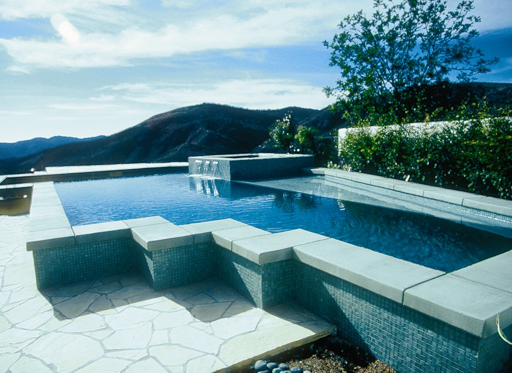
| I generally approach coping and decking as a single visual element in an effort to make a watershape flow seamlessly from the pool’s interior and up into the surrounding space. Here, for example, the soft green interior finish transitions to a green blend of waterline tile and on to a pale green poured-in-place coping treatment that flows with the decking material and the plant material in the background and distant views. |
The traditional look, in which a band of pre-cast bullnose coping smacks up against a brick, stone or concrete slab of deck, is so common that it seems at times to be the only way people think these things can be done. Again, although it is common practice, nothing could be less acceptable in basic design terms.
From my perspective, in fact, it’s fair to say that the traditional approach is the antithesis of what should be done: The last thing you want as a designer is call attention to the shape of the pool and create an awkward visual transition that doesn’t weave together any of the key visual elements.
I suppose, of course, if your aim is to build a pool that looks as though it’s a hundred years old, then the traditional approach might work. For any other situation, there are far better options. In fact, there are so many options that I won’t even attempt to discuss them all here.
Also in point of fact, these decisions about coping and decking are important, mainly because most residential pools stand relatively close to the home. This visual proximity typically requires that there be linkages among the architecture of the home, the look of the watershape and the details of the surrounding space. By selecting appropriately from a hefty palette of design possibilities, you can play the weaver and effectively unite all these spaces as a tapestry in which everything works together.
When you limit those choices to the traditional or familiar, however, that sense of integration becomes elusive at best – and impossible to attain in too many cases.
MAKING CHOICES
In general terms, you can break approaches to the coping/decking decision down into two distinct categories: Either you want the watershape to blend seamlessly with its surroundings, in which case the coping and deck material should be the same; or you’re creating a watershape that is to stand out as a separate artistic statement, in which case your options explode and literally number in the hundreds.
This is one of the many important reasons I always say that, from the very beginning of the design process, you need to understand which type of design you’re trying to achieve!
The first of the two approaches listed above is more conservative and is probably applicable in most situations – that is, when you want the pool to blend into a setting rather than stand out within it. The second allows you to be far more creative, but the issues involved in a successful design are far more intricate, detailed and complicated.
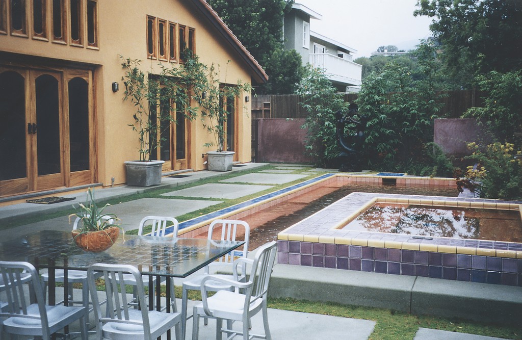
| Decisions about coping and decking are particularly important when a watershape is positioned near the home. In this case, the strong colors of the architecture freed me to use similarly bold colors at the water’s edge, with everything harmonizing visually in a distinctly colorful space. |
In this realm of the stand-alone statement, for instance, one tiny change in color, texture, material or can affect 20 other details (and each of those dozens more), so everything must be thought out, anticipated, interrelated and mastered to make the artistic statement work coherently. (This is, incidentally, another area where on-site supervision is critical if everything is to come together the way it must if the desired visual effects are to be achieved.) .
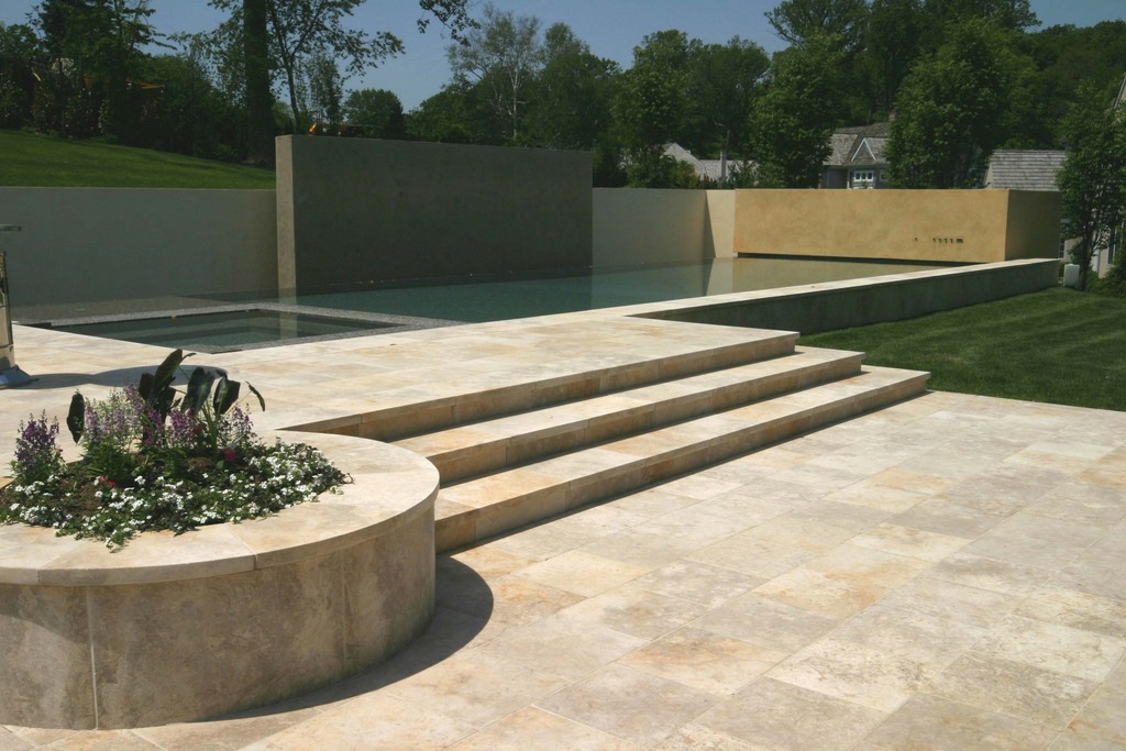
Let’s consider a typical free-form pool of the more conservative type. In most situations (although not all), these are watershapes for which there shouldn’t be any visual division between the water’s edge and the surrounding deck surface. In these designs, in other words, you never want to create a distinct visual band around the pool’s edge with either the waterline tile or the coping because it will destroy any sense of visual flow or continuity.
Too often, however, the use of the popular modular copings causes just this sort of visual break. And often, these materials are used with free-form pools despite the basic fact that their contours can make use of these materials impractical: The need to make cuts and create pie shapes to cover radiuses often outweighs the convenience that led to the choice of these materials in the first place.
On that score, modular materials are great when used around rectilinear watershapes because they fit – especially if you take the care to consider their size and the desired sizes of grout joints in setting dimensions for the structure. But still, these materials must be considered in the overall design scheme, and too often I think it’s a case where convenience overwhelms artistry and leads to some choices and bands that are disruptive in visual terms.
Again, from a design standpoint, you need to decide whether you’re banding the pool to make some type of artistic statement (let the designer beware, because this is extremely hard to pull off and usually leads to ugliness and visual failure) or should instead seek to blend the coping material with the surrounding deck material. In too many cases I’ve seen, that point isn’t considered and the results can be jarring.
DESIGN DETAILS
Enough about the sins of traditional or convenient approaches: Let’s get down to some solutions that really work in artistic, visual ways.
Natural stone, for example, is a wonderful material to use in edging free-form pools, because you can bring it to the edge with no visual separation from the surrounding deck and can thereby create a pond-like, more naturalistic appearance. In these situations, the irregular shapes and thicknesses of the material may pose installation issues; that’s something I accommodate at the planning stage by making the bond beam a little wider than usual to allow for placement of the mastic joint at a farther remove from the water (thus making it easier to conceal). I also allow depth for a deeper mortar bed to simplify the process of blending the coping stones placed atop the beam with material on the surrounding deck.
Of course, using stone in this context forces you to consider something that isn’t an issue with standard modular material: That is, you have the question of the back edge of the material and the way it interfaces with the decking, the landscape or other hardscape structures beyond the beam. Again, there are numerous options ranging from the intricate (often with special stone effects) to the relatively simple (by pouring concrete).
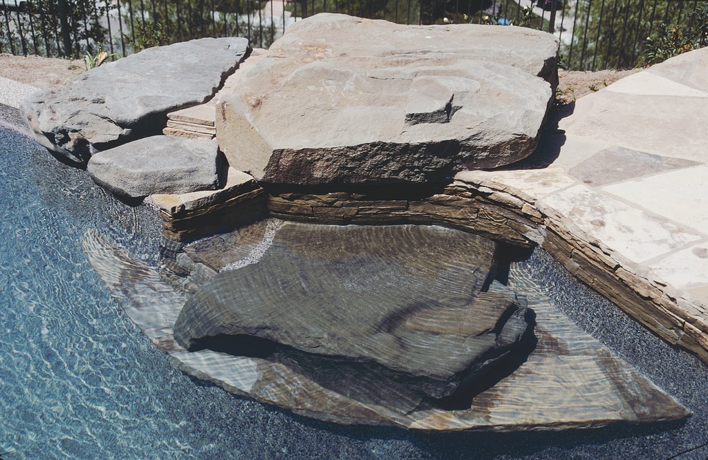
| The naturalistic appearance of this watershape is considerably enhanced by the way the stone decking material flows down into the pool – a continuity of color, texture and line further enhanced by the presence of large stone pieces around the edges and under the surface. |
Another option with free-form pools – and one I particularly love – is the use of some sort of poured-in-place-concrete coping that conforms readily to the shell’s contours. More on this below, but now let’s back up for a second and consider such choices from a more refined design perspective.
The front-edge thickness of the coping or other edge material and how it’s finished will have a distinct influence the way people perceive a watershape (and on how they step down into it, given the difference it can make in how big a step down they must take to get into the water). If, for instance, you choose a stone detail that is three or four inches thick, that can be a wonderful choice for pools that are meant to appear natural and blend with their surroundings – and it works well with contemporary designs as well. By contrast, you might go with a dramatic pre-cast or poured-in-place treatment to add visual weight.
That seems straightforward, but if the watershape is small or otherwise “light” in terms of visual weight, a thick, dramatic coping treatment on either the naturalistic or the architectural watershape may (or may not) be out of balance. Conversely with a larger watershape, a thin, cantilevered-stone edge might just seem too light.
And then you need to consider whether the waterside edge of the coping is to have a bullnose, how it will relate to the waterline tile, whether you want it to stand out far enough that it creates a strong shadow line. I devoted a whole column to approaches to vertical surfacing in November 2006, and the list of considerations could go on for pages, with everything depending on the situation, the visual needs of the design and the project’s budget.
These balances, of course, are all intricately interrelated, which is another reason why design education is so important. Without such a background, the process becomes a guessing game rather than a polished, visual approach to building. Besides, nobody ever said good design doesn’t involve lots of choices and decisions.
REFINING APPROACHES
Although the decisions are complex when looked at in isolation, they will certainly fall into place more easily if you’re aware of certain key principles architects, artists and designers have been applying for centuries.
I’ve discussed all of these principles before, but when it comes to thinking about the edges of watershapes, visual weight is an extraordinarily important concept that has much to do with how elements in a visual space balance and work with one another.
This is incredibly important, for instance, in working with a raised wall on one side of a pool. In most situations, raised walls serve as a useful means of integrating a watershape with sloping topography beyond. A problem I frequently see, however, occurs when the face of the wall is finished with the same tile used at the waterline or, less often, with some sort of ledgerstone detail. In both cases, these fields of material carry far too much visual weight and can throw a composition hopelessly out of balance.
| There’s no need to think of walls as monolithic monsters: By breaking them into planes and staggering the depth of the resulting panels relative to one another, you create a dynamic visual backdrop for a watershape – and a canvas for a subtly dancing lightshow after dark. |
In and of themselves, the tile or ledger materials may be expensive or beautiful, but when they rise above the waterline by more than 18 inches or so, they create a massive visual field: It’s all the eye sees, and it rivets attention in a way that simply should not happen.
There are, of course, exceptions, as when the wall is covered with a bold mosaic composition – a key artistic statement in almost every instance. For me, however, a better (and far less common) approach involves applying plaster on the wall above the waterline tile with a color and texture that blends with the pool’s interior as well as the decking material. When you take this tack, the wall isn’t so heavily weighted – and it becomes quite inviting if you allow plant material to drape over it and dangle down toward the water.
Also, there’s nothing that says raised walls holding back slopes beyond watershapes need to be perfectly linear, either vertically or horizontally. I like to stagger walls in and out as panels, thereby breaking up the solid planes, creating visual interest and adding dramatic shadow lines. (In these cases, the walls become artworks on their own after dark, when shifting light from underwater lights plays across their surfaces.) I also like designs in which small walls are established at water’s edge, then there’s a step back to a second tier of walls that does the bulk of the soil retention while creating a terraced effect.
Bottom line: While walls handled improperly become little more than sources of visual noise, walls thoughtfully considered and executed can become wonderful edge treatments that help the designer blend watershapes in with their surroundings.
CONCRETE CONCERNS
As suggested above in my mentioning of poured-in-place copings, concrete is another material that bears discussion when it comes to coping and decking. Let’s assume for the moment that we’re all familiar enough with the practical use of this marvelous material and here can focus instead on its use as a visual element.
In my view, architectural concrete is one of greatest materials we have at our disposal as designers. It can be used to create a range of beautiful deck and coping treatments in a rainbow of subtle or bold colors, and it can be formed to just about any desired shape and thickness. For all that, it may well be one of the most misunderstood of all design options.
|
The Weight of Water As discussed in the accompanying text, managing transitions between the water and edges, decks and raised walls comes down heavily on the need to understand visual weight. In that context, one of my pet peeves in wall treatments is the overuse of linear spillways that send long, sheer streams of water pouring into a pool. For whatever reason, this has become extremely popular; unfortunately, it’s also contributed immensely to the uglification of lots of backyards. It’s almost as if these lines of sheeting water are installed simply because they can be – no other reason given. The problem is that this effect all too often throws things out of visual balance: Not only does it draw undue attention to the wall, which is likely overpowering enough all on its own with its expanse of tile or stacked stone, but it also creates excessive turbulence in the water (disrupting the reflective qualities of the surface) and makes far too much noise, thereby destroying the tranquility of the space with a sound not unlike that of a flushing toilet. Then there’s the fact that these falls tend to be installed right at the top of their walls, which only intensifies the problems. Again, this is an issue of scale and visual weight. This is why, when I do install such effects, I prefer to break the long streams into smaller segments or use scalloped edges on the spillway to lend texture to the flow. And always, always, I make sure the streams are proportionate to their surroundings, which in most cases means making them mere fractions of the size of those I see on walls with typical wall-mounted waterfall effects. In my book, watershape design at its best has little to do with riffling through catalogs to assemble arrays of off-the-shelf products. Instead of being bound by what’s available, good design is about understanding the specifics of the situation and responding with creative, even innovative solutions. If that means inventing something nobody’s ever seen before to meet a need, then so be it! — D.T. |
In actuality, concrete is in a completely different world from the one occupied by stone, brick, pavers or tile and, when used well, is nothing less than an artistic medium unto itself that can be used to create extraordinary works of art. Unfortunately, many designers (particularly in the pool/spa world) see it strictly as a utilitarian medium and have never geared themselves toward looking at it as anything other than a raw material that comes together in dull gray masses that are inclined to discolor and crack.
It’s time for more watershapers to set aside preconceptions and prejudices and start to appreciate concrete’s nobler nature. Just accept the fact that it always cracks, no exceptions, and never creates a perfectly uniform appearance and the sky is literally the limit. The key is controlling where it cracks and having some idea how its appearance will change – and then making sure clients’ expectations line up with reality.
Many years ago, I had the pleasure of working with the great architect, John Lautner, who knew more than almost anyone on the planet about how to use the textures, colors and, indeed, the imperfections of concrete to amazing effect in creating homes, swimming pools and hardscapes of unparalleled beauty. In the course of that project, I worked with wonderful craftspeople and came to understand concrete as a design element in all-new ways.
Lautner worked with concrete in every imaginable form – textured, smooth, acid-etched, stained and brushed. He also favored board-formed concrete that revealed impressions of wood grain when the forms were removed. Ever since my experience with him and his crews, I’ve spent my career exploring the almost unlimited visual potential of this material and have tried to honor Lautner by using the material he most loved in interesting and occasionally unusual ways.
CARE AND FEEDING
As with most design materials, working with concrete is definitely a matter of finding craftspeople who know how to form it, install structural steel and mesh, mix it and finish it. Otherwise, any of the hundreds of variables involved in mastering the material can make things spin out of control.
And there’s a lot to consider, including the material’s compression, tension, expansion, contraction and chipping – not to mention engineering issues related to structural steel and wire mesh and the aesthetic and practical issues having to do with cracking and weathering and creating sustained visual effects. If you don’t understand and manage those issues, the material will control you and you’ll wind up with visual defects that make for client displeasure down the line. In other words, there’s much here to be considered.
Take color, for instance – an exceptionally complex subject with respect to concrete. You can use all sorts of dyes and oxides to create different colors that are beautiful, but you can’t expect to get the same color every time because there are too many variables in play. Differences in batches, curing times, aggregate mixes, troweling techniques or even the chemistry of the mix water impose slight distinctions, and these express themselves in all sorts of different ways over time and from one spot on a surface to another.
When you understand these variables and communicate effectively with clients about the behavior of the material, the wayward nature of concrete can even be used to your advantage. But if you don’t and can’t guide your clients away from expecting uniform perfection (or, worse, don’t engineer and install it properly), architectural concrete can become a nightmare.
As I see it, the capacity to see and understand topics such as these – visual weight, balance, the nature of concrete – in the broad context of watershaping and of setting up coping and decks – is what separates the artist from the pretender. The good news is, there are ways to get the training and education you need to step up to a higher level, so why not?
Believe me, my own career is testimony to the fact that this kind of investment pays for itself over and over again as the years pass.
David Tisherman is the principal in two design/construction firms: David Tisherman’s Visuals of Manhattan Beach, Calif., and Liquid Design of Cherry Hill, N.J. He can be reached at tisherman@verizon.net. He is also an instructor for Artistic Resources & Training (ART); for information on ART’s classes, visit www.theartofwater.com.