Night Eyes
Landscape-lighting design is my obsession: Not only do I make my living at it, but it has also reached a point where it informs the way I look at every landscape and watershape I encounter – whether I’m working on those spaces or not.
When I visit almost any site – and particularly when I spot an interesting garden – I almost instantaneously begin formulating ideas about how I’d light it. That’s a good thing, because it keeps me professionally sharp, but it’s also a bit addictive: Once you start visualizing how dynamic particular places can be when properly lit, you get hooked on the mental exercise and start enjoying the intensity of the experience.
In the beginning, of course, those clear visualizations didn’t come to me as quickly as they do now, but lately it’s really second nature – the key to a methodical process of assessment, design and application that guides me to create something truly special for my clients and the settings they offer me.
I describe this process as being able to see things with “night eyes.” Getting to that point takes imagination, an ability to see spaces in different ways and the accumulation of a specialized visual vocabulary that doesn’t mean much until the sun goes down and the lights come on. It’s a whole new design dimension, and exploring it offers you a way to enhance and even redefine the spaces you work so hard to create by day.
SEEING METHODICALLY
As with any big task, it helps to break the lighting-design process down into manageable bites.
At the outset of the process, for example, I’ll focus on a single planted area and I’ll design that planter entirely with my night eyes – not just the trees or other key plantings, but the whole space from top to bottom and side to side – before moving along to the neighboring space and eventually working my way around the property systematically (clockwise is best for me), making notes and formulating my initial design ideas.
As I go, I see what I’m doing as being akin to painting with light: I put it where I need it, making it more intense in some areas to call attention to them and less so in secondary areas that can be downplayed or used as transitional spaces or as areas of contrast.
I do this during the day, of course, which means I spend my time imagining different effects in various places, weighing possibilities and working to decide which plants or structures should be emphasized and which should be made to recede into shadows.
As I go, in other words, I’m establishing focal points and lighting trees and pathways and statues and architectural features, but I’m also looking for opportunities to use fill-in types of lighting and defining places where reflected light can be used to add layers of depth and visual complexity to the overall illumination plan.
For me, working in established spaces is far easier than trying to figure out what to do with a blank slate: The plants and features are all there and the visualization process is much more direct – so much so that I seldom need to prepare any drawings.
With an unfinished property, by contrast, a plan and a big empty space are all you have: Although I have exact measurements, I have relatively little sense of the space’s true visual dimensions. I might have measured things out and projected them as accurately as possible with my mind’s eye, but when I get out to the actual site after the plans have been followed and everything has been built and planted, key elements will often take on different characteristics relative to one another and significant adjustments to the basic lighting program are often required.
That’s not a bad thing: It’s just another factor to be considered and accommodated as the work goes forward.
A CASE STUDY
As I say, I prefer working on existing landscapes in which all the basic visual elements are well established – as is the case in the project pictured here.
The clients called me in to address what they considered as a failed landscape-lighting scheme. Everything had been installed just a year earlier, however, so they asked me to salvage what I could and base my design on the existing systems. Basically, what they were after was a repair job.
In some situations, adjusting or adding to an existing system can provide huge improvements, but in this situation, I advised the clients to start fresh: The components weren’t of the best quality, the design approach had been inadequate and the system engineering was substandard. Given the negatives, I knew it was more than a matter of “fixing” things: What this system needed was removal and complete replacement.
Happily, it wasn’t a tough sell: The clients professed their desire to have something special, and their familiarity with the work I’d done for a friend of theirs had convinced them that I was someone they could trust to do what it took to deliver what they wanted, something that would make a real difference.
After spending about two hours of looking everything over, I gave them a ballpark estimate based on fixture counts, degree of installation difficulty, the existing configuration of the utilities and an array of other practical considerations. The steep slopes were a major complicating factor – one that kicked up the level of difficulty as well as the cost.
Once we agreed on the scope of work and a general price, I set to work assessing and designing specific areas and evaluating features onto which I’d be shedding new light. You’ll see the results just below.
A Welcoming View
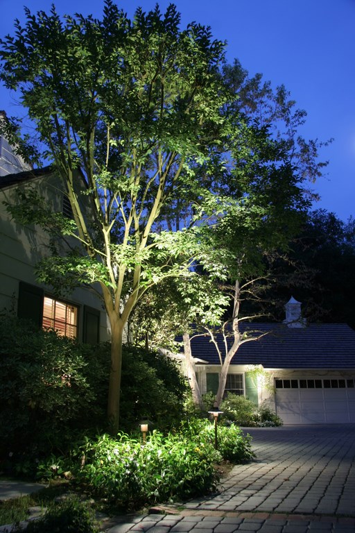
At the front of the house, the lighting design takes off from the planter adjacent to the entryway and its beautiful crape myrtle tree (located to the left of the doorway in the photograph). Here, I used a simple (yet dramatic) cross-lighting effect to accentuate the tree’s two main trunks and left the surrounding palms dark to define a contrast.
| After passing through the gate, the approach to the house along the driveway unfolds in light, first making visible a small sculpture on the right and ultimately leading to the home’s front door on the left. |
At ground level around the planter and nearing the front door, there’s soft spread lighting that both frames the entry and leads right up to the door. This entryway is off a driveway and large motor court around which stand a number of mature sycamores. In each case, I’ve illuminated these trees all the way to the top (my usual practice): This lets these big trees define the space while providing a level of reflected light that is bright enough to let drivers and pedestrians see what they’re doing without overwhelming the space in light.
|
Defining Needs As with all forms of exterior design, discussions with clients are always important. In lighting design more than in some other areas, however, clients seldom have clear notions about or much real understanding of what can be achieved, which makes determining their desires more difficult and turns it into a process of interpreting inferences rather than working through direct concepts as we discuss how they’ll use various spaces and what they want to see (or not see). I also make sure I know the layout of the home’s interior and what will constitute prime viewing angles from, for example, a living room, dining room or kitchen. We’ll also discuss outdoor living and consider views looking out from patios, garden benches, pool decks, spas and more. With those issues in mind along with my familiarity with the characteristics of the plants and structures in a particular landscape, I develop programs that align with what my clients want – even if it takes them a while to see what that was! — M.G. |
Off to the side of the driveway is a second crape myrtle that forms a matching pair with the one near the door. This one is viewed from one side only, so it’s lit accordingly – although there’s a bit of lighting behind it that’s no more than a byproduct of the main source of light.
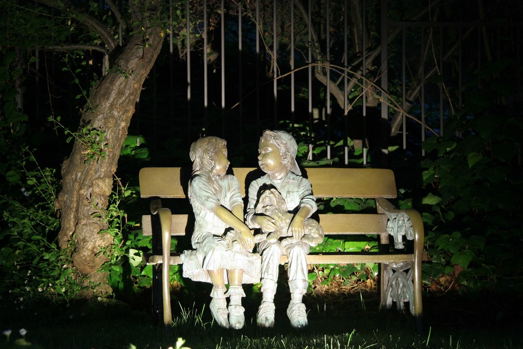
Along the driveway is a spotlighted bronze statue that serves as a focal point to those passing through the gates. Behind the statue is a deciduous fruit tree lit at a low lighting level: This creates a nice backdrop for the statue and falls in line with the subtle lighting of a line of oak trees further in the background.
Those oaks surround the entire landscape at the front of the house, and the overall lighting effect with them creates a sense of being surrounded by a warm, secure, welcoming ambience. You can see a lot without having attention called strongly or directly to too many features, but the installation actually uses lots of fixtures that bounce off lots of details to create a an attractive glow throughout the setting.
Around Back
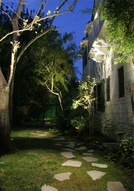
Shifting from public to private spaces, there’s a secret garden along the side of the house that features uplighting on sycamores and vines as well as downlighting from up in the tall trees. The latter mottles the pathways below with a special glow and with interesting, shifting shadow patterns. In addition, two special lights shine down from above to simulate moonlight.
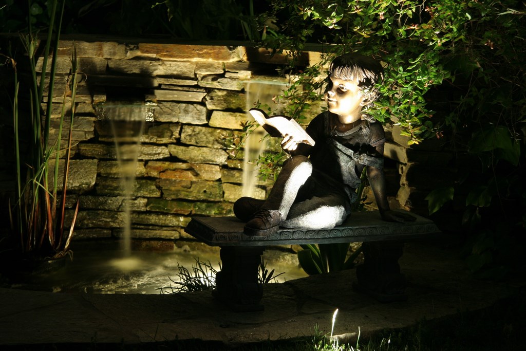
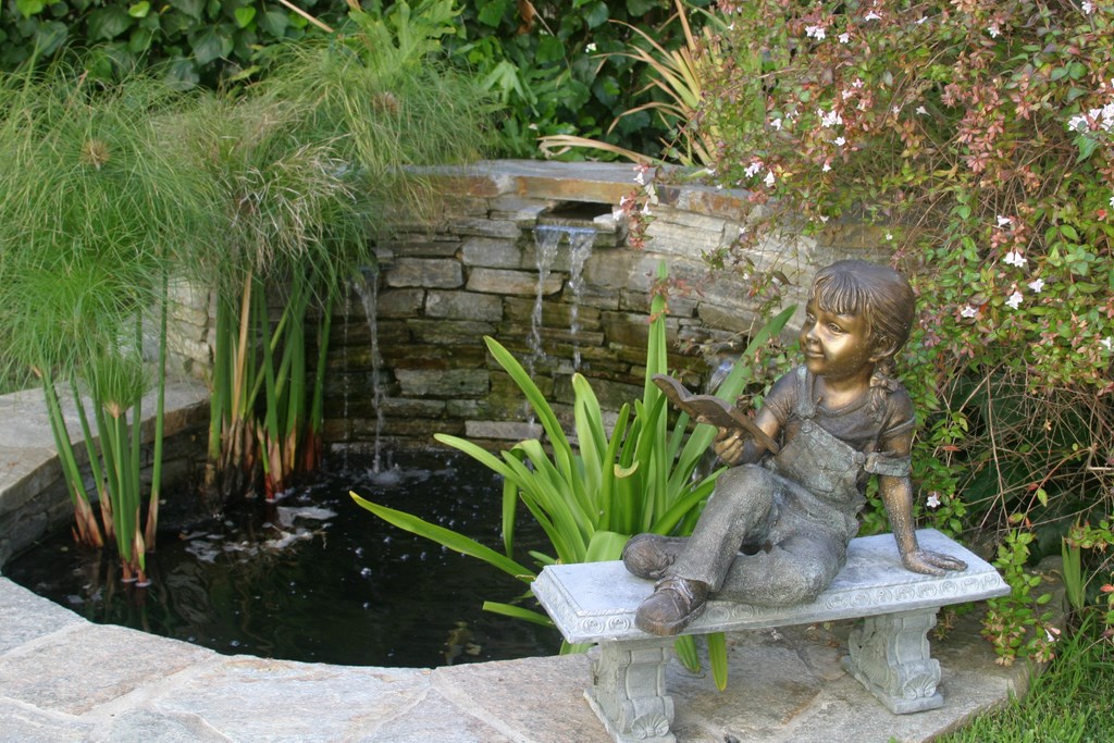
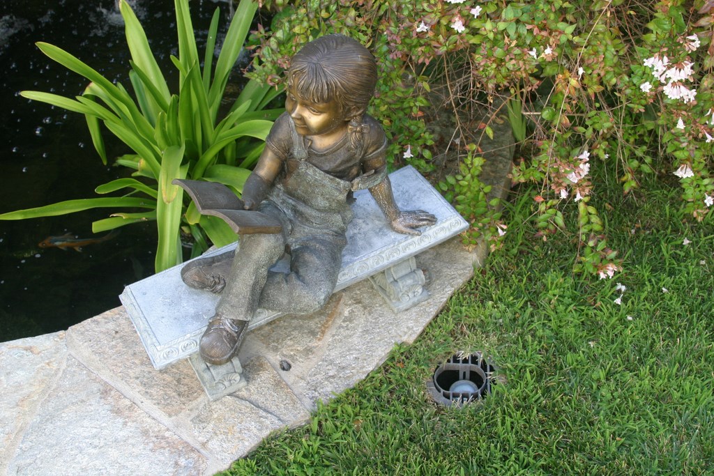
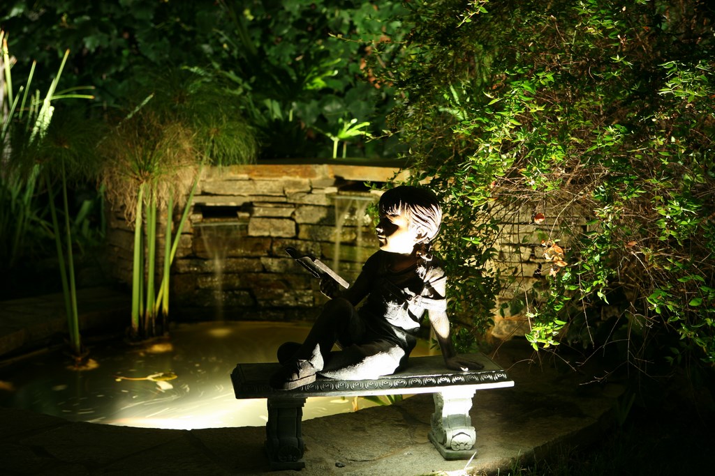
| The path to the secret garden starts well to the right of the front door, wrapping around the garage, flowing along the fringe of a large lawn and finally leading to a gate behind which visitors find a small pond and another garden sculpture. Pretty both day and night, the dramatic core of the scene after dark is produced by a single, sunken fixture that bathes the bronze child in a soft light. |
The backyard itself dominates views from inside the house (the much-used living and media rooms in particular), so we approached the lighting tasks here with special care and the goal of drawing observers out to exterior spaces we’ve deepened and enlarged through the lighting program.
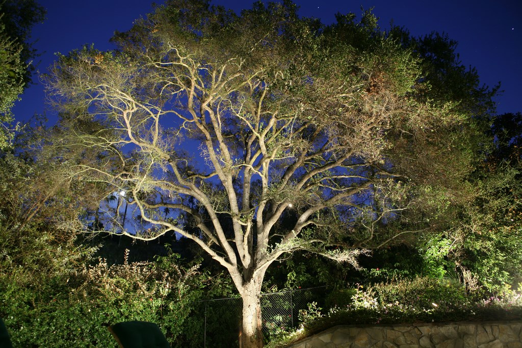
The surrounding oaks are all uplit, with up to nine fixtures on some of them to enable observers to see their intricate structures. These are big, beautiful trees – obviously our key after-hours subjects.
|
Protected Spaces It’s always critical to consider the design from the perspective of activities taking place both inside and outside the house. If, for example, a lit area is to be situated next to set of windows, you need to be careful about strong light shining from outside to in: If you’re not alert, you may end up illuminating spaces in exactly the wrong way. I’m particularly careful around bedrooms: Obviously, lights are meant to be on at night, but if they light up a child’s bedroom or a space favored by a husband or wife who likes to go to bed early, you don’t want any stray lights shining into the windows. That’s a sure way to displease a client and may lead to whole sections of your lighting plans falling into disuse. — M.G. |
Alongside the dimly lit patio is a planter filled with roses. This area, which is the special passion of the female client, is set up and lit in ways that call special attention to the flowers when they’re in bloom. When the plants have leafed out and become covered with flowers, this is indeed a special space in the overall scheme of things.
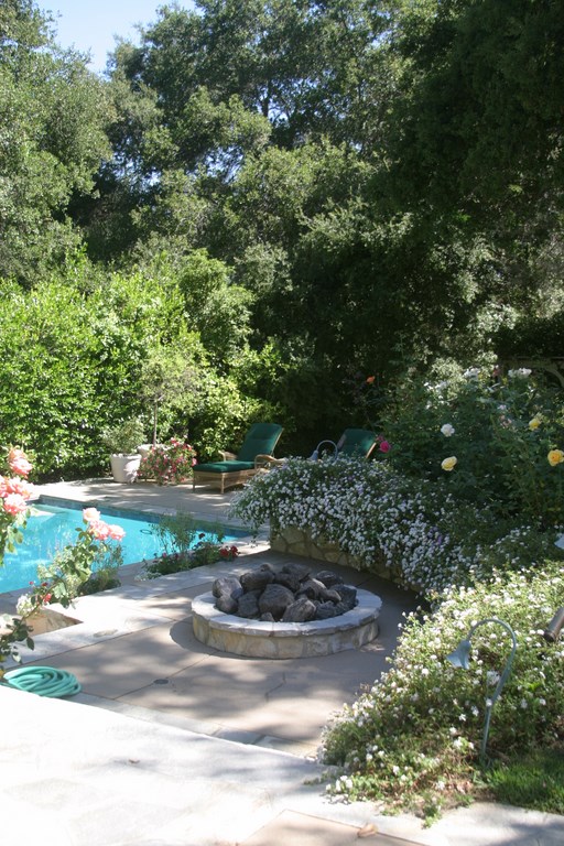
Back from the patio is a swimming pool – already existing when we came on the property and with its lights on the wrong side, facing toward the house. (That’s a big mistake; tips on avoiding it will be the subject of a future article specifically on issues related to lighting pools and spas.)
Between the pool and the oaks is a low, backlit hedge that looks as if it’s on fire: The lights behind it providing a wonderful back-glow, and the fact that the face of the hedge is in darkness lends an unusual sense of heat and depth to the scene – especially since just about everything else in the yard is front-lit.
Down the Path
Beyond the pool, our eyes are pulled down to a large lawn that I’ve left deliberately in the dark. I’ve found in many cases – unless you need to delineate a border or establish a safety zone for a pathway – that grass is typically best left in low light. In this case, by leaving much of the space dark, we create important contrasts that add drama to the overall setting and enhance the focus on elements bathed in light.
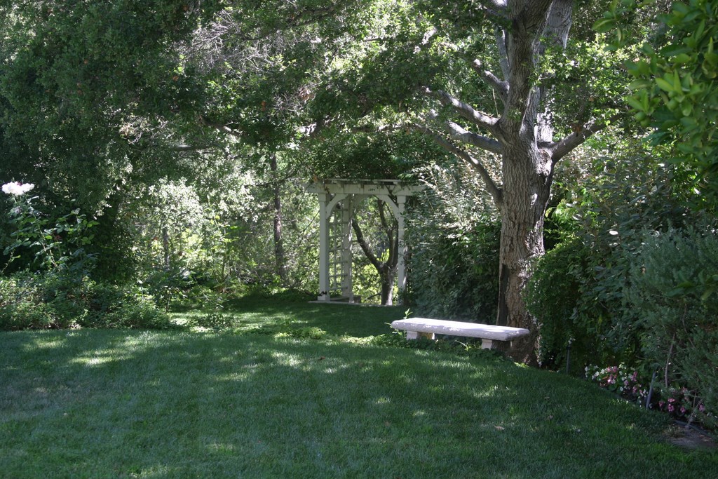
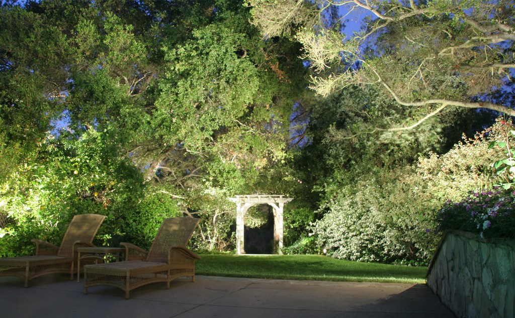
Off to one side, for example, we highlight an arbor as a focal point worthy of a good, long look. Here, I’ve used a distinctive framing effect that tells observers there’s something to be seen in that corner of the yard.
| The large backyard features not only a welcoming pool, a large patio and a rose garden, but also several trees, hedges and planters that truly come to life when the sun goes down. Consider the arbor and the oak beyond the end of the pool deck: They’re largely lost in the glare during the day, but at night they are both exceptional visual performers. |
In this case, the payoff in walking over to view the arbor at close range is gaining access to a small fountain softly lit from inside the water. This generates an upward light from within the water that throws dancing shadow patterns on an adjacent stone wall – but it’s also supplemented by downlighting that lends interesting accents to the stone surfaces.
Just to the right of the fountain is a small statue lit from only one side: This keeps it from competing with the fountain; it also keeps the light from overwhelming the object itself, instead caressing its surface in a soft light that accentuates the statue’s character.
I also established a backdrop for the fountain by uplighting all of the hedges and the trees that surround it: Everything is subtle, but it all comes together as an all-encompassing vignette to which you gain access only by following the light over to the arbor.
Michael Gambino owns and operates Gambino Landscape Lighting in Simi Valley, Calif. A graduate of Adelphi University with a bachelor’s degree in business administration, he has been a California-licensed landscape contractor since 1990. In 1995, he began specializing in high-performance low-voltage landscape lighting systems that he designed and built to last by himself. For more information, visit his web site: www.gambinolighting.com.


