Hearst Castle: A Question of Balance

 I just don’t get Hearst Castle. Why should we celebrate the gross-scale purchases of historical artifacts and period-inspired structures by a wealthy American whose main pleasures seem to have involved amusing himself and overwhelming others?
I am willing to concede that Hearst’s San Simeon compound and collections impress in their scale and sheer vastness, but shouldn’t we, as design-oriented professionals, perceive his “achievement” with far more critical eyes than the average visitor to the estate?
Typically, we professionals are appalled when someone coughs up what might best be called a product-based design — that is, a project that solely meets a need instead of reflecting the designer, the setting and the client. In countless magazine articles and during my Genesis 3 classes on art and architectural history, I have condemned such designs — yet Hearst Castle somehow slips under the radar and is generally hailed as stupendous.
In reality, the estate is about as disjointed and wayward as architecture gets. It is frivolous and utterly lacking in genus loci or meaning.
A Child’s Eye
My first visit to the hilltop castle occurred when I was a child of eight or nine. At that tender age, I was awestruck by the place, but at the time I lacked the critical skills required to understand where I was or what was going on. Now, after years of education and research, I see the crest at San Simeon as a Disney experience: little bits of this and that dressed to impress, but a space lacking continuity or any sense of design editing.
Great expenditures of money do not always translate to beauty. Many times, in fact, they do not.
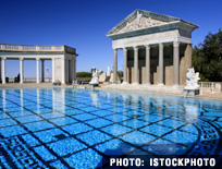
If you visit Hearst Castle, stand on the deck of the Neptune Pool and gaze up at the Casa del Sol through the various relics and architectural treasures Hearst collected from sites in ancient Greece and Rome — and notice that the object of your gaze is a Spanish Colonial Revival building replete with Art Deco flourishes. From my perspective, this is architectural hash, a comingling of the incompatible that’s more a tribute to Hearst’s will than to any designer’s skill.
There’s no sense of harmony. All you find is cacophony in a context that is less inviting than it is overtly intimidating.
It leads to the question: Why do we find certain spaces uninviting? Typically, this unease arises when we sense discord or confront visuals that throw us off balance — basic psychological reactions. And a place like Hearst Castle should make us, as watershapers, even more uneasy because so many of us have been migrating toward more of a focused design discipline as we attempt to elevate our industry.
In that light, designers who perceive Hearst Castle as any sort of model are taking steps backward.
Don’t get me wrong: I find merit in details around the estate and much exemplary engineering and watershaping — but only if I put on blinkers and view individual objects in a very tight perspective. The tile work is amazing, for example, and some of the objects on display are both breathtaking and clearly priceless.
But when I broaden my view and take in the entire hilltop, it is obvious that the bombastic impulses of a wealthy collector with often questionable taste won out over any considerate, appropriate design approach. Wealth does not bring taste with it, and the lesson here for watershapers is that landing a rich client does not necessarily mean a project will be great!
Ties That Bind
There are times when, as dignified design professionals, we need to rein in the wild emotional (and fiscal) impulses our clients might want to indulge, because often these impulses will be incongruent with the integrity of a project. There are indeed very few cases in which throwing money at art will result in actual beauty.
Thinking about Hearst Castle, I often wonder what would have happened if Frank Lloyd Wright or Pablo Picasso had gotten the call from Mr. Hearst: Would they have bent to Hearst’s demands? Or would they have had the gumption to stand up for what they believed? It’s hard to tell, but I would hope that the hilltop property would have been drastically different had such calls been made.
Essentially, what I want to do here is ask for an acknowledgment that Hearst Castle is a physical manifestation of Hearst’s emotional states and not the product of anyone’s architectural vision. When I visit, I see undeniable beauty and merit, but at the same time, I have never seen anything that should serve as models for us as watershapers. Nice vignettes, some good ideas, some wonderful unions of materials, lots of great engineering and craftsmanship — but a complete lack of masterful site-crafting or any control of movement through a quirky amalgamation of glorified movie sets.
I write this as someone who has visited the castle many, many times through the years — and as one who sees it as a place where there are things to be gleaned and learned. I’d enjoy hearing your own thoughts about the place — whether it’s to take me on or expand on my perspectives on the place. Any thoughts will be helpful!
To see a selection of images of Hearst Castle, go to http://tinyurl.com/29hzm59.
For Mark Holden’s further ruminations on Hearst Castle, click here.
Mark Holden, founder of Holdenwater in Fullerton, Calif., is a landscape architect, landscape and pool contractor, and educator specializing in watershapes. He is a veteran contributor to WaterShapes magazine. For more information, go to www.holdenwater.com.


