Designs on Edge

To my way of thinking, one of the most fundamental considerations in any landscape design has to do with understanding how the major elements blend visually with each other and their immediate surroundings. When that design includes water – be it a pond, stream, fountain, pool or spa – the key to effective visual blending depends to an overwhelming degree on how you define the internal boundaries within the design.
This is so because of a couple of crucial visual concepts: First, we all know that bodies of water command our attention – big or small, active or still, when we’re near water we all take notice. Second, our eyes tend to look for edges. Whether standing on the beach, in a park, on a city street or in a small courtyard, our eyes instinctively look for boundaries where major visual elements come together.
To use the biggest example possible, the horizon is the most arresting visual element when you look at the ocean. Places at which that element is divided or broken, whether by a land mass, clouds or even ships, become powerful points of visual interest. In the context of observing a landscape design, we run through the same mental processes we do with the horizon: We look at the water, the stonework and the plantings and at how they interact.
That’s why the construction details often known as “edge treatments” are so important: They are our points of transition, the places we find interaction and from which we capture our strongest visual impressions.
PLANNING YOUR LINES
These boundaries are so important that the edge treatments you place between the water and its surroundings can either make or break a project.
In a fully naturalistic design, for example, if the observer can identify how the pond or waterfeature was built – especially at the edge – it disrupts his or her enjoyment of the peacefulness of the surroundings. By the same token, in a more architectonic design, natural elements such as boulders or plants can thoroughly disrupt clean lines and compromise the visual effect.
In almost all cases, this play of contrasts between natural and man-made elements at water’s edge serves to accentuate certain visual characteristics – for good or ill. The key to success here rests in knowing what you want to achieve and in planning the type and nature of your edge treatments from the very start.
As the accompanying illustrations show, these design decisions tend to have something to do with whether your desire is to conceal the shell of your watershape – or accentuate it and draw attention to it. At that level, these decisions influence not only the aesthetics of the project, but also its engineering.
One more point: As you look over these projects, please keep in mind that although these designs are fairly complex, the elements used are all very simple and can be applied in all sorts of projects ranging from those at the very highest end to much simpler installations where just a small detail or two can really make a difference.
A Thin Lip
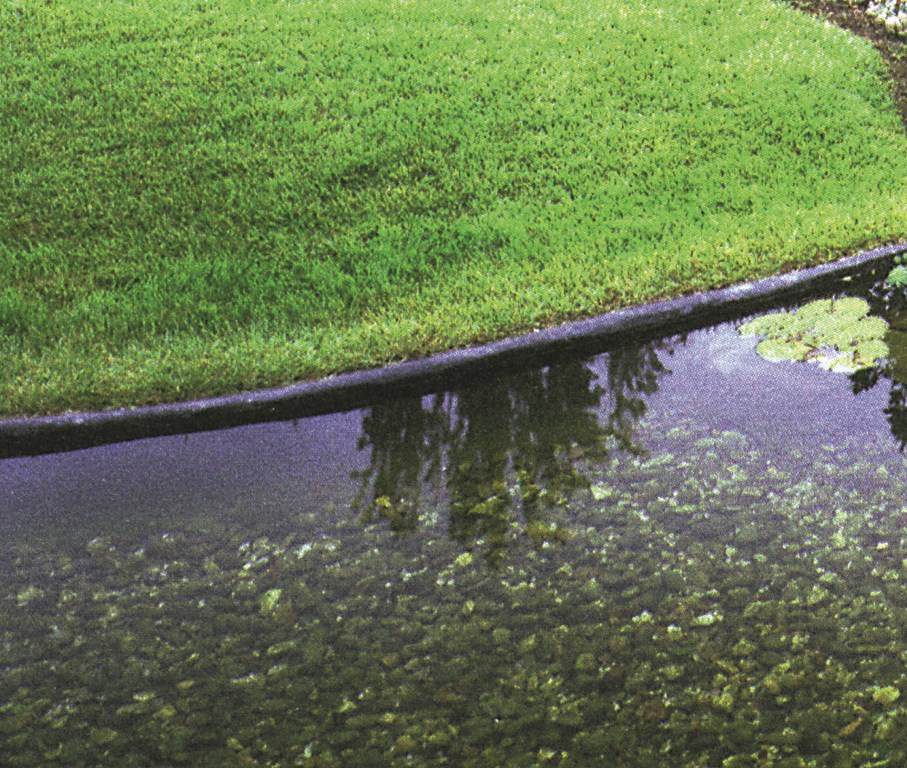
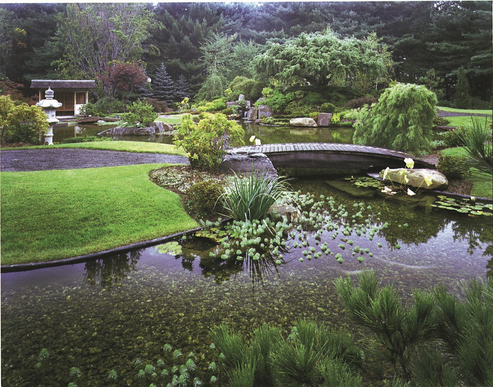
For this Japanese strolling garden, the pond’s chamfered lip allows sod to grow right up to the water, very nearly concealing the edge.
To achieve this effect, you bring the wall up just an inch or two above the water’s surface and then cut it back at a 45-degree down angle with the short side away from the water. (It’s the same concept used in vanishing-edge pools.) In this case, the grass growing up on the edge visually blends with the water’s surface.
A caution: In this type of treatment, you need to seal the exposed concrete on the chamfer by carrying plaster, pebbles or another surface material over the entire surface of the beveled edge and down the backside. (This is especially important in the northeast and other areas with freeze/thaw conditions.) This is a fairly low-tolerance edge, and you don’t want it cracking or to have the plaster spalling off the face of the chamfer!
Super Natural
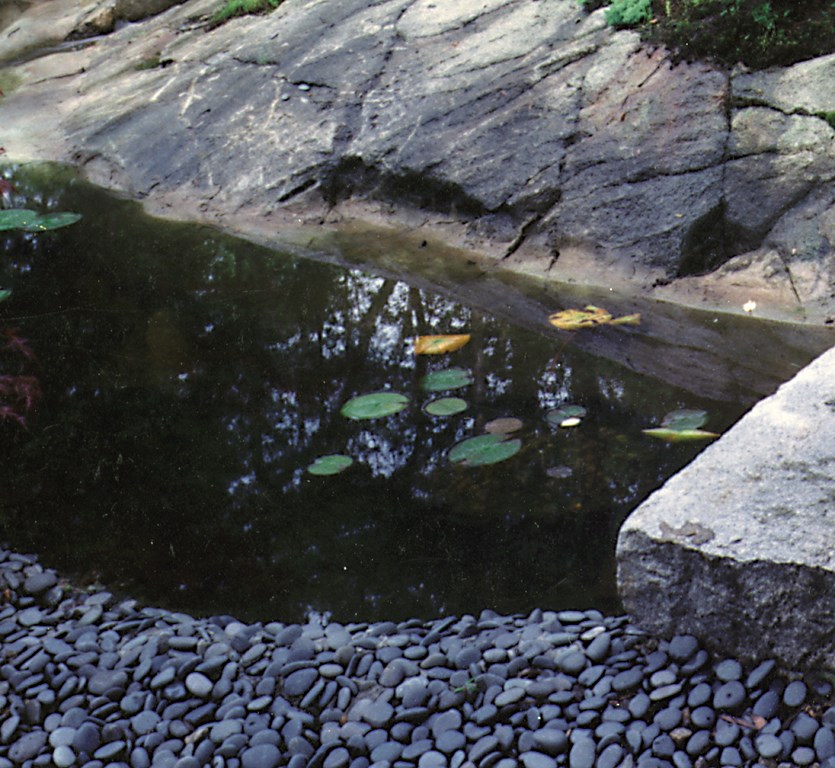
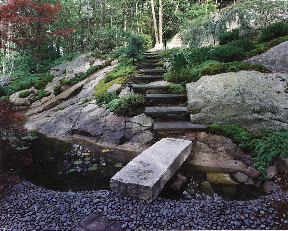
Here’s a case in which we’ve used the natural features of the site to conceal the edge. Even though the slope pictured here was entirely wooded when we came on site, the topography suggested there was a ledge underneath – and that’s just what we found when we took out all the soil and trees.
To hold the water, we pinned and shot a concrete shell right at the bottom of the ledge. After guniting, we blended the concrete with the granite visually by applying a mix of concrete and dyes to mimic the color of the granite, then used trowels to carry some of the ledge’s lines just below the water’s surface.
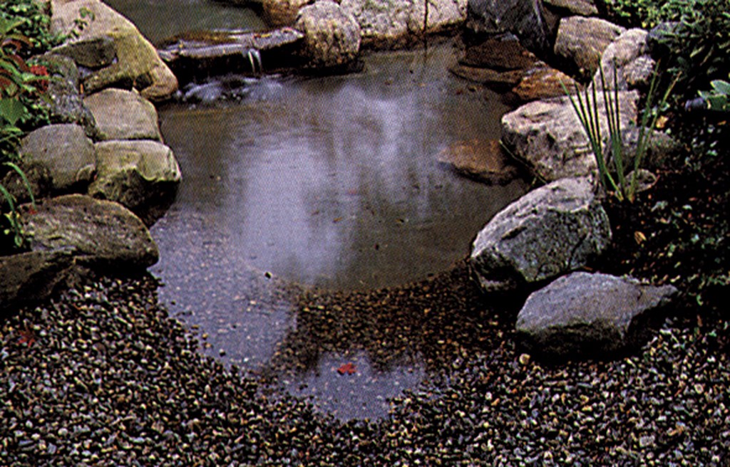
On the opposite edge, beach pebbles follow the soft slope of the concrete shell down into the water. The solid-granite bridge adds to the rough-hewn appearance of the design.
Sharp Contrasts
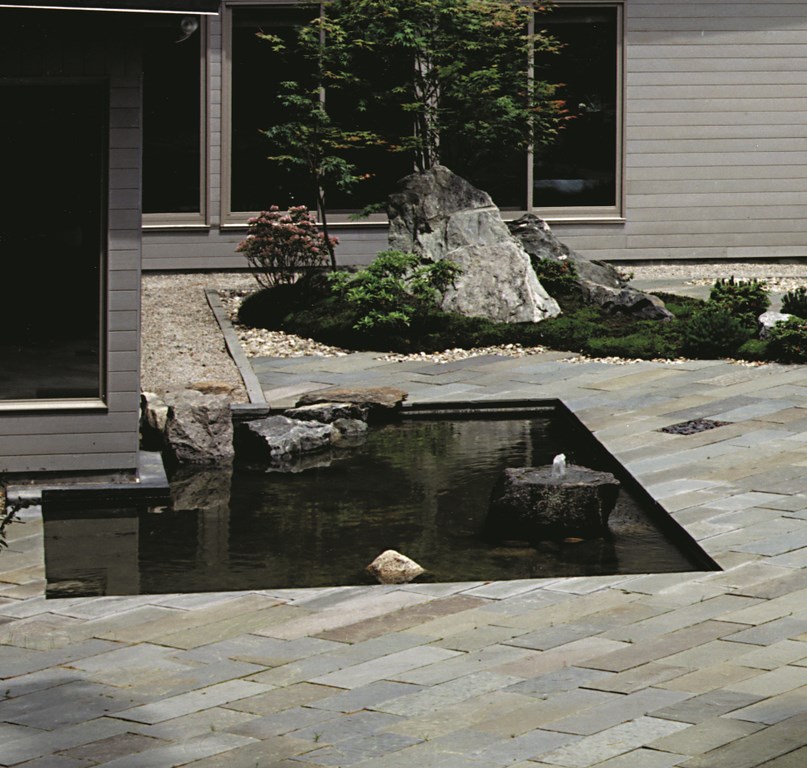
This is an example in which we used the angles of a house as a point of departure in designing a small pond as part of an unusual courtyard garden.
It’s generally tough to design a “natural” pond to sit next to a structure, because the lines of these (usually) free-form watershapes tend to conflict visually with the angularity of a building. We overcame that problem in this case by making the pond an angular extension of the house and eliminating its “natural” edge.
Around the pond, we used the sharp angles of the bluestone decking (set at 45-degree angles to the pond’s edge) to provide an extended boundary between the linearity of the pond and the more natural contours of the plantings and lawn. Within the pond itself, we used rocks to blunt the angles and draw more attention to the architectural design of the waterfeature.
A Natural Blend
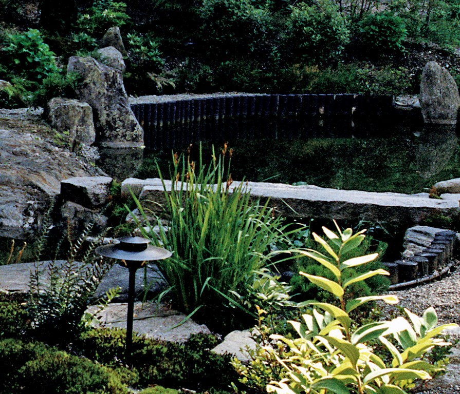
It’s a classic touch in Japanese design: take natural elements and use a detail to show man’s influence – or use definite patterns to contrast with the general asymmetry of natural elements.
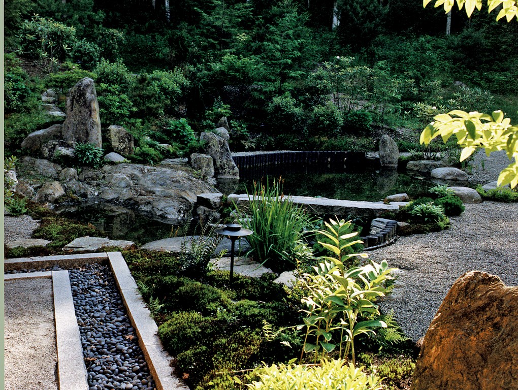
In this project, we applied that principle by using cedar ranjui posts to provide a contrast to the rocks, plants and river stone – an intrusion that shows man’s influence without disrupting the overall design. (A caution: Although cedar doesn’t easily rot, the posts will need to be replaced every three to five years – a fact that must be considered in installation!)
The channel seen at left is bordered by granite beams. The use of native material is critical in easing transitions between an architectural feature (in this case as in the previous one, the owner’s home) and its straight lines and right angles together with the naturalistic pond and its features.
Sculpted Effects
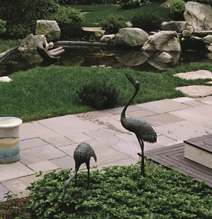
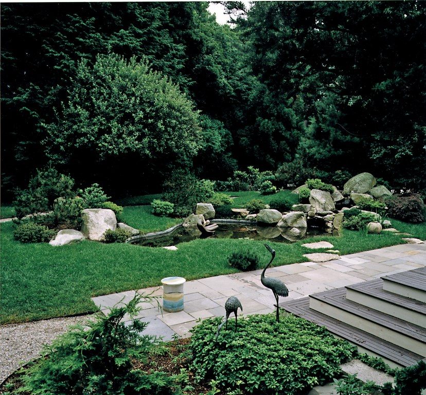
This project combines several natural elements to bridge architectural elements and the lush surroundings. The chamfered pond edge carries the grass right to the water, creating a clean, free-form line. The edge is then softened and disrupted by the stones, which stand outside, near and in the water.
This installation was influenced in part by the sculptures the owner wanted us to include in the design. We found out what they were, considered their proportions and discussed their overall impact on the design. The result is a soothing environment in which the natural elements gently invade the geometry of nearby structures – like the cranes strolling the deck, for example.
A Pathway Glade
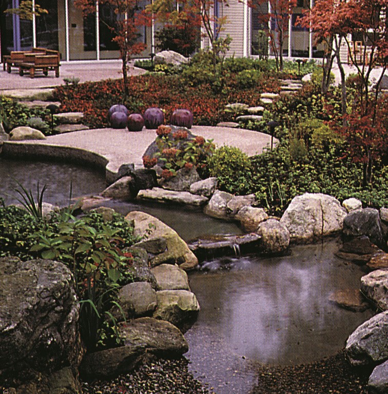
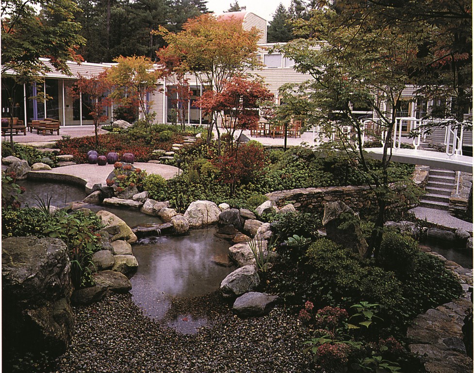
The edge treatments here were driven by a set of complex transitions from the architecture of the house and deck to the natural design of the garden and its waterfeatures.
To achieve the desired effects, we blended several approaches (including beach pebbles, natural rock and landscaping) to create natural touches that interact with stone walls, terraces and pathways and create an interplay of architectural geometry and natural textures.
The stone pathway through the garden serves to focus attention: It leads visitors through a small wooded garden to a tablet-shaped terrace where all of the elements – plants, rocks and water – come together and surround them in tranquility.
| Expanding the Base
Through the years, we’ve found that masking or hiding an edge often involves an extra bit of construction: We expand our bond beams two or three feet back from the waterline, thus giving ourselves the flexibility to top the edge with a variety of treatments that include anything from large boulders or small stones to flower beds of grassy areas. This structural approach also lets us integrate the shell with walkways or bridges. Consider the use of large boulders as an example: If you put a large stone ten feet away from the water, this will dictate the size of the stone you need to complement it in the water. If you don’t have the flexibility that comes with a wider bond beam, then you’re stuck with smaller-size boulders as your mediating edge treatment. There are endless ways this can play out, but we prefer working with expanded shells because they let us be more flexible – and creative. Another example of how the edge treatment influences construction is found in designs where you want to bring grass right to the water’s edge. Here, the bond beam should be as narrow as possible while retaining integrity. In still other cases, you may want to show off construction details, which means you may want to raise the bond beam to accommodate stone or tile facings that clearly show man’s influence over the environment. – P.W. |
Peter White is a senior landscape architect for Zen Associates of Sudbury, Mass. An award-winning designer with 11 years’ experience, he works on projects at all levels for large institutional and commercial customers as well as residential clients. White joined Zen Associates in 1990 and now specializes in the planning and development of large residential estates, intimate watergardens and city parks. His work often combines design elements of traditional Japanese gardens with features drawn from native forests found in the Northeastern United States.


