House Work

There’s no substitute for working closely with clients. I typically spend many hours conversing with them, discussing everything from their travels and artistic interests to the specifics of the project at hand. It’s the only way I know of to ensure that I’m following the best path in developing a design to meet their needs.
That approach was taken to something of an extreme in the project pictured here: Not only did I devise the outdoor spaces, including a large swimming pool and a host of other exterior features, but I also was extensively involved in building the house itself. It was an exciting process for me, one that yielded positive outcomes and that, to this day, is still one of my favorites.
Interestingly, however, my association with these wonderful clients actually began a couple years before this project commenced – an encounter that resulted in no work for me at all and also put me on the outs with a prominent real-estate agent.
DON’T DO IT!
It all started when the clients, who I did not know at the time, called me to take a look at a property they were considering in southern California’s beautiful Santa Monica Canyon. He was a bit reserved, but she and I hit it off immediately and I was genuinely excited by the prospect of working with them.
When we met, he was a producer and she was a gourmet cook. They had a couple kids, and she and the children were crazy about horses. What they wanted most was a parcel that would allow them to have a corral in addition to the house of their dreams – something that would be both spectacular and unique.
As we walked the five-acre estate, warning bells started ringing in my head. In fact, I didn’t like anything I saw, including the signs of water damage visible in the pad that had been cut for the existing house. As we kept moving, I grew increasingly concerned about the nature of the soil and the drainage patterns as well as the system of small retaining walls: Everything looked like trouble.
I started by letting them know that there was a high probability that simply correcting the drainage issues on the on the property would cost a small fortune – and that this expense would come with them not having built a thing.
Suffice to say, the real-estate agent was none too happy with my bluntness: Even in the early 1990s when these events took place, this was a multi-million-dollar site and I had just blown a major financial transaction. Had I not spoken up, of course, I might have undertaken an extremely lucrative project – but in all good conscience, I wouldn’t sacrifice my credibility and couldn’t have moved forward without telling these likeable people exactly what I thought.
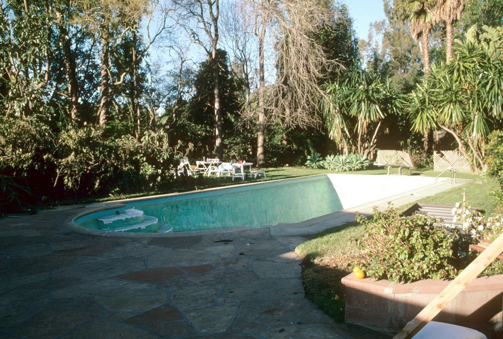
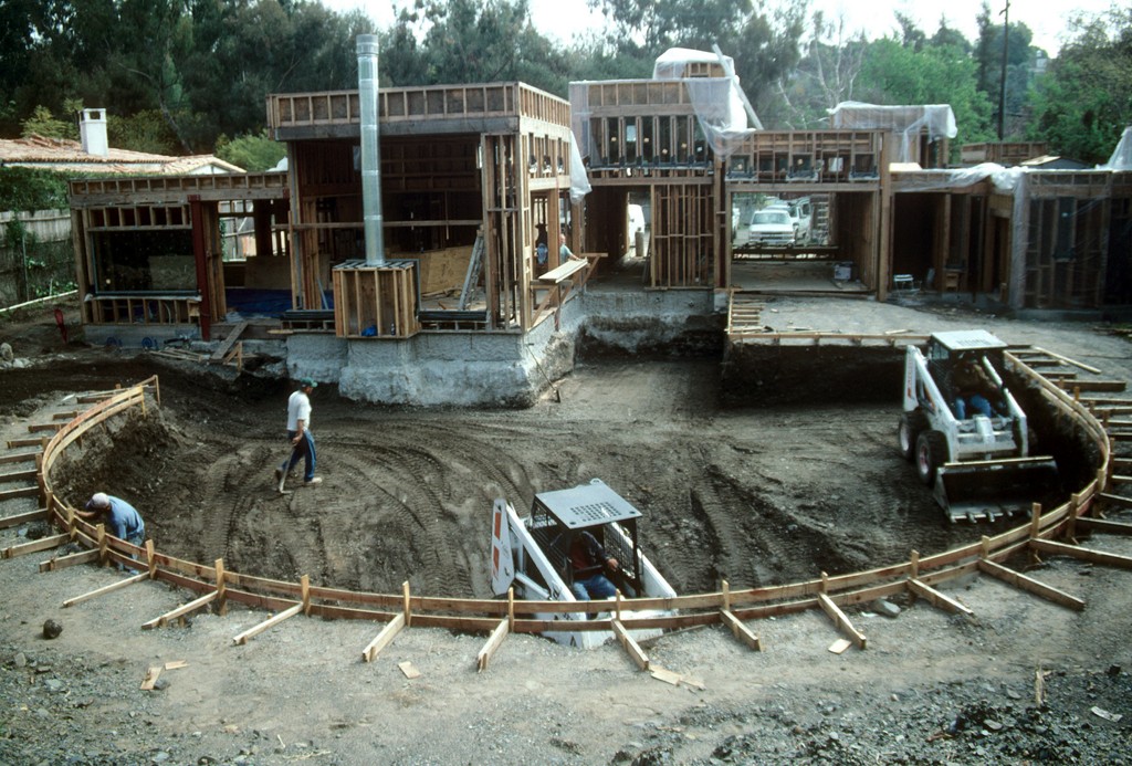
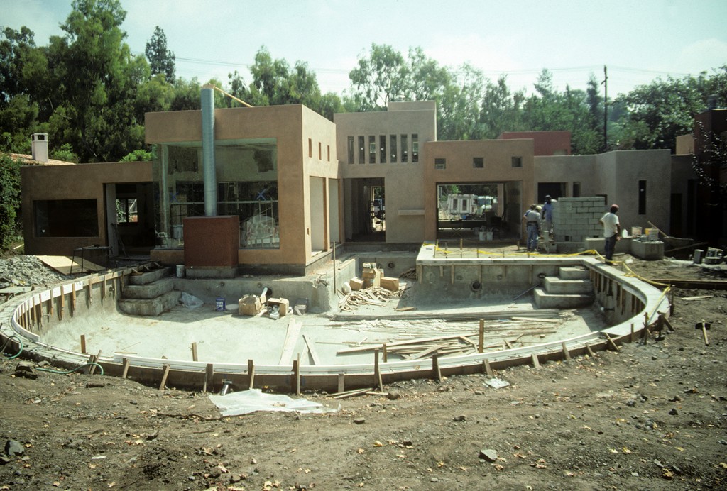
| The original pool wasn’t a good fit with the program we’d developed for the house, but it hung in there until we started framing the house and the homeowners could see clearly just how bad a mismatch it was. |
To test my visual survey, we brought in a soils engineer whose preliminary evaluation confirmed that the site was effectively unbuildable without significant remediation. The clients, who even at that point were about to enter into escrow on the property, backed out of the deal. I figured that was the end of it: I walked away empty handed, but I knew I’d done the right thing.
Two years later, the clients called me out of the blue and told me that they’d just purchased a property in another wonderful Los Angeles enclave. There was an existing house with a pool, but they wanted to scrape the lot clean and start fresh. At that time, they didn’t even have an architect; they were calling me first, they said, because of the trust we’d developed the last time around.
To get things going, I put them in contact with Mark Whipple, an architect I’d worked with previously who seemed to me to have the right personality and vision to be a good fit with these clients. I was right: He came aboard soon after, and we all began a series of discussions in which the basics of the design began to emerge. Then came the surprise: During one of these sessions, the clients asked me if I’d be willing to build the house.
I’m not a home builder, but through the years I’d worked with a number of top contractors and immediately called one of my long-time associates, Rick Shevitt, an absolutely brilliant general contractor. For purposes of this job, we formed a separate company and went to work.
HORSE COUNTRY
As mentioned above, the clients are equestrian enthusiasts. One of the main reasons they’d chosen this particular property had to do with the fact that it was in one of the few areas within the City of Los Angeles zoned for horses. It wasn’t a large parcel – just shy of two acres – but even though it was only a short distance north of the noise and traffic of Sunset Boulevard, it had a distinct feeling of being out in the country.
The clients had never lost their desire for something spectacular and unique, so the design phase for the house extended over several months. Whipple handled the lion’s share of the architectural-design chores, but it truly was a committee project with the clients and my ad-hoc partner and I participating fully. At some point in the process, the clients decided to accelerate things a bit by declaring that the existing pool would stay and that we should focus all of our energies on the house.
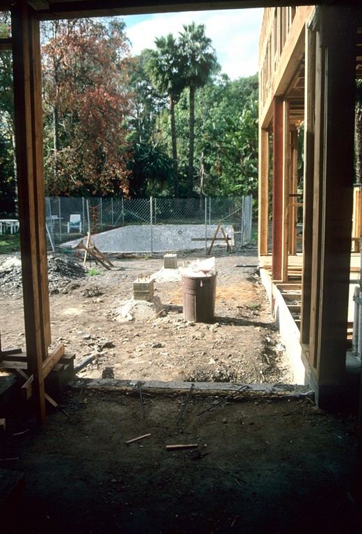
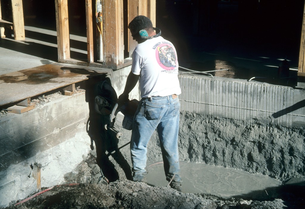
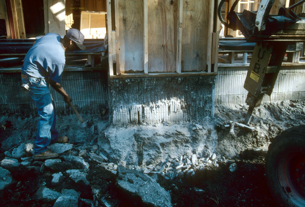
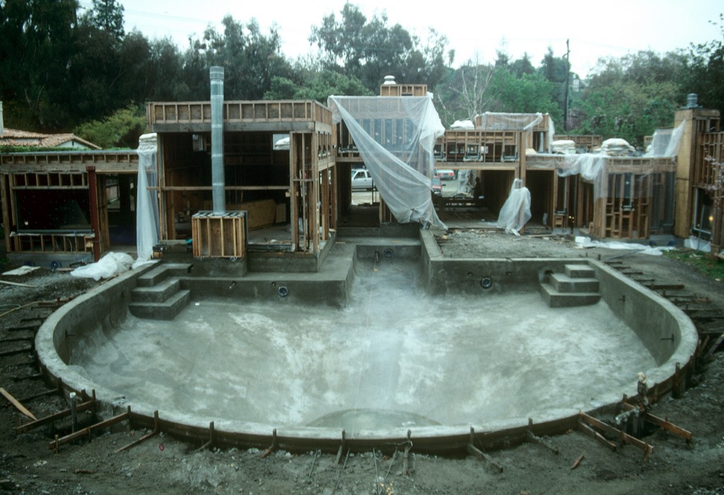
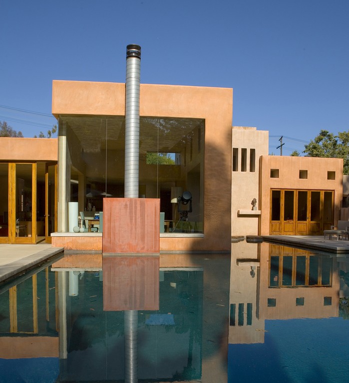
| We removed the old pool and then had to figure out a way to tuck the new pool slightly under the house to give the impression that the building was floating on the water. This involved the laborious saw-cutting of the foundation in all areas where the water was to interface directly with the house, then chipping away the concrete to prepare for insertion of the pool shell. We finished the shell, then waited as a magnificent structure took shape above it. |
The existing pool was an eyesore, but for several months after the clients had made their decision, I put it out of mind and stopped seeing a new watershape as an integral part of the project.
The design for the residence that ultimately emerged was a mélange of influences – part Legorreta, part Barragan, part Le Corbusier – with a distinctly Moroccan flavor stirred into the brew. Everything was to be modular and rectilinear, with wide-open interior spaces under lofty ceilings, and we all looked forward to the incredible light that would pour through the large windows and glass doors that were to wrap the building.
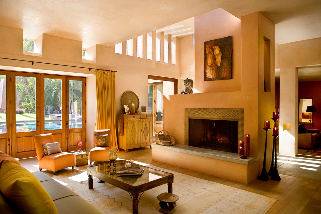
Where the play of light and shadows was to be the key in establishing the interior atmosphere, we also knew that colors would make a particularly strong contribution: Walls throughout were to be finished in beautifully mottled plaster in warm, rich earth tones, while the flooring consisted of seven-inch pecan planks through most of the home and of finished concrete inlaid with tile details in the kitchen and entry hall. The home’s geometry might have seemed a bit severe, but the juxtaposed colors, textures and materials were selected to give the spaces an exceptionally warm, comfortable feeling.
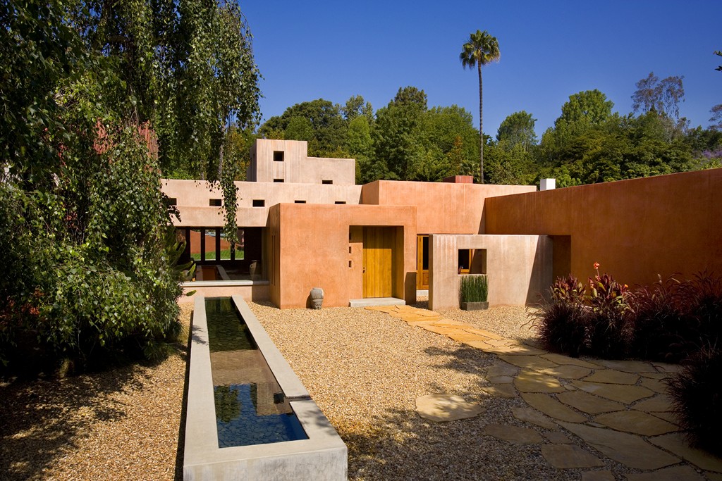
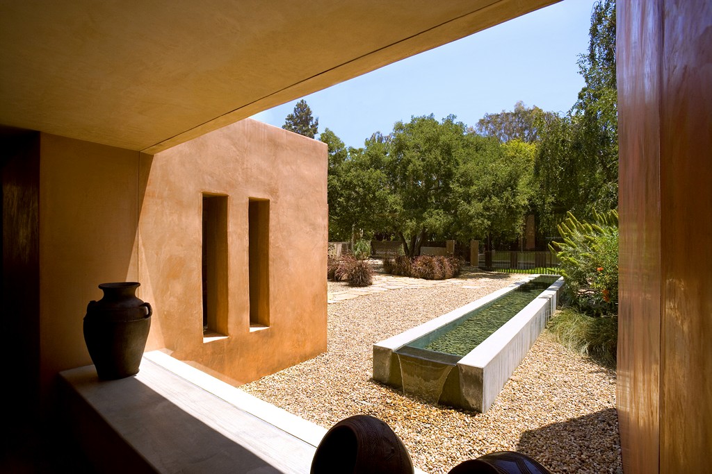
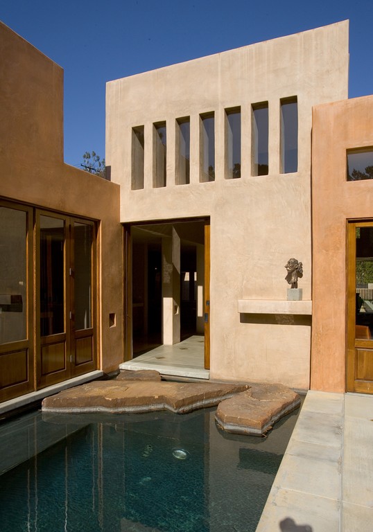
| The horse trough that flanks the approach to the front door introduces the homeowners and their guests to the prominence of water in the architectural composition. From inside, this waterfeature takes on added visual significance with an intriguing spillway that seems to flow onto the ground. |
We also went to great lengths to link the interiors visually with the exteriors. Colors from the inside flow to the outside, walls from the inside push through the framing to become exterior walls, and we placed windows strategically to take advantage of the best available views. Our ambition, in short, was to make the entire lot feel as though it was part of the home.
Nothing happened quickly: Every single detail was discussed and considered at great length; we made countless sample boards to aid in the selection of colors and materials; and we mixed dozens of custom plaster colors in ochre, beige, coral and more by adding various oxides to cement.
The entire process was wonderfully fun – a time of almost white-hot creativity in which the words “standard,” “typical” and “common” never came into use, not once. Even the gravel we ended up using outside in the corral area was sourced in Mississippi and was chosen for a beautiful salmon color that worked perfectly with the color of the house.
GOOD FORMS
Happily, and in stark contrast to the first property I’d visited with these clients, the new site was blessed with wonderfully stable alluvial soil. It was part of an ancient riverbed, and the soil consisted of layers of sand and stone – extremely sturdy, which meant we didn’t have to do anything to prepare the ground and could just jump in to build the home’s foundation.
As we dug, however, we encountered a few veins of expansive clay; not taking any chances (and acting on the advice of soils experts and structural engineers), we extended the foundation down a foot beyond the requirements of the original plan. As it turned out, that was a fateful decision – as we’ll see just below.
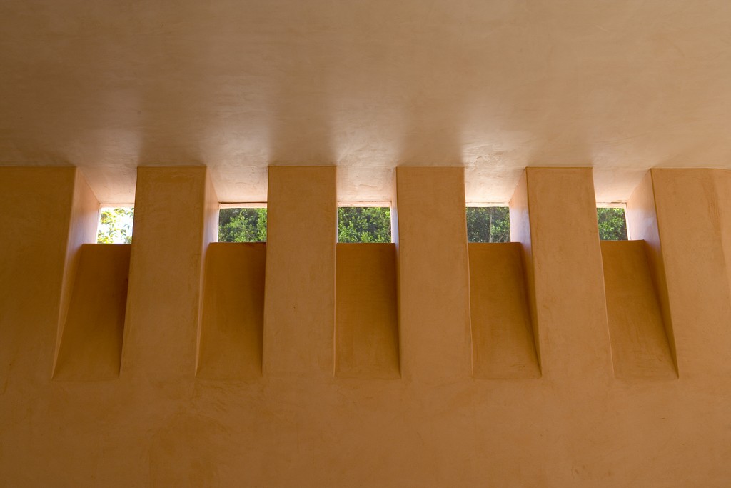
| Much of the light, airy exterior program was driven by design decisions made inside the house, where there was a steady focus on bringing natural light indoors from every conceivable angle. As you move through these spaces, you eventually become aware that there’s a big body of water in the backyard – and that it reaches right up to the house. |
We were well into the framing stage for the house when Shevitt told me that the clients had decided to rip out the old pool after all and replace it with a new one. Moreover, they had also decided that they wanted the new watershape to exist as a unified visual element with the house – meaning specifically that they wanted the walls of one part of the house to reach straight down into the pool.
The only problem: The home’s foundations had already been built.
The usual pool-guy approach under these circumstances would have been simply to abut the pool’s shell to the foundation, creating a visually awkward eight- to 12-inch bond beam and most likely failing to consider the relationship between the two structures and the surcharges one would impose on the other. That certainly wasn’t an approach a structural engineer would have endorsed – and was absolutely not what the clients had in mind.
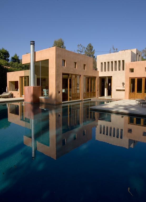
Instead, they wanted the pool to appear as though it was an integral part of the home itself – that, in fact, the wall of the house and the pool below it would be on the same, seamless vertical plane. And this was definitely the right call, aesthetically speaking: Conjoining the pool and the house in that way would create wonderful reflections and would also make the house seem to float on the water’s surface.
Without considering all of the construction-related implications of what we were doing, the pool we devised was a sort of elongated mushroom shape that was to flow right up to three of the home’s exterior walls and then reach some 65 feet into the backyard.
We all knew it would be visually spectacular from multiple vantage points inside the house and around the property. What we weren’t immediately sure of is how we would make it all work.
Fortunately, I had built the home’s footings myself, so I knew exactly what was there. Armed with that information, I put together a plan and contacted the structural engineer for confirmation.
What I’d proposed was sacrificing some of the existing 14-inch-wide, four-foot-deep footing to accommodate the pool shell. As luck would have it, both the width and the extra depth we’d added to the footings gave us what we needed. The engineer agreed with my approach, told us what to include by way of steel reinforcement and gave us the clearance we needed to move forward.
CLOSE QUARTERS
This revision called on us to saw and chip away four inches of the face of the stem wall that made up the house’s footing and place steel for the pool shell in the void we’d be creating. Then we would shoot right up against the concrete footing, in effect creating a structural notch that let us make the shell an integrated part of the foundation.
It was quite an elegant solution: We installed the steel against the house’s footing, then shot the shell right against it until the interior surfaces of the pool were just flush with the exterior walls of the house. In effect, we cantilevered a part of the house over the space where the pool shell was to go.
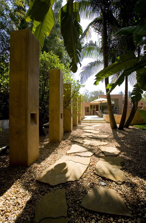
| We focused on making the exterior’s architectural features align closely with the style of the home and its interior. Even the monoliths that line a garden path have the same sort of undercut lighting apertures we used inside – a remarkable path-lighting effect indoors or out. |
Although this all was relatively simple in concept, actually executing the detail required extreme precision, and we spent an amazing amount of time measuring and remeasuring everything to achieve what amounted to zero tolerance. Think about it: We had to build the shell so that the finished plaster and tile surfaces would form an unbroken visual plane with the finished surface of the house, and there was absolutely no margin for error if we wanted to make the house seem to float on the water. Moreover, we had to get it right the first time or the whole thing would’ve turned into an expensive disaster.
It all worked out, and with all of these key problems solved, the rest of the swimming pool project was simply a matter of generating sets of details that would make everything work, both functionally and visually. One key detail, for instance, had to do with steps we inserted along the walls adjacent to the home: We wanted anyone inside the house to have easy access to the water through all of the doors and windows that opened on the walls above the pool.
Another major detail: On the far side of the pool over the deep end, the owners wanted a diving board. I truly hate the way typical diving boards look, so we developed yet another architectural detail and mounted the board in a circular structure that ties perfectly into the style of the house. Beyond the board, we also installed a fire pit and, behind that, an artist’s studio – everything designed to serve as visual extensions of the look of the main house.
By the house, the pool was to flow up to numerous sets of oversized pocket and accordion-style doors. Off the kitchen and dining room, we craned a nine-by-five-foot stone pad into place to connect the two spaces: When the doors are open, the water is right at your feet. (I’ve been told that the kids love to sit on the edge of the kitchen, dangling their feet in the water as they eat lunch. It’s a rare situation in which water truly becomes part of a living space!)
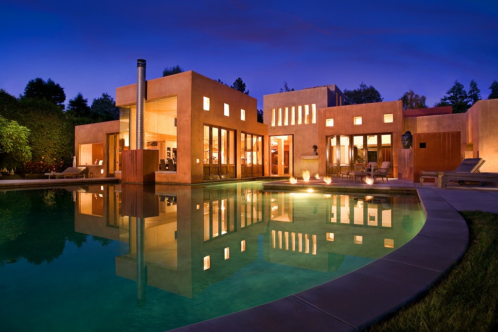
Off one arc of the pool, we built an outdoor shower structure consistent with the architectural program. In front of that structure, we placed a series of one-foot-square fire pits, set just a foot back from the edge of the pool. This proved to be a great detail – one of my enduring favorites: At night, these small points of firelight conjure spectacular reflections in the water that are visible from several spots inside the house.
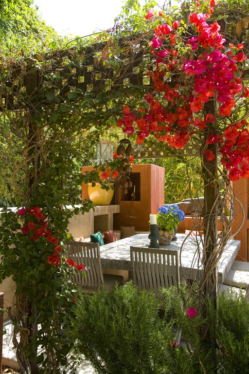
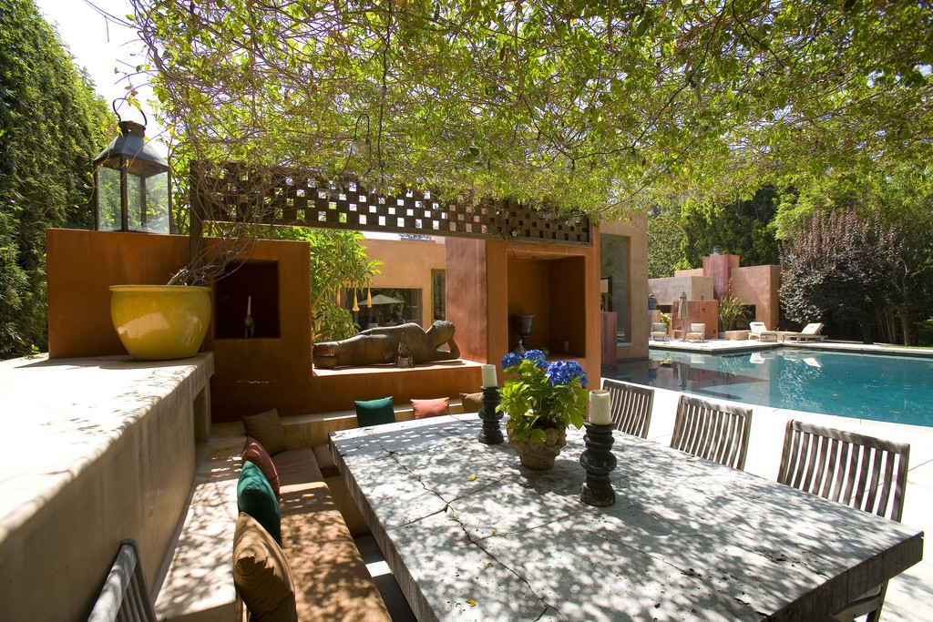
The decking is concrete with a rough, aged-looking finish. This aligns visually (and seamlessly) with the simple, poured-in-place concrete coping and with sections of the flooring inside the house. We also set up diamond-shaped areas in which we inlaid hand-made ceramic tile for visual interest – another outdoor echo of an indoor treatment. Finally, there’s the barbecue area, which has a design that again is directly aligned with the home’s style.
BEYOND THE POOL
Everywhere on the property, inside and out, we executed the design program with extreme attention to detail. The front gate, for example, is a steel structure with a checkerboard pattern that enables visitors to see through portions of the barrier as they approach. Even the mailbox is housed in a suitable rectilinear column.
A good bit of space is devoted to the corral and stables, all of it uncluttered and clean and in visual accord with the home’s architecture. The corral’s fence, for example, consists of simple steel posts that appear to be stuck unceremoniously in the ground.
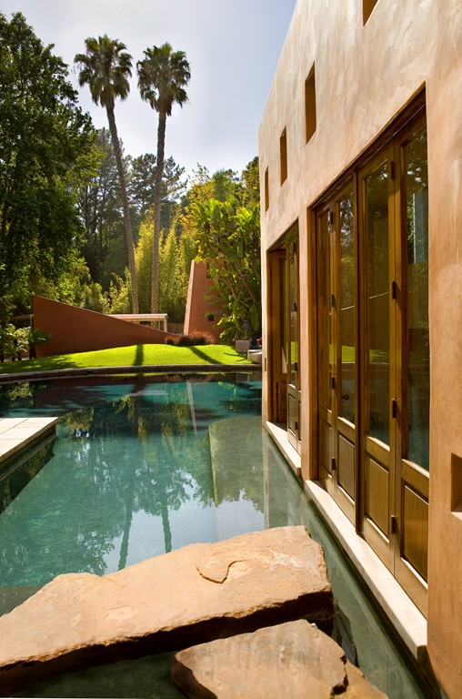
| The triumph of this fully integrated design is seen most readily in the reflections of the home off the water and in the way the building seems to float over its glassy surface – especially after dark. |
One of my very favorite details is the long, rectilinear horse trough. This was Rick Shevitt’s work, and he designed it with beautiful spillover details on each end – basically a pair of small vanishing edges that appear to spill onto the ground. This trough is visible from one side of the house and is striking for its disarming simplicity. It’s a beautiful waterfeature that just happens to provide fresh water for the horses.
The result of all of this detailing is a property characterized by complete and total visual continuity: Nothing looks out of place.
In visiting the property once our work was done, however, I was struck most by the reflections. We went with a dark-gray plaster finish for the pool’s interior, and it effectively turns the entire water surface into a giant mirror. From inside the home, you see reflections of the surrounding trees, landscape and structures; looking back toward the home, the architecture is reflected on the water’s surface in a way that reinforces the sense that the house is floating atop the pool.
At night especially, with the home lit up and the fire pits in operation, the reflections are wonderfully warm, inviting and beautiful, softening the starkly linear architecture and bringing fresh attention to the colors and textures that mark the scene.
This project is a perfect expression of the approach to watershaping I’ve always used. As I have said and written many times in the past 30 years, water is a colorless, odorless, amorphous, highly reflective material that enhances a setting and acts as a supporting element that duplicates the environment. In doing so, it changes the spectral palette and sets up subtle contrasts of line, detail and volume.
As such, a watershape should always be a coordinated part of (and never separate from) its environment. Yes, a watershape can be a focal point in a setting, but it should never take center stage and always serves the best purpose when it exists in proper scale and proportion and supports the architecture and space that surround it. On those occasions, watershaping becomes an art form – precisely the aspiration we all had for this project.
David Tisherman is the principal in two design/construction firms: David Tisherman’s Visuals in Manhattan Beach, Calif., and Liquid Design of Cherry Hill, N.J. A designer and builder of custom, high-end swimming pools since 1979, he is widely known in the pool and spa industry as an advocate for the highest possible standards of design, engineering and construction. He has degrees and credentials in industrial design, scientific illustration and architectural drawing from Harvard University and Art Center College of Design and has taught architectural rendering and presentation at UCLA. An award-winning designer, he serves as an industry expert for California’s Contractor State License Board. Tisherman was a 2008 recipient of The Joseph McCloskey Prize for Outstanding Achievement in the Art & Craft of Watershaping.


