Working the Angles

As a landscape architect, I generally approach projects with a balanced view of a space’s potential. I weigh all of the possible elements in the prospective design, envisioning pools, spas, decking, lighting, shade structures and plantings as well as the flow from the inside of the home out into the backyard and the uses to which the homeowner intends to put the space.
Every once in a while, however, the unique features of a setting, the home and the owner’s desires put the usual balances into a state of flux: This happens from time to time, for example, when the home and its interior spaces have a distinctively Contemporary style and the goal is to let that look guide our responses.
One recent project is an example of this sort of design dynamic: The interior of the home is what I would describe as California white-on-white, with bright surfaces and furnishings and a level of visual austerity and refinement with which our client was clearly comfortable. She wanted a pool out back, and we saw it as our mission to approach the task in such a way that the results in the great outdoors would reflect what we perceived indoors.
SETTING A STAGE
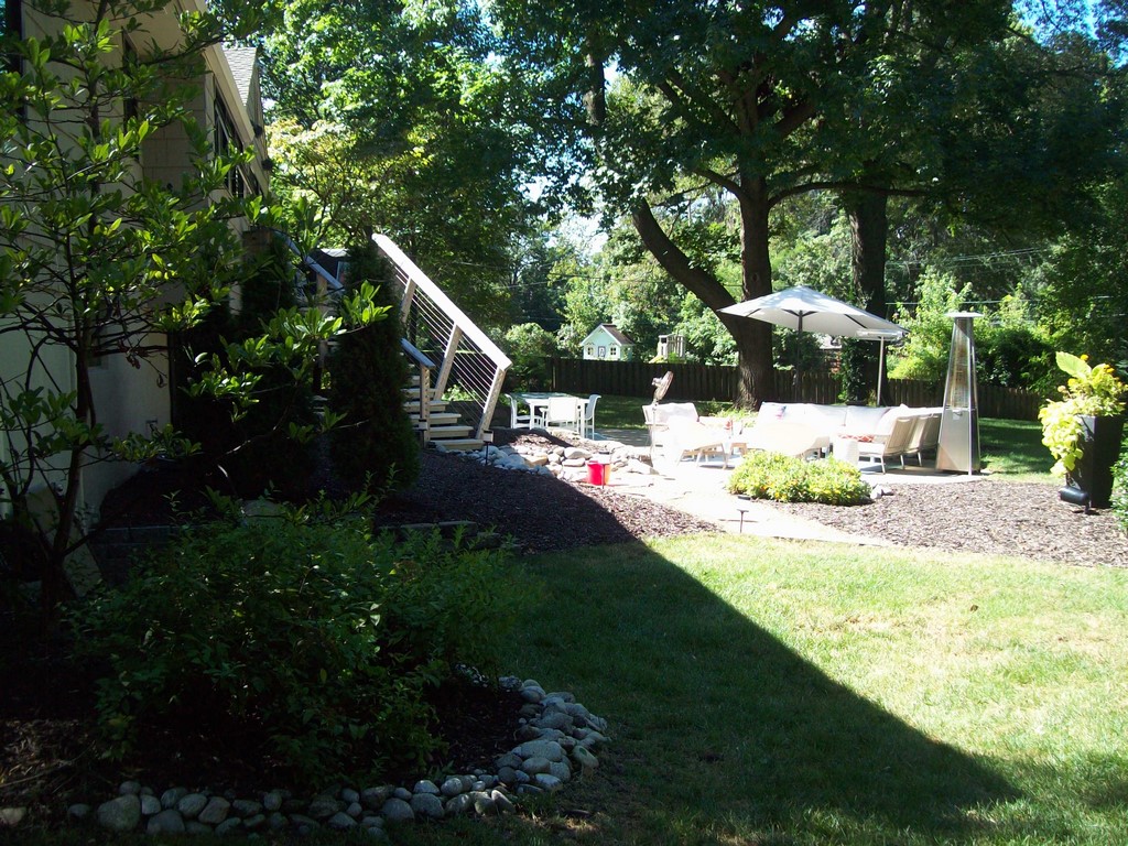
The main challenge we faced in developing this design had to do with the fact that the California Contemporary interior was situated in Leawood, Kans., rather than Los Angeles. Although the client had polished the interior to suit her tastes, the exteriors were typical for the area, with not much more than a non-descript rear façade, a common concrete patio, a few traditionally placed landscape beds and some tired, old shade and ornamental trees.
The client’s father had been in the pool industry, and she initially approached the project from that narrow perspective by interviewing several local pool contractors. Helpfully, she expanded her search to include a bit of Internet research and spotted our listing on Houzz, an online service about architecture, interior design, landscape design and home improvement. She liked what she saw enough to bring me in for an interview.
In the course of our conversation, she offered up a basic wish list and showed me a few images of features she liked. But beyond that, we were pretty much on our own with an existing space that could best be described as a blank slate.
Our operation consists of two business units: Liquify Pools & Spas and Lorax Design Group, with the former focused on watershapes and the latter covering development of entire outdoor spaces. Both are based in Overland Park, Kans. (I’m also one of the three partners in Tributary, a design service in which my partners and I collaborate on projects outside our established geographical areas.)
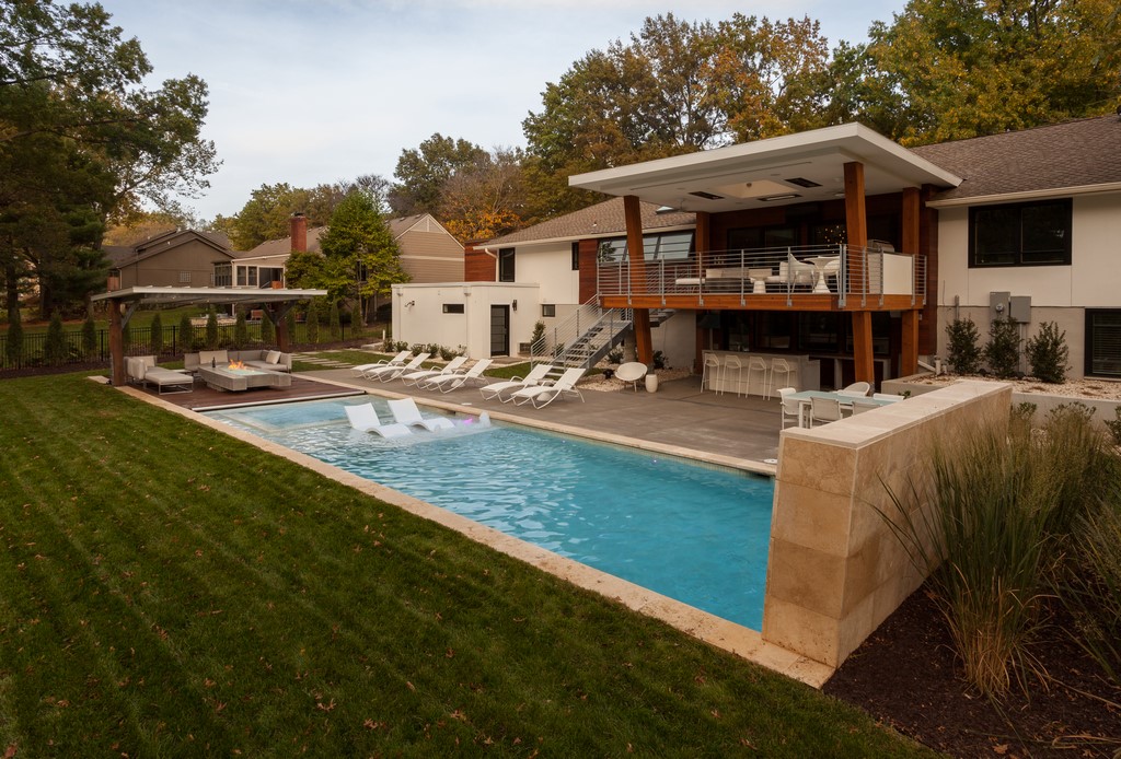
| BEFORE AND AFTER: The backyard we encountered was typical for the neighborhood and homes of this vintage, but a combination of ambitious clients and a good, integrated design scheme completely reshaped both the outdoor space and the home’s rear façade to align closely with the Contemporary styling of the home’s interior. |
At Lorax Design Group, we use a standard, six-step approach with all of our clients – starting with one we call “concept design.” This first step is a process in which we interview clients to learn their preferences, survey the site, create an AutoCAD base plan and begin analyzing the space and its potential. This phase involves a good bit of conversation; in this case, there was some give and take, but for the most part she relied on us to move things along.
In our second phase, we generate hand-drawings in conventional scale to give clients a sense of the space as we envision it. There’s a lot of detail and adjustment here, and the intention by the time this phase concludes is to get complete buy-in on a final design. That in hand, we move forward in full conceptual agreement before digging into cost estimation and materials selection – the third and fourth steps before we get to construction documentation and then construction administration.
In this case, it was clear that what she was after was going to involve more than the addition of a pool and some associated outdoor amenities. Once we reviewed our final plans with her, the client asked if I knew an architect who could revise the back of the house to harmonize with our ideas. I introduced her to three, and she selected Kurt Thuenemann, whom I’ve known for more than a dozen years.
He was to be responsible for designing the deck and house fenestration to align with our work in the adjacent outdoor spaces. We met on numerous occasions and ended up collaborating on both the design and materials selections to weave our work together as seamlessly as possible.
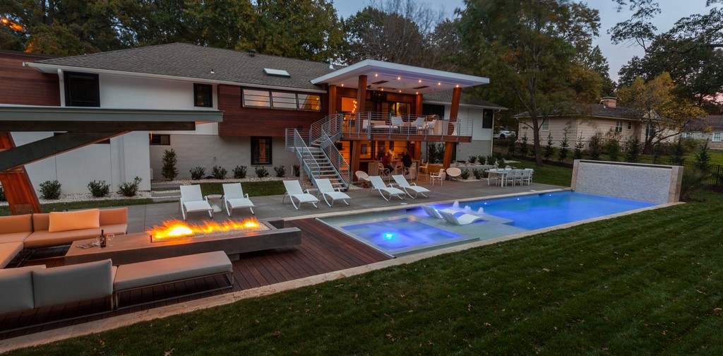
The result has the look of a yacht or maybe the upper deck of a cruise ship, with its upswept patio and shade structures, generous use of tropical hardwoods, metal stair and railing systems and a basic sea of lawn beyond.
THE SUM OF THE PARTS
With all of the business issues settled, we began our work on site by clearing the space completely. The backyard had become a bit of a mess by that point, a sweep of weeds and brush and trees that all had to be removed. We then rebuilt the fence across the back of the property, using materials and an approach that echoed the work on the back of the house.
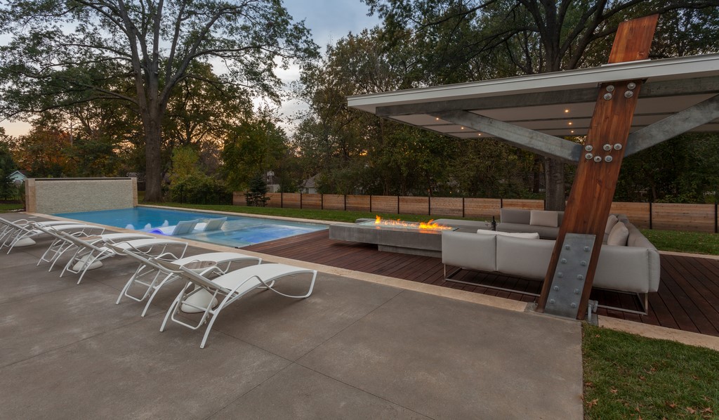
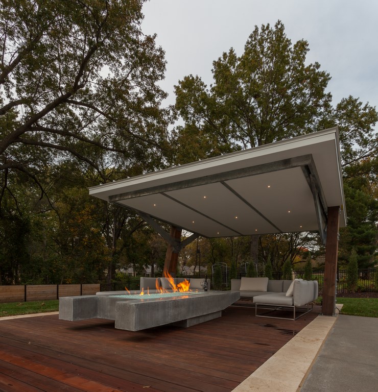
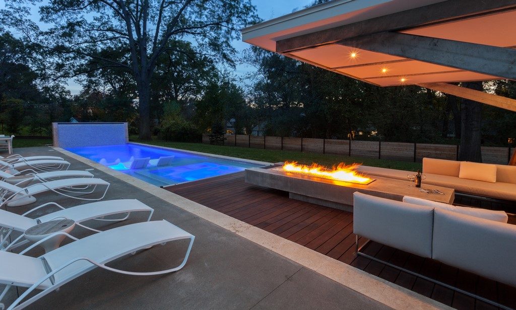
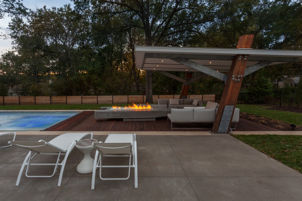
The poolside shade structure is the most dramatic of the design’s new elements. The vertical posts are glue-laminated Douglas fir beams set on angled (and hugely secure) plates. The roof system includes a base of exterior-grade drywall topped by a standing-seam metal roof. The various supports are galvanized steel tube structures, and there is recessed LED lighting throughout. The decking beneath the cover is made of Ipé, a dense Brazilian hardwood.
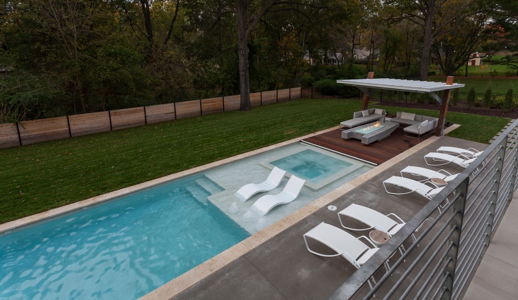
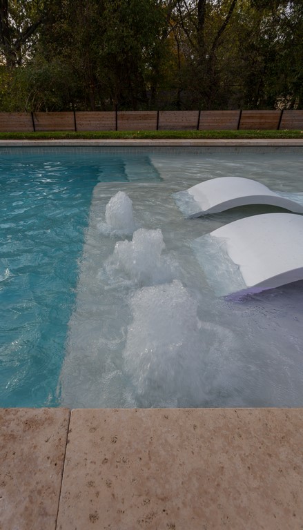
| SLEEK STYLING: The view from the upper deck opens onto a poolscape that looks something like the deck of a luxury yacht, with multiple opportunities for lounging in sun or shade and in warm or wet spaces. The water wall at the end of the pool opposite the shade structure is a strong visual focus on deck level – as well as the source of a sound reminiscent of gently falling rain. |
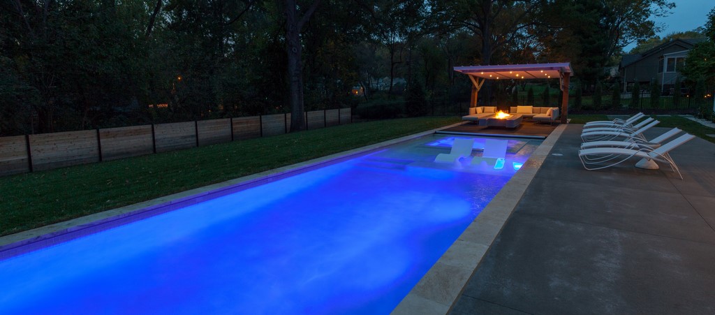
The fire feature is entirely custom, made using an approach we developed years ago in which we set up a cast-in-place concrete shell, insert a dual stainless steel liner system and plumb in a linear burner. The shape of the feature follows the elongated contours of the pool, with its cantilevered sections lending an appropriate sense of buoyancy to the low-slung structure.
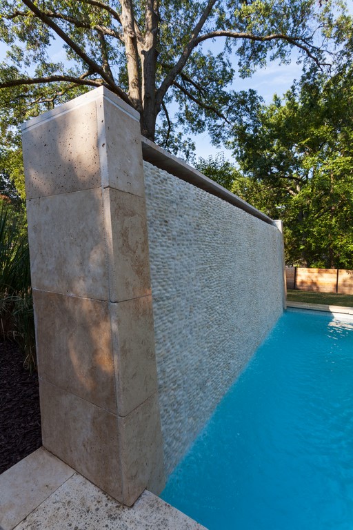
At the opposite end of the pool, we installed a large water wall made with a recessed white- cobble inlay to add interest and sound as water flows down the surface. We enhanced the flow as well as the visual and aural impressions by battering back the wall at a five-degree angle. The result is that the water clings to the surface and sounds, ever so subtly, like falling rain. (Of all the amenities we included, this turned out to be the client’s favorite.)
|
No Curveballs When I was a student at Kansas State University, Professor Robert Page was one of the leading lights of the Department of Landscape Architecture and the College of Architecture and Design. Harvard-educated and a powerful presence in the classroom, he taught me a lesson one day that I’ve never forgotten. I was working on a design in class when, looking over my shoulder, he said, “Where’s your catcher’s mitt?” I must’ve looked up at him like he had a couple heads, because he immediately started explaining what he’d meant. Every design, he told me, needs a target that focuses wandering eyes in just the same way a catcher’s mitt helps a pitcher get the ball over the plate by commanding his or her attention. “You need that here,” Prof. Page continued, “and in all of your designs.” I’ve always loved that metaphor and have spent my professional lifetime studying great spaces to see how Frederick Law Olmstead, for example, used this sort of approach in New York’s Central Park. In all of his many outdoor rooms, there’s always some key element, often involving an element of surprise, that serves as a defining point of interest that guides you into and through the space. In the project described in the accompanying text, the water wall is my catcher’s mitt, serving up unexpected sounds and providing a soothing visual presence. It’s all very deliberate and is used to capture the attention of anyone and everyone who ventures out to the shade canopy and takes a seat around the fire. — K.K. |
Rounding things out, the coping is Travertine, the deck is exposed-aggregate concrete and the pool has a quartzite plaster finish. The equipment set includes pumps and a filter from Pentair (Sanford, N.C.), a heater from Raypak (Oxnard, Calif.) and an ozone water-treatment system from ClearWater Tech (San Luis Obispo, Calif.).
The construction process ended up taking us longer than planned: With so much going on in the space close to the house, we ended up in a juggling act with the homebuilder the client brought in to rework the back of the house, the patio and its shade structure. There was quite a bit of conversation involved as we sorted schedules out, but the greatest impact was a simple lengthening of the timeline: Beyond that, it was smooth sailing.
The resulting space fits neatly within our usual design vision in which the pool, fire feature, shade canopy and water wall are all part of a system – a deliberate gathering of elements intended to contain and direct users’ attention. In this case, the vista for people sitting under the shade canopy and around the fire element will most directly reach over to the water wall – a point of focus within easy visual distance, easy on the eye and easy to enjoy as part of the environment we’ve created.
DESIGN DELIGHT
As mentioned at the outset, the completed design is somewhat more austere than the majority of projects we pursue on this scale. As a landscape-oriented designer, I definitely enjoy creating garden spaces that do more than frame a backyard.
But in this case, we all agreed that a more precise, geometrical and simplified planting plan would do the best job of complementing the architecture of the home and the angular profiles of the poolscape. It’s also true that the newly planted material seen in the accompanying photographs will grow in, eventually doing a more thorough job of softening the overall look and eventually playing a more substantial role in the overall composition.
| AFTER HOURS: When the sun goes down, the deck’s big fire feature takes over as a visual and social star. From every angle, it summons the homeowners and their guests to size up its unique, cantilevered structure and approach to enjoy the soft glow and warmth it brings to a cozy, sheltering space. |
Even with the smallish initial plantings, however, there’s plenty of visual drama to be found here already, with the rising lines of the balcony roof and the pool’s shade structure; the strong contributions of the fire feature and water wall; and the sharp contrasts between the wooden details and the expanses of concrete and water. It’s a fanciful space, filled with interesting details and great viewpoints – and it’s just what the client wanted by way of having her backyard environment become a clear, thoughtful, tasteful extension of the home’s bold interior spaces.
What makes it all so remarkable is that, when we started our relationship, all she’d asked for was a swimming pool. She now has one – and a whole lot more.
Kurt Kraisinger is a landscape architect with more than 20 years’ experience in design and consulting. In 2009, he founded Lorax Design Group with a goal of creating memorable spaces that allow people to engage in their surroundings. He received his degree in landscape architecture and urban planning from Kansas State University and participates in Genesis 3’s programs. He may be reached at [email protected].


