Expansive Vision

It all started in the years following World War II, when large parcels of undeveloped suburban land were carved into tracts in which, all too often, as many homes as possible were included to accommodate huge population influxes. In a nutshell, this is why so many of the lots in places like southern California are relatively small.
We do lots of our work in these “bedroom communities,” and I wish I had a nickel for every time I’ve been asked to shoehorn full-featured pools and spas into tiny backyards with limited access. It can be done – we at Aqua-Link Pools & Spas (Carlsbad, Calif.) frequently tackle small-yard projects – but each of them carries sets of challenges that must be addressed from the planning stages all the way through to completion of the construction process.
The project described here is a great example of small-lot dynamics, particularly on the visual side: It’s located in a 1970s-vintage development in Orange, Calif., and offered neither the designer nor the builder much room to maneuver.
LONG IN THE MAKING
The project was run by the landscape architects at Studio H (Newport Beach, Calif.). They’d been brought in by homeowners who had lived in the house for more than 25 years and had finally gotten around to addressing its exterior spaces after a recent, multi-year focus on remodeling the home’s interior.
There wasn’t much of anything the clients could do about the building itself, which was subject to the appearance rules of the governing homeowners’ association. But they and their architect had their way with things indoors, working with a design that focused on making the interior spaces as sleek, slick and modern as could be.
It was this renovated indoor environment that guided the landscape architect’s approach outdoors: Although there’s a certain visual disconnect between the structure and its new surroundings, it was done deliberately at the behest of the homeowners, who came to the process with all sorts of ideas about how they wanted their immediate surroundings to look.
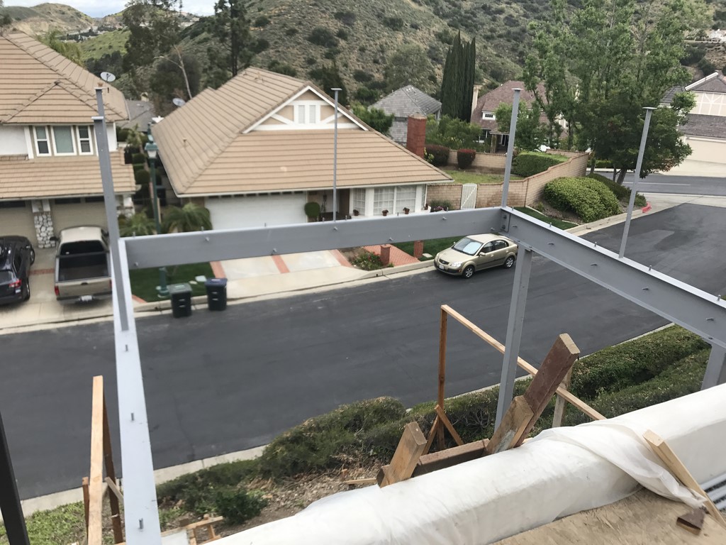
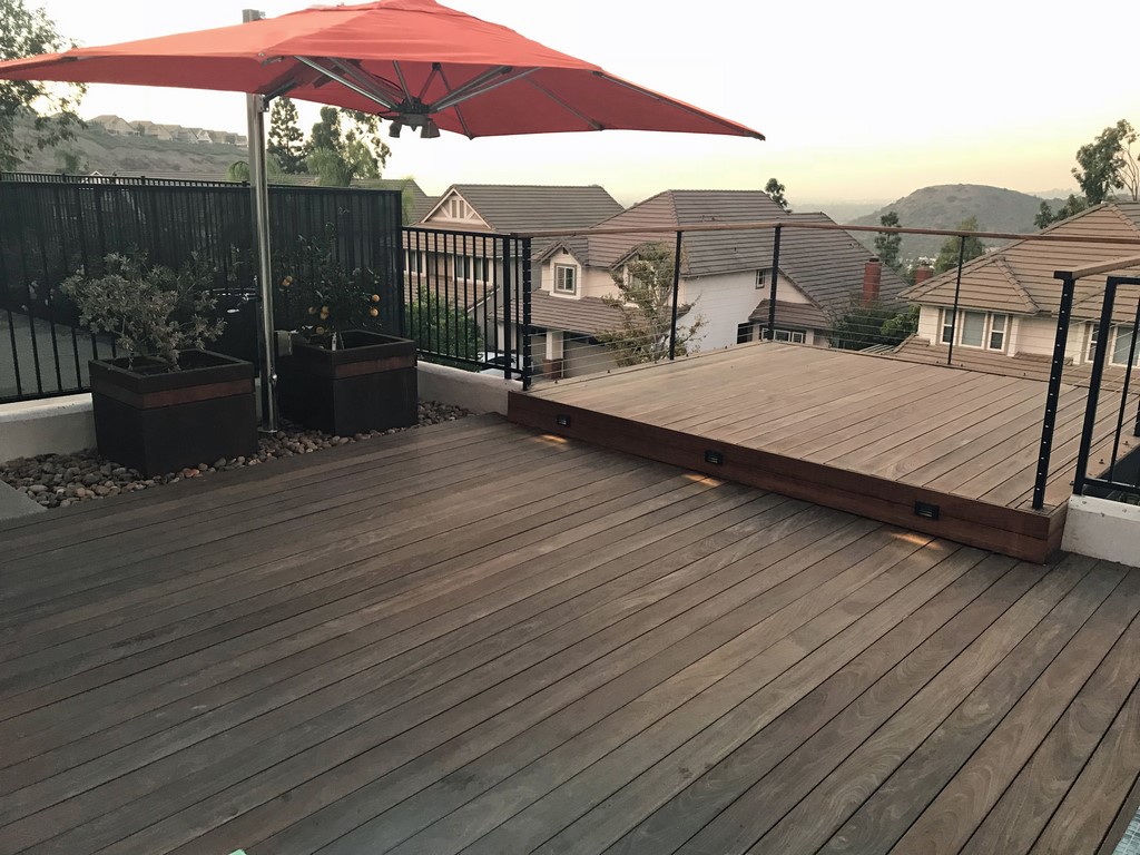
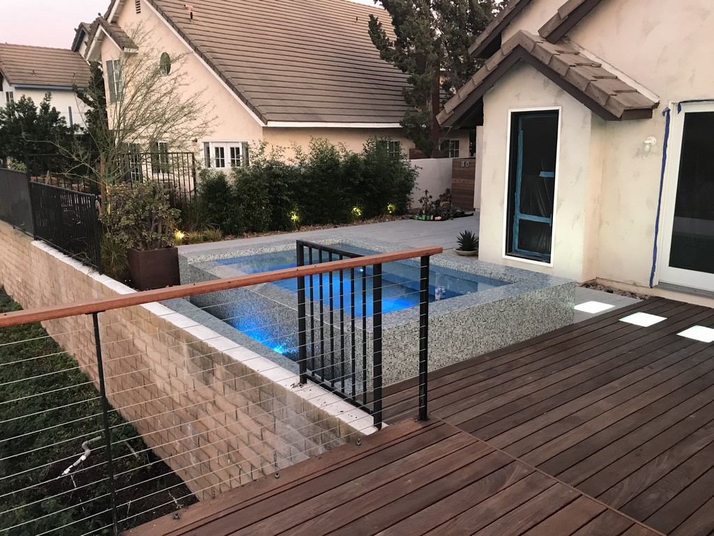
The home sat in a row of houses that rose atop a slope that dropped suddenly down to a street. This had the effect of angling the prime view down to a ribbon of asphalt rather than to a far better prospect of rolling hills in the distance. The design, everyone agreed, should remove the slope from the visual equation by setting up a flattened area with a large spa and a cantilevered deck that would serve to lift eyes up to take full advantage of the longer views.
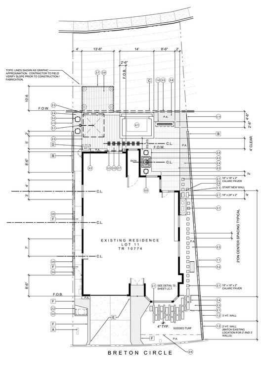
| It was definitely a small space, but we knew a well-placed spa and deck had plenty of potential to expand the impression it made while lifting eyes up from the street below to the hills in the background. As the plan shows, access was tight – as was the landscape architect’s notion of how much space the equipment pad would eventually occupy on the right side of the house. |
The landscape architect had invited us and a couple other builders over to review the design and make bids. Our focus is on top-quality engineering and construction, so our proposals almost always end up being much higher than those of other contractors. But in this case (and in many others, thank goodness), we had an edge.
As it turns out, the client was a physician and an engineer and brought both scientific rigor and boundless curiosity to his deliberations about who would build his pool. When he asked questions, I had answers. When he had doubts, I had explanations. Before long, we were well attuned to each other – speaking the same language – and from that point on worked together without a hitch (with one exception to be discussed below).
A soils engineer had examined the site and had developed a system that met all needs. The spa’s site was rocky junk, but the space was encompassed by a well-engineered retaining wall, so the expert determined that stabilizing the spa would require only a large key. The cantilevered wood deck was another story, however, because its supports fell beyond the retaining wall. In that case, caissons had to be inserted down to a level well below grade.
Once we signed on, it was in working out the construction details that we started running into a series of snags: The approach we’d developed for the whole site made sense to us and the client, but local building inspectors had a completely different take on things and became a substantial roadblock.
A CHALLENGING PATH
One big stumbling block was our desire to put steel in the bench to support what we considered to be a massive slug of shotcrete. We headed in this direction pursuant to guidelines of both the American Concrete Institute and the American Shotcrete Association, but for some reason the inspector had other ideas based on experience with many other local projects in which no steel at all was included in benches.
Why any of this made a difference was a mystery to us. Maybe this person was new? In any event, the upshot was that our plans were rejected multiple times for various odd reasons. And because the inspection office was jammed beyond belief, it invariably was weeks before follow-up meetings could be arranged. We stood by our approach and eventually gained the necessary approvals, but this meant we were knocked off our schedule by a few months.
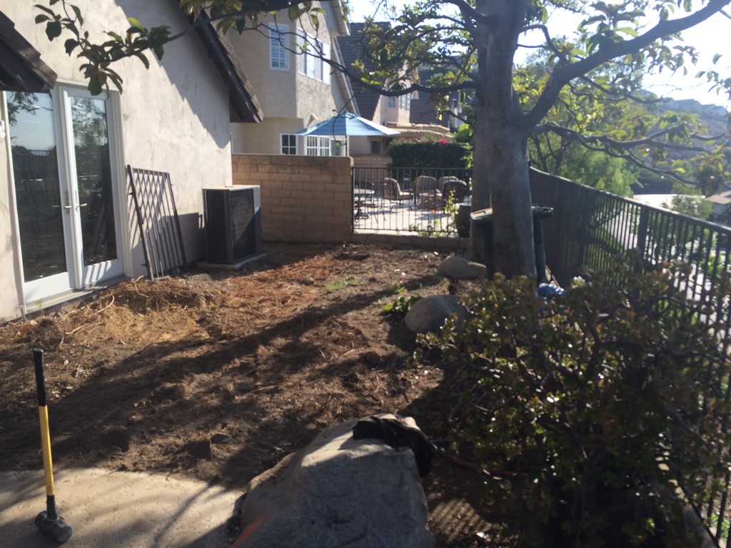
Once the work actually began on site, it was all fairly routine. We dug down through the rocky junk and cut the key for the spa, then we hand-dug the holes for the caissons (access issues!) for the wooden deck, shoring them up as they deepened until we reached competent soil ten or 12 feet below grade.
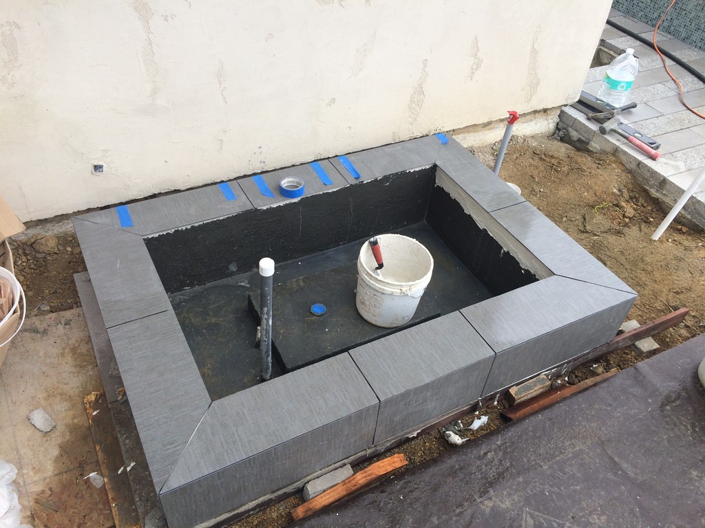
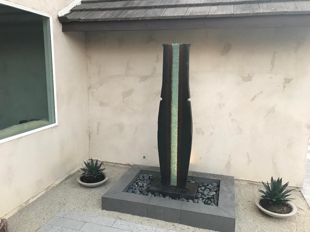
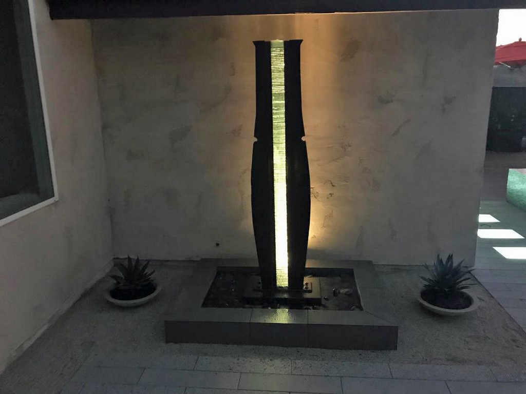
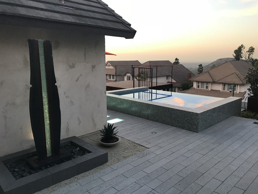
| The small sculptural waterfeature came as something of a surprise to us, given the fact that the sculptor never intended for it to involve water at all. As a result, we had to invent a system on the fly that would make a small volume of water well up at the top of the glass insert and trickle down with relatively little splashing – no small achievement! |
As work progressed, we ran up against two unusual challenges: First, the waterfeature planned for the side of the house included a sculpture that had never been intended for such a use. Second, the homeowner had convinced the designer that lighted stepping stones were something the project simply had to include – despite the fact none of us knew exactly how to make them happen in an outdoor application next to a body of water. Beyond that, piece of cake.
First the fountain: The homeowner was operating under the assumption that it would be easy to use the sculpture as a fountain, but with a quick examination we saw no evidence that any allowance had been made for any kind of water system. We contacted the sculptor, who let us know that a fountain application was nowhere in his thoughts and that we were on our own.
The core of the composition was a stack of glass pieces that could be removed, so we knew we could insert tubing alongside the stack to get water to the top. But then, with some testing, we discovered that there were problems with choppiness and general aesthetics once liquid started to flow.
We soon hit on a solution: After inserting the tubes into the small voids between the framework and the glass, we reinserted the glass and used a silicone adhesive to grout each piece in place, effectively making the stack monolithic and keeping water on the surface rather than moving freely between and among the small panes. We also inserted a bowl-like piece of glass at the top to allow the water to pool before overflowing around its perimeter, thus ensuring even flow down both sides of the central glass column. It all sounds simple now, but coming up with the solution on the fly was quite a test of our problem-solving and hydraulic skills.
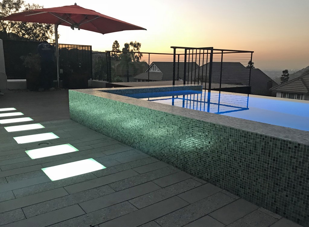
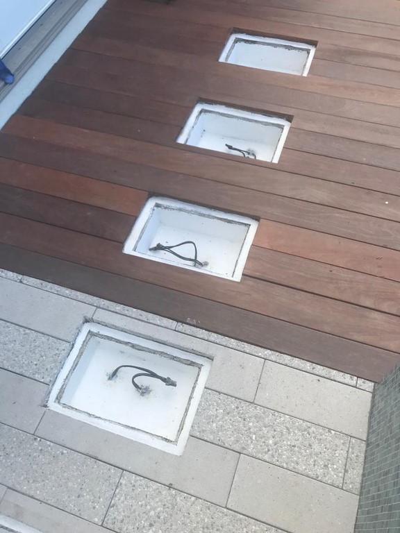
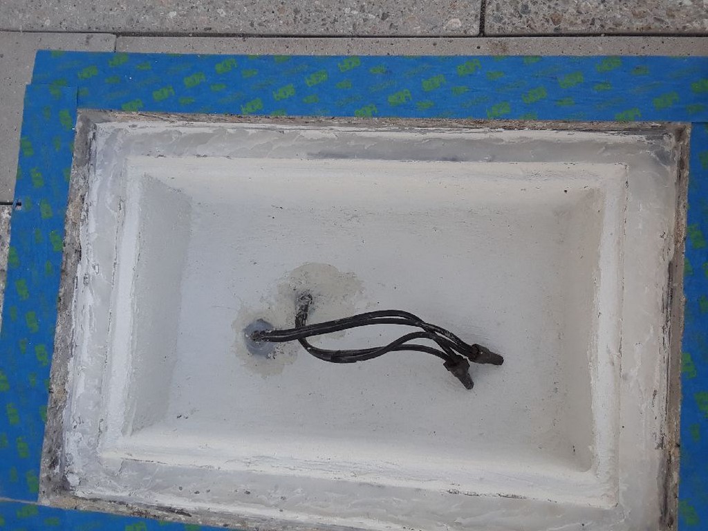
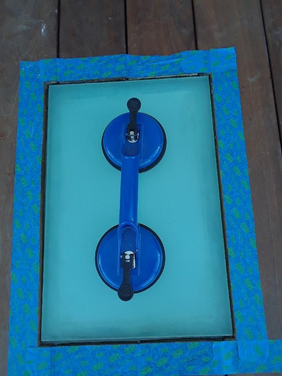
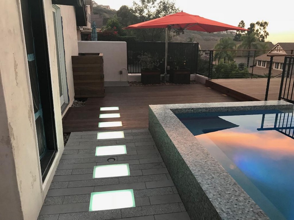
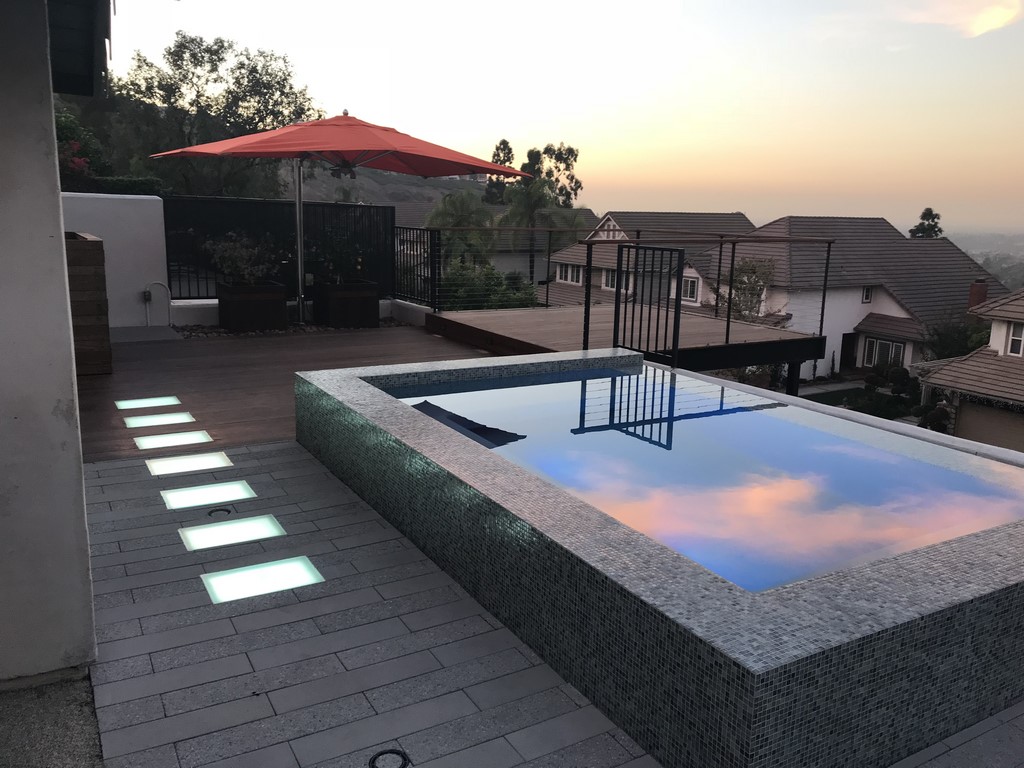
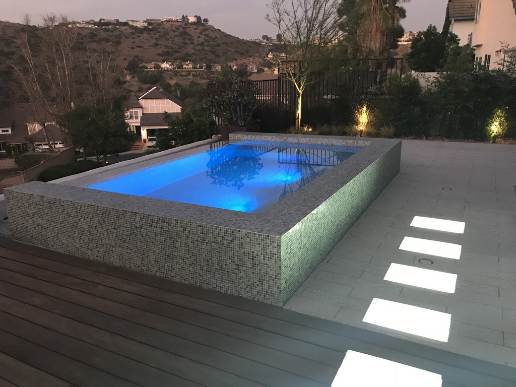
| This was another case where the idea of glowing glass stepping pads was great – but the underlying system undefined and, in this case, pretty elusive. Ultimately, we decided to go with indoor-use LEDs in waterproofed chambers to generate just the sort of uniform, glowing effect the client wanted. |
Then came the lighted pads: The landscape architect suggested using small landscape lights mounted under a light-diffusing glass that had been ordered for the purpose. Trouble was, the lights created strong visual hot spots that ruined the overall-glow effect we were pursuing.
We immediately thought to replace the lighting fixtures with multiple LED lights, but they didn’t diffuse enough either. Then we investigated LED panels, but none of the commercially available versions was made for wet-environment use. Finally, push came to shove and, settling on the LED panels, we decided to waterproof the niches and seal the glass onto each step’s rim. The one issue left? We figured there would be problems with condensation no matter how well we might seal out any incidental moisture.
Again, there was a simple solution in the form of those little desiccant silica beads so often used in packet form with shipments of electronics and other moisture-sensitive products: Before sealing each step, we included large quantities of these beads – and the solution has worked perfectly ever since. In addition, the LEDs operate well with a dimmer, so the steps also help the homeowners set the mood.
SWEET RELIEF
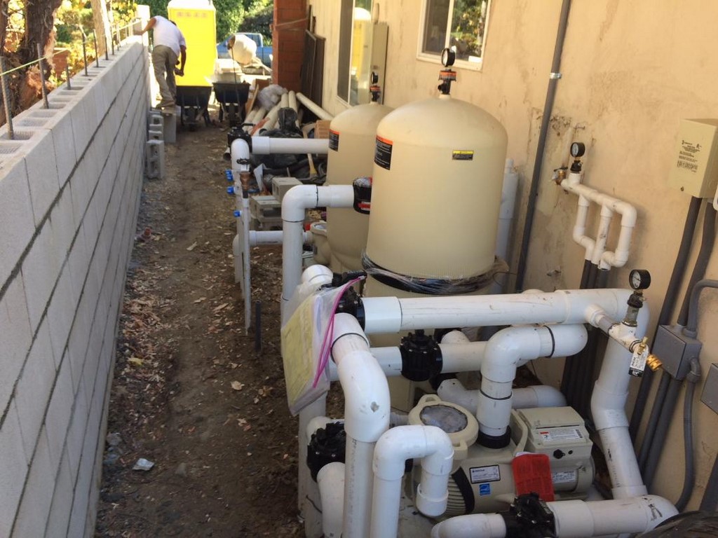
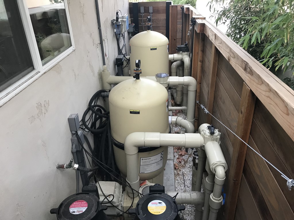
I mentioned up top that there was one hitch in what was otherwise a wonderful working relationship with the client: On the landscape architect’s original plan, the space allotted to the equipment set covered about six feet along one of the home’s side walls. But given the needs of the spa, vanishing edge and fountain – and the client’s desire for everything to be as hands-off and automatic as possible – the finished pad actually spanned almost 15 feet of that wall’s length.
| The fact that we needed more room for the equipment pad than the landscape architect had led the client to expect led to some tense exchanges late in the process, but there truly was no alternative given all the plumbing involved, with the cramping compounded by the need to leave a two-foot-wide access area between the wall and the array of pipes and equipment. |
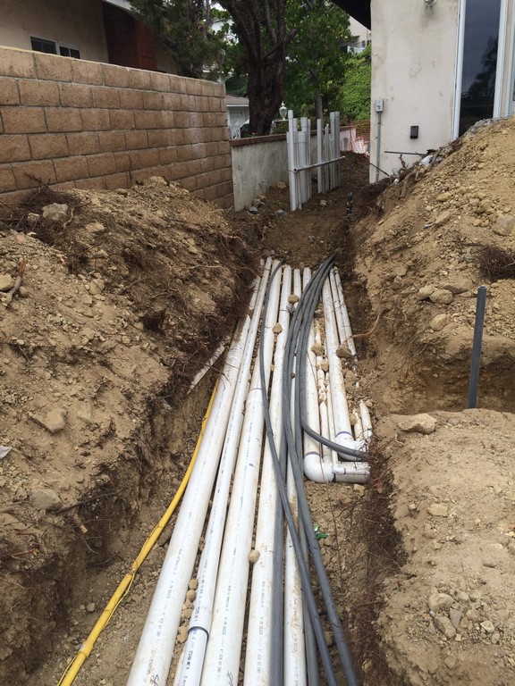
Part of the problem was that there had to be a fire-access gap no less than two feet wide between the equipment pad and the property-line wall. This left us to perform high-level contortions with pipes and conduits serving multiple pumps, two filters, a chemical-dosing system, control units and multiple manifolds and valves: It all had to fit within the offending 15-foot span.
Obviously, space was at a premium all around the property, and as the client saw the much-larger-than-expected pad taking shape, he wasn’t at all happy about it. It took some careful explaining of why things had turned out this way to pull him back to the positive side of things – but as I mentioned, he had a helpful understanding of the basic engineering involved, and we finished up with no additional conflicts.
| The result is an outdoor space that is infinitely more inviting than the old backyard – one that is stylistically aligned with the homeowners’ intense love of the sleekly modern while also engaging views of distant hills. |
In fact, the homeowners both love the result. They use the spa frequently and enjoy the elevated, street-excluding prospect of distant hills they now see from the spa and across their new deck.
They also appreciate the one design detail we persuaded the landscape architect to include: Instead of running the pavers and the Ipé decking parallel to the house, which would have been the conventional approach, we suggested perpendicular runs, thereby helping the decks seem larger while leading the eye toward the distant views. It proved to be a great and valued touch, especially with the rough/smooth alteration of the pavers and the dark finish on the long deck boards.
For all of us, it was worth the effort and the extra time it took to make it happen – for us as we improvised and innovated our way past inspectors and unexpected technical issues; and for imaginative clients who’d spent 25 years thinking about how these changes and additions would make their home a more perfect reflection of their lives and personalities.
Grant Smith owns Aqua-Link Pools & Spas of Carlsbad, Calif. After completing his service in the U.S. Marine Corps, he formed a pool/spa service firm in 1994 and steadily moved over to the construction side with a specialty in shotcrete pools and spas. Smith is a Master in the Genesis program’s Society of Watershape Designers and is licensed as both a pool and a landscape contractor. He may be reached at [email protected]


