Easing Transitions

If I’ve learned one truth about working with water in confined areas, it’s that success is most often measured by how much more spacious an added watershape makes those areas seem.
The funny thing in this particular case is that the yard wasn’t especially small, sloping away from a formal house down to a rustic cottage set on the edge of the property. What was crowded was the upper-level area into which we decided to insert a big part of the pool: It was hemmed in on one side by the home and on the other by the lot’s setback – a span of maybe 28 feet – below which the available space opened up and flowed down for about 30 feet to the cottage.
In quick order, I found myself confronting three distinct transitions: from formal to rustic, from upper level to lower level and from cramped to open. Added to the package was the fact that the clients had strong design sensibilities as well as several years of direct involvement in enhancing their backyard space: They’d already seen to construction of the cottage as a rustic retreat; had added a good bit of landscaping that had filled in nicely; and had previously done a great job of designing and building a wooden deck that extended off the back of the home.
It had all the hallmarks of a fine collaboration, and we went right to work.
IDEA EXCHANGE
The property itself is located in the heart of urban Atlanta, so when leaves drop off the downslope trees in the fall, the view opens to a nice prospect of the city’s skyline. The house dates to the 1960s or perhaps a bit earlier, but its current residents (as is true of many homeowners in the area) have remodeled it so extensively that it’s difficult to pin it with a date or even a style.
When we at Selective Designs (Atlanta, Ga.) arrived on site, there was already a waterfall and small brook down by the cottage. I listened carefully as the clients said that they wanted a pool but thought that there wasn’t room for anything more than a nice spa – and that whatever was built should effectively link the busy living space above to the slice of paradise they had established down below.
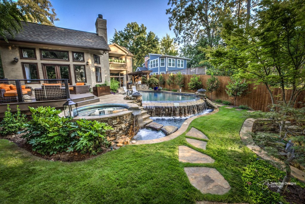
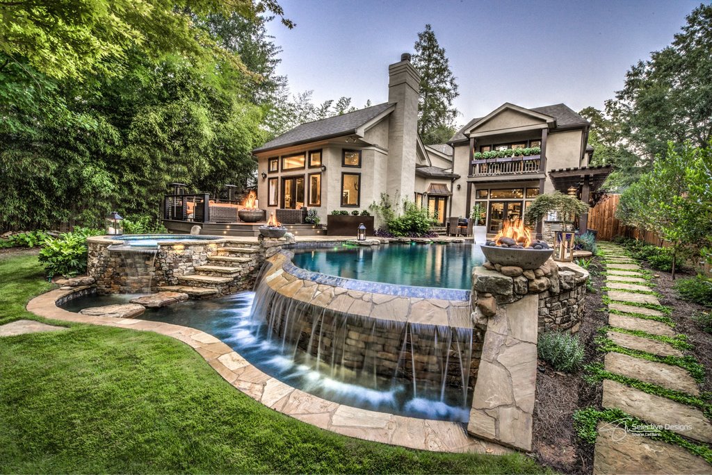
It was helpful that they recognized all of these dualities and transitions, and once we moved beyond “just a spa” to add a full-featured pool to the project, they let me know clearly that this was what they’d been hoping for all along – and that, now freed to dream, they wanted a vanishing-edge detail that would be just as spectacular looking up from the cottage as it would be looking out across the pool from the dining room toward the distant views through the trees.
Whatever else might be said about these clients, I’d be missing the mark if I didn’t credit them with being nimble in moving through various design ideas – and confess to how much fun these explorations were for me as well!
To make things even more engaging, for example, I suggested positioning the spa so it would take in a view of the pool in one direction, of the vanishing edge in the next, then of the home above in another direction, and finally of the cottage and waterfall below in yet another direction, effectively making it both a great place for relaxation as well as the design’s visual hub.
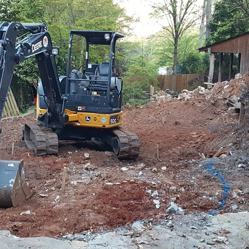
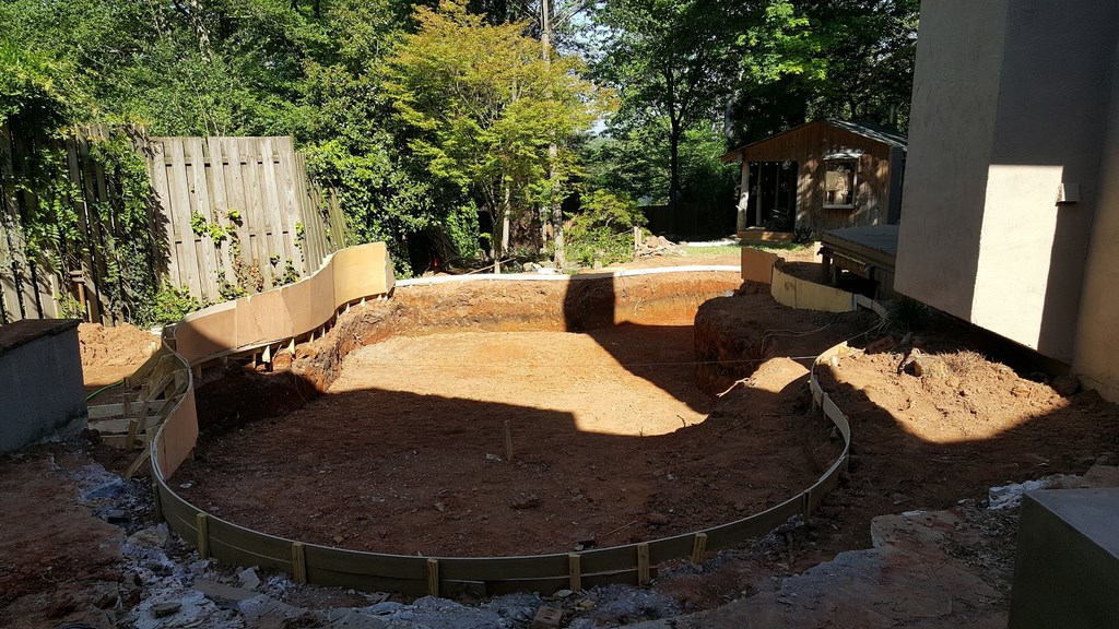
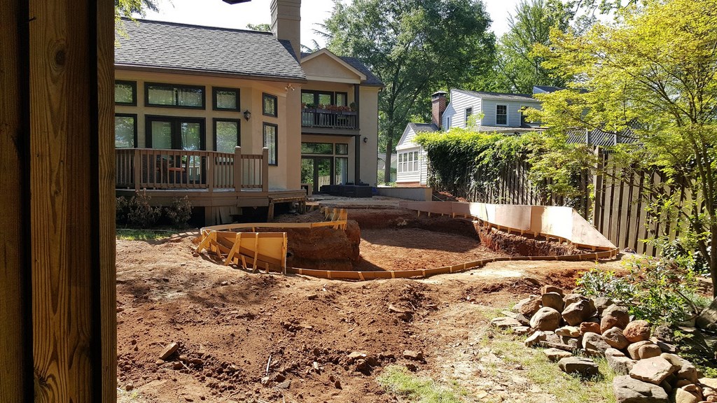
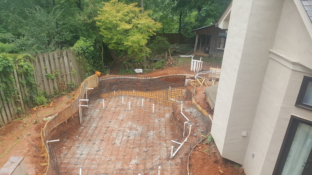
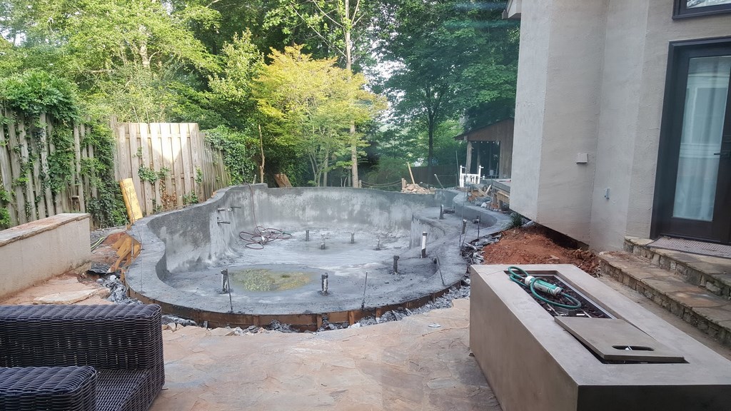
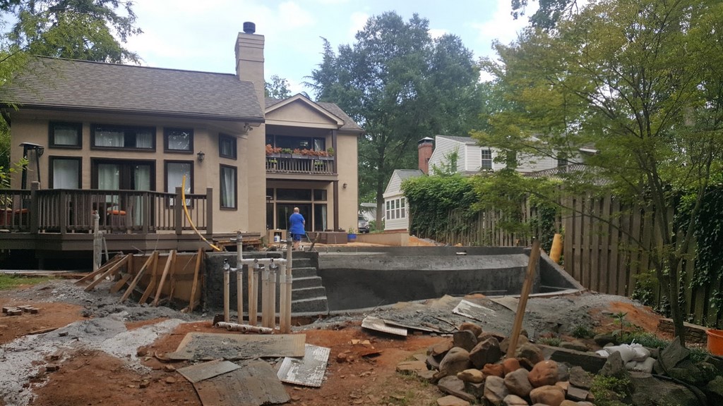
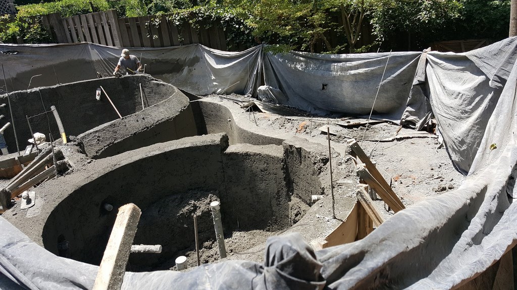
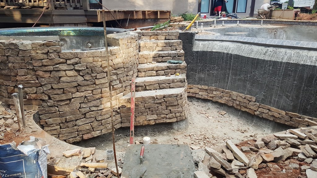
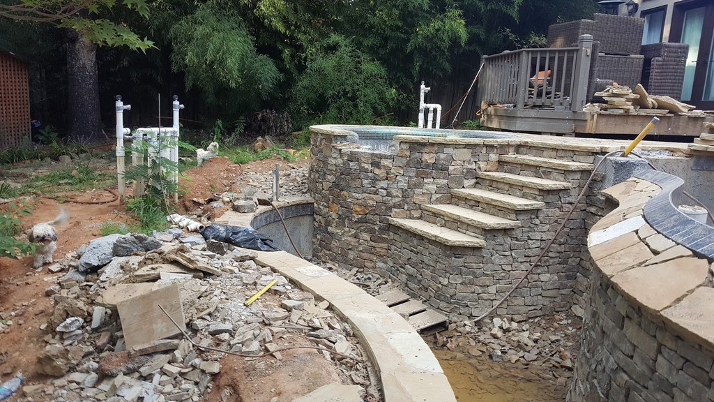
| We managed to squeeze one piece of equipment into the work area, but much of the digging was done by hand and all of the transferring of materials in and out was done with wheelbarrows and carts. Fortunately, much of the pool and the deeper-than-usual catch basin were above grade and came together efficiently. |
They loved the idea, and soon that line of thought led me to look at the vanishing edge’s catch basin in an unusual way. In most applications, these troughs are relatively small and fluctuate in water level (sometimes dramatically) depending on flow rates and bather loads. Our desire was to minimize these fluctuations so the basin would always look great from the spa; to that end, we made it much larger than usual in surface area and significantly increased its capacity.
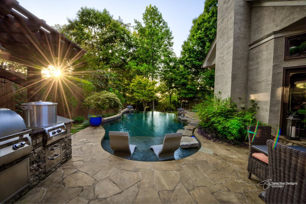
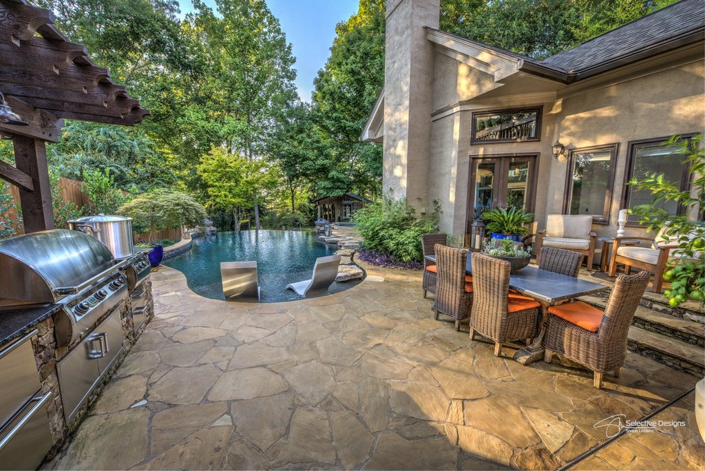
This level control was even more important in this case because we wanted to run a set of “floating” stepping stones down from a big outdoor kitchen/dining area on the upper level, along the side of the pool and then down through the catch basin before reaching a stone pathway leading to the cottage door. Big changes in water level would’ve ruined the visual trick from the key spa position; effectively doubling the capacity of the catch basin did the trick.
Up near the dining area, we petitioned the city for a variance that would let us work closer to the house than usual – which we did, but also left a narrow planting space so the pool seems more separate from the structure than it actually is. From there, the stepping stones flow along the edge of the pool and over toward the spa and wooden deck.
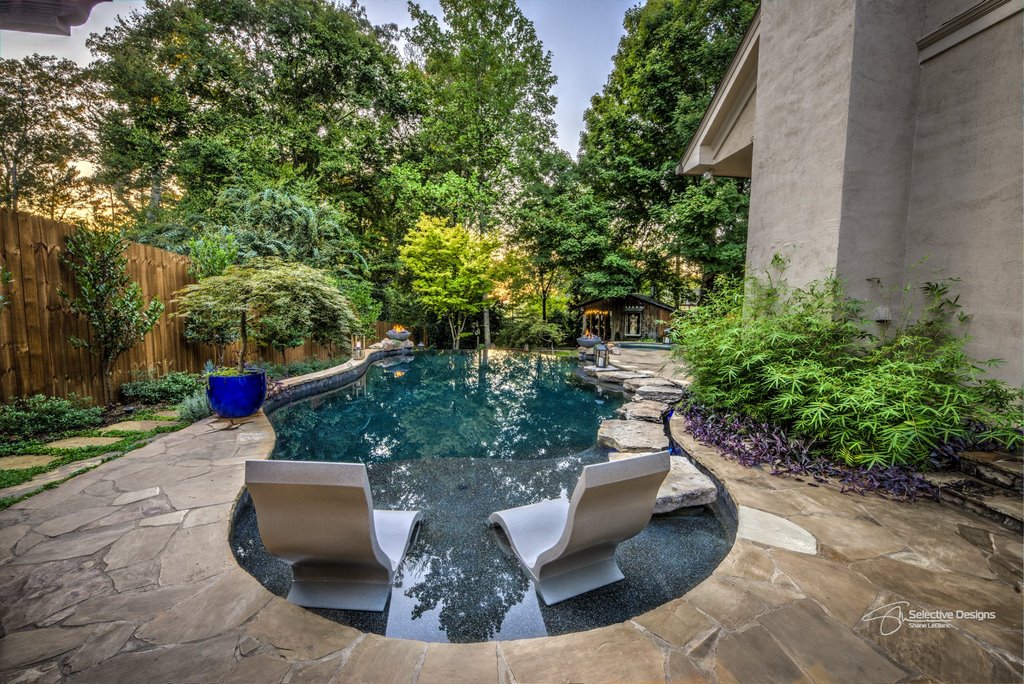
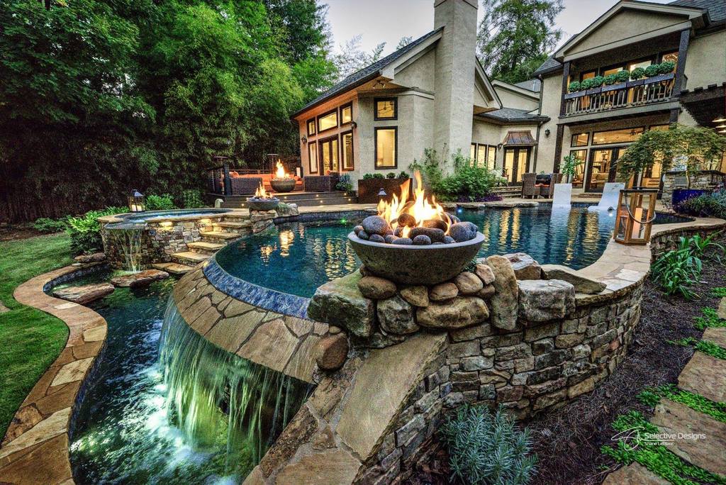
At this top-level transition point, we inserted a pair of bar stools into the pool and, at the clients’ request, a fire bowl, so now they or their guests can swim up to visit with people on the deck or in the spa – another vantage point from which multiple details of the backyard space are visible and extra-enjoyable because of the warmth provided by the fire feature.
EASY COLLABORATION
All of this was the product of lots of talking by the clients and lots of listening by me. Once we’d defined the possibility of their getting the pool they really wanted, I mostly sat back, all ears, and let two people talk who knew the space and how they wanted to use it to a degree I couldn’t touch.
It’s my usual goal in this design-development stage to gather so much information, so much guidance that the first rendering I offer will be right on target. In this case, I presented them with a nice three-dimensional design and they accepted it without a single change. Granted, our discussions led me to include a couple details that I wouldn’t ordinarily have considered – such as the fire bowls framing the vanishing edge, a look I’ve seen too often for it to get me excited. But through it all, my goal was to deliver what the homeowners wanted while preserving a coherent, sensible vision.
With these two, there was yet another added ingredient in the process: It was clear from the start that they wanted me to tell them what I really thought about ideas they offered, and more than once I dismissed possibilities with “That’d be garbage” or words to that effect. I could get away with this level of bluntness because it was so clear to them that I had been willing to hear them out; on the flip side, they trusted that I was operating with my best judgment where the decisions mattered most, even if they had expressed alternative desires.
In some ways, the outdoor kitchen is the best example of this dynamic. They’re both way into cooking and entertaining, and they were concerned that the upper-level space designated for the purpose was just too small and would effectively be cut off from the relaxing, cottage-oriented spaces below.
| Seen from the upper and lower levels (top left and middle left), the shell looks fairly simple. But when you look closely at the transition from the pool to the spa and catch basin (top middle right), complex contours come into full view and await the softening application of finish materials (top right and bottom left). |
We overcame this problem by placing the cooking area on the far side of the deck so the cottage and other rustic areas were plainly visible from above – and vice versa. And as was mentioned above, we also used plants on the upper deck as well as the rough, “natural” shapes of the stepping stones to soften the edges and visually tie the upper and lower spaces together.
At first – and although I went along with them – I had some difficulty seeing why they were so strong in their feelings about unifying all of these spaces. It was only as the construction process unfolded and I spent more and more time in the yard that I fully understood how important the cottage and waterfall were to the functioning of the overall backyard space – and just how cool it was to pull it all together and witness the revelation of the whole yard’s distinctive emotional appeal.
It’s all done up with Tennessee flagstone, which is typically prized for its brown tones. But we went with this material in gray tones to align things more with the look of natural local waterfalls and streams as well as the dominate color found on the home’s exterior. Reflections of the house and trees off the water surface were important, too, so the pool’s interior is Black Pearl from Pebble Technology (Scottsdale, Ariz.).
To get this all done, we worked with extremely limited access and had to do most transferring from street to backyard by hand and wheelbarrow. Given the slope, happily, most of our framing for the pool and spa was above grade, which helped immensely. Per plan, we placed all of the equipment behind a curtain of bamboo set off the side of the cottage. The plant material knocks down noise so effectively that it’s hard to tell anything is there.
THE DESIGN CRUCIBLE
As is fairly common in my projects, I like to test ideas when and where it’s appropriate. For this one, I focused particularly on hydraulic efficiency and a concept I’ve been working on where I use a boost in flow rate to help keep vanishing-edge pools clean. That’s a big issue here in the Southeast in general, and it was particularly important in this yard, where there are deciduous trees in abundance and experience told me that the pool would be a giant leaf magnet every fall.
In this case, I used a two-horsepower variable-speed pump and set it up with a “clean” mode that elevates the flow rate, lifts the water level flowing over the vanishing edge and effectively sweeps surface debris into the smaller catch basin for easier removal. When not in use for this specific purpose, what would otherwise seem an oversized pump consumes about as much energy as would the half-horsepower pump I might have used in a less-leafy backyard.
| The watershapes deliver just the sort of backyard narrative the clients wanted from the start: As you approach the pool on the upper deck (top left and middle left), the perspective stays narrow – but you’re also being invited to walk atop the rough shapes of the floating stone pads to see more. Looking back up the slope from the cottage (top middle right), the perspective is far broader (top right and bottom left) but still draws you in for closer appreciation of sounds, motions, textures and warmth. |
When we started all of this, the clients were thinking about a spa and ended up with a pool and a big, visually interesting catch basin as well. I get a lot of jobs like this, where small or oddly constrained spaces limit the vision of clients and put off the usual run of designers who see these sites. Builders often don’t want much to do with them, either, because access is frequently an issue and construction processes frequently have predictable complexities that push them beyond their comfort zones.
For myself, however, I see these intricacies as my sweet spot, and the result has been that I design projects like this one all over the country and, in fact, around the world. The result in this case is that, inspired by the clients, we produced a setting reminiscent of the work of the late Thomas Kinkaid, the self-styled “Painter of Light.”
It may be a small space, but with the visual pace set by the magnificent little cottage and its waterfall, we joined the clients in stepping beyond the hubbub of downtown Atlanta and turning their backyard into a magical, picture-perfect place they enjoy almost every single day.
Shane LeBlanc has owned and operated Selective Designs, an Atlanta-based design/build firm specializing in custom pools, landscapes and gardens, since founding it in 2002. Building on a foundation of experience in landscape design, turf care, tree farming and nursery management, he has a degree in business administration and participates in the Genesis educational system. He may be reached at [email protected].


