Shared Vision
As a designer, I am quite familiar with projects that involve a good bit of give and take between me and my clients. You know how it goes: the typical process of success by approximation as you work through sets of possibilities and navigate around a couple dead ends before a design is approved and accepted.
In a WaterShapes article earlier this year, for instance, I wrote about the ordeal of developing seven distinct design proposals before an eighth one finally made my clients’ hearts sing. This time, however, I’ll be discussing a project in which my very first draft of the design was accepted by the clients – no back and forth at all.
It’s not that they lacked ideas or expectations, because they had them in quantity. In fact, they’d worked with three other designers before me; by the time I came on the scene, maybe they’d just gotten better at expressing their wants and desires? Or maybe it was the fact that we really hit it off and discovered that our tastes and interests aligned significantly.
The result is a large project in a compact space that doesn’t seem quite so small now that we’ve completed our work.
STEADY AND SURE
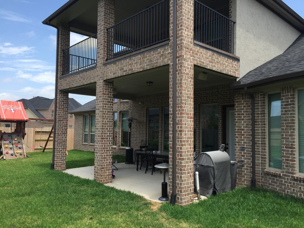
The home is in a newer, upscale development in Katy, Texas – one of the fastest-growing communities in the country. Most of the lots are relatively small, but folks still seem to want large houses that reduce available backyard space to postage-stamp proportions.
The specific cul-de-sac where my clients live is highly interactive, with lots of young families with a couple young children each. When it’s time to play, gates swing open and kids flow in groups from yard to yard, having a good time and always ready in summertime to beat the Texas heat in the street’s various swimming pools.
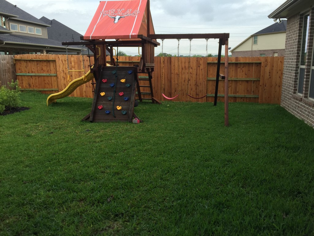
As I first saw the property, my clients’ yard had been doing its part in the play cycle with a big swingset and a fair patch of lawn, but that was it. They figured it was time to step up and install a pool – and while they wanted it to be suitable for children at play, they also wanted the space to work for adults, too, so there had to be an outdoor kitchen to go along with dining and seating areas as well as a good-size spa.
| As we found it, the job site was basically a hemmed-in play space for the kids and a limited spot for entertaining – compact and not very conducive to fun during a Texas summer. We remedied all that with a full-featured response to the clients’ desire for a water-oriented composition that would please family and friends alike. |
One more thing: The home’s beautiful interiors include wood floors from end to end, so my clients wanted an easily accessible outdoor bathroom. And let’s not forget the fire features and the lighting system and the swim-up bar and an ample shade structure.
As the space became more and more packed with expected features, I began formulating my ideas. I always start with a careful spatial analysis, moving away from the existing structures and effectively “walking” through the site, considering pathways, traffic patterns, furnishings and all of the practicalities related to all of the included elements.
As is my normal practice, I laid things out with the Pool Studio digital design software (from Structure Studios, Las Vegas, Nev.). After about five hours of total work – and about two weeks after our initial meeting – I called the clients and scheduled a presentation. Although I was confident that the design was just about perfect, there’s always an element of uncertainty as you await their responses and mentally prepare yourself for the usual set of adjustments and negotiations.
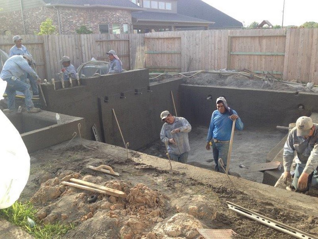
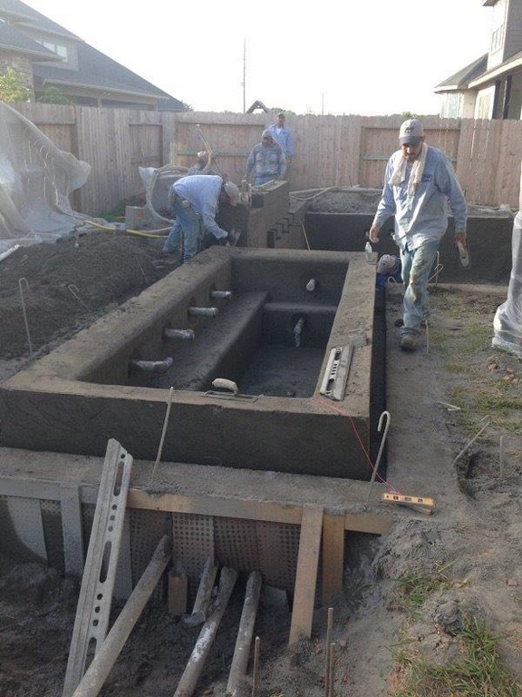
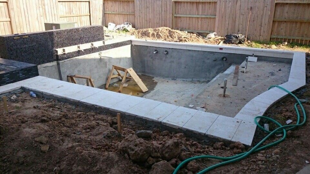
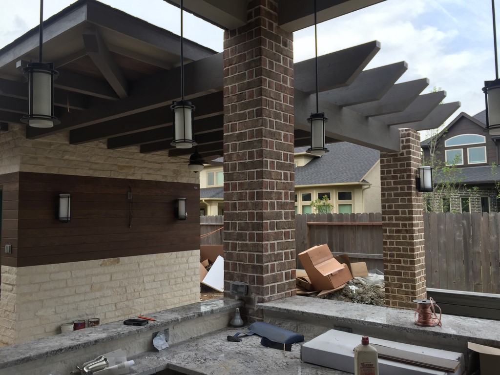
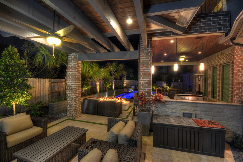
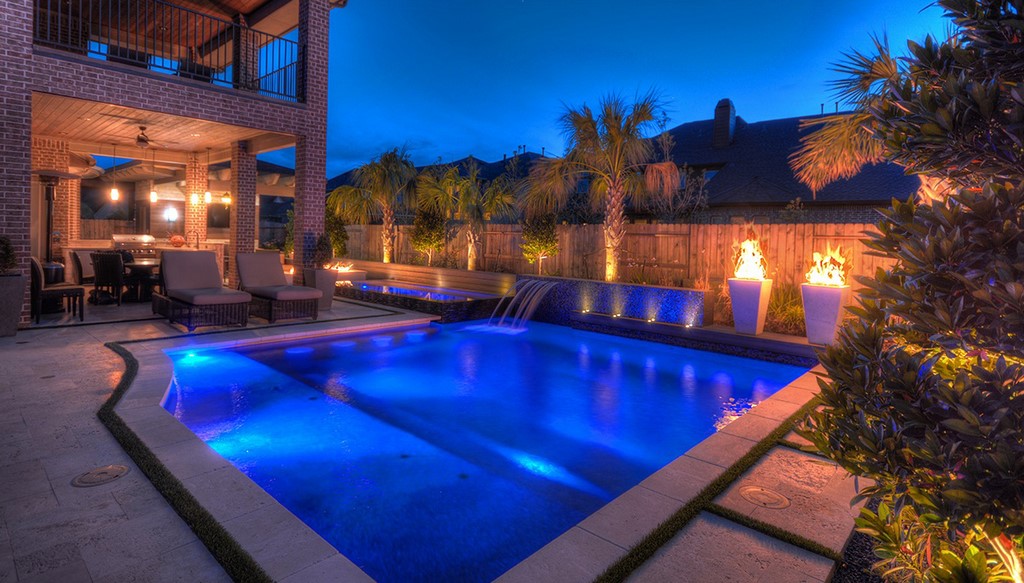
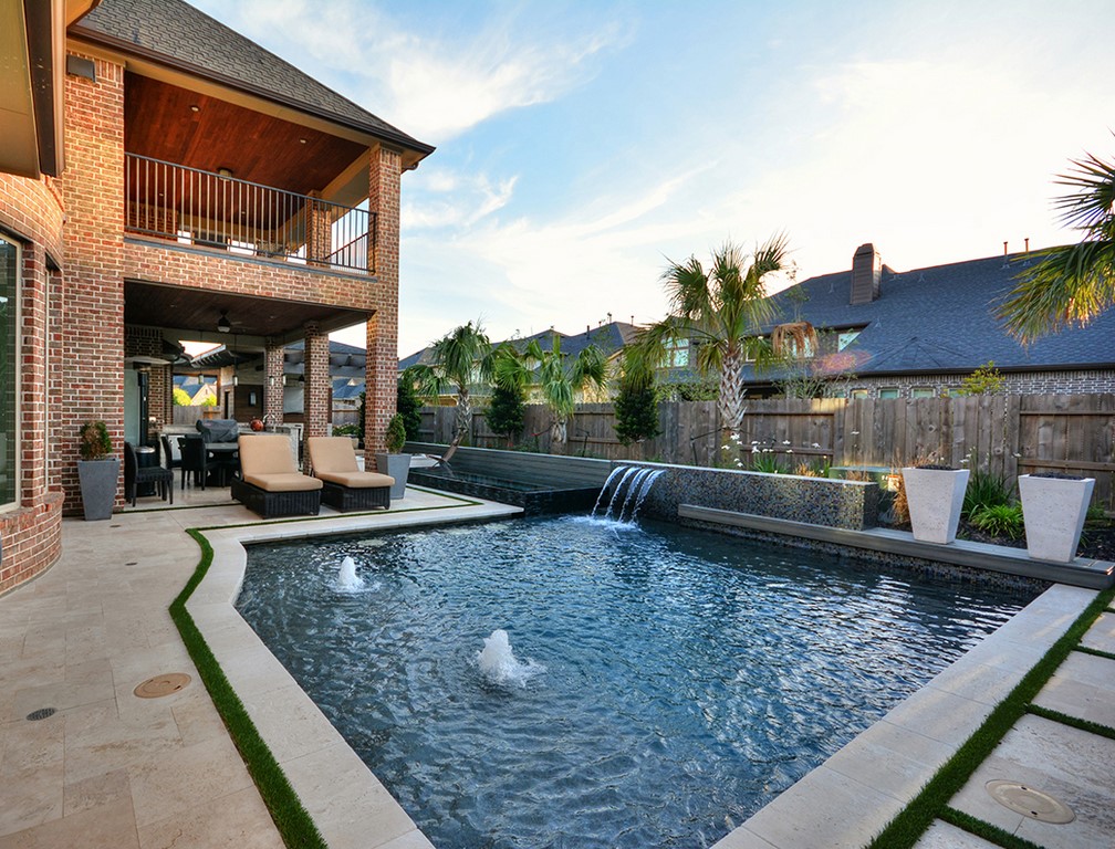
| From start to finish, there was always a lot happening on the job site – a sense of furious activity that was raised a level or two by the fact that craftspeople and workers often had to climb on or around one another’s work just to get from place to place in the small yard. But it all came together: As can be seen in the panoramic photograph at left, we managed to fit an awesome array of features into a postage-stamp of a space. |
When they arrived and I flashed my proposal on the big monitor, the man sitting across from me looked a bit upset and said, “Damn it.” I didn’t take it as a good sign and waited for the other shoe to drop.
What he said next was amazing: “I know it’s the one we’re going to build. And I know it’s going to be the most expensive.”
Thinking I could make things work if we kept talking, I carried on and kept waiting for feedback. Wasn’t there something specific that needed polishing? Had I packed too much into the space? Wouldn’t there be some sort of editing process to delete a few line items from the budget? Well, no, no and no. They wanted what they’d seen, just as they’d seen it – right down to using artificial turf instead of the usual mastic joints behind the coping – and all they asked of me was to do what I could to come close to the budget they had in mind.
A CLEAR PATH
At the time of the presentation, I hadn’t considered costs in any detailed way. So after a week of considering materials, contacting suppliers and thinking through every detail of construction, I went back with a number that was high for them, but not out of reach: They stepped up a bunch, we backed off a bit and the contracts were signed. Better still, the compromises we reached to get there had no discernible effects on the design.
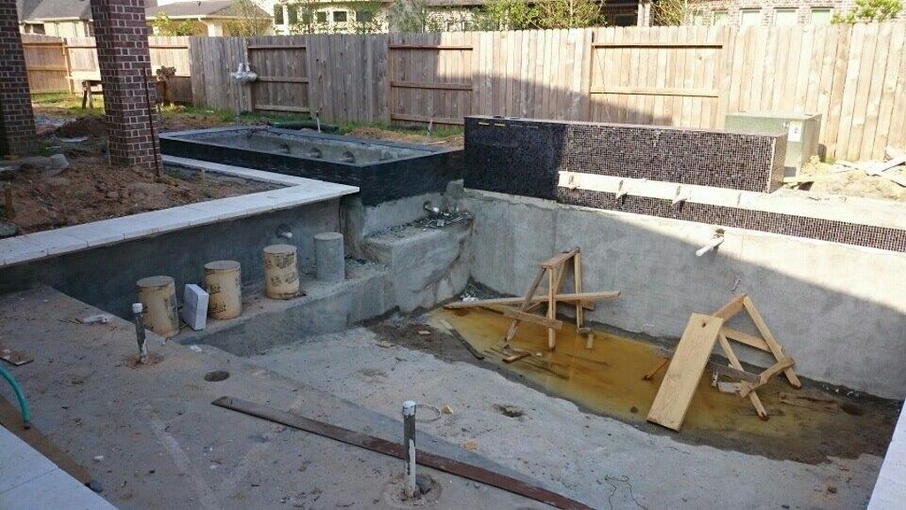
In all, the installation process took three months. Along the way, we had to make a few minor adjustments to accommodate the necessities of building in such a compact space. The composite-wood wall behind the spa, for instance, had to be moved over and raised a bit to allow for passage of all of the plumbing lines and electrical conduits running over to the equipment pad we’d placed around the corner in a narrow space alongside the home.
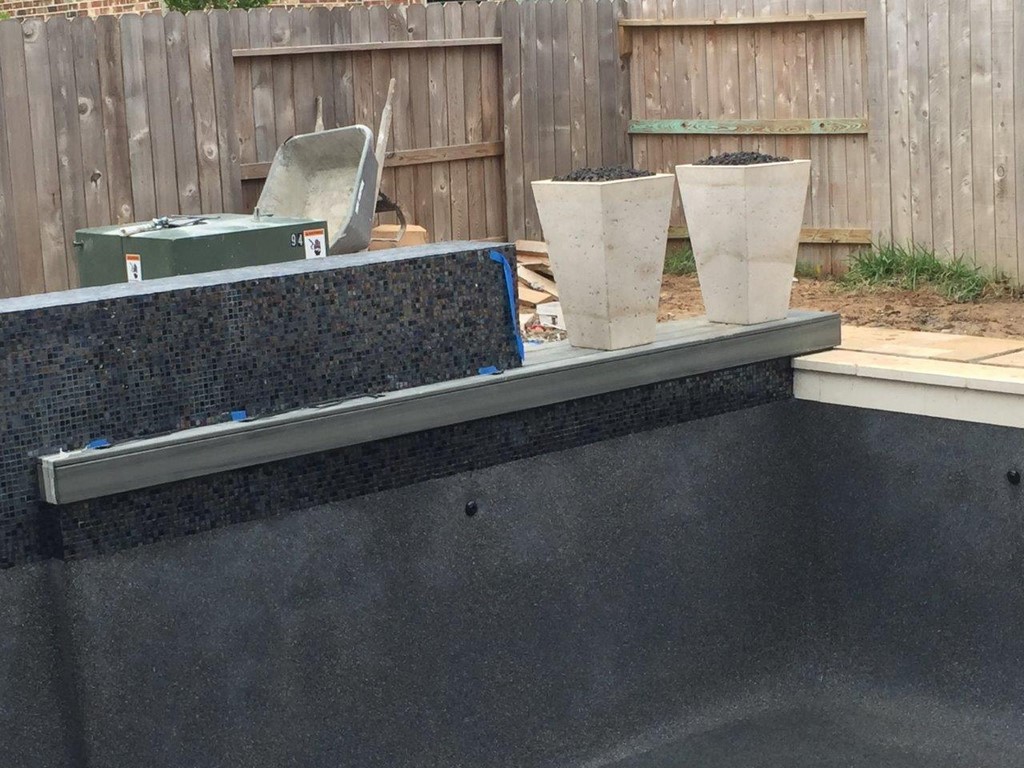
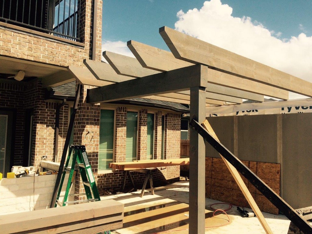
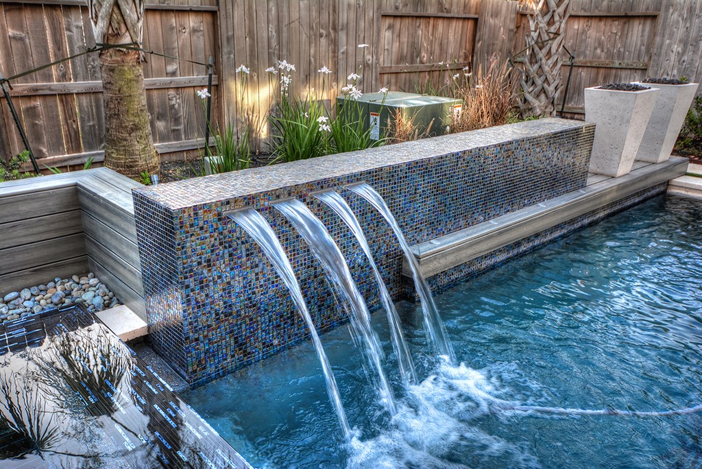
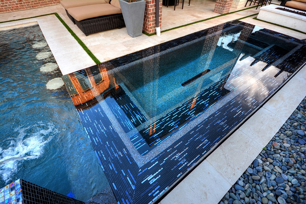
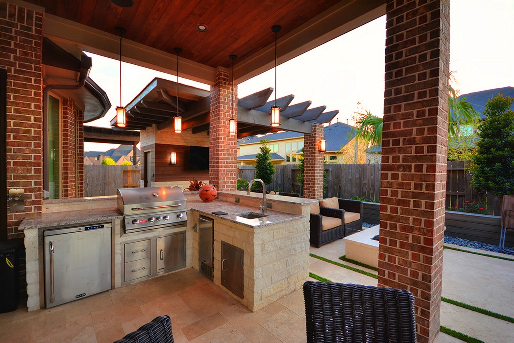
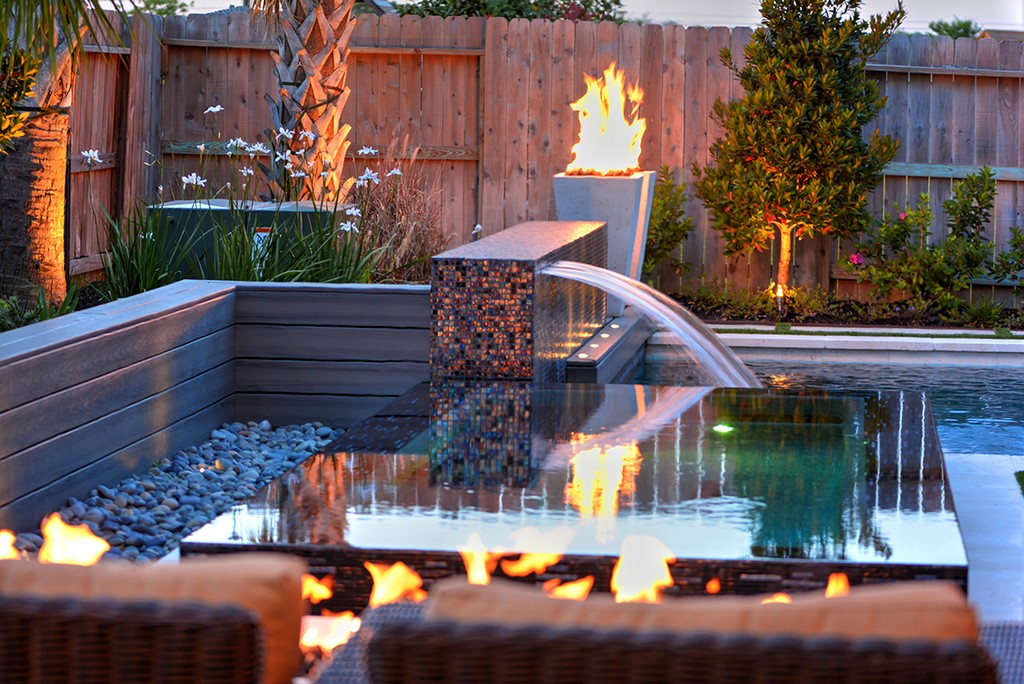
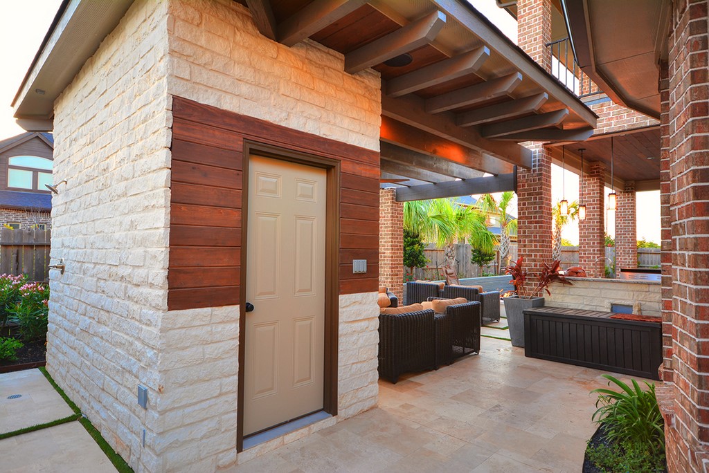
| Most of what we did on the project was familiar, including the swim-up bar with the cantilevered shelf (seen at top left). But we also stepped out of the box in several ways – once with the unusual composite-wood rail we added to the spillway wall (middle left and middle right) and again with the large shade structure we built into the wall of the outdoor restroom structure and were able to support with just a single new post (right and bottom left). |
We also had to a bit of on-site figuring out of how to do a couple things we’d never done before. The bathroom building, for instance, features a massive shade overhang tied into the existing balcony and also tucked in beneath the bathroom’s roof structure. It was very important to figure out a way to support a large portion of the weight by adding just a single column out in the yard – an imposition that took up a minimal amount of our precious “floor space.”
Another novelty was working with the composite wood material incorporated into the spillway wall. After we initially attached it to the shell, we saw immediately that it mirrored every surface twist, bump and imperfection in the substrate. So we removed it, addressed the issues along its full span and reapplied it with dead-straight results.
The spa’s seating arrangement was a bit off the beaten path as well. The raised vessel is 15 feet long but just six-and-a-half feet wide to fit within the available space, so we set up the seating as though it was a long sofa, with the main bench on the wall opposite the home and small “arms” on each end.
| This project was special in a number of ways – not only in the design process but also in the way everything fell into place during the complicated three-month construction process. From the unusual spillway wall to the sofa-style spa (top left, top middle left), from the outdoor kitchen to the shade structure (middle right and right), from the fire features to the outdoor restroom (bottom left and bottom middle left), we made it all happen – and beautifully! |
It’s an unusual approach, as was the inclusion of a swim-up bar with coping stones cantilevered above to provide the necessary legroom. Lots of these bar features appear next to sunken kitchens in other parts of the country, but that’s off limits in Texas, where expansive soils and torrential rains make recessed structures impractical. But the clients loved the way the bar related to the spa and the pool as well as the dining area, so it was always on the feature list.
Happily, we were mostly on familiar ground, working systematically to allow for the greatest possible efficiency in moving trades on and off the small site and keeping craftspeople from wasting too much time being in each others’ way. With the organizational issues under control, we met our timeline with unexpected ease.
BEYOND EXPECTATIONS
When I indicated above that the clients loved the design, I may not have been clear enough in expressing just how thoroughly that was the case.
They loved the colors, the textures, the tile selections, the Travertine decking, the limestone coping, the pebble interior finishes for the pool and spa, the multiple fire features and the generous use of composite wood, which helped in budgetary terms compared to stone and served to convey the sort of “Contemporary Rustic” style they were after. They also liked the furnishings, which was quite unusual, and left all decisions about details of the outdoor kitchen to us as well.
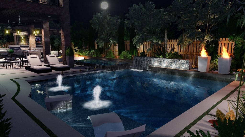
| From my perspective, the most remarkable thing about this project is how little it changed from computer design (left) to finished product (right). Yes, the fire features aren’t identical, but the clients went with everything we proposed, from materials and furnishings straight through to using artificial turf instead of the more common mastic joints beyond the limestone coping. At the very least, it made for an outcome that was both personally and professionally satisfying. |
This led to one bit of strangeness: In working up the design, I had included the firepots I’d found in Pool Studio because their proportions were a perfect complement to the long, low spillway wall. Trouble was, I had no idea where to find them in the real world. I usually work with a precast stone fabricator in Arizona, but I couldn’t recall anything in its catalog that had the sort of tall profile I needed.
After hunting through vendors across the globe and finding several products that hit the visual mark but couldn’t be used with fire, I went back to my usual vendor’s catalog to see if it had anything that would come close. As I flipped through the possibilities, I came upon one I’d never noticed before – and it happened to be a perfect match for the look I’d designed. It had been there the whole time, but I’d never seen it before.
As we wrapped up our work on site, I kept waiting for the clients to turn up with a list of 10, 20, even 30 things that needed adjustment, but that never happened. It was a graceful continuation of the happy dynamic that had marked this project from the start: Perfect clients, perfectly agreeable. Energetic kids, lots of fun. And a great big puzzle, waiting to be solved.
I wish they could all be like this!
Tanr Ross has been sales manager and lead designer at Sunset Pools in Katy, Texas, since 2009, and founded Intelligent Blue, an independent watershape-design firm, in 2011. A long-time advocate of computer-assisted design technology, he has served as an adviser in development of the Pool Studio software system and has taught a number of courses in its efficient, effective use. In 2014, he was recognized as designer of the year by the Houston-area chapter of the Association of Pool & Spa Professionals.


