Garden Tea
It’s rare in our fast-paced world when you get the chance to work closely with clients over an extended period of time – and in this case we took full advantage of the opportunity: All the way through the evolution of the project, the couple gave me voluminous information about what they wanted and enabled me not only to understand and deliver what they were after, but also allowed me in many instances to exceed their expectations.
I had worked with him before on one of his previous homes; during that process, we’d developed a terrific working relationship and I was thrilled when he called me about his new home. In contacting me again, all he was after was a simple fish pond for him and his new wife to enjoy. Years later, I can trace the way that simple charge morphed and evolved and grew into the composition displayed on these pages – and the process continues to this day.
The home is located in a neighborhood of small, turn-of-the-20th-century cottages in Woodside, Calif. When I first arrived, the small lot showed no signs of ever having been “developed” in landscape terms. But even though it was a small space, I knew right away that this neighborhood and its vintage home could provide the backdrop for a wonderful small garden.
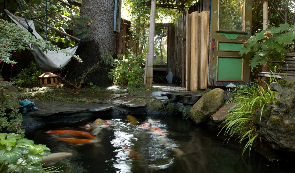
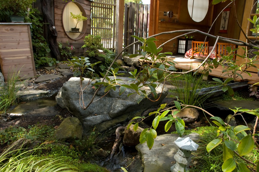
| The immediate impulse for the additional work we began on site was concern about the long-term health of a collection of koi, but before long the focus shifted and we set about creating a meditation-oriented refuge for the clients themselves. Seen on the far side of the enlarged pond is a bamboo-sheltered shower area with a yard-expanding mirror to its left. |
In our initial conversation, they let me know that they wanted to place the pond where I saw a tangle of blackberry vines and weeds that probably hadn’t been touched in 40 or 50 years. The chosen space also was hemmed in by an oak and a fir, but I went ahead and installed a small rock-lined watershape, cautioning the clients that with so small a volume, they would face troublesome water-quality issues if the fish were either too plentiful or grew too large.
Later on, in a second phase, we would double the size of the garden and completely redefine the space. In the meantime, I did what I could to address the fish-health issues in the shady pond.
INITIAL MOVES
For starters, I upsized the biofilter to double the manufacturer specification. (This is something I generally do with my ponds, the thought being that it’s hard for pond owners to resist bringing in more fish than the chosen volume can handle.) The unit I selected in this case (from Aquaculture Systems of New Orleans La.) has an automatic backwash feature that further helps accommodate the bio-load that comes with an excessive fish population.
The upshot: Water in the 14-by-eight-foot 1800gal pond is turned over every 45 minutes.
We still faced some difficulties, however, because the area was shaded and the water temperature seldom rose above the low 60s. This made it easy for the fish to get sick, because the cool water slowed their metabolisms to a point where it was hard for them to resist parasites. Although he is a veterinarian and knew how to treat the fish, there were sufficient losses among some valuable koi that my clients wanted a better solution.
Before long, we installed a solar heating system and increased the water temperature to a point where cool northern California weather was no problem.
Not far away (because nothing in this space could be very far away), we had set up a small bamboo structure with an outdoor shower. This new structured was mirrored on the opposite side of the pond by an old, small storage shed, and before long we started talking about how that structure might be used.
It was at this point that I started installing pathways and planting beds around the pond and the entire space began to take shape.
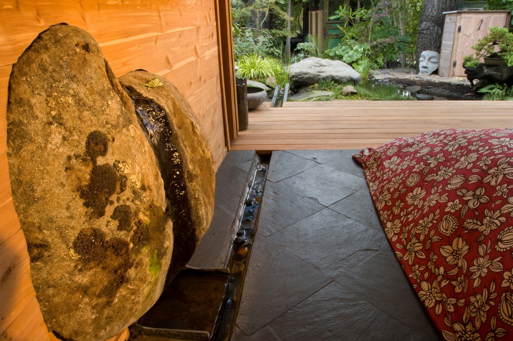
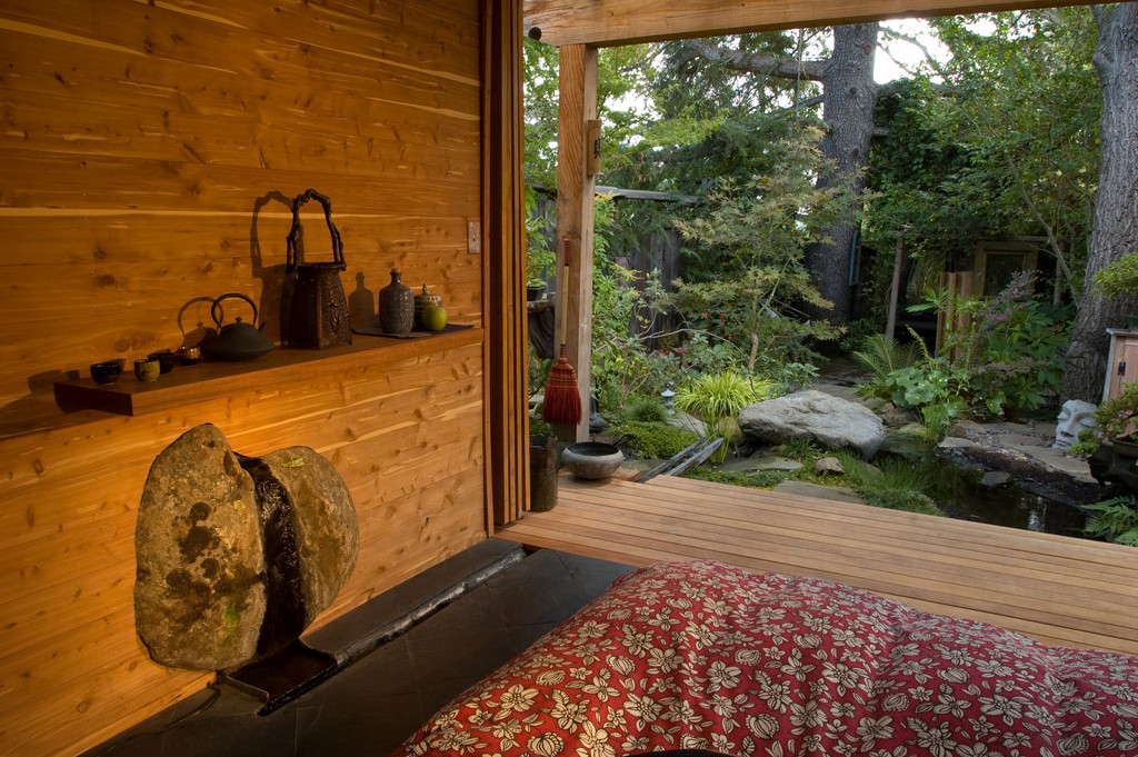
| Our clients wanted water to be an integral part of their teahouse. They’d seen rills running through other rooms of this sort, so we incorporated one that flows down the face of a mounted boulder, across the room, under a deck and, finally, into the pond. |
The key to the next phase of the project had to do with converting the shed into a teahouse. At first, the homeowners wanted to split the shed’s function, turning part of it into a meditation room but leaving the rest for storage. As we worked through the possibilities, however, they decided that it would be better to devote the entire 12-foot-square space to stress reduction and make it an indoor/outdoor room dedicated to helping them enjoy the garden.
The driving force here was the clients growing involvement with traditional Japanese tea ceremonies and their emerging desire to have a structure in the garden suited to that purpose. I’ve always admired Japanese architecture and began designing a building that would open up on two sides and would include a large porch area overlooking the pond.
MEASURED MOTION
All that seems straightforward enough, but these details actually evolved though months of discussions in which more and more ideas came into play as we moved ahead.
At one point, for example, she mentioned that she’d seen a house with water running through the middle of it in the form of a small rill. So we started playing with different ideas, beginning with a basin inside the house but eventually landing on a configuration in which water would emerge from a stone embedded in a wall. This trickle would then run down a narrow, 12-foot-long channel in the floor of the shed that would pass under the porch before spilling into the pond.
In cases like this, of course, moving from concept to execution adds its own stretch of time. It didn’t take long to find a great piece of fieldstone to mount in the wall for a nice sculptural look, but it took months of experimentation in my shop to find the right orientation and a flow rate that wouldn’t wet the rock’s entire surface or spill onto the floor. Then I had to cut the panels for the wall to accommodate the stone’s irregular shape.
Later, when everything was installed, my clients said it was “exactly” what they wanted, although they would have been hard pressed to come up with that sort of design solution on their own!
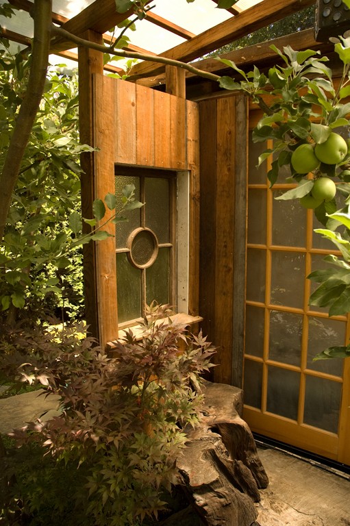
| Although the project is probably best described as ‘eclectic’ in style, there are certain distinctly Japanese-architectural touches we used in the space, including the teahouse’s use of circular moon-windows and other circular forms seen elsewhere in the garden. |
We also spent a great deal of time pursuing the right details for the teahouse’s interior. We started with rice wallpaper, which was both authentic and appropriate, but the homeowners didn’t care for the way it looked. So instead we went with an aromatic cedar paneling: This gave the space a rich, natural look, not to mention the fact that it served up a wonderful scent.
Then came a host of details, from cubbyholes for stowing shoes to shelving where they could display floral arrangements and artwork as well as the tea-ceremony accoutrements they’d collected in their travels. Next we installed laminated trusses with lovely, arching shapes over the rear entry; redwood burl decking on the rear porch and the (heated) black slate interior floor; and two salvaged windows. Above the porch is a roof made of a polycarbonate material that allows light to filter in and softly illuminate the room’s interior.
The doors on the front and back of the teahouse slide open, completely disappearing from view and creating a sense of interior/exterior integration. Even the door handles took careful consideration: They’re made from the nuts of a South American cycad and are often used as a substitute for ivory; we left the husk on and polished them to a warm finish.
MAGICAL DETAILS
Although the elements of the teahouse are decidedly eclectic, there are also a significant number of touches drawn from the traditions of Japanese architecture.
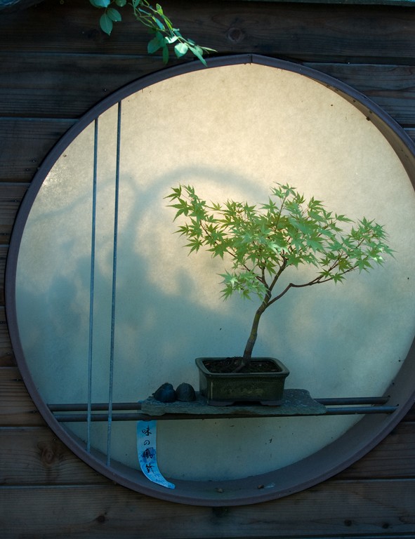
One of the details I enjoy most is circular moon windows, so we installed one in the teahouse with red rice-paper bands that represent a sunset when viewed from inside the room. Another of these windows is mounted in a fence adjacent to the teahouse and includes a shelf for displaying Bonsai trees. I also used this form to develop a small cabinet used to conceal the thermostat for the teahouse’s floor-heating system.
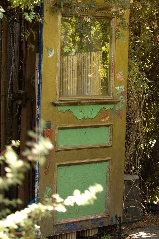
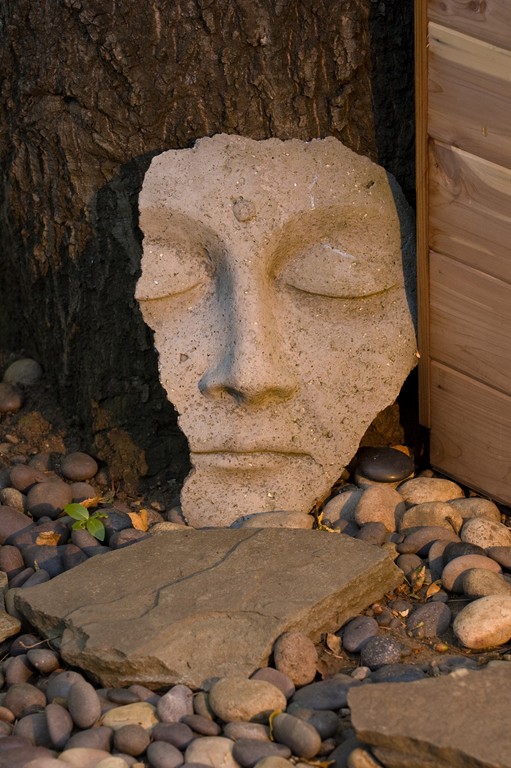
| The clients were personally involved in making the space theirs, which included her painting of the door that serves both as a privacy screen for the shower and to hide equipment from view. They also found fragments of statues, complete icons and a variety of other decorative pieces seen throughout the space. |
In a small way, this repetition of motifs is one way I like to create a sense of dynamism and motion in my gardens. In a much more direct way, however, I work with the element of surprise to encourage anyone entering a garden space to explore and catch unique and interesting views of special spaces.
That was certainly a focus here, despite the fact that the yard is only about 65 feet from one end to the other. On the edge of the space opposite the teahouse’s front porch, for example, I installed a large mirror hidden in the shadow of the shower structure. When you look down the length of the space, you see a reflection that suggests the garden extends well beyond its physical limitations.
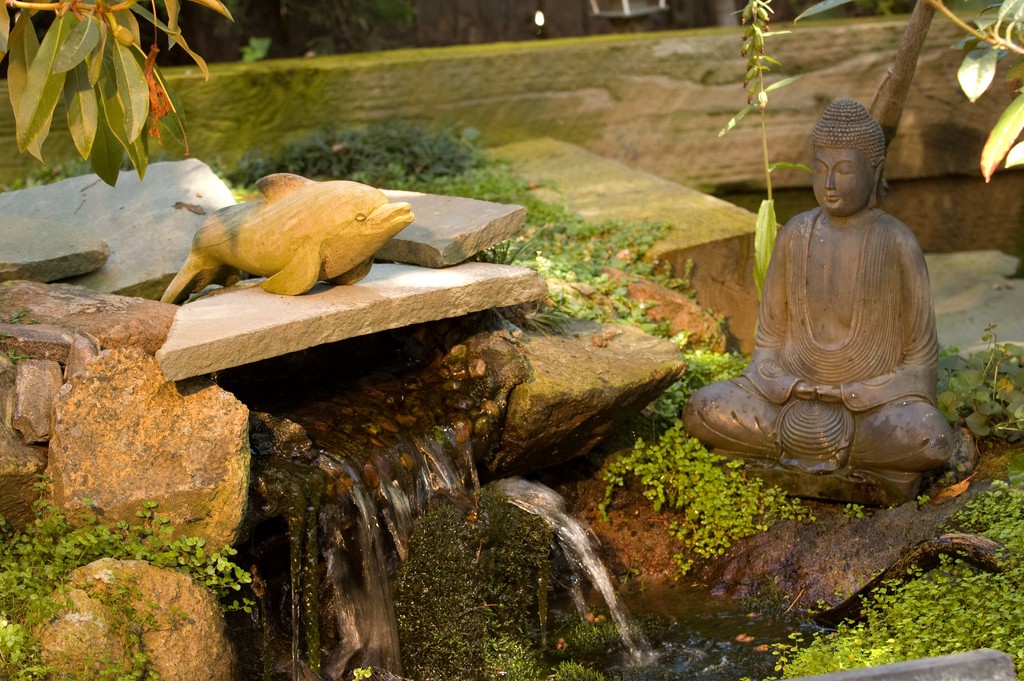
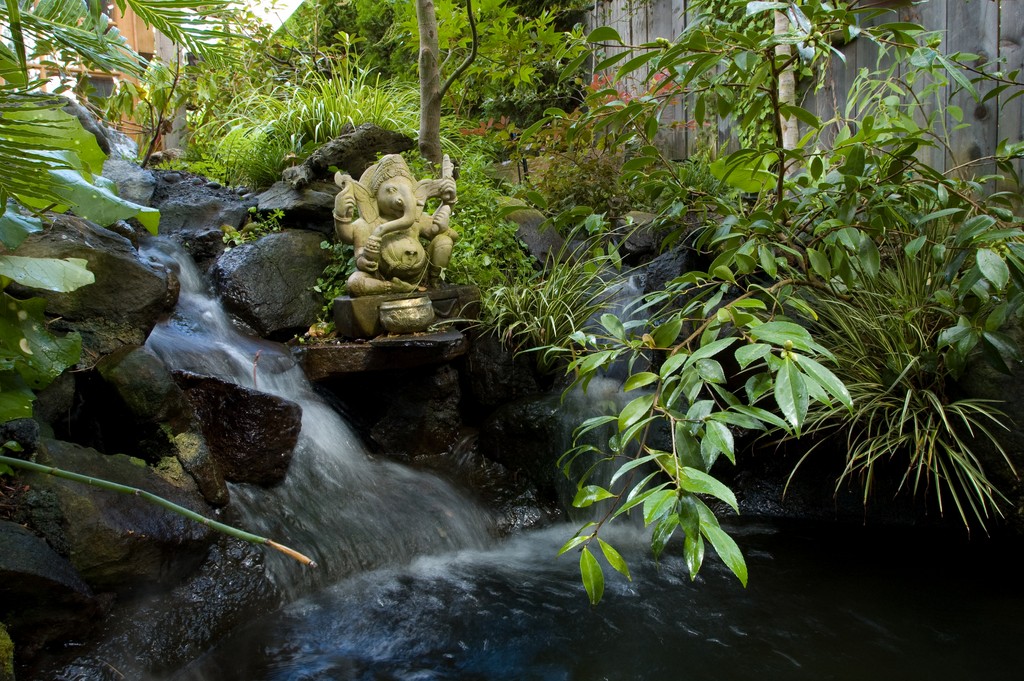
I’ve also found that getting clients directly involved increases the sense of the space having been personalized to their needs. Adjacent to the mirror and shower, for example, is a salvaged door that alternately serves as a privacy screen for the shower and a blind for the equipment set: She painted the door with vivid and beautiful colors. They also collected art that appears throughout the garden, including a broken Buddha, a Ganesh figure they found in India and statues of Christian luminaries including St. Francis.
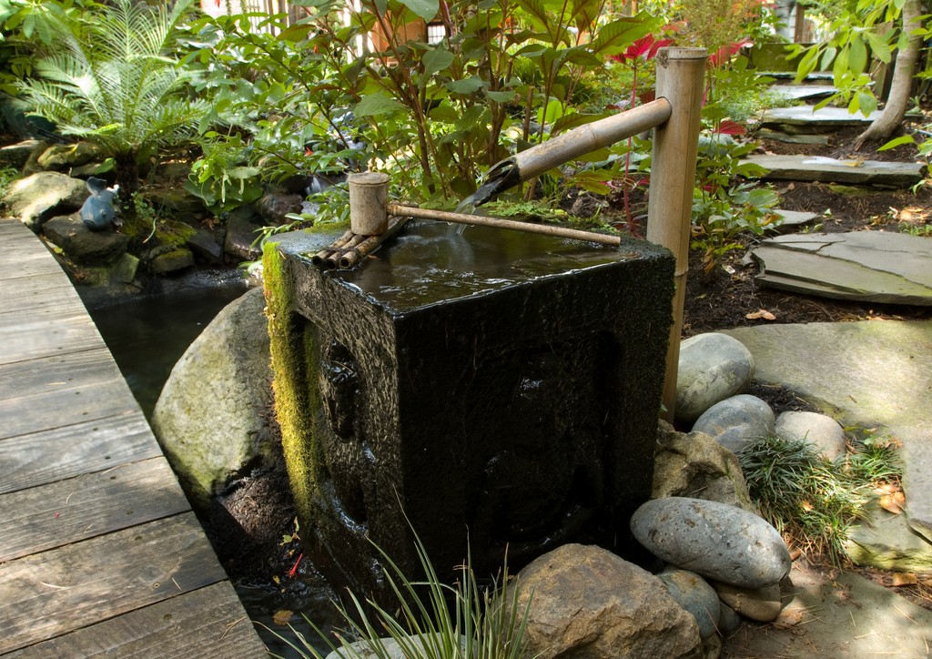
| The traditions of the Japanese tea ceremony had a lot to do with key features of the garden. This square tsukubai with its bamboo spout, for example, is intended for the washing of hands by tea-cermony participants, and the clients filled the teahouse itself with an array of accessories related directly to these rituals. |
Directly related to the tea ceremony, next to the pond there’s a square tsukubai with a bamboo spout (or kakei) for the ritual washing of hands. The basin was originally a concrete birdbath we found in a junkyard with moss growing on it: Now the flow from the bamboo spout fills the bowl before overflowing into the pond – and because it’s constantly wet, ferns have actually started growing out of its sides, giving the waterfeature a look of age well beyond its years.
The Asian theme is further expressed through the use of bamboo as a structural element in the shower area and as a plant that goes well with the dozens of species of ferns, fruit trees, Japanese maples and flowering plants we planted to follow the lead of traditional Japanese gardens.
COMPLETING THE SCENE
Adding even more design touches associated with the Japanese garden style, we spent a great deal of time selecting and placing unusual stone pieces to create a sense of asymmetrical balance. Then we wove lush plants in among those stones, both to add to the sense that the garden had been there for a long time as well as to create the impression that everything in this garden refuge has been fully and thoughtfully integrated.
| Our main aim in designing and installing the entire space was to create a proper atmosphere of serenity and meditative calm for the homeowners, their guests and their tea ceremonies – and even I have been known to stop by from time to time to step into this special realm and shed the stresses of the workaday world. |
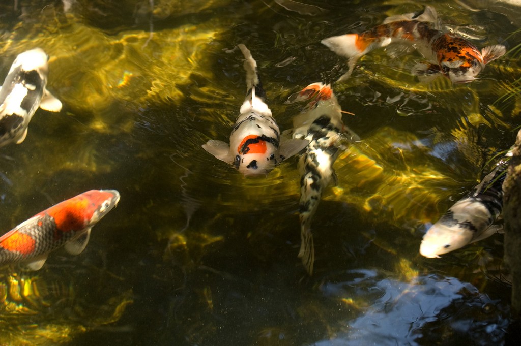
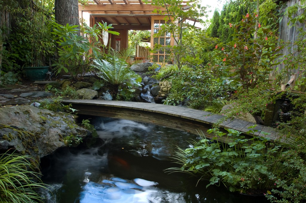
With the structures and details in place, we refocused our attention on the pathways we’d installed early in the project, extending and expanding them to carry visitors throughout the completed garden. A key here was a small, gently arching bridge across the pond – a great place for everyone to gain an intimate, overhead view of the homeowners’ collection of koi.
Although the garden is now essentially finished, we continue to collaborate with these clients in polishing up certain areas and adding small details that augment its array of visual delights. Indeed, we all see it as a dynamic, still-emerging space, and they keep telling me that the more time they spend in the teahouse, the more views and details come into focus.
The closeness I’ve developed with both the clients and the site makes this one of my all-time favorite projects, and one happy byproduct of the friendship that’s come to characterize our relationship is that they don’t mind if I occasionally stop by after work to spend a few minutes sitting in the garden to relieve my workday stress. It’s a great place to unwind – and absolutely the perfect venue for enjoying a well-brewed cup of tea.
Rick Driemeyer is founder and president of Both Sides of the Door, a watershape and landscape design/build firm based in Oakland, Calif. His design career began in Ann Arbor, Mich., in the early 1970s, when he became a specialist in interior landscapes and watershapes. After moving to California and expanding his work to include exteriors, he established his current company in 1981, deriving its unusual name from the fact that he now works with both interior and exterior spaces. An Arizona native, Driemeyer traveled extensively as a child with his family and has lived in Florida and Pennsylvania as well as Michigan. He credits this exposure to different types of landscapes and his parents’ love of the arts and nature as primary design influences.


