Splashes of Color

If you can’t see potential in every backyard you walk into, then you’re in the wrong business.
Yes, some projects are more inspiring than others, and some spaces seem to offer you more to work with than others. Without exception, however, our clients’ yards present us with opportunities to develop programs that take advantage of what’s there in ways that bring balance and harmony and interest to any setting.
Speaking for myself, I’m no more energized in a project than when I get the opportunity to right a wrong and replace a past mistake with a fresh, interesting design – and that was certainly the case in the project discussed in this article and in my past several “Details” columns in this magazine. The setting was special, the clients were great and I was given free rein to work with color, shape and line in vivid, interesting and even startling ways – all in keeping with their wants and desires.
SETTING THE SCENE
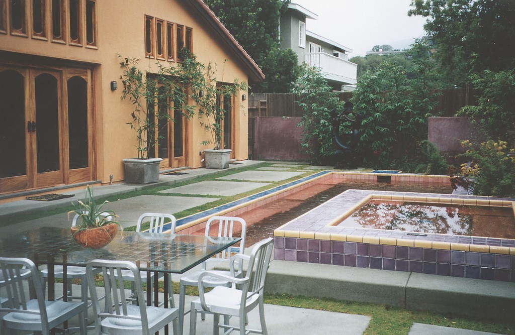
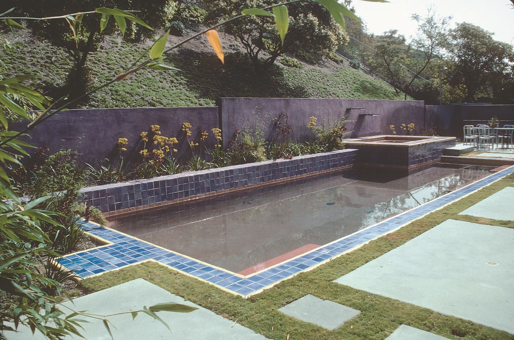
To recap information from recent “Details,” this pool/spa combination with its associated decking, walls, planters, outdoor cooking facilities and private garden area are located in a narrow yard at the base of a slope in Pacific Palisades, Calif. It’s a spectacular spot, and the home is a wonderful structure that radiates warmth with its rich wood trim, soaring architecture and unabashed goldenrod color.
The backyard, however, was an eyesore. Built without any sense of style or design, it featured an oversized pool, lifeless concrete decking and a drab retaining wall stuck aimlessly in the middle of the yard.
My plan, as you may recall, was to play off the home’s architecture, colors and textures, shrink the pool, add a spa, maximize the sense of space, pay homage to the design sensibilities of Mexican architects Luis Barragan and Ricardo Legorretta and play with color. As I’ve mentioned many times, I have been fortunate in this case to work with clients who’ve been able to visualize the yard’s potential and become collaborators in the process.
| A Secret Garden
There’s a neat little area off the clients’ home office that will eventually feature sculpture and landscaping to go along with storage space that’s already been installed, virtually hidden from view. This private meditation garden will be a special space made even more appealing by the surprise that awaits around the corner: a sweeping view of the expressive backyard and its array of visual and aural delights. — D.T. |
Not only was the existing pool much too large for the space, it was a visual mess with curved lines, straight lines, angled lines and multiple types of materials – none of which had anything to do with the space or the shapes around the pool. Rather than enhance the space, the pool actually sapped its energy and dragged down an otherwise beautiful property.
And the problems weren’t all aesthetic: The drainage was all wrong, the decks were set awkwardly at best and steps tended to be in the wrong places. It had all been composed without imagination or with any thought of how the space might actually be used.
Watching the transformation of this backyard has been a true delight for my clients and me, and I hope my columns have conveyed some of the joy of this process. A yard that once seemed overcrowded now seems spacious. Walls that once intruded are now an integral part of the design and color scheme. Decking that was formerly drab and unappealing now glows with warmth and color and soft textures.
If I do say so myself, the elements of the design are all so well considered and proportioned that no one element visually overwhelms the others or takes over the space. It’s all in balance with respect to color, volume and line – an ideal place for entertaining, relaxing, playing or exercising.
Color Keys
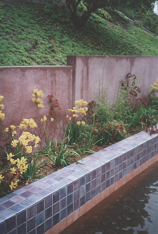
There’s so much color in this backyard that it’s really quite outrageous. But although the palette is bright and vivid, the colors all were selected to work together in a harmonious way – warm and expressive and even whimsical, but juxtaposed in ways that pull everything together.
This is a case where color has been used to expand the visual space. If that seems a puzzling notion, look at it this way: You can take three identical cars, paint one yellow, another black and the other red, and they’ll all appear to be different sizes. It’s also why some colors are slimming when you wear them – and why, unfortunately, others are not.
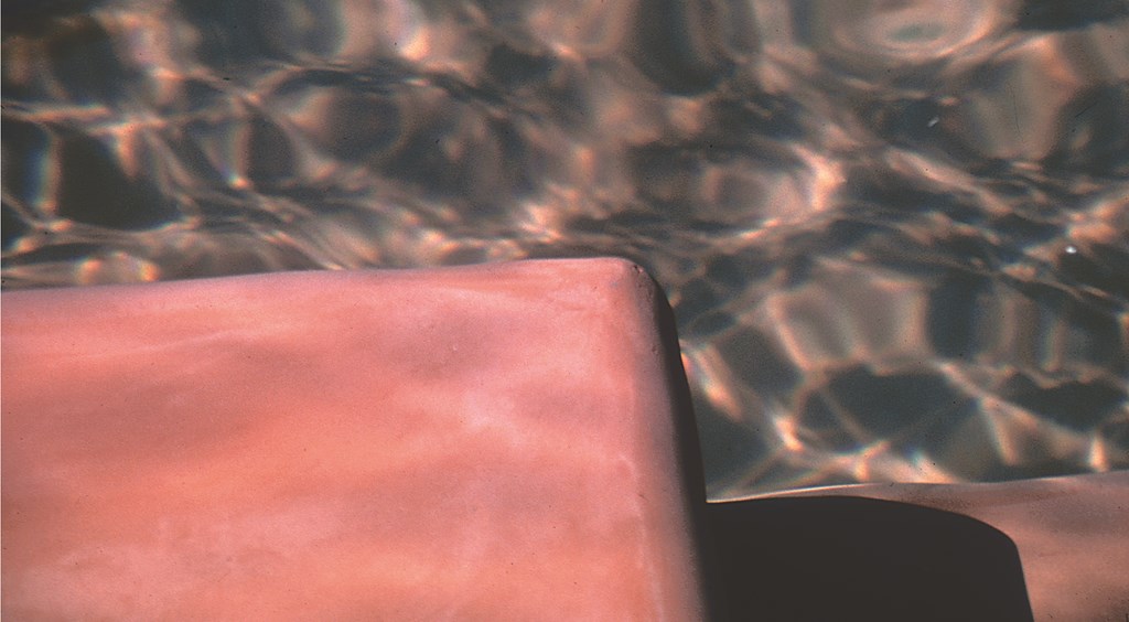
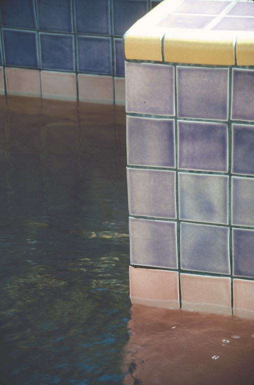
The key here is transitions that help to define shapes and spaces. The transitions bring some elements forward while fixing others in supporting roles. Look, for example, at the reddish hue of pool’s plaster and how it works with the water’s reflection of the vivid purple color on the walls. You see this interplay as well in the dark greens of the landscaping and the pale green of the concrete, between the plaster and the coral-colored band of tile, and between the yellow tile and goldenrod house.
It all works together because it’s based on color theory and appropriate use of a color wheel. On their own, the colors are bright, even startling – but here, rather than conflicting with one another, they harmonize while expanding and energizing the space.
Wondrous Walls
Contrary to common assumptions, walls don’t necessarily shrink your sense of space or just hold back slopes or serve only to separate one property from the next. In fact, if you have a good understanding of the dynamics of volume, line, color and shape, you can use walls to create impressions of space and visual balance and continuity that are truly something special.
Done well, they can give the eye a sense of sweep and focus and create sensations of flow and direction and spaciousness. Indeed, walls give us opportunities to expand rather than enclose or limit spaces. In this project, for example, they were used to create interesting offsets, reflect light, cast shadows and mingle with landscaping.
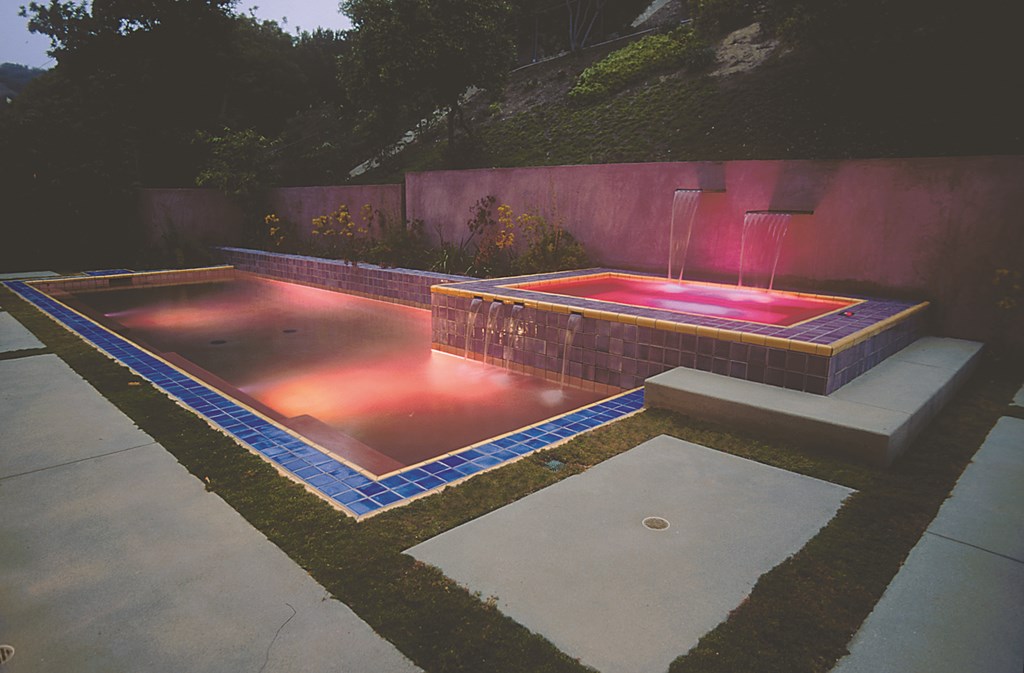
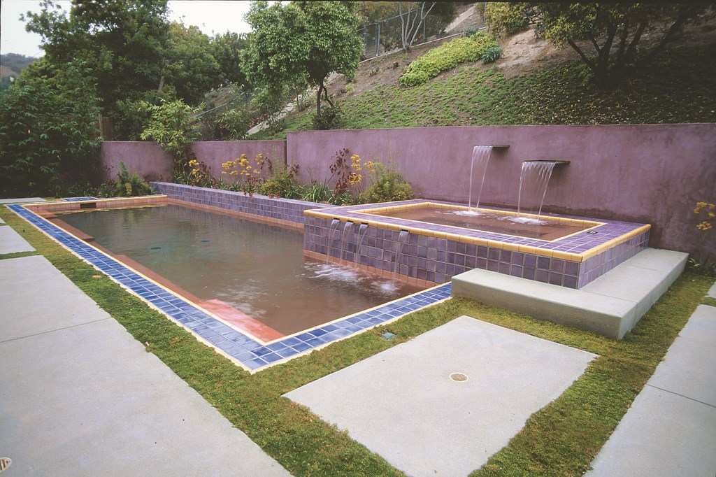
They also were used to add vibrant color. On its own, the purple of these walls is quite striking and maybe surprising, but in the context of the other colors we’ve chosen and the color of the landscaping and of the house, the color is beautiful, appropriate and exciting rather than jarring or unsettling.
But the appeal of these walls goes beyond great aesthetics: The original central wall has been upgraded and is now flanked by two side walls. Together, they serve as true retaining walls and have also been made an integral part of the slope’s drainage system.
Spa Ways
The spa is the understated star of the show – and a wonderful replacement for the tired portable my clients had been using.
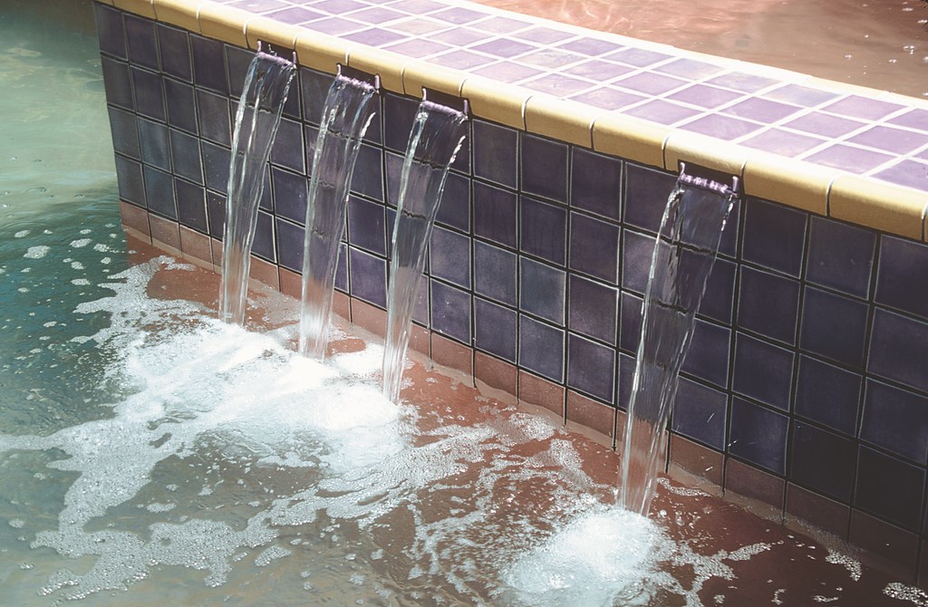
The new, full-featured spa has 16 jets, four slotted spillways into the pool, beautiful tile and comfortable seating in and out of the water. It’s large – some nine feet by almost seven feet – and will comfortably accommodate a large group of people with a variety of jet configurations intended to work on different parts of the body.
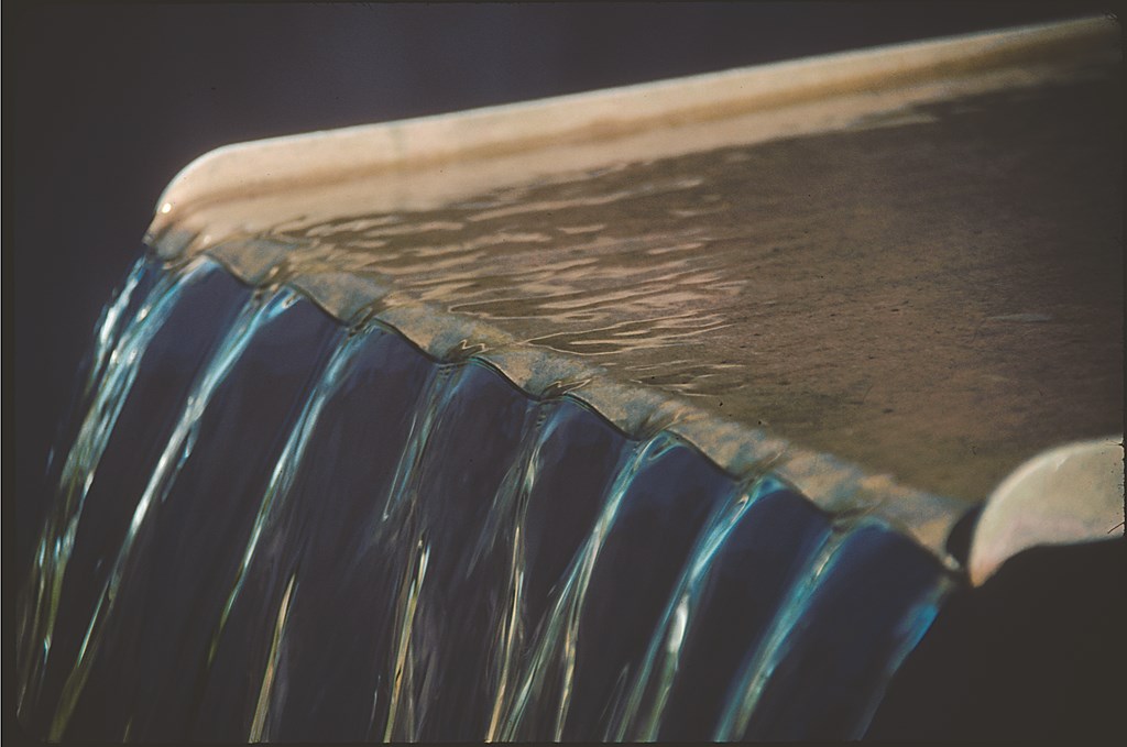
The crowning touch here is a pair of scalloped brass spillways that send a wavy flow of water into the spa. Made to order by David White and the staff of the Custom Cascades division of Oreq Corp. (Temecula, Calif.), the spillways provide drama and add interest made possible by the fact that the wall is set back from the spa instead of being pushed right up against it.
The whole composition now invites observers closer to the water, where they can enjoy the flow of water from the scalloped spillways into the spa or from the spa’s slot spillways into the pool. They can either interact with the water physically or simply watch and listen from any number of places in the yard and enjoy its unique asymmetrical balance. The rippling effect of the water flowing over the scalloped spillways is very important here: It gives the water a visual, even sculptural texture to go along with a distinctive aural texture.
For all its star-quality features, however, the spa and spillways don’t dominate the scene; rather, they blend in seamlessly as part of the overall composition.
Pool in Place
I’ve said it many times: Water is nothing more than a colorless, tasteless, odorless amorphous material. When it’s set in a design with rich colors in an open visual space, it reflects and enhances the surroundings. With this simple rectangular pool, that’s really all we’ve asked it to do visually.
In dimensional terms, the pool is like a simple set of building blocks with one thing growing or extending from another. Everything in this space is rectilinear, and the pool is just one more of those linear elements.
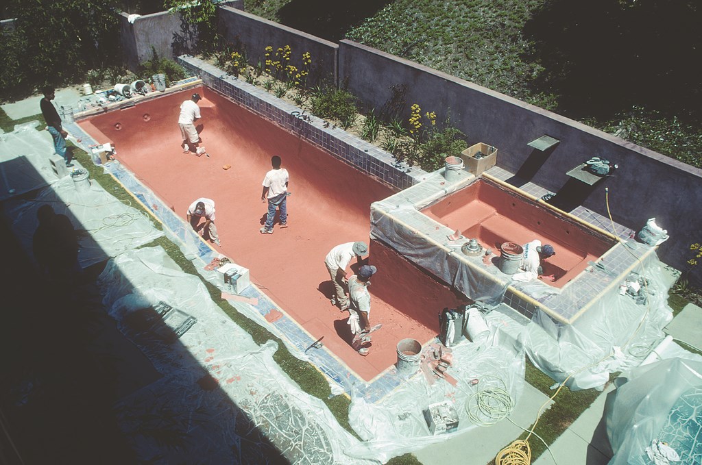
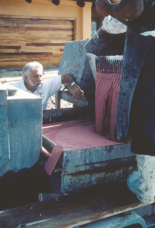
A special touch for this pool is the red plaster we used on the interior. To my knowledge, nobody has ever used red in this application, but in the context of the other colors used in this backyard, the effect is mesmerizing – truly a special look.
In producing this unusual plaster color, I relied as I often do on the skills of Tony, John and Luis Marquez and the staff at Marquez Plastering in Sylmar, Calif. Their willingness to work with me in trying and developing and adjusting special colors made it much easier to implement the visions we’ve developed of what this and many other pools ultimately have become.
Outdoor Living
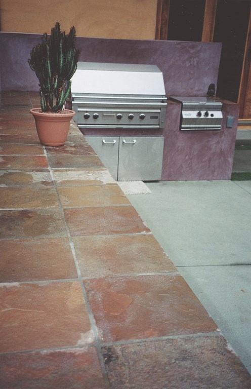
The outdoor entertainment center features a large barbecue with a two-burner cooktop, stainless steel storage, lots of electrical outlets and plenty of lighting to illuminate both the food-preparation and serving areas.
It’s a large portion of the yard and an important functional space, but again, it’s part of the setting without dominating it. The slate on the serving surface is flush-set rather than cantilevered to give the counters a monolithic look. The slate also features prominently inside the home and serves as a means of linking the indoor and outdoor spaces.
| Laying It on the Line
What do you bring to the table when you meet with a prospective client? Do you bring formal training or classroom education with you? Have you taken drawing classes or art history or learned anything about textiles or color theory or architecture or construction? How qualified are you to be designing and/or installing permanent, three-dimensional environments in public or private spaces? It’s apparent that few people who sell and install residential swimming pools could answer those questions with much credibility. I suppose it means opportunity for me and a few others, but I know I’d much rather operate in a universe where many, many more practitioners have the right background, the right experience and a good understanding of volume, scale, proportion, balance, texture, auditory quality, color and visual acceptance. A well-educated generation of watershape designers would only help me improve. As it stands now, however, qualified, credible watershape designers are few and far between. The situation is outrageous – and our clients deserve better. The clients who brought me into the backyard shown in the accompanying feature certainly did. The difference between the pool they have now and the one that was there before is the difference between the education, experience and creativity I offer as a designer and builder and the utter lack of training, sensitivity to design dynamics or refinement of thought displayed by my predecessor. The only answer is a commitment to education. It can be a long and difficult road, but the results can be priceless. — D. T. |
David Tisherman is the principal in two design/construction firms: David Tisherman’s Visuals of Manhattan Beach, Calif., and Liquid Design of Cherry Hill, N.J. He can be reached at [email protected]. He is also an instructor for Artistic Resources & Training (ART); for information on ART’s classes, visit www.theartofwater.com.


