Space Savers

Working in constrained spaces is entirely different from tackling projects that unfold in pastures where the only boundary might be a distant mountain or an ocean view. Indeed, in small areas that may be defined by fencing or walls or adjacent structures, the constrained field of view offers substantial aesthetic challenges to the designer in that every detail, each focal point, all material and color selections and every visual transition will be seen, basically forever, at very close range.
When you’re working small spaces, in other words, there’s literally not much room for error.
In this smaller context, each and every decision watershapers and clients make will subsequently be in direct view, and it’s likely that each detail will take on special significance for the clients, positive or negative, as they live with the watershape over time. And on many occasions, what we’re asked to start with as designers leaves much to be desired, including spaces already vexed by sensations of confinement, closeness or downright claustrophobia.
To illustrate what I mean, let’s take a look at two projects I recently completed in smallish yards for clients who wanted to use every square inch of space to the best possible effect. In both instances, we faced many challenges that are typical of small-space projects – and I have to say I’m proud of the solutions we developed along the way.
ISLAND FEVER
There’s a tendency to view work in small areas as being regimented and deliberate – at least to the extent that your decisions must all work together. For all that, I find that working with clients and making choices about layout, balance, scale, proportion and the basic configuration of major design elements is, when it comes to small yards, still largely an intuitive process.
I don’t believe, in other words, that there are set rules when it comes to small-yard projects (or any project for that matter), other than an overall sense that I want to make these spaces seem as spacious as possible as I work with sets of carefully integrated design elements. In these situations, my work with the client is aimed purely at developing a design that will provide a welcoming, pleasant experience for anyone who walks into and spends time in these yards.
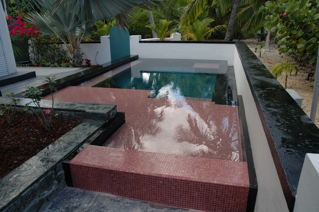
The first project pictured here is on the island of St. Croix in the U.S. Virgin Islands – a job that demonstrates both the potential and the compromises of small-scale design. As you might imagine, it’s a gorgeous setting in one of the world’s most alluring tropical destinations.
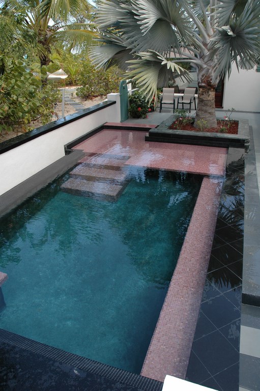
| The space available in this project was as tight as could be, with the house hemming it in on two sides and a low privacy wall taking care of the other two. |
The client owns 20 acres of oceanfront property with all sorts of places where a properly articulated watershape couldn’t help being enhanced by the grandeur of the natural setting. In this case – and for reasons I still don’t entirely understand – the client decided that he wanted to tuck the watershape in a 12-by-25 foot courtyard encompassed on two sides by the house by a low privacy wall on the others.
Complicating matters was the fact that this scheme was a distinct departure from the project’s original plan: When I first visited the site, the client wanted a large pool in a lush, wooded area near the water. I developed an entire plan, taking design cues from the ruins of the Dutch sugar plantations that once dotted the island. I rendered a large outdoor kitchen/entertaining area and a host other details around the pool – even some authentic-looking (but faux) ruins consisting of arches and columns. The client loved what he saw, and I thought we were all set – but that simply wasn’t the case.
Instead, the client completely changed directions and moved the project to the courtyard right next to the home. In fact, between my visits, he took it upon himself to dig the hole for the pool, following up that bold maneuver with a call asking what needed to happen next.
I was flattened by what he was saying. Even when he explained that he thought our first design was simply too complicated to execute given labor resources on the island and despite my assurances to the contrary, he simply didn’t want to wait for it to be done – a process he somehow figured would take up to a year.
RETRENCHING
To be sure, I was looking forward to working on the grand-scale design and was taken aback by the sudden change, but I quickly regrouped and started working with the new and more constrained paradigm.
I soon returned to the site to figure out just what it was that I was now supposed to create. And what I saw blew my mind: Sure enough, he really had dug a hole for a pool, with no specific idea about design or details.
Unlike the spot we originally had set our sights, the courtyard was extremely confined and, I thought in my disappointment, extremely limited in potential. For starters, the barriers were fixed: The house wasn’t going anywhere, and moving the privacy wall that wrapped around the courtyard on two sides was completely out of the question.
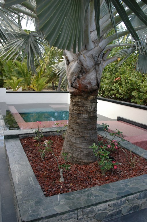
| Adding to the space problem was the need to integrate the planter for a well-established palm and to accommodate the need for a surge tank within the small pool structure – the kinds of head-scratchers that kept me on my best game throughout the project. |
Adding to the challenge was the fact that the space was almost completely dominated by a large, beautiful palm tree. Making a small hole in the ground and filling it with cement and water is easy, but being creative in transforming such a space into a visual pleasure was a whole different animal.
After some careful consideration (and a good bit of head scratching), I developed a two-stroke approach I believed would visually expand the space while retaining a sense of intimacy and up-close visual interest.
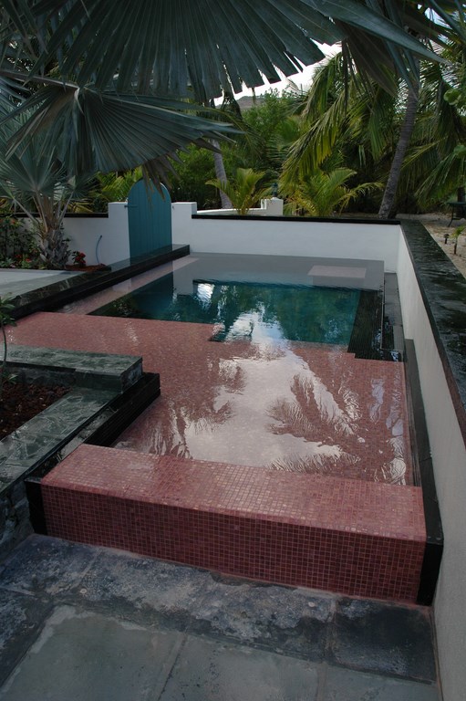
The first stroke had to do with breaking down the sense of confinement on two sides of the pool by installing a vanishing edge. I’m among those who think these days that the vanishing edge has become somewhat overused, but in this case I needed every opportunity I had to fool the eye. The result is an edge with a difference: The privacy wall stands only inches beyond the weir, and we celebrated this proximity through the use of contrast: The wall is white, while the pool’s adjacent interior is black.
To my eyes, this approach enabled us to have it both ways: On the one hand, the edge draws the eye to the surrounding hardscape and landscape by virtue of its dark, reflective quality, thereby expanding the sense of space. On the other, the edge spilling into the white background conjures curiosity and a sense of mystery about the nature of the boundaries that define the space.
DEPTH AND DETAIL
Naturally, designing the project was one thing while building in the allotted space was another.
In excavating, for example, we found that the low privacy walls were supported by a spread footing against which we’d have to place the pool’s shell. This forced us to construct the vanishing-edge gutter right on top of the footing with minimal expansion, which limited both the size of the gutter and its surge capacity. After a few volume calculations, we settled on a gutter size that was deemed acceptable.
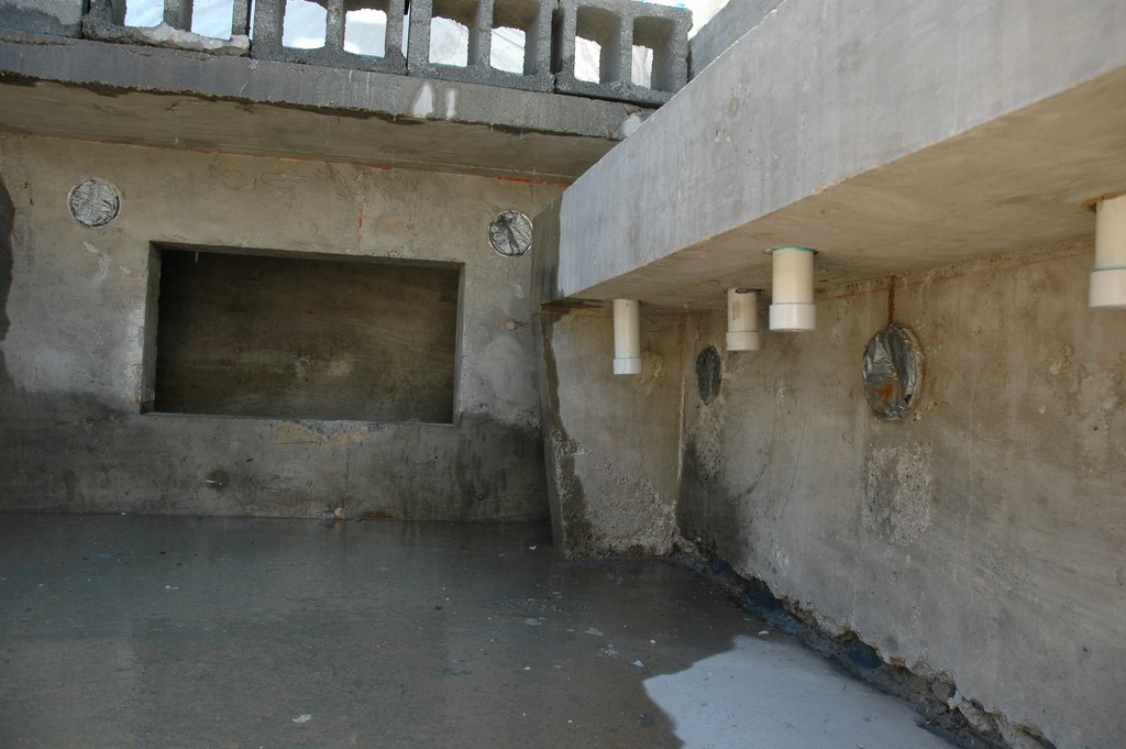
I designed the gutter detail with slope and additional drain pickup points that emptied into a pipe paralleling the gutter – virtually doubling the gutter size – with everything flowing into a remote surge tank. For some reason, the concept of a separate tank really annoyed the client, so we needed to develop Plan B.
With a good amount of pondering, I decided to make the surge tank an integral part of the poured-in-place pool shell by tucking it under a thermal ledge that would replace the steps we’d originally been considering. This in turn led to a decision to draw attention to the ledge with a vivid, coral-colored glass tile.
| To me, the keys to making designs work in close quarters include selection of the right materials and development of a suitable color palette. In this case, we used contrasts between light and dark colors within and around the pool to move the eye – from one long angle to the vanishing edge and the mystery of the disappearing water and from the other to the planter and the graceful palm. |
Now access to the tank became an issue. Rather than install and concealing a hatch in the planter above the tank (an idea the client rejected), we instead placed an submarine door on the inside of the pool’s structure below a ledge, where it is effectively hidden from view but is set up with a watertight separation between the pool and the tank.
I also decided to use the existing Palm tree planter as an anchor to the overall space. I had wanted to demolish the stone planter, rebuild it as part of the pool wall, then veneer it as before (another idea the client rejected), so instead we integrated the look by raising the bond beam of the pool to make it appear to be an extension of the planter’s structure.
As is the case with most exterior designs, the colors we used were critical – especially in so small a space. I like working with dark interior colors for watershapes to enhance their reflective qualities, and in this case I wanted the pool to be a mirror that would truly extend the sense of space in much the same way interior designers use mirrors to make rooms seem larger.
Wanting more than the reflective surface, I decided to add some additional dimension to the space by contrasting the pool’s darkness by using the above-mentioned coral-colored tile atop the thermal ledge, thus creating an area in the foreground that draws attention through the water to the pool’s interior finish and lends additional visual interest (another dimension) to the overall composition.
The surrounding hardscape is finished with black absolute granite along with a dark local stone. The local stone is a beautiful material with spectacular veining and subtle color variations. It’s also very dense and, when cut, presents what almost seems like a deliberately polished surface. To the best of my knowledge no one on the island has ever used the material in this fashion.
A MESS IN TEXAS
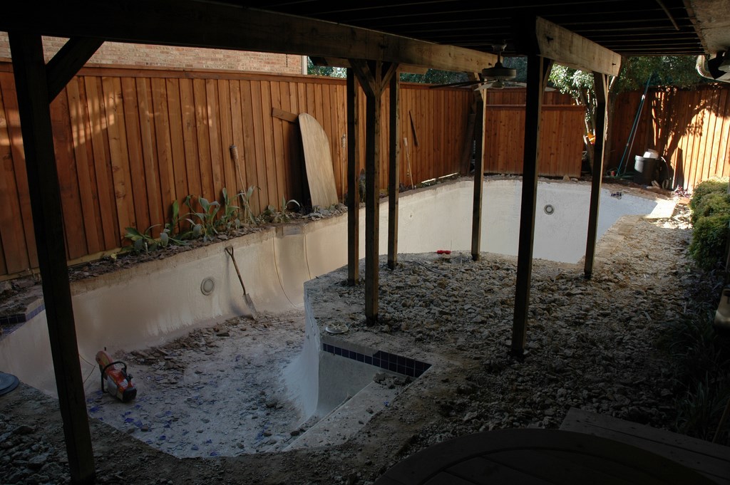
The second project featured here moved forward in an upscale neighborhood of Dallas. It posed site challenges of its own, including the oversized existing pool, the confining house and fences and an overhead wooden deck with multiple support posts that intruded on the pool’s space below.
The design approach here involved eliminating as much clutter as possible, enhancing utility and opening the space visually to the greatest possible extent. In this case, my approach was about segmenting the space and using soft transitions to create sensations of variety and movement within the long, narrow yard while doing a better job of balancing the proportions of pool, hardscape, deck and landscape.
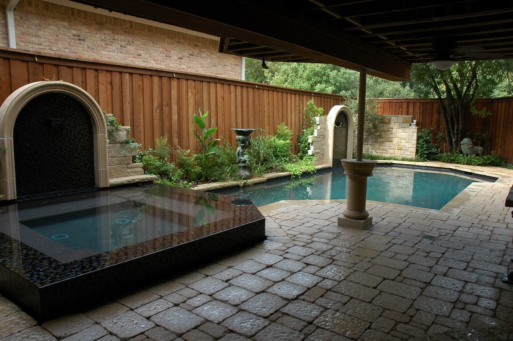
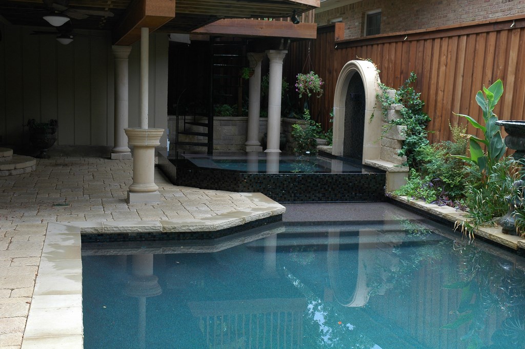
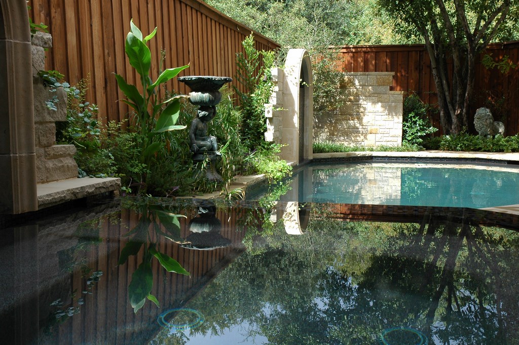
To do so, I worked with a pair of vertical elements – two tiled, arched panels that rise above the outer edge of the pool. These serve both to reduce the “looming” quality of the existing fence and change the visual nature of the yard’s boundaries. The arches include tiled weirs that spill water into the pool as well as what are apparently remnants of an old stone wall that soften the arches as they disappear into the landscape.
| In this case, clearing away visual intrusions was the key to opening a small space to its fullest potential. The elevated wooden deck was too important to remove, so we lightened the visual load from all angles below by replacing the wooden supports with a new system of I-beams and posts. |
Before we really could get started with those smaller details, however, we had to deal with the immense problem of the overhead deck. In my discussions with the client, I heard that it was in near-constant use and was also the main traffic conduit for accessing the pool, which meant that removing or reducing it (my preference) was completely out of the question.
The overhead deck was not the issue in and of itself; rather it was the presence of the eight wooden posts that supported it and added considerably to the clutter of an already crowded space. There was also the fact that the posts didn’t fit in the old-world motif the clients craved.
The solution turned out to be fairly straightforward: A structural engineer was retained to design a new deck-support structure that would minimize the intrusion on the space below, and all it took was an I-beam supported by two metal posts. The trade off of two metal posts (clad with cast stone) for eight wooden posts was just perfect.
For the pool itself, the client wanted a shallow game pool with a spa, which meant raising the floor of the old, deep pool. Again, we consulted with the engineers and modified both depth and size, the result being a pool that has about 20 percent less surface area than it had before to free up some much-needed deck space.
SUBTLE SOLUTIONS
The basic design approach here involved playing with vertical elements, reflectivity and color.
Vertical elements can exacerbate a sense of confinement if not handled properly. In this case, for example, linking the two arches with a solid wall would have made matters worse in the yard rather than better. As they stand now, the arches we developed by playing with models beforehand now work beautifully together, softening the lines on the back side of the pool and rising to a level that fits proportionately within the space.
And as the landscape matures around and between the arches, the softening effects will be enhanced to a point where the environment will seem remarkably open despite its narrow confines.
The use of color enhances these effects with a palette that includes a variety of dark, rich colors. Inside the arches, for example, we used the Moroccan Desert mosaic blend from Oceanside Glasstile (Carlsbad, Calif.) to accentuate the shadow effect and create a dark spot that retreats from view and opens the space.
The spa is somewhat large relative to the pool, but it was sized to meet the client’s desire to entertain groups of people in the spa. We used the same Moroccan Desert tile here, but to a different affect in that the dark color downplays the spa’s large size relative to the pool while enhancing its reflective qualities.
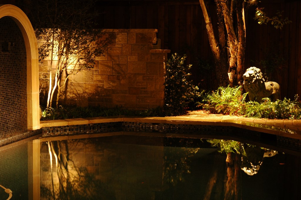
| The view from the new spa is engaging both day and night, with the arches and landscaping softening the sense of confinement caused by the proximity of the fence beyond – and some well-placed lighting lending a sense of drama to the setting when the sun goes down. |
Setting up the spa with a perimeter-overflow treatment is another approach we used in attempting to maintain a sense of visual balance between pool and spa. As stated above, the use of the overflow detail sometimes is advocated by the designer for no other reason than the adequacy of the budget rather than for purposes of the design. Judging the extent to which these measures work is in the eye of the beholder, of course, but we did what we could to manage visual weights in a way that brings things into balance.
Above all, we worked to ensure that the water’s overall surface would be perceived as a single reflective surface, both as a means of deflecting attention from specific elements within the watershape and of drawing eyes to the arches, stone columns and surrounding landscaping beyond the water’s edge. The result is that the pool and spa mirror the surroundings and visually increase the perception of spaciousness.
This project also involved us in enhancing the nighttime experience of the backyard with the installation of several low-voltage lighting fixtures within the deck structure and in some of the surrounding trees for a moonlight effect. The clients wanted garden art as part of the overall composition as well.
With most of my clients, I offer services beyond backyard design and construction. I will shop for furnishings, statuary and even outdoor textiles in some cases — and this project was one of them. On one such shopping excursion, a bronze lion with a beautiful patina was selected for an out-of-the-way planting bed. This statue recedes into the landscaping during the day but is a well-lit focal point by night – a simple element that is one of the most visually arresting on the entire site once the sun goes down.
RESTING ASSURED
Most of the projects I’ve done in limited spaces are defined by the fact that working on small canvases almost invariably leads to compromises.
In both of these projects, for example, I was working with clients who had definite ideas about what they wanted, and those desires occasionally didn’t align with what I considered to be the best design solutions. That said, much of the fun of projects like these is the feeling you get that you’re essentially solving a puzzle.
It’s reasonable to assume that as lot sizes in the U.S. real estate market continue to shrink relative to the size of new houses, there will be a growing premium on designs for smallish backyard spaces. This will increasingly force us, as designers, to confront issues of intimacy, proportion, color and traffic flow on levels few of us probably want to consider – but the opportunities to do so will increasingly be there, and I for one will welcome them.
To be sure, I enjoy working on projects where space isn’t an issue, but I have to say that I’ve come to love working in confined areas and find a particular level of satisfaction in making multiple visual elements work in close quarters. For me, there’s something special in designing a compact space with details that enable those who view the space to come away with the feeling that they’ve had a rich and enjoyable experience.
Small, large or in between, isn’t that what watershaping and exterior design are all about?
Michael Nantz is principal and founder of Elite Concepts by Michael Nantz in Dallas and Austin, Texas. A designer and builder of high-end custom commercial and residential swimming pools, spas and waterfeatures, Nantz has studied construction management and architectural design and is often called upon by architects and engineers to offer design and consulting services for elaborate watershape installations in the United States and abroad. He joined the pool and spa industry in 1988 and served the National Spa & Pool Institute in various capacities, including a six-year term with the Builder Council (for which he was chairman for one year). He also has judged many design competitions, served as an instructor and won many NSPI design awards. He is also a Platinum member of the Genesis 3 Design Group.


