Organizing Chaos

The backyard-design process, it’s been said, is something like completing a jigsaw puzzle: You start with a framed space and assemble available pieces to fill in the picture.
But there are two problems with this common analogy: First, the number of available pieces far exceeds the physical capacity of the frame and, second, there are no precut tabs or notches to guide placement of the selected pieces. So you’d be closer to the mark if you said that design is like the worst, most challenging jigsaw puzzle ever – and even then, the typical backyard-design task is much harder.
Shining a light on this process is the motivation behind this series of articles, in which we’ll start this time by looking at the component parts of a project we completed a while back, offering them up here without the usual images of the overall site to set the final contextual frame. The goal here is to show how large a bag of possibilities any competent designer has in working with a setting, a client and a budget to organize spaces that make sense.
In performing this component-identifying exercise with a nice but not extraordinary project I designed and built in Kansas City, Mo., it took me less than a minute to isolate the 38 details highlighted below – and we all know I could find dozens more if I included the preparatory and construction steps leading up to project completion, not to mention work on the equipment pad.
The point to remember is that in each and every case seen here, the client and I (and often I alone) made a deliberate decision to use each specific detail in a certain way in a distinct place while passing through the near-infinite number of options we had at our disposal.
The images below are arranged in no particular order. In fact, we’ve scrambled them in a way that will make it difficult to assemble the individual details into a coherent outcome. Next, in some articles to come, we’ll double back to the project’s origins and describe what was involved in developing a very specific scheme for a very particular client before we wrap things up with a brief look at the completed project.
Buckle up: It’ll be an unusual ride!
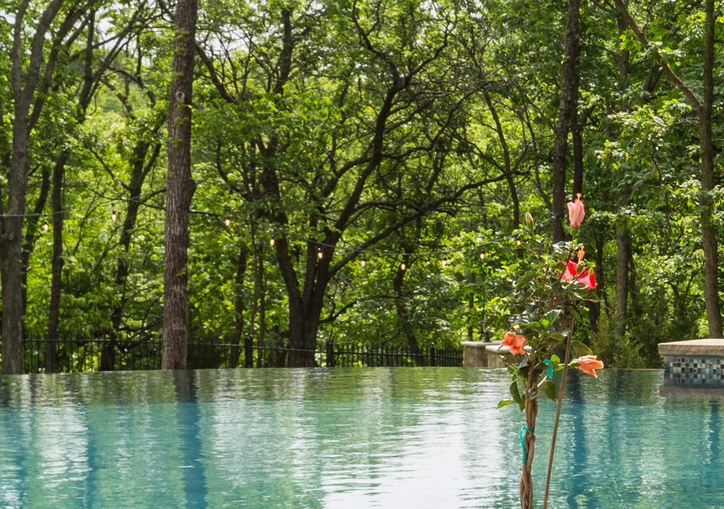
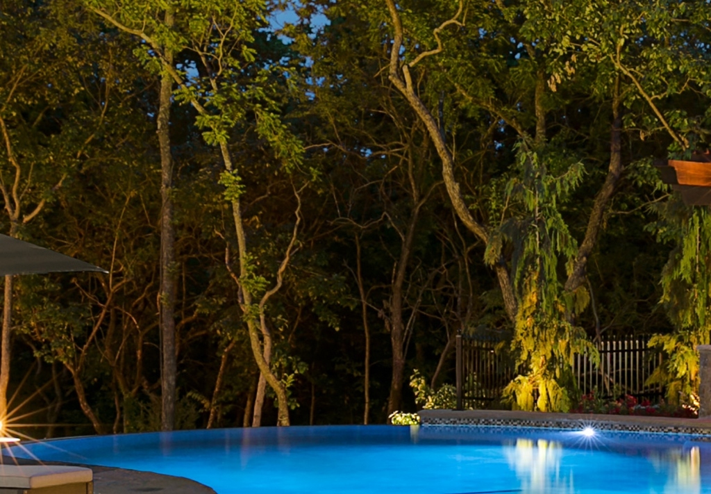
Vanishing edge
The property’s topography headed us in this direction from the start by dropping off toward the forest beyond. In this case, it’s not as dramatic as a hilltop or water-on-water view, but the effect is still glorious and can be seen from inside the house as a constant invitation to venture outside to see more.
Retaining walls
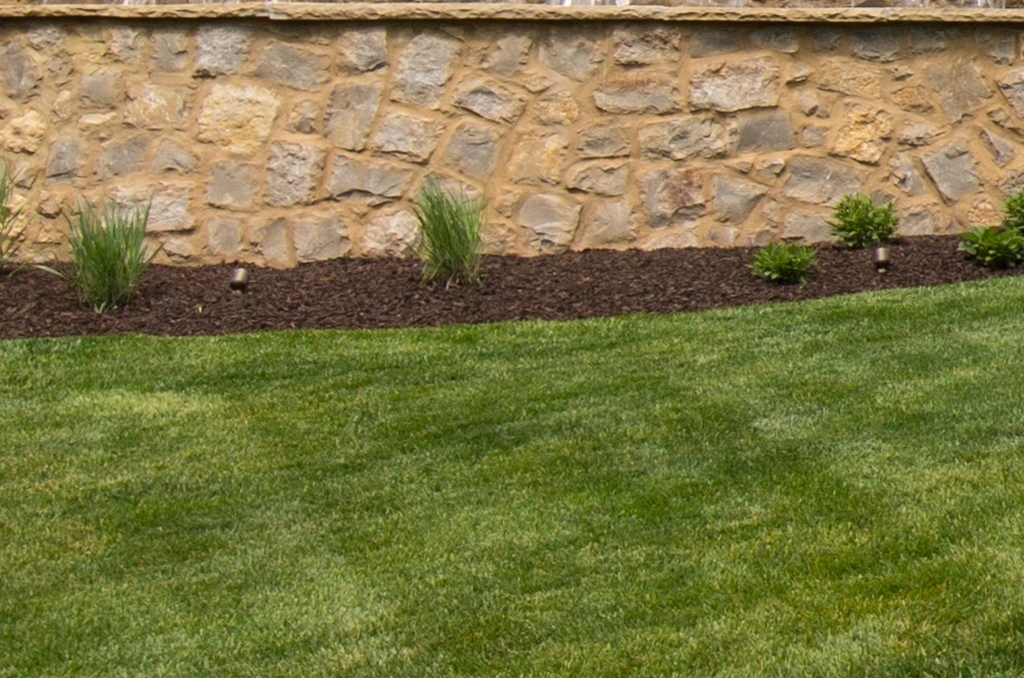
There are multiple retaining walls in this project – some out of sight but others in close proximity to the pool area that required a more refined aesthetic approach. To harmonize their look, the key landscape walls and the pool’s exposed bond beams were all veneered with limestone rubble, and then a slush-and-brush approach was used with the mortar – all in keeping with the property’s general Country French style.
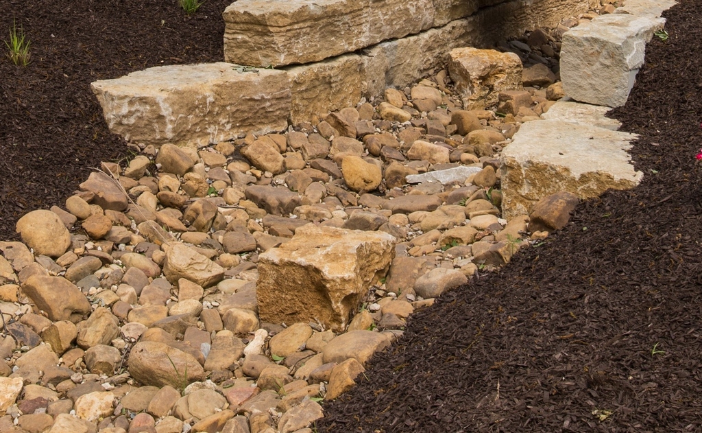
Dry streambed
We often set up dry-cobble streambeds in our landscapes for decorative purposes, knowing they will, in times of need, also help to channel surface water safely away to lower-lying areas. In this case, we used river rock in flat and cobble forms to match tones of the limestone used on the house.
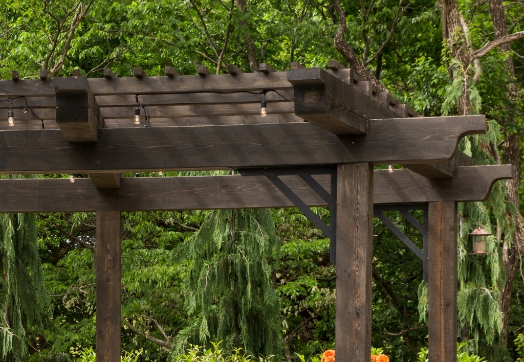
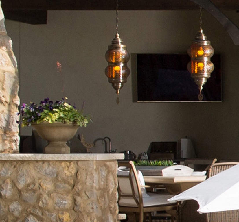
Pergola lighting
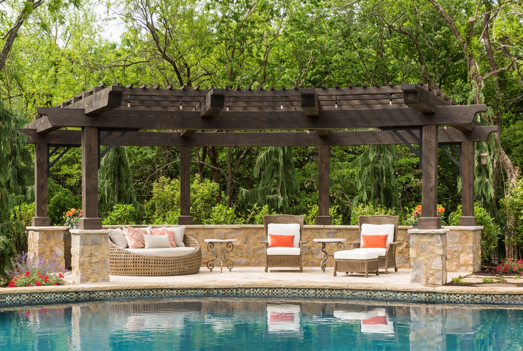
While lighting is important in any space used for dining or entertainment, with a pergola placed in this prominent a position it’s perhaps even more important to consider how it will look from inside the house or across the pool. Done well, the remote illuminated space will be warm and inviting from all angles – and a conversation piece on its own.
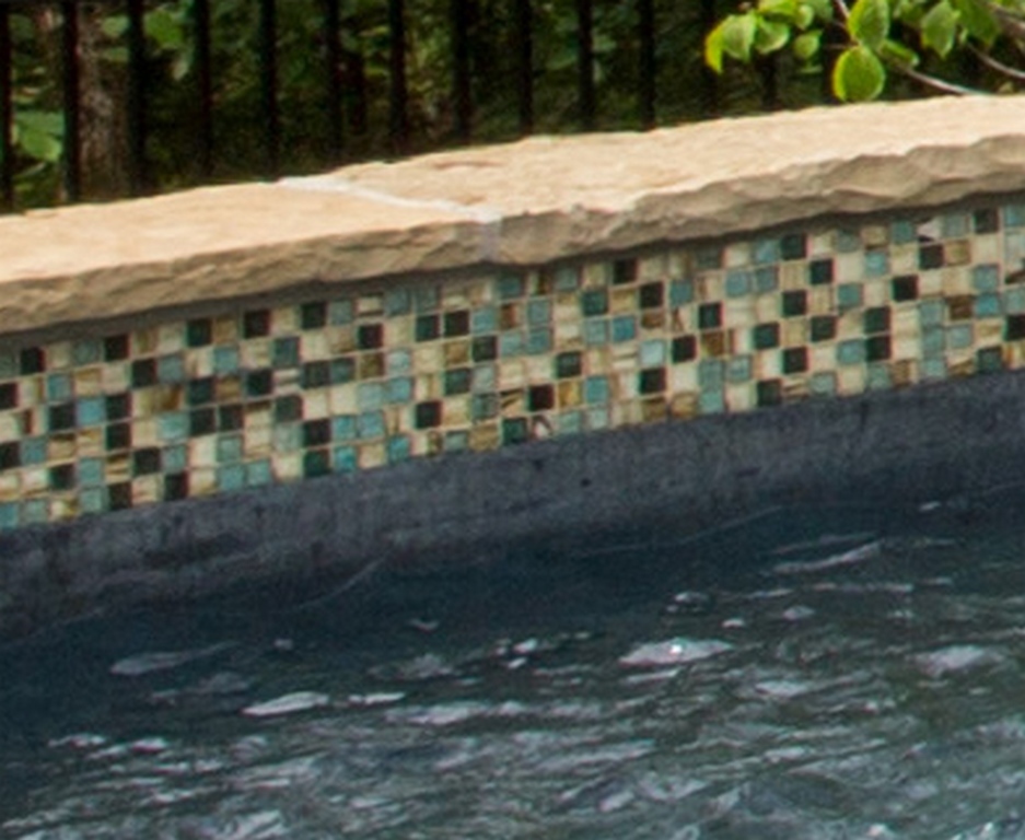
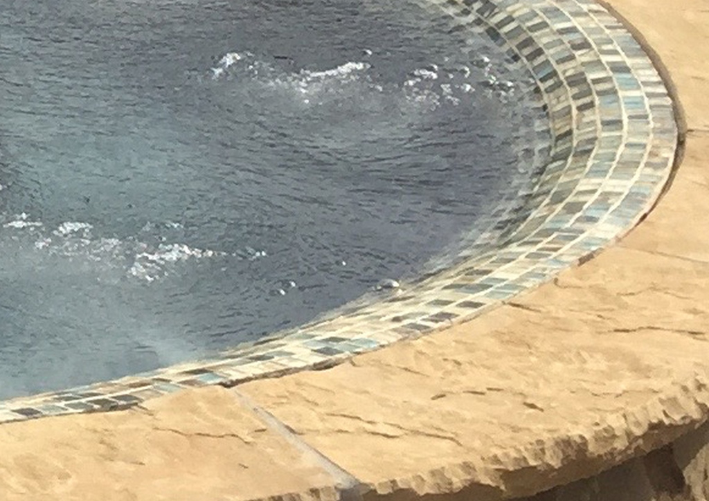
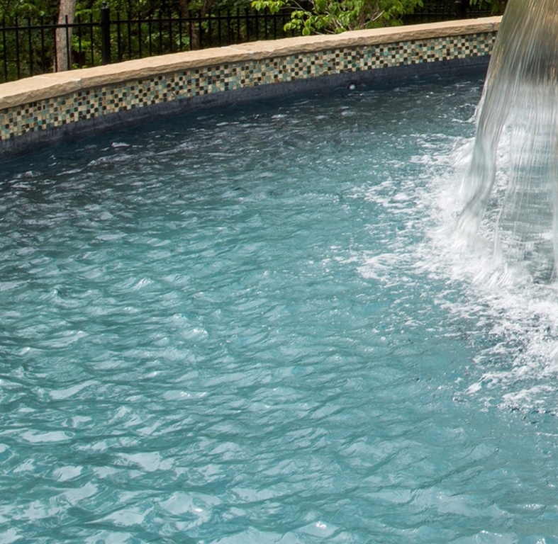
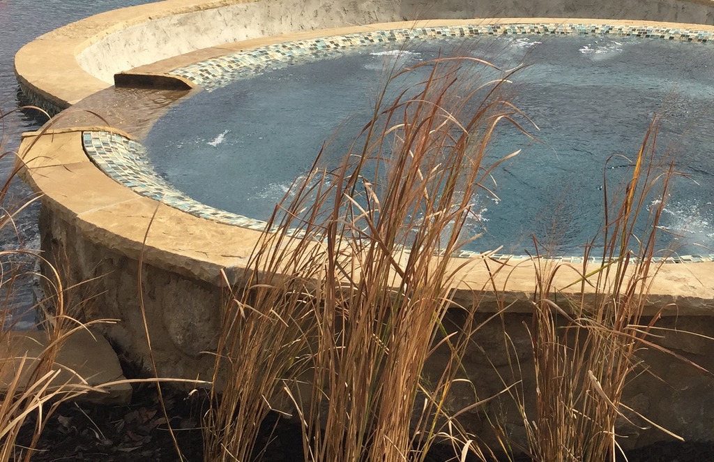
Waterline tile mosaic
This was a material choice that became oddly complicated. We showed the client a sample of this glass-tile blend, which at the time was rated for pool use, and he wanted it. Later, the manufacturer changed the rating and requested that we use an epoxy mortar and grout to meet new warranty terms. It was an unexpected twist, but one we navigated with ease.
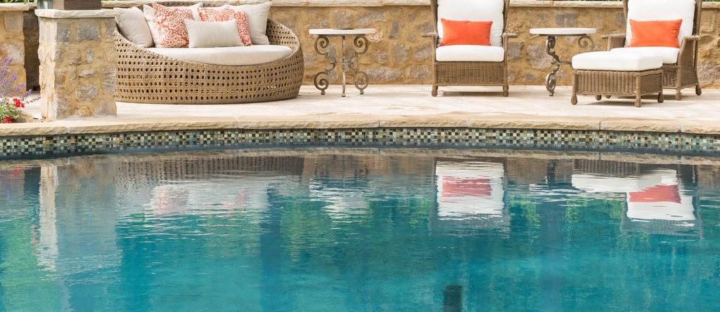
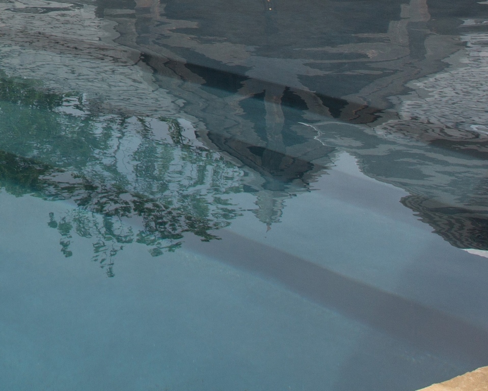
Reflections
We always see the still surface of water in our pools and spas as a prime feature in our projects, but it’s something relatively few homeowners consider as they enter the process. Our portfolio comes in handy here: We ask our photographers to capture day and night reflections of structures, fire features, trees, lights and more in recording our work; this helps our clients see the tremendous potential of mirror images in deepening their appreciation of backyard spaces.
Landscape lighting
We had control over the entire backyard space here and considered placement of landscape lighting as a key part of the design and installation planning. In this case, we specified extensive use of accent lights around the backyard; the landscape contractor had similar lighting-friendly inclinations and even expanded somewhat on the program we devised.
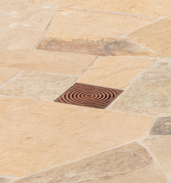
Deck-drain cover
We approach selection of deck-drain covers with the prevailing architectural style in mind. In this case, the home’s Country French style led us toward covers made of cast iron. To make it happen, we set the client loose to make the specific choice from among a few manufacturers we recommended. In this case, he went with a simple, cost-effective option.
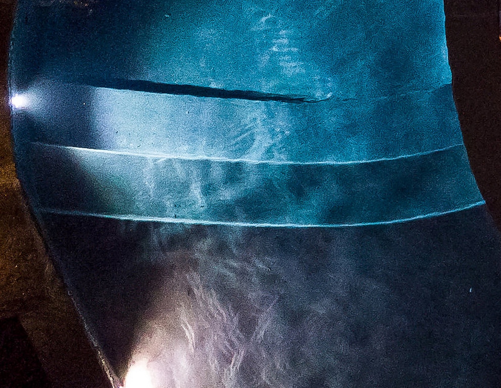
Illuminated pool stairway
I am a firm believer that vertical details within a watershape are very important, especially on flatter properties: Just a single staircase can provide all the required visual interest – and can do so day or night with the addition of some lights. In this case, we clad the larger staircase with the decking material and, in consultation with the client about how much illumination to use, inserted small, low-voltage LEDs into the risers.
Outdoor furnishings
The client worked with an interior designer’s recommendations for both the indoor and outdoor/patio furnishings. We often get involved with the outdoor choices, but in this case we just made recommendations on placement, size and type for another designer’s consideration. More often, homeowners want to do the shopping for themselves and make at least the exterior calls, basically because they do not feel a need to pay us to make these decisions for them.
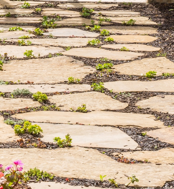
Garden path
We always prefer to break up the pool-deck area so a single hardscape treatment doesn’t entirely surround and isolate the watershape. In this case, we wanted some sort of rusticated path leading to a structure near the pool and set up this more open, transitional, “gardenesque” approach in place of a section of the pool deck, with wider spacings we filled with groundcovers and bark.
Beach entry
There’s a lot to be considered by way of material selections for this sort of detail in Kansas City – a place where temperatures can swing from zero to 60 degrees in a matter of hours. On such days, a plaster field will crack where the fluctuating water’s edge meets the exposed entry surface. Our solution: Use an aggregate-based mix for the entry area and separate it from the main pool’s interior finish with a narrow tile break. This way, if (or when) the finish fails in the exposed area, removal and replacement will be simple.
Garden bridge
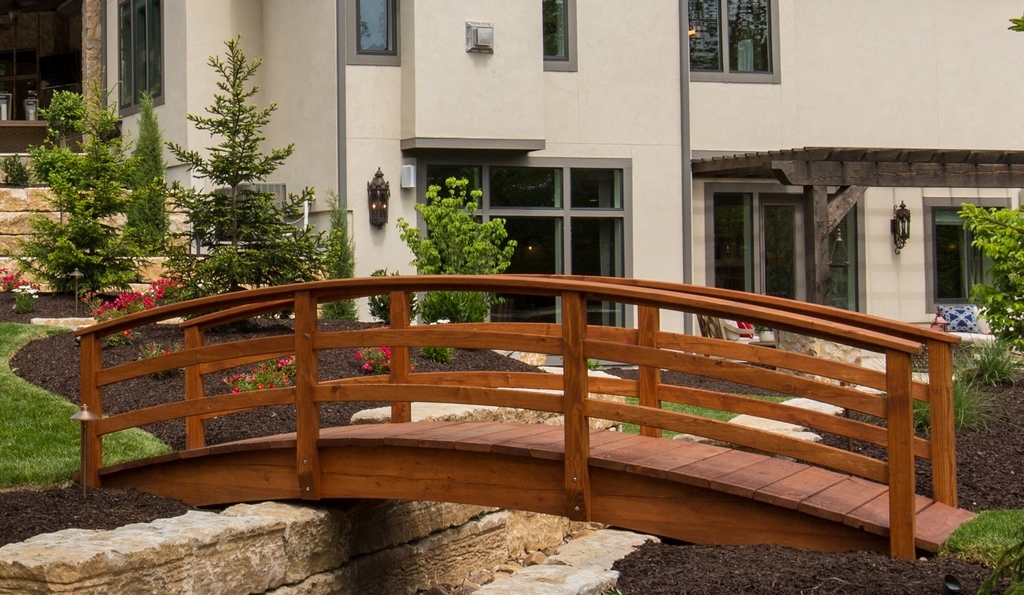
This was a client-generated afterthought intended to dress up a part of the yard – a decision that disrupted (and in some ways compromised) a comprehensive, well-considered design scheme. We had graded the space to eliminate some walls and terraces and establish a larger lawn area near the house. He insisted on adding several small walls that made the area confusing – then had the idea of spanning the space between two of the new walls with a bridge.
Safety fencing
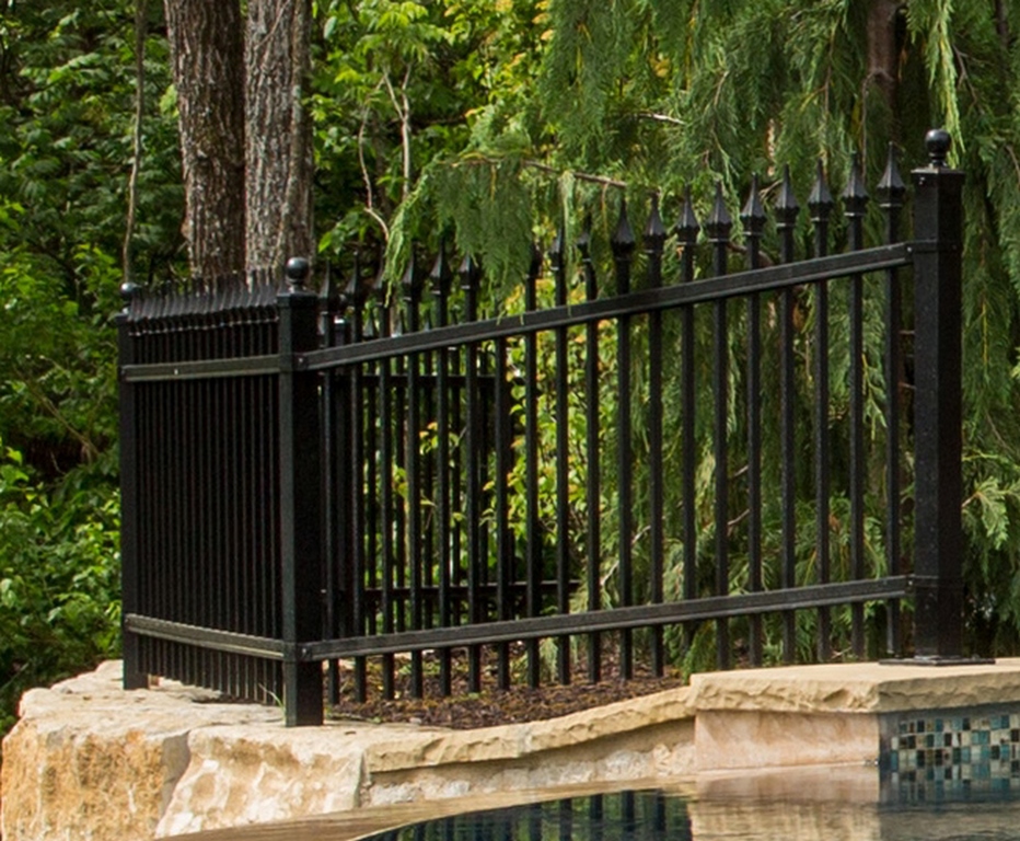
We’re always conscious of elevation changes around our backyard sites and, for obvious safety reasons, incorporate fences or railing systems into our designs as needed. In this case, the homeowner wanted a finial picket detail; we found a powder-coated version in black so it would recede visually into the forest/landscape backdrop.
Vanishing-edge dam wall
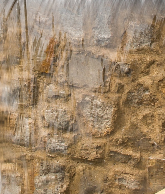
We questioned the use of the limestone slush-and-brush finish on the vanishing-edge dam wall, as we feared, even though it offered some visual continuity, it might also be troublesome in our climate zone as well as being too open an invitation to scaling and efflorescence. But the mason convinced the owner this detail would be fine, and they went with it despite our concerns.
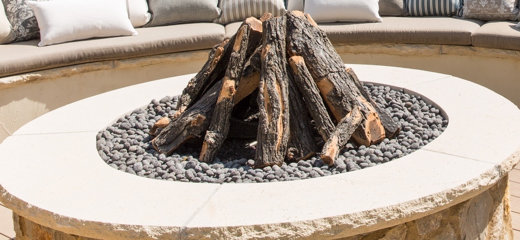
Fire pit
The fire pit is placed immediately adjacent to the spa and pool and is now a focal point for those who want to be in the pool environment yet stay warm while communing with folks in the water. Initially, we discussed the concept of a raised, round fire pit filled with glass rocks and faced with limestone to match the house. Once we started, the client wanted something more vertical and reminded us of a log-set approach we’d used on another of our projects. It was an easy adjustment – and a nice naturalistic touch.
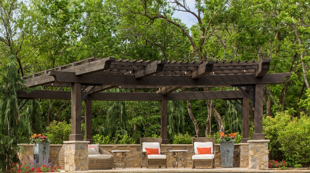
Shade structure
In developing shade structures, we often have them echo the contours of the adjacent watershape. In this case, the sweep of the pool let us go for a dramatic, curving cedar beam to front the structure. Both the curvature of the beam and its weight required some special engineering, but the final product is visually light – and alluring day and night.
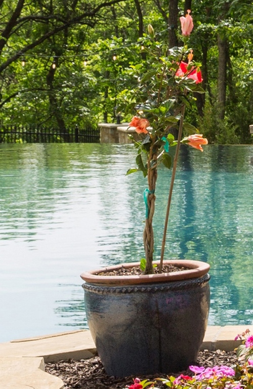
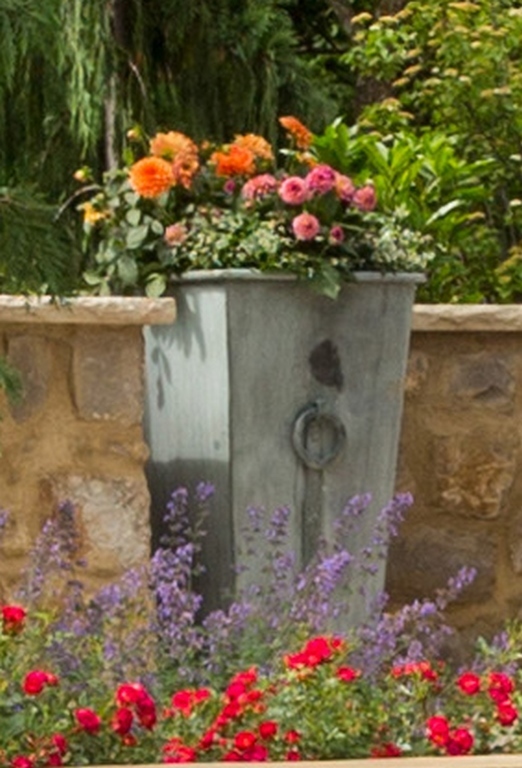
Potted plant
We often specify potted plants around our pools and spas to create vertical interest and provide for seasonal color and basic material contrasts. In this case, we indicated placements and, with some style recommendations, left specific pot selection to the client.
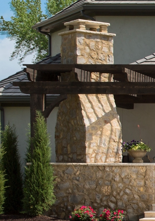
Outdoor fireplace
The client liked the formal outdoor-fireplace concept and worked with the builder and the mason to implement it after we modeled it in three dimensions and incorporated the fire feature and a pergola into the patio design. As for detailing, the owner set the tone with a photograph he had; the mason took it from there to produce a slush-and-brush-style stone veneer.
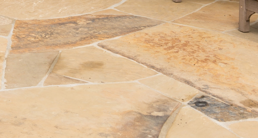
Flagstone decking
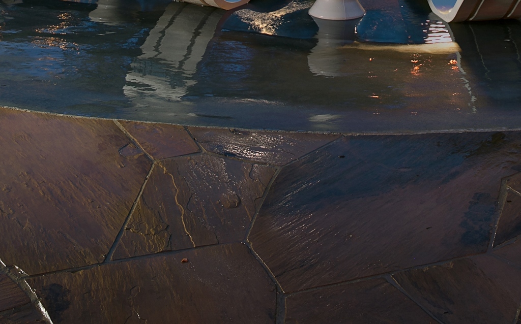
We love using flagstone for pool decks whenever it makes sense, in this case with a mix of 30 percent dark and 70 percent light pieces. We know with areas this large that smaller paving materials and their joints are visually busy, so we used big flagstones mixed in with a few smaller stones as infill and then kept our eyes open to minimize the quantity of run-on joints.
Birdbath
This is an area where we let the homeowner make the call in selecting key garden ornaments and features. In this case, the birdbath was chosen to harmonize with the Country French architecture of the home.
Rolled-edge spa wall
This is a detail I was first exposed to about five years ago – and I adopted it immediately because I liked the level of comfort it provides to spa users. More than that, it’s a great way to showcase tile! The client saw this detail for himself on another of our projects and wanted us to incorporate it into his design as well.
Outdoor sound system
This was another detail the homeowner tackled, but we prepared the way by using our experience in working with audio consultants on other projects to map out the yard for strategic placement of the sub-woofer and ensure adequate placement of other speakers on the pergolas and other structures.
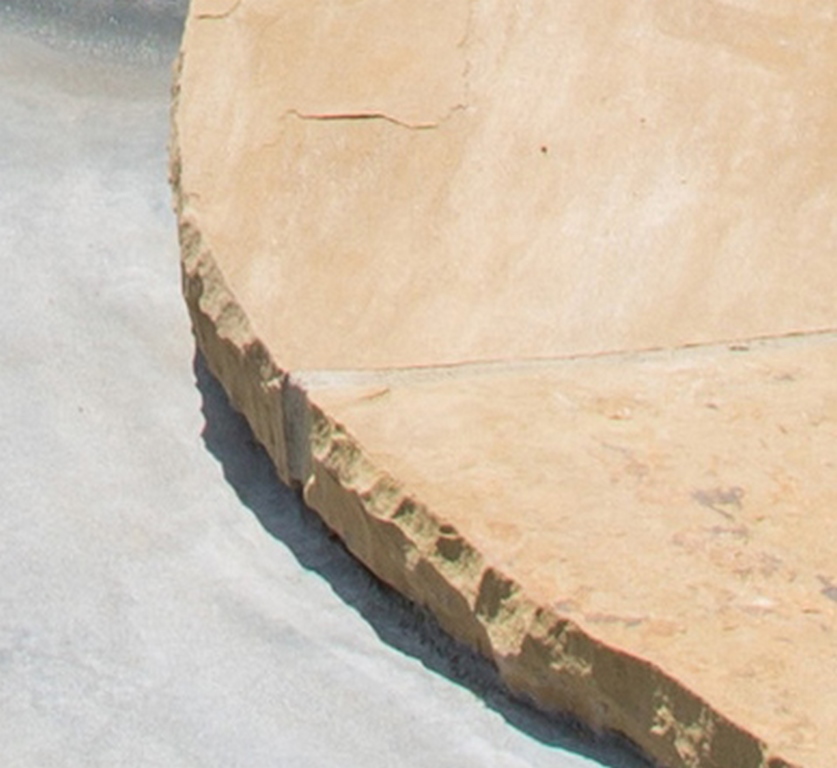
Hammered-edge stone coping
The charm of this stone detail is clear enough that many clients opt for it – but we offer it with two warnings. First, this natural-looking edge involves lots of time and labor in the chipping process; and second, it doesn’t mix well with swimsuits (especially nice ones with fine weaving) because the rough surfaces tend to snag the fabric. For the most part, clients get beyond those factors with ease because the chipped look has so much going for it.
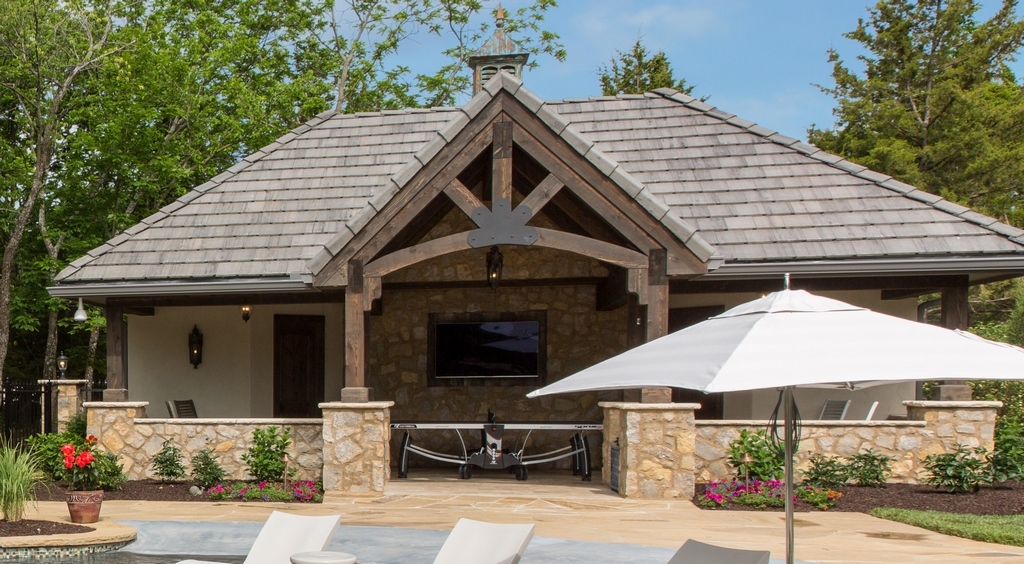
Pool house
This was actually a late addition to the design package, but once the client grabbed hold of the concept, we generated several designs to meet his needs. As often happens with this sort of interjection, the structure started out small but kept growing as we generated new three-dimensional models and the homeowner became more and more engaged. By the time we were done, the structure would include the equipment room, a seating patio, a bedroom and a bathroom. All of this meant rerouting utilities to the new space as well as developing extensive grading and drainage plans.
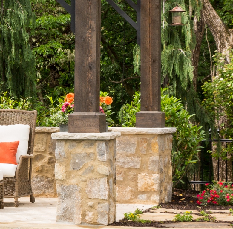
Stone column surrounds
This approach is a must in visually grounding the pergola – and a sharp improvement over running seemingly fragile wooden posts down to deck level. With the back wall in matching material, the lower structure pulls together as a solid foundation that rises to carry the pergola’s visually lightened beams.
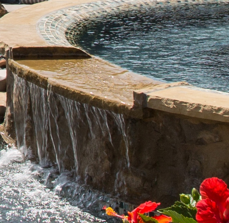
Spa spillway
This is a necessary detail that helps move water across the pool toward the vanishing edge on the other end of the pool. The spillway is also a wonderful source of subtle sounds and a sense of motion when in operation; in this case, we also harmonized the look with the chipped-coping detail so that it looks great as a waterfeature but is also consistent with the pool’s overall look when the water isn’t flowing.
Multiple skimmers
We sometimes use multiple skimmers on larger or complex pools to ensure adequate clearance of surface debris, but the second skimmer wasn’t called for in this case and was instead the result of the client’s desire, after construction started, to add a waterfeature. Once the wall was shot, I called a meeting in which I asked him to eliminate the waterfeature; with everything in place, he could see how disruptive the feature would be; the sole artifact of the decision was an extra skimmer that was intended to remove debris close to the water feature. Now it’s just an extra visual break at the waterline – functional, but not really necessary.
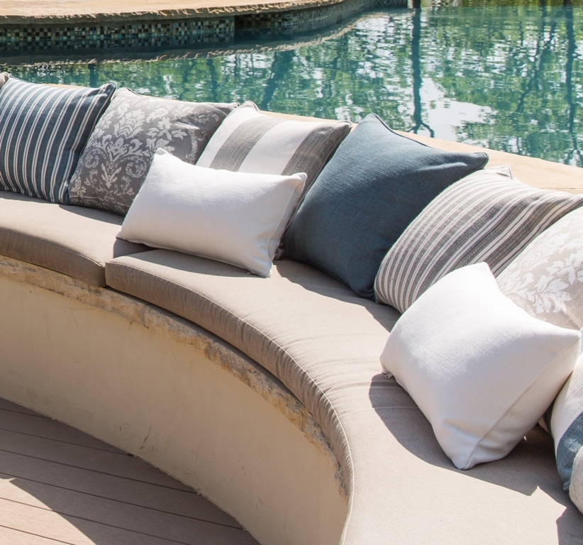
Sunken outdoor seating
At first, the client didn’t really “see” the sunken-seating concept. But when we presented it as a three-dimensional model, he loved the idea and understood how, with a fire feature, it would serve as a sheltered out-of-water gathering place from which it would be easy to monitor in-pool activity. He was so into it, in fact, that he went on to select the pillows and their colors himself.
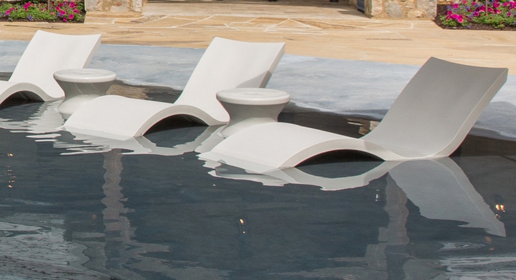
Shallow lounging area
This is one of our favorite design details these days, and we call them “reef ledges” or “reef tanning ledges” depending on how our clients intend to use them. It’s been our observation that these areas quickly become the most used parts of their pools, with spaces for in-pool chaises, active children at play, adult relaxation and more. It’s a great detail, and we’re now describing it as the functional, focal equivalent of a “kitchen island for the pool.”
Vanishing-edge catch basin
We made the vanishing edge trough wider and deeper than usual here to create a second swimming area, adding steps to ease access to it. The client liked this concept and insisted that we add a bench at the base of the vanishing edge’s water curtain – a bit awkward, but a detail he loves.
Garden ornaments
These are more owner-selected components and placements – nice, appropriate, personalizing touches.
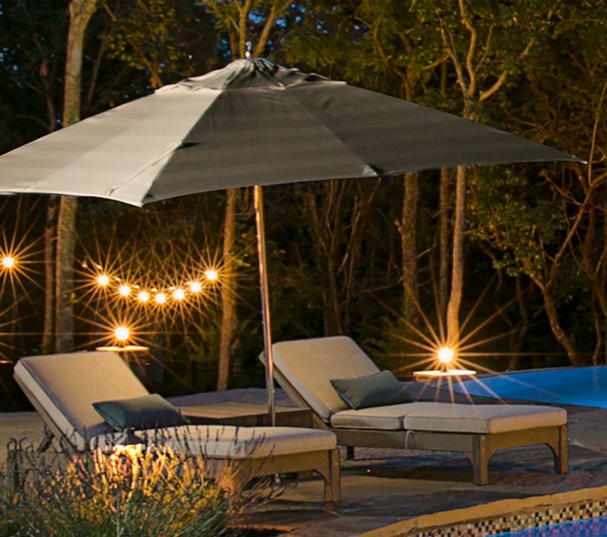
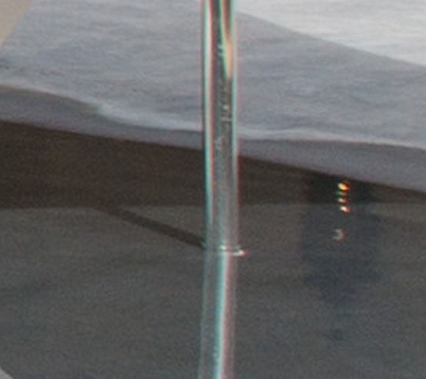
In-pool umbrella stand
We see umbrellas as must-have features for beach entries and shallow lounging areas and prefer placing stanchions directly into the shell to avoid the use of stands that are likely to scratch to area’s finish. Stanchion placements require some consideration of sun angles to optimize their value; sometimes we’ll use more than one or two to give pools users some seasonal flexibility.
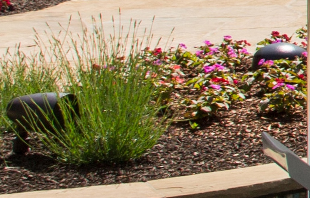
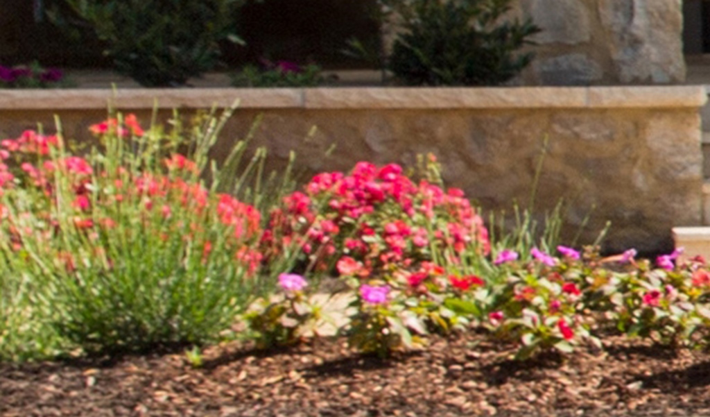
Planting beds
Where possible, we try to incorporate landscape beds in and around a pool to soften transitions among and between various hardscape elements. As often happens to meet the budget as well as the preferences of the landscape contractor, the plant palette we originally defined for this project was slightly modified – but still reflects our overall design intent.
Outdoor kitchen
In this case, the client ordered the grill and accessories for the kitchen area and worked with the mason to place them as desired. This is something we often tackle in our projects, but here it was another area where the owner was happy to get involved and save some money.
In-pool steps
A true beach-entry feature eats up a lot of real estate in pools with their required ramp length and pitch as they transition over to the shallow end of a pool. We minimized the span in this case by incorporating well-marked steps at the end of the beach area as an elevation transition. In these applications, we use wider treads and shallower risers to relax the sense of passage into the pool.
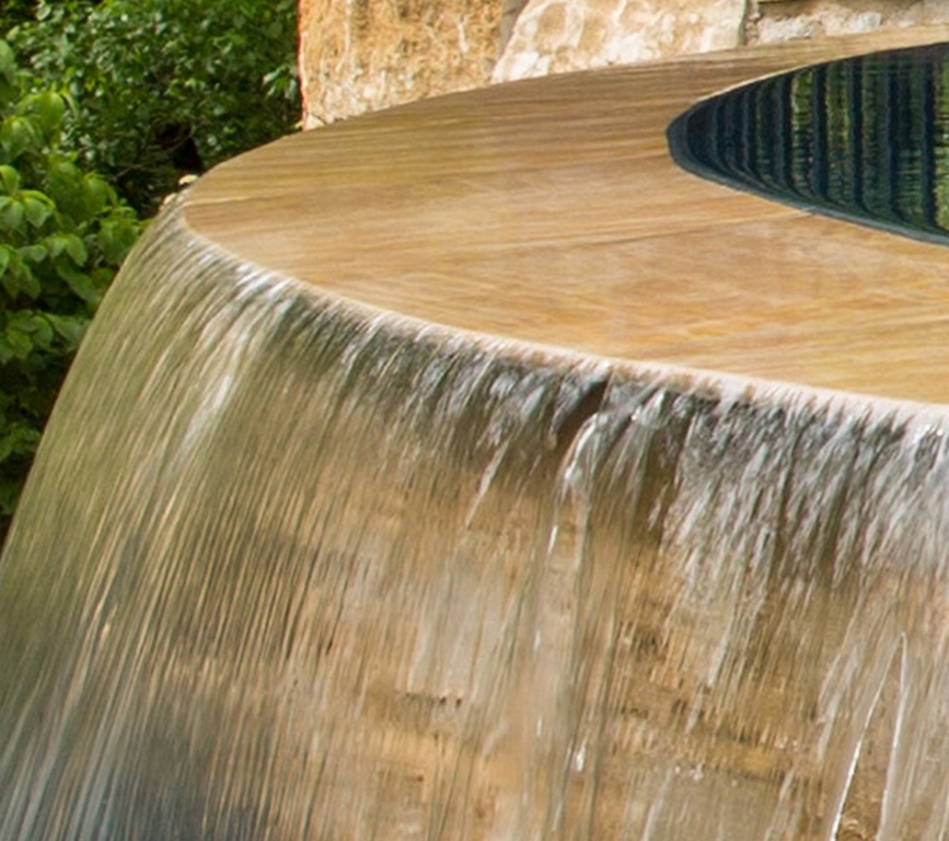
Vanishing-edge pitch
This is an area where there are many possible options, all concerned with how water is to flow across the edge. In this case, we gave the edge a slight positive pitch and overhang to create a strong, positive water flow and encourage the sort of free-falling curtain effect the client wanted.
Spa
Larger spas are becoming quite popular in our area, and that’s great because they’re easier to build than small vessels – and without much more cost. At a larger size, they’re ready as communal areas for family and friends as well as great places to teach young children to swim. Here, we elevated the structure to add visual interest and an effective spillway detail; we also spent a lot of time considering jet arrays and placements.
***
Obviously, we don’t begin designing with our hands stuck in a grab-bag of elements and details: It’s a much more holistic process than that, although I must say that after years of designing backyards for clients at a variety of levels, clusters of these options will quickly come together in response to observed trends and specific clients, sites and budgets.
I have to say, however, that this after-the-fact exercise of pulling a project apart made me think about what I do in a slightly different way. It doesn’t have any effect on how I proceed, but it makes me marvel at how easily things come together – and also helps me appreciate and understand the enormous scope and scale of the tasks at hand.
Let’s explore this assembly process in greater detail in a couple articles to come.
Next: Initial contact and the interview/design development process.
Kurt Kraisinger is a landscape architect with more than 25 years’ experience in design and consulting. In 2009, he founded Lorax Design Group with a goal of creating memorable spaces that allow people to engage in their surroundings. He received his degree in landscape architecture and urban planning from Kansas State University and participates in Genesis programs. He may be reached at [email protected].


