From Idea to Action

Most successful designers have a bit of show business in them. Whether you play the sophisticated artiste or radiate a quiet competence, it’s all about making a connection with a client who is asking you to participate in a significant project, whatever your personality or approach.
I’ve always wondered how those at the extremes of the personal-style spectrum find work, but the fact of the matter is that all of us, designers and clients alike, are individuals who respond in different ways to different triggers – and I know for a fact that the way I work isn’t for everyone simply based on the fact that we don’t win every contract we pursue.
For all that, however, we at Lorax Design Group (Overland Park, Kans.) have developed our own pattern and have found that it works for us often enough to call it successful. I’ve also learned that my own strengths in presenting ideas and communicating with clients makes the design process much easier all the way around.
Partly it’s that I’m a good listener, but it’s also because I pair that good ear with an ability to translate ideas into action and plot out trajectories that make sense to my clients and me together. The key to it all is applying what I learned in the information-acquisition part of the process (outlined in Part 2 of this series of articles – click here) and turning it into a presentation that has the potential to knock a client’s socks off.
DRAWN IN
Our direct work with clients always starts with pen and paper and an initial concept sketch. This is a distinctly old-school approach and I know lots of designers who have moved away from hand-drawing, but for me it injects too much personality into the process to make me willing to set it aside.
While it helps that I’m good at it and have training and an education that helped me develop essential skills I’ve spent a career polishing and upgrading, I know for a fact that almost anyone can learn to draw adequately enough that it can become a valuable tool in getting a point across, making a suggestion or managing the development of a detail. For me, it will always be my starting place.
Look at it this way: People happily pay to go to museums and see works of art that were crafted with two hands in media ranging from charcoal, ink or oil to clay, glass, metal and more. As a designer, I’m starting one of these art projects (in my case using pen and paper) and moving along toward what will eventually appear as a clean-lined master plan and, as needed, might evolve into a three-dimensional SketchUp, Lumion or AutoCAD display or even the output of a 3-D printer.
But it all starts in a conference room with hand-drawn, two-dimensional sketches as we review and critique the preliminary design with clients and mark any comments in red ink. Often, we’ll break out sheets of tracing paper, laying them over originals and adding or subtracting elements as we go. Our goal is to establish an extremely active, fluid dialogue at this stage.
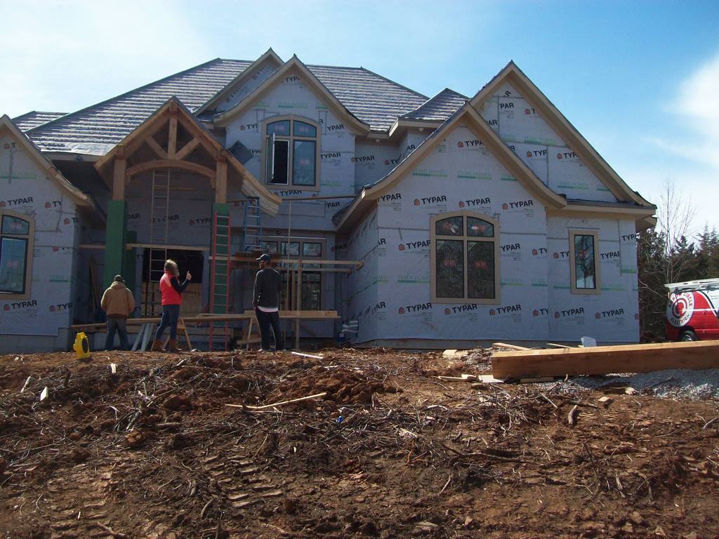
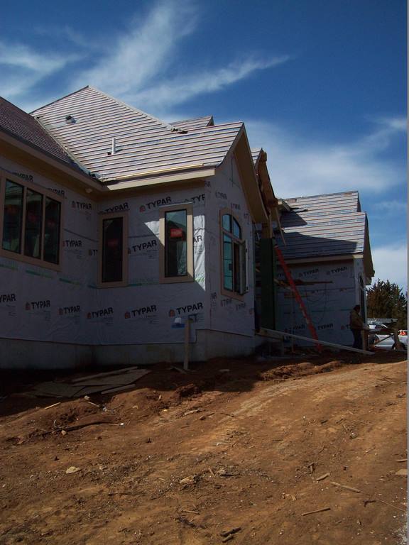
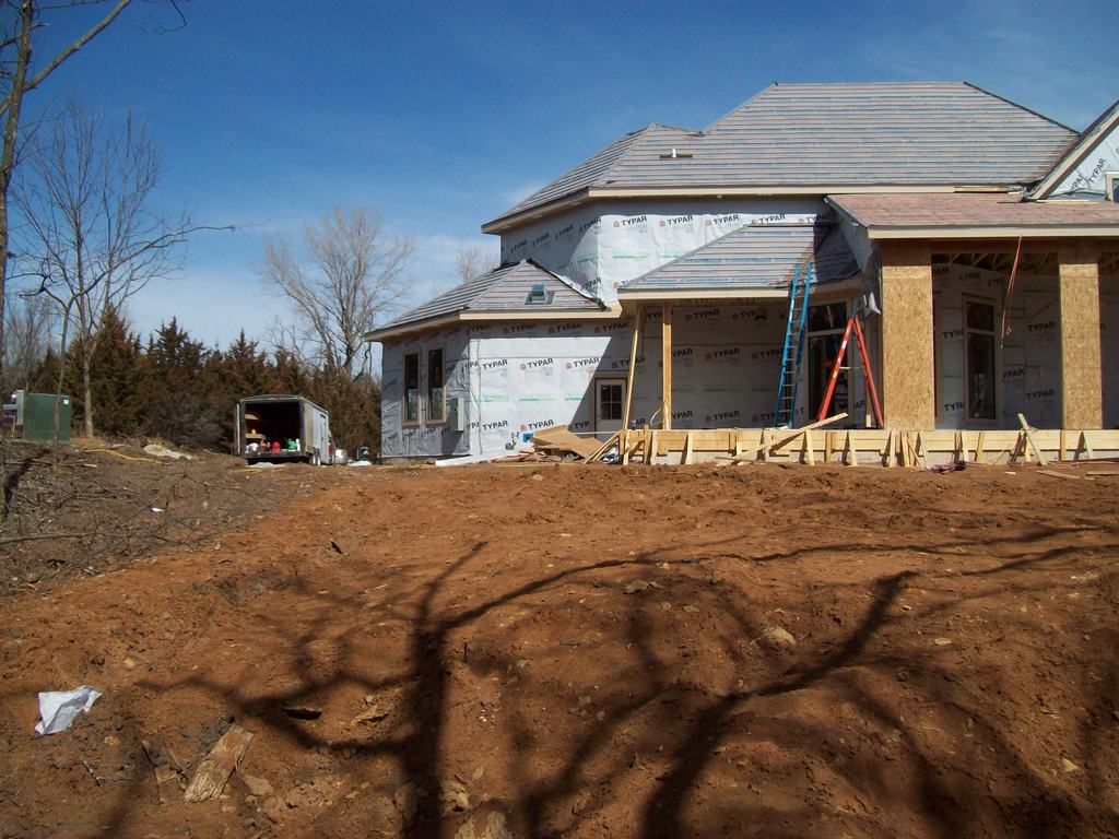
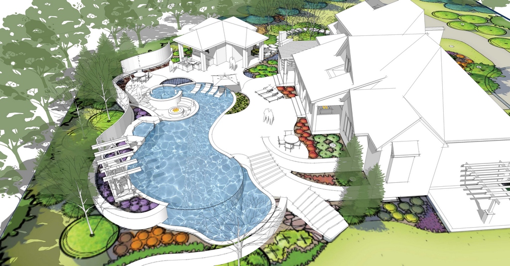
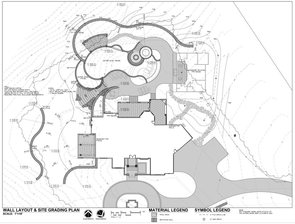
| This was the site as we first saw it and started developing a design that took form through the course of meetings both on and off site. In working through possibilities, we took the scale and style of the home into account, then started thinking about slopes, transitions and destinations at the same we time we weighed practicalities ranging from soil conditions to drainage. |
I know that my drawing skills impress my clients, especially when they offer up an idea and I break out a sheet of paper and immediately show them how this reality might take shape. Sometimes the ideas are great and easily incorporated; other times they aren’t so good, and a quick drawing that shows the negative consequences keeps us on the right track without slowing the momentum.
With the client whose project has been the subject of this series, this design consultation was eventful on many levels. As previously reported, he came to the process with lots of ideas, many of which we incorporated in the preliminary plan and brought to the table in our design meeting. But he also had some ideas we had to counter and could be adamant about certain details.
As was discussed in the first article in this series, the initial design included a large number of elements and we gave free rein to his own ideas in a few significant cases. But on balance, the concept plan we developed and offered came through more or less unscathed.
One key point where we prevailed was in eliminating a waterfall feature he’d really wanted. It can be seen in some of our drafts, but it never truly fit within the package. Another point where he stood firm and we gave in was with a section of the slope leading down from the house: He wanted to add some small retaining walls that eventually called for inclusion of a bridge. It wasn’t something we saw as a great or necessary feature, but it wasn’t a serious-enough deviation from the design’s goal to turn it into a deal-breaker.
CREATIVE NAVIGATION
Let me assert one last time that being able to draw is a key asset in making persuasive arguments in a hurry. If a preliminary drawing leads to a good idea, getting it down on paper even in quick-sketch form is a place-marker for additional discussion and can lead to great things.
On the flip side, a sketch can pull its weight by coming into service before a client has enough time to get so attached to an odd idea that dislodging it gets more difficult by the second. In addressing these issues quickly with explanatory sketches, a potential cul-de-sac is transformed into a slight bend in the road and the discussion keeps flowing before positions solidify.
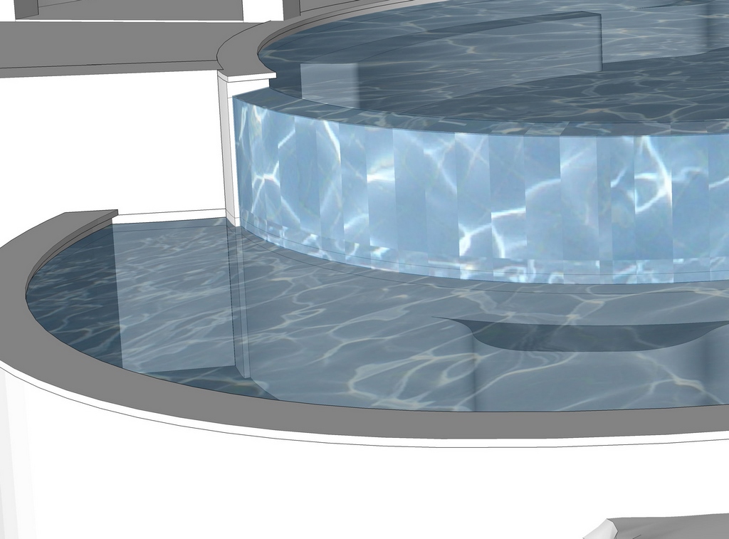
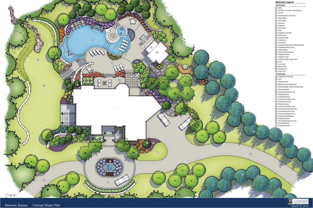
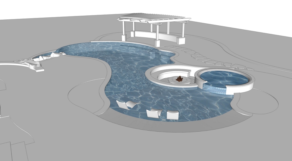
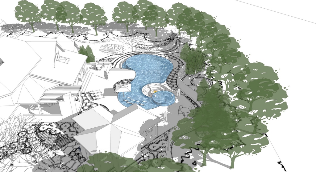
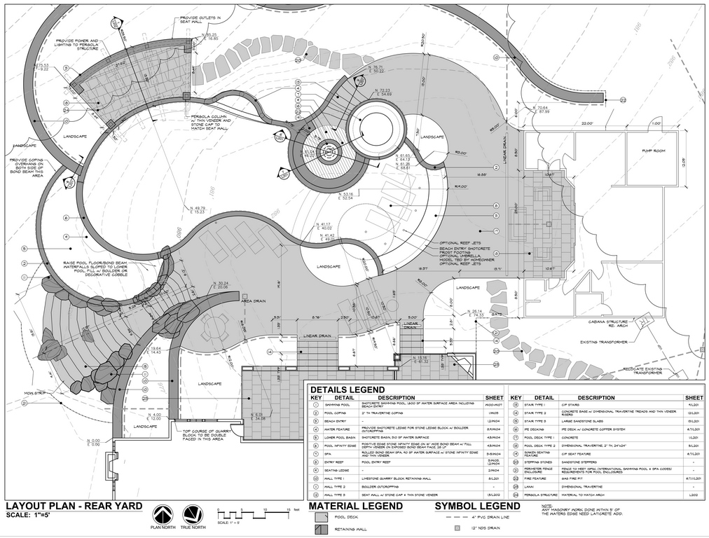
| Once we developed a master-plan concept (left), we put together some basic white-box models to give the client a clearer idea of the three-dimensional layout of the core pool environment. These simple illustrations steer clear of textures, colors, finishes and other considerations that might have made it too easy to get buried in details before key design parameters had a chance to take shape. (Note that even here, we were already edging our way toward editing the concept plan’s poolside waterfeature out of the program.) |
However things go, this concept review is meant as a parade of ideas for consideration in which the goal is to make certain everyone involved is visualizing and talking about the same things. With years of practice, I’d say that, in most cases, our designs are generally locked in with sketches before we ever get to a formal presentation – usually about 85 percent of the way home by the time we sit down and start finalizing the program. This says something about the fact that we’re good listeners, but it also points to the easy rapport our approach builds with clients. And believe me, that rapport and the trust we’re building pays dividends when it’s time to iron out the last 15 percent!
How clients respond, of course, varies from case to case. On rare occasions, wires will get crossed somewhere, we’ll miss the target and face the prospect of starting over again. But for the most part, we’ll be close enough that it’s all about filling in the gaps, making a few requested adjustments and sealing the deal before we start generating any documentation. And that’s great, because now is the time – before plans are sealed, permits are pulled and supplies head over to the job site and way before anything is locked in concrete!
As a rule, these design sessions are energetic and upbeat: We want clients to see the wisdom of coming to us in the first place and help them take advantage of this opportunity to raise questions, resolve little concerns and develop a design solution that is fully dedicated to meeting their very specific needs – only some of which they may have recognized themselves before sitting down with us.
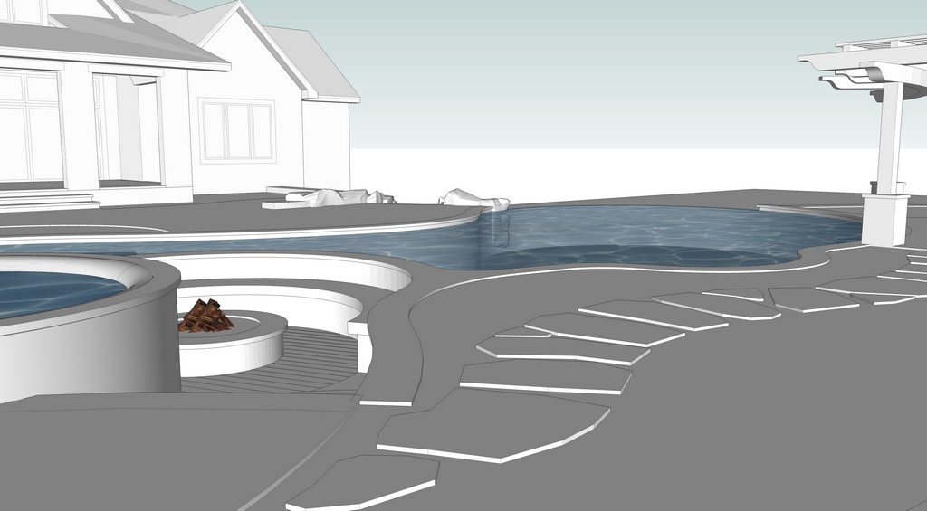
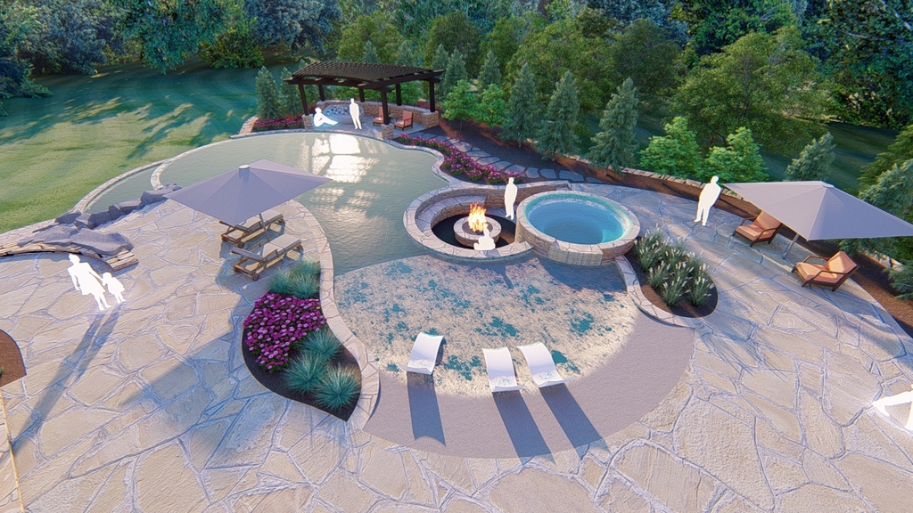
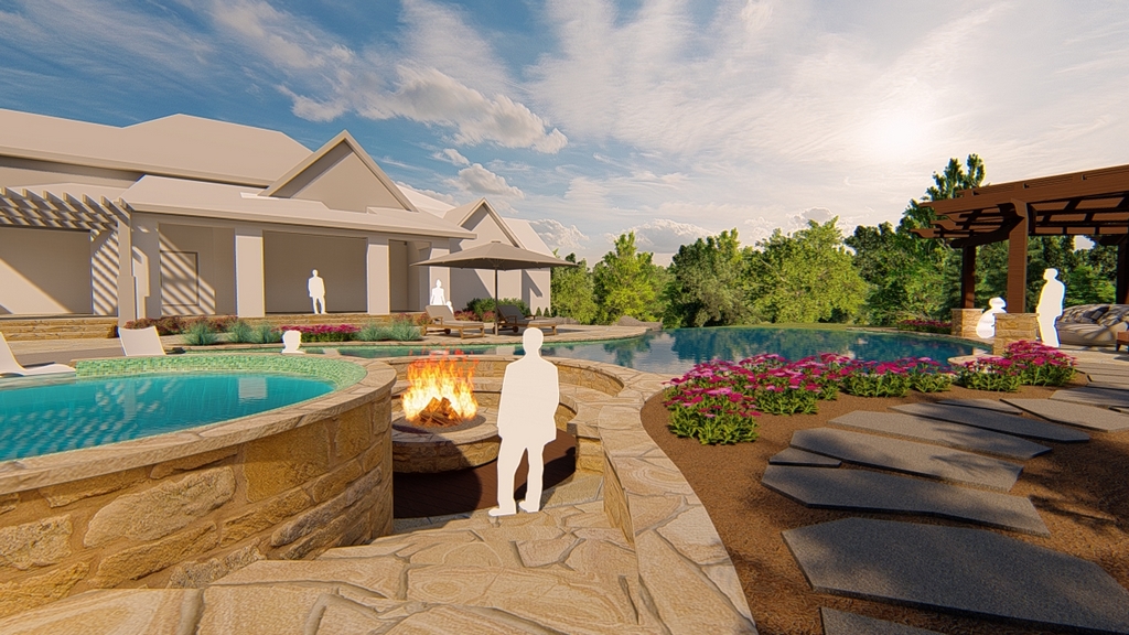
| As we moved along, the three-dimensional drawings came to include more detail and a sense of drama – but still held back when it came to colors, textures and materials. This left us free to discuss major issues such as the pergola, for example, without significant distraction: Its insertion, deletion and eventual re-inclusion in the design drawings (with and without the waterfeature) set us up for all sorts of helpful editing discussions. |
For the project we’re covering here, this meeting went smoothly and worked out well, despite the fact there were a few issues we still needed to address. What I’d figured out as we kept working together was that, although he was opinionated and could be stubborn, he had hired us for a reason and wanted our help in defining and refining his dream backyard.
It was good, creative give-and-take, and as we worked together I generally took in stride his desire to ask pointed questions, express strong opinions and make me defend the design. Where I could let him call the shots without undermining the design’s essence, I was happy to oblige.
As I mentioned in the case with the poolside waterfeature/waterfall, he was determined to include it – but I kept nibbling away at the idea until he finally came around to my way of thinking and ultimately appreciated the fact that a little editing in this case left us with a more coherent design program. It would’ve been great if he’d relented before we went to the trouble of building a second (unnecessary) skimmer into the pool wall, but the important thing is that he finally came around and is happy with the easy visual balance of the outcome.
MANAGED TRANSITION
Once the preliminaries were done and the design was set, we moved along quickly and began assembling various components we’d settled on into a working design presentation that, once approved, enabled us to generate a master plan that would set the stage for every step to follow.
This is a process through which SketchUp is a particularly valuable tool: The quick, three-dimensional projections get people past the fact that most of them struggle to “read” flat, two-dimensional plans – particularly when it comes to site issues including slopes, grades, setbacks and all other physical constraints that need to be considered.
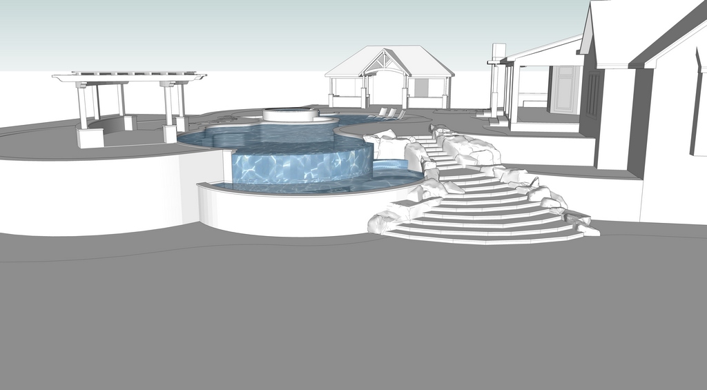
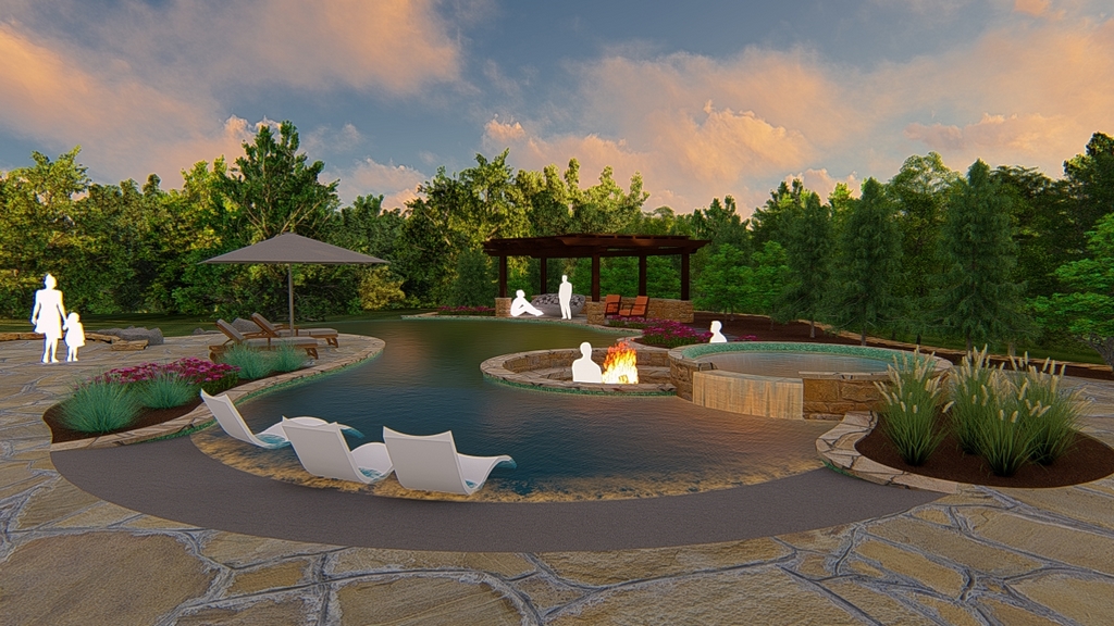
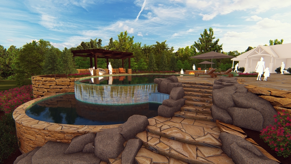
| Once essential design parameters were set, we moved on to drawings from a higher-caliber modeling system (brand-new to us at the time) that opened up detailed consideration of scale, spatial relationships, proportions, key repetitions, alignment of views, overall forms, grades and arrangement of various features and destinations. The goal here was to make certain the client completely understood the design as assembled. |
These sorts of physical factors place boundaries on what can be accomplished in any specific setting, and helping clients see why things are heading in a given direction can be most helpful in getting them to understand and accept the design’s parameters. The upshot of all this furious activity and negotiation is a master plan that incorporates all of the ideas that have survived our discussions so far.
Now the ball is firmly in our court, and we begin talking with clients about what they can expect with regard to the construction process, how the schedule will work and the basic sequencing of events on the job site as trades come and go. To this day, most of our clients assume that a single contractor will do the lion’s share of the work. When we explain that 16 to 20 or more different companies will cycle through the project, each working toward completing it, they begin to get a sense of how large an undertaking a watershape project can be.
Our construction unit, for example, takes care of hydraulic-system design and will consult with structural engineers on appropriate matters, but beyond that, we’ll bring in trusted associates who will take care of the practicalities of pursuing the project, from excavation, framing, steel and plumbing to concrete application, tile work and finish detailing.
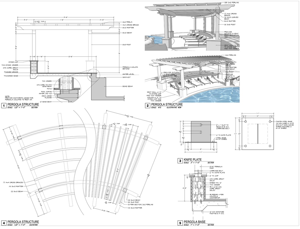
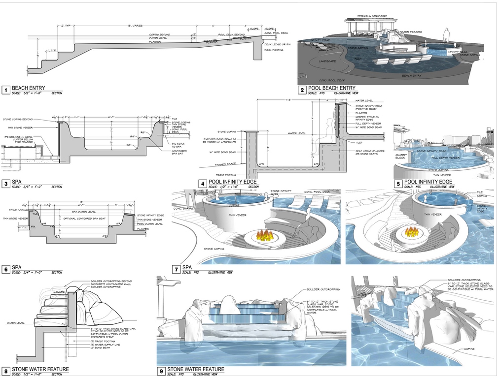
| Armed with detailed drawings, we moved along to material and finish selections – a process that, in this case, took about 90 minutes for the client to review our recommendations, get a good look at samples and commit to a final design. Next, we revisited and updated the construction documentation we’d been preparing in parallel with various design discussions and made ready to transform illustrations and plans into a working poolscape tailor-made for a very specific client and an equally specific backyard. |
All through the process, we assure them that we’re definitely still right there as a guiding presence and are still making decisions about how everything unfolds. We also constantly remind our clients that their pools are our informed responses to the features of specific sites and homeowners’ personal desires. The results, when we’re done, are backyards that are exclusively, uniquely theirs.
So after spending a week or two polishing the concept plan, another couple weeks on finalizing the master plan and preparing higher-level renditions of our sketches (three-dimensional animations, for example) and four to six weeks of preparing construction documents so detailed any competent builder capable of reading a plan might build the project, we are on our way.
Through these steps, computers become an important tool by helping us compile information and share it with contractors we’re organizing to get the job done. Indeed, we only bring these high-tech tools into play once the basic design work is complete: We’ve found them to be most helpful after we’ve used other tools at our disposal to get the concepts aligned and ready for implementation.
STAYING FOCUSED
In some instances, clients will want to change things around once we get past their acceptance of the design as presented and agreed. Knowing this can happen, we incorporate time for revisions into each of our project phases and steadily after carefully explaining what this “flexibility” can mean with respect to the budget.
Our intention is clear: By letting them know up front that changes will increase their costs and can even include additional design fees, we want them to know that we’re not here as a drafting service for someone else’s string of ideas. We take considerable time to develop a workable design and do all we can with drawings and in our formal presentation to help them visualize and understand where we’re all heading – and do all we can to keep the focus on executing the project.
But yes, there are some clients who insist on being the smartest people in the room because they’ve just seen some YouTube video or watched a DIY or HGTV show or researched a subject on Houzz. We’ll listen, but then we’ll educate them about what they may or may not know or be considering. Usually, they’ll step back once the financial consequences surface: Even affluent clients don’t generally have open-ended budgets just for design – nor would I enjoy working with them if they did!
In the case of the project on display here, as inventive as the client could be, he kept pace with the program and knew when we’d reached a point where further discussion wouldn’t be particularly productive. So now we were ready to move forward: All of the preliminaries were behind us, final documentation was ready for official review and approval, materials had been selected and quantified and we’d quietly and competently set the stage for construction.
Our interface with clients becomes very practical at this point as we make final selections of tile, stone and finishes and the familiar processes of construction finally get under way. This stage and all of the subprocesses involved in it goes beyond the reach of this series, but eventually all of the pieces of the puzzle we set up in Part 1 of this series begin sliding into place.
Next time, we’ll take a look at the outcome of the project at the heart of this series of articles and reflect back on how it all of its various pieces came together.
Kurt Kraisinger is a landscape architect with more than 25 years’ experience in design and consulting. In 2009, he founded Lorax Design Group with a goal of creating memorable spaces that allow people to engage in their surroundings. He received his degree in landscape architecture and urban planning from Kansas State University and participates in Genesis programs. He may be reached at [email protected].


