Shaping an Environment
As a matter of habit and long practice, my design process for an outdoor environment begins the moment I arrive on site, starting with an assessment of the property’s physical qualities.
Indeed, before I let structures, features and visual details start dancing in my head, I focus on grading, drainage and basic spatial relationships. In my experience, this overview of the practicalities will help drive the design – and allow the aesthetic decisions to flow smoothly into view at the appropriate time.
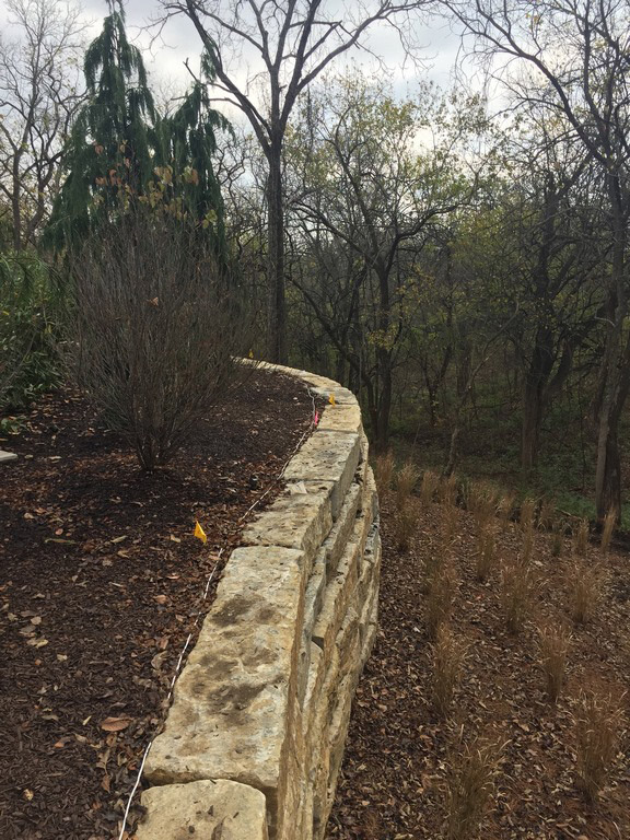
In the case of the project that’s been under discussion through this string of four articles, for example, my early assessment of the lay of the land led me to a key initial decision: Rather than step down the existing grade to a much lower level, I saw that we’d be better off raising the watershapes and hardscape to minimize stepped transitions to the pool deck. As this crucial choice took shape, I was continuing to think about existing topography and how drainage would work. We had plenty of positive slope away from the house, so I knew we’d be on the right track by keeping an eye on the site’s natural advantages.
In many projects, this is the point where close-up, middle and distant views come into consideration. Here, the primary views were toward an existing canopy of forest trees, so I was starting to think we’d need nearby focal points to build visual interest – nothing specific yet, just a sense that, before long, I’d be looking at elements such as pergolas, waterfeatures, fire effects and other arresting visual details.
At about this point, I was also beginning to consider the client’s long wish list.
The process here, in other words, is about layering, with each level, feature or detail coming into play as the underlying levels, features and details take firmer shape. So before I’d finished assessing the slopes and elevations, I was already moving on at least in part to drainage and important views and was beginning to consider traffic patterns and destinations. It’s an ordered sequence, and it all overlaps and weaves together sequentially as the program takes shape, sometimes rapidly.
WEIGHING POSSIBILITIES
In the first article in this series, I wrote: “The point to remember is that in each and every case seen here, the client and I (and often I alone) made a deliberate decision to use each specific detail in a certain way in a distinct place while passing through the near-infinite number of options we had at our disposal.”
Although I do what I can to set that basket of possibilities aside in my initial look at the site, the options it carries are always there with me, in some ways struggling to hijack the process and make it unfold even more rapidly. And in this case, the client’s ideas were there from the start as well: He had already been offering up inspirational images of materials, finishes and details that reflected his tastes and sense of style, and I have to say it ratcheted up the pressure to start putting ideas on paper.
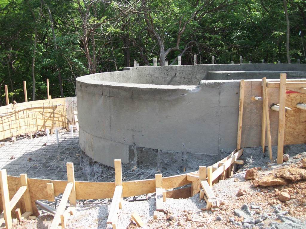
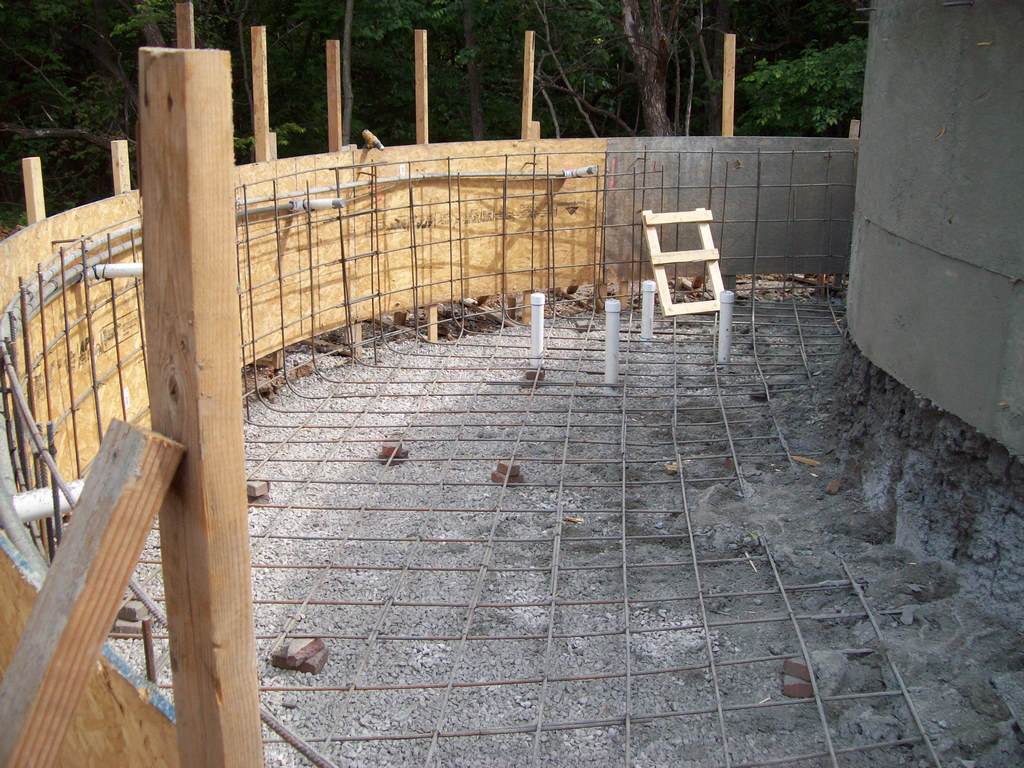
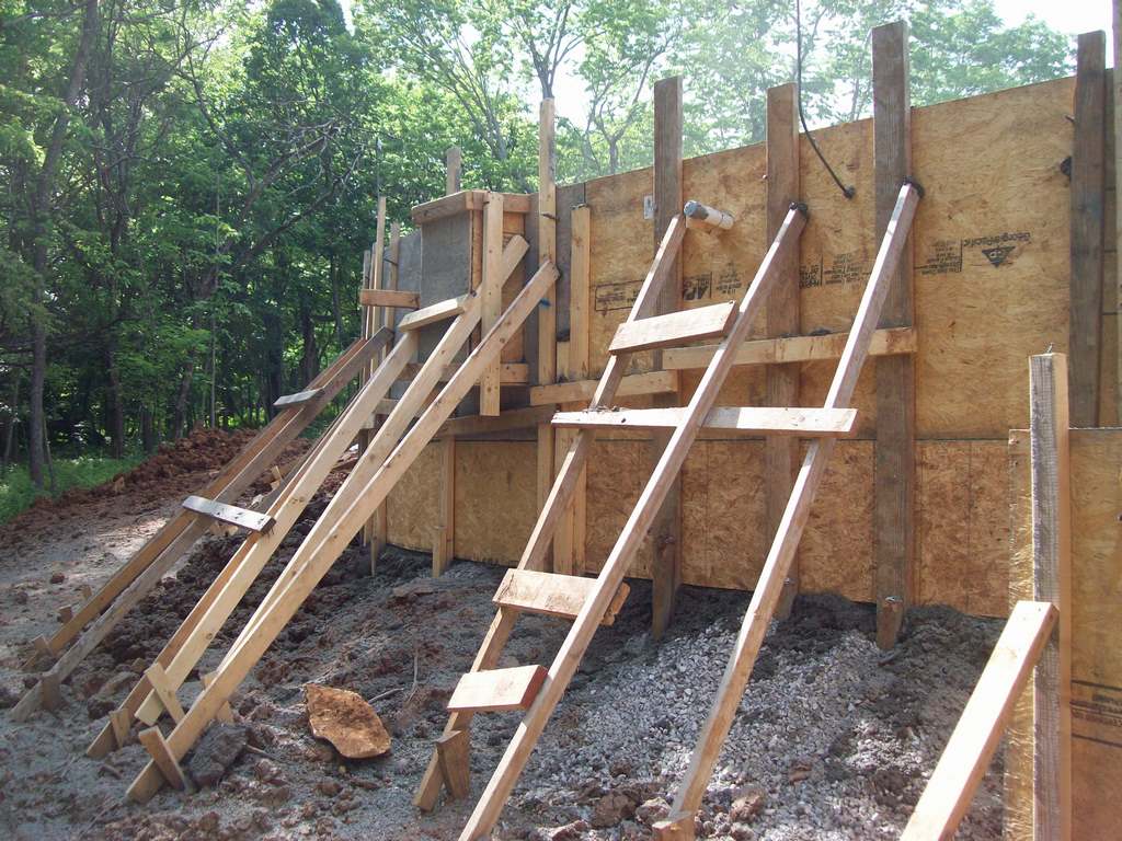
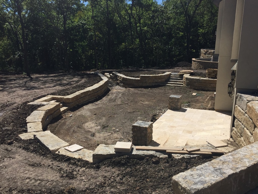
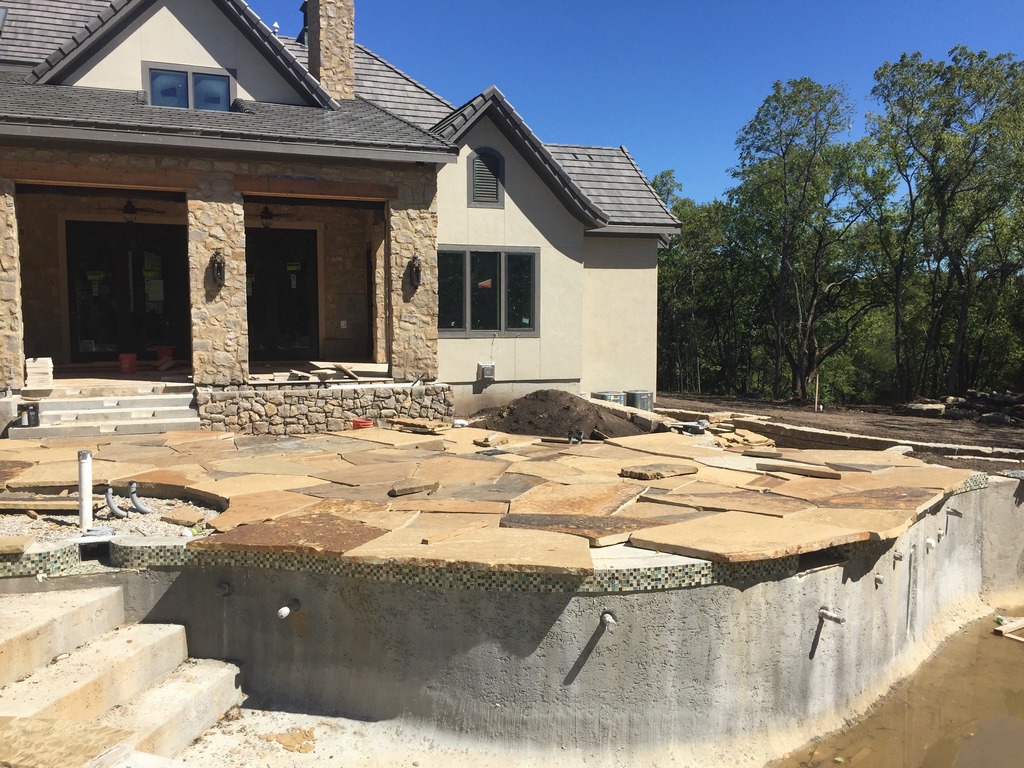
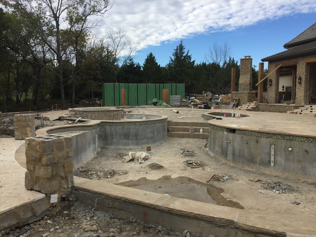
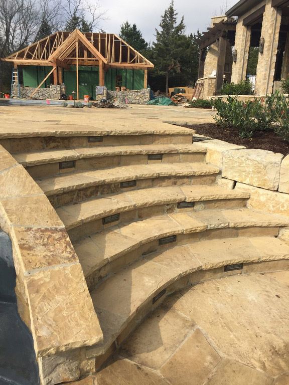
| Our early decision about elevating the pool deck required us to use a lot of concrete to push successive downslope elements up to the right levels. As can be seen in the image at top right, the shell also included an extra crescent above the bond beam where the controversial rock waterfeature was to be placed. As the shell cured, we continued our work around the backyard, inserting retaining and decorative walls, adding the flagstone decking and, much to my relief, finally sawing away the waterfeature’s bulge and transforming it into a small, unobtrusive shelf. |
When I first saw the site, I immediately began figuring out how the lay of the land would influence the design and, aided by his prompting and my awareness of multiple possibilities, began a bit sooner than usual to consider how things would eventually look. That’s important, of course, because we listen to our clients and do what we can to incorporate their ideas – and the pace of their ideas – as a means of making each project unique and tailored to specific aspirations. In this case, those ideas came at me as a flood.
Often, we’ll show clients what their ideas mean in terms of the specific site – whether the ideas work or not, just so they know we hear them and are responding. Sometimes, this means preparing a scheme that incorporates their ideas as a prelude to making necessary adjustments; other times, we’ll prepare a drawing that starts with their ideas but immediately shows our clients how and why some of them don’t work.
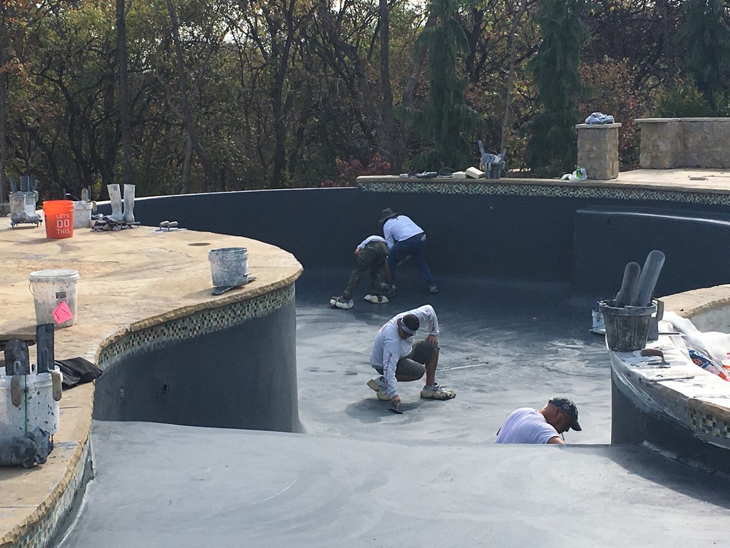
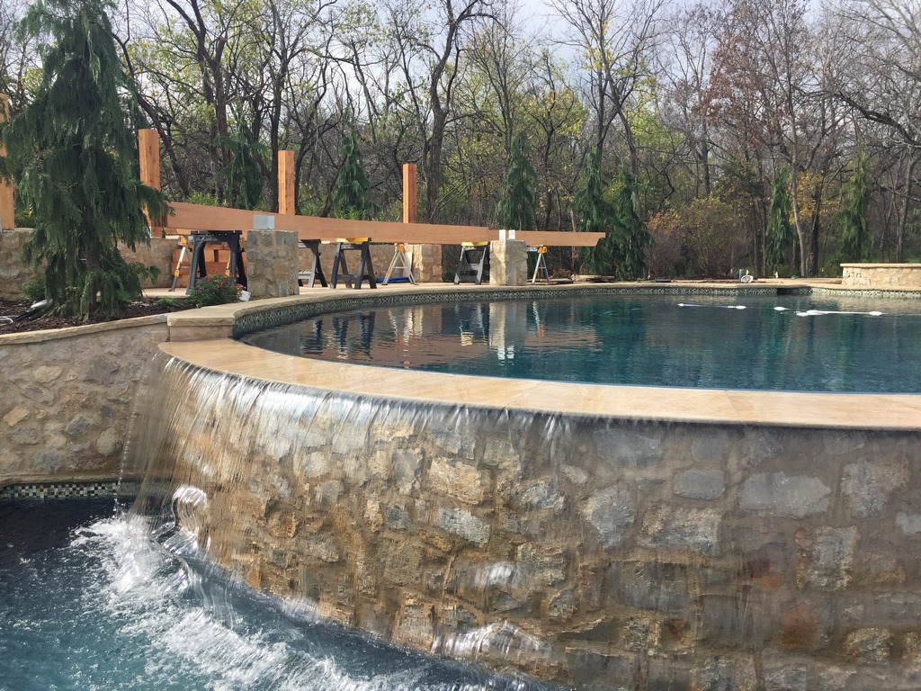
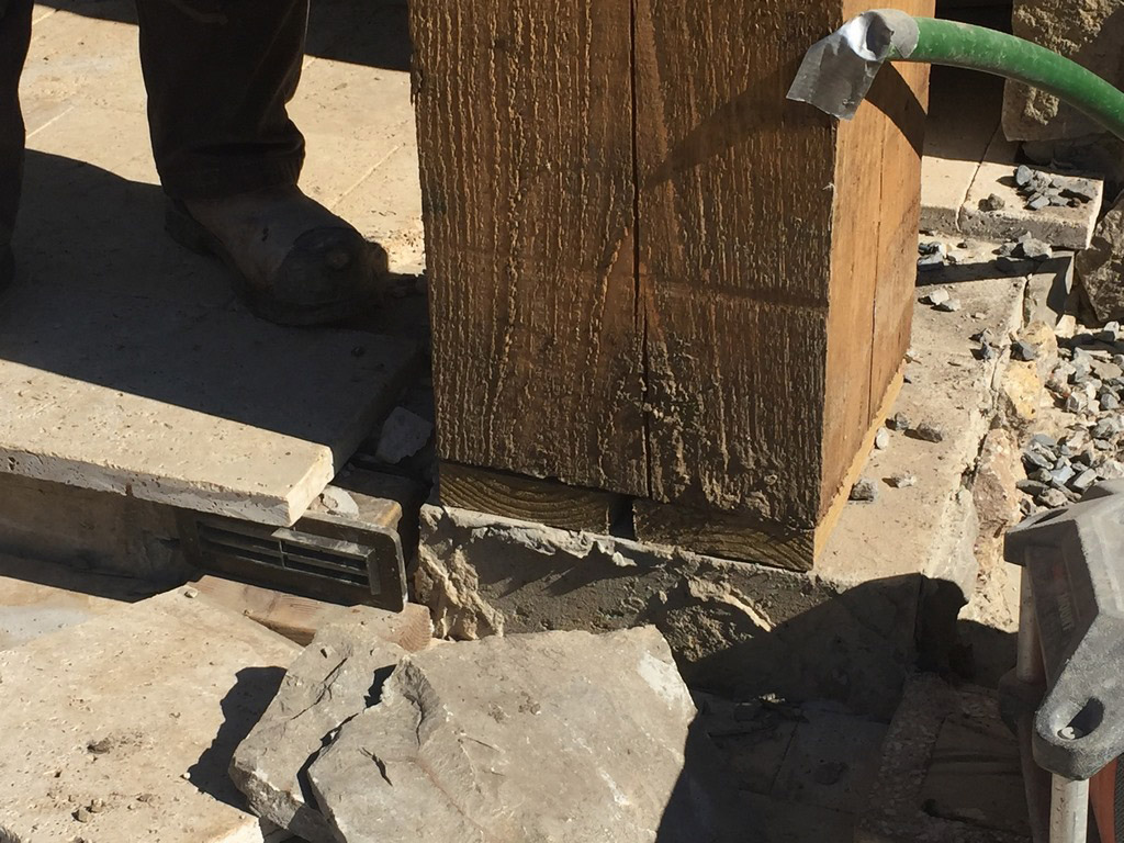
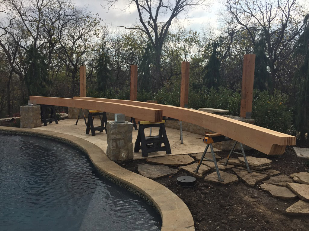
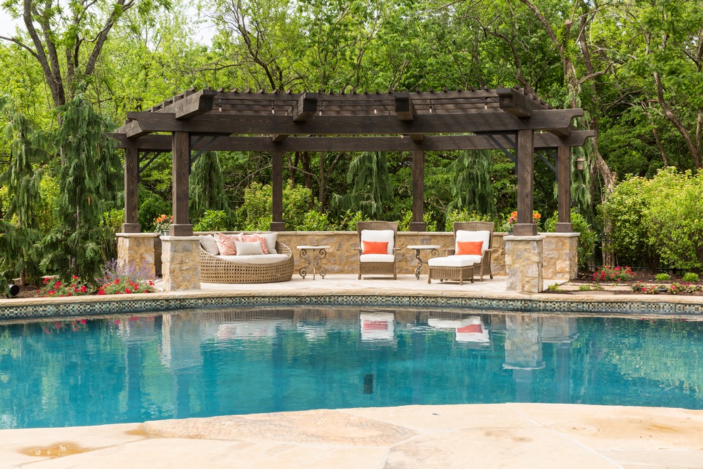
| With finishes applied, we ran the watershapes through various system tests and started a sprint toward completion with the addition of extensive landscaping, volumes of stonework and the pool house. We also made preparations for securing the truly massive timbers involved in the sweeping shade structure that was to moderate views across the pool and out toward the trees beyond. |
For this particular homeowner, there was lots of the latter sort of back and forth, but before long he saw what was emerging and began to like it.
|
The Vanishing Waterfall As has been mentioned several times so far in this series, there was one major point of creative conflict as the project developed: The client was very clear in wanting a waterfall feature at poolside, and I considered it so far beyond the scope of the design package that I kept chipping away at it until he finally gave in. I consider the extra skimmer that survived this particular dead end as a small intrusion compared to the visual disruption the (thankfully abandoned) waterfeature would have imposed on the completed project. Even this difficult sort of extended negotiation can be part of a good, productive process as a design takes shape. In fact, we make room for these discussions, although as a rule we settle them much earlier because we work so hard up front to help our clients understand what we’re doing and why. In this case, the client was fully committed to the design and ended up loving his backyard. The path wasn’t always smooth, but we now see the saga of the waterfall feature as part of his process of making certain we were paying attention as we kept our eyes on the prize. — K.K. |
This doesn’t mean he backed off entirely: He stayed engaged through the entire process and inundated our offices with emails and phone calls about materials or details he’d encountered. It was all positive, all enthusiastic – and ironically, his energy actually helped us navigate the initial design stages with minimal conflict because he was so caught up in what was happening.
Before long, it was clear that his prime interest was in making everything we did consistent with the Old World/French Country Estate look he was after. We took note, for instance, when he was insistent about the slush-and-brush approach to the stone veneers.
This was great, because in balancing our give-and-take, giving him a win here likely made it easier for him to step back when it came to other decisions – about the shape of the pool, for instance, or how the overall program flowed together across the space.
That’s not to say he was ever really hands-off: He very much wanted to be involved in materials selections, for instance, and liked seeing lots of samples. But with big elements including the pool itself, his only real injection into the process had to do with the beach entry and the decision about where it should be placed.
One interesting wrinkle: He had moved to the Kansas City area from Las Vegas and arrived with an awareness of southern Nevada prices for pool construction.
He spent a good bit of time early on being distressed by how much more it cost to get things done in Kansas, which put a premium on both of us communicating clearly about these issues and taking what advantage we could of local bargains for tile, stone and the like.
BASKING IN THE GLOW
To make a long story short, the client ultimately came to love the design you see on display in this series-concluding article. Cost was a lingering background issue, but that’s far from uncommon – particularly with a project that includes not only a pool but an extensive surrounding environment as well.
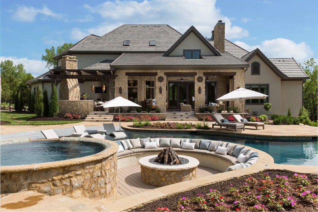
As you work your way through the photos and see how we assembled all of the components shown in disembodied form in the first article, it’s clear to see that the homeowner was ultimately willing to spend good coin so long as he knew we were listening and had a sense that we at Lorax Design Group (Overland Park, Kans.) were being conscientious about how he was spending his money.
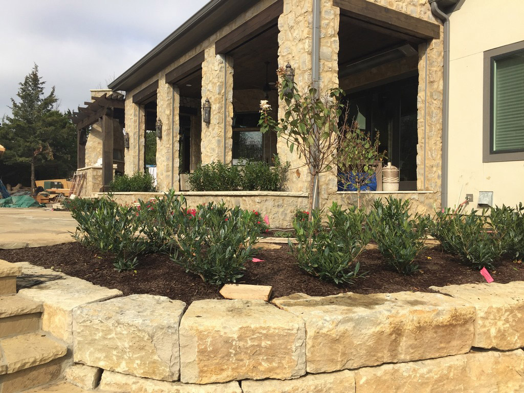
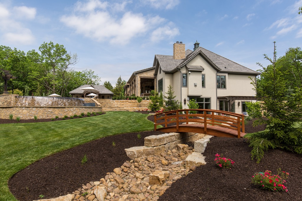
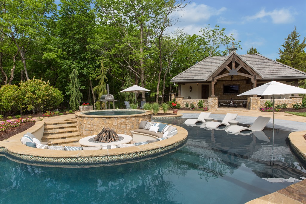
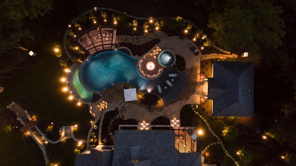
| The completed project is entirely true to the design program we envisioned from the start, incorporating the disembodied list of 40-odd elements identified in the first article of this series into an integrated environment – a variable-filled puzzle uniquely assembled to meet the client’s desires while expressing our professional response to the home, site conditions and our design principles. Every choice was deliberate, every detail given its full share of attention – and the result made the client and his family more than happy, which was our target right from the start. |
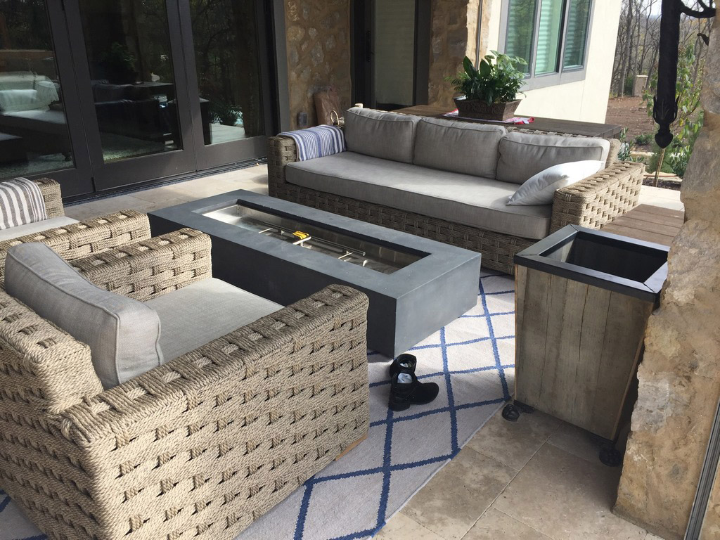
The resulting composition contains many items from his wish list, and he clearly enjoyed filling in some of the blanks we left him with respect to container plants and outdoor furnishings. There’s definitely a lot going on here when you consider that we included 40 specific, distinct elements highlighted in these articles – and I’m sure we could identify many more that came up for discussion and decisions.
Not all of our projects are so expansive, but it was the nature of our collaboration with this particular client that this was to be a total environment that fully engaged the eye and ear while providing a variety of destinations, materials, colors, textures and surface treatments to go along with retaining walls, a bridge, various pathways and a host of landscape details.
|
Catching Up ‘Shaping an Environment’ is the fourth and final entry in this Design Dynamics series. See below for links to the other installments: Part 1: ‘Organizing Chaos,’ click here. — K.K. |
The process by which we reached these solutions may well be ours alone at Lorax Design Group, and it is far from my intention to be prescriptive about how anyone else pulls a project together. Instead, these articles have been structured to encourage you to pull apart your own practices and give them the sort of productive, critical examination preparing these articles has opened for us.
In this particular project, our usual process was pushed around in many ways by the client’s own ambitions, but it worked – and he loves what we ultimately achieved because it reflects so much of what he wanted by way of features, finishes and materials. It was a success on our side, too. As I’ve mentioned a few times, there were some decisions we might’ve made differently had the client not been so decisive in certain areas. But on balance, none of the details he insisted on altered our overall program enough to make a real difference or represent what we’d consider to be a negative compromise.
This sort of involved project exemplifies why I love the way we do things in our operation. We’re good listeners, resourceful problem-solvers and forthright partners in the design process – true professionals. This wins the respect of our clients, which in turn enables us to fulfill their expectations of a custom project they can be proud to enjoy with family and friends for years to come.
This one? It’s easy on the eye, fun and seemingly effortless: All in a day’s work.
Kurt Kraisinger is a landscape architect with more than 25 years’ experience in design and consulting. In 2009, he founded Lorax Design Group (Overland Park, Kans.) with a goal of creating memorable spaces that allow people to engage in their surroundings. He received his degree in landscape architecture and urban planning from Kansas State University and participates in Genesis programs. He may be reached at [email protected].


