Entertaining Possibilities

Some of our favorite projects have gotten us involved with an unusual class of clients.
These folks are affluent enough that they travel extensively and own multiple homes in spots around the world – places they’ll stay for stretches ranging from a couple weeks to several months each year. When it comes to developing or remodeling new acquisitions, they’ll set some basic ground rules and step back, leaving the specifics to a trusted firm or individual who assembles a hand-picked design/project team.
This is a realm where familiarity and trust are all-important: We were called to participate in this project, for instance, based on our history with Terri White, a Tampa, Fla.-based interior designer with whom we’ve worked on several previous occasions and who thought we’d be a perfect fit here.
Once we were accepted by the clients, we met with them just a few more times and did all we could to figure out their likes and dislikes. We then submitted a design for review and approval, made a few adjustments and prepared as thoroughly as we always do for a major construction project.
The watchword here was integration: The outdoor spaces needed to flow from the home’s interiors and respond to its architectural style. In addition, we knew from our limited contact with the homeowners that the main objective outdoors was entertainment from lot line to lot line – with healthy dashes of family fun added for good measure.
MAPPING AN APPROACH
The home is in one of the last few rural neighborhoods within the city limits of Tampa, Fla. The lots in this 20-home subdivision are large, with parcels ranging from about two to around five acres. The intention in this particular development was to give each property some breathing room, with lines of sight dominated by nearby wetlands that, where we were, encroached on the lot with a substantial setback that ran diagonally across one corner.
The home itself is in a style that’s widely known as “Floridaterranean” – not quite Spanish, not quite Tuscan, but rather a mélange of ideas borrowed from countries and regions around the Mediterranean Sea, with dashes of Greek, Moroccan and even Country French lobbed in from time to time.
This structure, designed by the team at Sater Group (Bonita Springs, Fla.), also reflects a 1970s-vintage Florida form known widely as a Rutenberg Home. These places commonly featured an L-shaped structure wrapped around a large swimming pool that can be seen from many vantage points within the home. In this particular case, however, the typical 3,000-square-foot format of a Rutenburg Home was upscaled to 20,000 square feet on two imposing levels.
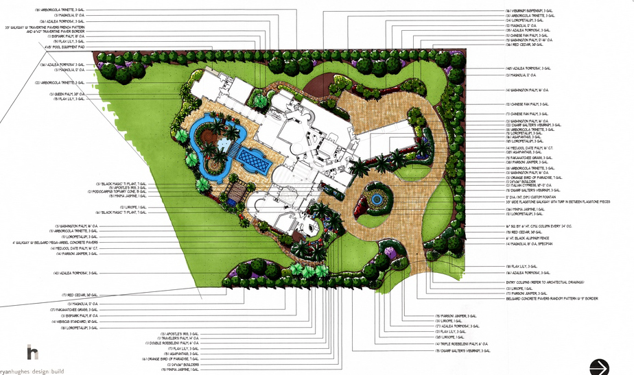
It’s a stylistic hybrid, in other words, and one advantage of the large scale is that it gave us plenty of room to work with in placing outdoor-living features in the open space – the sole limitation being the easement we had to observe over by the wetland. With plans for the home in hand, our staff landscape architect Jeff Zock and I were able to identify key lines of sight and, in an approach borrowed from Frank Lloyd Wright, set up a grid that helped us align key outdoor elements with views from important spots within the home.
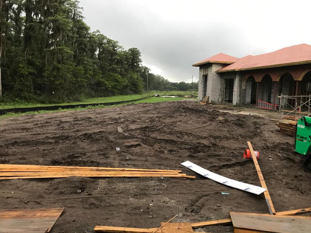
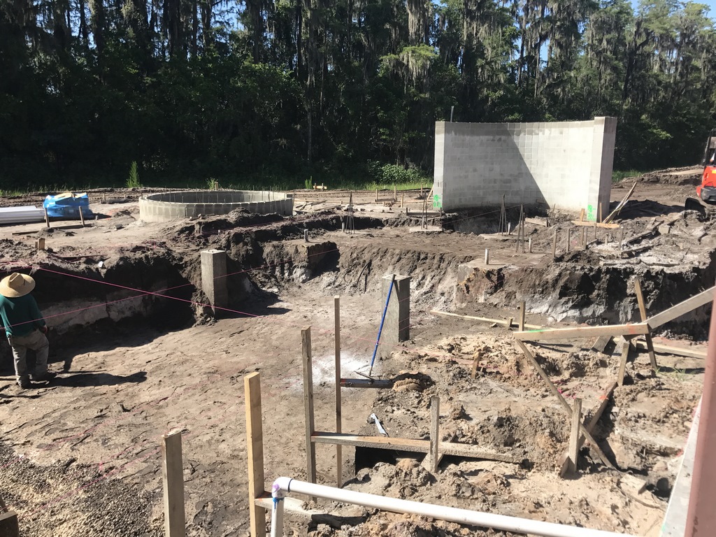
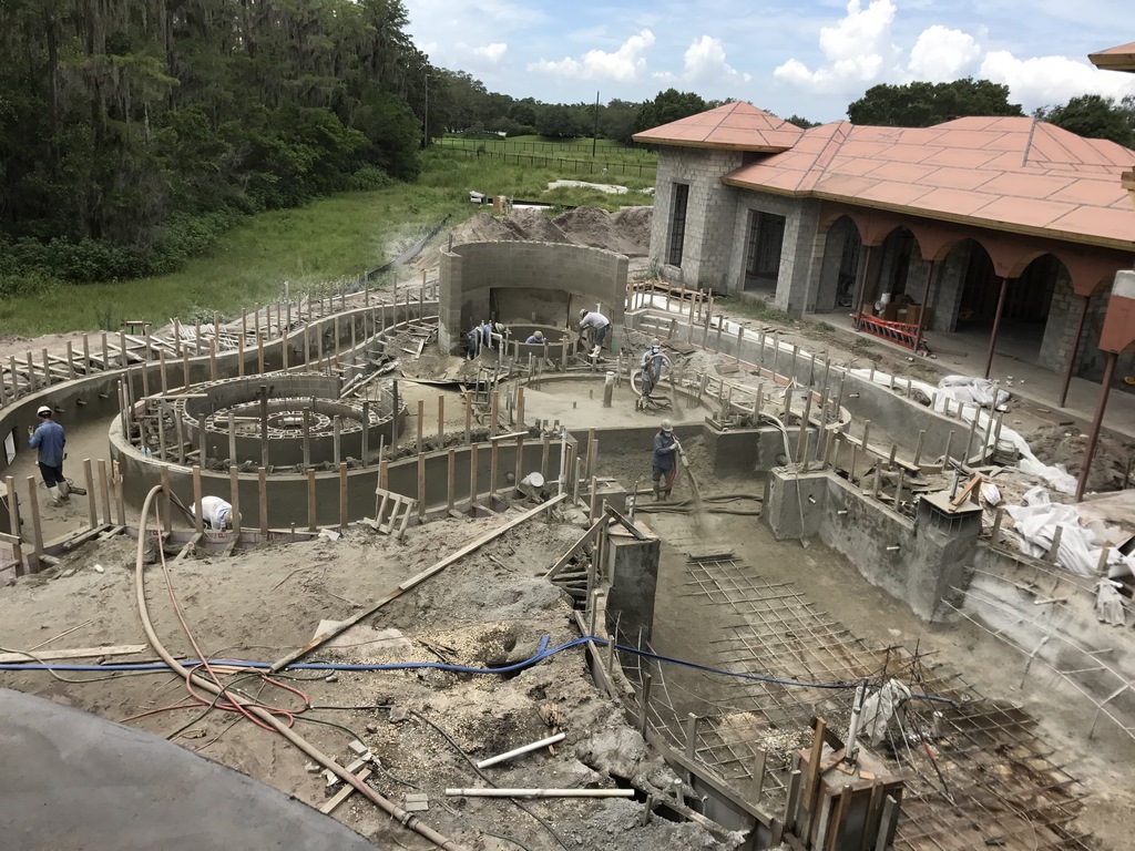
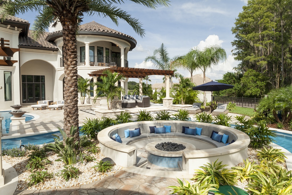
| The yard behind the home, then under construction, was a blank slate graced by easy soil conditions and even easier access. The one constraint was a diagonal slash across the back of the property as a result of a wetland easement – but this still left us with ample room to establish a grid and arrange a number of outdoor rooms and destinations within a space dedicated to flat-out fun and entertainment. |
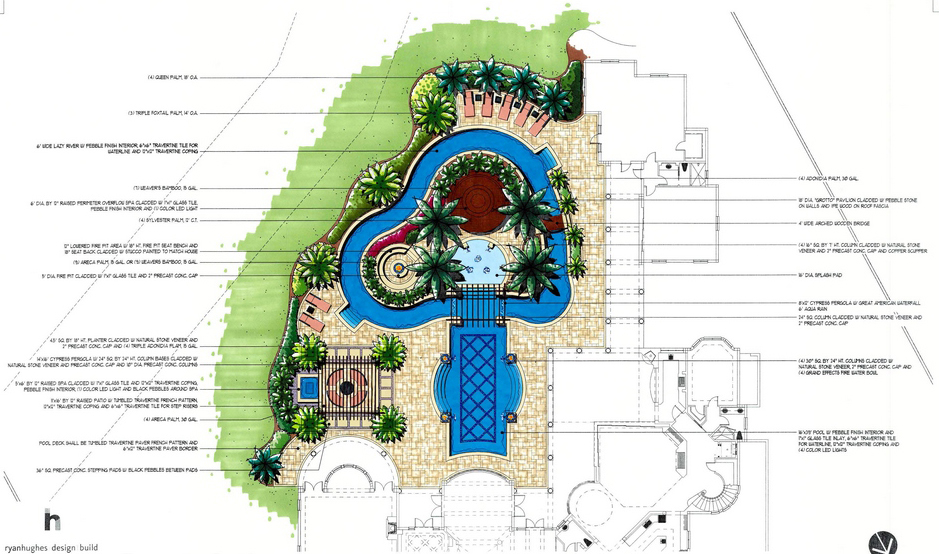
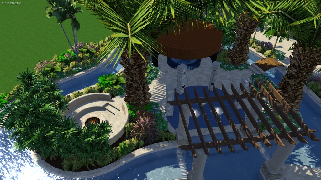
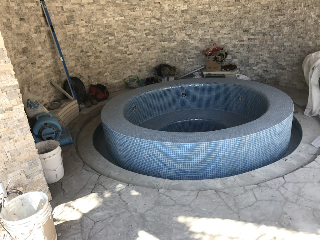
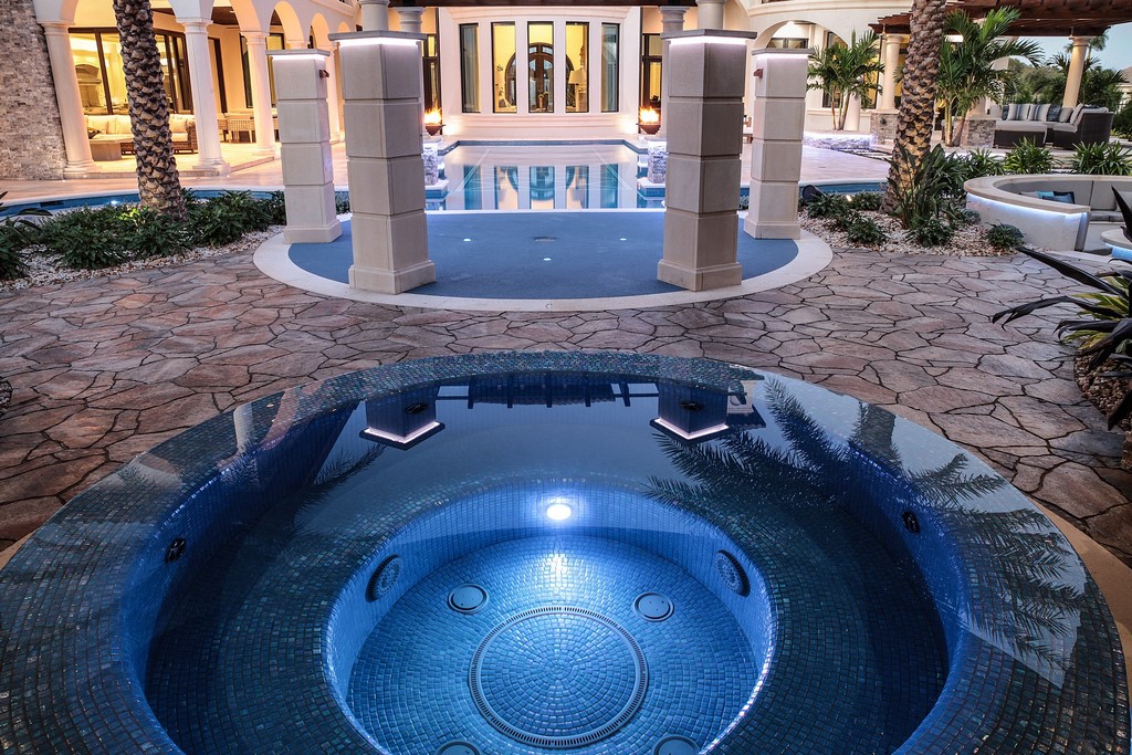
We started at the front door and drew a line through the house and out beyond a 40-foot-tall bay window. This axis now leads straight through the center line of the pool and up to the splash pad before ending with a spa contained within a structure referred to as a “grotto” – but built with wood rather than stone in keeping with one of the clients’ few declared preferences.
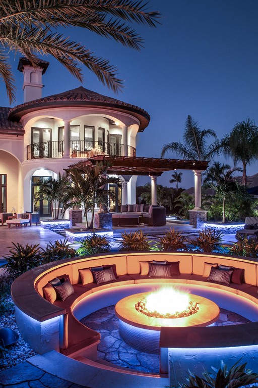
Then we moved to the master suite and drew another key line, this one running out past another big bay window to reach what is now a small, pergola-covered seating area and then on to the island and a much larger conversation pit with a central fire feature. The view from the heart of the new outdoor kitchen sets another line that crosses the midpoint of the main pool, cuts through the core of the small pergola/seating area and terminates with a spa tied to the master suite. The grid also covers fire features, rain curtains, pathways and details associated with the lazy river.
Many of our projects include plentiful design elements, and often clients will review our portfolio and want everything we show them. We use the grid system to constrain their wilder impulses and maintain control over what can easily become chaos, focusing first on functionality and only then turning to aesthetics in considering and placing specific features.
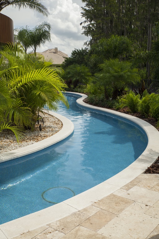
As mentioned above, the setback influenced the layout to the extent that it led us to flatten and elongate the course of the lazy river. The result of this is a configuration that, seen from above, looks a bit like a profile of a famous beagle from the Peanuts comic strip. Any similarity is entirely accidental, but it’s now a description the composition can’t quite shake.
MADE FOR FUN
It was always part of the plan that, when the clients were elsewhere, the home would be available for special events of all sorts – charity fundraisers, corporate events and the like.
With that entertainment goal in mind, we upsized everything from the main spa to the splash pad and the seating areas to create multiple destinations and gathering spots, each one of which can easily accommodate 20 or more people at any given time. Knowing the overall space might be accommodating hundreds of people at once helped us with materials selections, too, putting an accent on durability and easy maintenance. This is why we went with an all-glass-tile finish within the watershapes (all from Kolorines of Cuernavaca, Mexico, and installed by Mosaicist of Miami, Fla.).
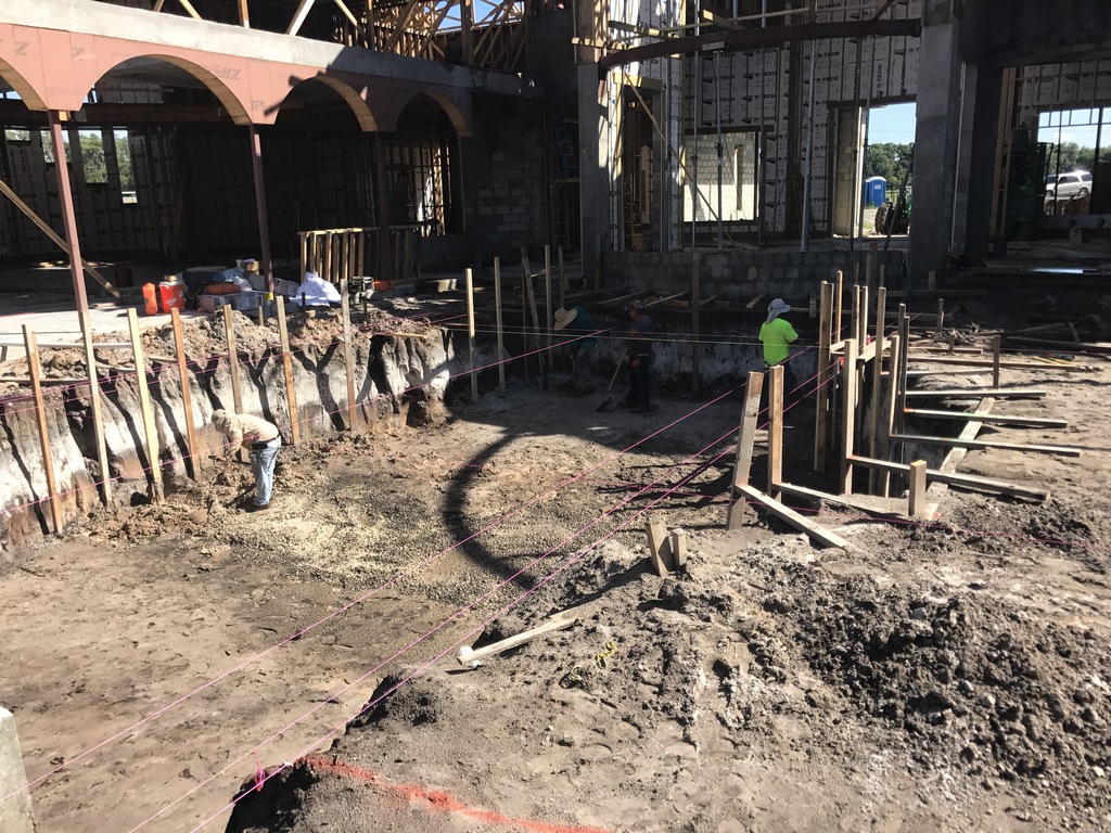
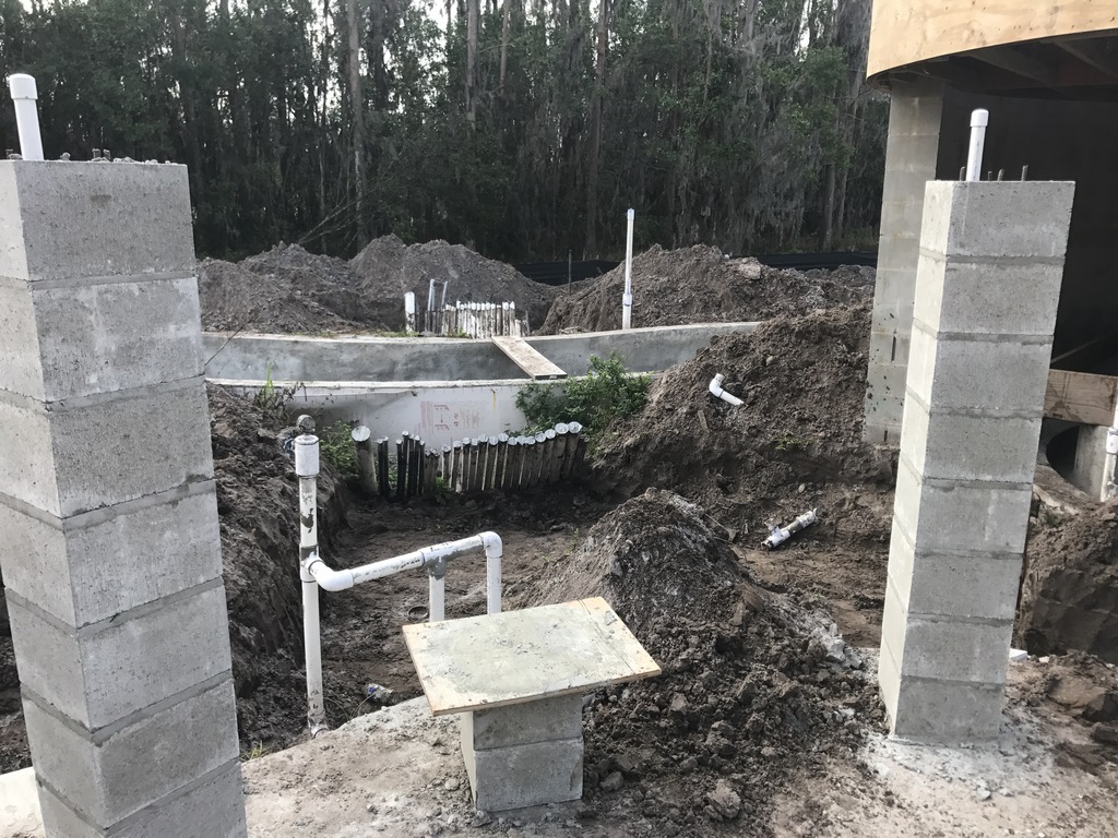
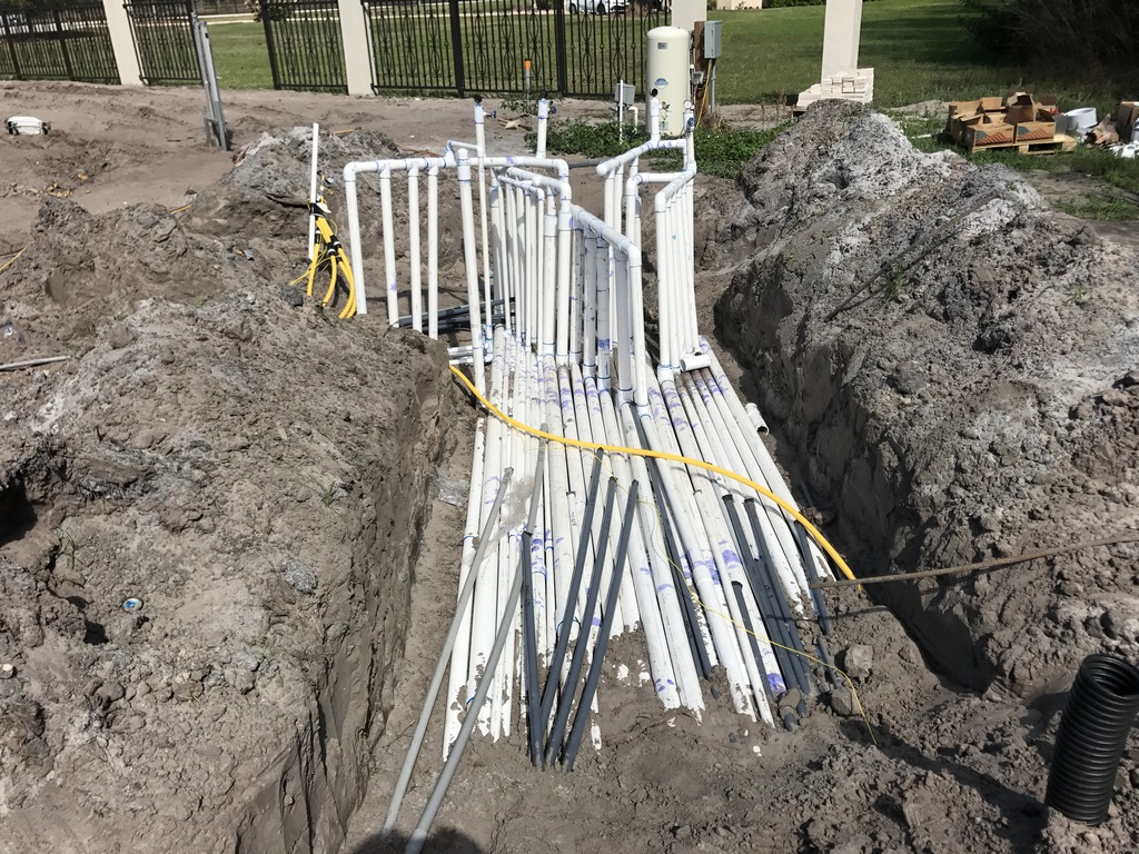
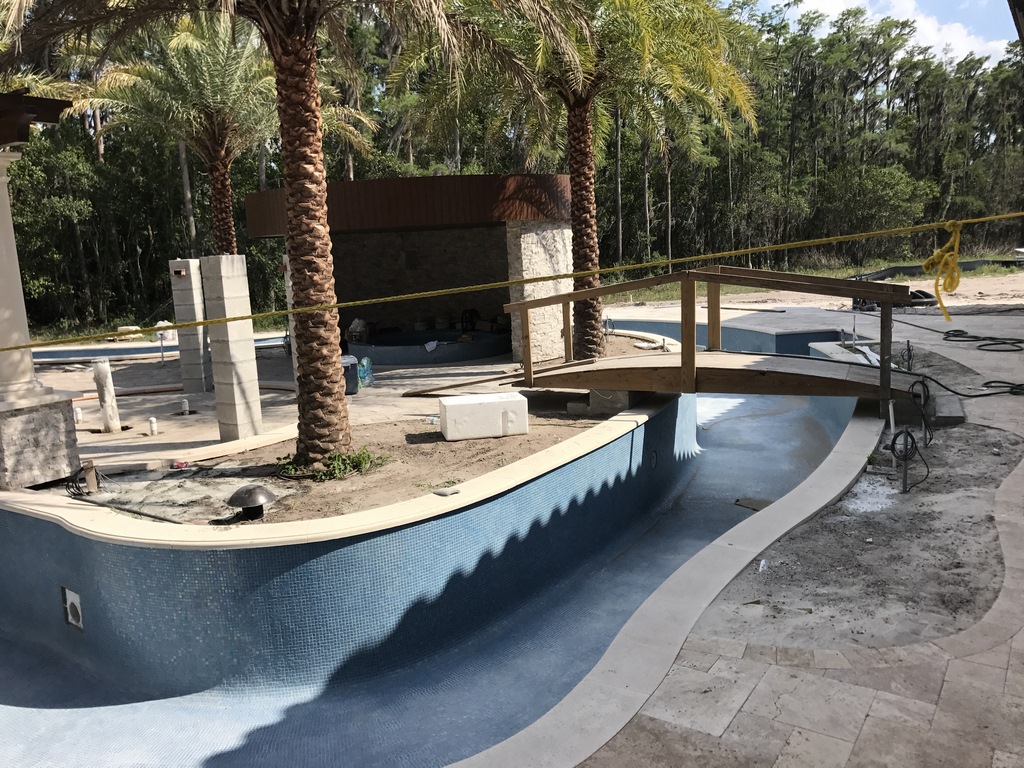
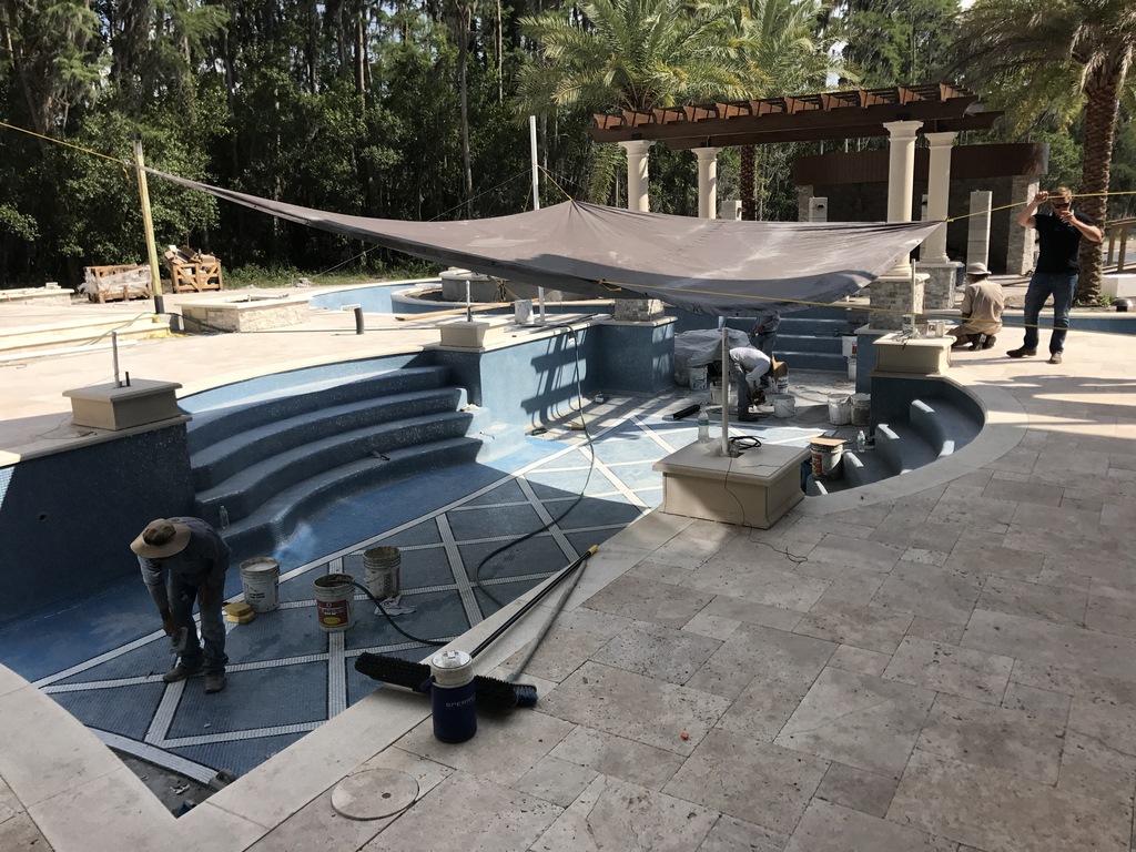
| Every phase of construction went smoothly with this project, from excavation and forming through to concrete application. Planning in great detail was the key: As can be seen in the image at upper right, for example, we had just one shot at inserting lines to the island, which put a premium on anticipating needs and organizing pipe runs to enable us to keep moving forward with construction without any backtracking or unscheduled interruptions. |
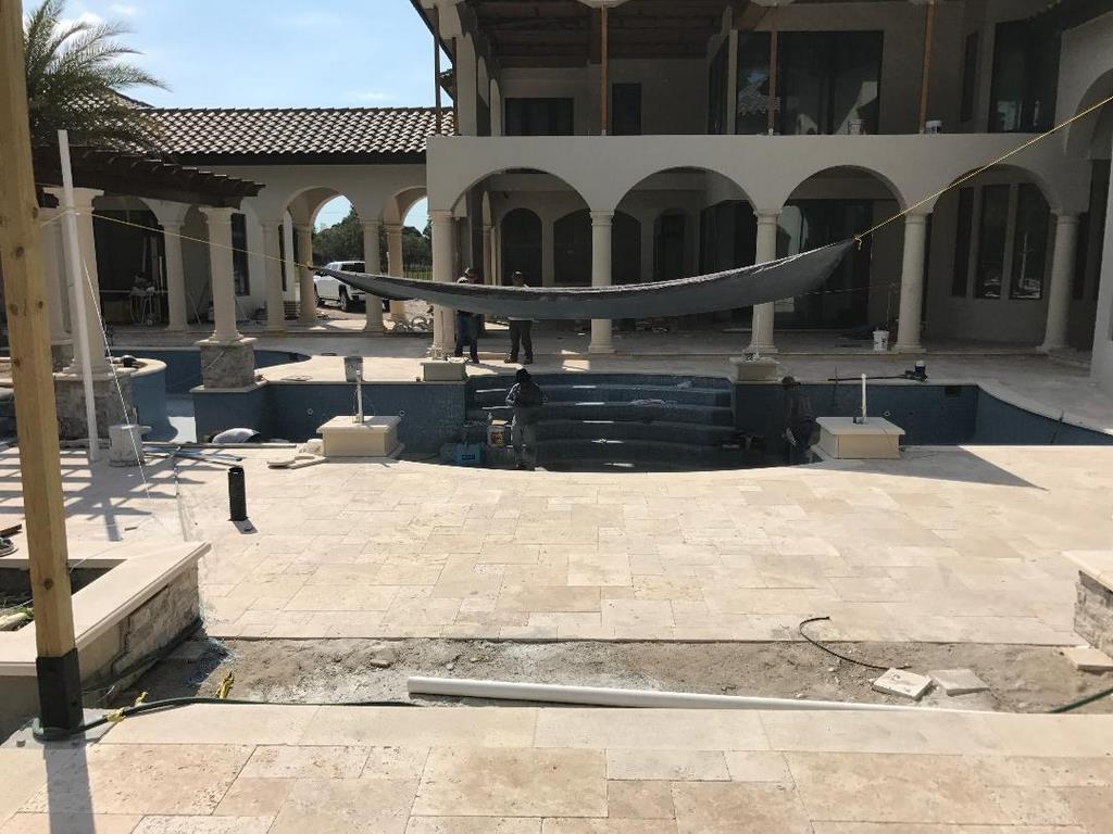
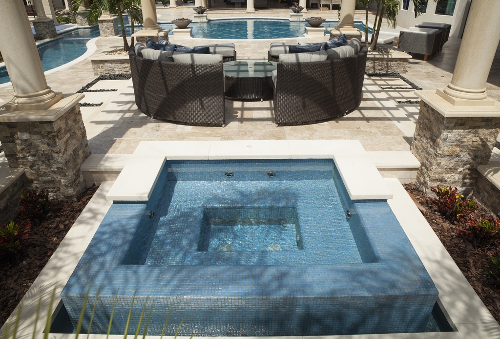
This also led us to install a tumbled Travertine decking, which harmonized with the home’s color palette while also presenting a cool, durable surface for guests. And although I’m uncertain whether it’s ever been used in this way, it is also possible to bridge the main spa and turn the grotto into a band shell for music or presentations.
We worked in close coordination with the architect and other designers here, but we made almost all of the specific selections for the exterior spaces. For one thing, everyone on site knew we were fully capable of getting things right. For another, it was a huge project and there were more than enough decisions for them to make with the home itself. Regardless, it helped that we kept our eyes open from the start of the project, always making certain our decisions aligned with details emerging around us – and reviewing things with the principals if we ever saw a need for creative consultation.
It was also important that we listened carefully to the clients in the four or five conversations we had with them. We knew they had a couple kids and planned on a couple more; we also knew they were from Greece and made certain that the blue and white of the Greek flag found their way into our color schemes. Finally, we were aware that they spent a lot of time staying at high-end resorts around the world, so we did all we could to translate that same sort of luxury experience to their own backyard.
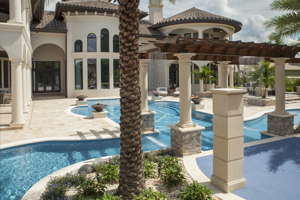
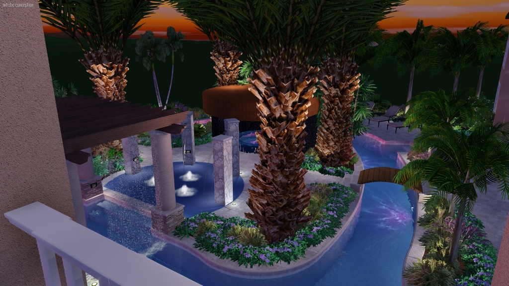
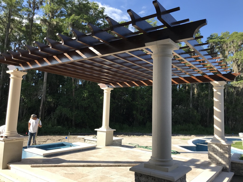
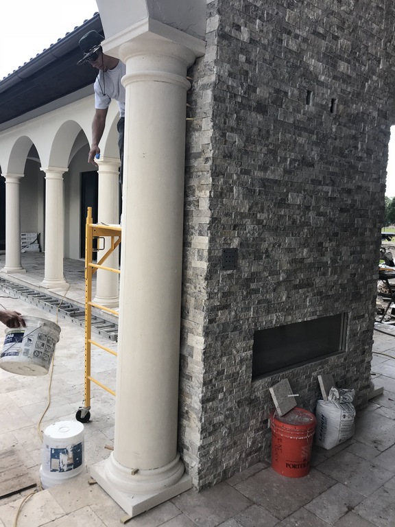
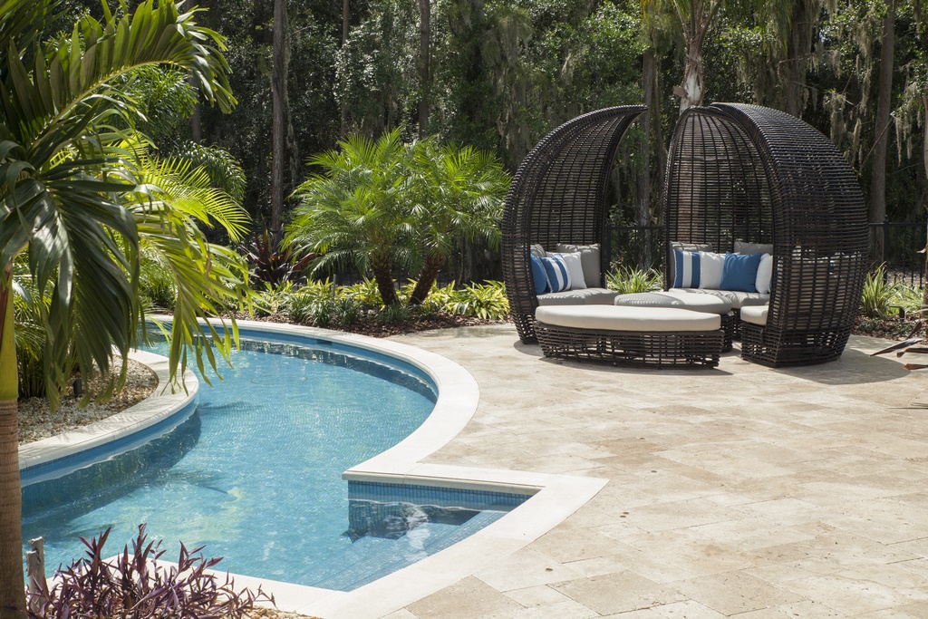
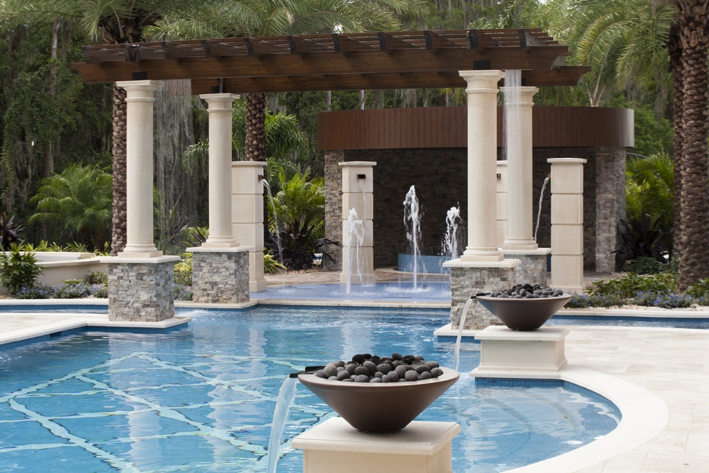
| We worked with materials of just about every variety in completing this project, from wood and large architectural elements to stone veneers and Travertine pavers – all of them meant to set off and complement a set of glass-tiled watershapes that included a pair of spas, a long lazy river and an elegant, lap-length swimming pool. |
The result of all our planning was that this project, grand as it is, came together with very little drama. One of the things we at Ryan Hughes|Design|Build (Tampa) have learned is that, with projects of any considerable scale, good planning and logistical discipline are absolutely critical.
Our planning, for instance, simplified tasks as large as executing the lazy river: Knowing we needed technical support, we enlisted the assistance of our friends at Aquatic Consultants (Miami, Fla.) as well as the system manufacturers at Riverflow (Ventura, Calif.) to make certain we were ready when the time came to install the required pumps without incident and get the system running smoothly right off the bat.
This no-drama approach worked throughout our time on site. It made it easy for us to pull off when required to let home construction move forward, for example, and then come back on site seamlessly when it again became possible. Our level of preparation allowed us to perform as professionals from beginning to end: It’s the kind of on-the-job prowess that puts and keeps us in the running when jobs of this significance come along.
ORGANIZED EXUBERANCE
It also helps that we’ve defined our business as being about over-the-top entertainment. Clients and designers come to us when they’re after a wow factor – a no-holds-barred emphasis on delivering spaces that perform, entertain and even dazzle homeowners and their guests as well as organizations that use these spaces for fundraisers and social events.
Many watershapers these days are about water as art – beautiful spaces that are meant in large part to be admired but seldom used. By contrast, we design our backyards above all as places for fun, recreation and activity, starting, as mentioned above, with functionality and then moving on to fine detail. This has never meant that our projects don’t turn out to be beautiful, but gorgeousness is a goal we focus on after we’ve given clients the functions and arrays of fun features they crave.
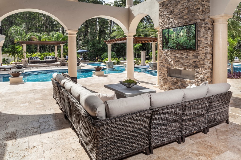
| Given the owners’ intention of allowing the space to be used for charity fundraisers and corporate events – not to mention their own gatherings – we set the space up to accommodate large numbers of visitors among a range of comfortable destinations, including multiple seating areas as well as an array of watershapes and sound-generating waterfeatures from rain curtains and a splash pad to spillway-ready fire bowls. |
In this case, the clients wanted the backyard to be blow-out fun for their children and their friends, which led us to include the splash pad, the grotto, the rain curtains and the lazy river. In fact, the whole island was assembled with active play in mind. We also set things up for adult recreation and relaxation, with a long swim lane, the master suite’s “private” spa, the outdoor kitchen and multiple seating areas that allow for adult supervision of activity in the pool and lazy river.
Finally, the owners’ desire to make their home available to the community meant establishing destinations, managing traffic flows and keeping everything well-lit and safe. This functionality is supported by an outdoor sound system, all sorts of LED lighting and comfortable seating/socializing areas placed in spots throughout the yard.
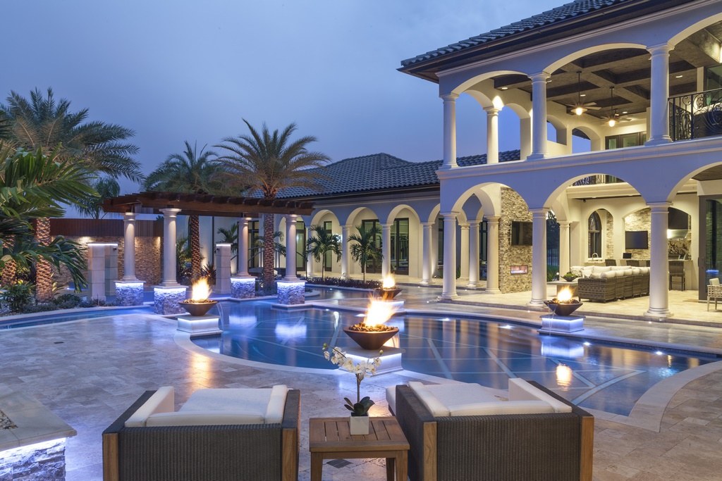
| By night, the space takes on even greater senses of elegance and dimension with the activation of numerous fire features and the use of extensive landscape and underwater lighting. It’s not garish by any means, mostly meant to enable guests and visitors to use the space safely as they move from area to area around the big backyard. |
We take obvious pride in what we do for our clients, but after nearly 20 years, that’s something we take in stride. What gets and keeps us going these days is the way we manage our projects and stay on top of all of the logistics involved in pulling compositions as grand and complex as this off without any hitches.
Take the island, for instance. It has all sorts of features of varying complexity, from the splash pad and the large spa to the fire pit/seating area and the grotto structure. We had to plan down to every last detail because all of our pipes, conduits and lines had to run under the lazy river’s structure. As it turned out, we made every single connection – and now our clients run it all with their cell phones.
The good news is that this is now the homeowners’ main U.S. residence – a refuge from travel but a resort on its own. We’re not exactly surprised by their positive responses, but it’s still satisfying to know how much they’re enjoying what we designed and built for them – from their perspective, so effortlessly.
Ryan Hughes is president and creative director at Ryan Hughes|Design|Build in Tampa, Fla., a firm dedicated for nearly 20 years to creating fine outdoor living spaces and enclaves featuring pools, spas, waterfeatures, landscapes, fire features, outdoor kitchens and more. He may be reached via email at [email protected].


