Creative Linkage

It may not happen as often as I’d like, but every once in a while a project comes along unexpectedly and turns out to be just fantastic.
In this case, I was referred by a pool builder I didn’t know to a home designer/builder I didn’t know, either. The pool builder had found me via the Internet after the designer/builder had let him know that she was interested in finding a talented pool designer who could help carry her residential projects to a new level.
He’d liked what he’d seen on my web site and passed my name along. Soon I was in direct contact with Stephanie Bell of Bella Fine Homes (Atlanta) and was invited to review a site for which, she told me, she wanted a swimming pool, a spa, some fire features and a sport court. The last item was a bit off my usual path, but the overall situation was so intriguing that I jumped right in.
STARTING FROM SCRATCH
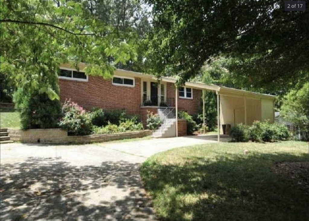
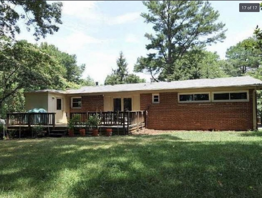
There were all sorts of good reasons for doing so. First, the property is located in Buckhead, an affluent enclave in the city of Atlanta. It’s a well-settled area in which vacant lots are rare and finding homes for sale is uncommon. But Bell had found one – a knockdown-worthy home that stood out for its lack of style and grace amid beautiful surroundings.
Second, she had decided that this was where she wanted to live with her family. In place of a red-brick, one-level, postwar box, she was thinking about a two-level contemporary structure that represented a distinct upgrade over the old house. This was why, she explained, she wanted to bring in a good pool designer:
Third, it was encouraging that she seemed to know her limits. While she was more than comfortable in deciding what she wanted for her family by way of a polished, refined living space, she knew she wanted something special outdoors, too – and I was more than happy to oblige.
As is usual in my design process, I took her wish list and, considering the complete environment – views, the home’s planned architecture and style, the lay of the land and the fact that the parcel was near an often-busy street – began to organize the space into two designs I showed her to give her a sense of what could be done.
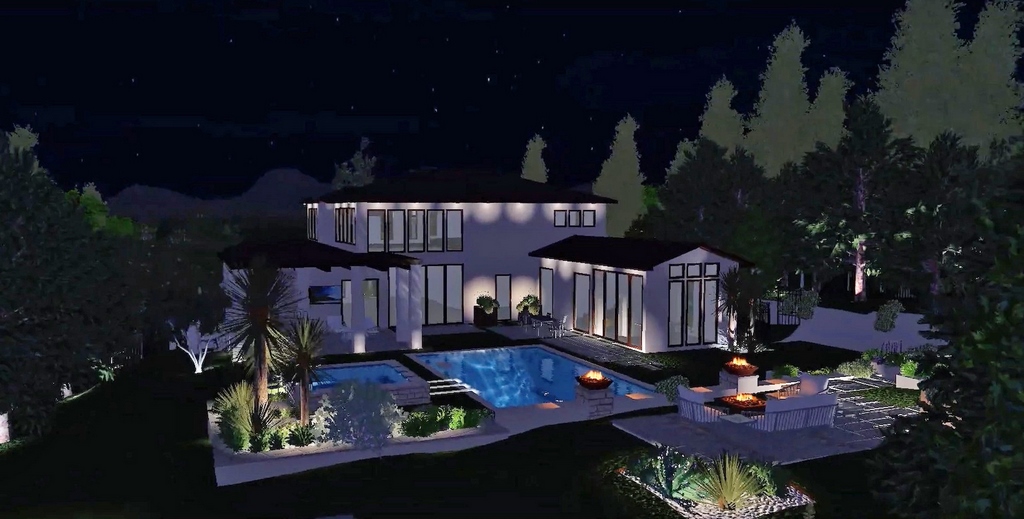
There was just one problem here: She hadn’t completed her own design process, which left me in something of a vacuum when it came to figuring out how the site would work. She had mentioned that, while she liked Modern approaches, she didn’t believe it would be right for the area and was thinking in more Contemporary terms. I needed something to work with, so I expanded on what she’d told me and placed a home inside my design, figuring she’d let me know where my assumptions were off base.
What happened was just amazing: She loved the look I’d come up with for the watershapes – and also for the home! What I’d done had in some ways bridged Contemporary and Modern looks through a dramatic use of windows, and, later, she ended up adopting some of what she saw in her own design. My guess is that it gave her just what she needed to get going – an early meeting of the minds that set us off on a great creative adventure.
| Front and back, the original home was significantly dull and ripe for replacement. My design work started before a plan for the home was ready, so I improvised and placed a poolscape in the context of a partly Modern, mostly Contemporary shell that captured the spirit of my conversations about style with the client, a home designer and builder. The client loved the pool – and adopted elements of my backdrop home in her subsequent design. |
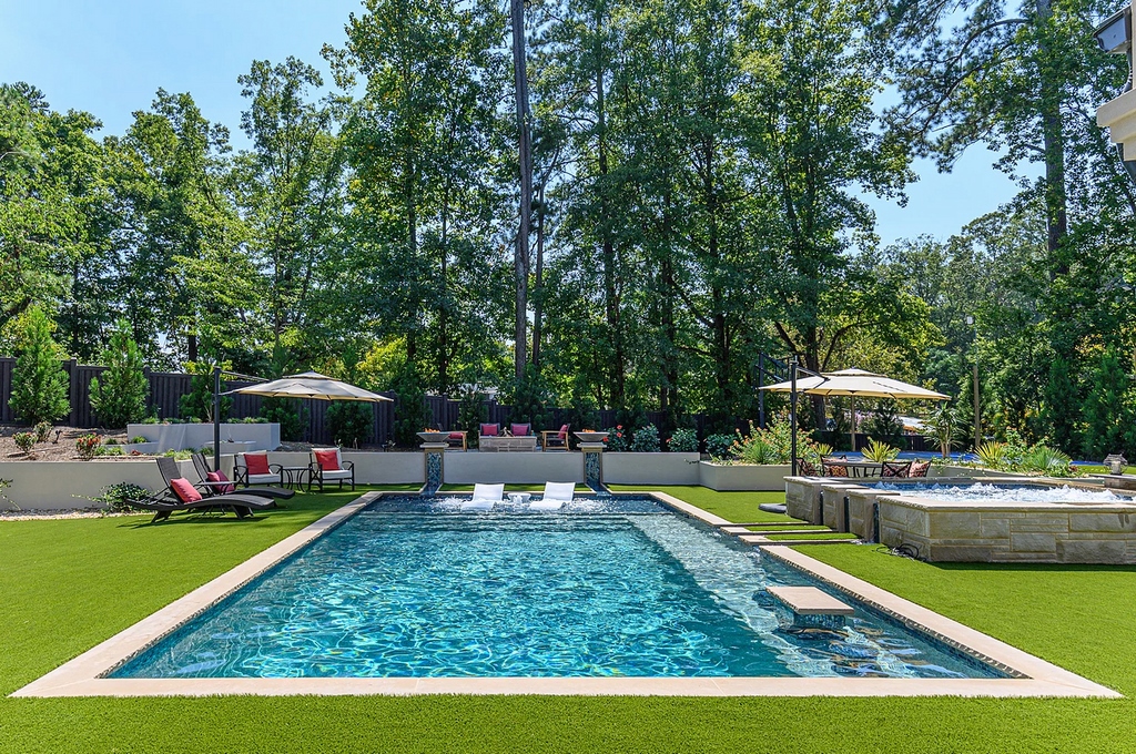
The way she ultimately set up the home reflected my desire that there should be a clear view from the front door, on through the house and out to the backyard, making it easy to site the pool. But the long view on this line ended at a fence backed by trees, so I included a low wall that would have a pair of runnels to give the view a vertical flow that would jump over the fence and rise directly up to the trees.
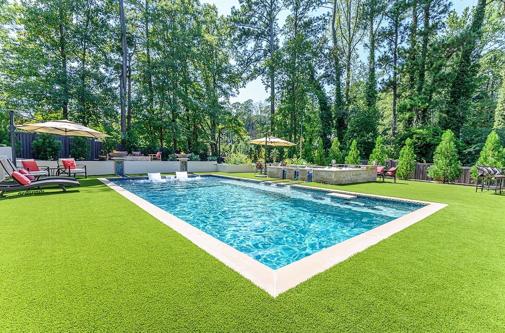
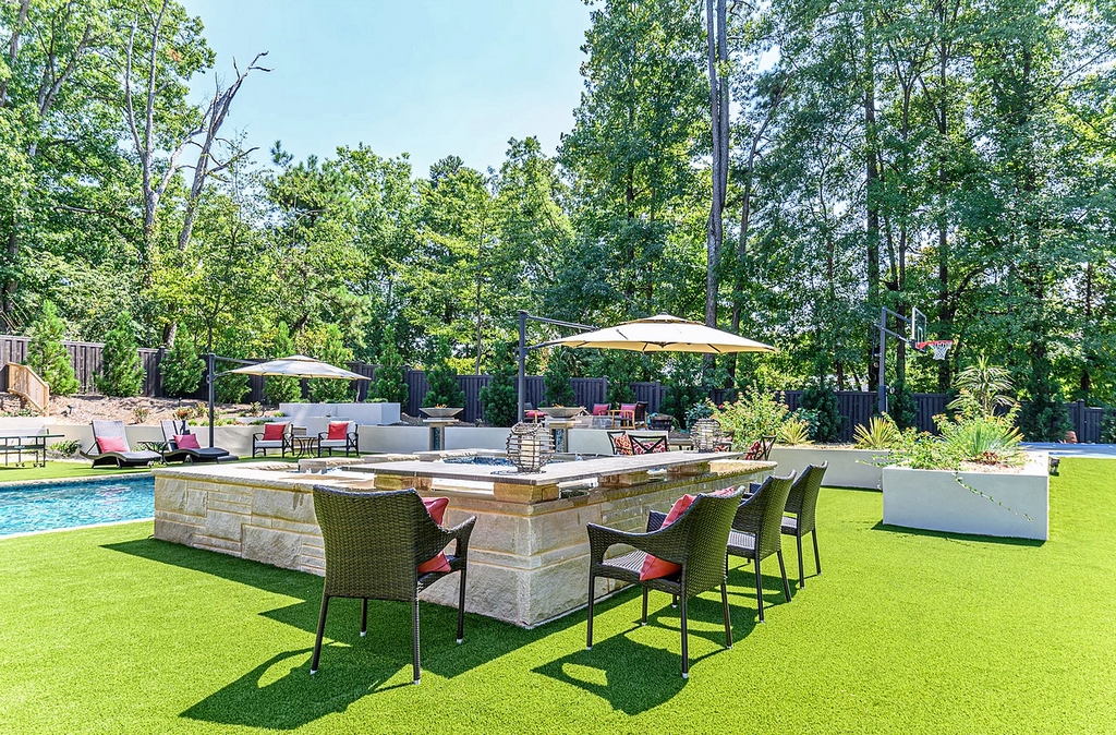
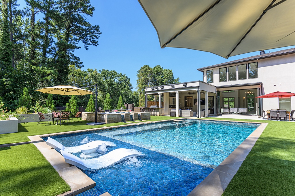
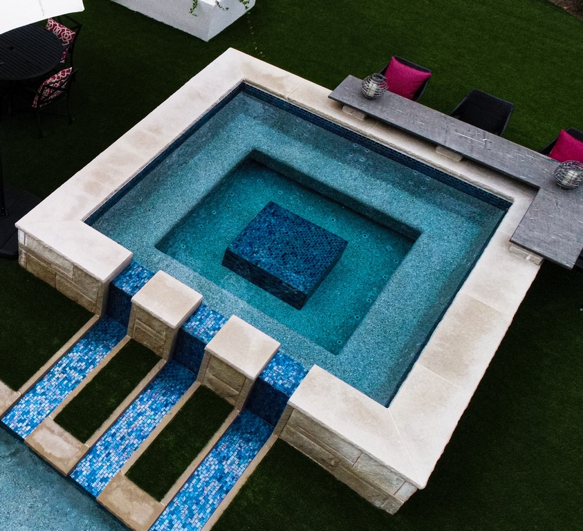
On that same line and inside the pool adjacent to the low wall, I inserted a shallow lounging area with three bubbler jets. To the right side of the pool is the spa – along with three more runnels. (I’d seen similar channels while traveling in Spain last year, and I love their clear, calm, clean look.) The spa occupies a position convenient to the outdoor kitchen and bar, so I placed a seating area along its back edge to encourage traffic within the area.
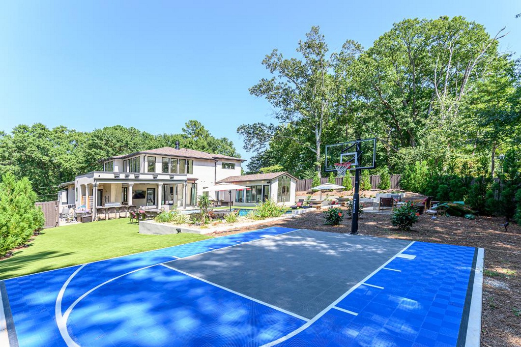
All of the waterfeatures here – the five runnels and the three bubblers – serve as nice visual details, but there’s also a practical component: All of them bring adjustable levels of sound to the pool area, thereby blocking out traffic noise as needed and, more specifically, maintaining the pool as a separate refuge when basketballs are bouncing and the rim is clanging on the sport court.
Continuing with this separation of spaces and functions within the yard, there are several short walls and planting beds in the space. Basically, when you’re in the pool, it’s set off as a special place, low in profile and essentially isolated from its surroundings – but easily accessible via multiple pathways leading out of the home.
VISION TO REALITY
The contractor who had pulled me into the project was the one who actually built the pool, but I was involved on several occasions as the process unfolded.
For one thing, my hydraulic plan represented a new approach for him with its upsized pipes. This wouldn’t have been much of an issue had he not run into something completely unexpected in excavating the pool – that is, a granite ledge that was located almost exactly in the pool’s footprint.
Nothing of this sort was anticipated: Subsurface stone wasn’t found when the home’s basement was dug out just a few feet away, and no digging elsewhere on site had even suggested that we’d run into problems. Cutting away the granite threw the schedule off for a while, but the main practical consequence was that I had to reroute some of the pipe runs to bypass the rock in certain areas.
Beyond that, construction was fairly simple, with just a few last-minute adjustments. One had to do with including an in-pool table: The client liked the idea of a swim-up bar, but I hadn’t included one because of the big shallow lounging area and the seating along the back edge of the spa. The only available space was on the pool-length step/bench structure, but a conventional swim up bar there wouldn’t have related well to the space around it.
The solution was the small in-pool table: It’s the swim-up feature she wanted, but it’s also self-contained in a way a conventional swim-up bar would not have been.
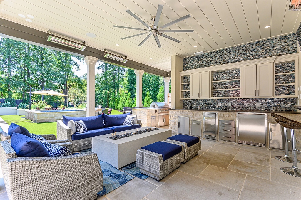
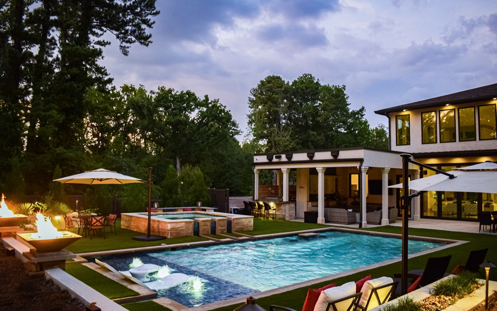
| The pool comes into view the moment you pass through the front door, walk through the atrium and approach a low-walled courtyard set amid tall trees. The covered patio/outdoor kitchen offers a different perspective, as does the seating on the back of the spa, of a composition rich in details, from the shallow lounging area and its bubblers to the five glass-tiled runnels that flow to the pool. It all has a resort feel, right down to the shower hidden next to the bar and the sport court that occupies a big corner of the yard. (Opening photograph above as well as, here, the top four images and the image at bottom middle right courtesy Bella Fine Homes, Atlanta) |
A second addition – this one after the spa was complete – took the form of a footrest in the well of the spa. The client is quite petite, and the impressive eight-jet arrays we’d included in each of four main seating areas basically pushed her right off the bench when it was operating at full hydrotherapeutic capacity. She needed to brace herself, and the fully tiled block we added was a nice aesthetic solution.
The landscape involved some nice solutions as well. It wasn’t part of our original responsibilities – nor was the landscape lighting – but as her trust in my capabilities grew, letting me handle both became an easy choice for her. She let me know that she wanted the backyard space to be as low-maintenance as we could make it, which led to the unusually expansive space given over to synthetic turf. (The plants aren’t plastic, of course, but they are as low-care as we could find.)
There was a simple reason for her low-maintenance request: Once the project was set, it became clear that it would be difficult to give a landscaper the sort of equipment access that would be required. I’m not an advocate of devoting this much surface area to synthetic grass, but it was the best option in this special case.
Actually, everything about the outdoor space is meant for carefree living and meeting the basic criteria the client set out for me in our first conversation: It had to be fun for both adults and children; it had to be suitable for entertaining and an extension of the big outdoor kitchen she’d be including in her design; and it had to function as her retreat – a depressurizing space for quiet relaxation.
And one more thing: The new home was also to serve as her place of business, meaning everything about it had to reflect her ability to deliver detailed, stylish results for prospective clients who came to her office. This upped the stakes for me and the way I considered how it would all hang together: The accent was on beauty, of course, but it also needed to reflect a high degree of casual, effortless elegance – a style she would carry to future projects with her visitors.
INTEGRATED ART
Staying attuned to all parts of her wish list and design ambitions was relatively simple for us, because at Juliet Wood Designs (Atlanta) we focus on establishing easy, effective relationships between interior and exterior spaces. As mentioned previously, we start pulling our clients and their families and guests out to the backyard the minute they pass through the front door.
In this case, the Contemporary design with its large front door (and even larger glass doors and windows opening out to the poolscape) made it easy to inspire lingering glances toward the backyard. This explains the use of the runnels, which feature prominently in views both through the entry space as well as from the large, covered patio and the client’s bedroom: This water in motion brings a sense of life to the setting, with sound and movement that reward anyone who opens a door and steps into the backyard.
| As dusk settles in and day turns to night, the backyard becomes an even more inviting outdoor retreat – a sheltering space filled with the subtle sounds of moving water, landscape lighting that keeps the trees and numerous planted areas in view and fire bowls that bring warmth and flickering reflections to the poolscape. |
We also work best when a client gives us a few parameters and lets us make most of the necessary decisions on his or her behalf. In this case, Stephanie Bell had expressed her original vision and now had a house to build – a fact that helped her leave us to integrate what we were doing with the physical patterns she was establishing.
As mentioned above, the sport court was an unusual design element for us, but our decision was to integrate it, too, linking it visually to the bar area and keeping it in view for people standing around the pool. But despite those easy eye-level connections, we also invite people to sit in and around the water in a walled-off, visually sunken courtyard – a separate space in which it was possible for her son and his friends to play basketball “over there” without intruding too much on a sense of poolside calm.
Ultimately, she wanted a vacation at home. Now she has it.
It wasn’t long after the project was completed that I received the ultimate compliment from Ms. Bell: She asked me to sign on for another project with the same sort of fully integrated design – and since then has called on me as her designer for two additional projects.
Juliet Wood is principal at Juliet Wood Design, an Atlanta-based specialist in exterior environments. Working in association with Eco Pool Services (Atlanta), she offers complete design/build packages in the region and consults on projects beyond her local base. She started out as a fashion designer in Bogota, Colombia, before moving to Atlanta, where her interest in landscapes and water led her to study landscape design at Emory University (Atlanta) and pool design and construction through Genesis. She may be reached at [email protected].


