A Private Paradise, Revisited

In many ways, this project is a study in personalities: of the original clients, of the home’s architecture and, ultimately, of subsequent owners who purchased the property and called me back to it years after my initial work had been completed.
The first time through, the owners were close friends of mine. We had remarkably similar tastes, so my basic charge was to do exactly what I thought needed to be done, much as if it were my own home.
The house is a beautiful example of Mid-Century Modern, a style that fits well in the special environs of the Florida Keys. But when I first visited the site, I could tell that someone had tried to turn it into something it wasn’t meant to be – vaguely Balinese with wood lattices, a flat, beige color scheme and lots of dark spaces. Nothing really flowed.
As I came to understand the architecture, the setting and their particular needs, I decided to rework the color palette, change the way the patios and covered areas flowed and functioned, alter the look of the swimming pool and, finally, redefine the layout of the private garden spaces that encompassed the home.
I could clearly see the bones of the house and knew that the swanky, modern luxury befitting the style was right up my alley.
FOOLING THE EYE
In essence, Mid-Century Modern is all about evoking a sense of casual elegance while establishing free-flowing connections between interior and exterior spaces. That’s perfect for homes situated in Key West, where it’s warm most of the year and the climate encourages active, sunny, artistic lifestyles.
The one limitation to homes in Key West, however, is that there’s no overabundance of land: As exterior designers, we’re left to create appropriately lush, tropical looks in what are often absurdly small spaces.
This is why linking inside and outside spaces and making full use of patios and covered areas is so critical. This project, for example, offers clear connections between formal interiors and a natural abundance beyond, but if you were to measure the planting areas, most people would be amazed how such an open look and feel could be achieved in so small a space.
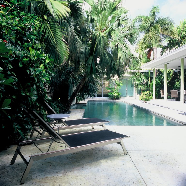
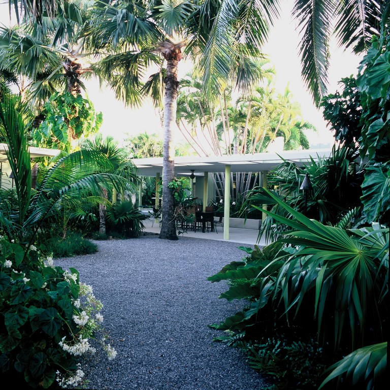
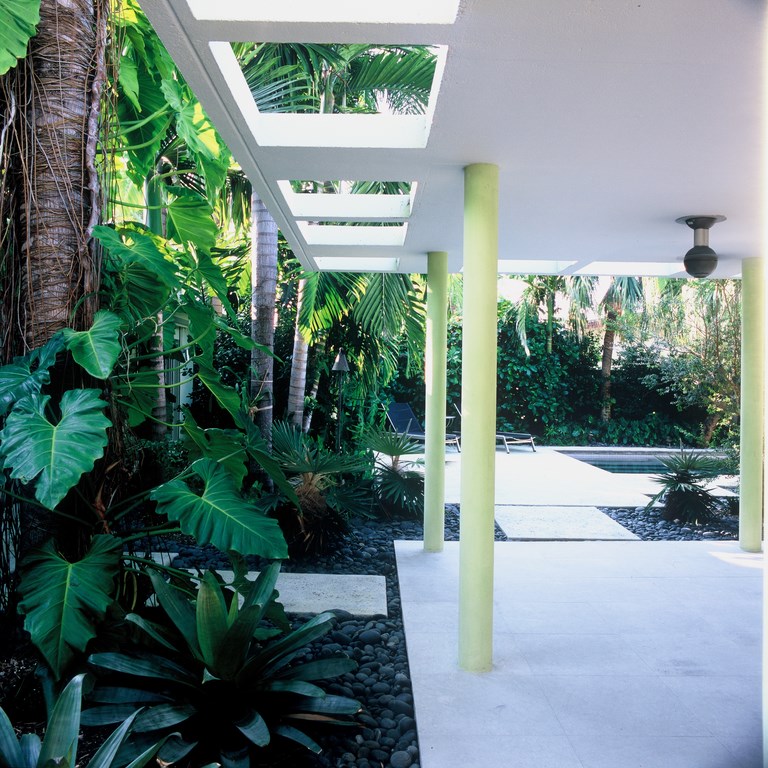
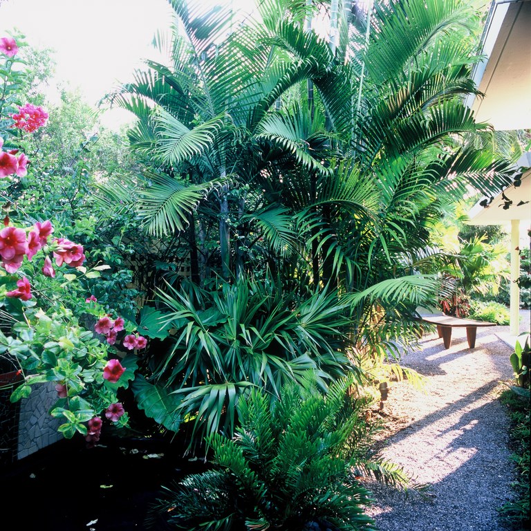
| The sense of spaciousness you experience in visiting this relatively small parcel comes through careful use of patios and covered areas to create links from inside the home to areas beyond. In fact, we augmented this sensation by bringing the walls in a few feet from the property line: In sacrificing some square footage, we retained complete control of the plantings on the other side of the walls and the impression they make. (Unless otherwise noted, all photos by Richard Felber Photography, New York, N.Y.) |
The illusion works so effectively because most people don’t understand how grand gestures can be used to create vistas and draw people outdoors, even with decidedly cramped settings.
Accordingly, one of my first decisions was to move the walls in a couple of feet from the property lines: That might seem counterintuitive in a small space, but it enabled me to set up tall plantings beyond the walls that were still under my control within the property’s boundaries.
I also used a long, rectilinear waterfeature to amplify the sense of space. As a rule, one doesn’t associate large, bold visuals with small properties – so when you see them, they create a strong sensation, another illusion that you’re in a space that’s much larger than it really is.
KEY DETAILS
Such boldness is particularly on display in the long waterfeature and in the swimming pool on the other side of the yard. With their vivid tile mosaics, they create strong, unifying focal points while also delivering a benefit in the form of the traffic-masking sound of falling water.
| One wall features a long, large rectilinear waterfeature – a bold inclusion in so compact a space. At this point, it’s hard to see more than flashes of water through the lush, heavy growth the new homeowners prefer, but the sound of flowing water still fills the space. |
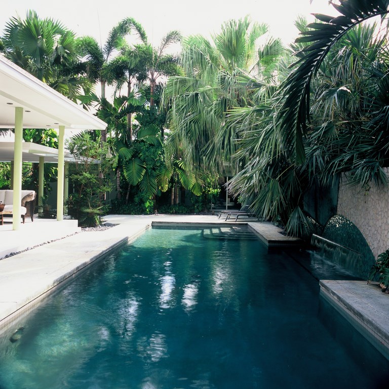
The swimming pool is, by the way, a thorough reworking of the home’s original pool. Both occupy the same footprint, but the old one had been elevated out of the ground to a truly awkward height that made it more of a trip hazard than a locus for recreation or relaxation. So we sank the vessel into the ground and added an elevated planter with sheer, gently splashing waterfalls (and another tile mosaic).
For all the work that needed to be done in the backyard, the most obvious visual problem on the whole property had to be the two-car garage that consumed too much space at the front.
| The swimming pool occupies the same basic footprint as did the slightly raised watershape we found when we arrived, but we knocked it down to deck level and took advantage of the change to add a low spillway to the far side of the structure. |
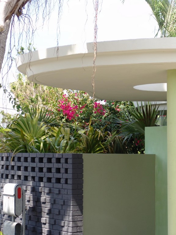
It walled off (and wasted) a huge portion of the exterior space. Before we started on any other garden area, we reshaped the entryway with a new carport – a potato-chip-shaped loggia supported by three simple columns – and set up an inviting walkway with floating slabs of textured, stained concrete. This pathway leads to a covered courtyard area that was once the driveway.
By reorienting this entry space, we were able to push the useable area out to the walls and to the property-line plantings, for the first time allowing my clients to make full use of this exterior expanse.
We linked the new entryway with the rest of the exterior spaces by picking up the modular decking pattern and its simple, stained finish. I love this approach and use it whenever I can: The modules create visual interest, aren’t large enough to crack and make those on foot slow down a bit as they move from one area to the next.
DEJA VU
Some years after completing this project for my good friends, I was called back by the home’s new owners to revisit the design and harmonize it with a new pair of personalities. She’s a well-known author who had her own ideas about the home, but at the same time she declared her interest in retaining the best of the qualities we had developed and expressed the first time around.
| In some areas, we spun off the home’s Mid-Century Modern detailing to enhance the overall composition. As seen here, for example, we reworked the entry to create a carport (a welcome addition to any home in the sun-drenched Keys). We also added a vividly colored blue wall (later redone for the new homeowners in a softer gunmetal gray) to anchor the soaring look of the new carport. (Photo by the author) |
In this case, the updated exterior vision sprang from the thorough remodeling of the home’s interior. Basically, they’d knocked down walls and opened things up in ways that created dramatic new flows and views through the home. I loved it, because it gave me the opportunity to offer even more by way of connections between spaces inside and out.
My favorite addition is the exterior shower area now associated with the master bath. Whether you’re facing this area or just catching the view in the bathroom mirror, the garden is always there. And you can easily step outside and move right into the outdoor spaces.
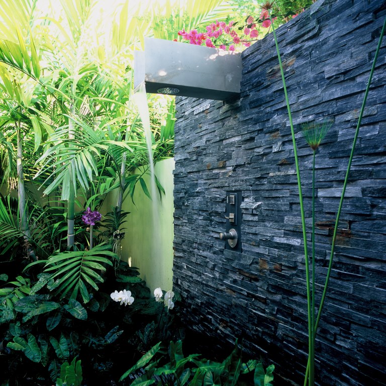
To make the experience both decorative and useful, we installed a stacked ledgerstone wall out of which the combined shower/spillway feature emerges – a water effect as well as a glorious place to bathe. To enhance privacy and increase our clients’ sense of security, we took the extra precaution of planting the far side of the wall with lush, thorny plants.
| A key addition for the new owners is this outdoor shower, positioned just outside the master bath. It’s another way we’ve linked interior – and has the pleasant side effect of making the master bath seem twice as large. |
As established, the shower space has an intimate scale and some wonderfully expressive plants, including Red Bananas, Cabatta palms and various orchids. The stone is black, which makes the greens we chose for other exterior surfaces stand out along with the plants. Moreover, the clients are pleased with the sense that the size of their master bathroom has essentially doubled.
Colors were of paramount importance in the revised exterior design and reflect critical choices made for the new interiors. My first clients had gone with furnishings and a palette appropriate to the home’s mid-century style, so we worked the same way outdoors, using recessive, dark blue-greens and olive-grays for the walls to serve as backdrops for plants.
There were some bolder accents – the most significant being a deep, vivid blue we used on a sinuous brick wall along the path to the courtyard’s entrance – but the overall look was appropriately restrained.
CHANGED VENUE
The new owners had a broader, richer vision and pursued an altogether different approach, using lots of wood and eclectic art indoors that almost play against the architecture – and it all works beautifully.
|
Defining the Process I create gardens in my mind, then build them in reality. It’s a three-dimensional art form that changes constantly during installation as I respond and react to what I see in the emerging composition of various elements. It’s also a temporary art form that aspires to permanence, one that puts my head in the clouds but never lets me set aside the mason’s chisel. Yes, gardens are personal places, and creating one for a client is an act of sensory intrusion, an effort of nearly unthinkable intimacy. Indeed, I owe much to clients who tolerate this chef as he hotly pursues a meal to be served well. Most of the projects I’ve shared in WaterShapes (and will share in several shorter articles to come) are the result of years of just this sort of intimate human interaction, and the spirited generosity I’ve been shown by many of these clients is still more than enough to make me blush. That these creative souls then enjoy their homes and gardens for years on end because of the work they’ve let me do is a source of satisfaction that cannot be fully communicated. This is why, finally, I look upon these gardens as my children. They are conceived without knowing what they will become, and like all progeny, they grow with their own personalities, needs and inclinations. For me, it’s an honor to be there in those moments, in those places, and be part of helping them become and strive and achieve. — R.J. |
This prompted me to go with softer colors outside, shifting to gunmetal gray on the front wall, for example. We also changed out some of the stonework in various hardscape treatments, shifting from a rose travertine to a soft, gray stone.
The renovation was completed before the devastating hurricane season of 2005, soon after which I revisited the home and found that the gardens had been fairly well devastated. Nonetheless, I was gratified to see that many of the key hurricane-resistant plantings had endured: They may have been in sad shape, but they were ready to bounce back and flourish.
The same can be said for the house itself: Although the original occupants lacked much imagination in dealing with its surroundings, subsequent owners came at their surroundings with more energy, had clearer visions of what they wanted and brought in a designer who appreciated the resilient spirit of the place.
It’s always interesting to revisit one’s past. To do so in the company of such thoughtful, agreeable clients is a remarkable privilege.
Raymond Jungles is founder and principal of Raymond Jungles, Inc., a landscape architecture firm based in Miami, Fla. His passion for landscape architecture stems from his longtime association with Brazilian artist and environmental designer Roberto Burle Marx; his current practice is firmly rooted in Florida and the Caribbean basin with a focus on residential, resort and community design. This November, he will be the keynote speaker for 25th annual conference of the Association of Professional Landscape Designers, to be held in Orlando in conjunction with the International Pool|Spa|Patio Expo. For details, click here.


