Committed to Balance

For most of my professional life, I’ve worked on projects in which the dominant color is green. With the project under discussion here, however, both the client and the setting called for something quite different.
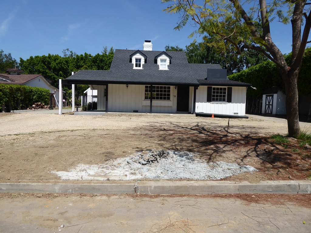
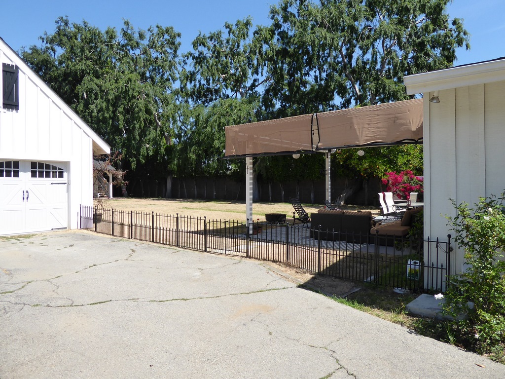
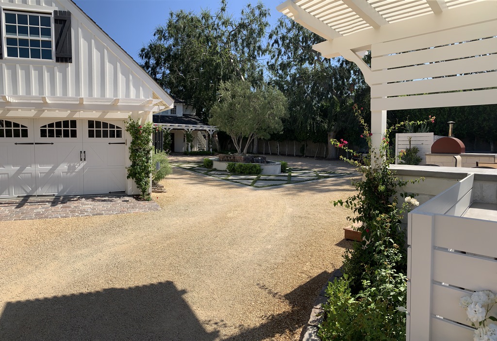
As I knew going in, the property, located in Northridge, Calif., is both a residence and a place of business, so on any given workday multiple cars and trucks invade the space and need convenient places to park. But while this primary use of a plaza-scale space as a parking pad suited clients’ business needs, it was plainly too dusty and downright bleak to offer any satisfaction to home or family.
The solution involved some creative play with surfaces and materials as well as the introduction of core features that brought some verticality to the space. Beyond that, it was about tempering a light-brown roadbed, a concrete deck surface and white structural components with flashes of green – and crafting a space that could be all business by day but family fun at night and over weekends.
ESTABLISHED TIES
I became involved when the clients, a family team that runs one of Los Angeles’ best surveying companies (and whom I knew from having hired them many times in connection with my own projects), called and let me know that it was time to remake their surroundings.
It was great for commerce as it was, because cars and big trucks could get in and out easily. But it was a wasteland for the family that lived there: After years of compromise in the name of business, they told me, they wanted to restrike the balance of their surroundings to the greatest extent possible.
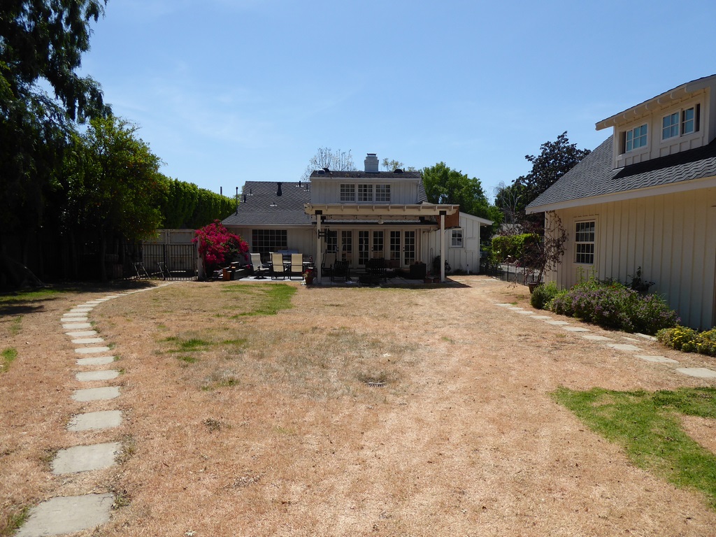
Part of the program included the enhancement of a separate living space at the back of the property through addition of seating and dining areas to go along with a new outdoor kitchen. At the same time, the main house was undergoing some expansion – leaving the revamping of the seemingly inviolable parking pad as a final and most difficult design challenge.
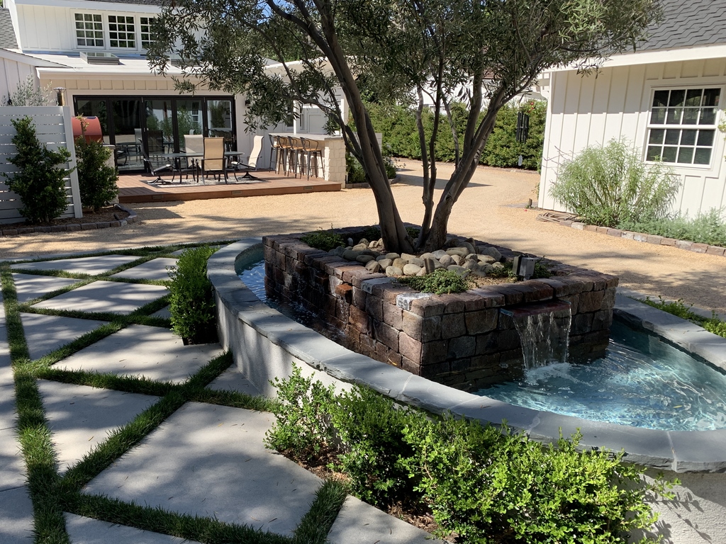
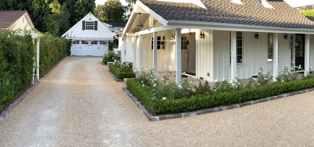
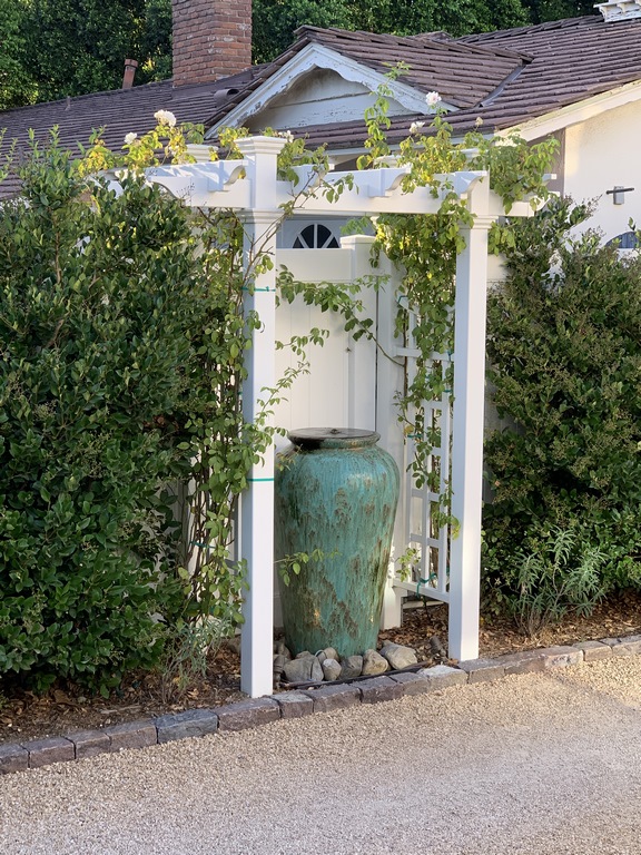
It wasn’t generally a noisy area (other than when big trucks lumbered across the property), but I decided that the sight and sound of moving water had to be at the heart of the program – and could be subtle because the existing spaces were so quiet as a rule. Two small waterfeatures would do it, with one along the driveway at a spot opposite the main home’s living room and the other in the center of the parking pad.
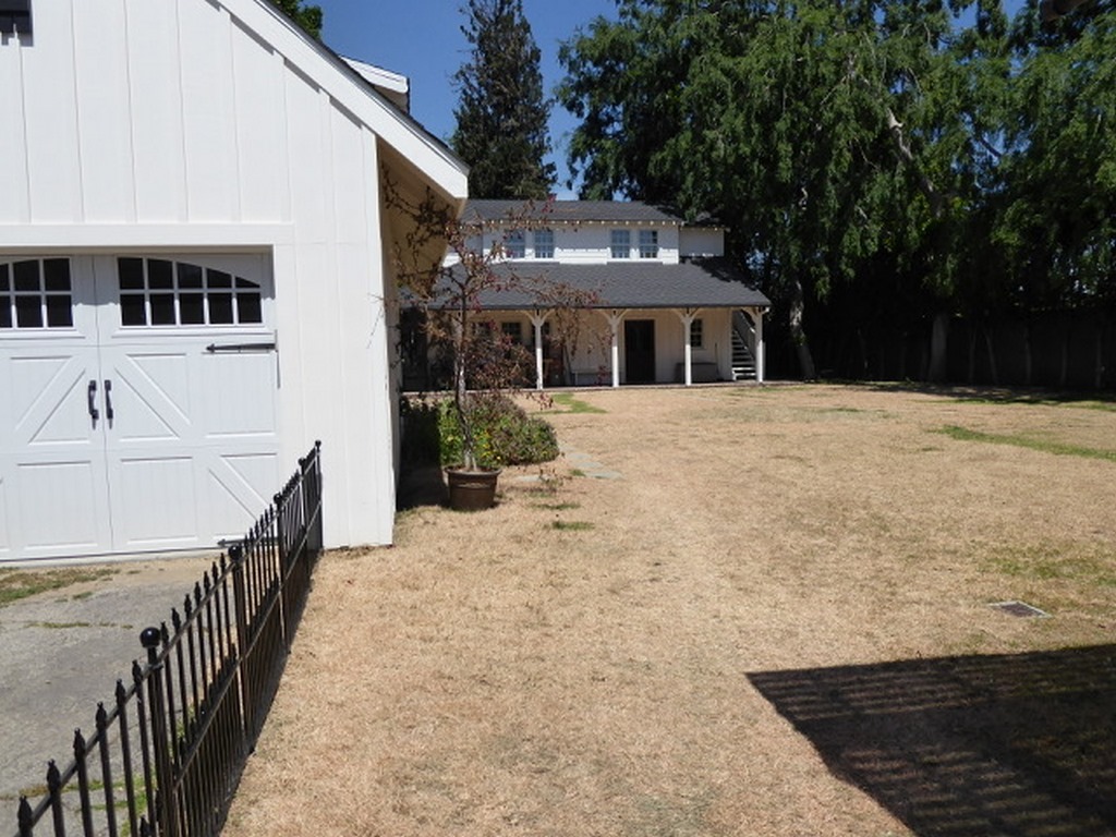
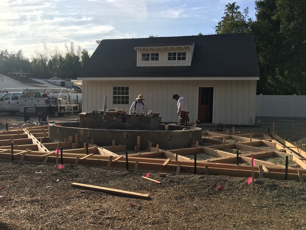
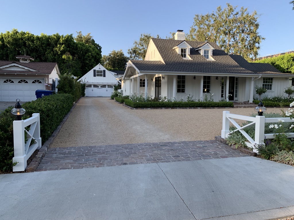
| When we arrived on site, the situation with the yards both front and back was pretty grim: It was clear that easy access and parking spaces were more important than family fun. Although there was a gesture to good times in the form of an overly exposed patio space in front of the building at the back of the property, the homeowners asked me to do what it took to reset the balance to favor of a more pleasurable outdoor-living experience. |
This pad was the key to the entire space: It can be seen from key spots inside the main house (particularly when the new addition was considered); was open to viewing from inside the company offices and meeting rooms; and would serve as an extension of the new patio space that was destined to become the home’s outdoor social hub. We had to get it all just right, in other words, and needed to find an unusually flexible approach.
In weighing options, we had to dismiss decomposed granite as a possibility. While it had the right look, it wasn’t viable for steady vehicular traffic and would’ve shown tire tracks and become unmanageable in wet weather. But it was just the color the woman of the house wanted, so we kept looking for a workable option.
There was also the fact that the extensive brown surface under discussion might become visually blank and boring, which led us to consider a contrasting central area made of concrete – just the sort of possibility that would work well with a raised fountain feature of the scale I was considering. This added the further challenge of figuring out the shape and extent of the concrete surface and figuring out ways to make it interesting as well as functional.
So we had a fair idea of the direction we were headed – but then needed to spend a good bit of time assessing visual features, defining traffic patterns and figuring out ways to beautify the space, soften its edges and make it as engaging for the family as it was functional for clients and staff.
SURVEYING THE SCENE
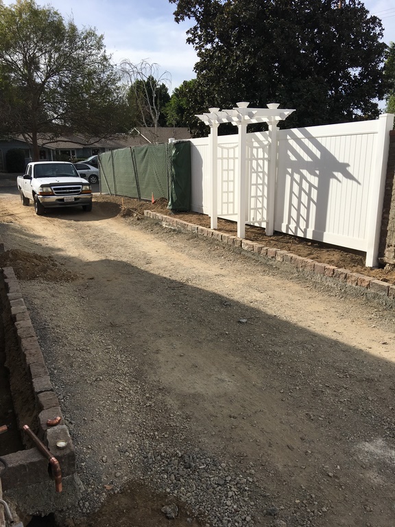
The first breakthrough came in identifying a crushed gravel that had the same light-brown coloration as decomposed granite but a large enough grain size that it could be compacted to form a durable roadbed. The color was perfect, but we knew from our conversations with the vendor that it would need to be fully and rigidly framed to maintain surface integrity.
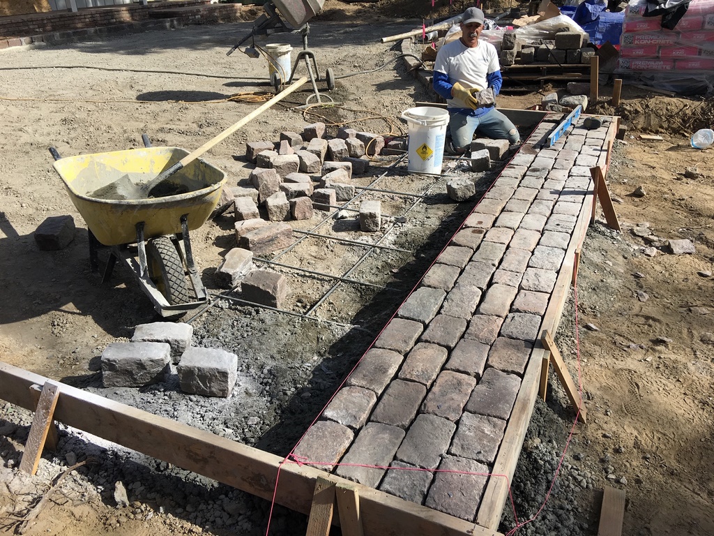
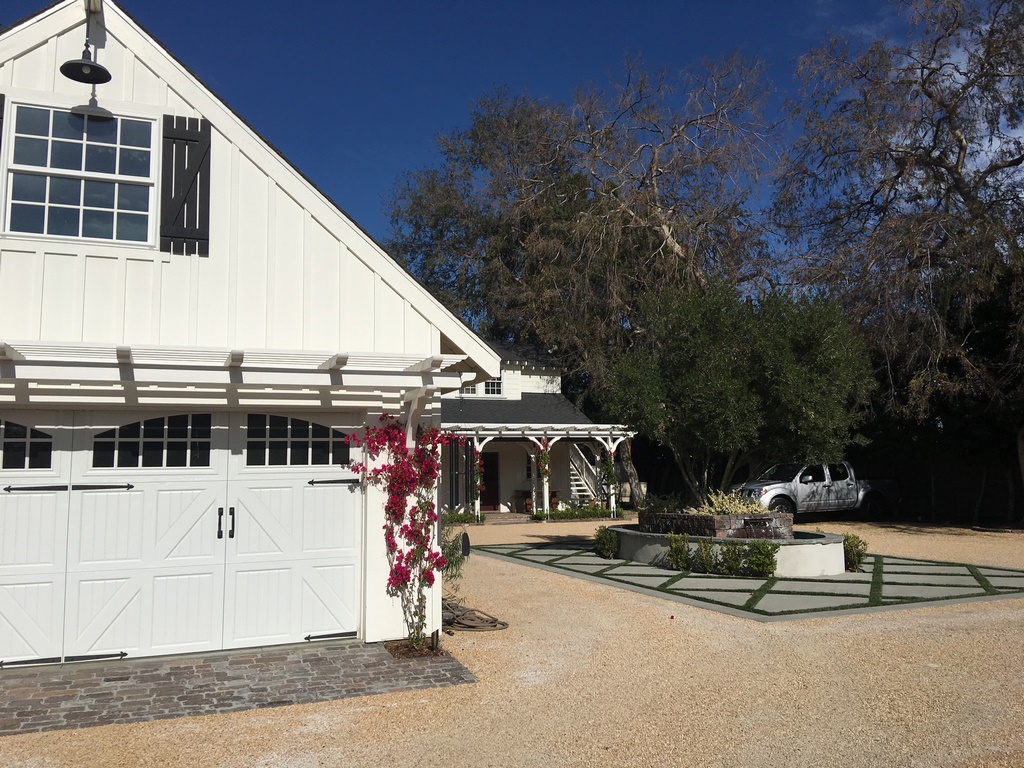
Now we found another perfect solution, this time in a cobblestone material sourced from the historic streets of Philadelphia, Pa. It has a wonderfully worn appearance, was available in suitable quantities and provided us with an irregular surface texture that contrasted nicely with the utterly flat planes of the gravel and the island of concrete we’d be placing at the center of the space.
In all of this, it’s important to remember that these clients are surveyors – the sorts of folks who dream nightly of straight lines and perfect edges. So everything we did needed to fit within an overall composition that reflected who they are, the kind of precision they pursue and the sensitivity to line that’s so much a part of the profession they want to embody for their clients.
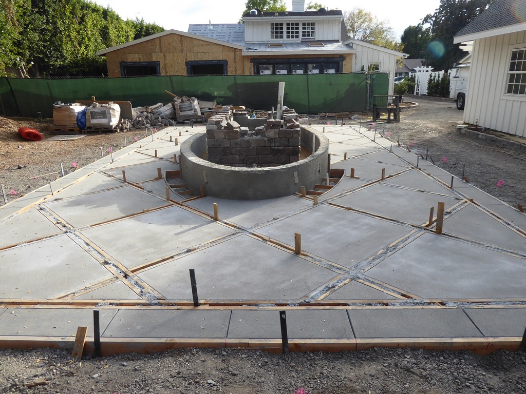
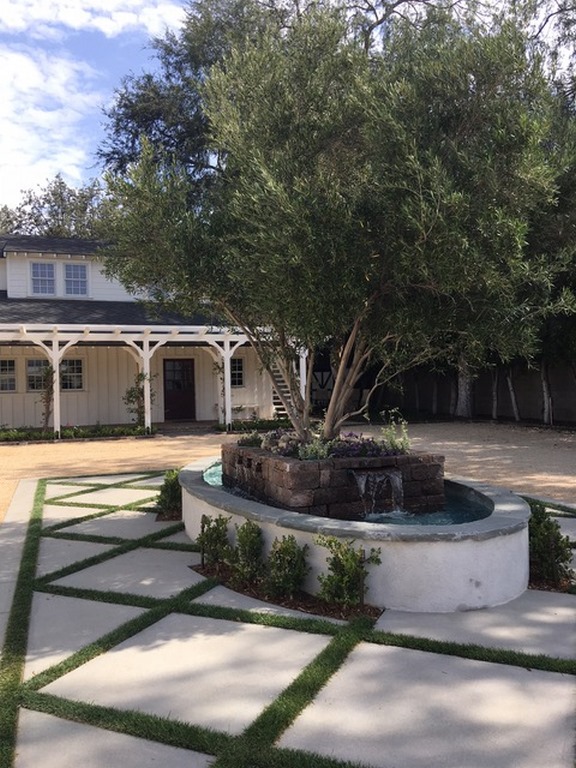
With the frame selected and the field material on its way, we needed to figure out the details of the raised waterfeature and the concrete deck. To soften its look, we decided to compose the pad of a series of diamond shapes interposed with strips of grass. We had considered artificial turf for durability, but that possibility fell short of the clients’ desire to include a bit of nature in the surface treatment.
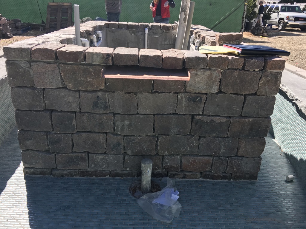
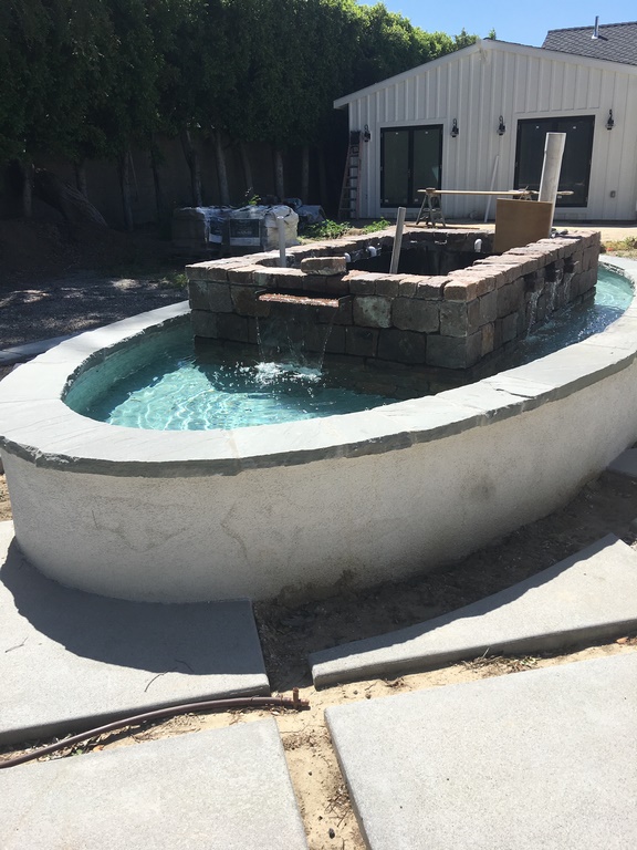
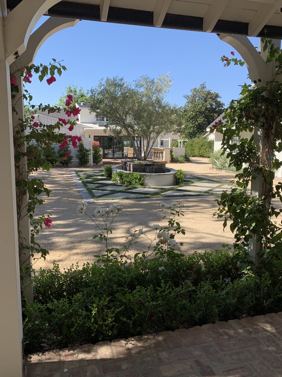
| Finding the right materials was crucial to polishing the design. The historic Philadelphia cobblestone we used for curbing and border treatments was one key, for example, and was so strong visually that we ended up using it as cladding for the central fountain’s core structure. We also played with shapes, which made sense given the family’s surveying business, by surrounding the rectangular fountain with an oval basin set within a precisely crafted array of concrete diamonds set within a rectangular frame. |
We had the same sort of exchange about the olive tree we’d decided to place in the deck’s raised central oval: I had suggested going with a small specimen and letting it grow into the space. They took an impatient path and selected the largest tree they could find that we could crane and cram into the small available space.
The tree is what’s described as mostly non-fruiting. Almost everyone knows that true, fruiting olive trees can be extremely messy, and my recommendation had been to go with a completely non-fruiting variety. But the clients gravitated toward this specific tree – probably because it was the largest one available that we could still fit in the planter.
Ultimately, I think they were right to be stubborn about the tree’s size: As it is, the plaza looks like the olive tree had been there for many years before the structures were added to the space – always a nice touch.
As for the waterfeature, its oval form gave us two large surface areas to feed with spillways but really didn’t give us the room we needed to place anything more than restrained scuppers on the narrow sides of the oval. This measured flow is also necessitated by the fact that, for a good part of the year, Northridge is an unusually breezy place – and we needed to keep the water where it belonged.
LINES OF SIGHT
We at New Leaf Landscape (Agoura Hills, Calif.) took care of the gravel, framing cobbles, concrete-and-turf surfaces, the central fountain and various planters. We also developed a preliminary design for the patio area and outdoor kitchen, but that project was taken over by another firm that, while inspired in many ways by our plan, brought their own ideas to the table.
In addition, we had a hand in planting the vines that are now creeping their ways up the posts and pergolas distributed around the plaza space – more softening spots of greenery arrayed around the parking area. We also set up lighting within and around the central waterfeature and its olive tree, turning the daytime parking lot into a variegated nighttime feast for the eyes.
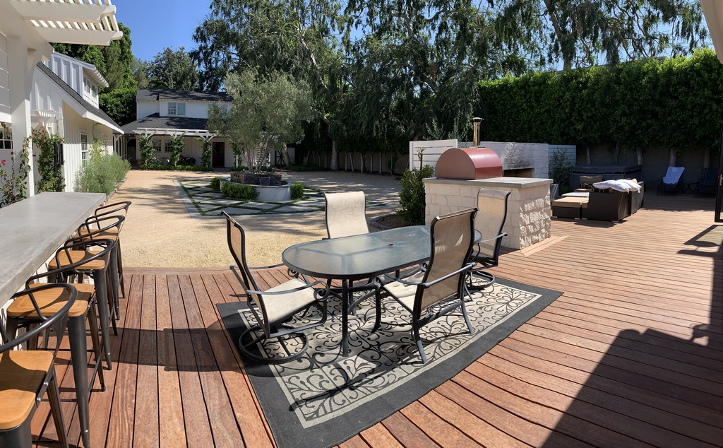
| The new patio now features barriers that separate most of the space from the mixed-use central core, but the dining area is positioned to take advantage of the fountain’s sound and the dominant presence of the olive tree around which the entire space rotates. We also added greenery to the backyard as well as out front in addition to a small entry fountain. This is still a commercial space during working hours, but when the last customers leave at the end of the day, it becomes a family retreat filled with opportunities for fun, socializing and relaxation. |
All in all, this was an unusual process: For just about every step we took in an aesthetic direction, we found ourselves taking a corresponding step back to consider the practicalities and needs of the property’s commercial side. It’s fair to say we had to make some compromises as a result, but it’s also perfectly true that we shaped a space that suited the family’s needs in ways they’d never imagined.
It was a balancing act from start to finish – business needs vs. family fun, hardscape vs. greenery, curving forms vs. straight lines, horizontal vs. vertical elements, flat-color planes vs. colorful planted textures – and it helped that the clients’ vision was so clearly expressed. But for all the apparent simplicity, there’s a lot going on here, too.
At times, I felt a bit like a pioneer staking out new territory at the intersection of commerce and domesticity: There was no rulebook, only a perception of what the clients wanted, what their business needed and how everything could be aligned and balanced for all-around, long-term satisfaction – ready for business, ready for relaxation.
Colleen Holmes is president of New Leaf Landscape, a full-service landscape design/construction firm based in Agoura Hills, Calif. A professional with more than 35 years’ experience, she began her career as a child at the side of her father, Charles Prowse, who instilled in her a love of the art of landscape design. She studied landscape architecture at the College of the Desert in Palm Desert, Calif., where she was profoundly influenced by sculptor/landscape artist Michael Watling, and later attended UCLA’s school of landscape architecture. Her early work focused on designs for country clubs and gated communities in the Coachella Valley. Since then, Holmes has run her own pool and landscape maintenance firms, founded her first landscape design/construction company in 1980 and established her current firm in 1987. She may be reached through her web site: www.newleaflandscape.biz.


