Classical Influences

It’s a point I’ll probably make to the end of my days: There is no substitute for travel and exploration of the historic world to learn about design.
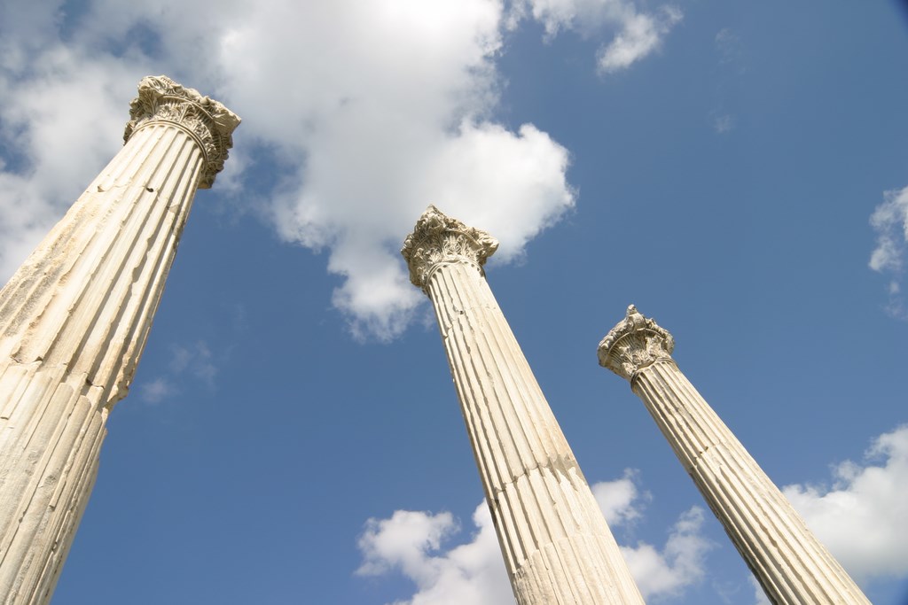
In my “Details” column in the June 2005 issue of WaterShapes, for example, I discussed my recent trip to Turkey and made the point that the ruins and intact structures we examined while there were full of specific details that I and other watershapers use in our work – whether or not we recognize that what we’re doing actually derives from ancient original works.
Showing what I mean in the clearest possible terms is what this pictorial article is all about. As you will see, I’ve included images of my work published in the pages of this magazine through the past six years to show that I really mean what I say about the possibility of translating classic ideas to contemporary uses.
My intention in doing so isn’t the arrogance that’s usually ascribed to me: I’m not proclaiming myself some spiritual heir to western civilization here. Instead, my motivations are purely practical: I seek to share my sources and show that much of what we do as watershapers is about translating ancient forms to the here and now.
Indeed, the closer you look, the clearer it is that almost everything we do as professionals has been influenced by the past in a range of obvious ways.
CORNUCOPIA
Some words of caution: While I encourage everyone active in the watershaping trades to open his or her eyes and take a good look at the wide world of design, I am also familiar with the notion that a little bit of knowledge is a dangerous thing. Taking a drawing or art-history class or visiting the ruins at Ephesus will give you snippets of knowledge, but they will remain no more than snippets without the years of education and experience that separate real designers from hacks.
I’ve been trained and educated as an industrial designer, and I honed my craft by having professors I respected smack me on the forehead if I misapplied the concepts they sought to impart to me. I’ve also spent a career since then looking for inspiration in architecture the way the creators of naturalistic streams and ponds go to the woods to study Mother Nature in action.
Through my instructors, I’ve learned that the concept of “appropriateness” is just as important to design success (if not more so) as is proper application of the principles of line, contour, color, contrast, visual weight, balance, scale, spatial relationships and all the rest of the concepts they fed me through the years. In other words, it’s not enough to select a cool detail from a Moorish courtyard in Marrakesh and drop it into a project in Milwaukee: The key to using design history as a tool is knowing enough about how the originals work in context to have them make sense in a modern setting wherever it might happen to be.
In a very real sense, design is about adapting ideas, not copying them. If you’ve seen and familiarized yourself with a neat little Moorish fountain detail and inserted it into a backyard in Milwaukee just because you can, it’s meaningless imitation rather than inspired designing – unless, that is, you’ve managed to adapt the forms in ways that make sense in the given situation. By extension, having the simple ability to impose a vanishing-edge detail on a pool when the situation doesn’t call for one is a design error, not creativity.
Another key point: While it is helpful to get out and see the world, the best way to learn from the experience is to have the discipline either to record or remember what you’ve seen and file things away in an accessible way. I admire those with photographic memories, but I’m not one of them. As a result, ever since I started traveling umpteen years ago, I’ve carried a top-quality camera with me and have thousands of slides carefully filed in binders and boxes to prove it.
My Genesis 3 partners Skip Phillips and Brian Van Bower make fun of me endlessly because I’ll put them through long slide shows at the drop of a hat when they visit my studio. However silly my collection may seem with respect to sheer volume, I use these slides all the time to remind myself of how certain details looked and worked in context. Quite simply, I see them as an indispensable source of design inspiration.
Finally: There are so many ideas buried in the past that even extensive exploration mainly reveals what we don’t know. Adding to your personal trove of insights can become a lifetime’s work, as it has become for me. I know for my part that each and every time I travel to the treasure troves of antiquity in places like Italy, Turkey, Greece, Spain, Egypt, Japan and China (to name a few), I am inspired by the richness of design traditions found in those places – and utterly humbled by the experience.
Art in the Ordinary
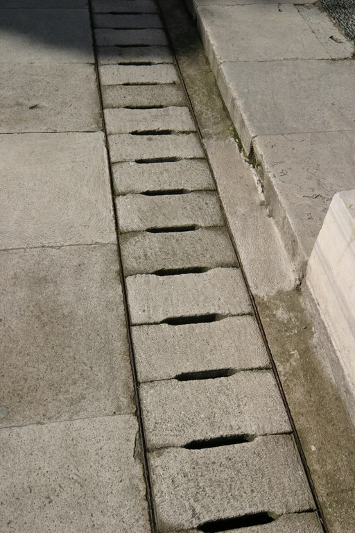
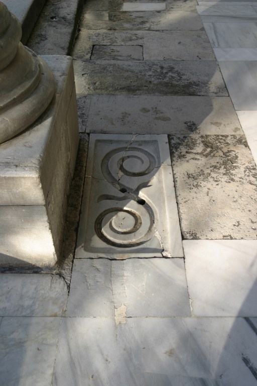
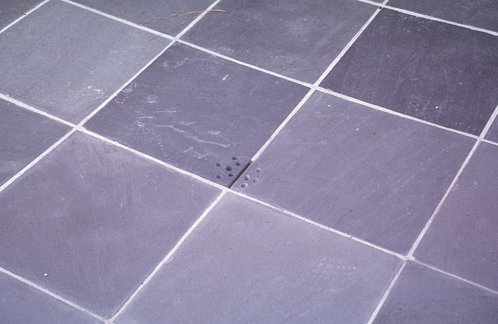
The ancient world abounds in examples of small functions treated in artistic ways, and I’ve always been particularly struck by the way the ancients celebrated things as simple as the need to move water into drains. In these examples from Sardis to Istanbul, I’ve found inspiration for my own decisions to use stone to cover drains while not disrupting the clean look of a deck with plastic or metal drain heads. Some of these are so artful, in fact, that mine (as in the example seen at right) seem tame by comparison.
Carousels of Color
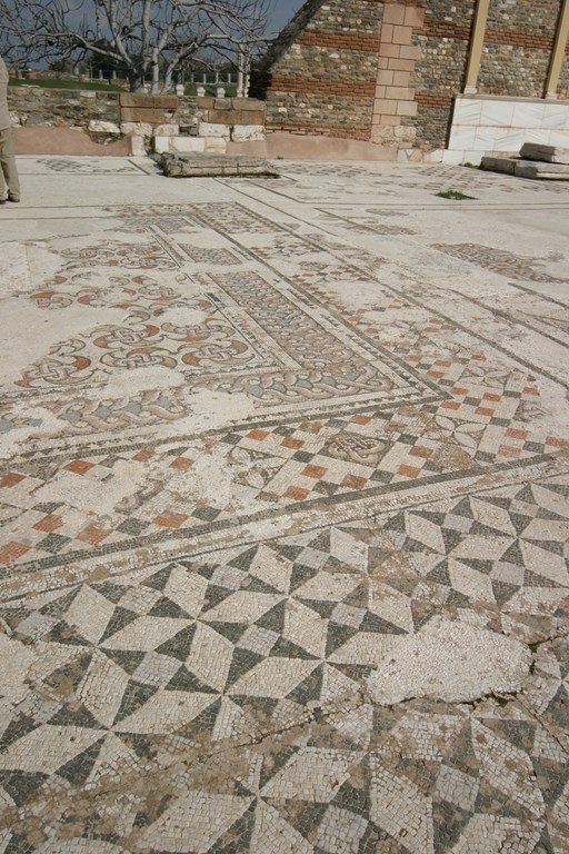
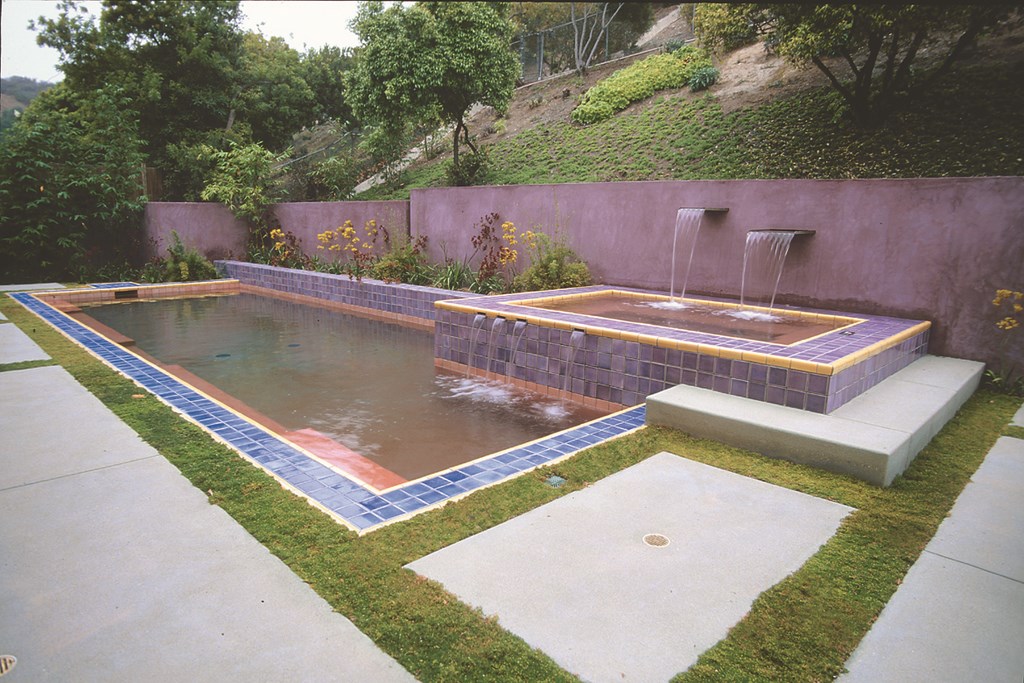
One of the things that has impressed me most in my travels is the apparent willingness of ancient artisans to dig deeply and boldly into the color palette in developing decorative details. In the case of this mosaic floor, for example, the bright reds and pale blues remind me of Oriental carpets and have empowered me to think in much broader terms about the colors available to me in my designs – including, for example, the notorious ‘red pool’ (seen at right) but a host of others as well.
Studies in Contrast
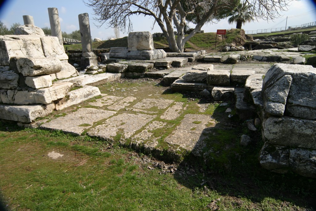
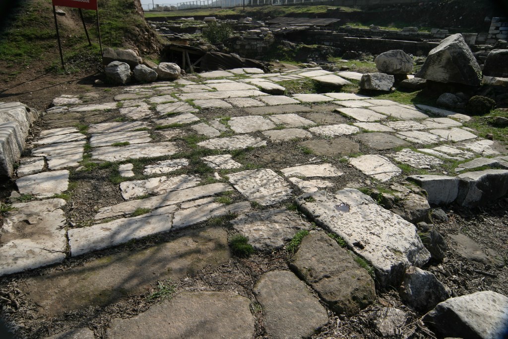
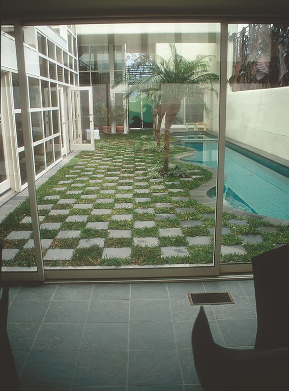
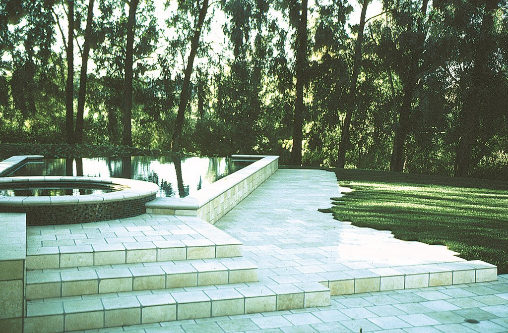
I’m uncertain whether grass was allowed to intrude on these paved areas in ancient times, but I’ve long admired the way these modern eruptions of green have softened the looks of expanses of stone as I’ve seen them in my travels – and have applied the concept many times in my own projects, such as the one seen at right. I like the color contrasts and also the texture distinction of setting the softness of grass against the hardness of stone.
Graceful Spouts
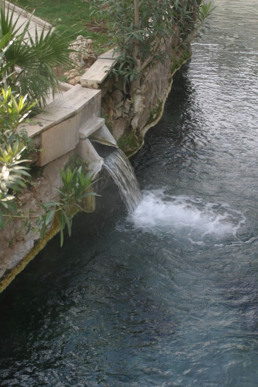
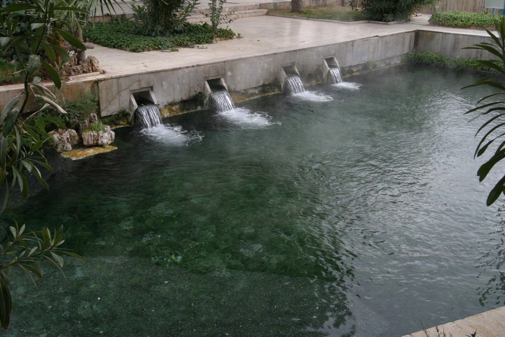
Through the years, I’ve expended lots of energy trying to get watershapers to think about spillways in creative ways, and it all stems from seeing things like these mineral baths in Hieropolis, where ancient designers decided there should be a visually appealing way to move water from the hot springs into the baths. These ‘Tishways,’ as my friend and fellow traveler Pablo Benedetti has dubbed them and as you see at right, are now one of my signature details, and I trace their origins back through centuries of design history.
Access by the Yard
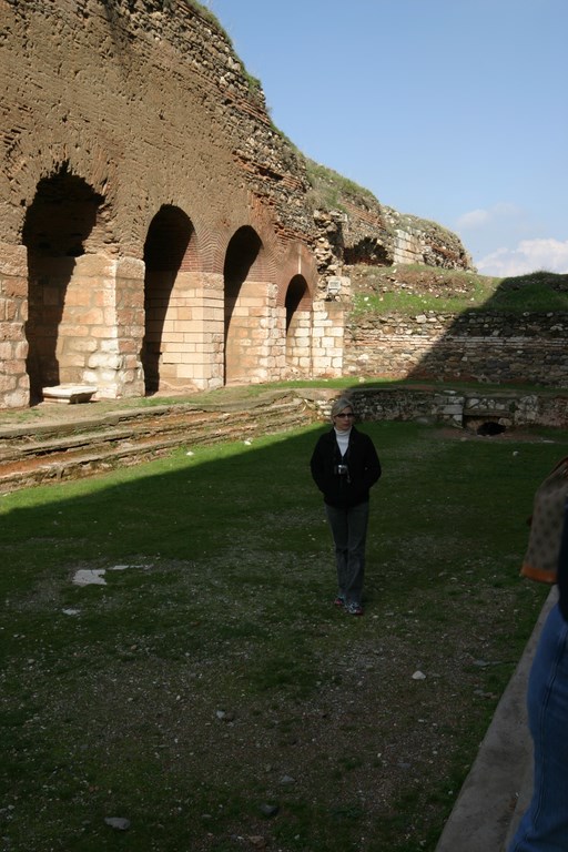
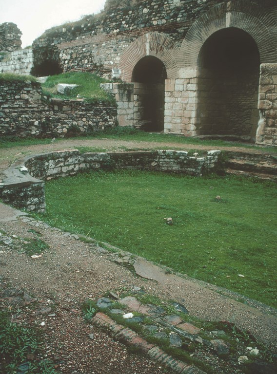
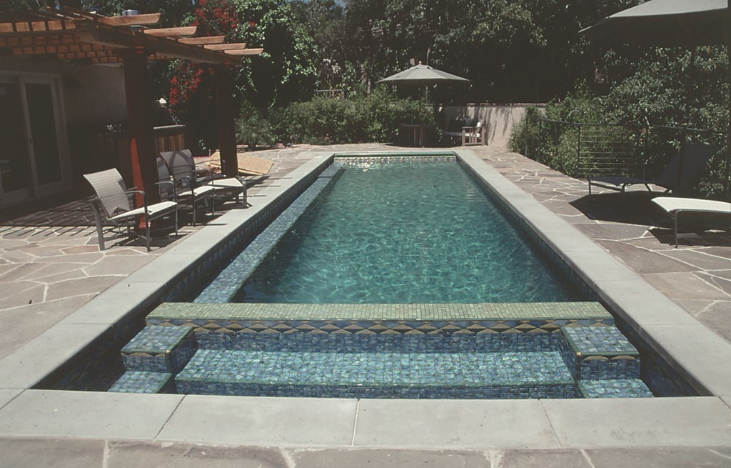
Ever since seeing ancient swimming pools such as this one at the Gymnasium at Sardis, I’ve been a strong advocate of easing access to the water by running steps or low benches along entire long walls of my own pool designs, as seen at right. There’s something appealing about the way such arrangements blow out the number of ways bathers can get involved with the water. I also find an appealing elegance that’s lost by using the usual small steps in the shallow end and a ladder or two in the deep end.
Raised for Convenience
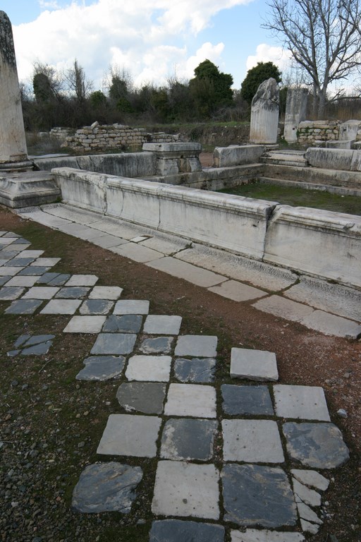
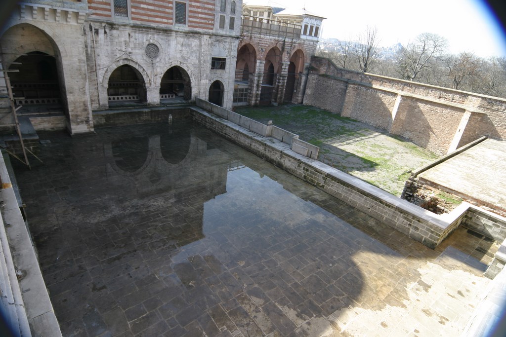
Another common detail in my pools involves raising the vessel out of the ground by 18 inches or so to provide poolside seating areas and to ease access to the water for those who want to sit down before swinging their legs to the wet side of the wall, as in the Roman baths at Aphrodiasias. Much later, the pool for a sultan’s harem in Istanbul (top) was filled with cow and donkey milk as a further enticement I haven’t tried, but there’s something to the look of these raised pools that goes beyond convenience – a strong presence I’ve exploited over and over again through the years (as in the project seen at right).
On File
In these cases, I don’t have analogous work of my own to set against the images of ancient watershapes – and I’m not certain that I ever will. But these are the sorts of details I record in great and intimate detail while I’m on the road with the thought that, maybe someday, I’ll be able to dig into my files and find just the inspiration I need – and remind myself once again that traveling is more than worth the investments of time, money and energy.
David Tisherman is the principal in two design/construction firms: David Tisherman’s Visuals of Manhattan Beach, Calif., and Liquid Design of Cherry Hill, N.J. He can be reached at [email protected]. He is also an instructor for Artistic Resources & Training (ART); for information on ART’s classes, visit www.theartofwater.com.


