Small Wonders
Just as every garden should reflect the aesthetic values of its owners and accommodate their lifestyle preferences, so too every watershape should reflect the nature, purpose and “meaning” of the garden it inhabits.
If it’s a Victorian garden, then the watershape should be of similar style – perhaps a blend of formal and natural elements with stone or brick accents. If the theme is “wild, romantic tangle,” then cascades, blossom-laden pools and rambling roses may be in order. For its part, a simple, paved court may call for a raised fountain.
As a designer and builder of landscapes with a particular appreciation for water – and as one who has worked for the last ten years in the New York City area – I have been critically concerned with comprehending the principles of landscape and watershape design for small spaces.
When built from scratch, the watershape in a small garden should be seen as an integral component of the landscape – either as an accent or as a focus around which the garden is arranged. If the landscape is already there, then I let it guide the design of the watershape. Then, beyond basic design, there’s also the “how” of it all and the selection of materials most suited to creating the desired effects and impressions.
To illustrate these approaches, let me start with two landscapes – completely different arrangements in distinct styles that create entirely different effects, but both of which support the use of a raised fountain – and then follow up with discussions of two others that bring the issues I’m defining into sharp focus.
A NATURAL SANCTUARY
This first landscape, seen before work began (below, left), is now lushly organic and meant to be reminiscent of the owners’ homeland of Nicaragua (below, right). Active businesspeople, they wanted a natural sanctuary in their little rear plot – a place in which they could escape the modular rooms and hard surfaces of their daily lives.
The key to success in designing for any space – and for small ones in particular – is achieving a balance of the elements that make up the garden. If you get it right, the space is comfortable, evocative and attractive. If you don’t, you end up with disunity and confusion.
Though small in size, this private retreat gives them a variety of soothing sensory experiences. And even though the garden is only 18 feet by 30 feet, it doesn’t feel confining.
The curving, dry-laid stone wall is one important factor. Straight lines are instantly taken in by the eye, forcing us to acknowledge the limits of the space they define. They also can be rigid and uninspiring, and the hard corners created by straight lines are generally uninviting. By contrast, curves create a sense of motion. They are soft and add interest, while the scooped-out bends are inviting and enhance the sense of usable space.
| Landscape #1 |
The wall sets up fundamental divisions of the space – a key issue of balance in small gardens. Had the planting areas been made larger, the living areas would have felt too confined. Had the planting areas been smaller, the hardscape elements would have become too dominant, rendering the scene both uncomfortable and even sterile. As it is, there is an ample living area with a richness of plantings that carries numerous and repeating harmonies as well as contrasts in form, foliage and flower.
Detail is another important tool for enlarging small spaces. Gardens are visual scenes, but they also are scenes that are experienced. Detail, however introduced, adds dimension and interest, expanding the impressions the garden makes. In this garden, I’ve used distinctive plant combinations to perform this function.
With its rounded leaves, the variegated Hydrangea both harmonizes and contrasts with the blade-leafed, variegated Iris. For its part, the variegated Cornus harmonizes in leaf color with both of those plants while contrasting with the dark, glossy-leafed Ilex cornuta. Below, the low spreading Gaultheria procumbens and the variegated Liriope repeat these foliage effects on a smaller scale.
This whole luxuriance of flora grows behind, within and spills over the top of the stone wall. It creates pleasing textural contrasts – again, adding dimension through detail.
The watergarden is a natural adjunct to the overall design motif and an extension of the dry-laid stone wall. It wasn’t “fit into” the garden design; instead, it grew out of it and, with its rock, water and plants, reflects the garden back upon itself. It is not specifically a focal point, but instead is an integral and harmonious component of the landscape.
The motion and sound of water trickling down rocks and the vision of colorful Koi gliding among the water lilies also add depth to the garden, contributing further to the sensory experience the owners craved.
CURVACEOUS CHARM
The second landscape also was built in a small yard, has a raised fountain and is a natural result of the overall design – but here the watershape is clearly the garden’s focal point.
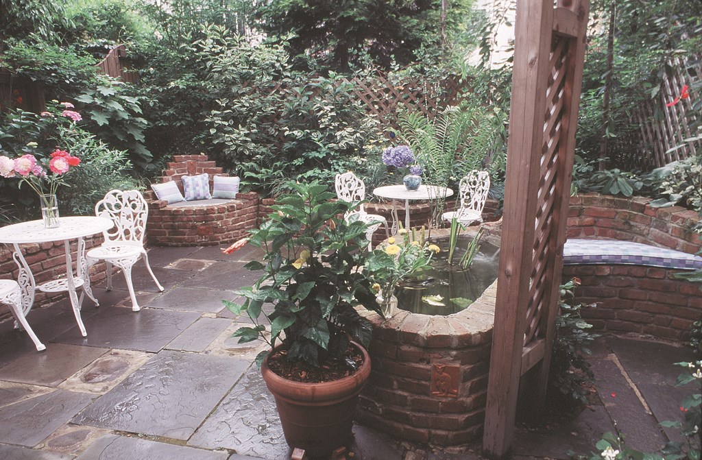
The drive behind this landscape was our desire to capture a convivial, enduring whimsy that was inherent in the site but had not been exploited, as the “before” photograph shows (below at left). Those qualities are now supported by the curvy, rolling brick walls, the scooped-out/built-in seating areas and the hand-carved animal tiles and family members’ names built into the walls (below at right).
| Landscape #2 |
The space was designed for use by two little girls who love to play outdoors and throw tea parties – and by their parents, who thrive on outdoor living. This landscape, I think, gives all of them what they wanted from their garden (below at left).
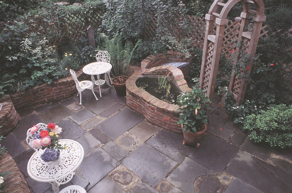
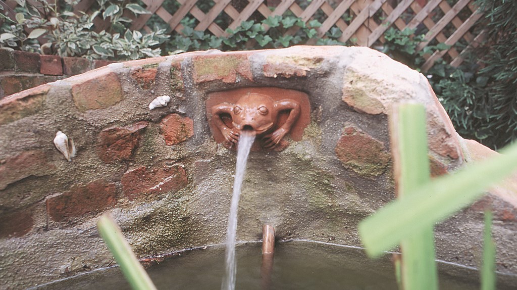
The brick fountain, with its frog spout and water-themed tiles (below in teh middle), is truly the heart of the garden. It’s the first place people go when they enter the space and a focal point from almost everywhere within it. But it’s not visually inescapable: If you simply want to sit quietly and listen to the sound of falling water, the built-in brick-and-bluestone bench behind the fountain offers that experience, shielded by a rose arbor and the cascading branches of a weeping cherry (below at right).
| Landscape #2 |
The space is not more than 30 feet by 17 feet, but because of the design elements – the division of space, the curves and undulations, the small spaces within spaces, the details of tiles, stone and unusual plant combinations – the garden feels ample. And the fountain lends the garden a vibrancy and charm that echoes throughout the space.
CLASSIC VICTORIAN
Now let’s move on to a discussion of a small garden done in a specific style – in this case, Victorian. Characterized by natural materials romantically composed, Victorian gardens can be among the most beautiful of all spaces to see and most pleasurable in which to be.
They also can be lots of fun to build. I really enjoy working with elements such as redwood deckings, bluestone patios, dry-laid stone walls, stone planters, lattice fences and rose arbors – as I did in the project seen in the next sequence of photographs.
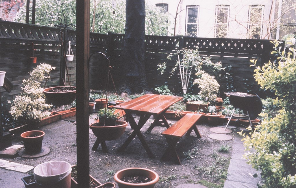
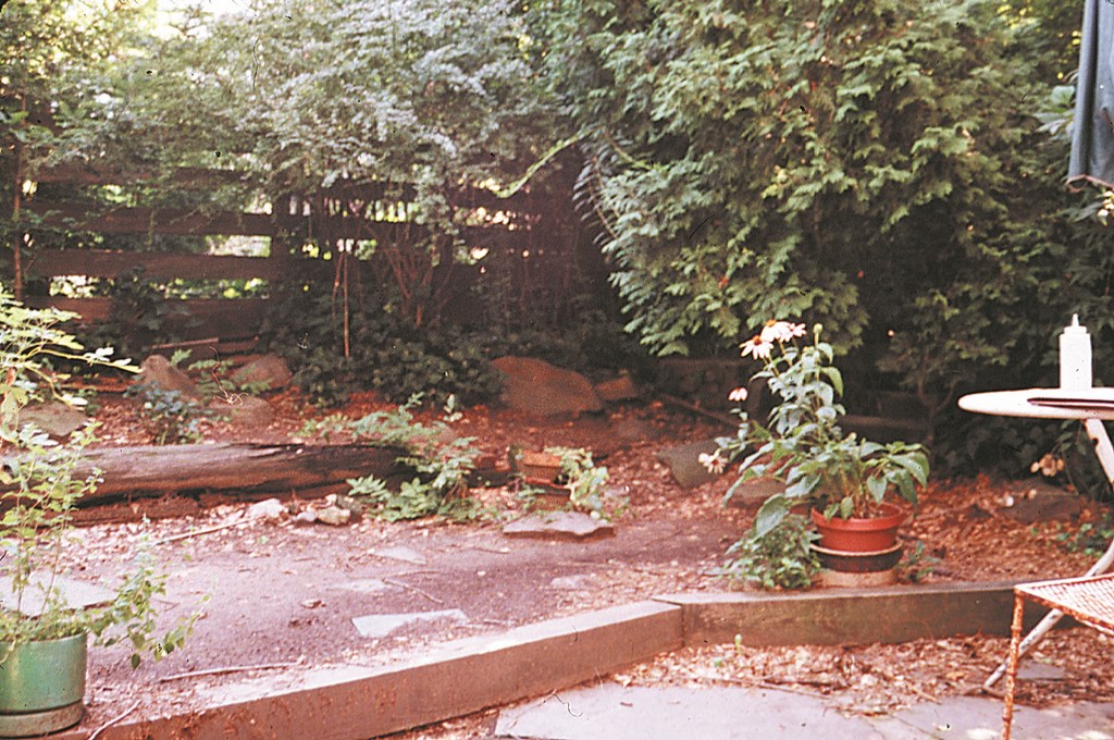
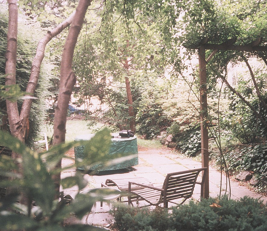
As seen in a snapshot taken before work began (below at left), the space was long and narrow, so I divided it into three “rooms,” thus building a sense of spaciousness and intrigue. A long, narrow garden is static, apprehended all at once and consequently uninteresting. Divided into rooms in this way, the viewer takes in other portions of the garden – but from no single spot can the entire garden be seen at once: There’s always some promising place to go and thing to see “just over there.”
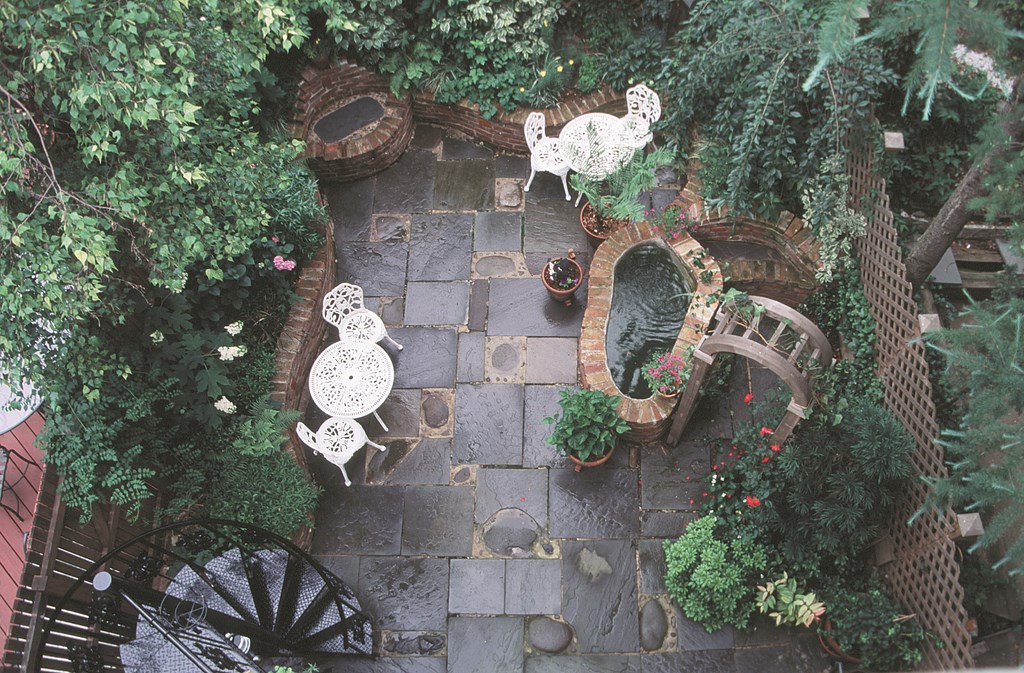
The upper room, accessed directly from the house, features the redwood deck flowing down to a private patio area overhung with Birch and Japanese Maple (below in the middle). The customer wanted this to be a relaxed, easily accessible area, intended primarily for family members to drink their coffee, have a quiet lunch or enjoy an intimate dinner.
| Landscape #3 |
I also wanted this room to have its own watershape. Keeping with the informal motifs of this area, I built a small fish-and-lily pool in a natural, free-form design with a small flow of water over river rocks.
From this room, one sees through a rose arbor and into a larger, more formal room and a semi-formal watergarden embedded like a dais in a field of lawn and plantings. This central room serves as an outdoor, scaled-down grand hall or pavilion, offering a classical Victorian experience — that of stepping from a modest, low-ceilinged room into a spacious, sumptuously ornate environment.
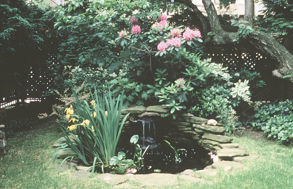
There are blossom-bedecked, stone-faced planters on the left, a dry-laid stone wall on the right (also richly planted) and a low, arching wall straight ahead. Here is the dining area for larger parties, a gathering area for groups or simply a room for quiet enjoyment and wandering. And once you’re in the room, the watershape draws you in further, becoming the focal point of the landscape (above right).
The fountain itself is classic Victorian: an oval-shaped, inground pool lined in stone with an arch-shaped stone wall behind it – one that harmonizes with the low retaining wall and from which water pours, catching both the eye and ear from the first room onward. Dead center and the most readily identified component of the garden, this fountain captivates the viewer at the same time it makes him or her curious about what awaits in other rooms and spaces.
A ROMANTIC INTERLUDE
The “wild, romantic tangle” I mentioned earlier was how the client described what they wanted in the fourth and last landscape I’ll discuss here.
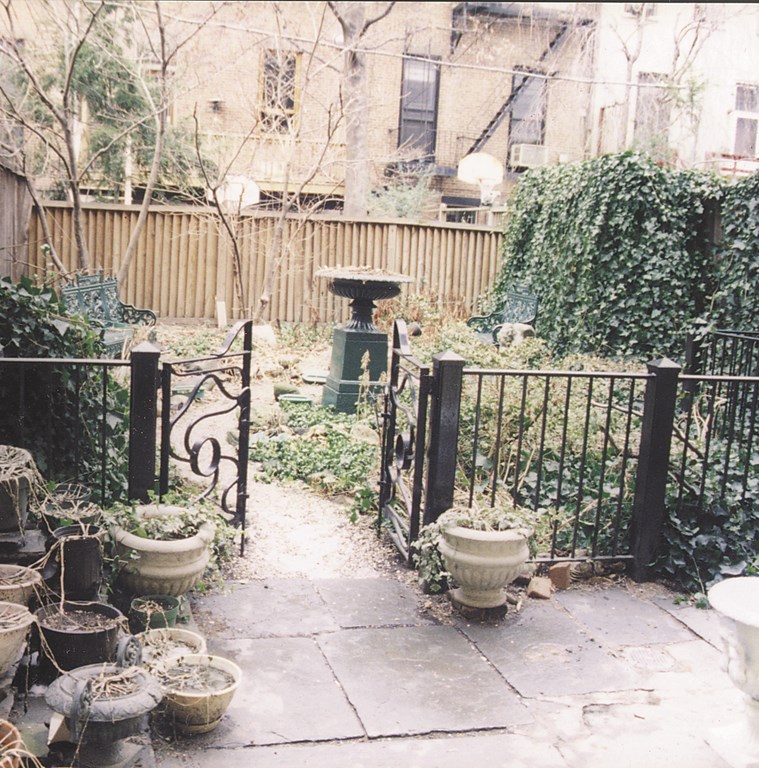
How I was to achieve that tangle was, happily, left entirely to me. By the time I was finished, the project seen in the “before” shot (below at left), involved bringing in about 300 cubic feet of soil, three tons of stone, a lifting and moving machine, about a hundred species of plants, countless odds and ends and a whole lot of hard work.
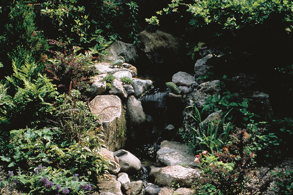
This is a case in which the garden was built around the watershape. I conceived of the site as a sort of “ruins” through which a natural stream runs, issuing from an Artesian fountain and flowing into a natural pool. (For details on how the stream came together, see the sidebar below.)
| Landscape #4 |
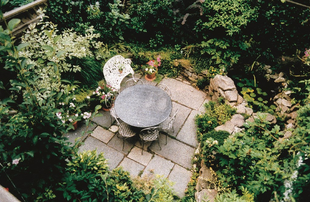
Shown here just after planting and before placing a few more artifacts of ancient destruction – a piece of column, a broken capital and such – you can see how, as the plants grow in, the space will align with the owners’ desires (above, middle left).
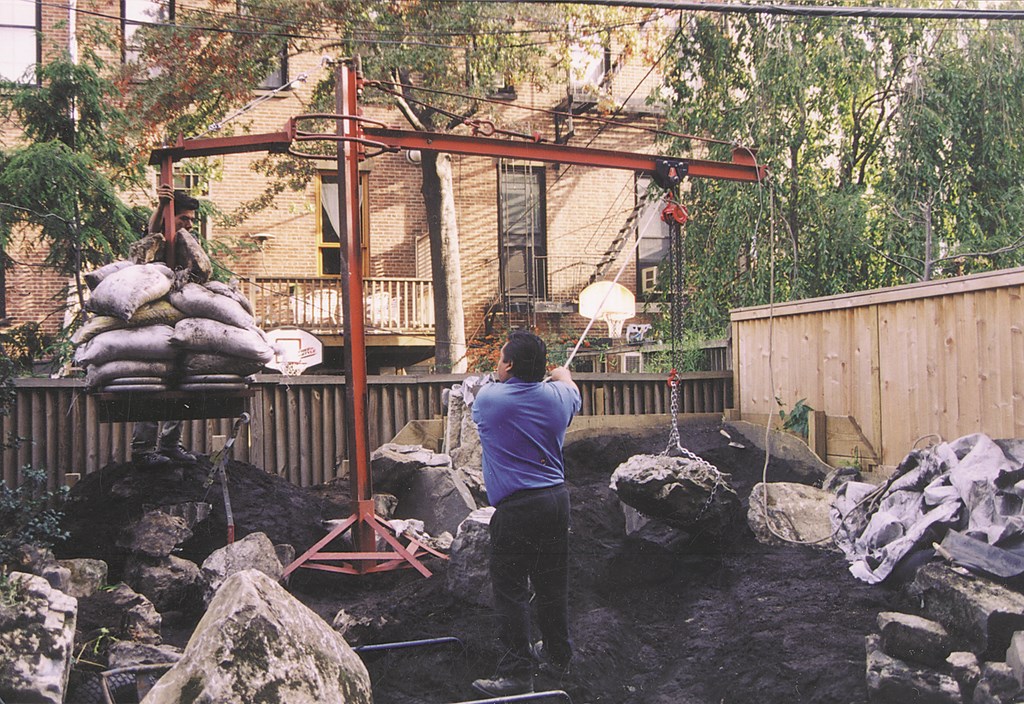
Important to this landscape is the “how”: After bringing in 600 bags of soil (remember, these are city dwellings, and there was no access to the rear except through the home) and then sculpting the terrain, we brought in the boulders, one by one. Through main force, we wrestled them onto the site – but it became quickly apparent that good placement would require something other than brute strength.
I thought about it, contacted an ironsmith and asked for help in building a machine that could lift the 1,200-pound stones. The first version crumpled instantly. After consulting a few more ironsmiths, one directed me to a shipbuilder who repaired ocean-going vessels. From my design, he fabricated a machine that would allow me to lift, swing, pivot and precisely place even the largest of the stones (above, middle right).
|
Making Magic A big part of the “how” of creating the “wild, romantic tangle” my clients wanted in their small yard revolved around the task of setting up the stream and the river rocks. I spent the better moments of my childhood sailing sticks down streams, and I suppose I picked up something of how streams look and water flows in the process. Although this is a skill you can learn, it isn’t something I can teach here – although I’ll share some principles I always apply in building streams. First, if a stone is to be in water, it should show signs of water wear – smooth or rounded and placed in such a way that its curves parallel the flow of the water. Notice my waterfall stone, for example: I searched long and hard for that rock, and it works wonderfully. Too many waterfalls I’ve seen have water flowing over rock recently hacked from the bones of a mountain and never before visited by so much as a raindrop. That just won’t do it for me. Second, no matter how small, elevation changes (my client calls them “cascades”) are crucial to conveying the feeling of a natural stream. But they’re a real challenge to build when, as in this case, you do your shaping without the aid of concrete or foam. Fortunately, my foreman has a knack for folding liners up the backs of stones and covering with other stones – completely hiding the liner while forcing the water over the top of the lead stone. Third, pay attention to aural effects. The sound a whole series of cascades makes is a real delight – and another key to creating the impression of a natural stream. – K.D. |
In addition to good placement, this device also allowed me to set the liner under the rock, obviating the chore of laying the liner over the large stones, then covering it over with additional stone. This was certainly important: The garden was just 17 feet by 30 feet, so every square inch was precious. You may not have thought it possible for this type of construction to look natural in so tiny a site, but as you can see in the photos, it does work.
When planting time finally arrived, I set off for the nursery with a big truck and a small list with a few plants the clients particularly wanted. For the most part, however, I prefer to ad lib, looking for effects rather than specific species.
In this case, I wanted nothing too tame. I set up a backdrop of deep evergreen (Arborvitae and Cryptomeria), plants to arch over the water (dwarf spreading Hemlock, Berberis, oakleaf Hydrangea) and background shrubs to grow all into one another (Viburnum, Camelia, and Cornus) – along with a few flowering trees (weeping Cherry), a bunch of vines and countless perennials.
It took us seven months to build this garden, including time spent in resolving some of the how-to issues and accommodating some specific client wishes. We had the stream completely built and looking great, for example, when the client requested more activity in the upper stream (above right). We took it apart and started over.
To sum up, we began from a theme, translated that into a concept, built the primary element and let the rest of the garden grow up around it. By this time next year, as the climbing Roses, the Wisteria, the Lilac, the Honeysuckle, the Viburnum, the ferns and ninety-odd other species of woodsy, rambling plants grow in, we should indeed have a “wild, romantic tangle” with a magical stretch of water flowing through it.
As we moved along, even I wondered if we would be able to produce the results we were after in these cramped quarters, but on balance I think it works. More important, the clients wholeheartedly agree.
Keith Davitt is owner and principal designer for Gardens, a landscape design/build firm based in the Park Slope area of Brooklyn, N.Y. Davitt has been designing gardens for upscale clients across the United States for the past 20 years, with services including horticultural consultation, site analysis, landscape design, project management and all aspects of landscape construction. He is also a garden writer and photographer for magazines including Fine Gardening, Gardening How To and Horticulture, to name a few, and is currently writing a series of books about landscape design.


