Chromatic Virtues

Color is amazing. It provides us with some of greatest opportunities we ever have to create spaces that are emotionally evocative and visually compelling – yet it is also one of the most difficult design details to understand and put to good and effective use.
Trouble is, there’s no easy way to simplify the challenge: Color is indeed a tough nut to crack, and that’s as true for architects, artists, fashion designers and the people who choose colors for new cars as it is for watershapers. And because it’s hard, an awesome majority of what we see around us on buildings, clothing and freeways tends to be “safe” – unimaginative, conservative and bland.
Designers aren’t entirely to blame for this situation. The fact is, most of our clients live and work and are quite comfortable in environments and spaces that are terribly unsophisticated in terms of color. They’ve grown accustomed to the general dullness that surrounds them in the textiles, appliances, flooring, automobiles and apparel they see, buy and have been led to believe makes them happy.
In other words, just about everyone’s afflicted to some degree by this conservative approach to color and limited appreciation of its power and beauty. What I’d like to suggest here is that we take a break from this go-with-the-flow mentality and look for something fresh and unusual in our watershaping palettes.
DULL REALITY
Watershaping is a truly specialized and dynamic type of construction, and what we generally see around us is one missed opportunity after another – with the not-so-occasional design abomination thrown in for good measure.
The water isn’t the offending party: It is absolutely colorless and relies on reflections of the surrounding environment, absorption of ambient light and the colors of things that find their way into it (including algae) for its appearance of color. We see water as blue not because the water itself has that coloring; rather, it’s because of physics and optics and, most obviously, the way the water reflects the sky.
We should consider water’s colorlessness in designing structures that contain and surround it and think about the ways we can use this context to add weight, interest, intensity, distortions and more to the appearance of the water.
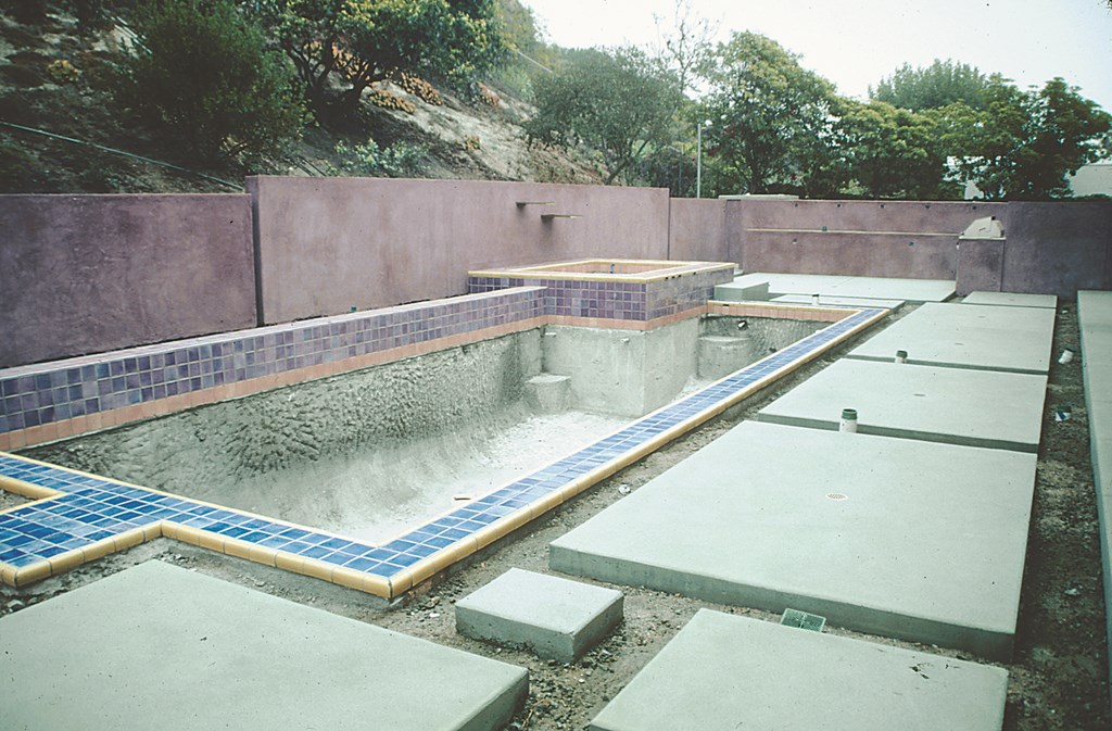
| It’s still a work in progress, but entering this backyard even now is a special experience because of the unusual range of colors and textures on the walls, decking and surfaces of the pool and spa. |
In nature, we see incredibly sublime blends of colors around water that always seem to “work.” We see the primary colors (blues, reds and yellows) and the secondary colors (greens, violets and oranges) as well as a rich array of browns, creams and hundreds of shades of gray. When you look at those hues in nature, the composition is almost always beautiful.
But when you take those very same colors and put them in the hands of someone who isn’t sensitive to how they work when transported to a different space, the results can be horrendous. I’ve screamed for years about all the projects where gray plaster is butted up against near-fluorescent blue tile. Beyond making me double over in pain, these combinations alone put the lie to the assertion you hear that the dawn of colored plaster somehow made the pool and spa industry more “color savvy.”
If there’s anything “savvy” about the common practice of mixing colorants with white cement and any sense of pride in the pastel colors that often result, then we need a new word to describe these self-inflicted atrocities. Had someone in the loop understood color, they’d have known that a better option for colored plaster would have been to mix the color with gray cement.
What it takes to avoid design atrocities is, first, an awareness that color is both crucial and difficult to master, especially on a large scale; second, a recognition that there are tools that can help; and third, that this is yet another area of design in which education is important.
AN EXPRESSIVE PALETTE
There’s no short cut here. Color theory is something that can indeed be learned, and there are a great many resources available to designers in selecting and using colors.
But the key is the first step and simply opening your eyes to what’s around you in nature and taking the time to seek the guidance of the great designers who’ve gone before us. I bring up Frank Lloyd Wright and John Lautner all the time, and any skimming of a book of their work shows them to be sublime, natural colorists. The use of color in Islamic architecture and textiles, in the art of the Italian Renaissance and in Chinese and Japanese gardening are also supremely inspiring.
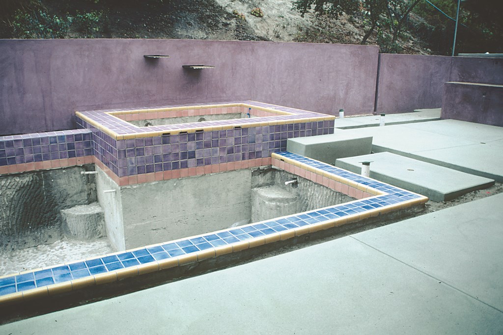
| This bump-out was needed to accommodate the skimmer. In a detail I’ve described before, we avoided having a white plastic lid by creating a lid from tile This way, we kept the color palette consistent in every way we could. |
When you open your eyes to color and look at the works of the masters, you see broad, rich color palettes. When you visit the Taj Mahal or the gardens of Kyoto or Fallingwater, you see color used to create emotion as well as senses of space, surprise, harmony and enjoyment. These effects don’t happen by accident, but instead are the direct result of the designer’s understanding of the way colors relate to each other.
My sense of what colors can do for spaces is the main reason you’ve seen me advocate the use of green in and around watershapes so many times in these columns. When I mention green, pool builders almost invariably respond with revulsion because they immediately think of algae. But some greens are wonderful with watershapes because of the way they can blend with and complement the greens of the landscaping – as well as the blacks, grays, browns and creams of rocks and masonry materials.
|
The Usual Suspects You know who you are. You’re the pool builder who adheres religiously to convention and wouldn’t dream of anything more daring than a white-plaster vessel held down by a belt of basic-blue tile surmounted by an unimaginative, earth-toned coping of one material of another. For you, “daring” is recommending a patterned blue tile with dolphins or starbursts or geometric designs. You’re also the landscape designer or architect who plays the naturalistic hand so steadily and well that anything beyond the earth tones is reaching too far. For you, “bold” is accenting a spot or two with an upended rock or a purple plant that may or may not contrast purposefully with the colors of the dozens of other brownish rocks or greenish plants strewn around a pond or pool. This is all bland, standard stuff – and, in far too many situations, exactly the wrong design decision. There’s a tendency we all have to play it safe, to err on the side of conservatism and sacrifice principles of good color design in the name of this year’s hot material or hue. This isn’t surprising, of course, because our trades are filled with people uneducated in many of the processes in which they’re engaged – and color theory is among the hardest of all the disciplines to learn and apply. Despite the fact that I earnestly wish it could be so, this one column won’t remake the world. I do hope, however, that there’s enough to go on here that some of you will be led to seek out the information you need. At a minimum, I hope this discussion has opened some eyes to the fact that, indeed, your eyes must be opened to put color to work in clear and effective ways. — D.T. |
(I say some greens just above because not all of them work. Green is made up of yellow and blue: If the blend has too much yellow in it, the resulting green can be awful in watershape applications. In other words, you need to know what you’re doing to make the kinds of color decisions I’m discussing here.)
In the project we’ve been following for much of this year in these “Details,” the use of color was of primary importance and took on a whole new meaning for me and my clients. This is admittedly an unusually expressive palette compared with much of what I’ve done in the past few years, and it’s a case where the clients are sophisticated, open-hearted, open-minded people who love color and beauty.
What we have going in this project is just the right people, just the right setting – and just the right spirit of adventure. All it took was a glance at the bright goldenrod plaster on the home’s exterior to guide my color palette beyond the usual.
As I’ve mentioned in past columns, I became involved with this project after a landscape architect had convinced the couple to remodel their pool and surrounding space as a sort of mountain lake. The proposed palette of greens, grays and browns probably would have been inoffensive, but to my eye there was potential here for something much bolder, livelier and more fun.
AROUND THE WHEEL
Rather than a plain, naturalistic color scheme, what I saw instead was a palette of warm, expressive colors similar to those used by Mexican masters Luis Barragan and Ricardo Legorreta.
The clients – who had, after all, chosen a dazzling goldenrod for their home’s exterior – liked the idea of using bold colors not for shock value, but because they believed me when I suggested ways in which different colors would define and visually expand the available space. So now there’s a narrow rectangular pool complemented by balanced architectural features that include broad walls, custom tile and colors that range from reds, blues and yellows to greens, purples, lavender, coral, bronze and black.
| Once the landscaping goes in, we’ll be ready to aply a muted red plaster to the pool’s interior – the perfect way to enhance reflections of all the vivid colors that surround the watershapes. |
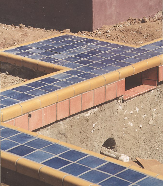
The key to using such vivid colors is understanding how they relate to each other. In this case, for example, you’ll find walking and seating pads made of green concrete separated by eight-inch gaps from a bright, mustardy yellow in the tile that borders the pool. (The gap will be filled either with gray/black stones or some type of vegetation.) The walls enclosing the space are finished with a soft purple color that complements the lavender tile.
Expense becomes an issue here: With typical finish colors, you can get mixed batches of pigment for less than $100 per pound. In the case of the purple used here, mixing up the required amounts of (inexpensive) red oxide and (extremely expensive) elemental cobalt to generate the desired color cost approximately $2,600 per pound.
In this case, the choice made sense – and all of the vibrant colors around the watershape will be reflected and transformed by the surface of the water. That’s why we’re using a very soft red-plaster finish inside the pool: It will deepen and accentuate the reflections of the greens and purples and yellows.
|
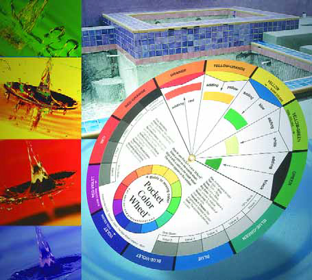
Managing Transitions Color me red or green, but not both – not side by side, anyway. One of the common mistakes I see in the field is the use of red brick against green grass or foliage. A glance at a color wheel (available at art stores along with guides to color use and combination if the store has anything on the ball) will show you that red and green are opposites and fight with each other. I use reds and greens often (as I have in the project depicted on these pages), but they’re held out of conflict because of the way I’ve used other colors taken from strategic spots around the color wheel, with greens touching yellows and reds butting up against purple and coral. Despite the boldness of some of the individual colors, they all co-exist in harmony because of the transitions established between them. — D.T. |
This brings me to another point I’ve made time and time again: This pool exists as a complement to its environment, not as its focal point. A white-plaster pool and spa would have screamed for attention; instead, we have a space that’s unabashedly rich with colors and spaces that play off of or balance with one another – and that’s what is most important in this unique environment.
It’s true that there are people out there who are born with a knack for picking colors and making combinations work, and if you’re one of those rare individuals, you should consider yourself fortunate. That doesn’t mean you should avoid education, however, because talent combined with expert training is an amazing one-two punch.
For the rest of us, we need to work at this and open our eyes to the chromatic relationships that exist all around us. It means looking at the work of past masters, finding ways to become versed in the use of a color wheel, or discovering the resources and color-combination aids many designers use to guide them in color selections. With hard work comes acumen; with acumen comes outstanding results.
Here’s a moment to consider: When you gain this kind of insight, there will come a time when you truly do begin to see the world around you in all new ways for the very first time.
David Tisherman is the principal in two design/construction firms: David Tisherman’s Visuals of Manhattan Beach, Calif., and Liquid Design of Cherry Hill, N.J. He can be reached at [email protected]. He is also an instructor for Artistic Resources & Training (ART); for information on ART’s classes, visit www.theartofwater.com.


