Natural Intuitions

I believe that what we strive for in our watershapes is evident in the paintings and sculpture of the great masters. The harmony, the beauty, the drama, the excitement of the senses, the total captivation of the viewer create an experience we call great art. The more we can reflect on this work and use it as a lofty benchmark, the more effective our watershapes become.
I’ve always believed that the best way to work at the highest level is to follow the tenets of classic design, at which point it’s all about creating an exciting environment that captures visual and auditory interest and constitutes an “experience” for someone moving through it. And then, of course, there’s the water.
To my way of thinking, water is a key ingredient in any beautiful landscape, which is why most of my designs include some form of water – even if it’s just a small stream or a pond. And when that water is something as grand as a swimming pool, it gives me the chance to create truly special environments for my clients.
When you design a swimming pool in the context of the landscape, you have a tremendous opportunity to create a natural environment that is both beautifully detailed and highly interactive. Done well, pools and the spaces around them can become like any great garden area – a place so well defined and so fully realized that it provides recreation layered above a profoundly pleasurable sense of relaxation and escape for those who spend time there.
LEAPS OF FAITH
I tailor my watershape designs to the needs and desires of my clients – a point of departure that has always made for highly individualized results. It makes the work fun for me, but it also gives me a certain amount of difficulty in describing exactly what the outcomes will be once I begin work on any given project.
I rely on photographs of past projects to get the process moving in certain directions and to help my clients visualize. But that’s only part of it: Through the years, I’ve learned to rely as well on past customers and what their referrals can do to help me win the trust and confidence of new clients.
Each of the projects pictured with this story was built for people who wanted something truly artistic and unique for their homes. In each case, they were willing to join me in the process of discovering the potential beauty locked in the raw dimensions of their garden spaces.
That process is largely intuitive. Yes, my background and the work that influences me are both there to guide me (see the first sidebar below for more on these points), but when I’m “in the moment,” working on site, I allow my gut-level responses to drive the decisions.
It’s a personal approach, so much so that linear discussion of what’s happening is difficult with clients – and in writing an article such as this one. But as I go, I keep four basic principles in mind that give the process a certain amount of structure as I arrange rocks, plantings and watercourses:
• Unity. Each job must have elements that are continuous and tie the whole site together. It may be repetition of flat rocks to create seating areas or pathways or the repetition of certain colors or the repeated use of particular shapes and textures. And it might also mean drawing from the surrounding environment.
|
The Sum Total It’s fair to say that my work is primarily a product of my own intuitive processes – but it wouldn’t be fair to say I work in isolation. In fact, I carry the influences of those whose work I have studied through the years – a broad, deep palette of aesthetic features that fuel my own work in a limitless variety of ways. My parents, for starters, were both extremely creative people with lifetime interests in the fine arts. On my own, I spent lots of time in the woods of the northeast and the great cities of Europe and also traveled over West Africa in my time with the Peace Corps. I’ve been influenced by the modern as well, reveling in places such as Disneyworld in Florida and (now defunct) Busch Gardens in Los Angeles as well as countless parks, public gardens and resorts around the world. For all of those experiences, I am perhaps most profoundly influenced by what I view as the highest expression of man-made exterior environments: Japanese gardens. I believe without hesitation that the great Japanese gardeners are masters equal on the scale with Michelangelo and Van Gogh. One outstanding garden-maker in particular, Hoichi Kurisu, is a key influence for me. The level of detail in his work and the way he explores relationships between elements of his spaces is absolutely breathtaking, truly transforming. I’m also the product of my education as a landscape architect and the training I received at Penn State. I lament the fact that the curriculum introduced me neither to the principles of Japanese garden design nor to anything having to do with watershaping – but those are gaps I have happily been filling in the more than 20 years since I graduated. – J.L. |
This idea comes from Japanese gardening tradition, where scenery borrowed from the surrounding area is incorporated into the work to provide context and a sense of harmony with the greater surroundings. For instance, I’ll often tie my work in with views both near and far by framing the vista with plantings.
• Balance. This can be a tricky thing to understand and is perhaps the most intuitive component of my designs. In my definition, balance isn’t about symmetry; in fact, the visual balance I seek is decidedly asymmetrical and is about an overall, compositional balance of the visual weight represented by rocks, plantings, water, open spaces, green spaces and all of the other elements of the design.
At several points while setting rocks or arranging plantings, I’ll step back and look at the work as a whole, striving for that balance. Adjustments may be as simple as alternating small stones to provide a visual rhythm or a counterpoint to larger stones. Or it may mean balancing tall plantings with ground cover or providing places in stone structures for soft green plants. This sort of balance is achieved in innumerable ways and is something that must be checked and rechecked as the work moves forward.
• Variety. I strive to include a broad range of colors, textures and forms in my work – a variety that sustains visual interest over time. This is another factor I watch for constantly, sizing up the site to see if there are variations in the shapes of rocks, in the sizes of rocks, in their physical orientations – or to see if the plantings provide interest from one area to the next.
I’m fortunate when it comes to plantings because I run a nursery. This lets me think ahead about my plant selections and even do things like prune plants a certain way so I know they’ll fit a particular spot. I also have a wider-than-usual range of options from which to choose and spend a great deal of time selecting the variety of plants I’ll use and thinking about their relationships to each other and the rockwork and the water.
• Contrast. This quality is inseparable from the other design values mentioned here. By juxtaposing differing shapes, colors and textures in plant and rock materials, you add interest – the white bark of a birch tree, for example, and the way it might stand out against a backdrop of evergreens.
These are classic principles of design and apply in almost any field of endeavor, from painting or sculpture to landscape design or architecture or watershape design.
In addition to these principles, I am constantly thinking about things like sequence and the psychology of arrival. Sequence is how one moves through the site and what he or she takes in and in what order. The psychology of arrival is all about impact. In fact, my overriding thought throughout the process is how can I create impact with small arrangements of rock and plants; impact in larger garden areas; and impact of the whole.
Ultimately, unity, balance, variety and contrast are my tools for creating an ordered, harmonious landscape that doesn’t fall short on impact.
ONE BY ONE
My awareness of the uniqueness of sites and clients has led me to try never to repeat myself from project to project. In fact, if I find myself creating by borrowing from another plan, I back up and begin again. If I don’t start over, the work will lose its spontaneity and intuitive feel and will prove far less interesting and exciting for want of that creative spark.
Two projects I’ve chosen to highlight here, I think, have that spark and embody the four key design principles I’ve just outlined. (I’ve also included images from a few other projects and offer captions in those instances that examine points of specific interest.)
The first project (below) was started by a pool contractor, but the process wasn’t meeting the clients’ expectations and I was brought in to complete the work. The clients – the wife a painter and the husband a graphic artist – had strong ideas about what they wanted aesthetically.
| Project #1 |
This starting point was less than ideal for me: The shell had already been shot by the time I arrived, so I was basically stuck with its contours and elevations. Fortunately, however, the ground was bare, so I could start from scratch in that respect.
It was a small space, and they were interested in creating an area that felt separate from an adjacent carriage house and created a sense of solitude. This meant that I would be using a combination of tall, medium and low plantings in fairly narrow strips of ground. They also wanted to see a rugged-looking waterfall on one side of the pool, balanced by a patio and seating area on the opposite side.
|
Select Stones I like to use natural rock on my jobs and am among those who believe it’s just too difficult to replicate the work of nature using artificial rock methods. That’s not to say that many artificial rock structures don’t look great, because many do. But in the area in which I’m fortunate enough to work, there is no shortage of natural rock sources that enable me to get the job done. I stick with surface stone because the side that has been exposed to the air develops a very interesting patina along with interesting patterns of moss and lichen. And I go to great pains in selecting stones, looking for a variety of shapes and sizes and always trying to find character. In particular, I keep my eyes peeled for good flat pieces that can be used as weirs or seating areas or in pathways. I also want large dramatic boulders that can be contrasted by smaller pieces. It’s time well spent. – J.L. |
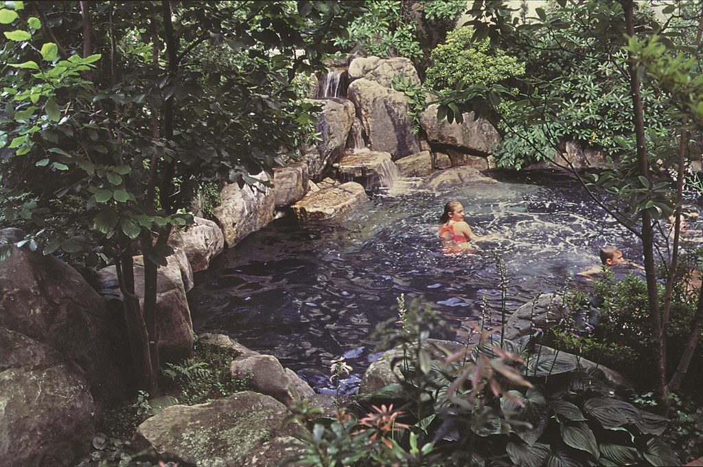
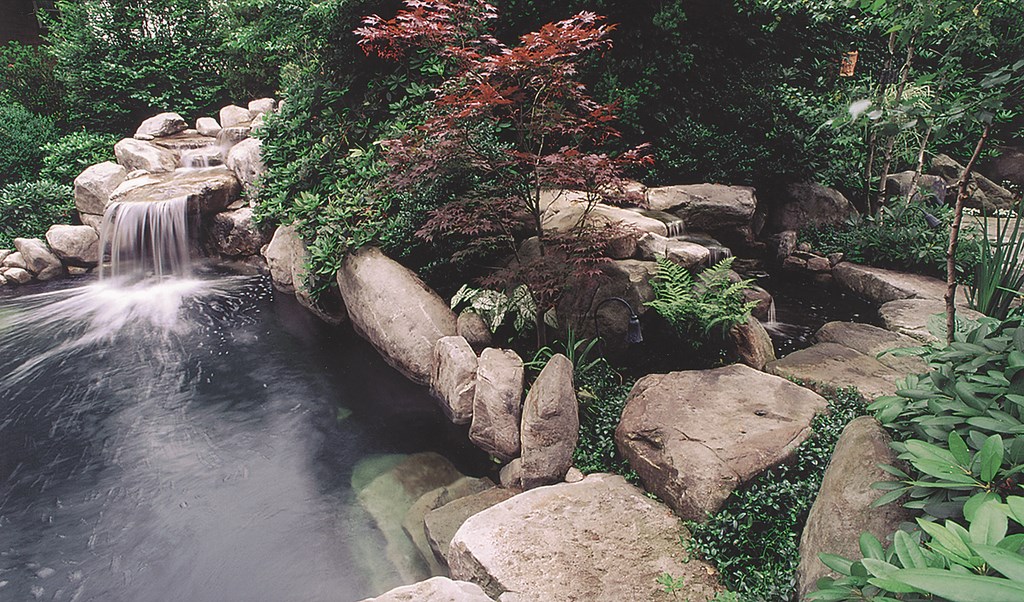
I began by placing the stones for the waterfall based on a rough sketch the wife had done of a rugged arrangement of boulders. This gave me a point of departure – and the liberty to make real progress. I set up two source points for the water, which cascades down a narrow path between large, rugged boulders and then joins as a single flow that spills over two large, flat stones just above the water’s surface. A crown of rocks extends around the perimeter of the pool, providing a variety of irregular shapes.
I used a broad palette of plantings on this job including rhododendron, four varieties of Japanese maple, sweet bay magnolias, narrow pines, hollies, service berries, azaleas and a whole slew of herbaceous plants, including ferns, hostas and tree peony.
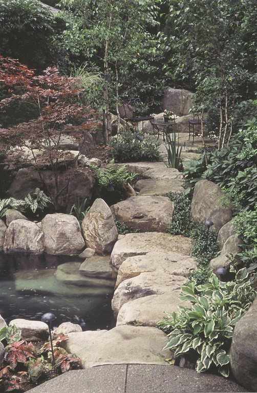
The photographs show the interrelatedness of the various shapes, textures and colors of plant and rock materials. The density of the plantings and the arrangement of rocks provide the desired sense of shelter and privacy, while the smooth trunks of the maples and birch trees contrast with the almost fleshy foliage of the herbaceous groundcovers.
The flat rocks just above and below the surface provide places to lounge.
The interior of the pool is shotcrete painted with a black swimming pool paint to deepen the visual surface of the water as it reflects the soothing, deep greens all around it.
NATURAL PROGRESSION
The second set of images (below) comes from a project that grew out of the first through a referral: The new clients were friends of the people who commissioned the first project.
Their home had recently been remodeled to include a breakfast nook that provided prominent views of the backyard; they were looking to add value to that investment by beautifying the surrounding exterior space. They also wanted to transform the view (which was of their garage across the backyard) and create pathways and destinations within the yard.
| Project #2 |
I say the project “grew” because of the process we went through to land on a design that included a pool.
They had started out by asking me to replicate the look and feel of their friend’s backyard, but with a very small waterfeature. As the plan developed, the small waterfeature became more of a pond – at which point I suggested that if they were going to put in that much water, it might be nice to hop in and enjoy it.
That led to a design that included a natural-looking spa and waterfall, but as discussions continued, I stirred the pot again by observing that since we were already going to the effort of building a body of water to sit in, why not expand the vessel a bit so that you could push off into the water?
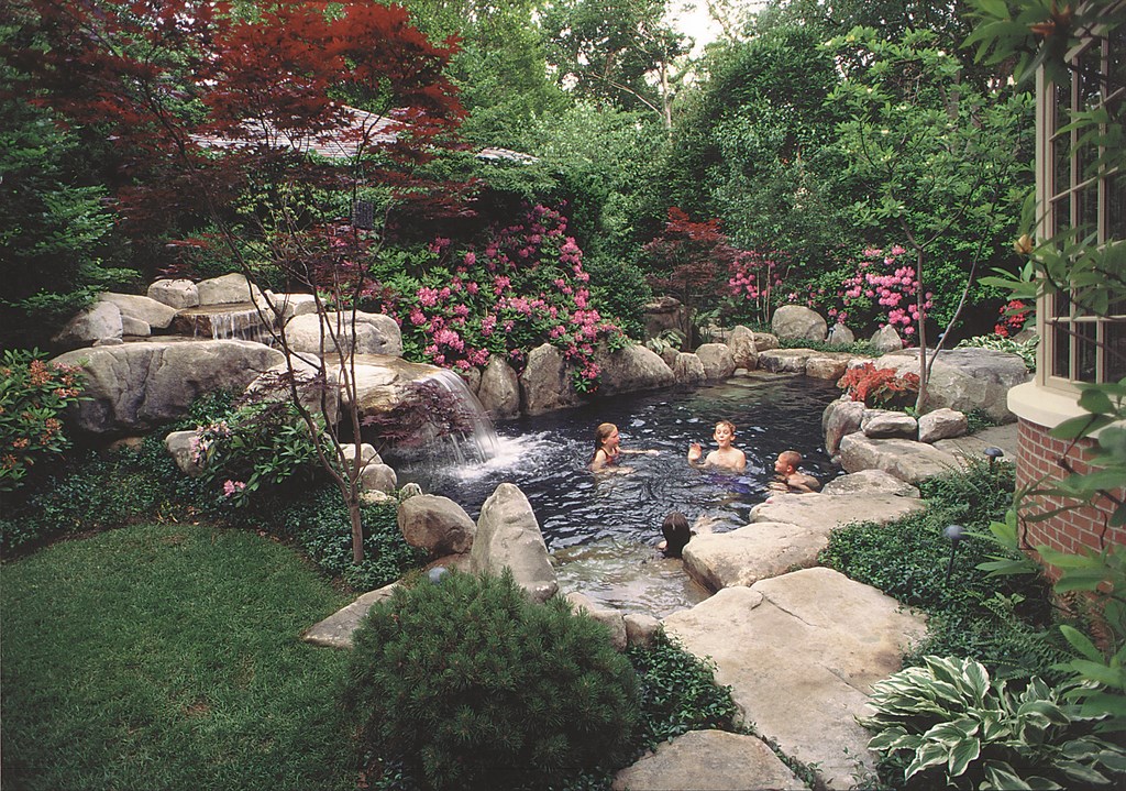
By the time the design was finalized, the pool ended up taking about half the space in the backyard – but in such a way that it added a sense of spaciousness. This effect was achieved by using the pool to create several points of interaction with the environment and by setting up a variety of distinct spaces with differing views.
This concept of creating an illusion of space is always at the back of my mind. I came to understand it when I visited the spectacular Jardin Exotic just outside Rabat, the capital of Morocco. It’s a lush garden that provides a variety of footpaths in and around a pond, each leading to a different location and providing a variety of views – so many that you’d swear there were several ponds and not just one. In this case, I used the same control of approaches and lines of sight to increase the sense of space around this pool.
The key here was the use of flat rocks around much of the pool’s perimeter to provide a variety of viewpoints, seating areas and points of access to the water and the foliage. The rock path leads to a small alcove nestled among tall plants in which a small fishpond is fed by a small rock waterfall. I also placed a bench under the waterfall in the swimming pool – a common detail, but one I had never done before – and installed a flat hydrotherapy seat with a couple of return jets. Below the waterline at several points and depths are rocks intended for seating.
PRACTICALITIES
As with many shells that are designed to support rockwork, I used an expanded bond beam here to provide support and an adequate mounting surface. I also set up shelves inside the pool (and below the waterline) to enable me to submerge large rocks and communicate a greater sense of unity between rockwork above and below the water’s surface. These shelves are set anywhere from 4 to 12 inches below the waterline and are 8 to 30 inches wide.
Selecting the boulders was particularly critical on this job because of the pathway detail. I had to find rocks with good patina that were flat on one side and had no slopes, irregularities or bumps that would constitute a hazard. Sometimes that meant mounting the various boulders at different depths so the upper surfaces came up level. To contrast the flat rock, I chose several distinctly vertical pieces to spread throughout.
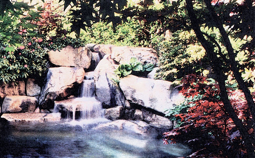
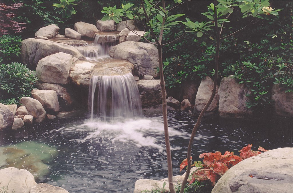
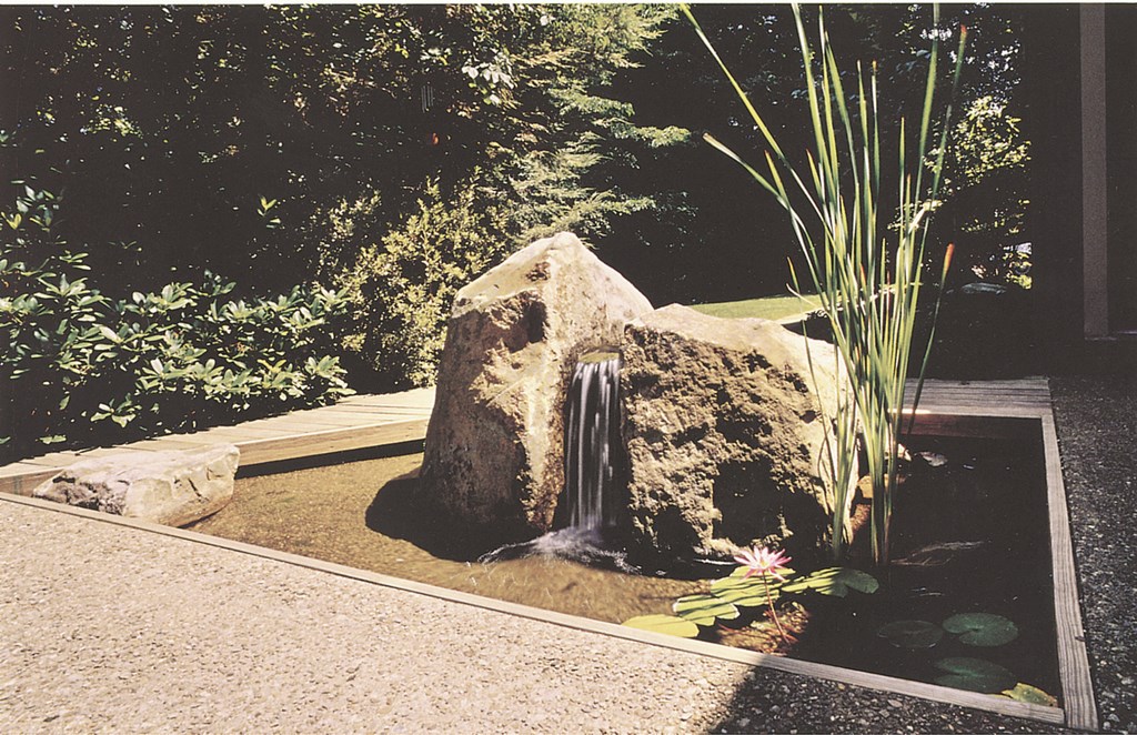
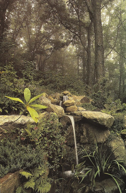
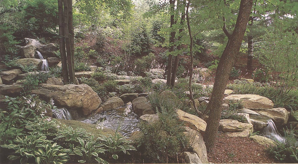
| The approach I use to watershaping can be said to borrow liberally from principles of Japanese garden design. I find particular appeal in the sense of harmony and balance that can be achieved with extremely simple forms when they are arranged and organized with care (left). While I never stray far from those ideals, I also find inspiration in the forests of Pennsylvania and have striven to capture the experience in several projects through the years (including those seen in the middle and at right). For starters, the natural source material is drop-dead beautiful. Also – and just as important – I like the thought of my work helping observers recall an experience they might have had, a vista they might have seen in tromping through the local woods. In that sensory context, even a ribbon of water falling into a pool can be powerfully evocative. |
The planting scheme for this project was very similar to the variety of plants I used in the first project: Tall maples, birch, dogwood and rhodendron provide cover for the garage and a sense of shelter, while shrubs and groundcovers provide a lush base plane of greenery.
I’ll confess that what I’m after in all of this is a highly artistic form of expression. I see myself as a provider of sublime pleasures and surprises that defy precise description in unique settings that have a feeling and ambiance all their own.
Of course, as we seek to mimic nature, we invariably fall short of the mark. The key to coming anywhere close, I think, is by taking time in the design and construction processes to let the composition unfold. Just as the pools I build can’t be cranked out or mass-produced, they defy any attempt I might make to draw them accurately in advance.
For me, the real blueprints for my work are found in the great gardens and exterior spaces I’ve seen around the world. They give me the inspiration I need, time after time, to fulfill the desires of clients who seek spaces of great and enduring beauty.
Jim Lampl grew up in the landscaping trades. His father founded the family business in 1955, then purchased a small farm in Allison Park, Pa., in 1960 and transformed the site into a nursery. In 1972, Jim Lampl graduated from Pennsylvania State University with a degree in landscape architecture and went on to join the Peace Corps. Following extensive travel abroad and a three-year stint in the West African nation of Ghana, Lampl returned home and rejoined the family business. He soon became the principle creative force in the firm’s custom designs, most of which include watershapes ranging in scale from small streams to large swimming pools. A lifetime student of the fine arts and exterior design, Lampl’s work reflects his particular love of Japanese gardens and of detail in landscape design and installation.


